B R
Senior Designer | Developer | Contnent Writer | SMM
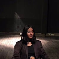
Ready for work
B is ready for their next project!
I also design Instagram carousel posts tailored for premium brands, crafted to showcase true finesse and luxury. Each slide is thoughtfully structured to feel cohesive, elegant, and visually engaging — combining clean layouts, refined typography, and high-end aesthetics that align with the brand’s identity.
The goal is to create content that not only looks polished but also tells a story, keeps the audience scrolling, and delivers a premium visual experience from the first slide to the last.
1
27
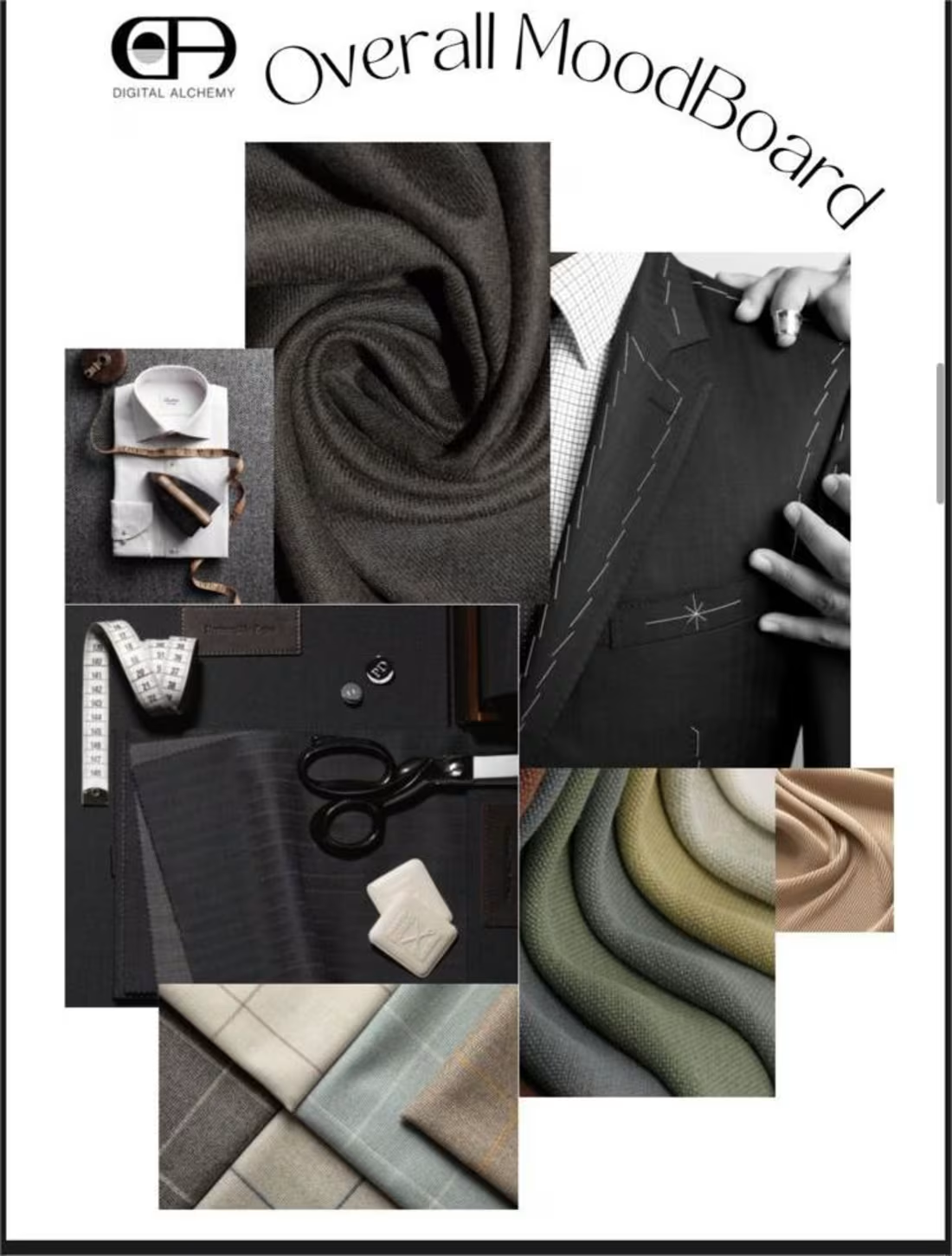
I also specialize in editing and creating social media moodboards for premium brands that aim to showcase true finesse. This includes refining visuals with clean, polished edits while maintaining a natural, high-end feel, as well as developing cohesive moodboards that reflect luxury aesthetics, elevated color palettes, and strong brand consistency.
The goal is always to create a social presence that feels intentional, visually captivating, and aligned with the elegance and exclusivity that premium brands represent.
1
23
Illustrations and design become genuinely exciting when you’re given creative freedom. Being able to explore different styles, experiment with concepts, and bring ideas to life without limitations makes the entire process fun and inspiring. It allows creativity to flow naturally, and that’s when the best work happens — when you’re not just designing, but actually creating something with personality, originality, and meaning.
1
29
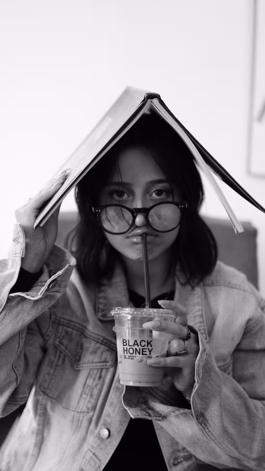
Editing images after a shoot — especially when it’s your own brand — teaches you a lot about storytelling and authenticity. While post-production is important for polishing lighting, tones, and overall aesthetics, it also makes you realize that sometimes the most powerful content is the most real.
When you’re behind the camera and the editing screen, you start to notice that perfection isn’t always the goal — personality is. Small imperfections, natural movement, raw textures, and real expressions often create a stronger connection with the audience than overly edited visuals. It’s a reminder that keeping things genuine can actually be the key to making a brand feel relatable, trustworthy, and memorable.
1
34
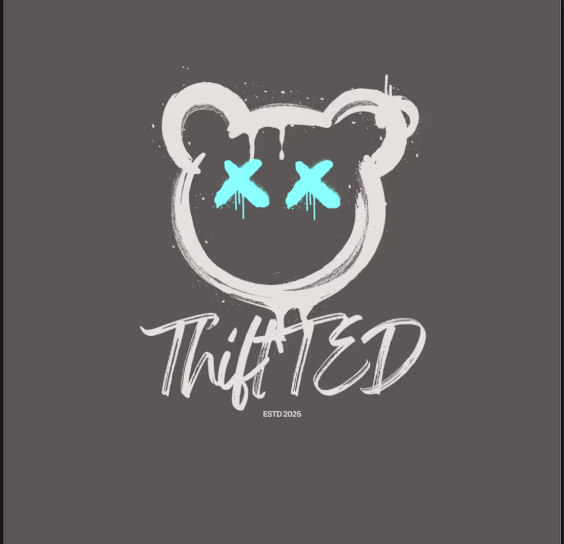
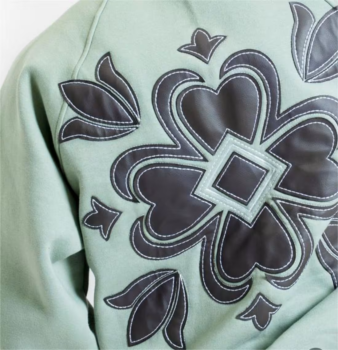
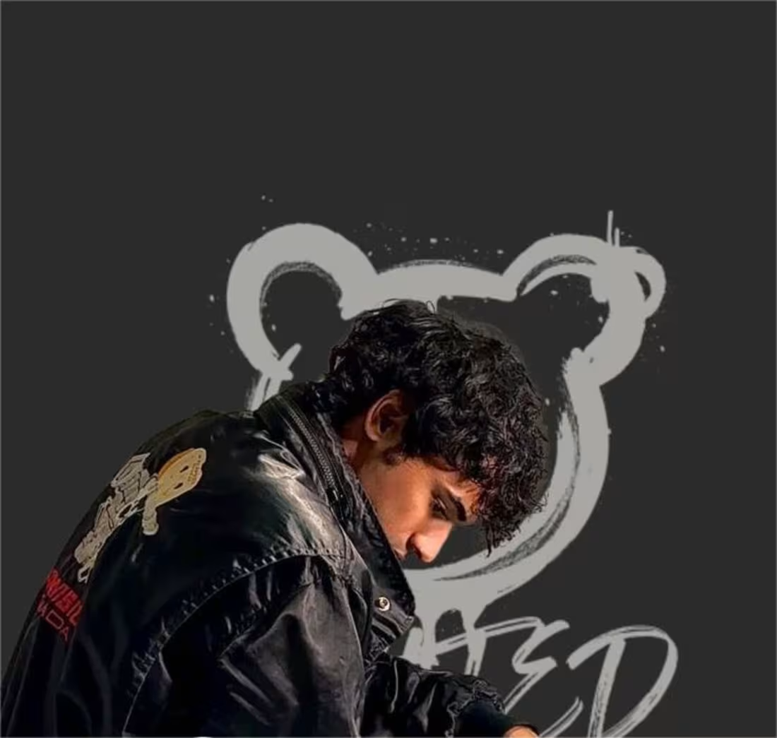
One of my recent clients owned a thrift store but didn’t yet have a clear brand identity and they didn’t even have an official name. They approached me to build the brand from the ground up, which included creating the full concept and defining the store’s personality.
I translated the concept into a cohesive brand identity by designing the logo and key branding elements, ensuring everything aligned with the store’s vibe and target audience.
To make the brand even more memorable and playful, I also developed the tagline and character concept behind the store’s identity:
“Here comes Ted! Let Ted style you and make you hip. Ever met a bear this cool?”
This helped establish a fun, youthful personality for the brand and gave it a unique edge that instantly stands out in the thrift and streetwear space.
1
30
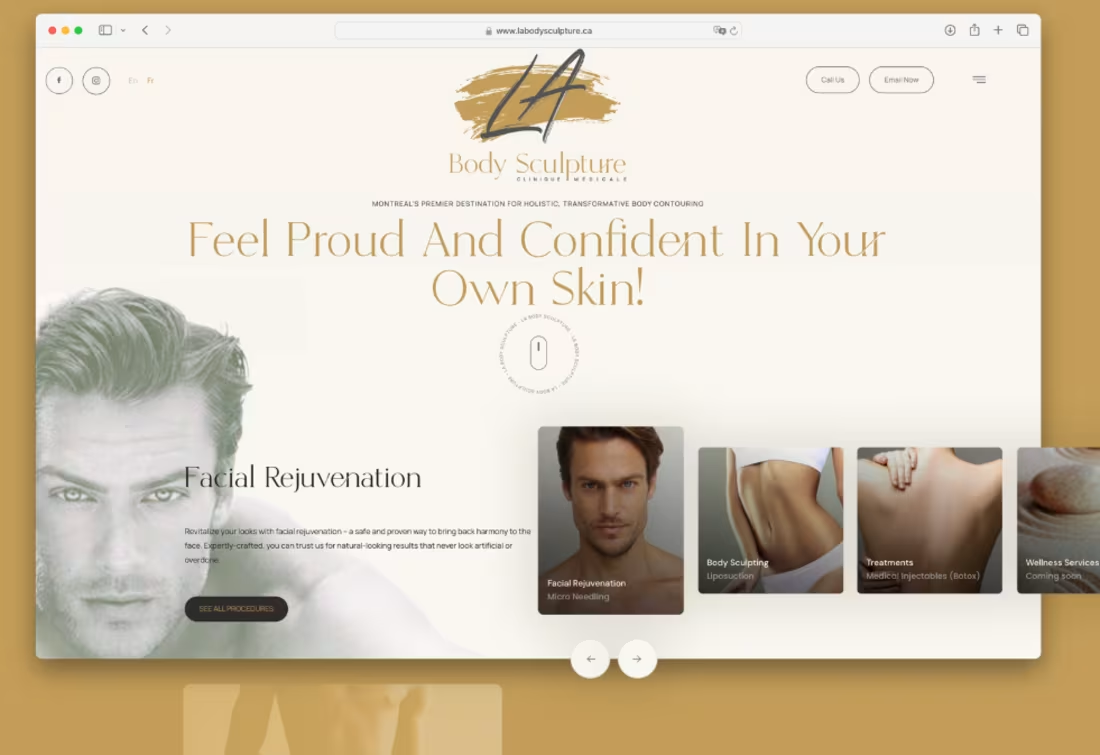
I don't know much about skincare, but I love a challenge!
I designed and developed a custom Webflow website for LA Body Sculpture. The website features an intuitive interface since I had creative freedom. The aim was to feel "handsome" haha...highlighting the product's results: beauty and confidence. With a focus on user-friendly navigation and aesthetic appeal, the platform provides a seamless experience for users to explore treatments and book appointments securely. Being pretty is just one click away in this case!
1
66
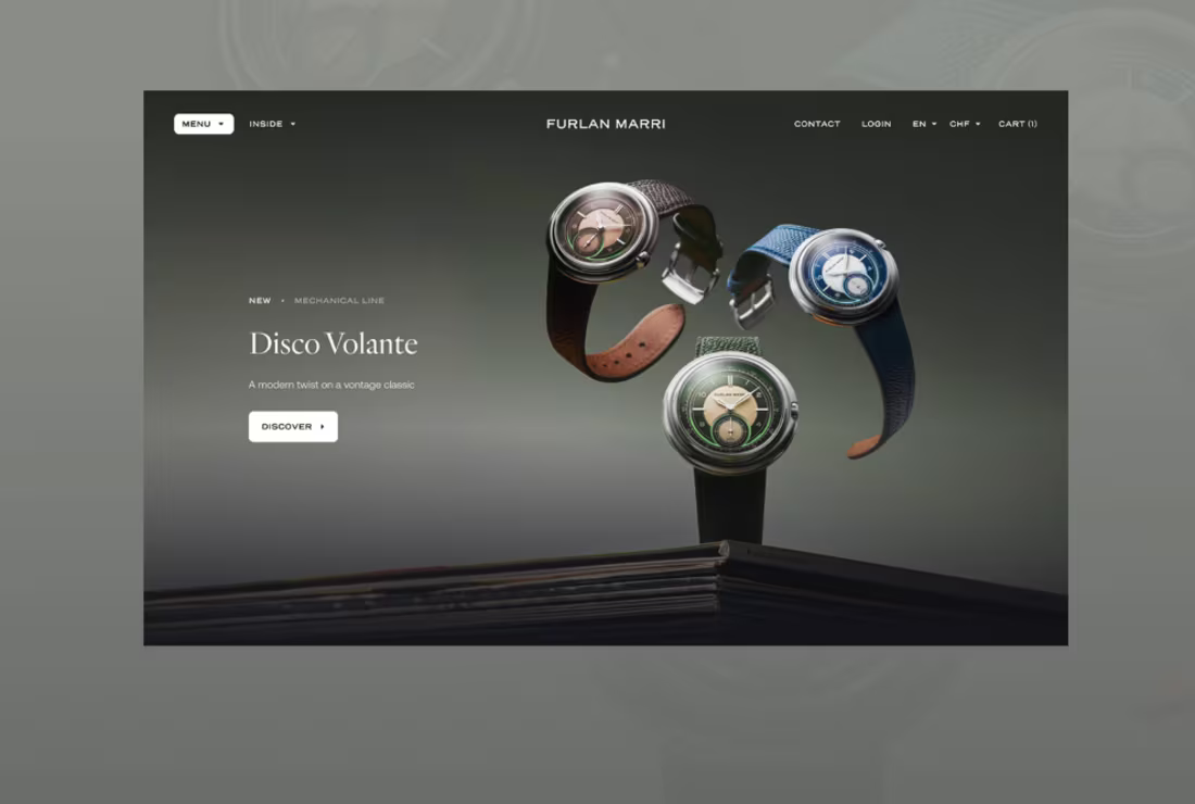
One word: Timeless.
This is what I was told the day I had my first meeting. And from that point onwards, it was all I could think of. In this case, color and font mattered the most. And so, within a week and a half, I was able to come up with something that didn't slap you in the face. The whole point of this was to make sure users were taken through a journey that seamlessly took them through the website while emphasizing the watches. I didn't want the font or color to compete with the product, instead I wanted the two to blend in.
1
51
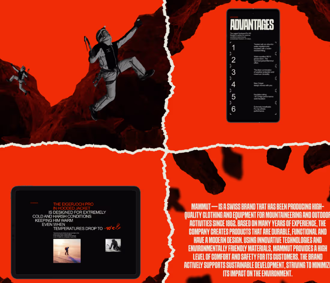
This was a challenge. The client wanted a specific tint of orange, but simply couldn't decide what to pair it up with.
The aim was to create a sleek and 'dynamic' UI/UX concept for a jacket-making company. Now, I'm there like, "dynamic?jacket?" God help me!
Initially, I couldn't think of anything that could go with absence, and then it clicked: Just like Mammut wishes to stand out, so should the orange- it should be right in YOUR face. The interface then followed a simple concept: modern with a pop of orange. With a focus on user-friendly navigation and a visually engaging layout.
1
49
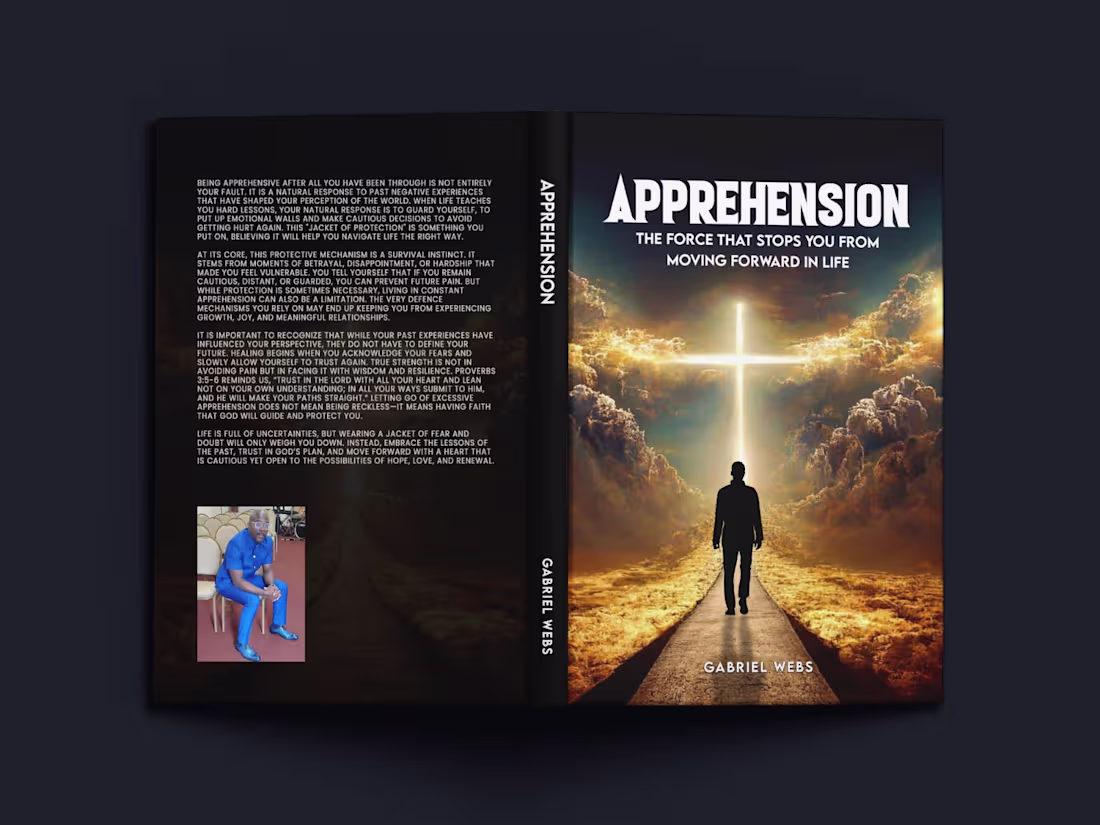
Over five years, I’ve specialized in professional book cover design, creating covers across a wide range of genres. My approach to every project is rooted in one key goal: to listen closely to the client’s needs, understand their vision, and capture the true essence of their story through design.
These two covers represent that philosophy best.
The first cover was created for an author who wanted his story to be heard as a person of colour. The design reflects both his identity and the powerful role that God and faith played in helping him overcome challenges and navigate life’s path.
The second cover is a completely different creative space. A fantasy story exploring how wolf dogs came into existence through a majestic, mythical wolf from the clouds named Zaila.
1
46