
pro
Avolé Studio
Art Direction, Branding, Packaging & Visual Identity
New to Contra
Avolé is ready for their next project!
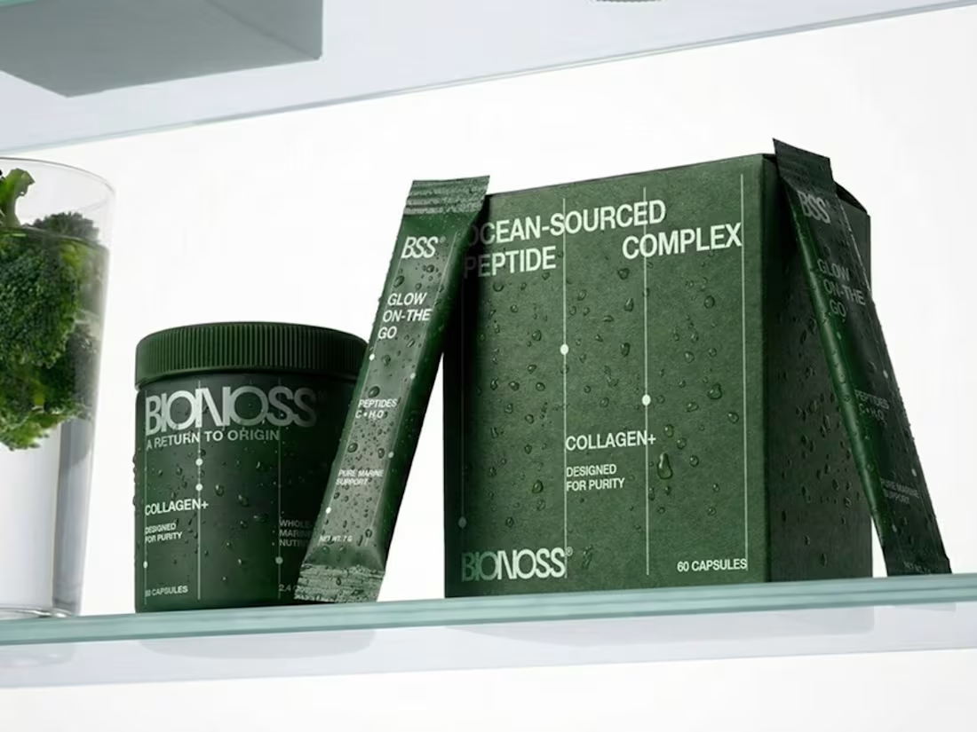
BIONOSS — Brand Identity & Packaging
A marine-sourced peptide supplement brand built on the principle of returning to origin. Deep forest green tones reference natural wholeness, while a clean editorial wordmark and clinical layout system ground the brand in modern wellness. Packaging extends across jars, boxes and daily spark sachets — each format anchored by the same disciplined typographic logic. A visual identity that translates marine nutrition into quiet, considered ritual.
0
21
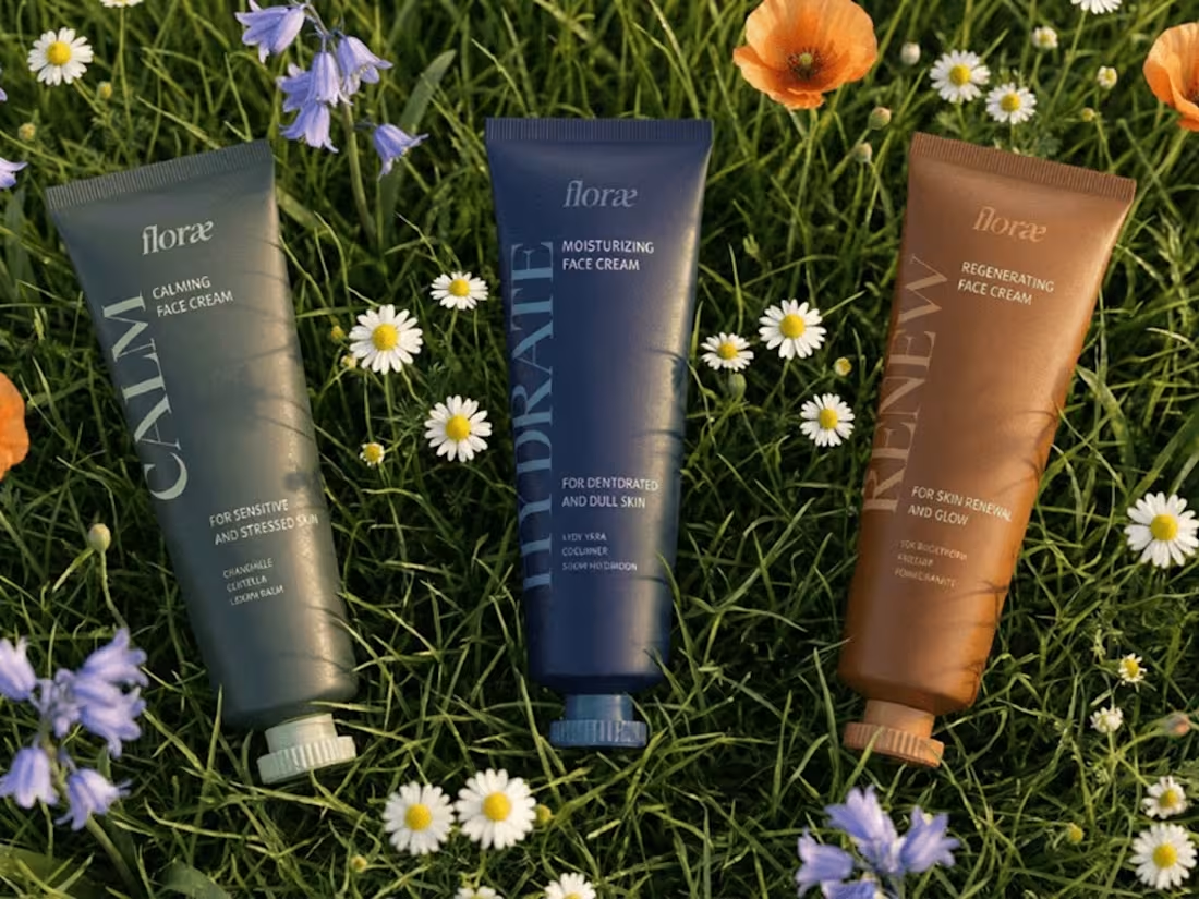
FLORAE — Brand Identity & Packaging
A natural skincare brand inspired by plants, botany and a gentle interaction with the body. The name draws from the Latin flora — the plant world, flowers and quiet life. The visual identity translates that botanical heritage into refined typography, soft considered colour and packaging that feels rooted in nature without leaning literal. A brand built on calm, intention and the slow ritual of caring for skin.
1
26
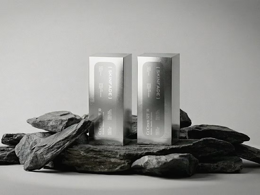
SKINFADE — Brand Identity & Packaging
A skincare brand built around tonal correction and quiet confidence. CC Cream SPF 30 with mineral SPF and skincare-grade actives — designed to even tone without a trace. The identity is anchored by a refined parenthetical wordmark, monochrome metallic packaging, and editorial typography. A visual system that feels clinical without being cold, modern without losing warmth — skincare presented as discipline, not decoration.
1
38
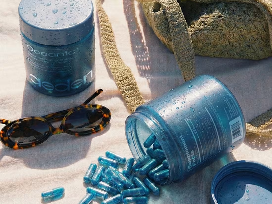
AEDEN — Brand Identity & Packaging
A supplement brand built around oceanic strength and whole-food nutrients. Deep blue tones reference water as the source of vitality, while a confident wordmark and refined typography ground the brand in modern wellness. Packaging designed to feel cooling, fresh and intentional — a visual identity that translates power and purity into a daily ritual.
1
51
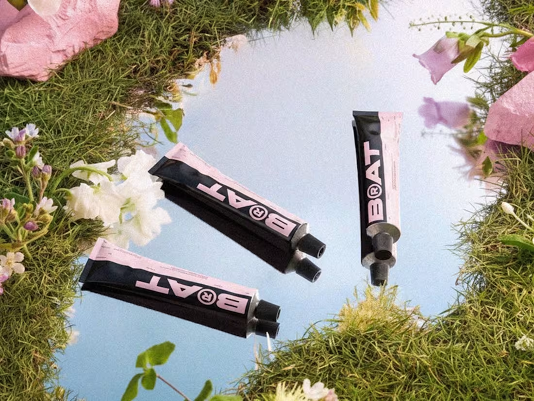
BRAT — Brand Identity & Packaging
A cosmetic brand built on minimalist identity and tactile contrast. Soft pink meets bold black, with a confident wordmark that anchors the entire system. Editorial product layouts, considered ingredient typography and a visual world that feels both playful and refined. Packaging designed to perform on shelf, in hand and across campaign imagery — a brand that holds its character at every scale.
0
57
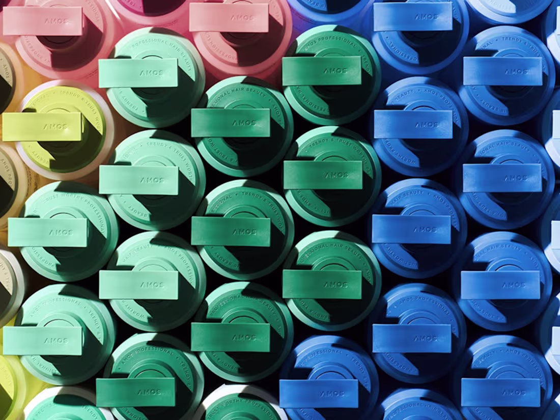
AMOS PROFESSIONAL — Brand Identity & Packaging
A global extension of Amos Professional’s full brand renewal — built for launch across North America and Europe. The project covered graphic guidelines, container design and a refined colour strategy for new markets. The body shape was simplified to emphasise distinct functional features, while a low-saturation palette differentiates products intuitively within the lineup and lets them blend seamlessly into varied environments. The pump button design was standardised for cost efficiency, and eco-friendly inks and recycled paper were used across the packaging system.
0
58
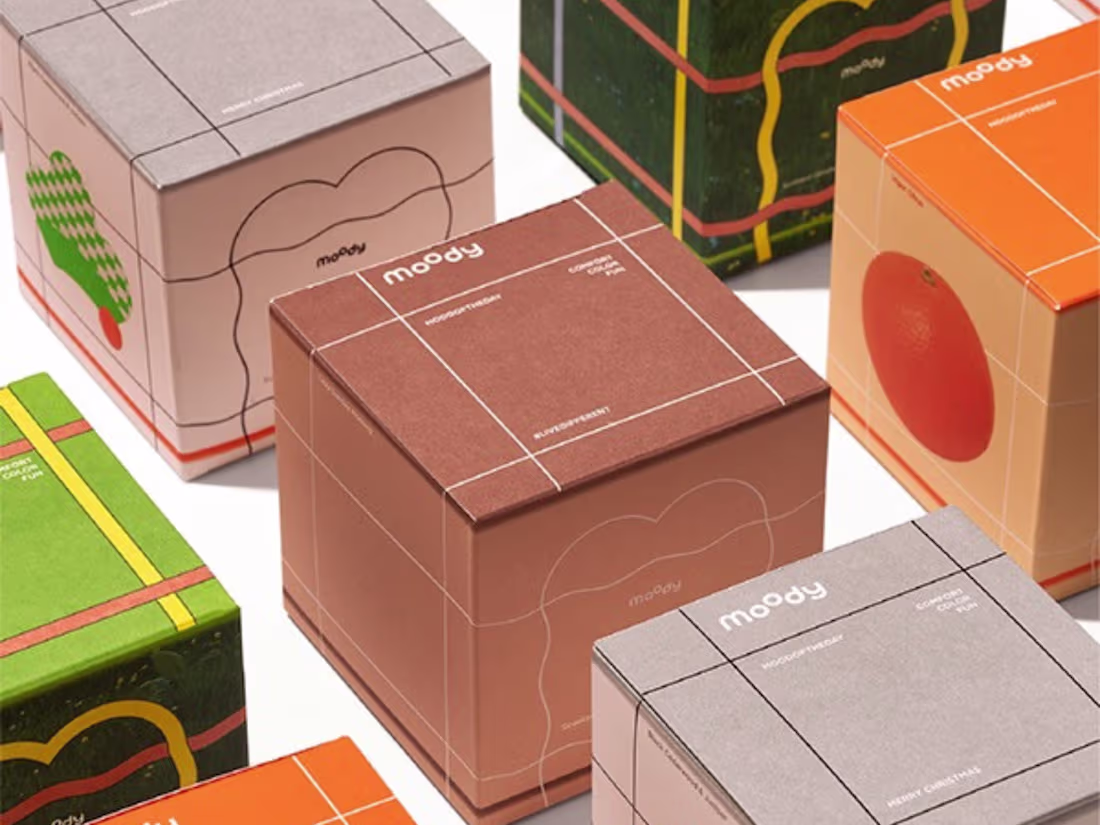
MOODY — Brand Identity & Packaging
Derived from the ‘M’ transformation of the moody logo, this shape becomes a universal design element adaptable across scents. Fine lines traverse all six faces of the cube, creating a structured typographic layout while partitioning the visual field — turning scents into imagery, with the ‘M’ acting as a frame. By varying line weight, the motif shifts into a distinct illustrative style. A hidden symbol embedded across packaging and channels, carrying layered meanings beyond decoration. The logo remains the protagonist, but this simplified abstraction quietly reinforces brand recognition.
1
65
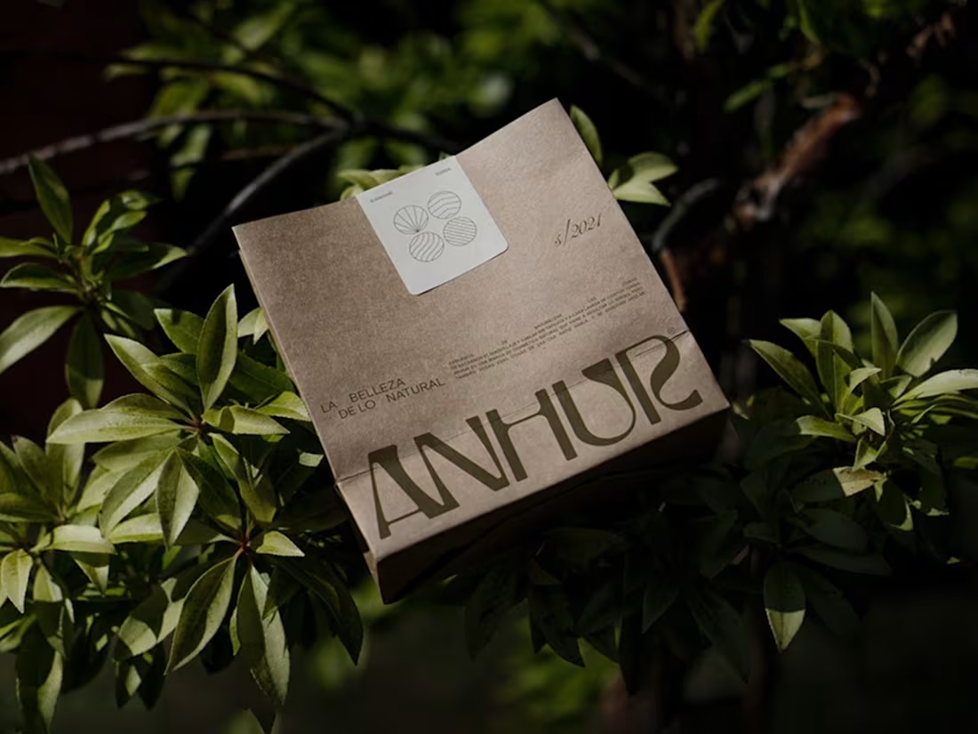
ANHUR — Brand Identity & Packaging
A skincare brand built on 100% natural ingredients. No filters, no additives, no sugarcoating — just honesty. Anhur doesn’t believe in perfection and doesn’t chase it. The visual identity speaks face to face: simple, direct, real. A brand that normalizes both the good and the not-so-good — presenting itself for exactly what it is.
1
99
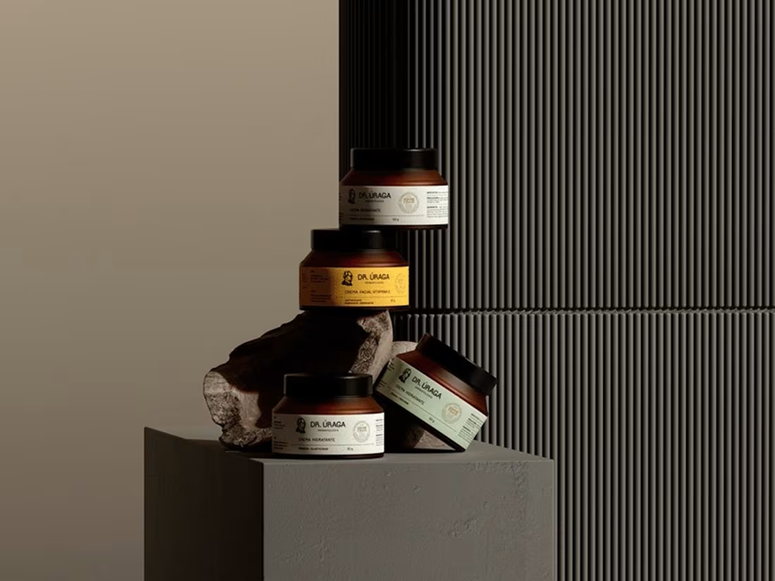
DOCTOR ÚRAGA — Brand Identity & Packaging
A skincare brand and clinic in Guayaquil, Ecuador — established in 1928, now managed by the third generation. The redesign honours nearly a century of history while opening the brand to new generations. Dr. Úraga’s distinctive features brought into a modern, clean graphic environment with unconventional colours. Authenticity meets innovation, tradition meets contemporary expectation.
1
98
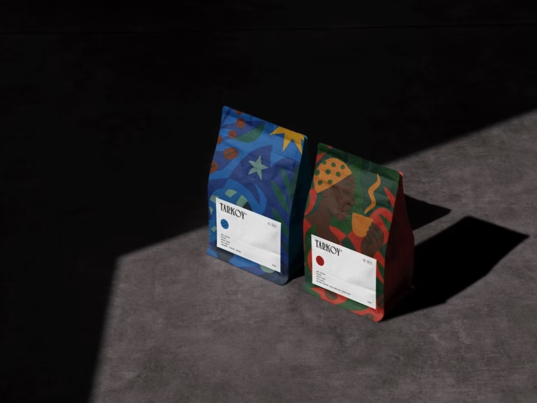
TARKOY — Brand Identity & Packaging
A coffee brand born to bring Latin American culture to North America — built on family farming and high-quality beans. The serif logotype carries an artisanal feel with subtle gothic influences, while hand-drawn illustrations reflect the culture of each country where the coffee is produced. A visual identity that translates tradition and care into something dynamic, sophisticated and rooted in heritage.
1
48
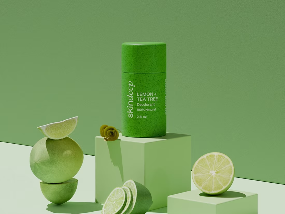
SKINDEEP — Brand Identity & Packaging
A premium skincare brand built on natural beauty and purity. The identity balances elegance and modernity — a refined serif for “deep” paired with a clean sans-serif for “skin.” Deep green and beige tones reflect nature, purity and tranquility, while soft, natural imagery communicates a fresh and luxurious feel. A brand designed to embody clean, effective and nature-inspired skincare at every touchpoint.
1
39
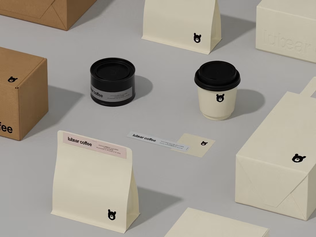
LUBEAR COFFEE — Brand Identity & Packaging
A coffee brand derived from the imagery of the moon bear. The brand system unites graphic logo, custom wordmark, layout guidelines, colour palette, offline materials and product packaging into one cohesive whole — logically consistent across every touchpoint. Just as the name implies, Lubear carries a warm, pure and minimalist vibe.
1
48
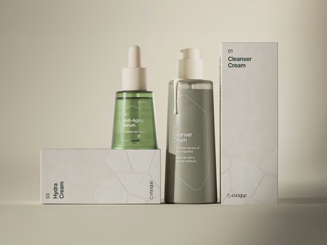
EVOQUE — Brand Identity & Packaging
A skincare brand built around the idea of skin as the core of personal identity and well-being. The visual language is rooted in skin texture and cellular patterns — translating skincare into a tactile, recognisable system. A cellular pattern (in both fill and outline) runs across every touchpoint, hinting at scientifically-backed formulas and a commitment to the preservation of nature. The same texture subtly shapes the brandmark itself, tying every product into one cohesive family.
1
29
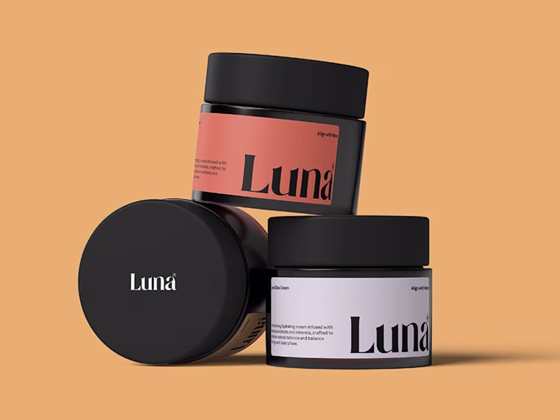
LUNA BOTANICS® — Brand Identity & Packaging
Skincare brought back to its roots — enhancing natural radiance through botanical ingredients. Lunar Glow Cream blends soothing chamomile, hydrating hyaluronic acid and nourishing avocado oil into a cream that replenishes, balances and revitalizes. Visual identity built on modern elegance and natural authenticity: Languid Lavender, Silver Sand and Platinum tones with accents of Middle Yellow Red and Jelly Bean. A design that reflects purity, tranquility and warmth — connecting users to a skincare ritual that feels pure, fresh and effective.
1
41
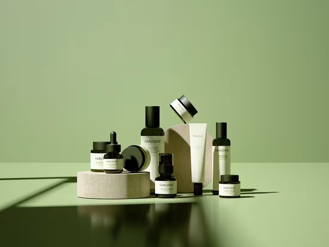
FAR L’OVIÉ — Brand Identity & Packaging
A Korean-inspired skincare brand built on natural, organic formulations — non-fragrance, non-pigment, non-chemical preservatives. Minimal cream packaging with soft green accents, structured typography and quiet numbered system. Skincare reduced to clean ritual — balanced, conducted, refined.
1
61
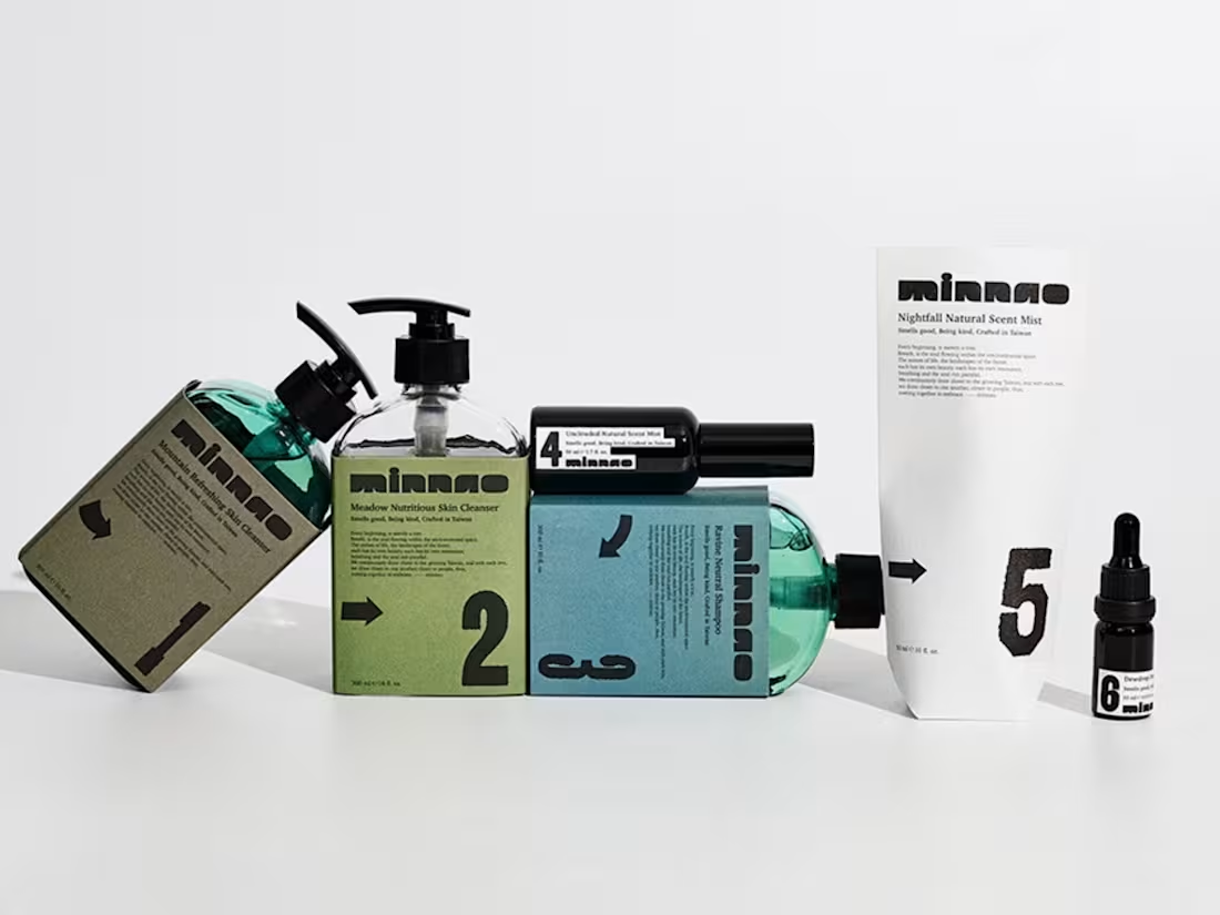
MINNAO — Brand Identity & Packaging
Taiwan’s landscapes explored through scent. The “Scent Trail” concept turns fragrance into a sensory coordinate — mapping place, memory and movement. Each scent assigned a route code and colour palette inspired by terrain: misty hills, river valleys, open fields. Geography becomes a visual anchor that extends through naming, packaging and photography. Tactile materials echo the richness of soil and place — wayfinding through scent.
1
60
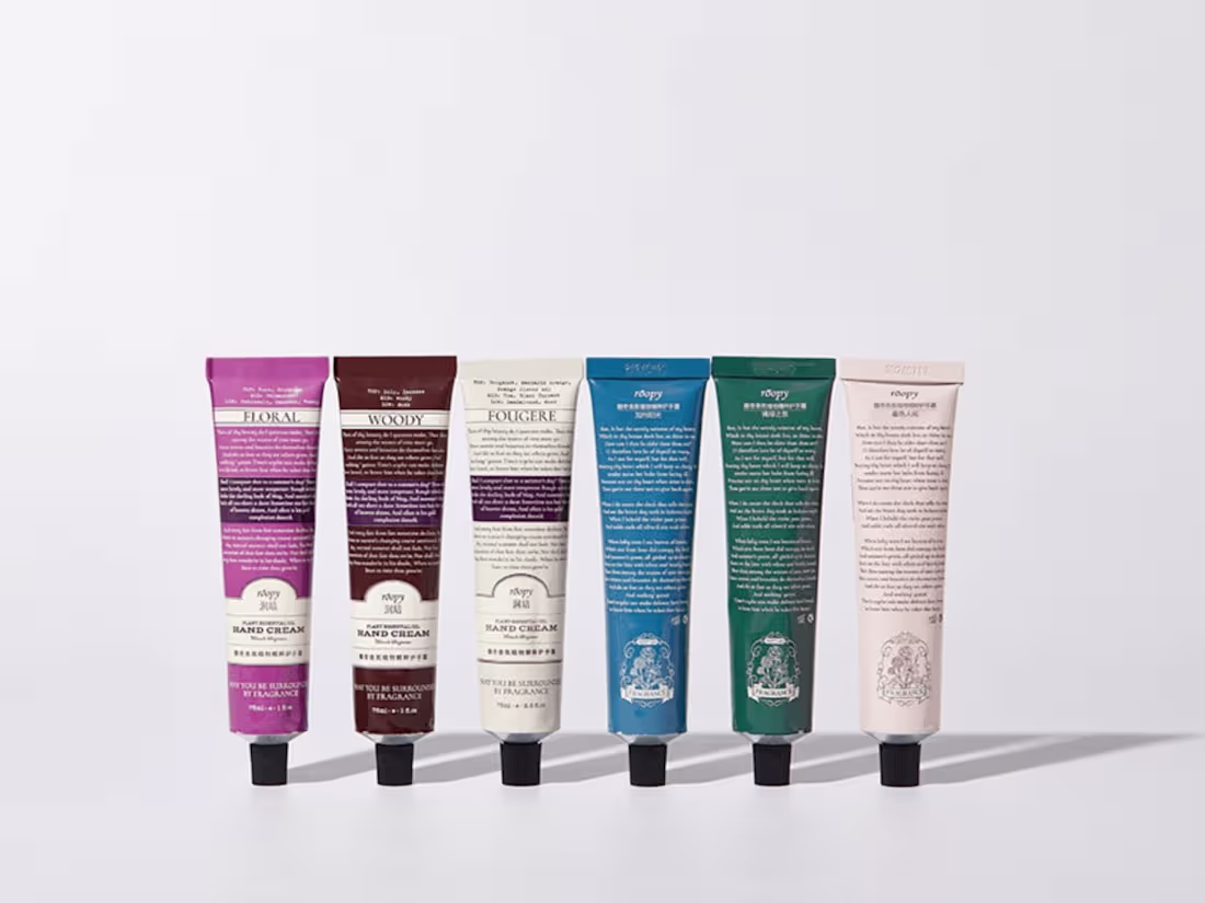
ROOPY — Brand Identity & Packaging
Skincare and scented rituals rooted in nature. Roopy uses natural plants to care for natural skin — bringing botanical heritage into a quiet, sensorial ritual. Warm amber tones, vintage apothecary-inspired labels and tactile typography. A brand built around being surrounded by fragrance, where skincare and atmosphere become one.
1
34
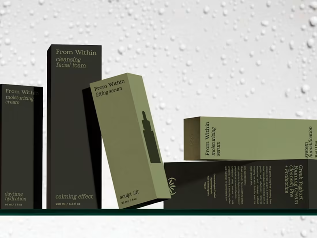
FROM WITHIN — Brand Identity & Packaging
A cosmetics brand built on innate, unconditional beauty. Natural ingredients that engage all the senses — emphasizing character, individuality and the strength of roots. Beauty as a tool for emotional transformation, not as a mask. Visual identity rooted in acceptance, naturalness and diversity, helping women reconnect with themselves and reveal what’s already there.
1
61
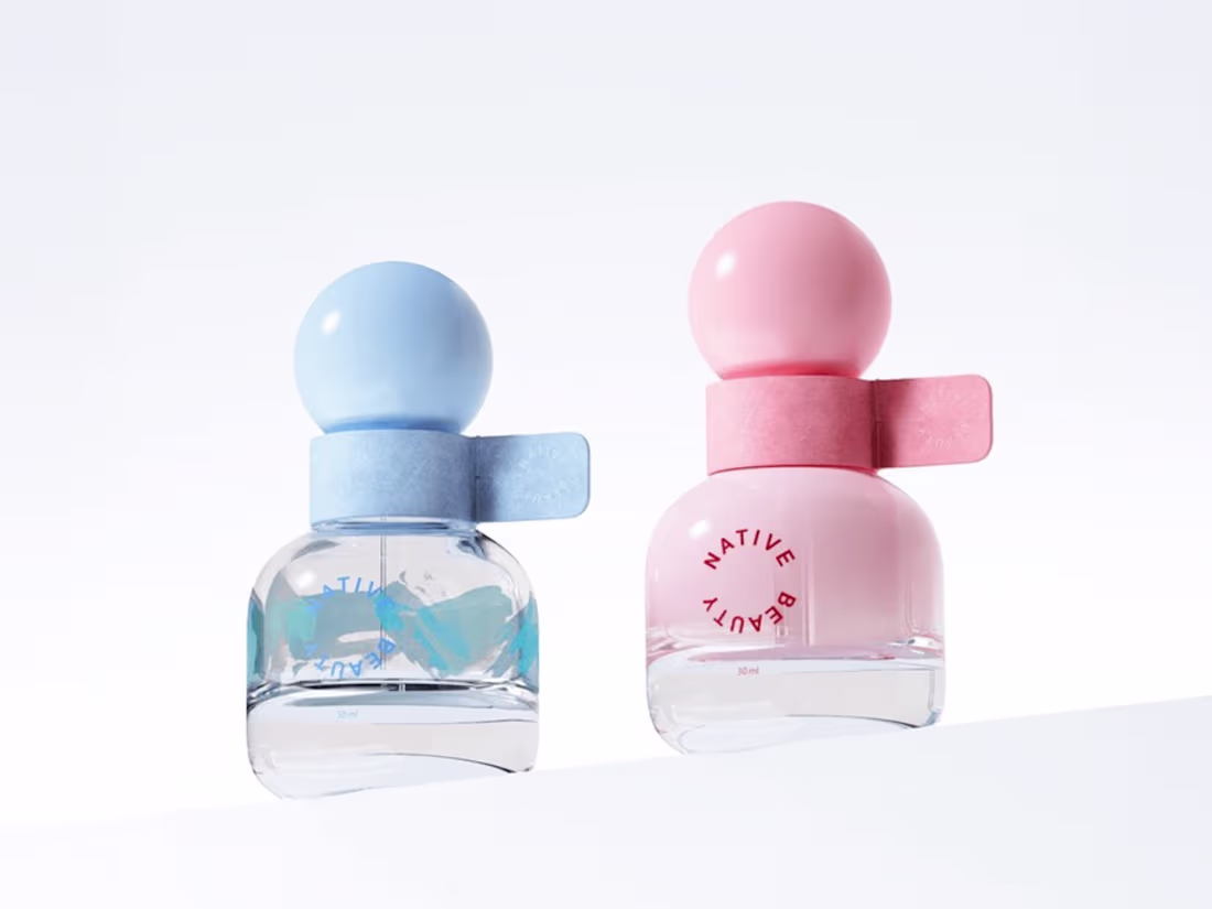
NATIVE BEAUTY — Brand Identity & Packaging
Skin Power Essential Oil designed as a skincare ritual focused on recovery and balance. Formulated with carefully selected natural ingredients, the design reflects the inherent qualities of each material — translating raw nature into refined form. Visual identity that speaks of restoration, balance and quiet strength.
1
52
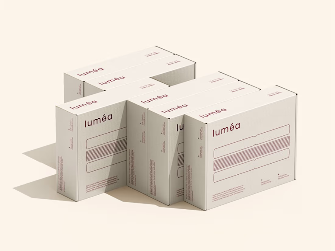
LUMEA — Brand Identity & Packaging
A candle brand built around light and glow — without being literal. Lowercase typography with generous spacing, no decorative elements, just clean forms designed to feel contemporary yet enduring. Linear patterns and stripe variations inspired by the steady burn of candlelight. Muted reds, violets and teals — distinction without breaking the brand’s quiet tone. Tall, slim packaging echoing the proportions of the dinner candles inside.
0
64
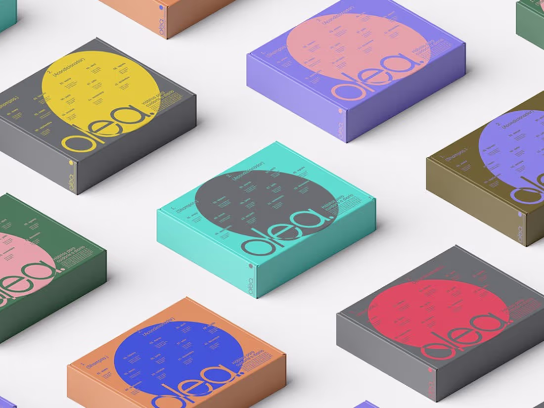
OLEA® — Brand Identity & Packaging
Personal care without boundaries. Skin and hair care that’s inclusive — across genders, across body types, across everything. Conscious, comprehensive care for both body and planet. Born from years of searching, testing and personal experience — sharing what works because well-being starts with caring for ourselves and the world around us. Nature as the foundation, inclusivity as the standard.
0
72
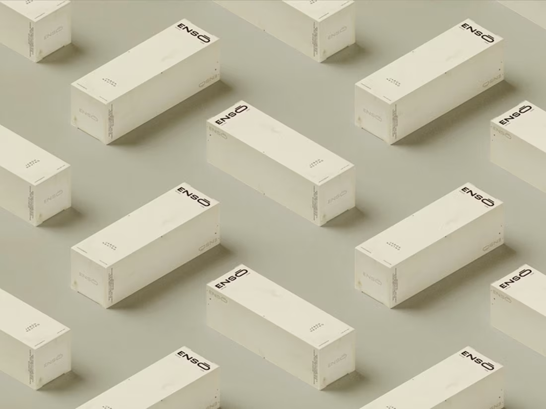
ENSŌ — Brand Identity & Packaging
Tattoo aftercare rooted in intention. A complete product line of creams, soaps and lotions formulated with vitamins and natural extracts — hydration, relief and restoration to keep ink in optimal condition. Visual identity inspired by wabi-sabi — beauty in imperfection, simplicity as strength. Earthy tones, minimal forms, quiet confidence. A system designed to feel as considered as the care it delivers.
6
101
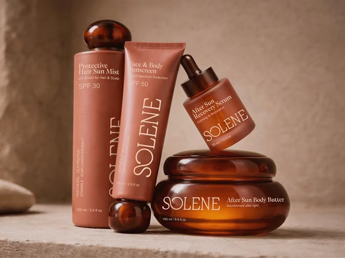
SOLENE — Brand, Visual Identity & Packaging
Sun care between protection and sensuality. A refined, design-led brand that redefines SPF as an everyday ritual — not just a functional product. Moving away from the overly clinical or overly playful, into a visual language that feels elevated, tactile and emotionally engaging.
1
48
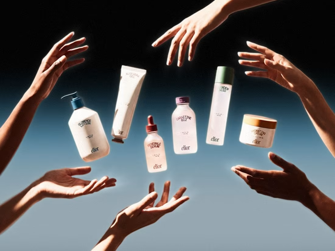
ELIOR — Brand Identity & Packaging
A clean, modern skincare brand built from the ground up. Full identity, logo, colour palette and packaging design across six products — lotion, serum, B12, cream, micellar water and vitamin syrup. Every carton box designed to sit cohesively on shelf while holding its own individually. Purely brand language and surface design — a tight, consistent system that feels premium without being cold, built to scale across a growing product line.
0
64
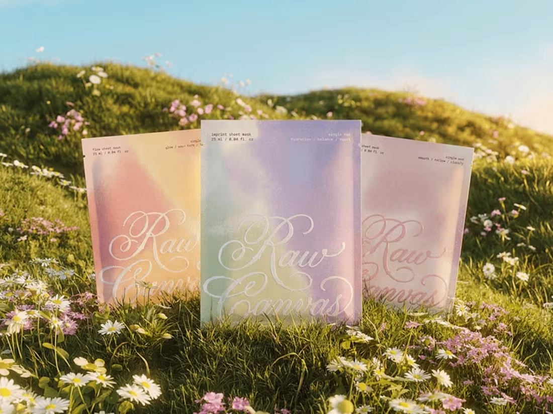
RAW CANVAS — Brand Identity & Packaging
Skincare as a form of expression. The face as a surface, each product as a layer — applied, absorbed, allowed to evolve. Inspired by the language of painting, self-care becomes a tactile, intentional ritual. Dreamlike gradients, pastel tones, expressive lettering. Beauty not as a fixed result, but as an ongoing creative process.
1
1
73
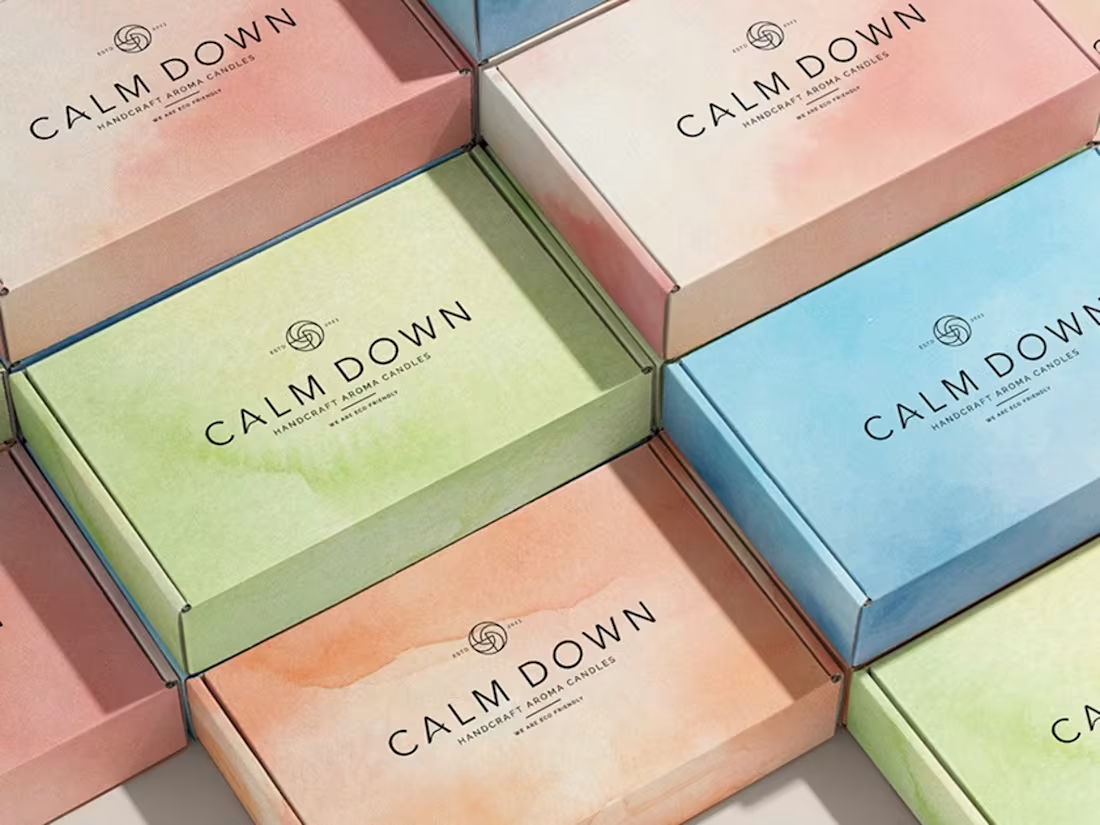
CALM DOWN — Brand Identity & Packaging
A handcraft aroma candle brand shaped around the idea of a pause — a quiet act of care you can hold in your hands. Watercolor textures as graphic language, fluid and emotional, mirroring the way scents drift and linger. Each fragrance carries its own atmosphere: marine calm, forest warmth, homemade sweetness, bakery comfort. Vivid colors guiding you through moods and memories. An invitation to breathe slower.
1
80
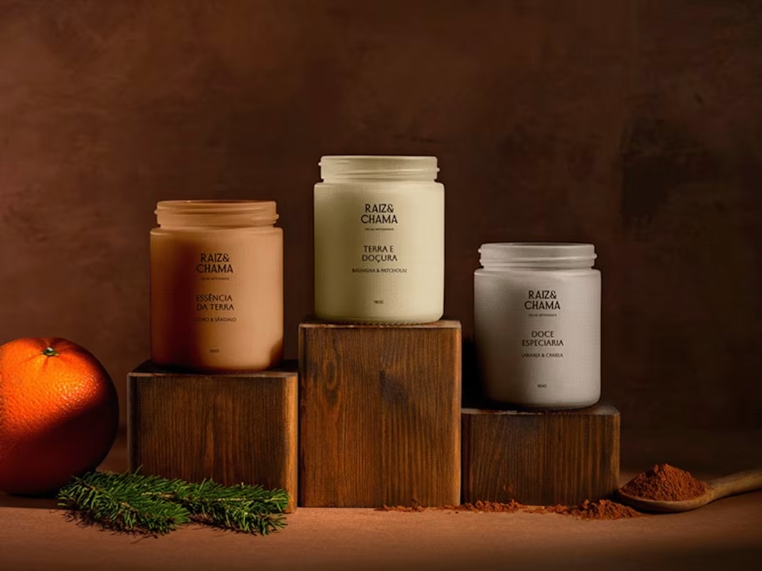
RAIZ&CHAMA — Brand Strategy & Visual Identity
Artisanal candles combining the warmth of flame with a deep connection to earth. Frosted glass, earthy tones, minimal typography. Doce Especiaria, Terra e Doçura — each scent rooted in nature and moments of introspection. A brand that invites you to pause, connect and inhabit the moment.
1
112
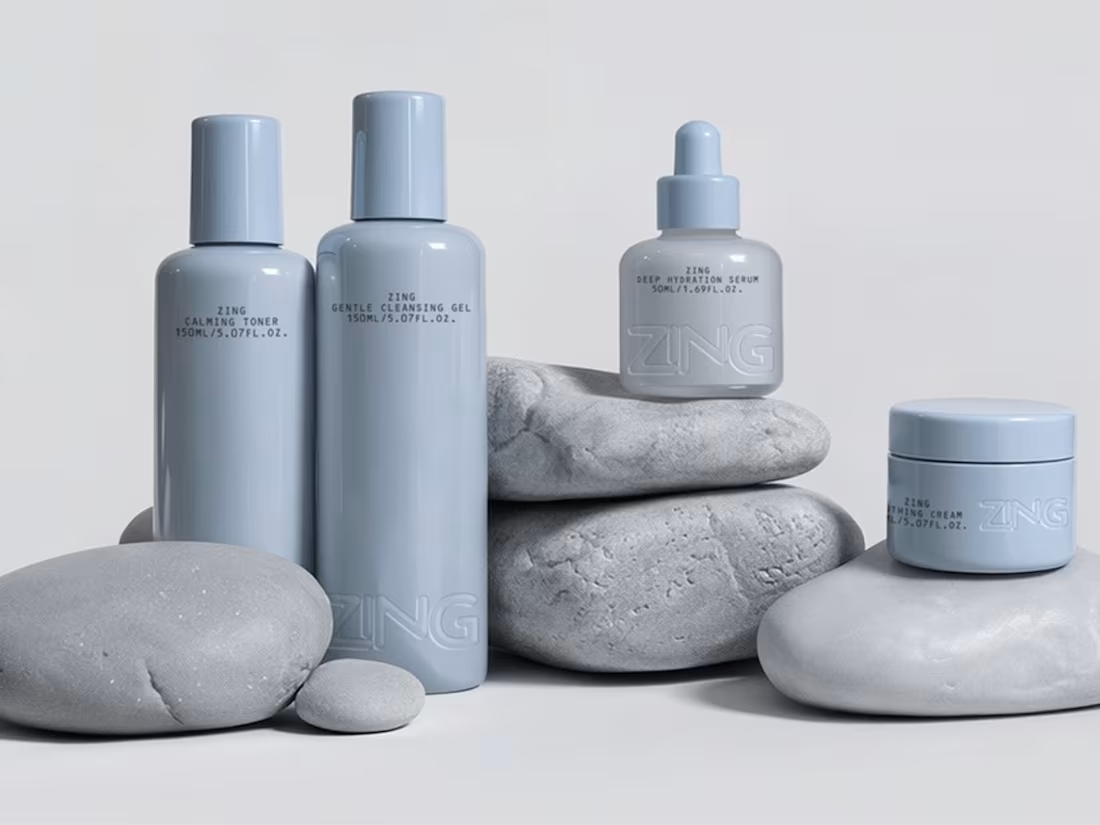
ZING — Brand Identity & Packaging
A conceptual dermo-aesthetic skincare brand built around softness, tactility and visual calm. Minimal design that communicates care, sensitivity and quiet confidence without relying on loud beauty tropes. Muted pastel tones, subtle contrasts and clean geometric packaging. Typography restrained and airy, letting materiality and form lead. Embossing, soft shadows and tactile surfaces — skincare not as routine, but as a gentle daily ritual.
1
40
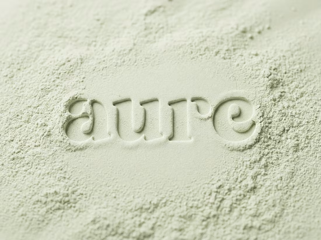
AURE — Brand Identity & Packaging
A conceptual supplement brand for the modern woman with an established wellness routine and a selective approach to self-care. Complete identity system from naming and positioning to packaging and visual direction. Creative direction, logo, color palette, graphic language, layout principles and brand applications. Intentional, refined, cohesive.
1
78
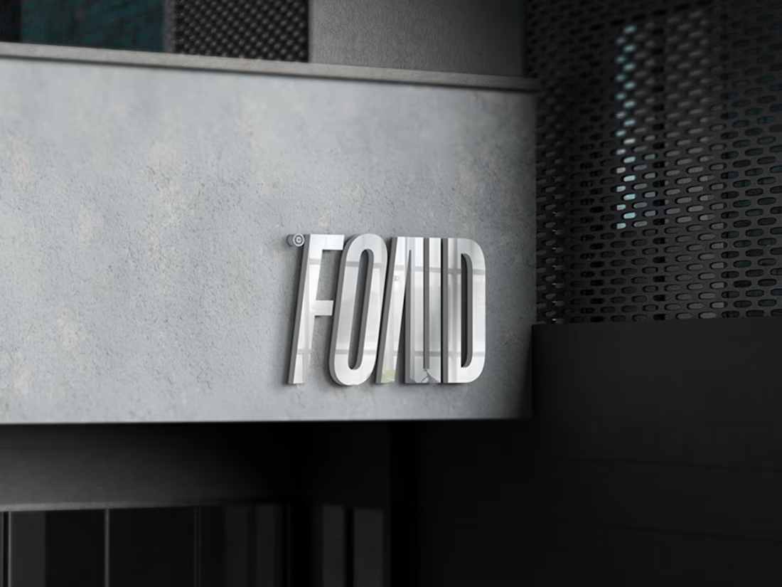
FOND — Brand Identity & Packaging
A cosmetics brand born from a deep appreciation for individuality. Beauty that belongs to you — not an outcome, but a feeling. Every formula, texture and visual element follows balance, simplicity, clarity and quiet power. Chrome signage, refined typography and a visual system designed to feel personal at every touchpoint. Fond of You.
0
101
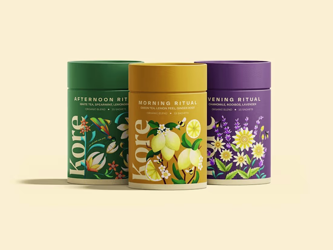
KORE — Brand Identity & Packaging
An organic tea brand offering intentionally crafted blends for calm, clarity and presence. Nature-inspired illustrations, rich botanical greens and elegant serif typography. Each blend designed as a daily ritual — white tea, spearmint, lemongrass. Packaging that invites you to slow down and honor the rhythms of the earth.
0
103
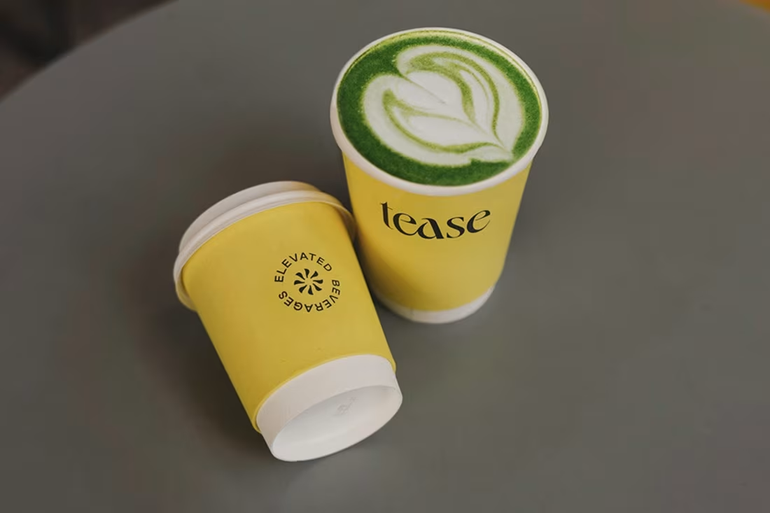
TEASE — Brand Identity
A sugar-free wellness bar in South Kensington, Mayfair and Dubai. Adaptogenic blends, superfoods and the highest-quality ingredients — wellbeing meets indulgence. Editorial wordmark with subtle femininity, signature yellow with touches of teal and mandarin. Since the rebrand, positioned alongside Loewe and Prada, becoming a viral sensation as London's best matcha. Elevated beverages, understated design.
1
102
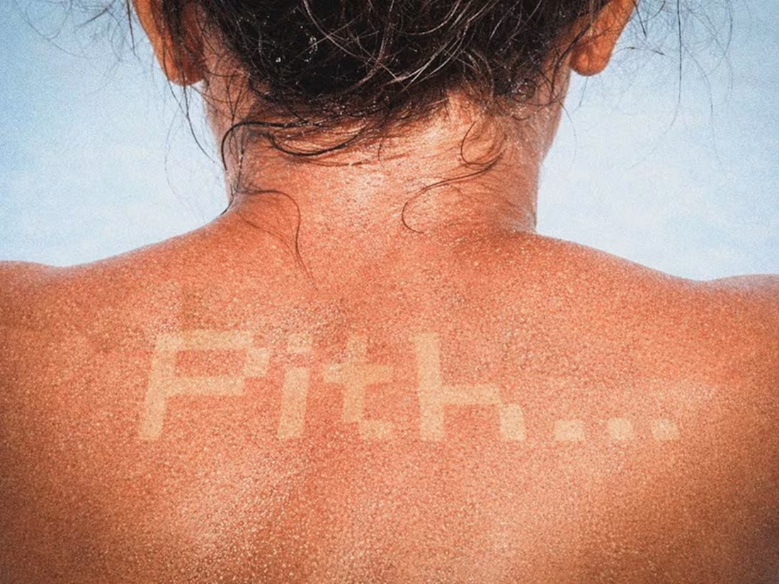
PITH — Brand Identity & Packaging
A natural cosmetics brand rooted in the belief that everything nature gives us is the best for your skin. Products made with extracts of lyonnaise, cherry and peach. Raw, honest, skin-close — the visual identity lives on the body itself. Art direction that feels as natural as the ingredients inside.
0
98
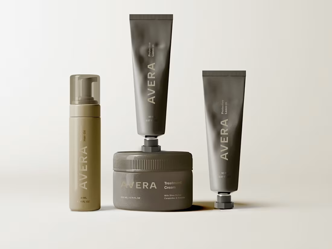
AVERA — Visual Identity & Packaging
A hair care brand designed around balance — scalp and lengths, care and lightness, function and sensorial experience. Minimal, refined visual language combining technical credibility with a calm, modern aesthetic. A complete product system differentiating scalp care, hydration, repair and protection while maintaining a unified identity. Premium, intentional, effortless.
1
112
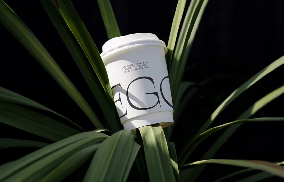
EGON — Brand Identity & Packaging
A coffee club and roastery based in Biarritz. In Basque, egon means to be — to exist, to remain. Coffee not as routine, but as presence. Identity rooted in the Basque landscape: deep mountain greens, oxidized sunset oranges, mineral tones. A logotype evoking erosion and falling drops — letterforms shaped rather than drawn. A club before a café, grounded in territory and materiality.
1
10
160
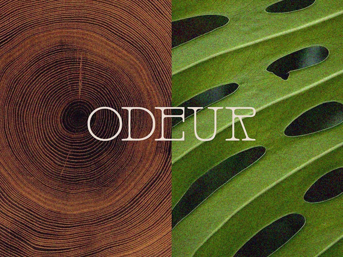
ODEUR — Brand Identity, Packaging & 3D
A fragrance and candle brand where scent meets sculptural design. Wood grain and tropical leaf — nature as the foundation of every note. Elegant serif typography layered over raw, organic textures. Branding, packaging and 3D visualization crafted to evoke warmth, intimacy and quiet luxury.
1
101
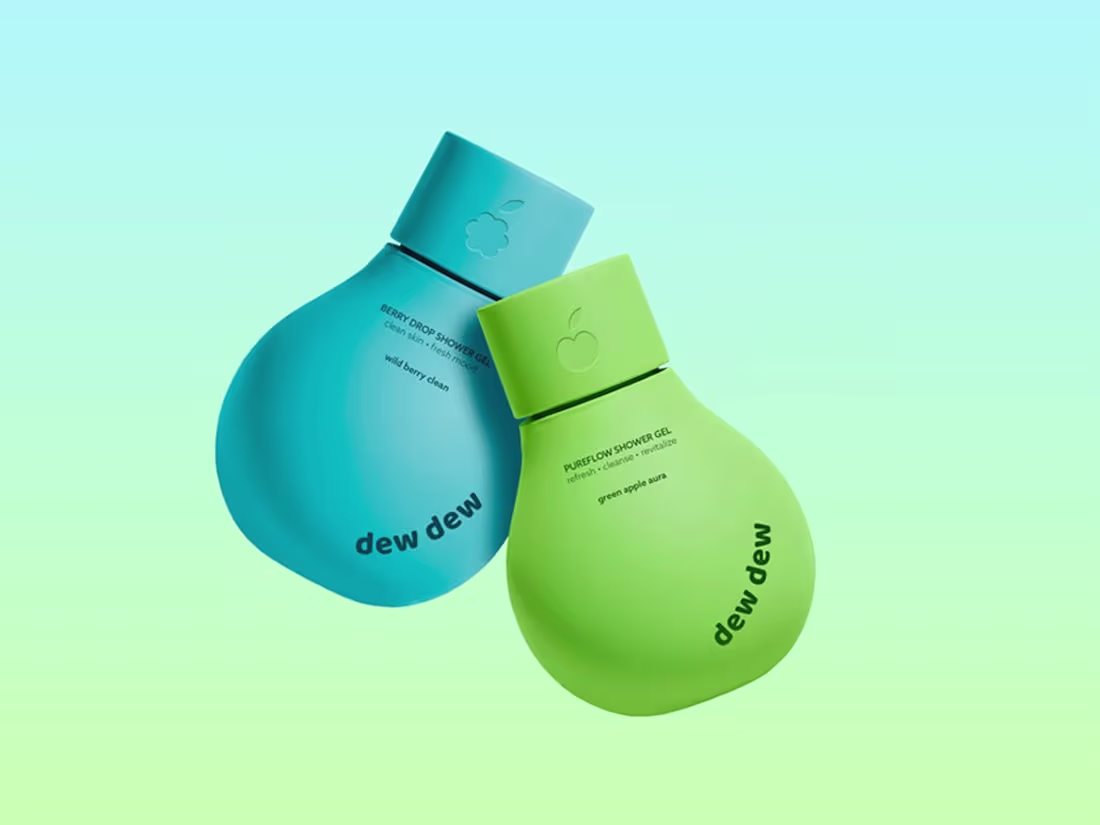
DEWDEW — Brand Identity & Packaging
Shower gel line inspired by freshness, fruit energy and everyday self-care rituals. Vibrant, playful packaging with bold color storytelling — each variant a distinct hue with subtle fruit icon embossing on the cap. Soft rounded geometry meets minimal design. Simplicity with personality, designed to stand out on shelves while communicating freshness and a fun daily skincare experience.
1
55
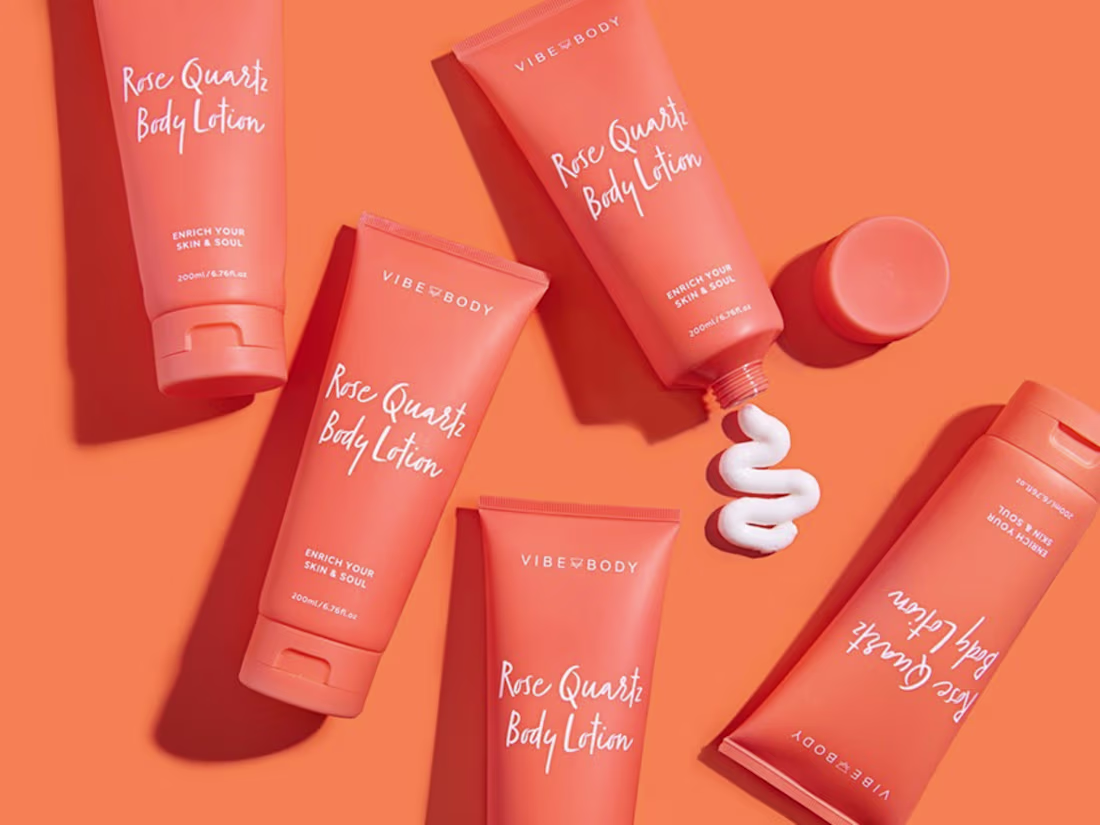
VIBE BODY — Brand Identity & Packaging
Going beyond skin deep — a daily practice to align mind, body and soul. Branding, art direction and packaging for a Rose Quartz Body Lotion launch. Self-care as alignment, not routine. Every touchpoint designed to feel as intentional as the ritual itself.
0
50
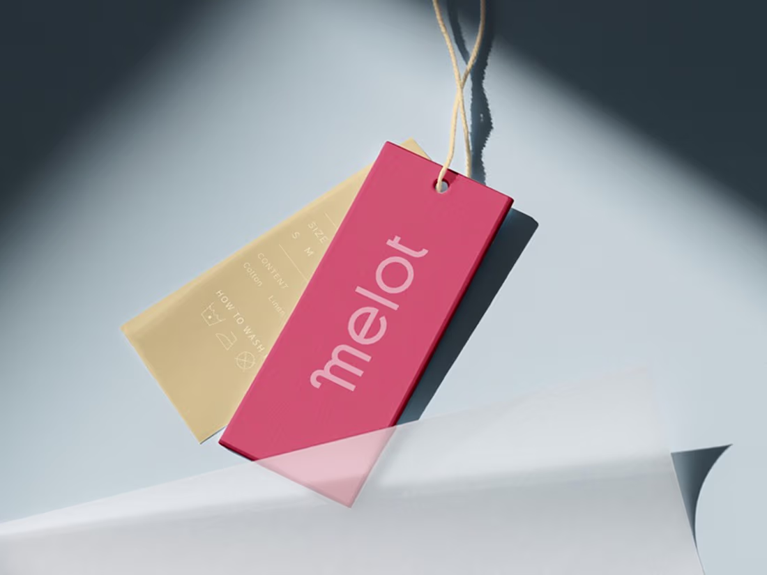
MELOT — Brand Identity & Packaging
Conceptual activewear shifting from performance to comfort and ease. Custom-drawn letterforms with subtle irregularities in structure and rhythm — typography that carries the entire brand character. Muted bright palette: deep cherry, soft pink, pale lemon, cool cucumber green and light aqua. Logo, hang tags, packaging, shopping bags, shipping tape and advertising banners.
1
73
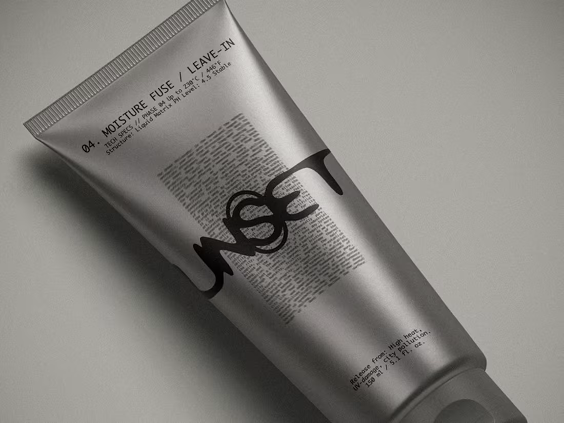
UNSET — Brand Identity & Packaging
A niche haircare brand designed to counteract the effects of daily styling. The core idea is zeroing out — a total reset from hairspray, foam and urban pollutants. Visual identity built on contrast: rigid grid and monospace typography meets an expressive, fluid logo. Packaging designed to feel clinical yet raw. Release your hair.
1
85
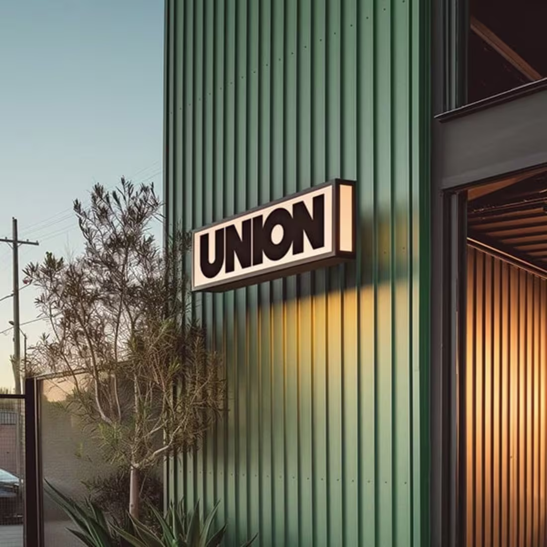
UNION — Brand Identity
A culturally dynamic restaurant in the heart of Long Beach. Southeast Asian traditions with a Southern California twist. Bold flavors translated into a vibrant visual identity — signage, typography and atmosphere harmonizing with the local community while maintaining a distinctive voice. Cuisine as culture, design as experience.
1
74
Lipstick Packaging Concept
A sculptural approach to cosmetic packaging. Soft pink meets polished chrome — a lipstick designed to feel like jewelry in the hand. Organic, bubble-like forms that break away from conventional beauty packaging. Product design where form becomes desire.
1
70
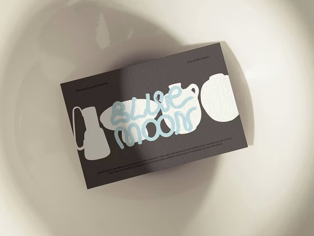
BLUE MOON — Brand Identity
A Ukrainian brand of handcrafted ceramic tableware where artistry meets authenticity. Each piece shaped with intention, embracing wabi-sabi — finding beauty in imperfection. Clay-inspired logo evoking an immediate connection to the craft. Deep crimson, azure glazes and ochre reflecting the natural palette of the products. Not just tableware — a story molded in clay and fire.
1
87
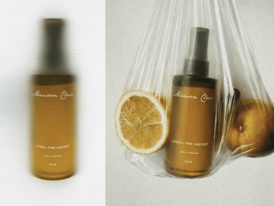
MAISON CLAIR — Brand Identity & Packaging
More than bath and body care — an atmosphere, a ritual of slowing down. Built around the contrast of bright citrus and calming pine. Minimal visual language, soft neutral tones, clean typography. Purity, freshness, simplicity. A sensory pause for those who believe everyday moments can feel special.
1
82
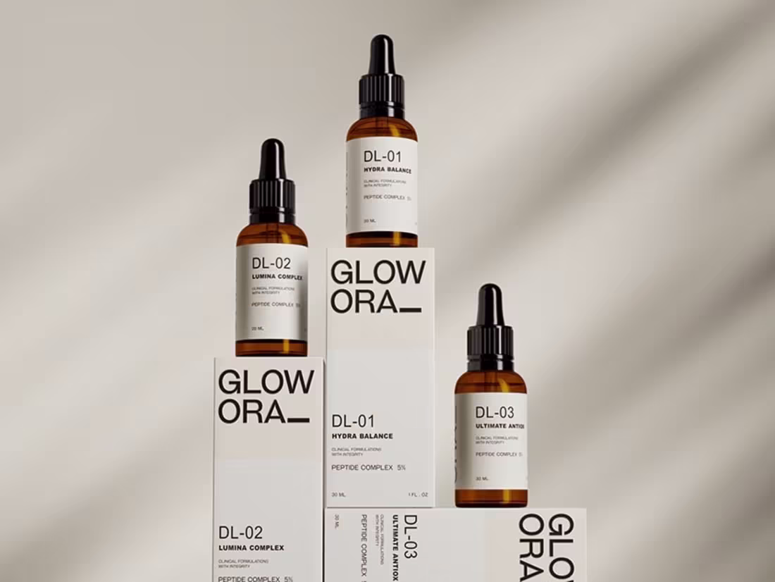
GLOW ORA — Brand Identity & 3D Visualization
A clinical skincare brand built on integrity and precision. Detailed 3D product modeling and CGI for a serum line — amber bottles, clean white packaging, coded product system. Every visual crafted with precision lighting, textures and art direction to look editorial-ready and campaign-worthy. Science-driven, minimal, confident.
0
85

INYOE — Brand Identity & Packaging
A K-Beauty skincare brand with a simple, clear approach to essential skin needs. Formulated around familiar ingredients — rice, tomato, olive — each product designed for a targeted function. Color-coded packaging connecting every formula into one cohesive routine. Complete care built only on what is necessary.
0
84
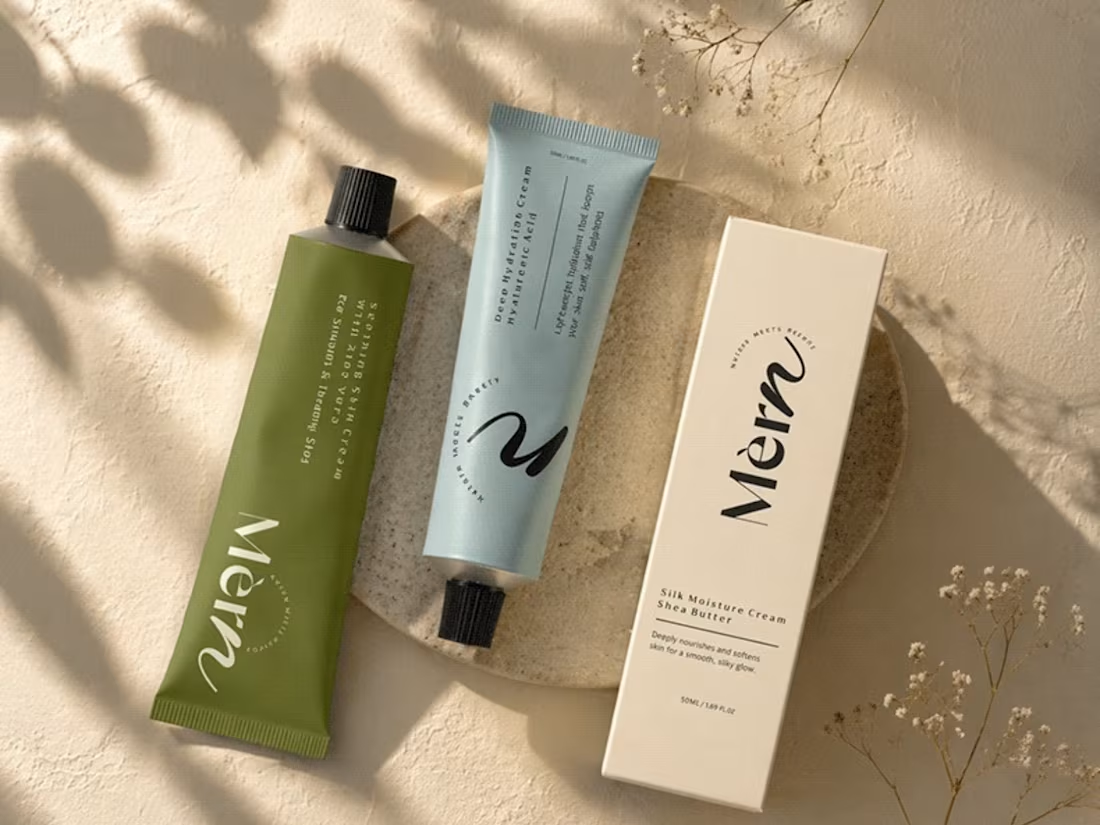
MÈRN — Brand Identity & Packaging
Nature meets beauty. A modern skincare line with soft, muted tones — pastel blue, warm beige and olive green. Clean typography, balanced layouts, tube packaging refined to stand out. Simple, elegant, organic. Each product variant represented with calm, soothing tones reflecting a natural skincare experience.
0
122
BRYN — Brand Identity
A Middle Eastern coffee house brand built from the ground up. Strategy, naming and full identity design for high-altitude specialty coffee. Bold red visual system, architectural minimalism, storytelling and consistency. Coffee starts at origin. Designed to stand out in a saturated market.
0
113
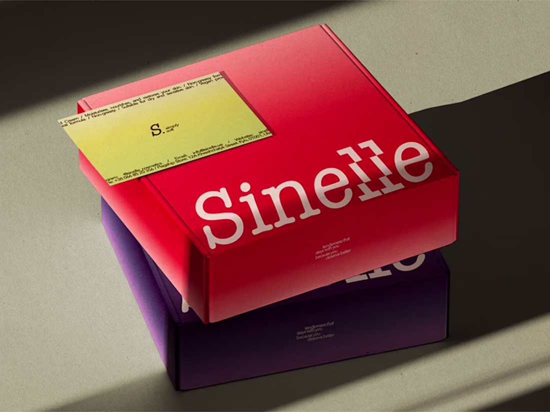
SINELLE — Brand Identity & Packaging
Hand care that feels like you. A contemporary brand built around simplicity, tactility and quiet confidence. Each product inspired by a specific mood — translating scent into color and form. Bold typography, soft gradients, color-driven identity. Designed to be carried, used and lived with. Subtle, but never invisible.
1
108
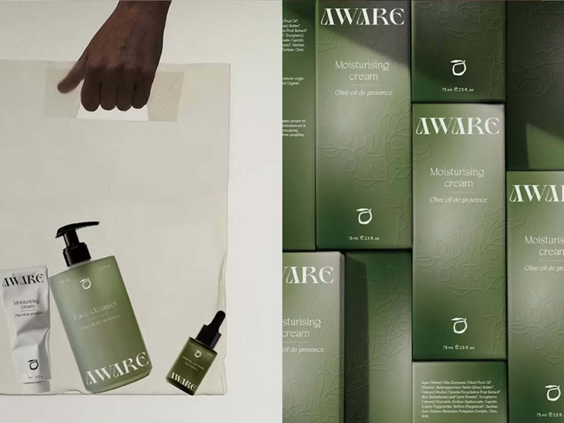
AWARE — Visual Identity & Packaging
A premium skincare brand rooted in Provence Côte d'Azur, built around three essentials — serum, cleansing gel and hydrating cream, all formulated with olive oil. Minimalist packaging with green gradients evoking the olive tree, embossed details adding artisanal warmth. Conscious, attentive, elegant.
0
98
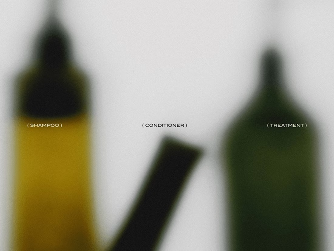
CANDEUR — Hair Care Brand Identity
A contemporary vision of haircare branding. Modular product design where each formula — shampoo, conditioner, mask, treatment — is designed to be combined into a personalized beauty ritual. Intuitive, flexible, user-driven. Elevate your hair routine. The final touch that makes all the difference.
0
90
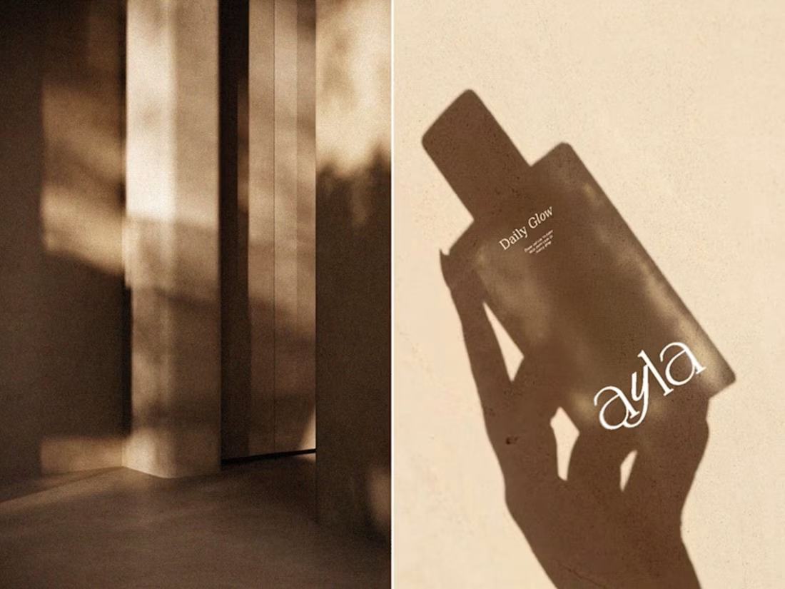
AYLA — Brand Identity & Packaging
Modern skincare born in Copenhagen, where simplicity is luxury. Each product defined by its own gradient — color and form quietly expressing purpose. Science and nature in balance, delivering clarity and care without excess. Skincare reduced to what truly matters. Nourish your skin, radiate beauty.
0
98
ETIRA — Brand Identity & Packaging
A niche cosmetics brand in the affordable luxury segment, created for intellectual professionals seeking tranquility amidst the noise of the information age. Built on a philosophy of weightlessness and transparency — skincare as a tactile ritual of self-therapy. Intelligent minimalism, cold color palette, conscious design.
0
91
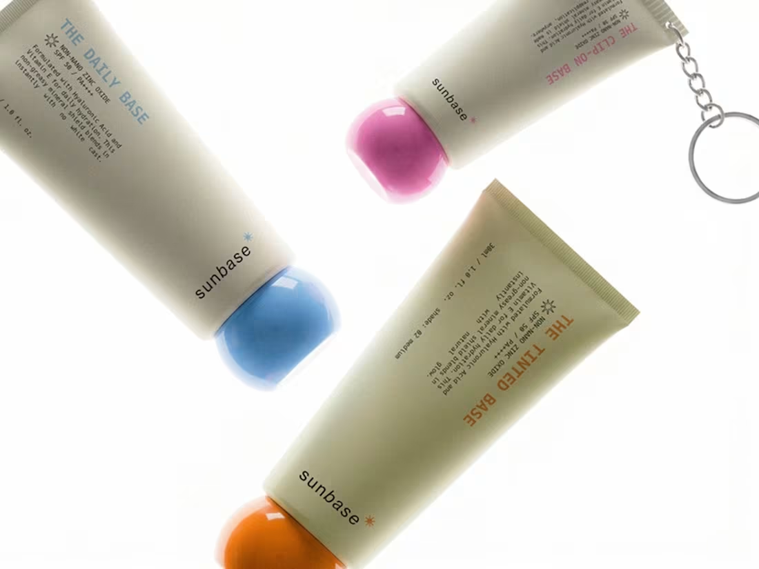
SUNBASE — Branding & Package Design
Sun care redesigned for the everyday. Merging high-performance mineral protection with utilitarian design. Soft-touch materials, bold color-coded caps, integrated clip-on system and art direction that shifts SPF from the beach to daily uniform. Skin. Sun. Base.
0
91
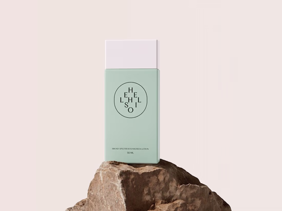
HELIOS — Brand Identity & Packaging
Sun protection deserves better. Often an afterthought, bought last-minute at the airport. Helios redefines sun care as an essential, intentional daily ritual. Named after the Greek sun god, with a minimalist identity, sun-kissed palette and packaging designed to feel like an object of desire.
0
83
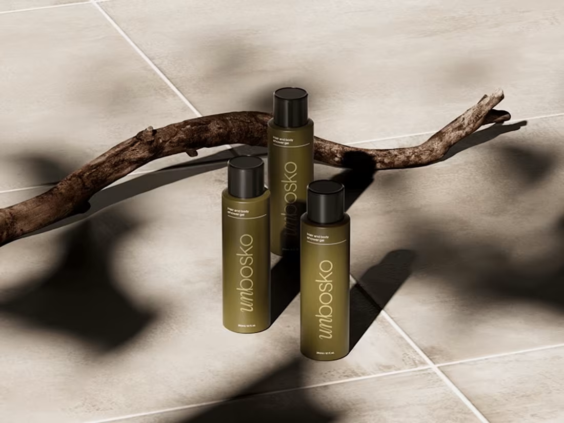
UNBOSKO — Visual Identity & Packaging
A personal care brand offering a dual-purpose hair and body shower gel. Designed around hydration, freshness and convenience — complete care in a single product. Clean packaging, clear purpose. The visual identity is minimal and grounded, letting the product speak for itself.
0
83
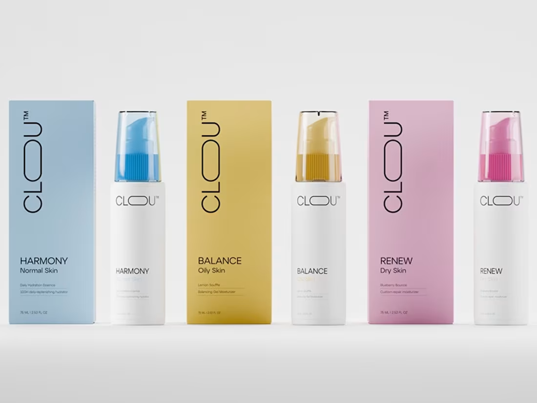
CLOU — Brand Identity & Packaging
A premium skincare brand inspired by the purity and softness of clouds. From naming and brand strategy to packaging and 3D product animation. Soft cloud motif, refined typography, serene palette and modern minimalism with elevated shelf presence. Every detail designed to communicate freshness, luxury and sustainability.
8
188