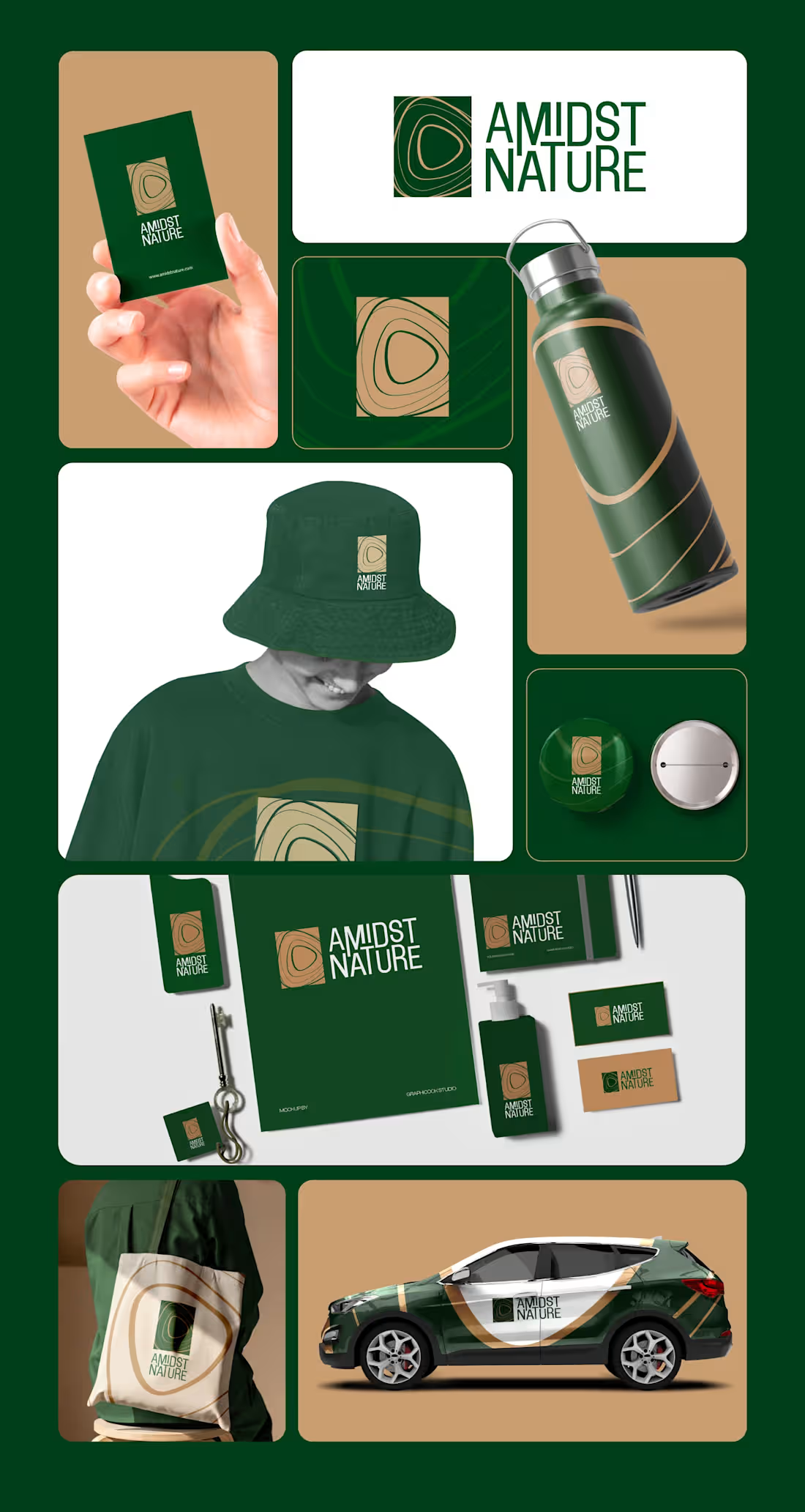
The identity of Amidst Nature reflects the essence of living in harmony with the natural landscape. At its core is a pebble-inspired symbol, representing nature’s quiet strength, balance, and timeless evolution. The curved triangular form within the mark echoes organic patterns found in mountains, valleys, and flowing terrains, symbolising the connection between earth, water, and life. Paired with deep forest green and warm earth tones, the visual identity conveys natural luxury, serenity, and authenticity. Together, these elements create a brand that embodies a refined lifestyle—peaceful, grounded, and truly amidst nature.
0
9
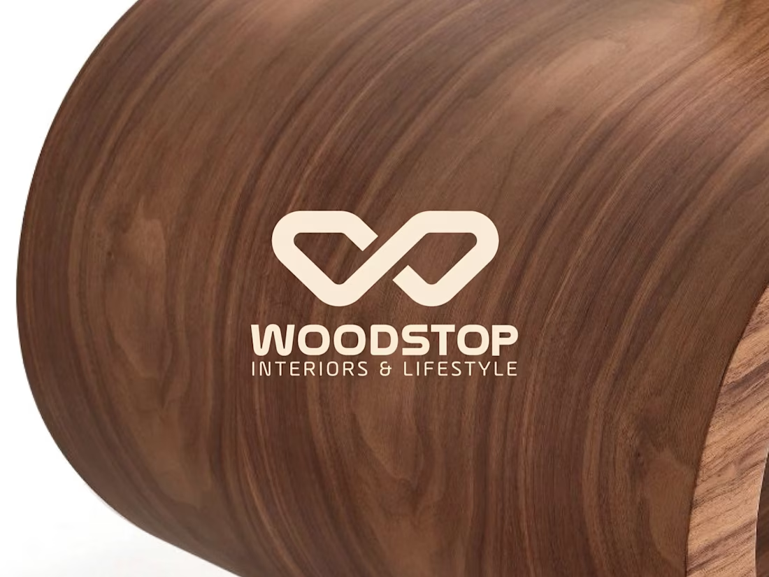
As the brand moves forward with the name Woodstop, it marks a thoughtful evolution rather than a completely new beginning.
Eeshaanya was always more than just a name. It symbolised the most auspicious corner of the home and reflected the founder’s deep connection to the northeast—carrying meaning, memory, and emotion.
In a changing world, clarity matters. Woodstop brings that clarity: a name that is simple, memorable, and globally appealing, while remaining deeply rooted in Indian values. It represents comfort, reliability, and a meaningful pause—a place where quality woodwork finds its home.
For everyone who valued Eeshaanya, Woodstop carries the same warmth, reimagined with a name ready for a wider world, while staying true to its core values: craftsmanship, honesty, and purpose.
0
40
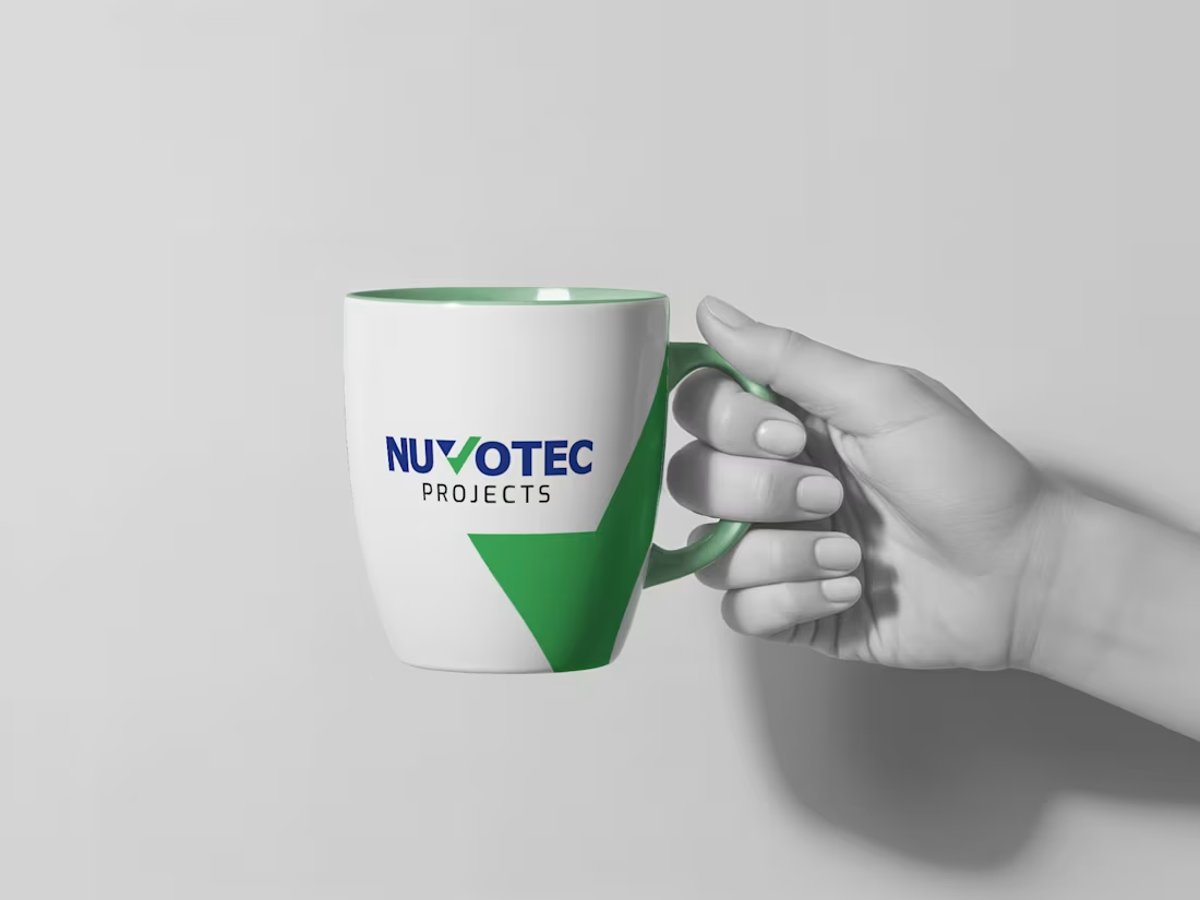
The rebranding of NUVOTEC reflects its evolution from a regional engineering firm into a trusted global provider of turnkey HVAC and cleanroom solutions. Founded in 2010 and headquartered in Bangalore, with operations across Riyadh, the UAE, and Algeria, the company delivers high-precision systems for industries where controlled environments are critical.
The new identity embodies NUVOTEC’s philosophy of precision, purity, and performance, expressing innovation, reliability, and sustainability. More than a visual refresh, it represents the company’s forward-looking vision to engineer efficient, controlled environments and strengthen its position as a trusted global partner.
0
48
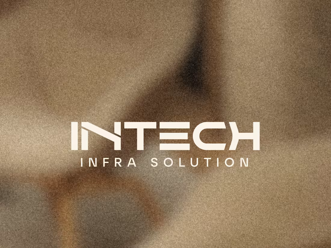
Intech Infra Solutions was founded in 2007, at a time when turnkey interior design services were still emerging. With a strong focus on commercial spaces, the company built its reputation by offering both contracting and design & implementation - delivering practical, end-to-end solutions. While the previous logo reflected values like teamwork and unity, it no longer captures the nature of work Intech does today.
The rebrand aims to bring clarity and relevance to the brand's identity. The new logo introduces elements that reflect interior design- structure, space, and thoughtful detailing-while staying warm, modern, and professional. It marks a step forward in strengthening Intech's presence and better aligning its image with the environments it creates.
0
55