
pro
Armend Alimi
Brand Identity Designer | Graphic Designer
Ready for work
Armend is ready for their next project!
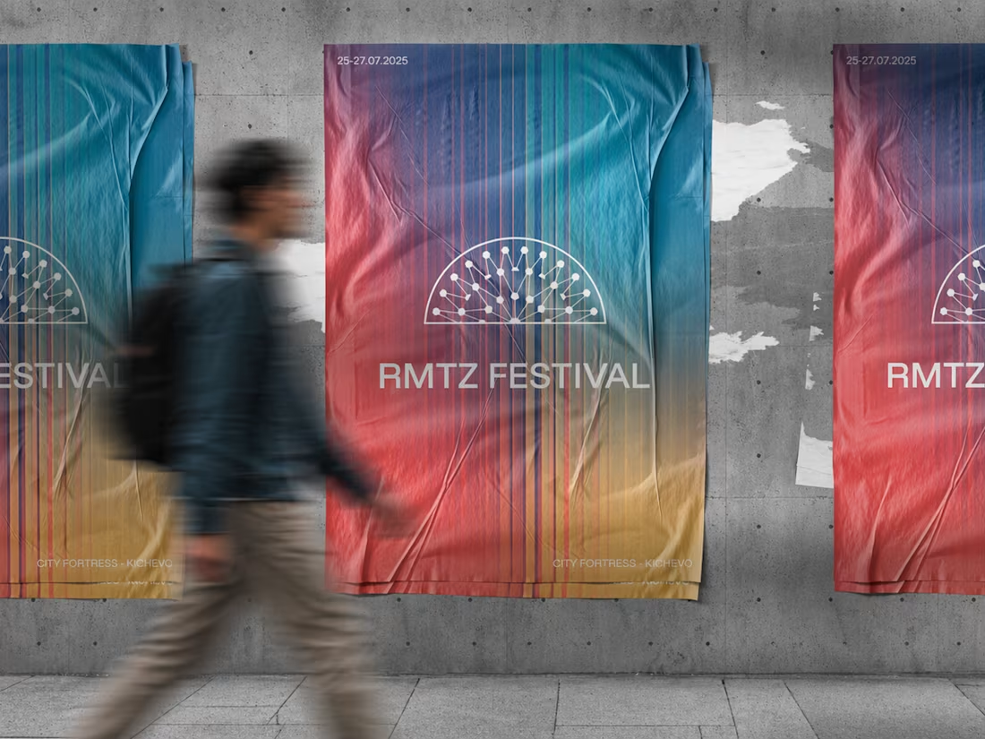
RMTZ Festival
0
1
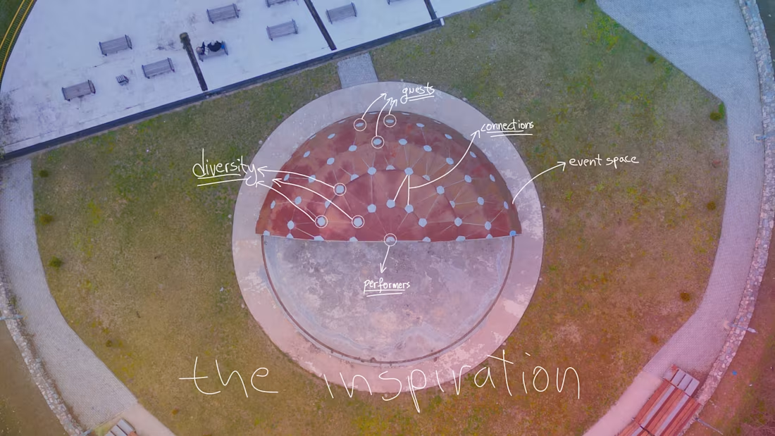
Inspiration behind the logo
The festival takes place every year in this circular open space. When I first saw it from above, it immediately felt like more than just a venue. It felt like a system.
Performers at the center. Guests surrounding them. Countless connections happening at the same time. Music, movement, diversity, energy, all flowing outward from a single point.
That aerial view became the foundation of the logo.
I translated the space into a simplified network. A semi-circle representing the venue, nodes symbolizing people and cultures, and connections showing how everything comes together through music. The gradient reflects diversity and transition. Different voices, one shared experience.
The goal was to design a mark that does not just label the festival, but visually explains how it works and what it stands for.
1
1
61

A clean and welcoming logo for a dentist's office, combining simplicity and clarity to make patients feel comfortable and confident.
1
102
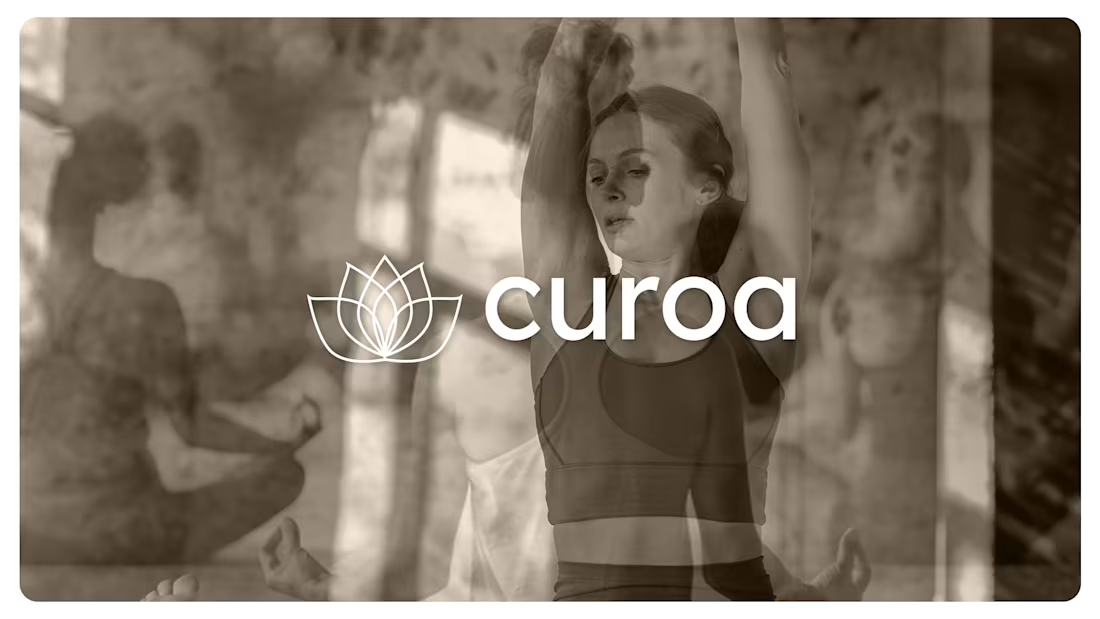
A serene logo designed for a yoga and wellness brand, inspired by balance, growth, and inner calm. The mark blends organic shapes with a modern wordmark for a timeless, peaceful identity.
1
96
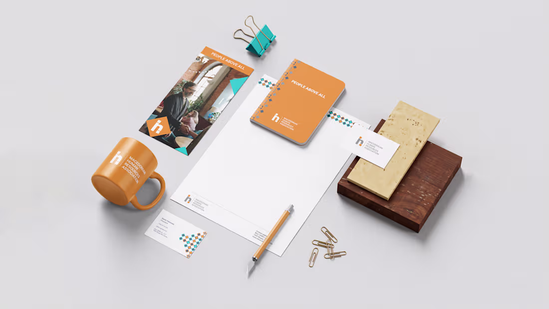
A clean, people-first brand identity designed for clarity, trust, and everyday use.
The visual system brings consistency across stationery, print, and branded materials through a warm color palette, modular elements, and modern typography.
1
99
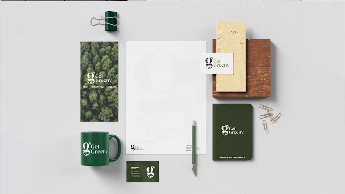
A clean and nature-inspired brand identity designed for Get Greeny, focused on sustainability, clarity, and a modern eco-conscious visual system across print and stationery.
1
74