
Arina Yanovska
Social media design for beauty & wellness brands
New to Contra
Arina is building their profile!
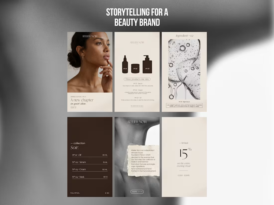
Instagram Stories storytelling system for Atelier Noir, a concept for an independent Parisian skincare house devoted to the evening ritual.
Most beauty brands on Instagram push product. The brief here was the opposite: build a 6-story sequence that works like a short editorial, the kind of thing you pause on, not swipe past. The goal was to make skincare feel like a quiet ritual, not a transaction.
Narrative arc across the 6 stories:
Editorial opener, sets mood and season (“A new chapter in quiet skin”)
Product system, the three-step ritual explained like a recipe
Ingredient close-up, science-as-poetry framing
Full collection with pricing, clean product menu
Brand story on textured paper, positioning and origin
Soft CTA with a 15% code, low-pressure conversion Visual direction: a restrained palette of deep espresso, bone, and warm cream, pulled from niche fragrance and editorial beauty, not drugstore skincare. Serif display type paired with small-caps labels for an archival, apothecary feel. Real photography (skin, texture, serum macro) balanced against minimal product silhouettes so the brand reads as both human and clinical. The system is modular: any of the 6 templates can be reused for new drops, ingredient spotlights, or campaigns without breaking the world. Deliverables: 6 Instagram Story designs (1080x1920), cohesive visual system, ready for a full seasonal campaign.
1
4
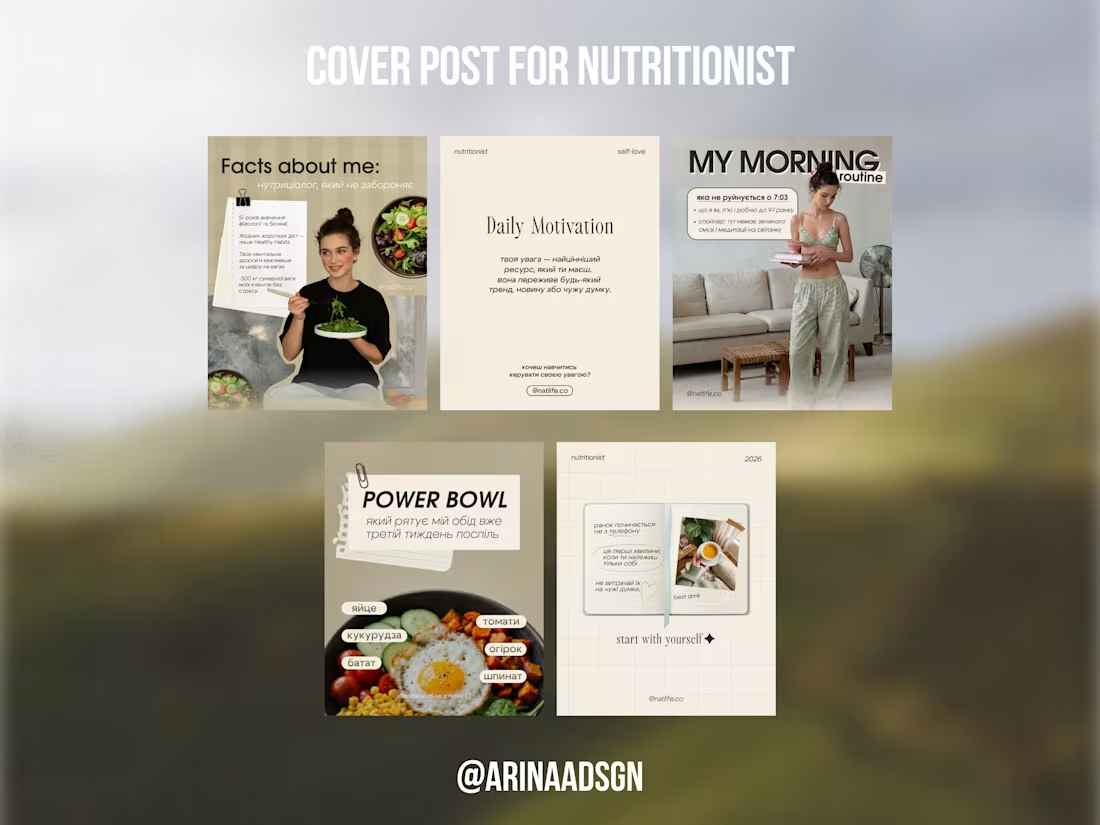
Instagram content system for “natlife.co (http://natlife.co)”, a personal brand of a nutritionist who helps women find food balance without diets.
The brief was to move her profile away from the typical “nutrition blogger” look (bright food photos, motivational quotes on gradients) toward something that feels like a calm, editorial self-care magazine, matching how she actually talks to clients.
What I designed:
• Profile cover concept with coordinated highlight covers (about, reviews, food, diary)
• 5 feed templates covering the main content pillars: personal intro, daily motivation, morning routine, recipe breakdown, and reflective notes
• A flexible visual system that Natalia can reuse for future posts without a designer
Visual direction: muted olive, cream, and soft beige palette to read as grounded and feminine without being sweet. Mixed serif and bold sans type for editorial contrast. Paper textures, clips, and handwritten accents to soften the expert tone and make the feed feel like a personal journal, not a clinic.
The result is a profile that positions her as a thoughtful specialist, not a diet coach, and gives her a content template she can actually keep up with.
Deliverables: profile cover set, 5 feed post designs (1080x1350), bilingual system (Ukrainian + English elements).
1
14
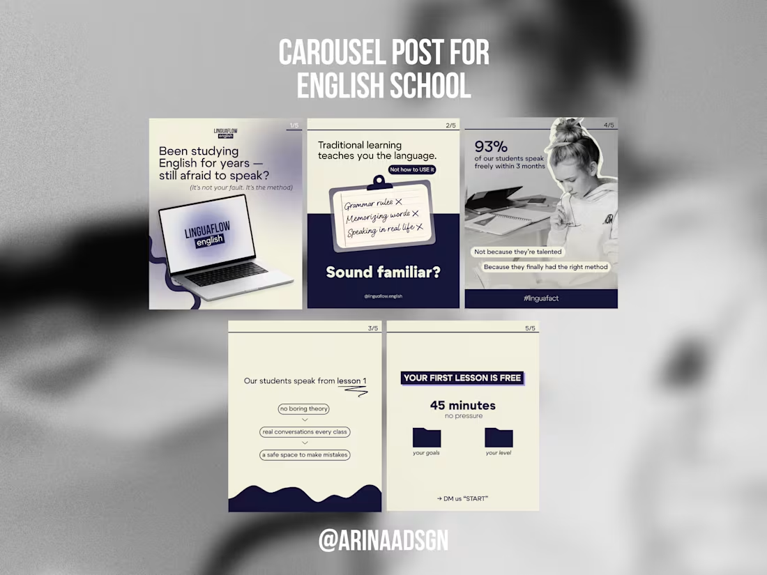
Instagram carousel for LinguaFlow, an online English school targeting adult learners who feel stuck after years of traditional study.
The goal was a 5-slide carousel that moves a cold viewer from “this is me” recognition to a clear CTA (free trial lesson), without feeling like a hard sell.
I built the narrative around a single tension: “you’ve studied for years, but still can’t speak” → named the real reason (the method, not the student) → delivered proof (93% speak freely in 3 months) → closed with a low-friction offer (45 min, free, no pressure).
Visual direction: deep navy + soft cream palette to read as trustworthy but not corporate, mixed serif/handwritten type for a human tone, and consistent slide numbering so the carousel reads as one story, not six separate posts.
Deliverables: 5 carousel slides, optimized for Instagram feed (1080x1350).
0
15