Aria Muhammad
Brand Identity Designer & Strategist
- 5
- Followers


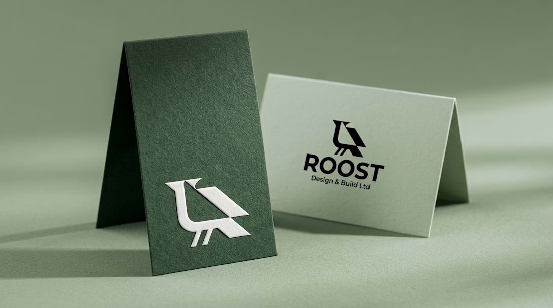
Real estate branding often hides behind cold corporate roofline clichés.
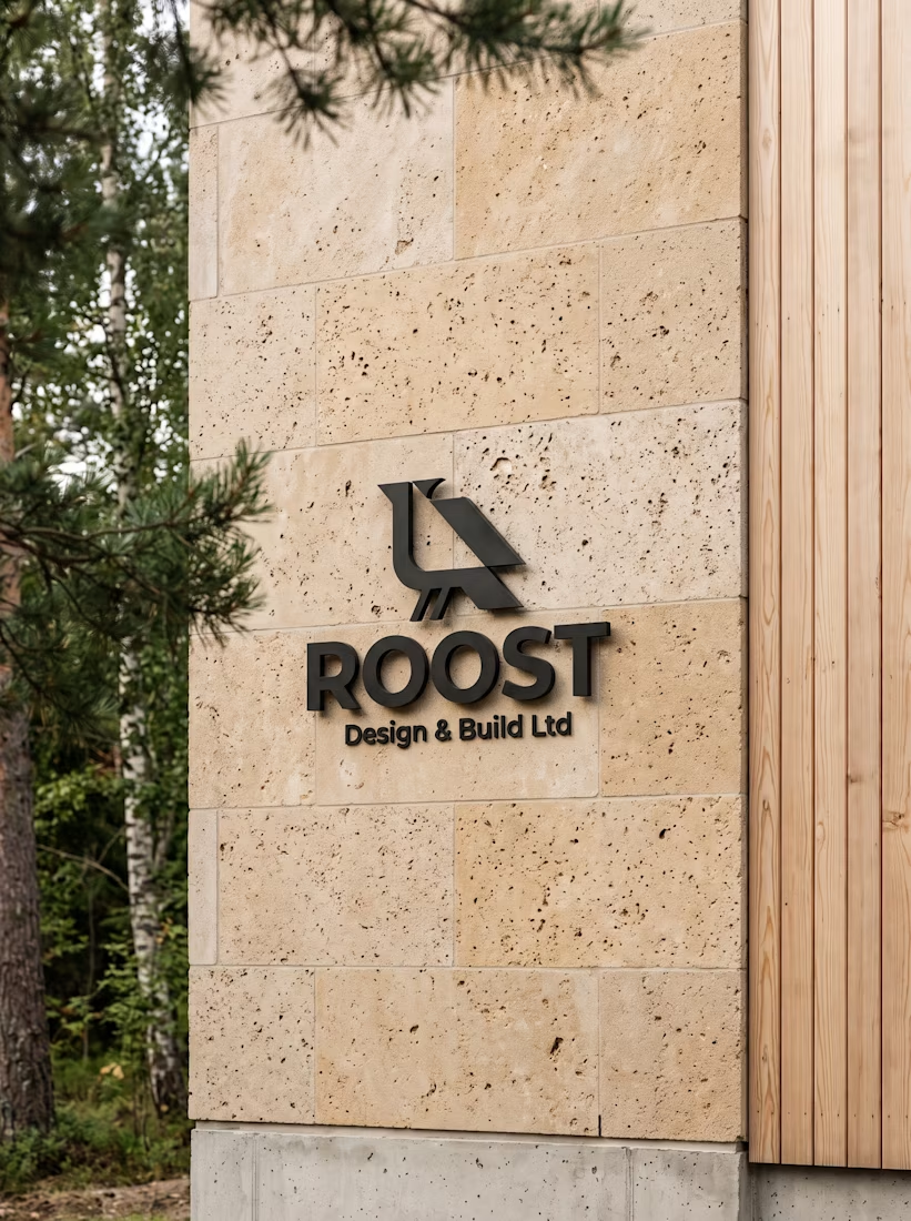
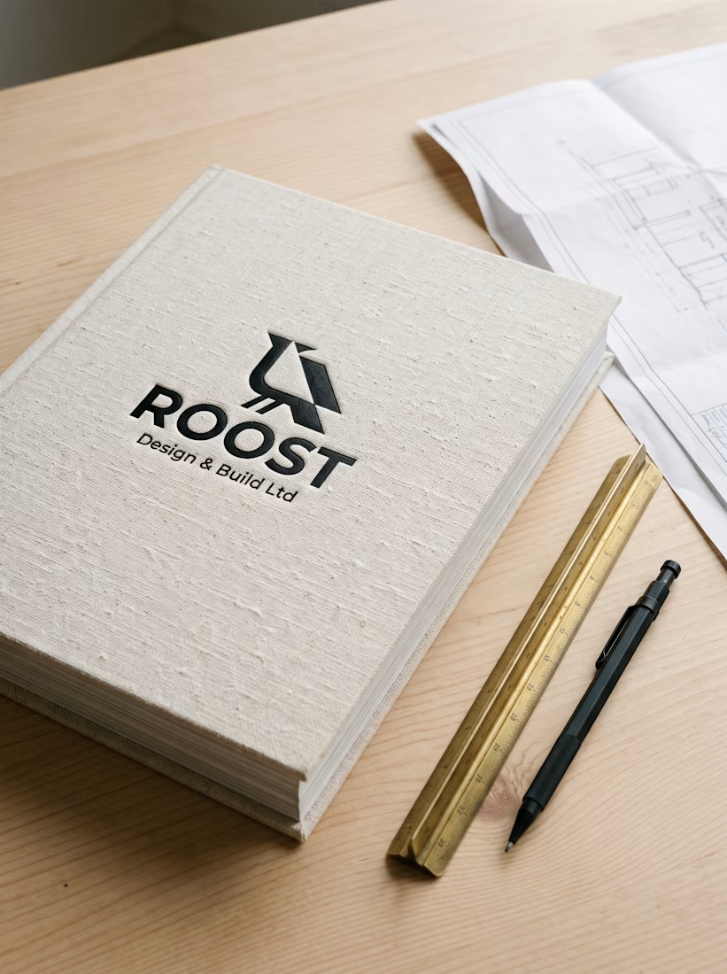
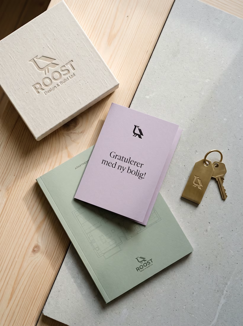
For ROOST in Oslo, my goal was to connect Nordic timber warmth with clean geometry. I paired the perched raven mark across folded sage cards, blackened steel facade signs, and linen handover books.
A brass...
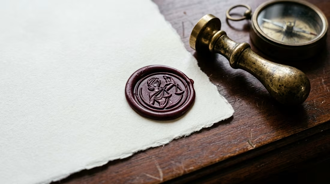
Deconstructing a classical figure into disciplined vector relief without compromising its historical gravitas is one of the ultimate tests in sovereign mark design. Too ornate, and it collapses at favicon scale; too stripped down, and it loses its legal authority.For Specimen 08...

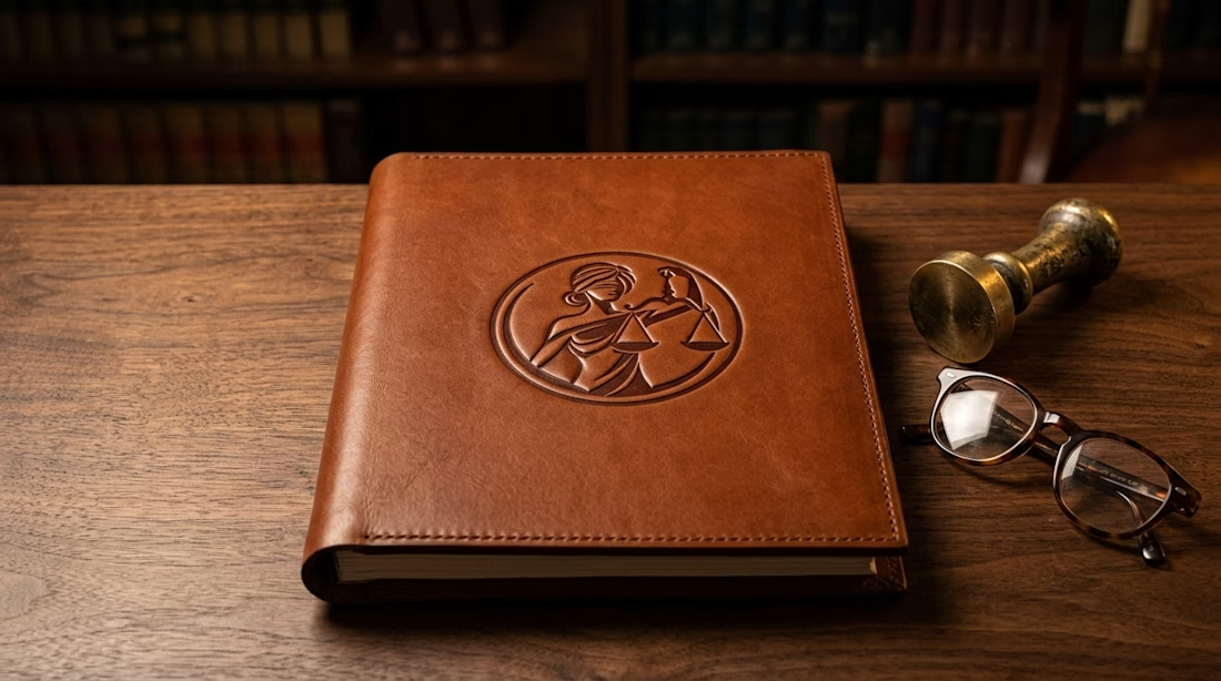
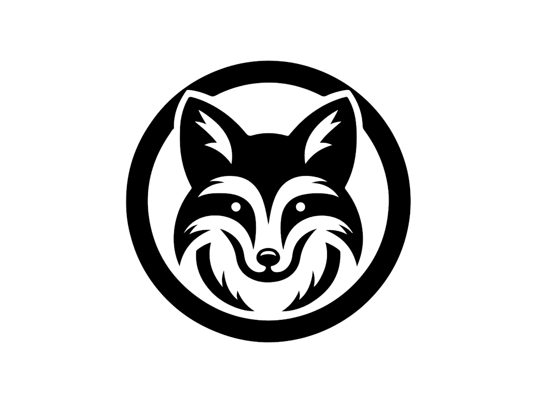
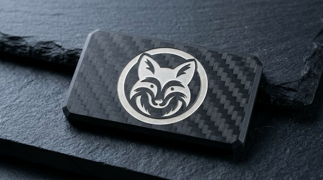
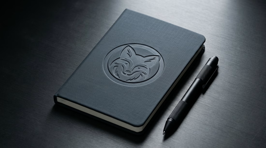
Deconstructing an animal form into disciplined geometric planes without losing its organic vitality is one of the hardest exercises in identity design. Too rigid, and it turns into cold CAD wireframes; too soft, and it loses its tactical authority.
For Specimen 07 (Arctic Fox), I...
Designing hospitality identities that translate honestly into natural mountain substrates is always a balancing act.
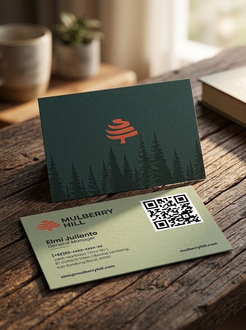
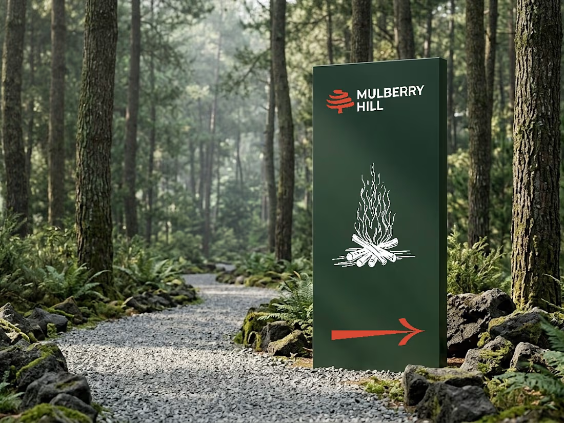
For Mulberry Hill Estate, a boutique eco-resort nestled in the Maribaya highlands, my goal was to reflect that quiet sanctuary through a calligraphic mark and...

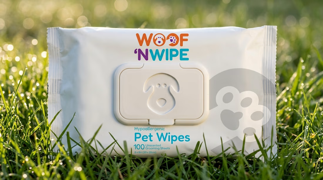
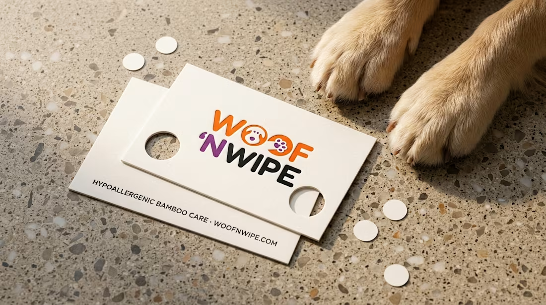
Fresh packaging identity release for Woof 'n Wipe.
My goal was to design a clean, tactile identity for hypoallergenic bamboo pet wipes, featuring embedded puppy and paw glyphs paired with a custom debossed flip-top lid.
Full 12-slide case study live on Behance: