
Arena Studio
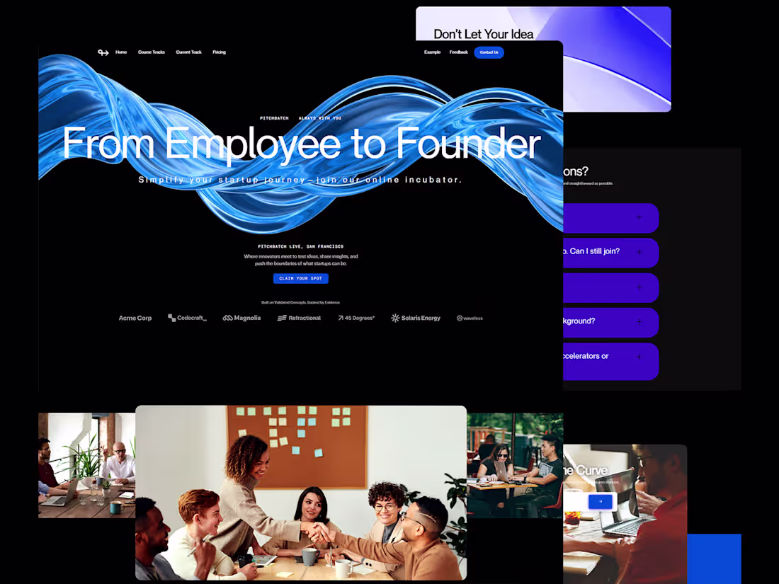
Websites That Turn Traffic Into Paid Clients
Profile in progress
Arena is building their profile!
AuraDental - Modern Clinic Website
A high-conversion landing page designed to build patient trust and simplify booking.
with a warm, inviting aesthetic to increase appointment bookings.
✨ Key Highlights:
• Warm UI: Replaced sterile clinical vibes with energetic orange tones.
• Seamless UX: Streamlined 3-step booking flow for higher conversion.
• Trust Building: dedicated sections for patient stories and milestones.
2
85
Recently worked on Quantra, a high-conversion template for AI & Finance.
• Fully Built in Framer
• Responsive Dark Mode
• 3D-style Assets & Smart Animations
• Perfect for SaaS & Crypto projects
2
91
Recently worked on a personal brand website.
The focus was translating a nuanced idea into structure and tone:
helping high-functioning professionals make sense of quiet burnout and identity shifts.
This kind of work is less about visuals
and more about clarity.
When your work looks successful from the outside
but feels heavy on the inside,
your website shouldn’t add more noise.
It should help people recognize themselves in your message.
Slow them down.
And make them feel understood before asking for anything.
Designing for this space means being careful with words, pacing, and structure.
Too much confidence feels fake.
Too little feels uncertain.
Getting that balance right is the real challenge.
I’m curious how this kind of simplicity lands for you.
Does this approach feel clear or too minimal?
14
274
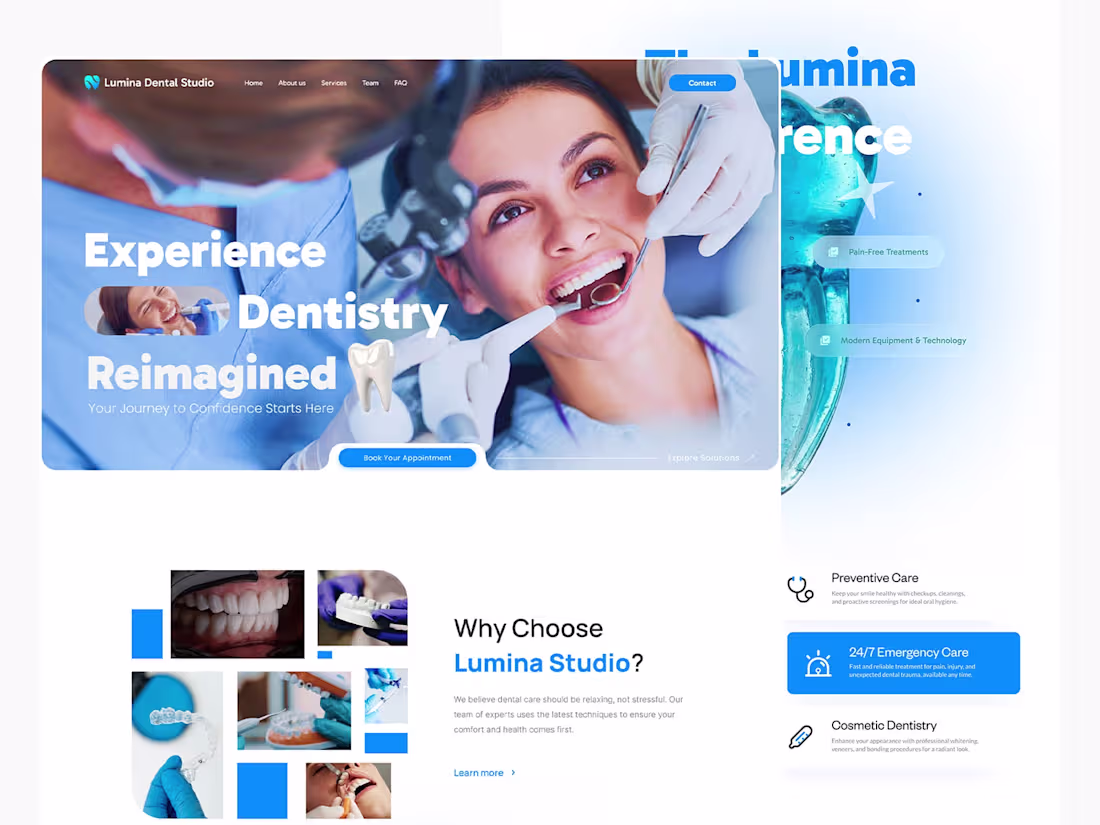
Lumina Dental Studio: UI/UX for High-Trust Healthcare Brands
Created a premium, modern web presence for a conceptual dental clinic. The goal was to pivot from a generic medical feel to a sophisticated digital experience that enhances patient trust and drives appointment conversions.
My Role: UI/UX Design, Full Branding (Tone, Visual Strategy).
Skills Applied: Figma Prototyping, Implementation in Framer, Conversion Rate Optimization (CRO), Information Architecture (IA).
Design Focus:
* Credibility: Strategic use of Testimonials and "Experienced Professionals" sections.
* Clarity: Simplified service browsing and clear, repetitive CTAs.
* Aesthetic: Clean blue/white palette symbolizing hygiene and calm.
Available for new high-impact design projects.
Let's build a brand experience that converts!
10
30
525
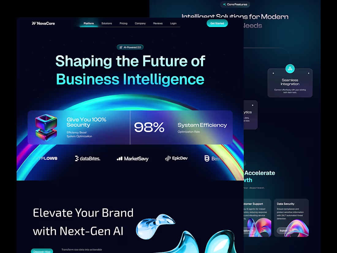
Elevating SaaS Conversion: NovaCore AI Platform Design 🚀
As a specialist in high-performance digital products, this NovaCore concept demonstrates my focus: translating complex AI/SaaS technology into a premium, conversion-optimized interface.
Why this design works:
✔️ Premium Authority: Dark, futuristic aesthetic builds immediate trust.
✔️ Goal-Oriented Flow: User journey is engineered to drive sign-ups and acquisition.
✔️ Clarity & Impact: Simplifies advanced features for maximum business appeal.
I craft interfaces that are not just beautiful, but strategically designed to solve business problems and increase your ROI.
Need a Web Designer for your next high-growth SaaS project? Let's connect and discuss your vision.
#SaaSDesign #UIUXSpecialist #ProductDesign #FigmaExpert #FreelanceDesigner
2
14
368
Most websites don’t fail because they look bad.
They fail because they don’t make sense to the user.
This project was about clarity.
Clear structure.
Clear messaging.
Clear paths for action.
No visual noise.
No overdesigned sections.
Just a website that helps the right visitor understand the value and move forward with confidence.
That’s the difference between a website that looks good
and one that actually works.
6
25
319
A fully custom website designed with a clear focus on structure, clarity, and credibility.
• Clear content hierarchy for fast understanding
• Purpose-driven UX focused on real user behavior
• Calm, professional visual language to build trust
• Responsive layout optimized for all devices
• Clean structure designed for long-term scalability
Project goals:
• Communicate the brand’s value without friction
• Help visitors understand the offering quickly
• Build confidence through clarity, not complexity
• Support consistent and reliable user actions
A website built to work quietly in the background while doing its job effectively.
15
211
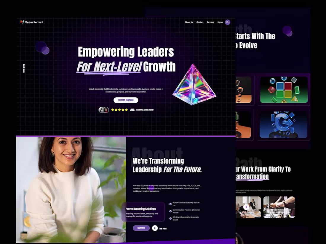
I designed a new website for an executive coach working with senior leaders and founders to drive human-centered, future ready growth.
My role was to explore how her depth of experience in leadership, neuroscience, and AI-era coaching could be translated into a calm, clear, and trustworthy digital presence, without overloading the user or turning the site into a sales-heavy experience.
The first iteration was mainly focused on shaping the structure and narrative of the site: clarifying her positioning, highlighting measurable outcomes, and creating a visual rhythm that reflects confidence, clarity, and long-term impact rather than noise or hype.
On the content and experience side, the focus was on guiding visitors through her frameworks, results, and approach in a way that feels intuitive and human.
16
193
This kind of website isn’t built to impress.
It’s built to clarify. That's all that matter in a coaching website.
Clear structure.
Focused messaging.
A layout that helps visitors understand the value and decide faster.
No visual noise.
No forced complexity.
Just a site that supports trust, authority, and action.
That’s where real conversion usually begins.
13
179
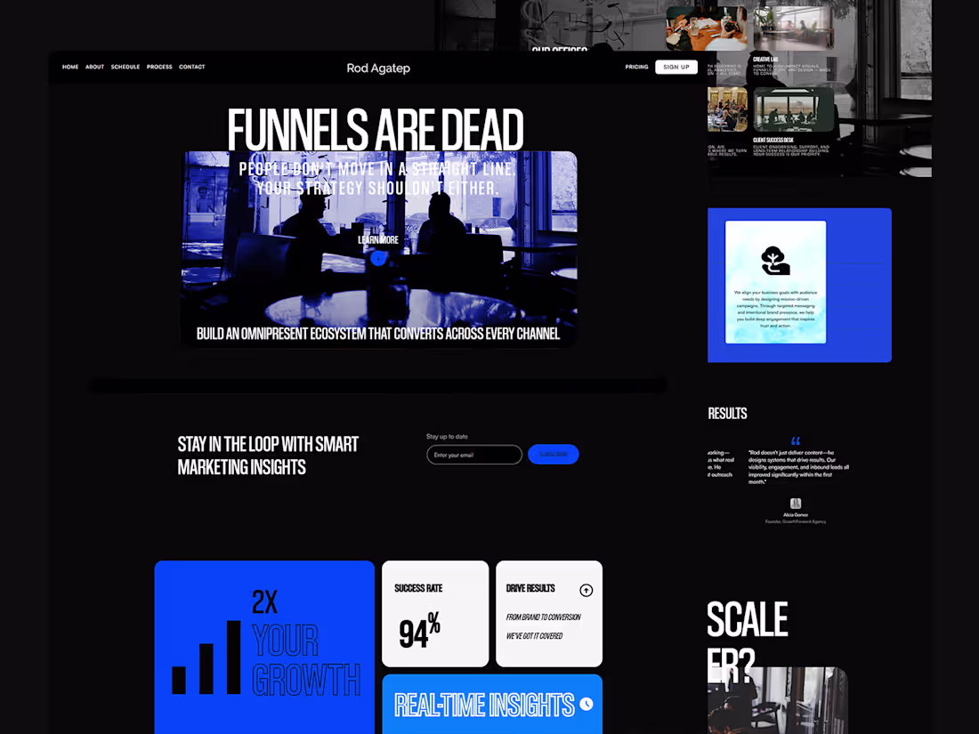
A clear, conversion-focused website designed to turn visitors into inquiries.
This project was built with one priority: making it easy for potential clients to understand the service, trust the brand, and take action.
Key highlights:
• Clear content hierarchy that communicates value in seconds
• Conversion-driven page structure and call-to-action placement
• Clean, professional visual language that builds credibility
• Smooth, intuitive user flow from first visit to contact
• Fully responsive experience across all devices
Instead of relying on flashy visuals, the design focuses on clarity, usability, and real business goals, resulting in a website that supports lead generation and long-term growth, not just aesthetics.
12
213
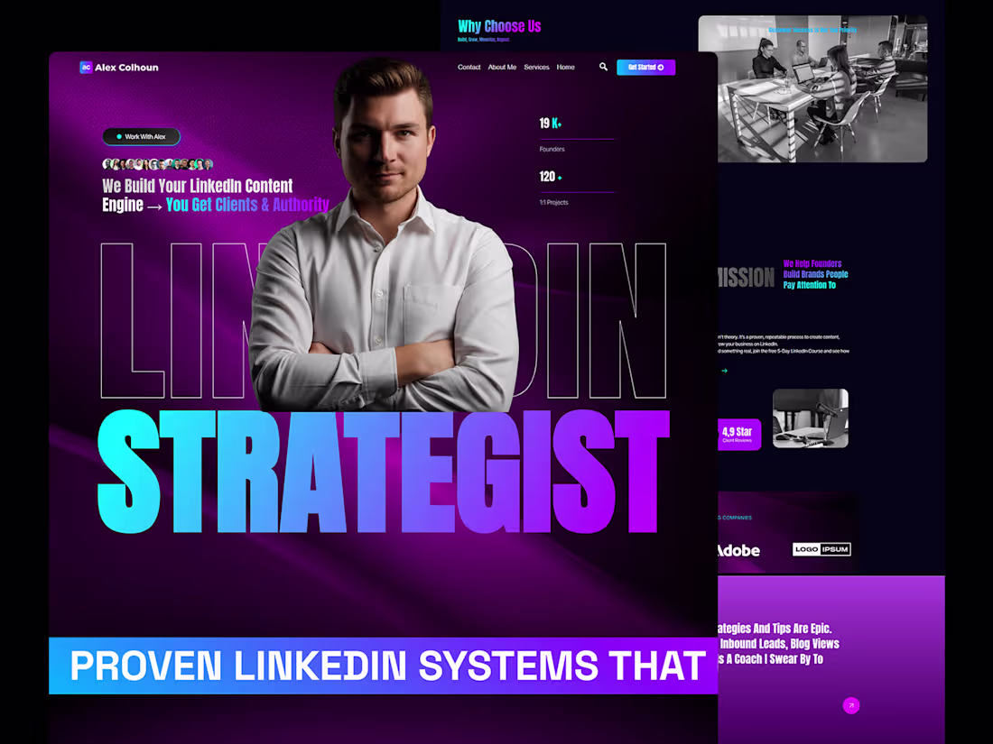
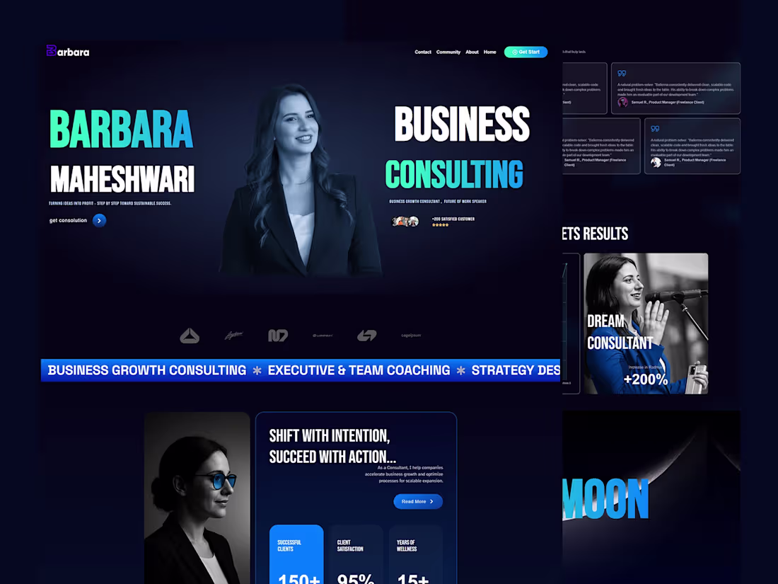
This website was designed to help Alex present his personal brand with clarity, credibility, and a strong first impression.
The focus was on creating a clear content structure, strong messaging hierarchy, and a calm visual language that communicates expertise without noise. Every section was designed to guide visitors naturally, reduce friction, and build trust from the first interaction.
Special attention was given to usability, responsive behavior, and consistency across pages, ensuring the site feels professional, intentional, and easy to navigate on all devices.
The result is a focused personal brand website that supports long-term positioning, strengthens credibility, and helps turn visitors into real opportunities.
27
313