
Girum Asmare
Web Designer UI UX | Framer Developer | Open to Work
Ready for work
Girum is ready for their next project!
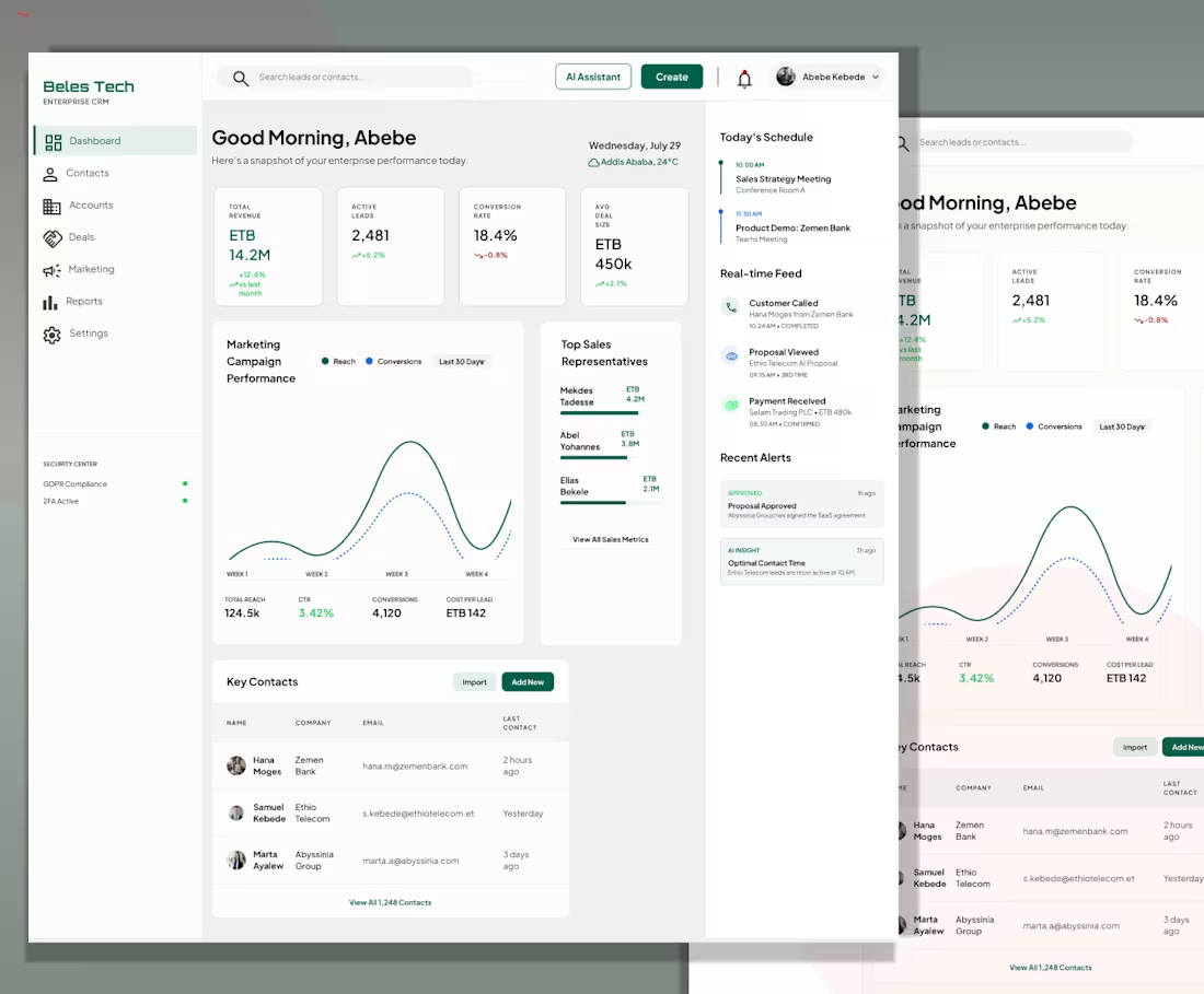
Just wrapped up this enterprise CRM dashboard for Beles Tech ( conceptual ).
Focused on balancing powerful functionality with a clean, modern interface making it easier to manage customers, monitor performance, and keep every team aligned in one place.
2
116
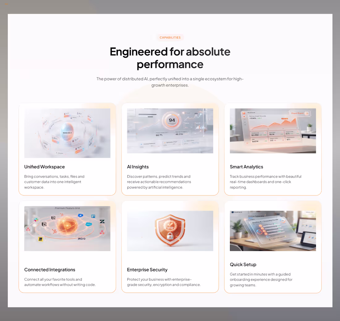
Latest SaaS feature card designs.
Designed a set of feature cards exploring clean layouts, soft gradients, and custom UI illustrations for a modern AI SaaS product.
2
220
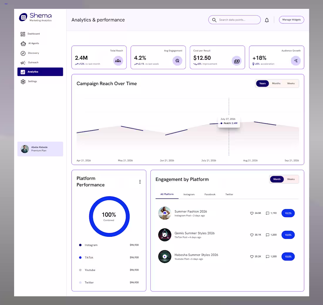
Designed a clean marketing analytics dashboard for Shema.
Highlights:
• Marketing performance overview
• Campaign reach analytics
• Multi-platform engagement tracking
• AI-powered insights
• Modern card-based layout
• Clean data visualization
• Responsive SaaS dashboard design
Designed in Figma.
0
397
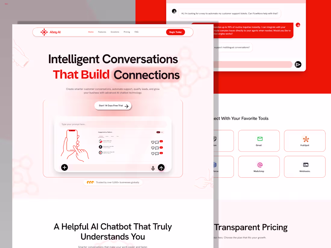
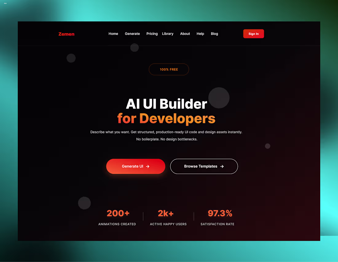
AI Chatbot SaaS Landing Page Design - Abay AI
Abay AI is a modern landing page designed for an AI-powered customer engagement platform that helps businesses automate conversations, qualify leads, and deliver instant support.
The goal was to create a premium SaaS experience with a strong visual hierarchy, clean layouts, and an intuitive user interface that highlights both functionality and brand identity.
2
568
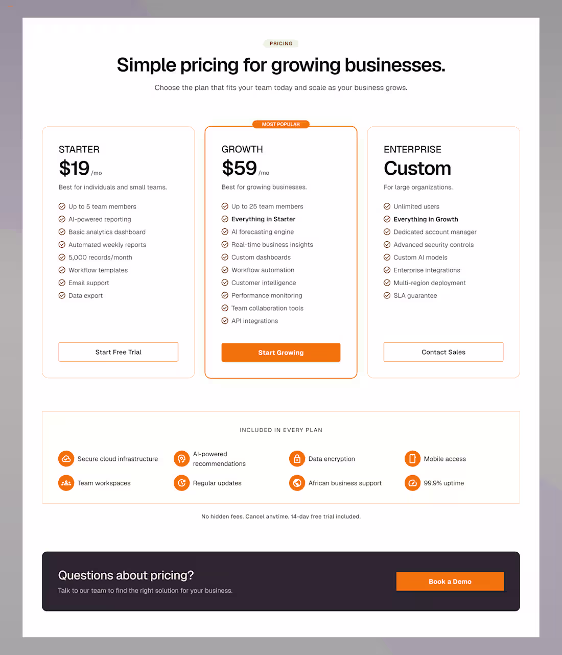
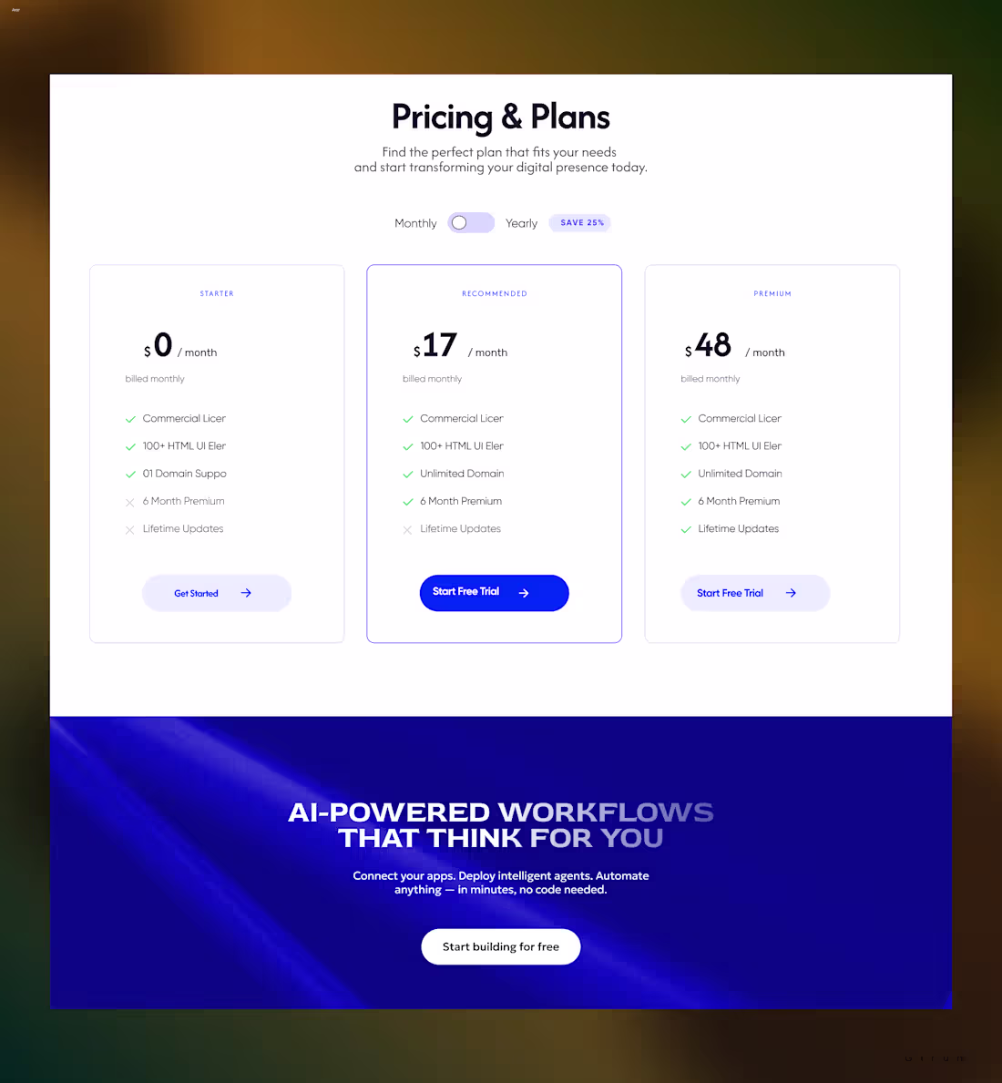
Pricing pages are often where users make their final decision.
Designed this pricing section for an AI startup concept with a focus on clarity, trust, and easy comparison between plans.
Thoughts? 👇
2
1.2K
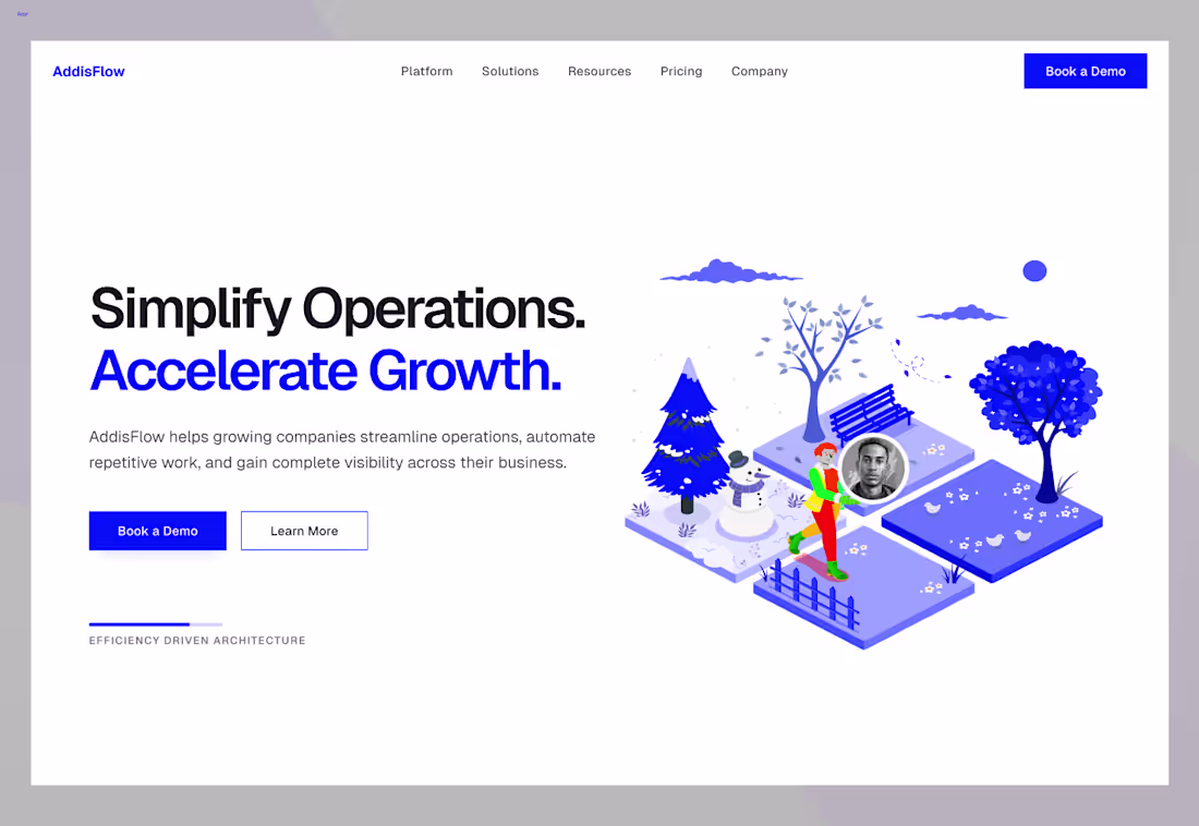
Another day, another design.
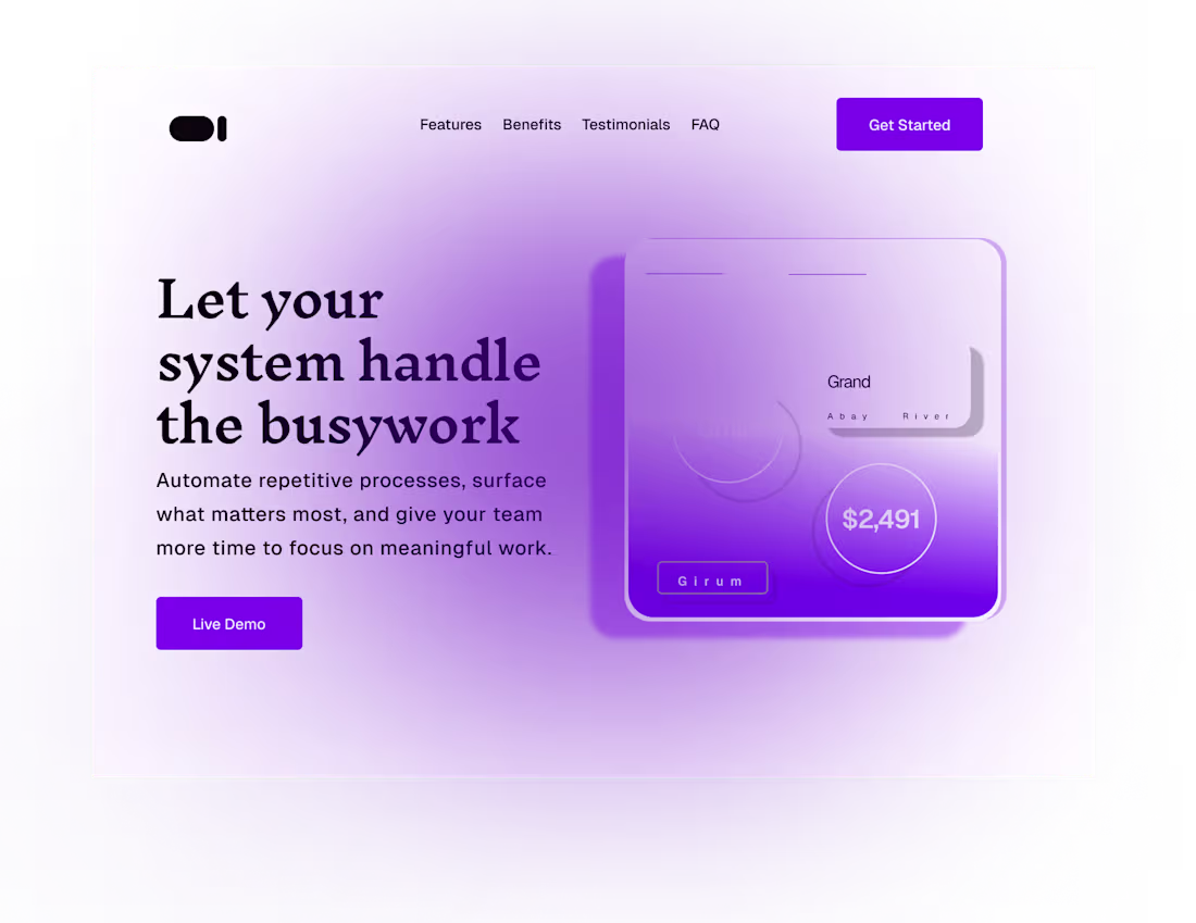
Designed a hero concept for AddisFlow, exploring how operational efficiency and business growth can be communicated through a clean and modern startup experience.
What do you think?
2
1.4K
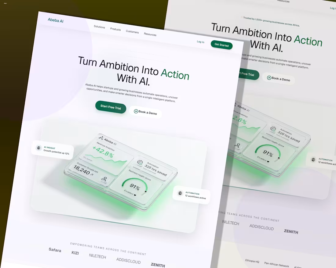
Another clean SaaS hero exploration.
This time, I focused on combining a clean marketing layout with a strong dashboard preview to communicate value instantly and build trust from the first interaction.
Designed for Abeba AI, an AI-powered platform concept for modern businesses.
Feedback welcome 👇
5
9
1.8K
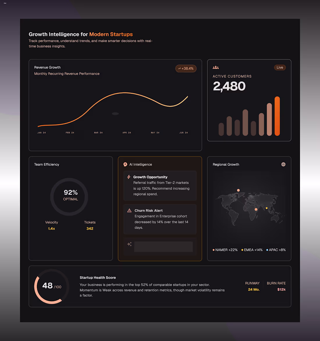
Designed a Growth Intelligence section for a startup SaaS concept.
Explored how revenue, customer growth, AI insights, and business health metrics can be presented in a way that's both informative and easy to scan.
Focused on:
• Data visualization
• Information hierarchy
• SaaS dashboard aesthetics
• Decision-focused UX
• Modern startup branding
Designed in Figma.
5
6
1.7K
New case study is live ✨
Genzeb AI, a modern SaaS design, AI-powered workflows, and conversion-focused UX.
Let me know what you think 👇
Check it out (https://contra.com/p/sesLFkq2-genzeb-ai-saa-s-landing-page-design)
2
5
1.7K
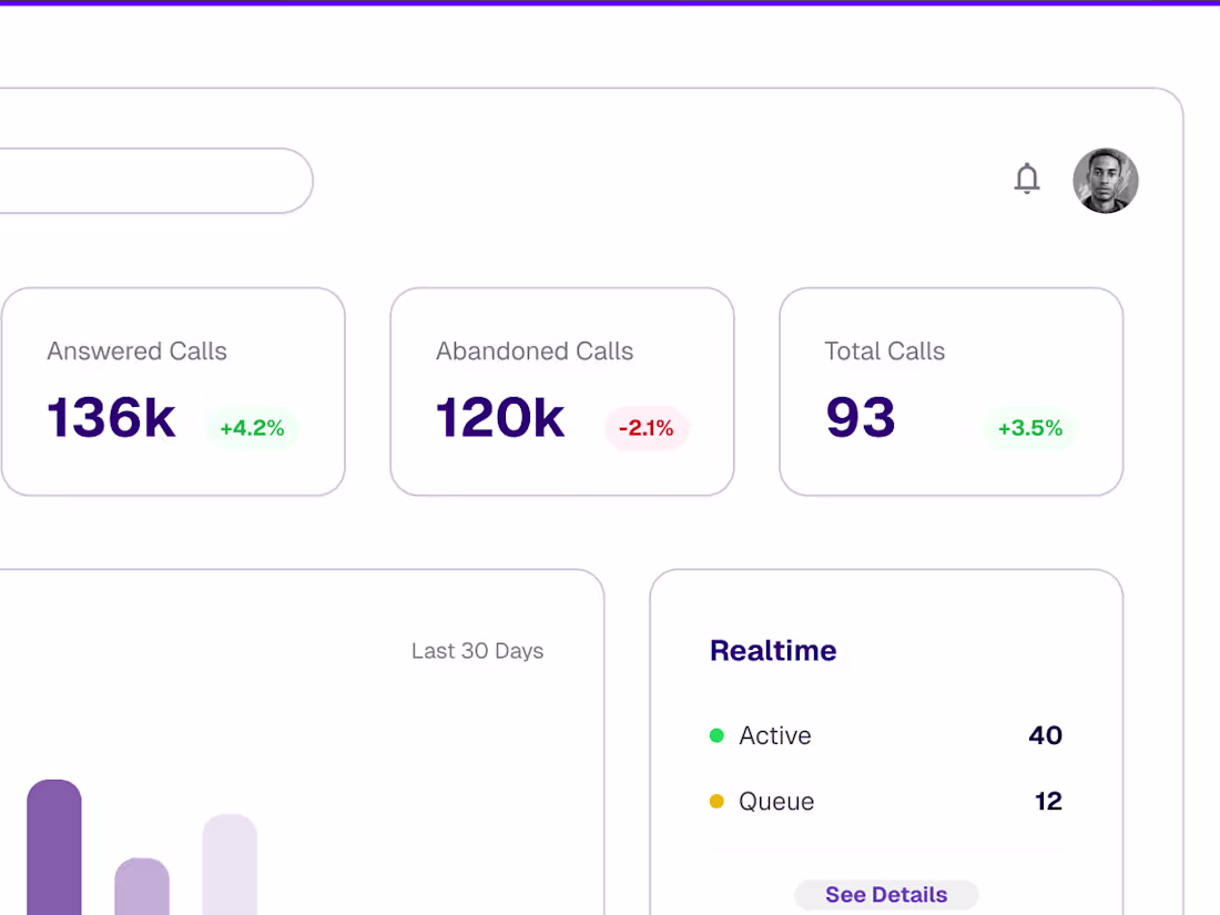
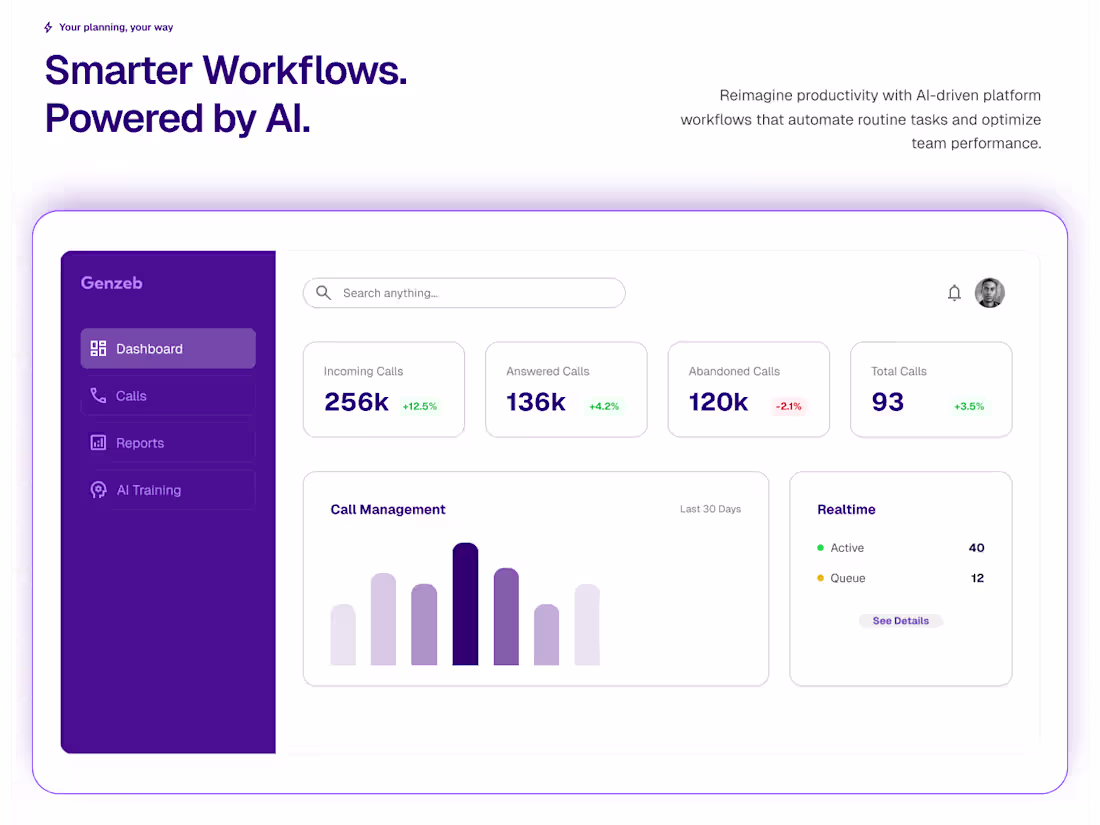
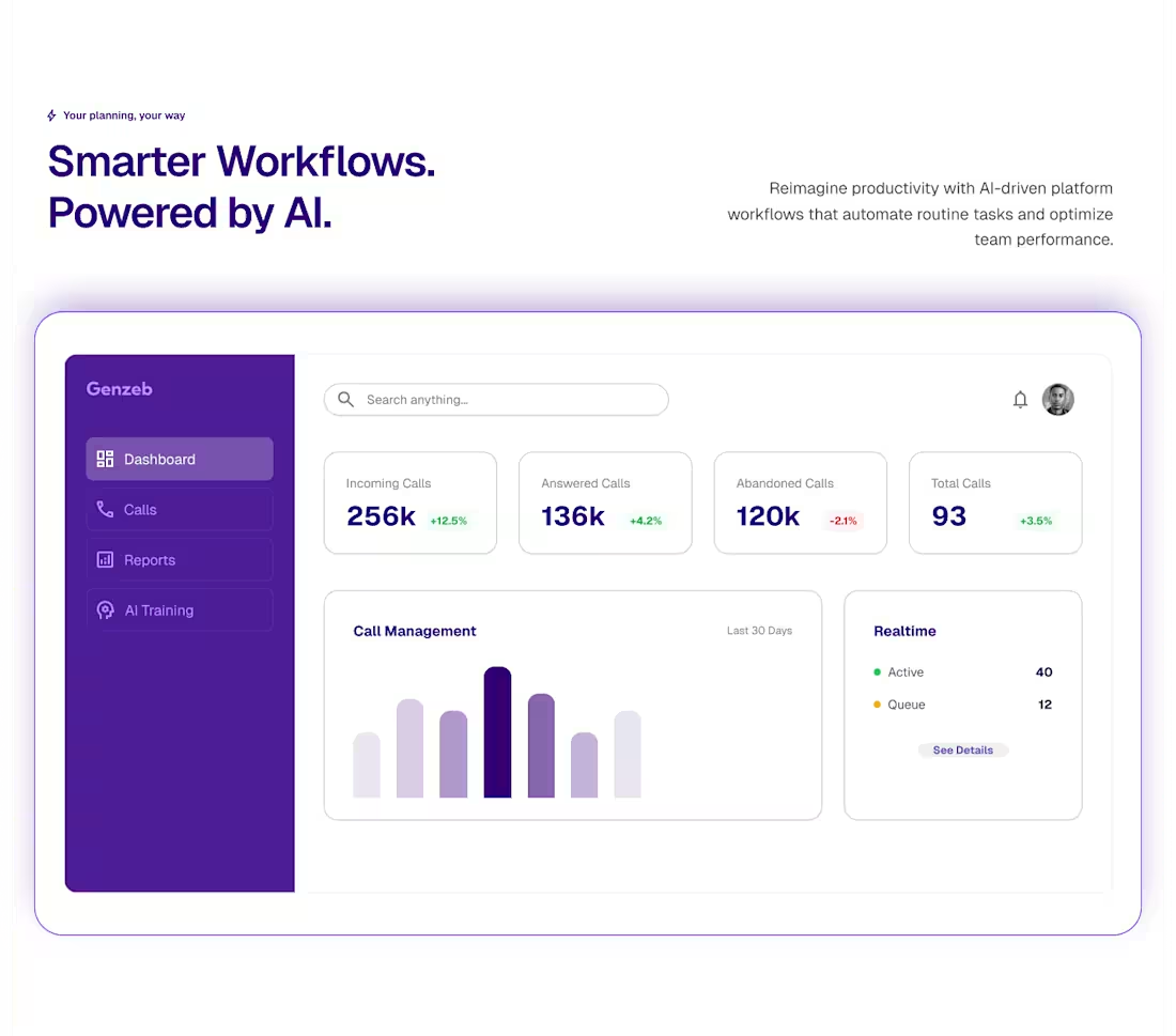
Genzeb AI — Dashboard Design
Designed a dashboard concept for an AI-powered productivity platform focused on workflow automation, performance tracking, and real-time insights.
2
3
1.7K
Most users prefer dark mode, so I designed this feature section exploring a darker visual direction.
Clean cards, strong hierarchy, and a modern SaaS aesthetic
Thoughts? 👇
1
1.7K
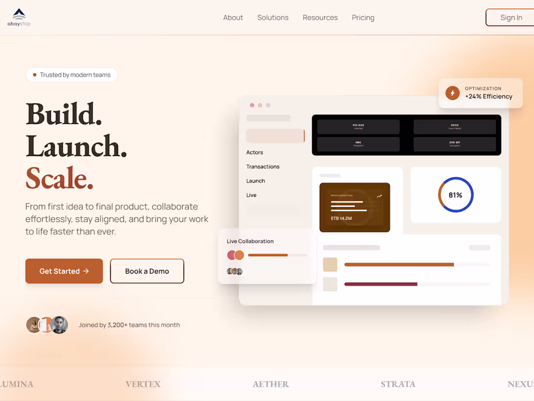
Build. Launch. Scale.
Exploring a startup SaaS hero section with warm gradients, clean layouts, and a focus on clarity.
What do you think?
1
4
1.8K
I like glassmorphism when it adds depth without getting in the way.
Designed this mobile Financial Analytics section with layered glass cards and a modern fintech feel.
Designed in Figma.
Thoughts? 👇
1
1.5K
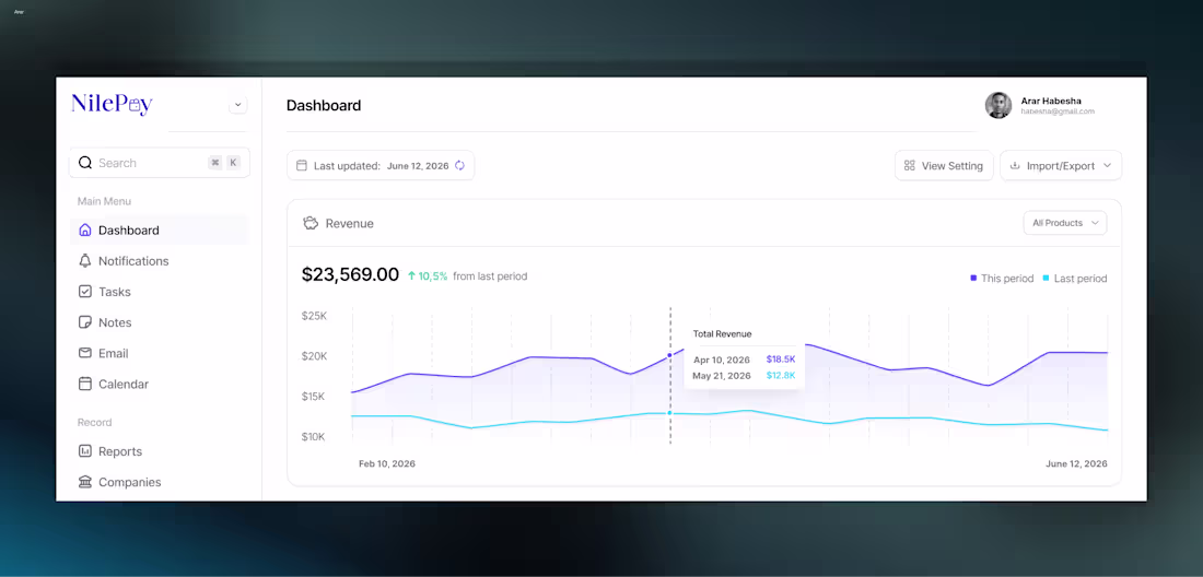
NilePay fintech dashboard design. This concept is built around the idea of helping growing businesses simplify payments, track transactions, and gain better visibility into their finances. Clean layouts, meaningful data, and a focus on usability.
Feedback is always welcome 👇
0
1.4K
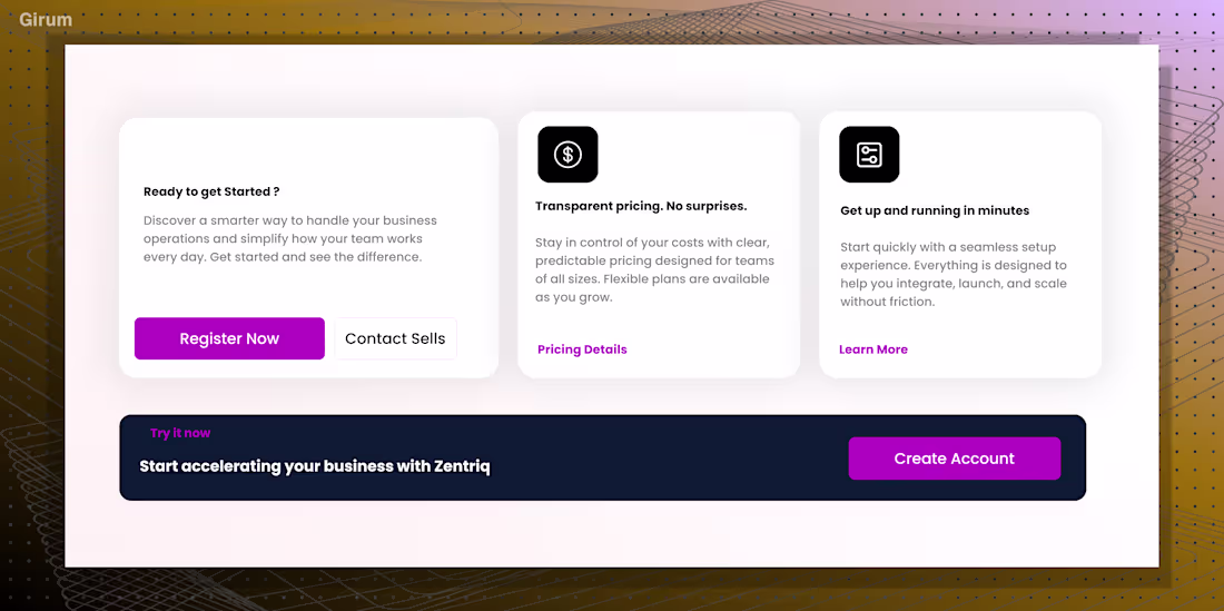
Worked on a CTA section.
Focused on creating a stronger visual pause in the page flow while making the call to action feel more intentional and compelling.
0
1.7K
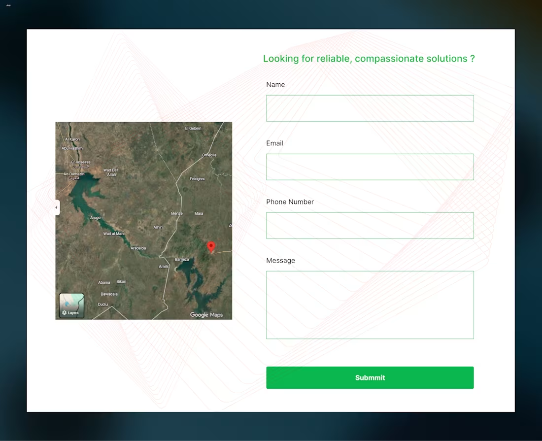
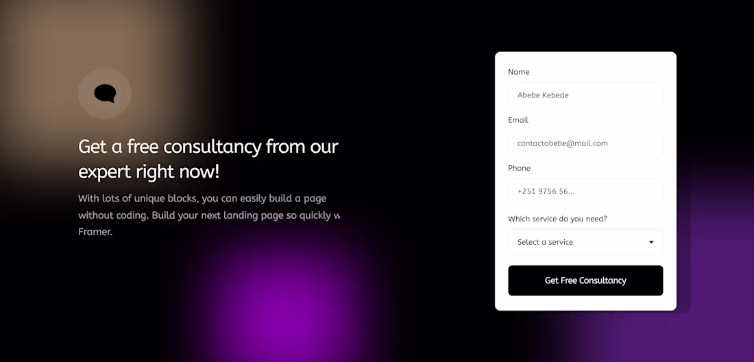
A contact page should do more than collect messages, it should make reaching out feel effortless.
Designed this contact section with a clean form, embedded map integration, and a layout focused on accessibility, trust, and usability.
0
2K
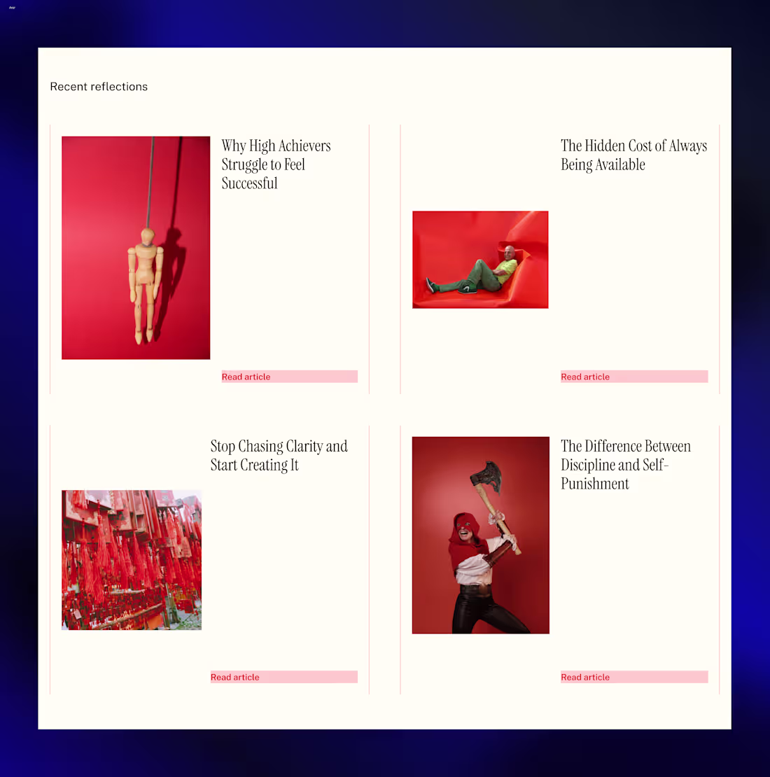
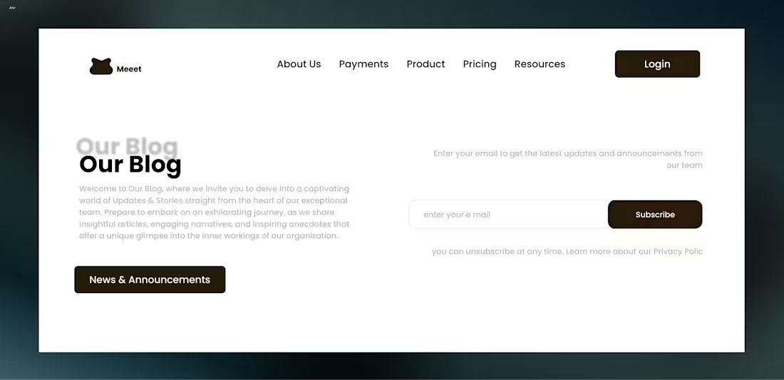
Designed a grid-style blog section for a business coaching website.
The goal was to make content feel approachable, easy to scan, and compelling enough to encourage deeper reading while maintaining a clean and modern layout.
0
1.8K
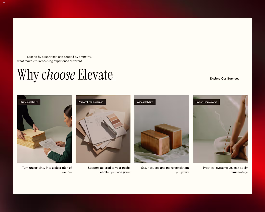
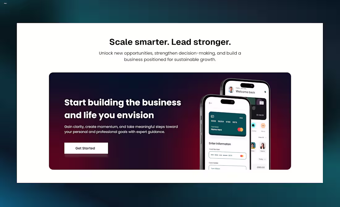
A strong "Why Choose Us" section can make the difference between a visitor leaving and a potential client taking action.
Designed this section for a business coach with a focus on credibility, clarity, and client-focused messaging.
4
4
2K
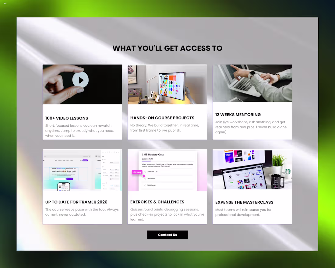
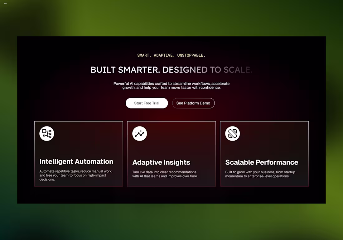
Been refining the visual direction for this features section.
Tried moving toward a softer and more minimal interface by simplifying the background, improving spacing, and letting the content breathe more naturally.
11
10
2.5K
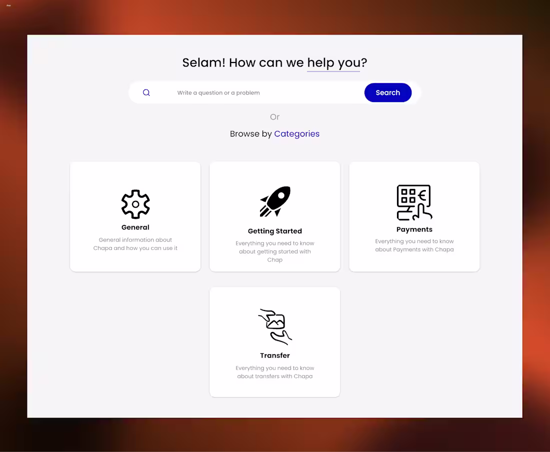
Redesigned these support category cards for a fintech SaaS experience with a focus on clarity, accessibility, and cleaner information flow ✨
5
2.4K
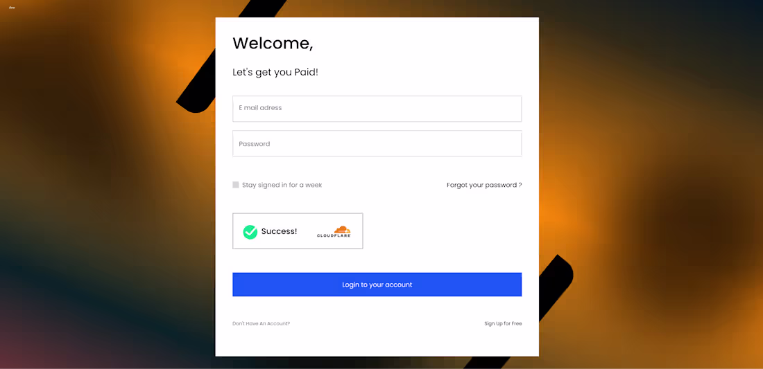
The login experience is one of the first moments users interact with a product and small details shape that first impression more than people realize.
Designed this login popup with a focus on clarity, spacing, and a smoother, more welcoming user flow.
4
2.3K
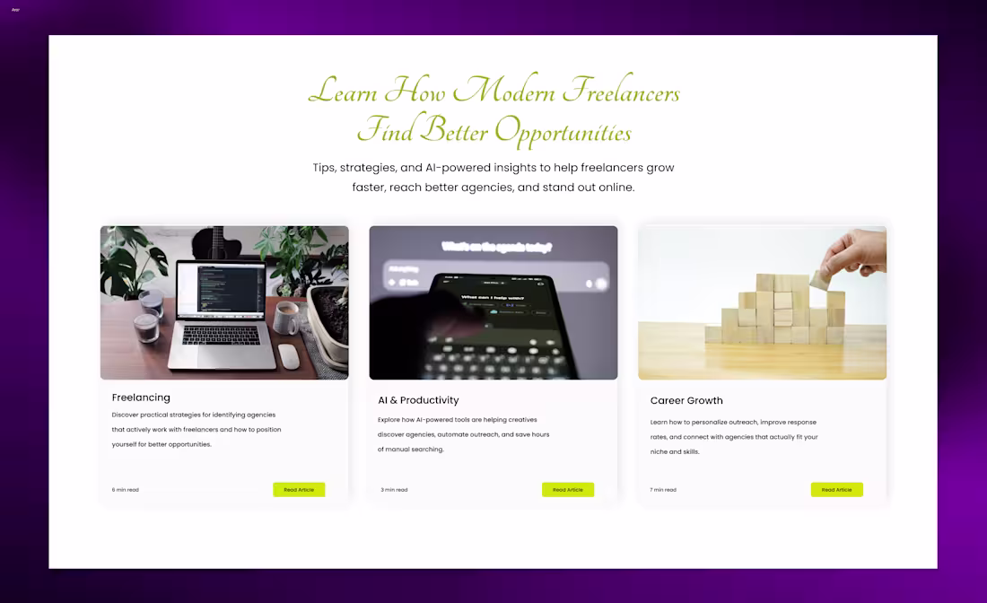
A blog experience starts long before someone reads the first paragraph.
The hero section sets the tone, creates curiosity, and shapes how the content feels from the very first glance.
Designed this hero section with a focus on hierarchy, spacing, and a modern editorial aesthetic.
4
2.1K
Working on a project in Figma.
What are you guys doing today?
5
2.1K
A good blog section isn’t just about aesthetics, it should make content easier to scan, read, and engage with.
Designed this one for an AI SaaS interface.
2
8
2.1K
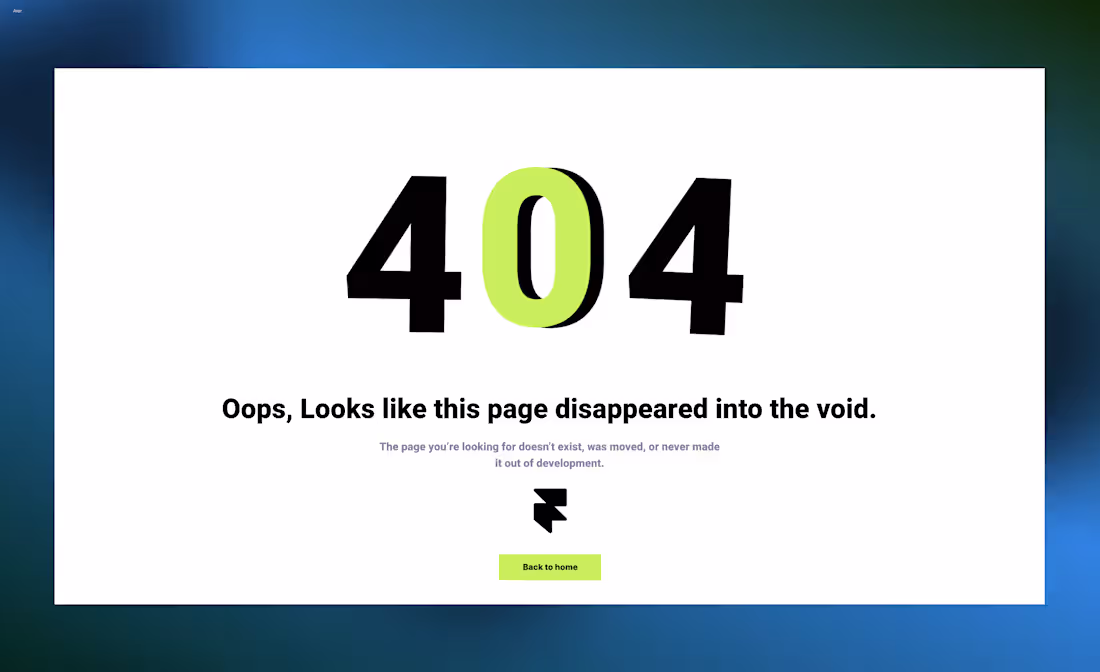
How’s this 404 page design?
Tried keeping it minimal while matching the overall futuristic aesthetic.
4
1.8K
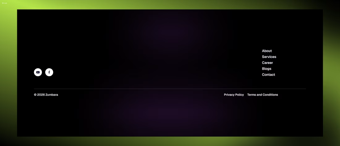
Footers should feel minimal, but still guide the user with clarity and purpose.
4
1.9K
Me while designing an AI SaaS interface in Figma.
Exploring structure, interaction, and visual direction in real time.
2
3
1.9K
Wireframe Vs High Fidelity. Designed in Figma
3
3
2K
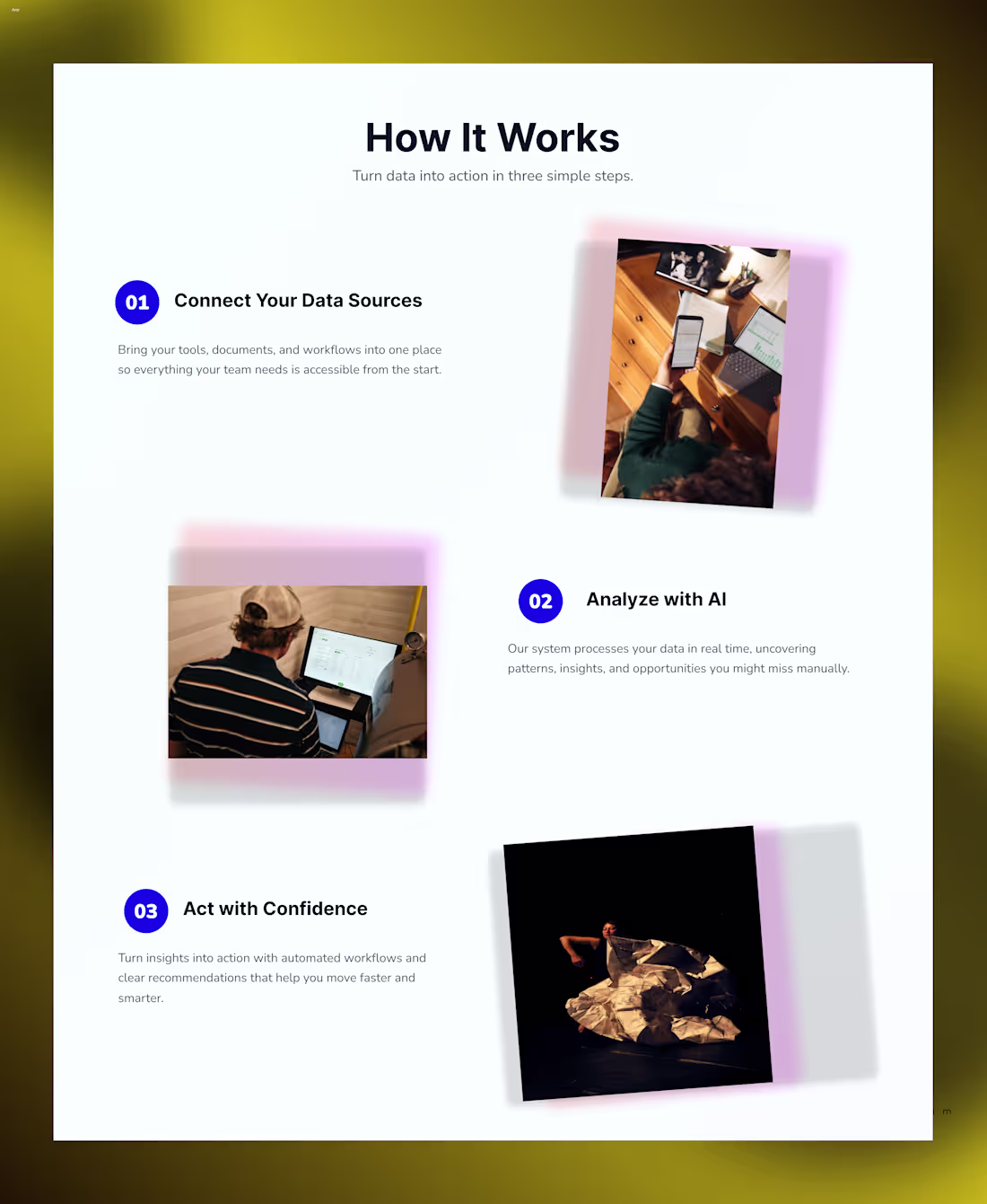
Designed how it works section for a website
3
5
2K
Designed premium looking hero for saas
4
1.8K
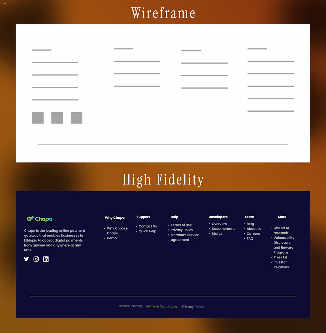
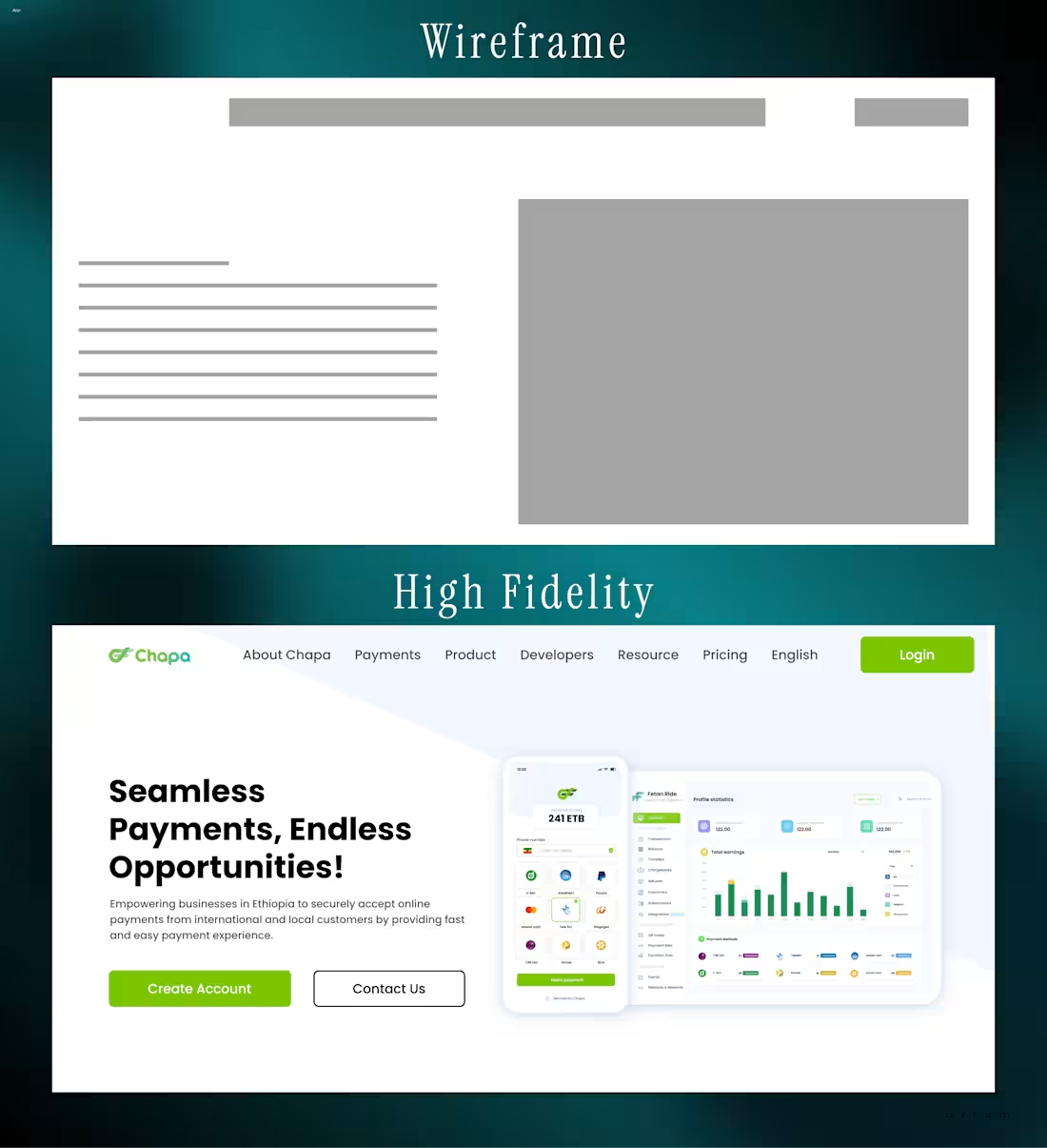
Wireframe Vs High Fidelity
Designing in Figma
6
5
1.8K
Designed hero section
2
6
1.7K
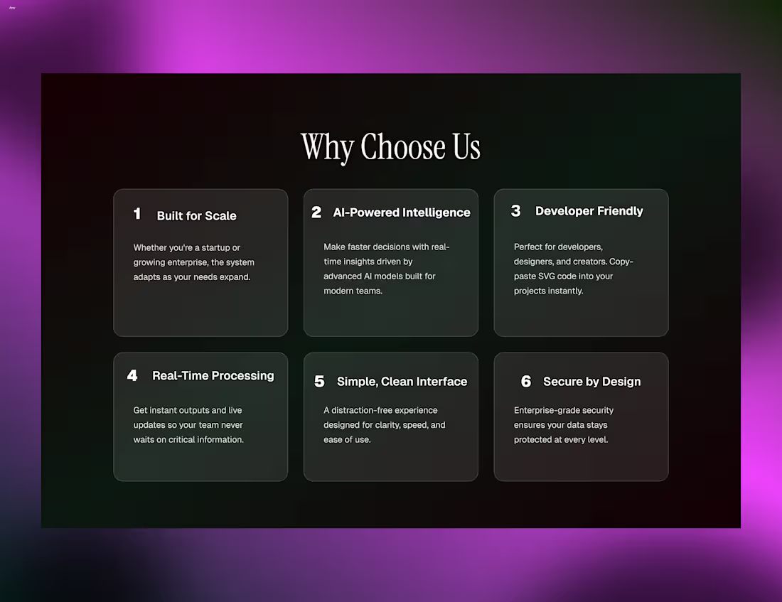
Designed Why Choose Us Section
3
1.6K
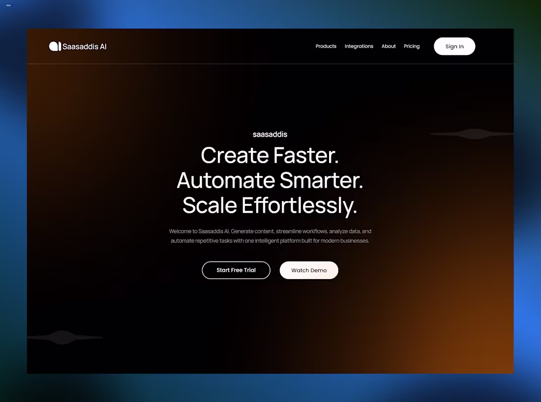
Hero design for an AI SaaS. Contact me for your projects
4
1.6K
Designed this clean pricing section
2
4
1.5K
Designed cards with nice Call To Action buttons
2
4
1.5K
Features section design
2
1.5K
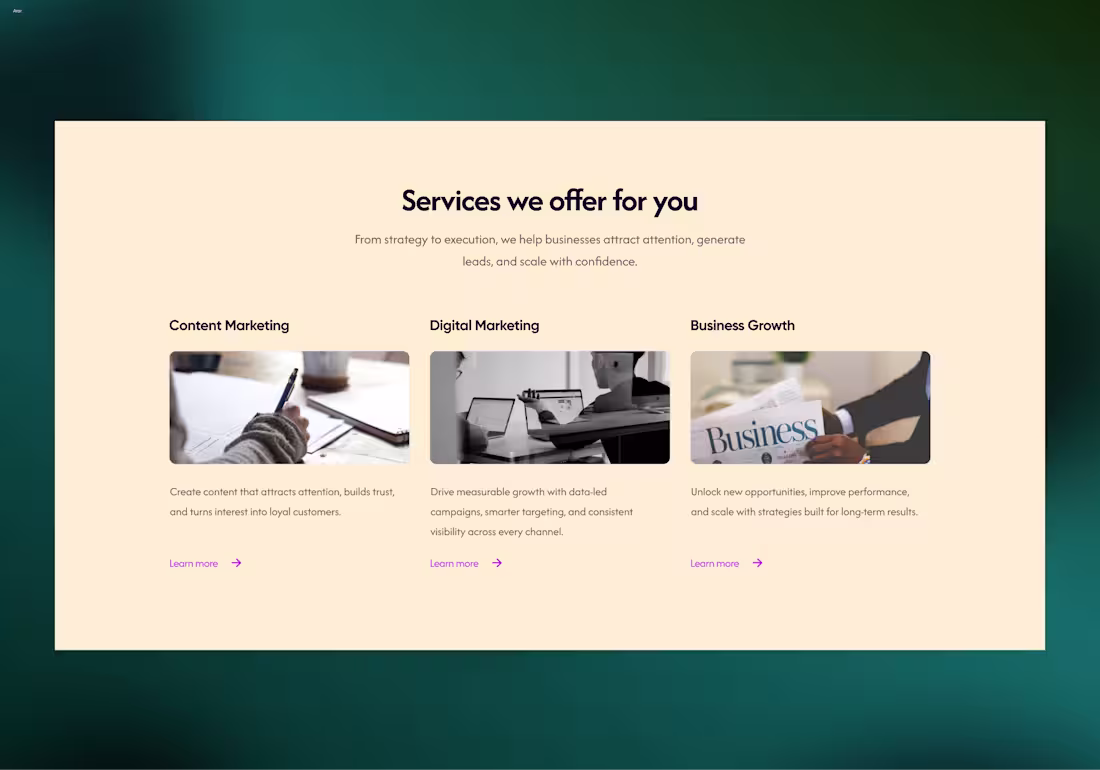
Designed services section
3
5
1.5K
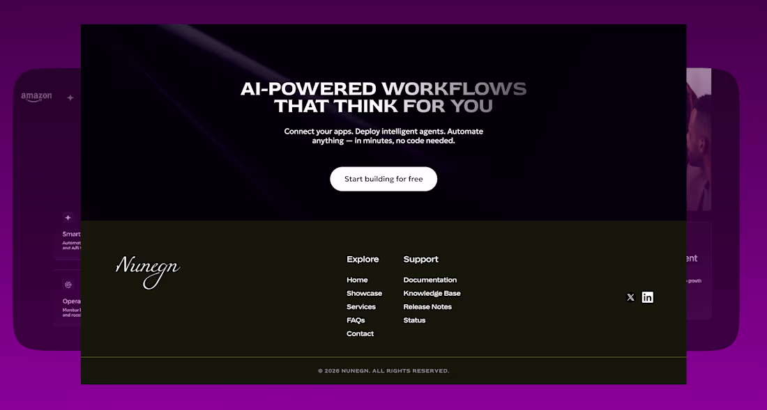
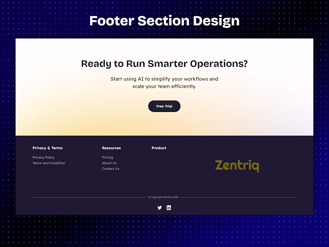
Designed footer section
4
8
1.7K
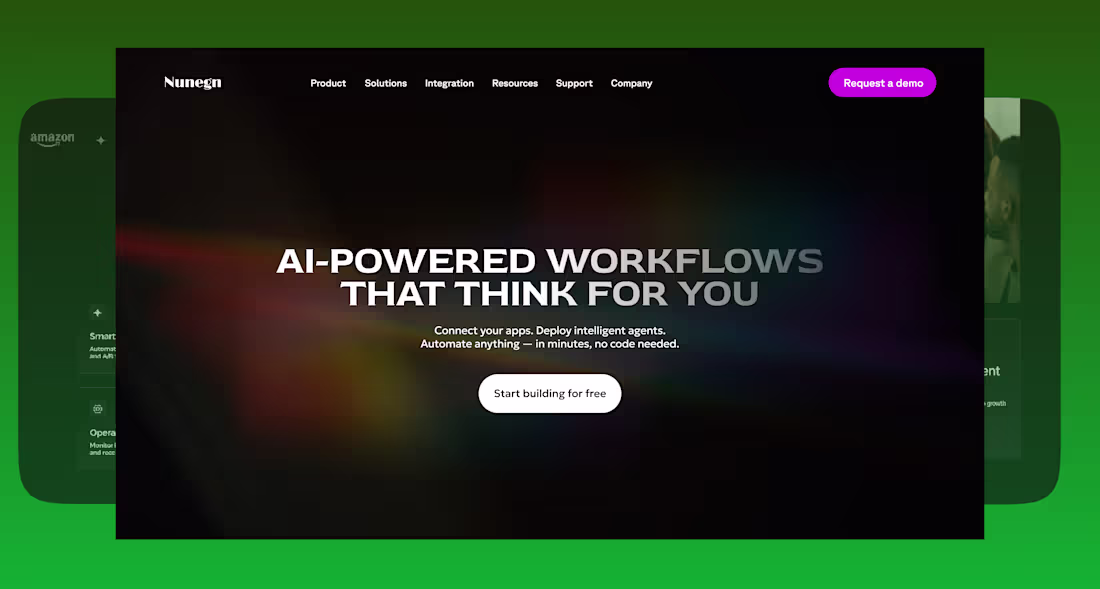
Designed this hero
2
1.7K
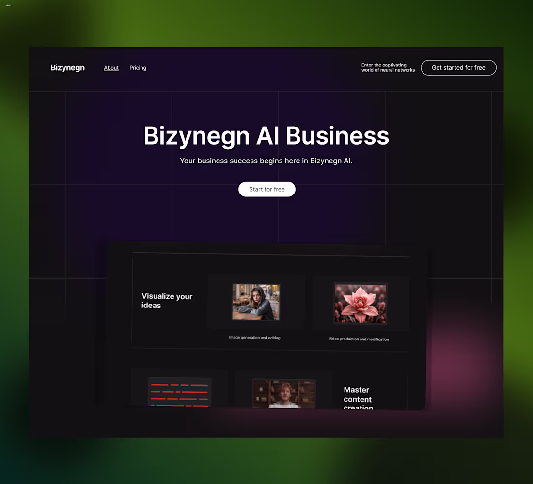
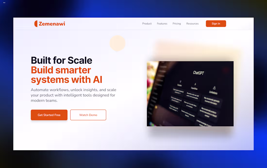
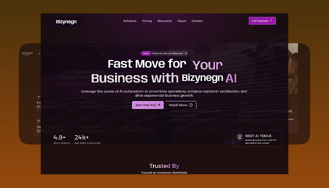
Hero design for Bizynegn AI SaaS
6
8
1.8K
Hero Design
4
7
1.8K
Re-designed this landing page in Figma
3
1.6K
Yeah LottieFiles for Figma Expert. Hope to get the badge as well.
#lottiefilesforfigmaexpert
2
1.6K
Landing page design
4
4
1.7K
CTA form section design at Figma
2
1.5K
Doing on Framer
0
1.3K
Testing footer section for a restaurantl website in framer.
2
1.5K
Hero Design in Figma
1
3
1.5K
A work in-progress @Framer.
Landing page
2
2
1.5K
Card & CTA Design @Figma
1
1.6K
Create one Component in Framer and then re-use it
1
1.8K
Me designing hero @Figma
1
2.2K
Stacking Cards in Framer
2
2.5K
Workin on Framer
2
2.4K
Minimal hero Dev't @Framer
1
2.3K
For Framer and Figma Projects
1
2.2K
Footer Section Design @Figma
1
2.1K
Post your Framer work
4
5
2.1K
Building in Framer
3
1.7K
Publish your site @framer
(https://x.com/framer)
2
1.6K
Open to work.
Yeah, I'm open to Framer and Figma projects.
1
1.6K
Available for Framer & Figma Projects
I design and build modern, conversion-focused websites.
If you need help bringing your product to life — I’m here. Work with me.
2
1.6K
AI SaaS Landing Page Design
@figma (https://x.com/figma)
Minimal, structured, and built for clarity.
Here’s a quick walkthrough of the full design
0
1.7K
A Framer project I really enjoyed building
1
1.7K
Working on Figma make for Sunday school e-learning website mobile version
1
1.8K
Framer Landing Page Dev't for for a speech-to-text SaaS platform.
0
1.8K
Features Section Design for SaaS Website
2
1.7K
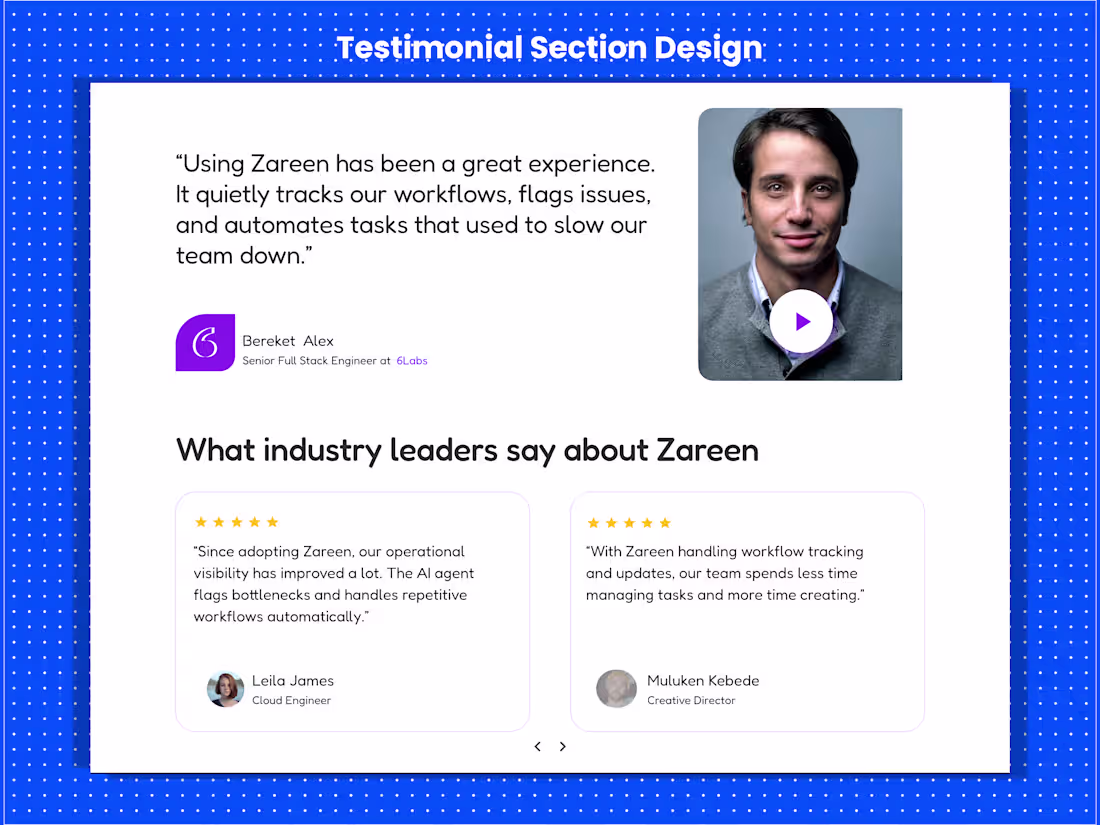
Testimonial Section Design
1
1.7K
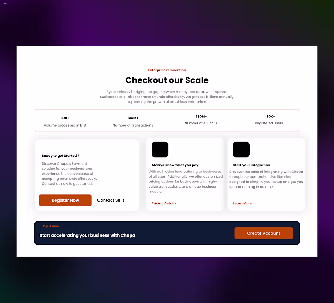
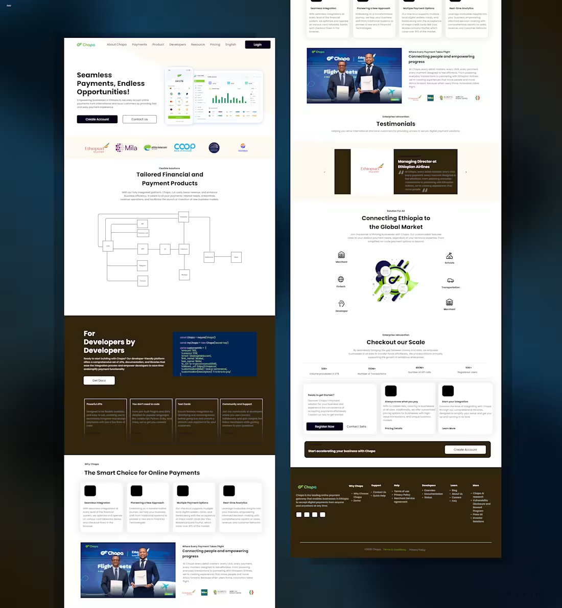
Landing Page Re-design ( Chapa's )
0
1.6K
Kelemia Landing Page — Framer Build
Designed in Figma.
Built in Framer.
2
1.6K
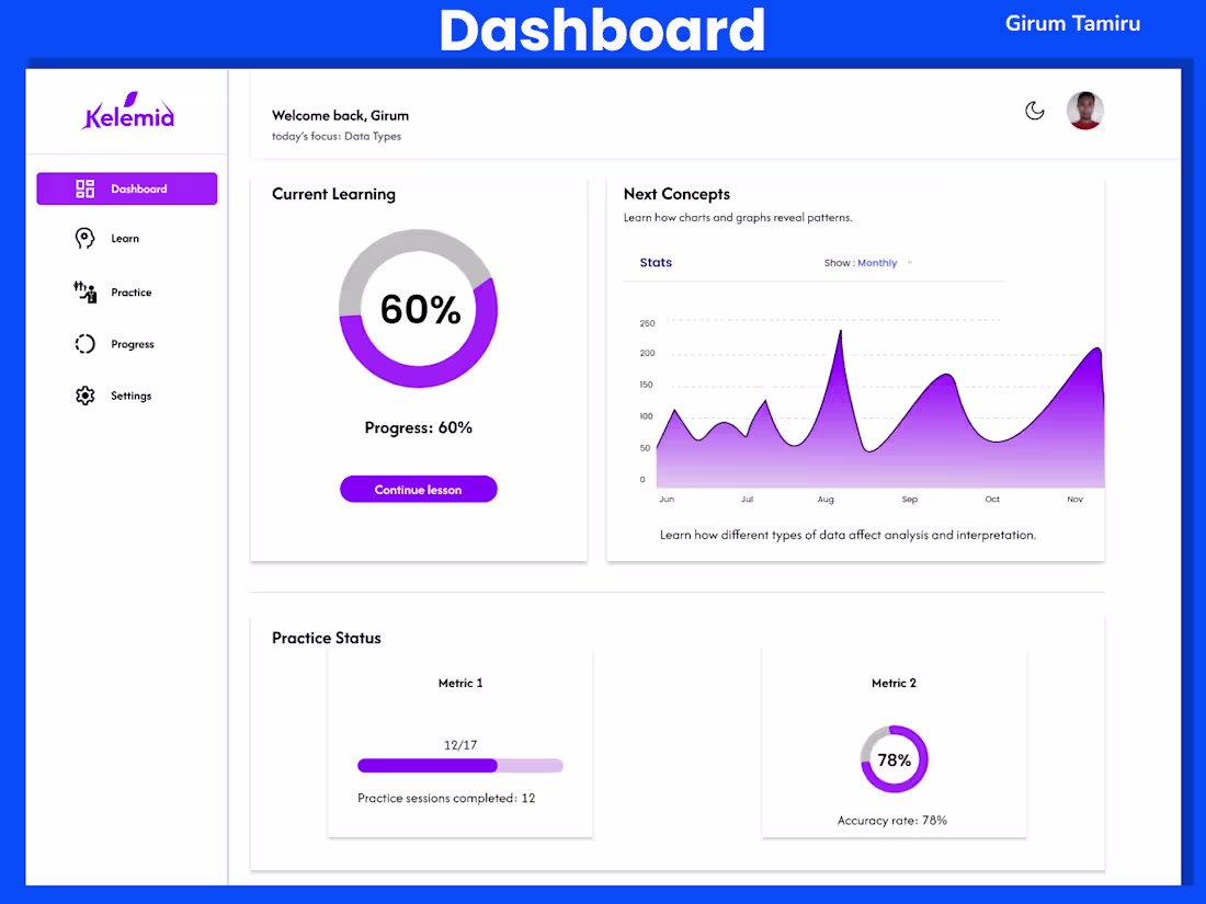
Kelemia — Learning Dashboard Design
A learner-focused dashboard for a data analytics education platform.
Designed to prioritize clarity, progress tracking, and structured learning - showing current focus, upcoming topics, practice progress, insights, and learning streaks.
2
1.6K
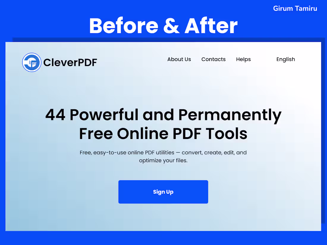
CleverPDF - A Before & After UX Redesign
I redesigned the CleverPDF website as a before-and-after UX redesign, focusing on improving usability, clarity, and overall user experience.
The redesign introduces an alternative layout and visual structure, applying UX principles and intentional use of color, spacing, and hierarchy to better align with user expectations and reduce friction especially for first-time users interacting with PDF tools.
Designed entirely in Figma.
1
1.5K
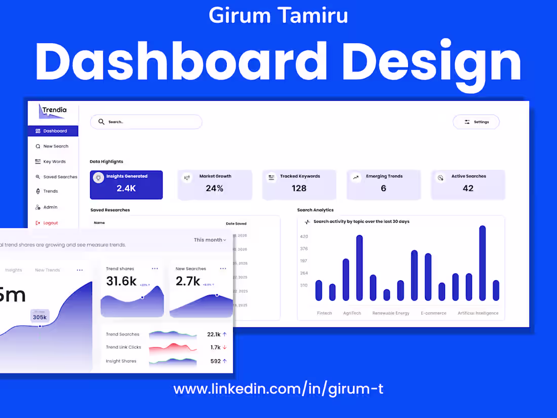
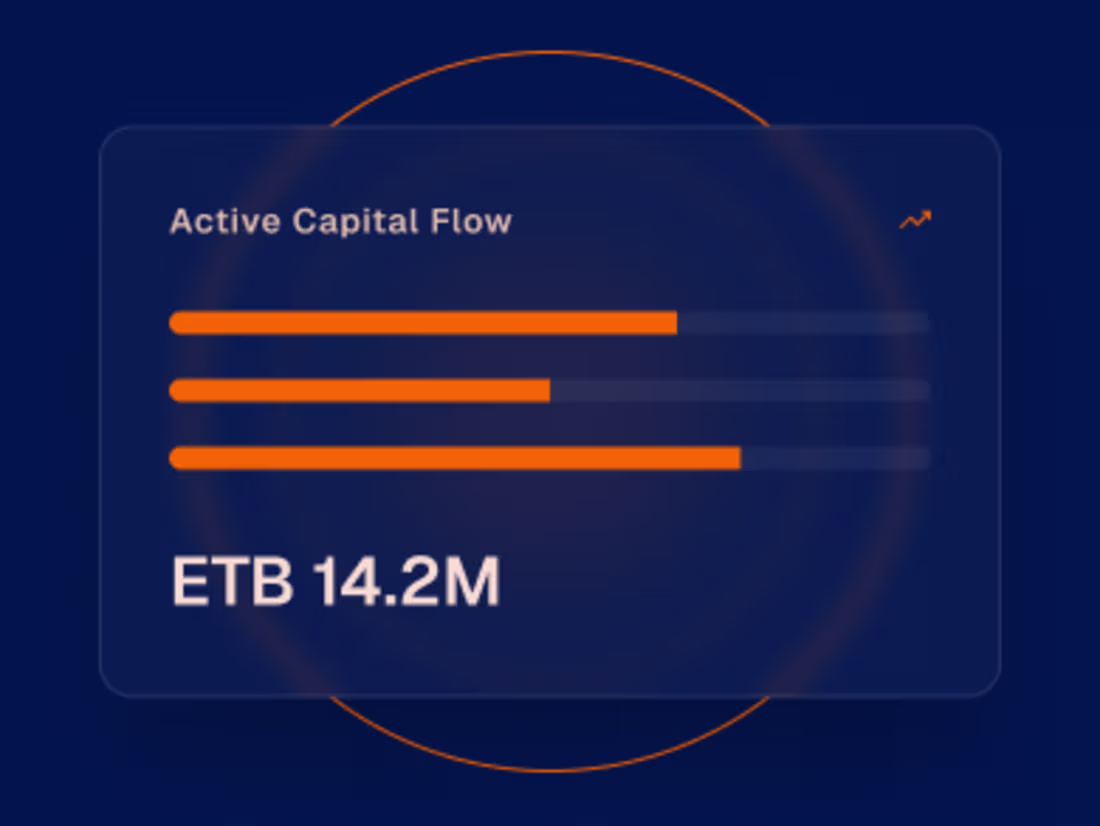
Trendia — Market & Trend Analytics Dashboard Design
Trendia is a market analytics dashboard designed to help teams understand trends, performance signals, and key metrics at a glance.
The project focused on transforming large volumes of market data into a clear, structured, and decision-oriented interface, allowing users to quickly identify patterns, monitor performance, and explore insights without friction.
Project goals
Present complex market data in a clear and readable format
Establish strong information hierarchy for fast insight discovery
Reduce cognitive load while maintaining data depth
Create a scalable dashboard system suitable for future expansion
Design approach
I started by defining the dashboard structure and metric hierarchy, ensuring that the most critical insights are immediately visible.
2
1.6K
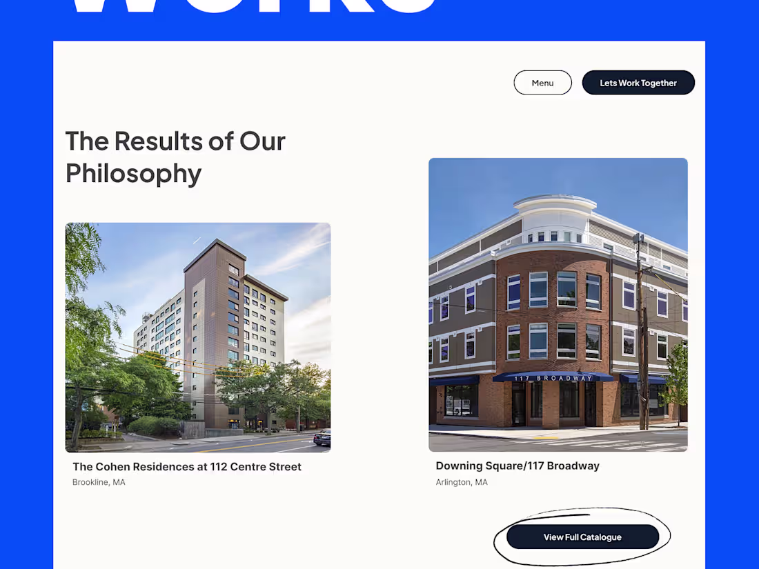
Davis Square Architects Website Redesign (UI/UX Case Study)
1
8
Genzeb AI — SaaS Landing Page Design
0
11
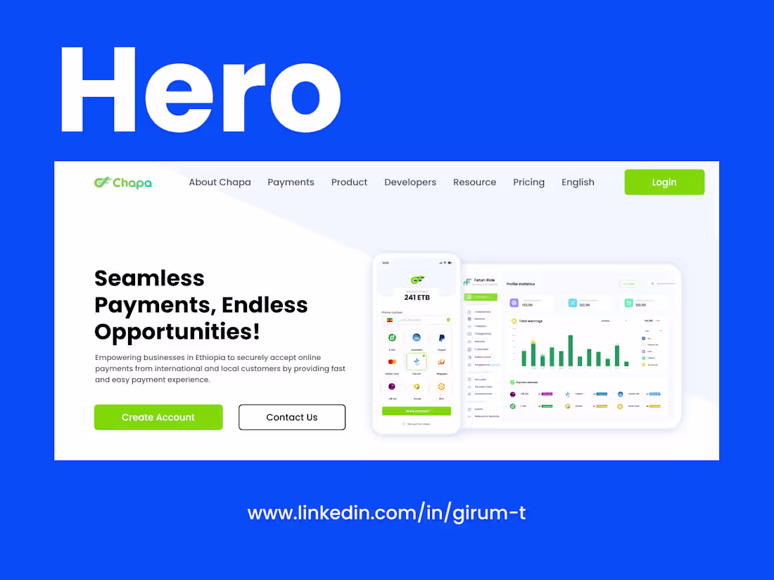
Chapa Homepage Redesign
2
1.6K