

How we launched Azuron in four weeks?
Brand, design and development running in parallel and delivered as one system.
Check the full case 👉 apta.agency/projects/azuron


Happy to announce that we're officially a Webflow Partner! 🥳
We're so excited about this milestone. It's a big one in this new chapter for us.


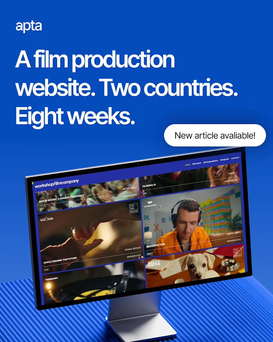
Website design, development and CMS, all in eight weeks.
We took Workshop’s existing brand identity and translated it into a website that puts their films and talent front and center.
Working closely with their team, we designed every page and responsive layout in Figma, then...
How do you build a website for a film production company in Vancouver, from Brazil, in eight weeks?
Everything happened in one Figma file, designed on auto layout from the very first frame. Three to four rounds later, the design was ready to build, and since the structure was...
Wrapped September, a month that felt like three...
We launched Grind, a sport nutrition brand designed like a coffee brand, briefing to shelf in 4 weeks. Workshop's new website went live after 8 weeks of work, and we officially joined the Webflow Partner Program.
Behind all that:...