
Apex Design
Packaging & Label Designer | Branding & Product Visuals
- 1
- Followers

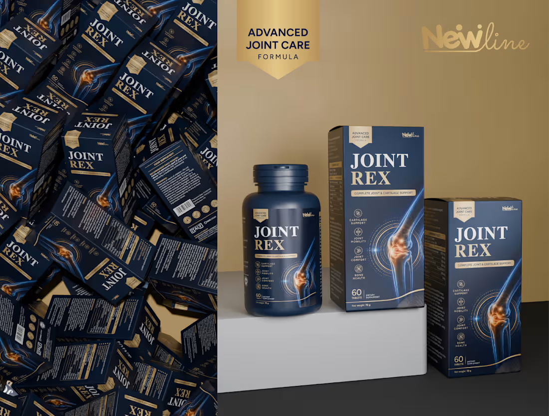
A premium Joint Support Supplement Packaging Design created with a focus on modern aesthetics, strong visual identity, and professional product presentation.
The packaging features a sophisticated navy blue and gold color palette, bold typography, and detailed joint-inspired graphics that communicate strength, mobility, and wellness.
The project includes custom supplement bottle label design, product box packaging, and realistic 3D product mockups. Each visual was carefully composed with studio lighting, natural textures, and premium product rendering to create a professional presentation.
The goal was to develop visually appealing, distinctive packaging that stands out in the competitive health and wellness market while maintaining a clean and consistent brand identity.
Design Focus: Supplement Packaging | Label Design | Box Packaging | 3D Product Visualization | Product Branding
About Apex Designs
We craft distinctive branding, packaging, and visual identities that help products stand out and leave a lasting impression. By combining creativity, strategy, and attention to detail, we create designs that are both visually compelling and commercially effective.
✨ Turning ideas into impactful brand experiences.
❤️ Press “L” if you enjoyed the project
📩 Have a project in mind? Let's create something remarkable together.
0
26
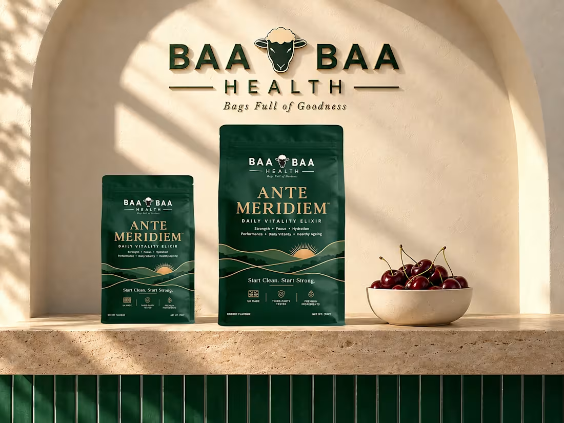
premium packaging design for BAA BAA Health Ante Meridiem, a Daily Vitality Elixir created around strength, focus, hydration, performance, and everyday vitality.
The visual identity combines deep forest green, warm gold details, and a nature-inspired landscape to create a refined wellness aesthetic. The packaging was presented through realistic product visualization with natural textures, warm lighting, and cherry-inspired elements to complement the product’s flavor and premium positioning.
The goal was to create packaging that feels clean, distinctive, and confident while maintaining a strong shelf presence.
About Apex Designs
We craft distinctive branding, packaging, and visual identities that help products stand out and leave a lasting impression. By combining creativity, strategy, and attention to detail, we create designs that are both visually compelling and commercially effective.
✨ Turning ideas into impactful brand experiences.
❤️ Press “L” if you enjoyed the project
📩 Have a project in mind? Let's create something remarkable together.
0
65
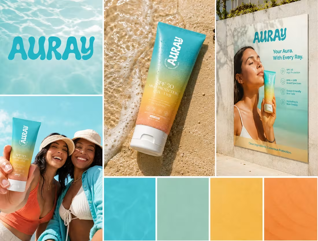
AURAY SPF 50 | Sunscreen Packaging & Brand Design
A vibrant sunscreen packaging and visual identity created for AURAY SPF 50, inspired by sunlight, ocean tones, and an active summer lifestyle.
The design features a fresh gradient color system transitioning from aqua blue to warm sunset tones, giving the product a distinctive and energetic shelf presence. I developed the tube packaging, typography, color direction, supporting graphics, and branded promotional visuals to create a cohesive identity across product and marketing applications.
The final concept combines modern skincare aesthetics with a bright, approachable visual language designed for a sun-care and lifestyle-focused audience.
My work included:
• Sunscreen tube packaging design
• Brand visual direction
• Typography & layout
• Gradient color system
• Product presentation & mockups
• Lifestyle advertising visuals
• Outdoor promotional design
• Print-ready artwork preparation
Let’s turn everyday sun protection into a brand people want to carry everywhere. ☀️✨
0
164
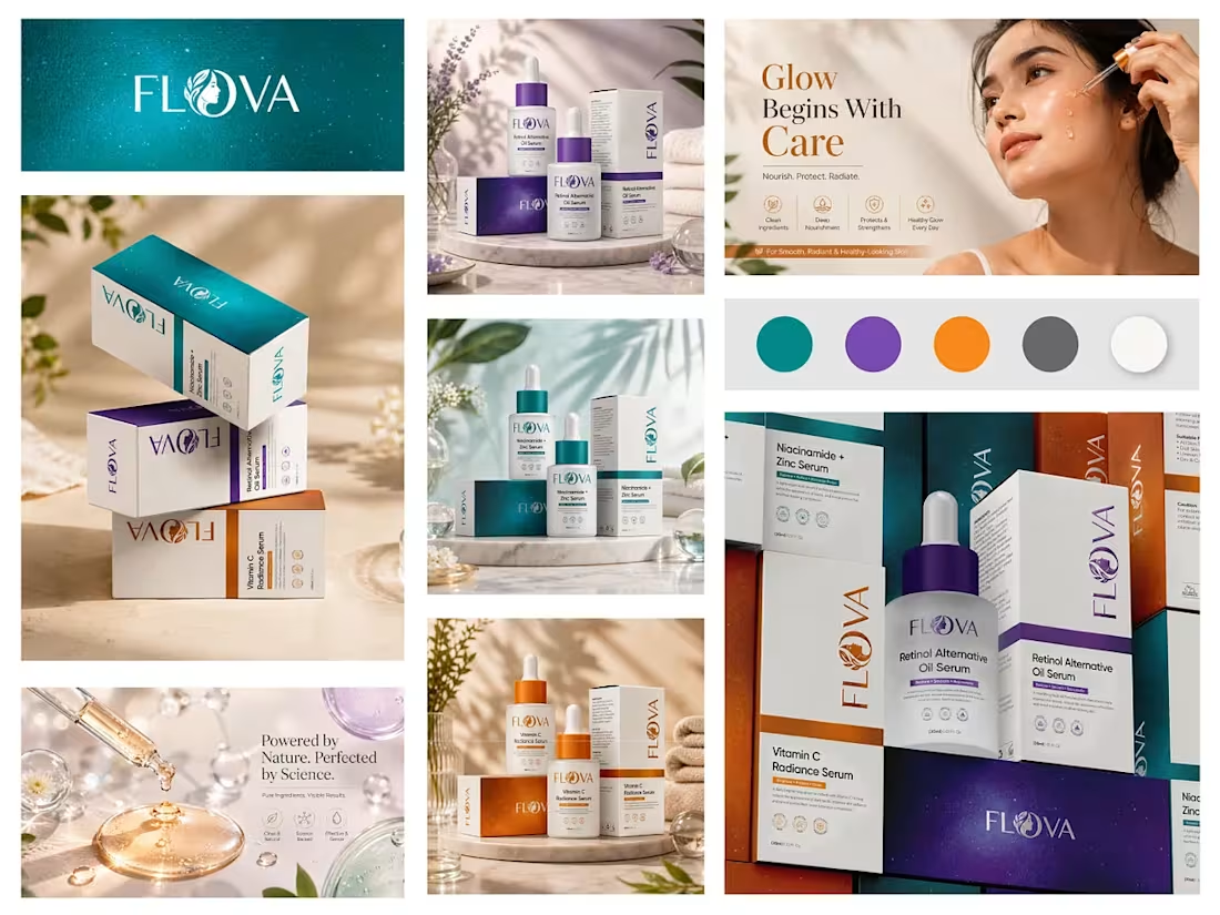
FLOVA Skincare | Packaging & Brand Visual Design
Tell us about this work
A cohesive skincare packaging system created for FLOVA across three serum products: Vitamin C Radiance Serum, Retinol Alternative Oil Serum, and Niacinamide + Zinc Serum.
The goal was to build a clean, premium, and recognizable visual identity while giving each serum its own distinct color direction. I developed the product labels, box packaging, typography, color system, supporting graphics, and product presentation while maintaining consistency across the complete range.
The final system combines modern skincare aesthetics with clear product communication, allowing each variant to stand independently while remaining instantly recognizable as part of the FLOVA brand.
My work included:
• Packaging & label design
• Product box design
• Color-coded product system
• Typography & visual hierarchy
• Brand visual consistency
• Product mockups & presentation
• Print-ready packaging artwork
0
261