
Most coffee brands compete on intensity. Bold colors, aggressive typography, slogans built around hustle and momentum. Even premium specialty brands tend to lean on origin stories, roasting data, and café culture aesthetics.
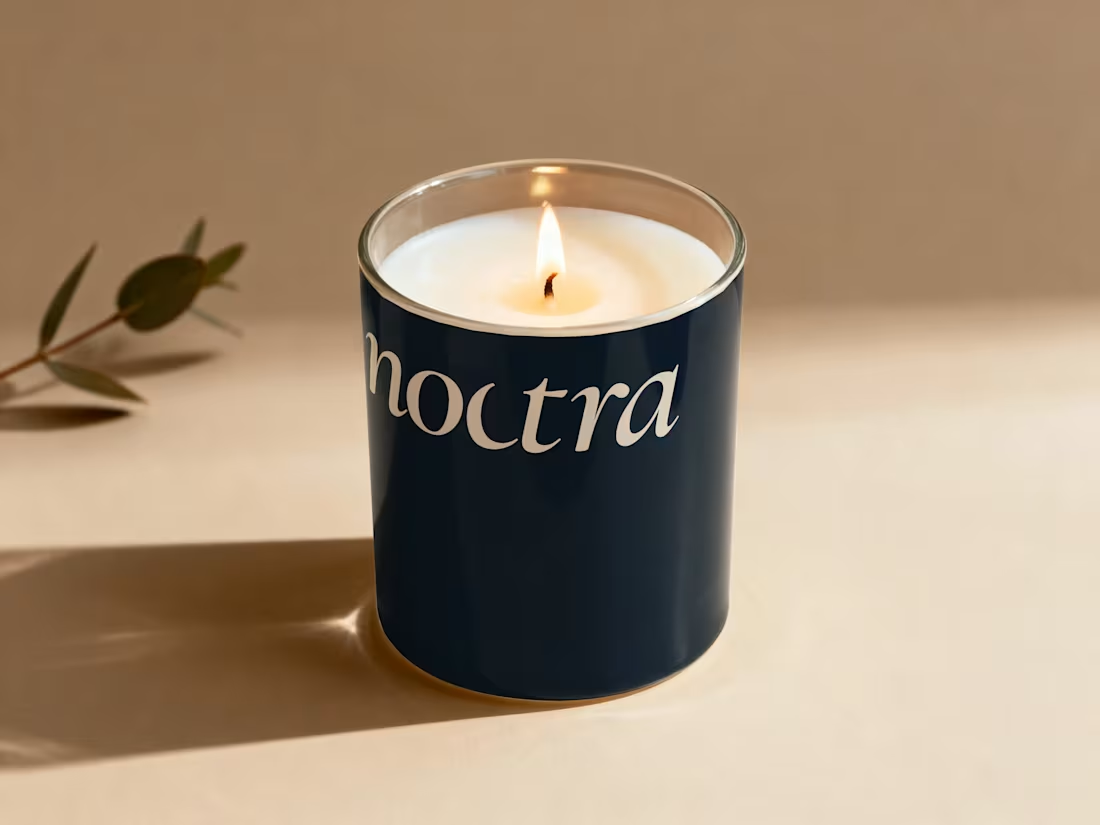
Noctra is a specialty coffee brand built for the quiet hours — the moments between dusk and dawn when the world slows down and you finally have time to just exist. In a market that shouts energy, speed, and productivity, Noctra whispers something different: stillness is not emptiness. Darkness is not absence. And a good cup of coffee deserves more than a rushed morning.
The goal was to build a brand that feels like the last hour before sleep or the first hour before the world wakes — warm, intentional, and deeply present.
6
9
214
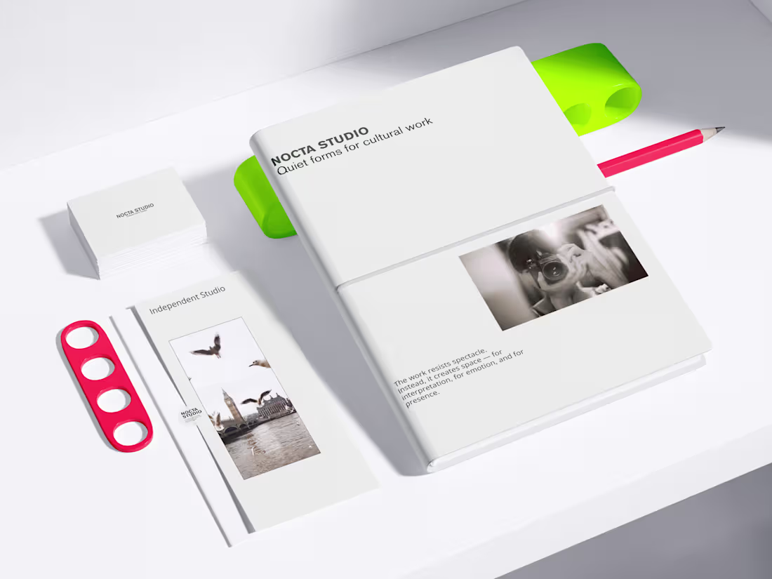
NOCTA STUDIO — Brand Identity & Editorial System
NOCTA STUDIO is a conceptual brand identity project for an independent cultural studio working with artists and filmmakers.
The identity is built around emotional restraint, clarity, and a system-driven approach to typography and layout. The goal was to create a flexible visual language suitable for editorial, print, and digital applications.
This project demonstrates my approach to minimal branding and content systems.
Services
Brand identity design
Editorial design
Visual systems for social & digital
Print & digital mockups
Check my full work
https://www.behance.net/anukumari4567
3
162
Minimal Brand Systems for Tech, Beauty & Food 🙌
This project explores minimal brand systems designed for clarity, consistency, and long-term use.
The focus is not on decoration, but on building flexible visual foundations that scale across industries.
The work covers technology, beauty, and food brands, unified by a calm, restrained design approach.
Objective
To design brand visuals that:
Reduce visual noise
Communicate purpose clearly
Adapt easily across digital and physical touchpoints
Each concept prioritizes structure, typography, and balance over trends.
This project is a personal exploration of system-driven branding and minimal visual communication.
Feedback and professional critique are welcome.
4
237
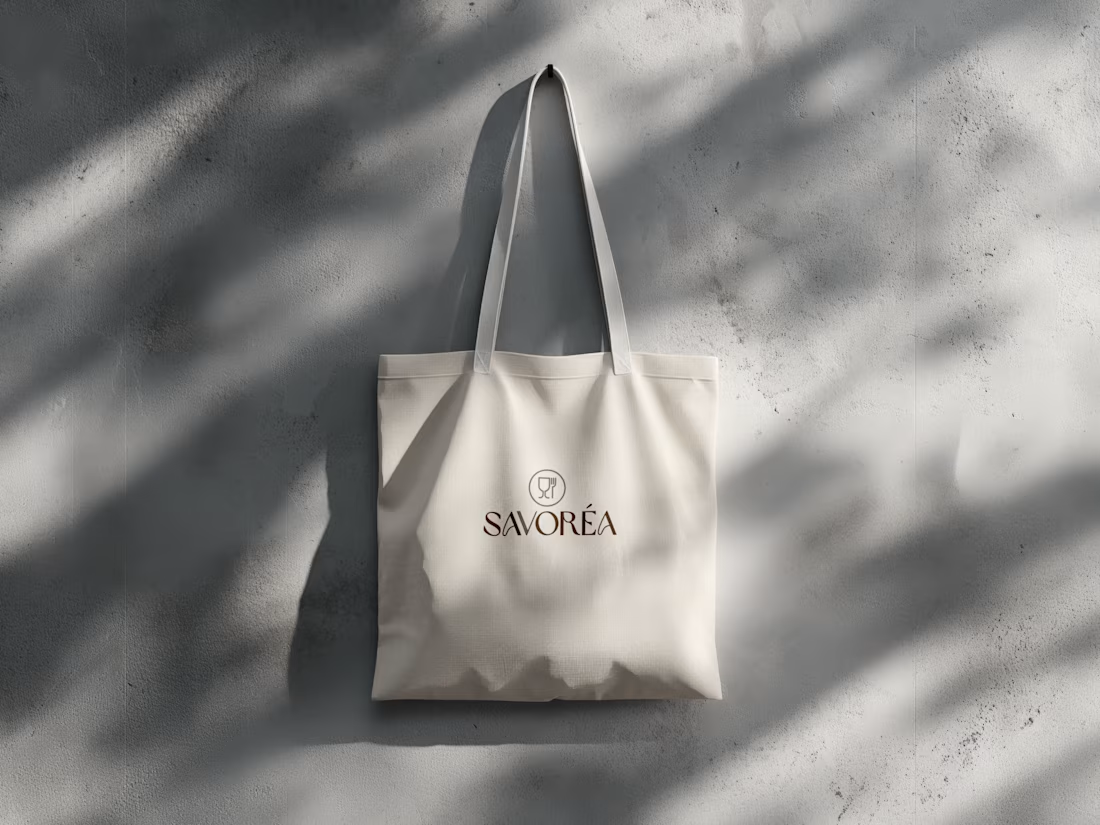
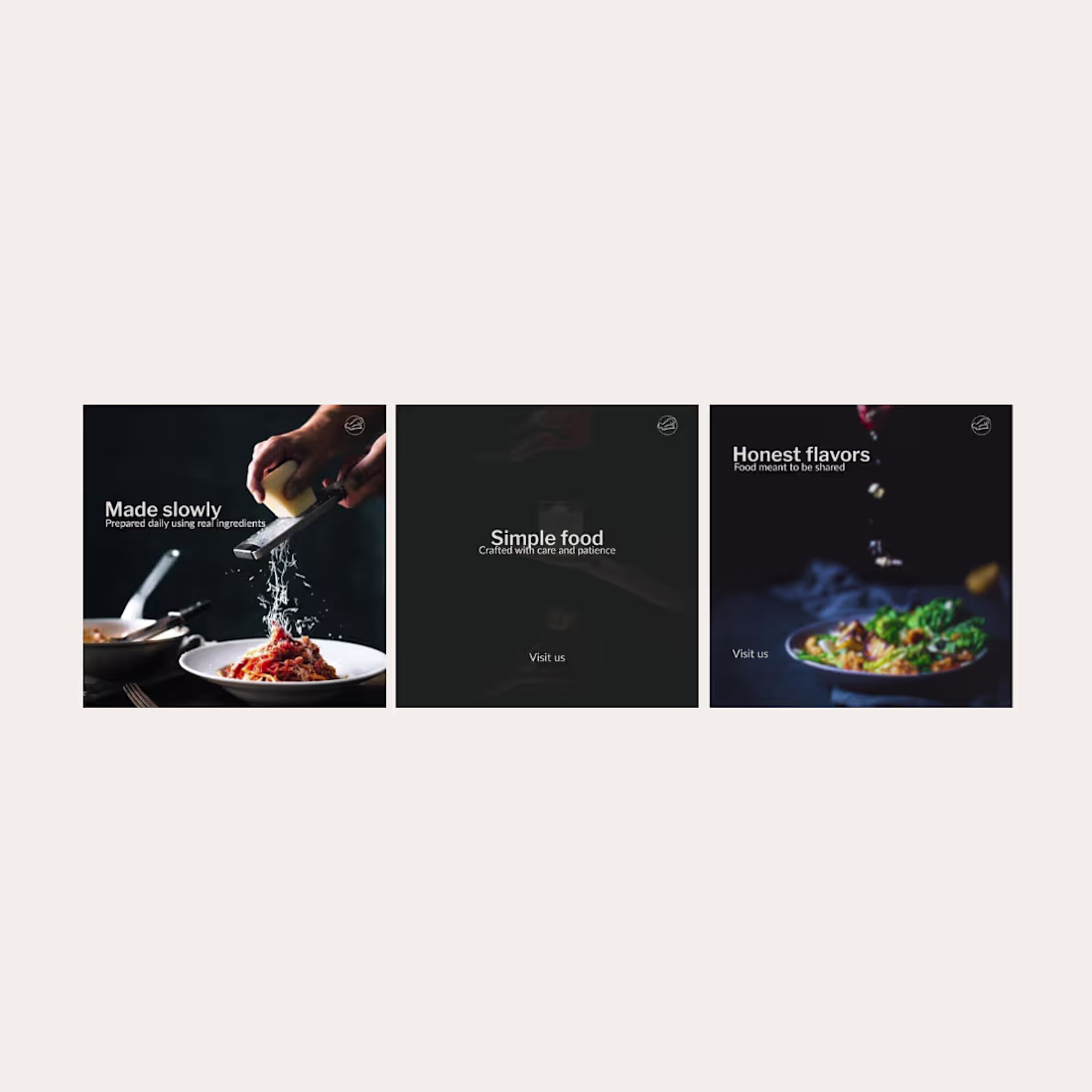
Food & Beverage Brand Identity & Marketing Design
This project focuses on creating a clean and consistent brand identity for a food & beverage brand, applied across both print materials and social media.
The goal was to build a simple visual system that ensures clarity, balance, and brand consistency across all touchpoints. The identity includes logo design, color and typography direction, print applications, and social media layouts, all developed with a minimal and professional approach.
The result is a cohesive branding system that supports clear communication and a strong, reliable brand presence.
6
12
306
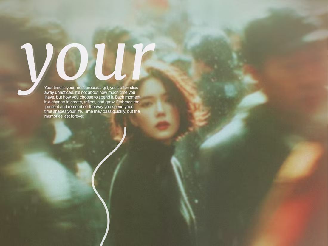
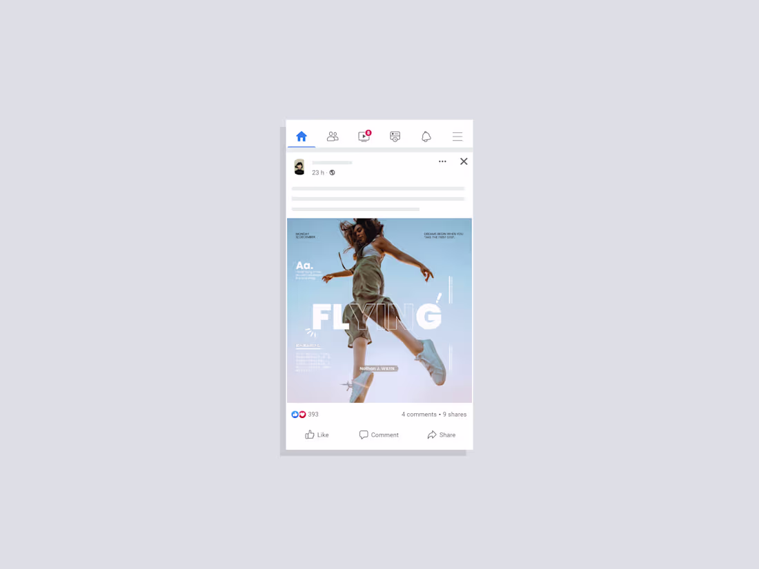
Animated Motion Poster Design — “Your Time”
A visually immersive poster brought to life through subtle animation.
The design uses a soft editorial aesthetic, warm tones, and expressive typography to create a calm but emotional atmosphere.
For the animation, I focused on:
— Soft depth movement in the background
— Maintaining clarity of the text
— Cinematic, minimal storytelling
— Smooth motion that enhances rather than distracts
This piece reflects my style: clean, emotional, typography-driven design enhanced with gentle motion.
Available for poster design, motion graphics, and creative brand visuals.
2
8
308
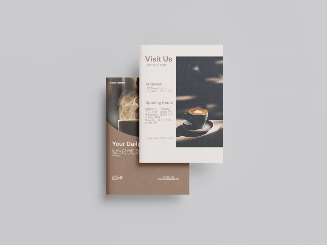
Brochure design for a cafe brand.
“A minimal, modern brochure design featuring clean lines, balanced layouts, and a refined aesthetic that reflects the café’s warm, contemporary atmosphere.”
3
230
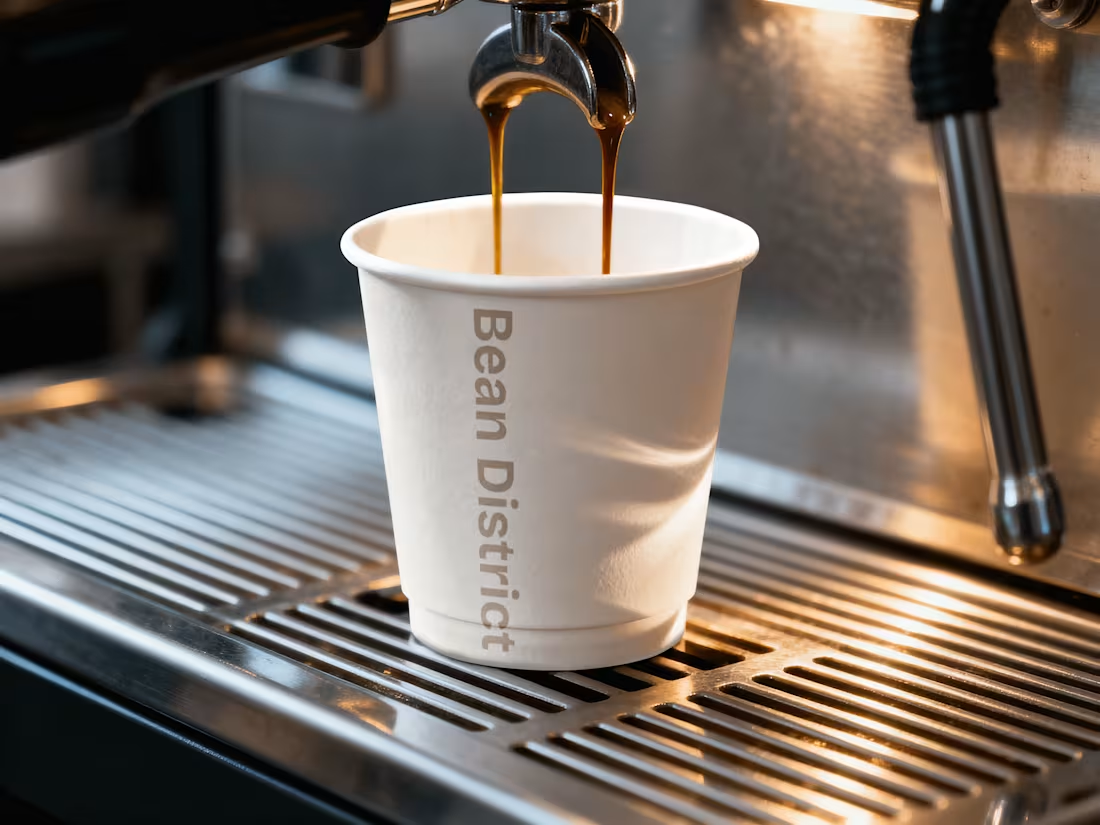
Minimal Café Branding: Before & After
A complete visual update for a café brand, built around soft neutrals, modern minimal typography, and warm textures.
This project includes a full before/after comparison, updated color palette, new type system, pattern alignment, posters, social content, brochure, and business card design.
The direction focuses on creating a calm, modern, and warm atmosphere — simple, clear, and cohesive across every touchpoint.
What I DO
✔ Before & After brand comparison
✔ Updated color palette
✔ Refined typography system
✔ Pattern + alignment style
✔ Posters
✔ Instagram post + story templates
✔ Brochure design
✔ Business card design
Check my full project on Behance:
https://www.behance.net/gallery/239844061/Minimal-Caf-Branding-Before-After
3
197
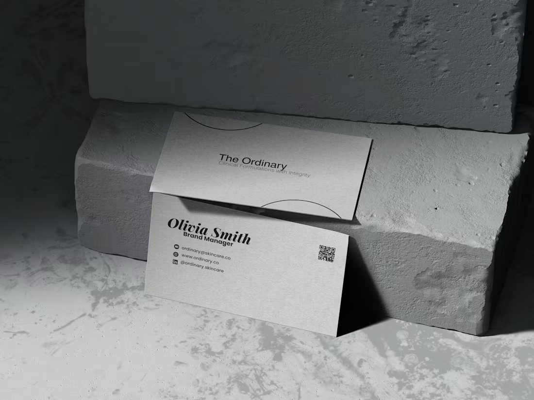
The Ordinary — Minimal Social + Print Campaign
Minimal, neutral-tone design campaign created for The Ordinary as an aesthetic brand study. Includes social media visuals, print ad, tri-fold brochure, and brand guideline sheet.
7
8
205

Behance
2
8
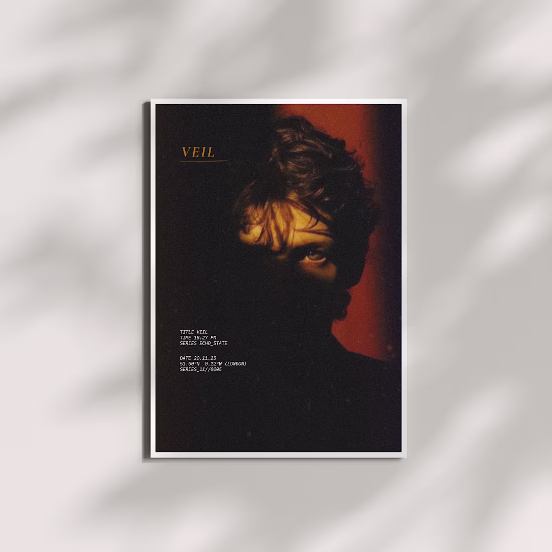
Experimenting with film-inspired grading and clean typographic layout. A simple portrait turned into a mood study.
A Lightroom color experiment: soft highlights, quiet shadows, and a minimal graphic touch.
2
4
218
This collection explores the relationship between form, balance, and visual emotion through a series of conceptual poster designs.
Each piece — from energetic event ads to calm, minimal brand visuals — captures a different side of design communication: motion, structure, simplicity, and storytelling.
The works combine Swiss design precision and Japanese minimalism with global contemporary aesthetics.
Every composition focuses on clear typography, strong grids, and intentional color psychology to evoke feeling and direction.
Through these posters, I aim to showcase how visual design can express identity, rhythm, and atmosphere without words — where geometry, space, and contrast speak their own language.
4
199