
Antoniya Kostadinova
UI/UX Designer | Visual Design & Branding
Ready for work
Antoniya is ready for their next project!


Brand Identity for Tereza Ignatova
0
5

CRISSAFLEURS Brand Identity Design
1
5
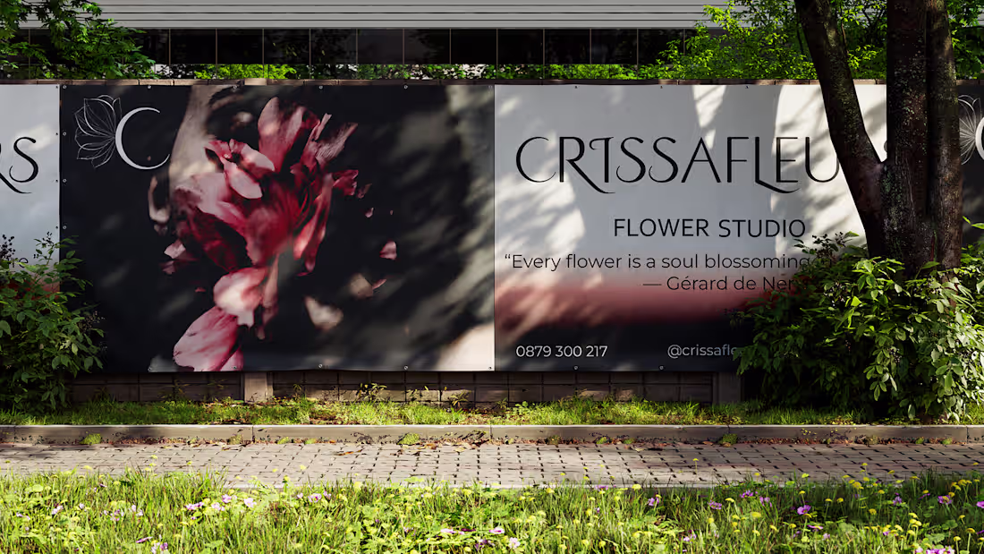
A contemporary flower brand identity built on pastel harmony, refined typography, and graceful visual storytelling.
Designed to bloom — everywhere.
2
225
Crissafleurs – Visual Identity & Logo Animation
This brand identity project explores pastel color harmony and fluid, fairy-like motion to express softness, elegance, and floral aesthetics.
The animation enhances the logo presence while preserving a minimal and refined visual language.😍
2
279