
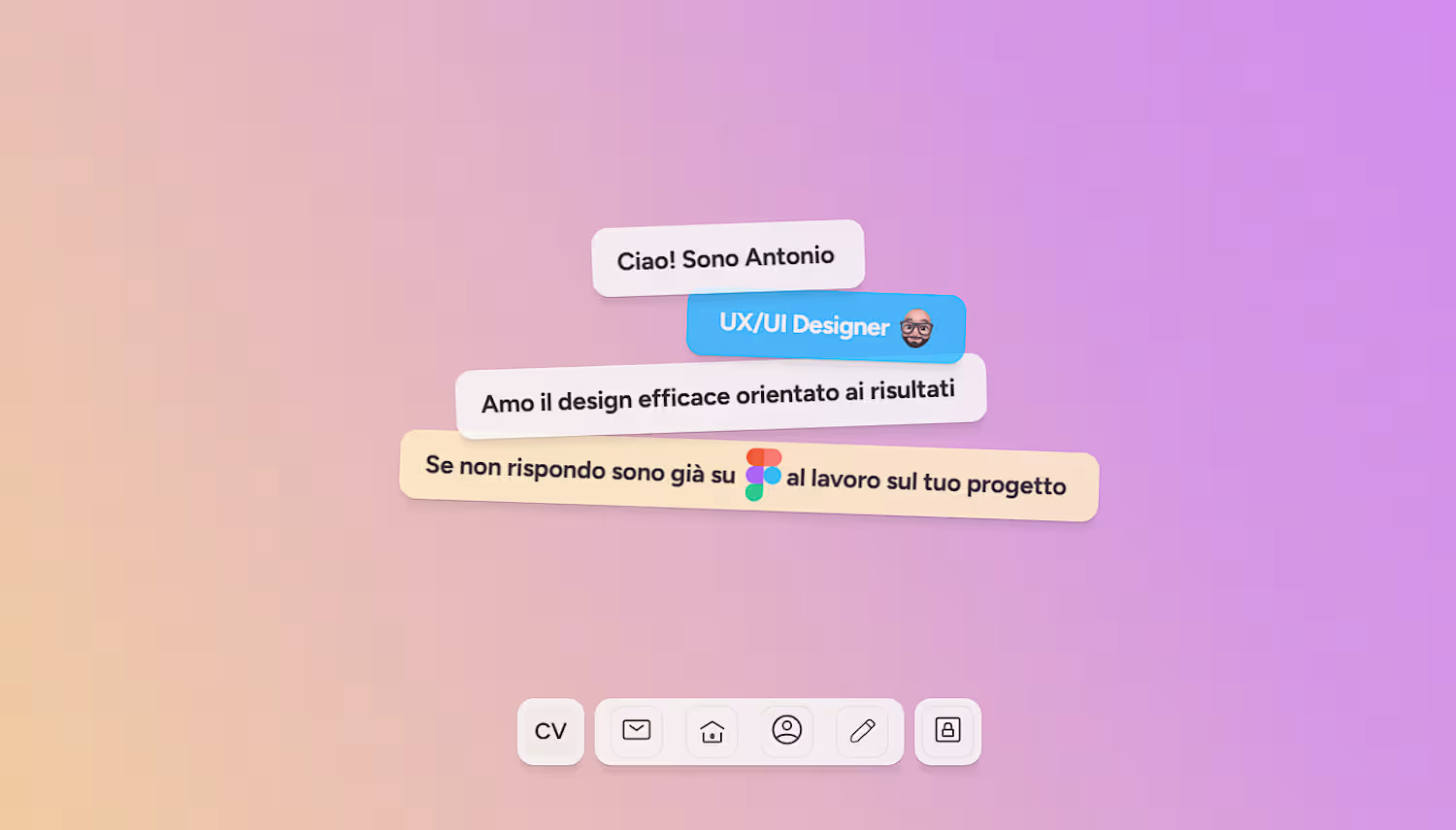
Antonio D'Addio
UX/UI Designer & Brand Designer and creative all of sort !
New to Contra
Antonio is building their profile!
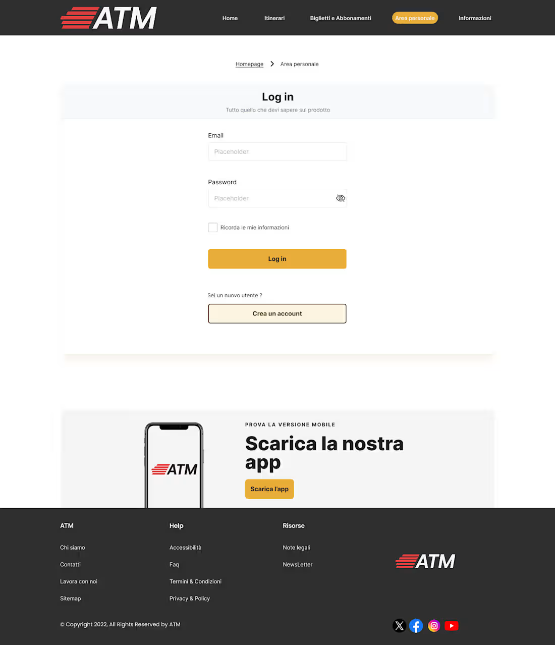
ATM: Redesigning Urban Mobility
A comprehensive UX/UI case study on Milan’s public transport digital ecosystem.
"This project involved a complete structural and visual overhaul of the ATM platform. The goal was to transform an information-heavy site into a functional, user-centric utility that simplifies daily commuting.
Key improvements featured in these screens:
Integrated Ticketing: I designed a seamless e-commerce flow, allowing users to purchase tickets directly—a feature previously missing from the web experience.
Intuitive Route Planning: Refined the journey planner with a focus on real-time feedback and visual clarity.
Accessible Tech Identity: Developed a clean, 'digital-first' aesthetic that complies with WCAG accessibility standards, ensuring the service is usable for everyone.
2
18
"In these prototypes, I focused on defining the tactile feel of the platform. The goal was to bridge the gap between a premium streetwear aesthetic and functional community features.
Specifically, you can see:
The 'Push' Interaction: A custom, Reddit-inspired mechanism designed for intuitive community engagement.
Seamless Onboarding: A fluid entry point that sets the brand's 'New Perspective' tone.
Dynamic Feed: A clean, responsive social-commerce experience where content and commerce coexist naturally.
By prototyping these micro-interactions, I ensured that every transition provides the satisfying feedback expected by a modern, tech-savvy audien
1
22
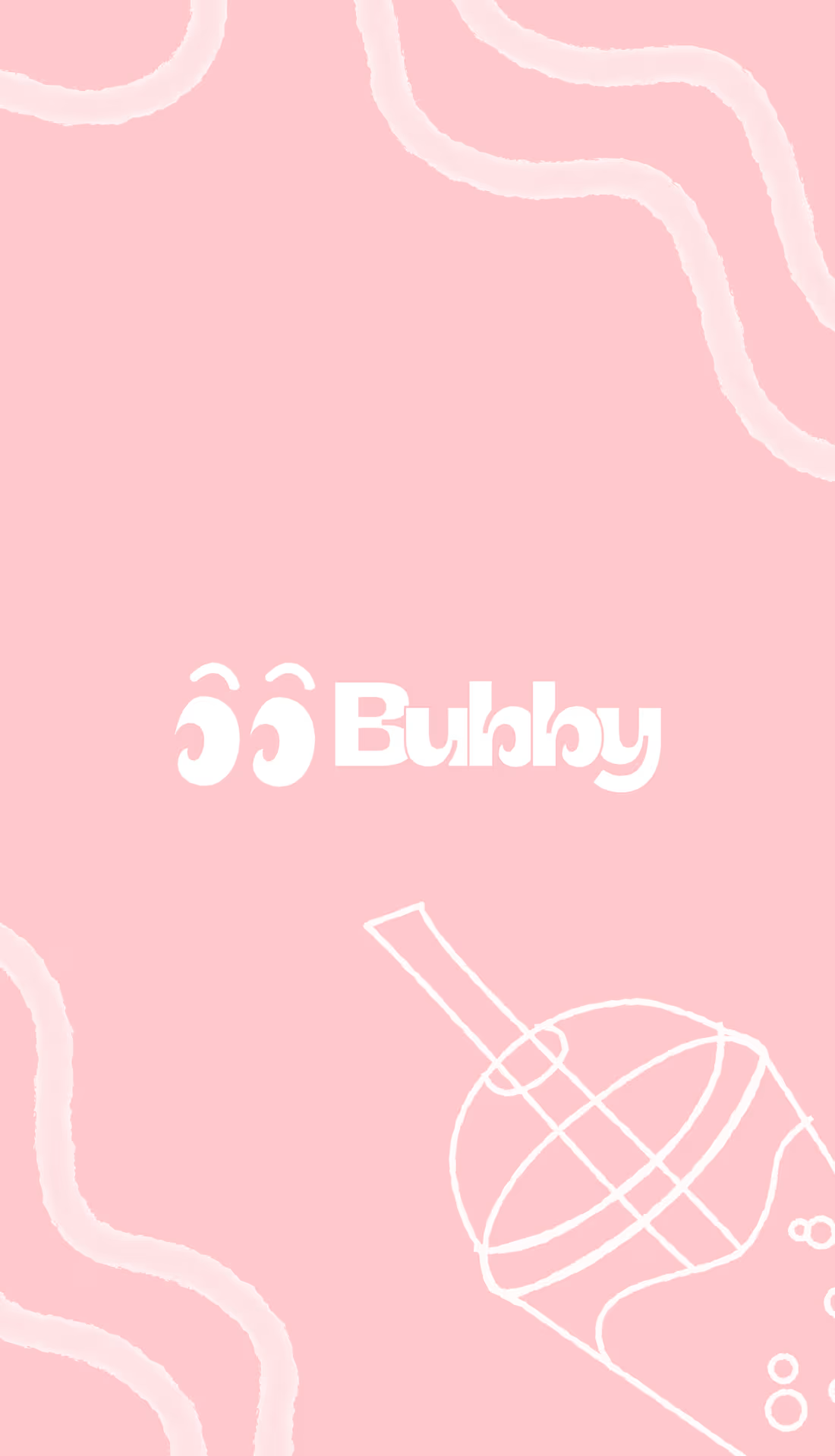
Overview
Bubby is a premium matcha brand born from the fusion of "Buddy" and "Bubble". Bubby positions itself as your "new best friend" in beverage form. The project focused on building a vibrant, community-first visual identity that swaps Zen minimalism for high-energy Gen Z appeal.
Challenge
Defining a brand identity that feels both "premium" and "approachable." The challenge was to create a visual language that felt like a friendship: reliable in quality but fun and informal in execution, centered around a bespoke character.
2
3
54