
pro
Anna Sobieniak
Strategic design for businesses ready to stop blending in.
Ready for work
Anna is ready for their next project!
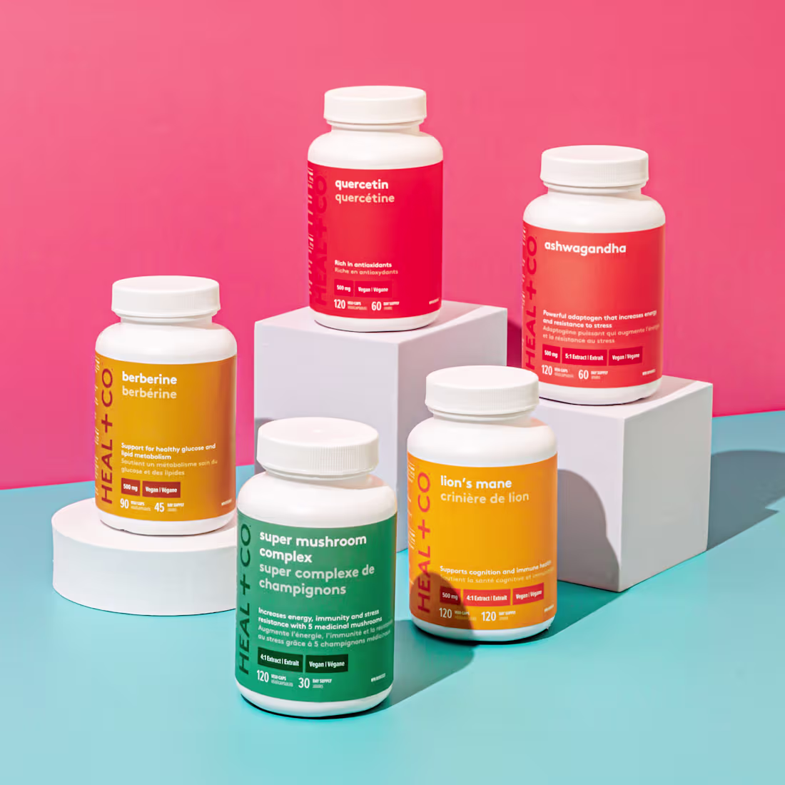
Heal & Co. Packaging & Brand Design
0
2

AG Executive Search – Brand Identity & Website
1
1
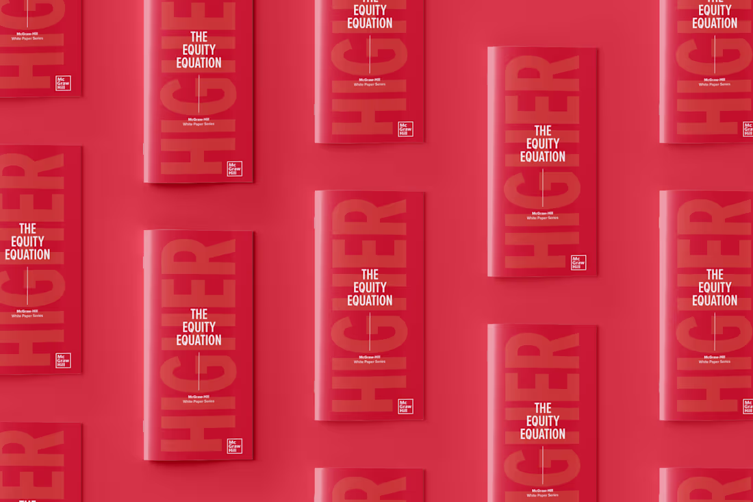
McGraw Hill Whitepaper Design
0
1
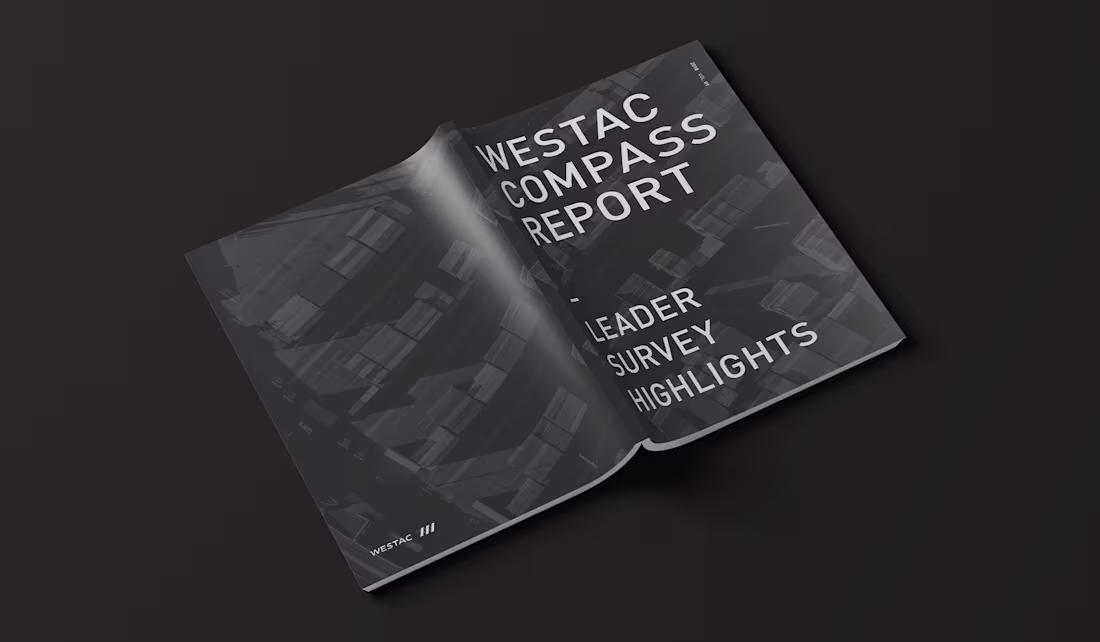
Westac Report Design
0
1
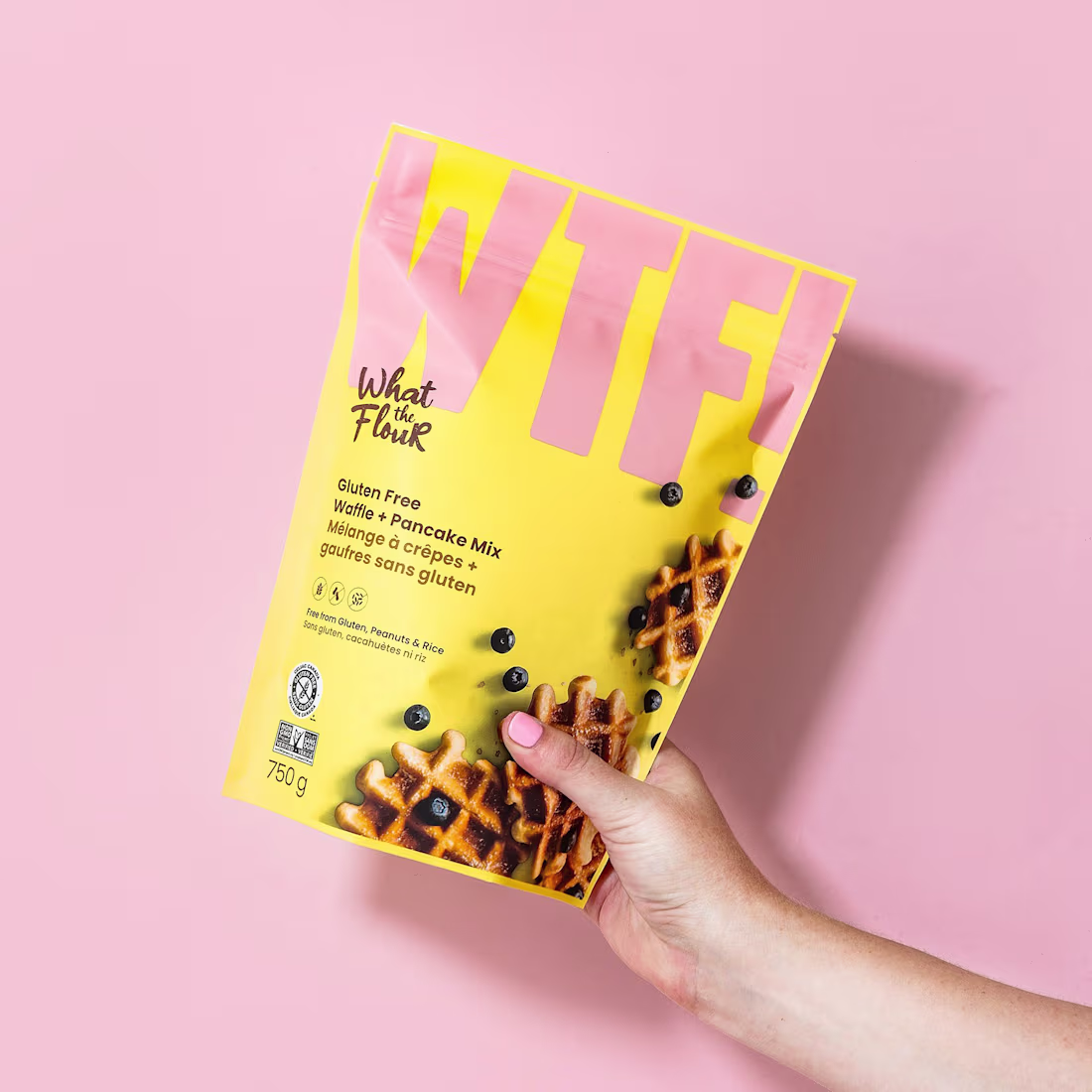
What the Flour - Brand Identity & Packaging
0
1

Whistler Cannabis Co. - Brand Identity & Packaging
1
2
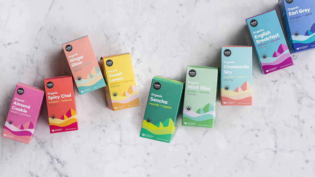
Tealish - Brand Refresh & Packaging
0
1
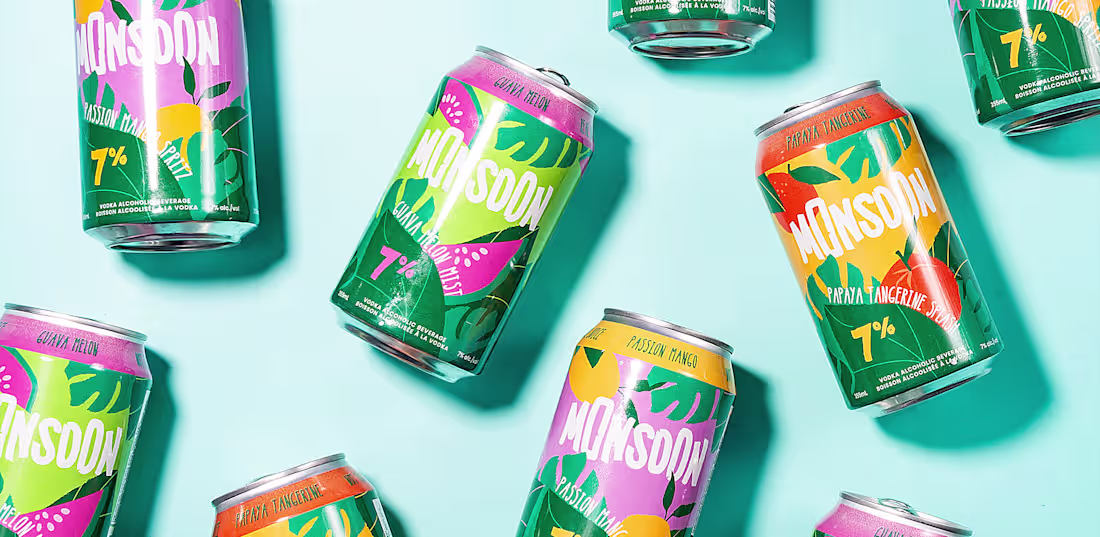
Monsoon - Packaging Design
0
2
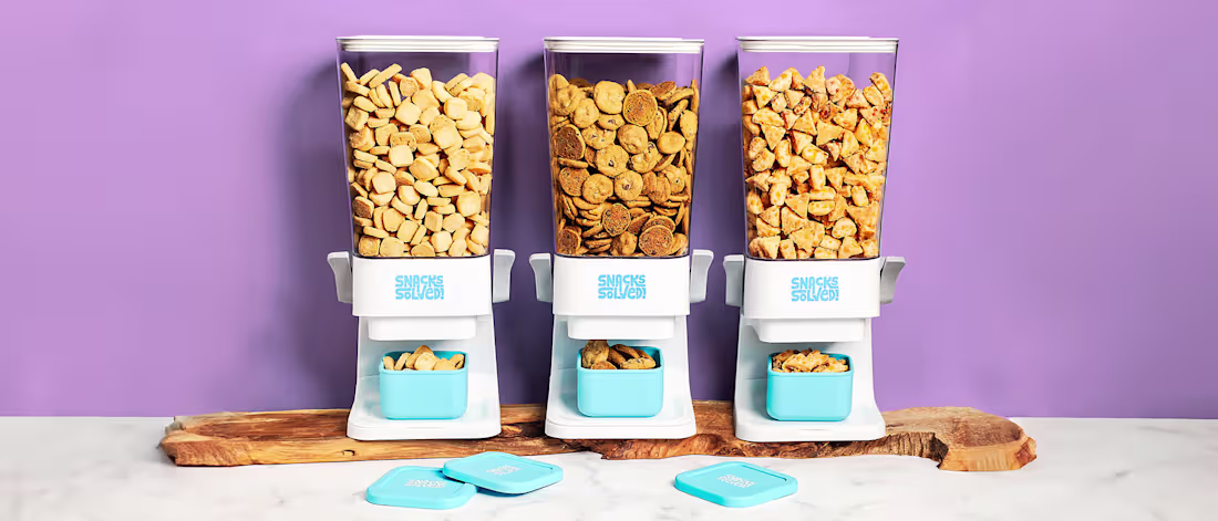
SnacksSolved - Brand Identity
0
3

Superfun - Brand Identity & Packaging
0
1
Ecosign - Brand Refresh & Website
0
2
Brahmi Skincare Brand Identity & Website
0
2
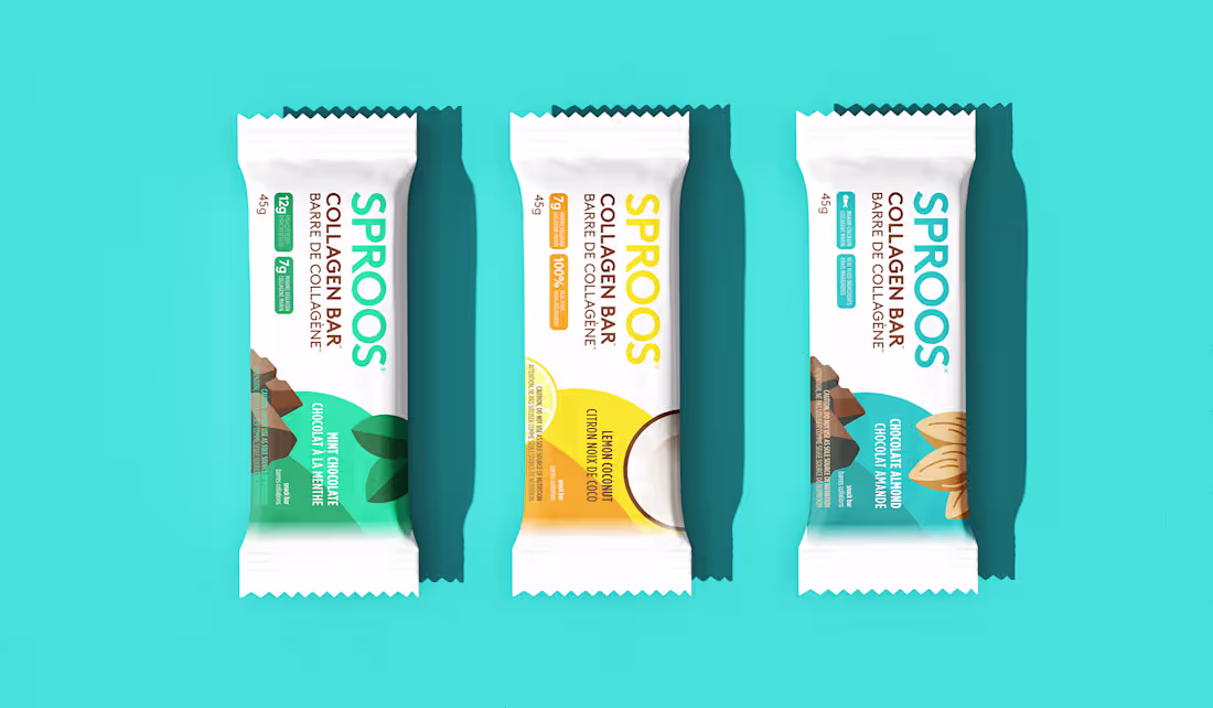
The supplement market's never been more crowded. Sproos saw an opportunity to stand out with simplicity and a smile - be the fresh, friendly collagen for everyone.
We captured this through clean, bright design, delightful illustrations, big clear fonts, and refreshingly direct messaging. The goal was to catch eyes on crowded shelves and show people an easy way to discover first-rate collagen.
Starting with three foundational products, we've helped Sproos diversify to a dozen products including superfoods - maintaining the same colorful, positive approach throughout. Such a joy watching this brand grow.
Deliverables: Brand identity, packaging system for 12+ SKUs, custom illustrations, brand guidelines. wearesobi.com (https://wearesobi.com/)
14
93
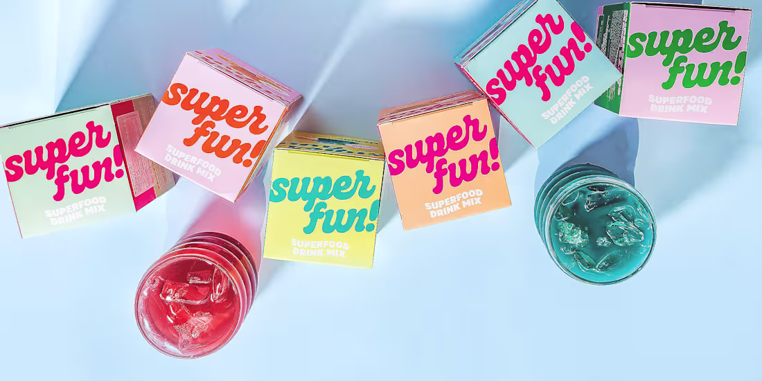
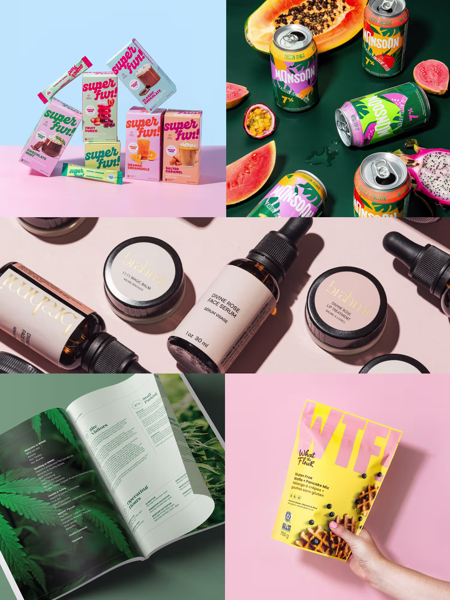
Benefit-packed functional superfoods in retro flavors and day-glo colors... like a soda fountain in a health food store! We leapt at the chance to make this brand as much of a treat to look at as it is to sip.
Our moodboard overflowed: nostalgic flavors, superfood goodness, sparkle, sun, and most of all, fun. I designed a vintage-feel logo that practically smiles, then created custom product photography using funky glassware that made those colorful beverages pop. The website continued the party with lively pastel settings and playful details.
The goal? Stand out from the earnest good-for-you crowd while staying super-authentic - perfect for wellness-minded consumers who still crave a sweet treat.
Deliverables: Brand identity, packaging design, custom photography, website design, brand guidelines.
13
91
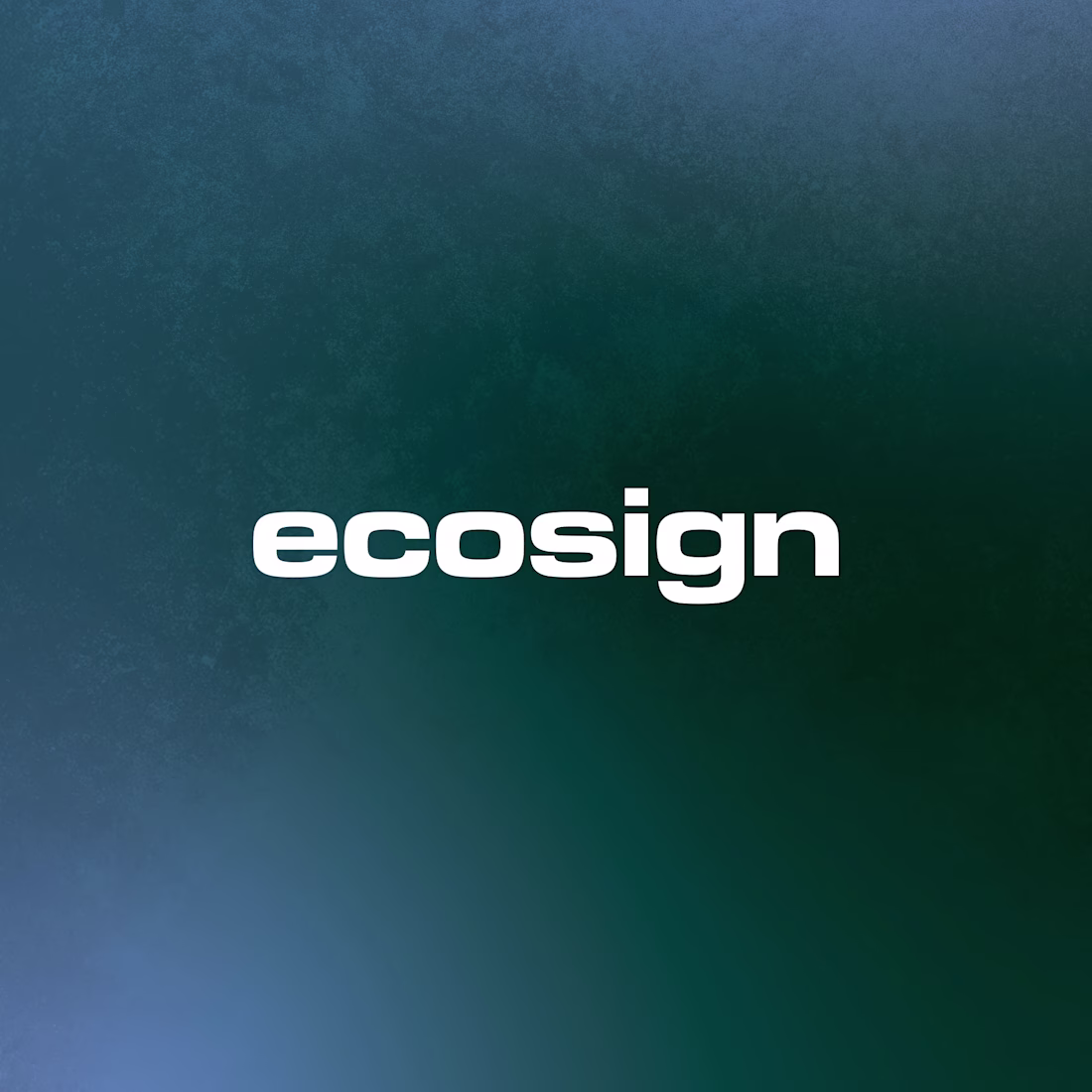
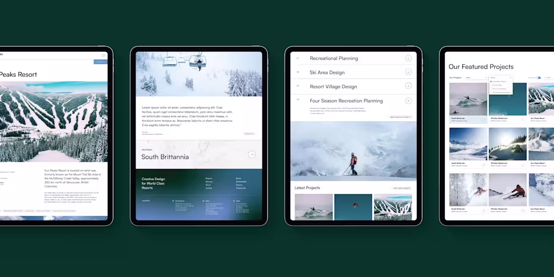
In 1975, two firsts launched the Whistler phenomenon: Canada's first resort municipality, and Paul Mathews starting Ecosign, a mountain resort planning firm. Much of Whistler - like the Peak to Peak Gondola - has been imagined by Ecosign. 1,000+ global projects later, they asked us to make their brand as world-class as they are.
Two truths led this facelift: despite their reputation, these are down-to-earth people, and the very best always understate. We created an international, up-to-the-minute look with fresh outdoor feel - all deep woods and white slopes.
What an honor helping Ecosign enter their next half-century looking like the icons they are.
Deliverables: Brand refresh, website design, brand guidelines, presentation templates.
0
21
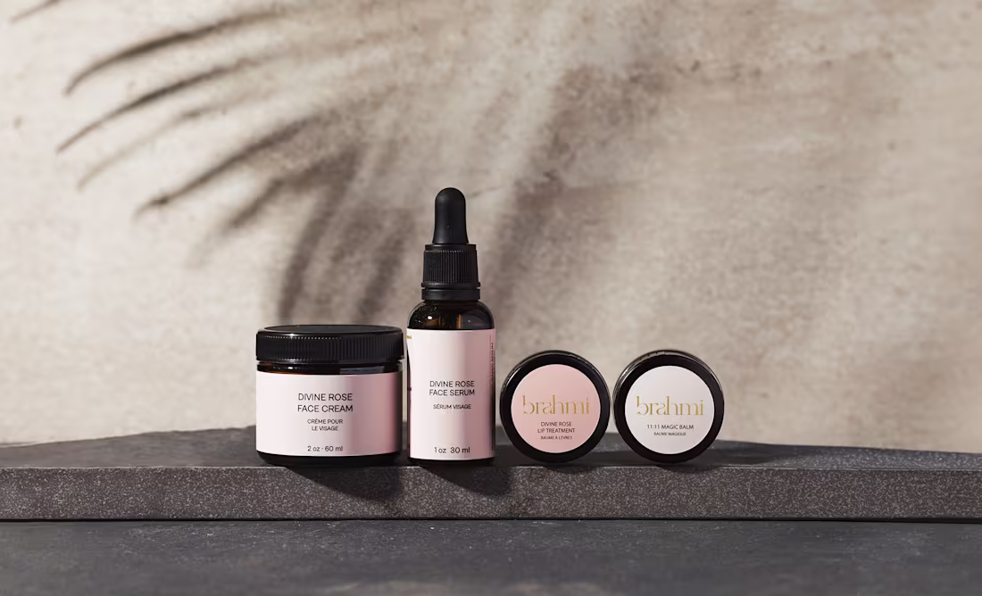
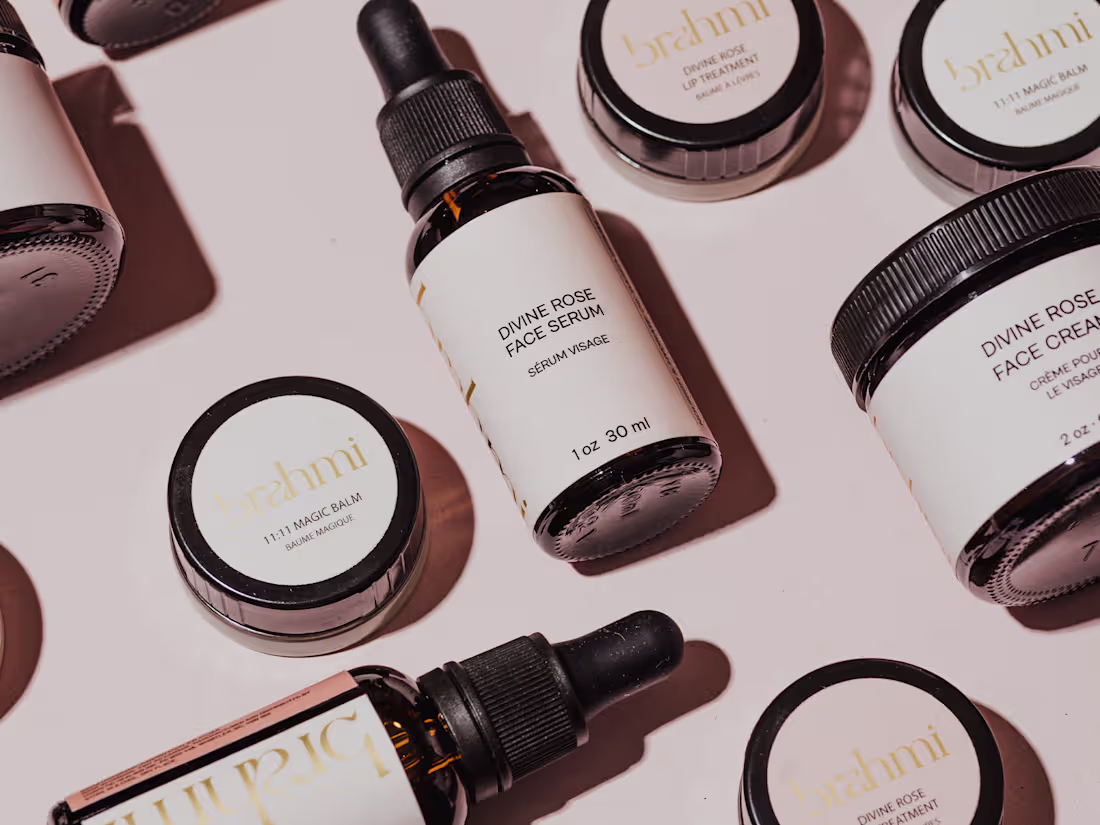
"Beauty is falling in love with yourself." Founder Lily Chandra lives this philosophy completely - hand-making her skincare, offering meditations, even modeling for her own brand at 48 without makeup.
The refined wordmark speaks to Lily's Indian heritage, while gold gradients and soft cream colors suggest luxurious quality. But here's what made this special: her tagline is "Where beauty meets spirituality," and we designed the entire experience around that synergy.
The website presents carefully produced audio recordings of Lily's guided meditations for a truly holistic skincare ritual. The layout gives her endless opportunities to share her wisdom, making the whole experience as nurturing as the products themselves.
Deliverables: Brand identity, packaging design, website design with audio integration, brand guidelines.
27
156
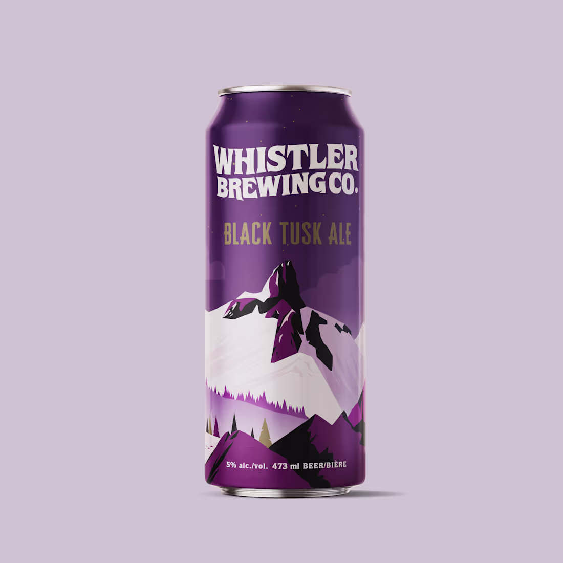
Whistler is a legendary brand, so its namesake brewery has a lot to live up to. In the ultra-competitive craft beer world where can design rivals the brews themselves, every package must convey distinctiveness and quality in a single glance.
We approached each beer as a unique recipe - rich illustrations of Whistler's outdoor opportunities recalling classic travel posters, personality-filled fonts capturing each flavour's spirit, and eye-catching layered design.
The result? Packaging that actually stands out on crowded shelves while honouring Whistler's iconic brand equity.
Deliverables: Packaging design system, custom illustrations, label templates, production files. wearesobi.com (https://wearesobi.com/)
1
13
92