Anirban sarkar
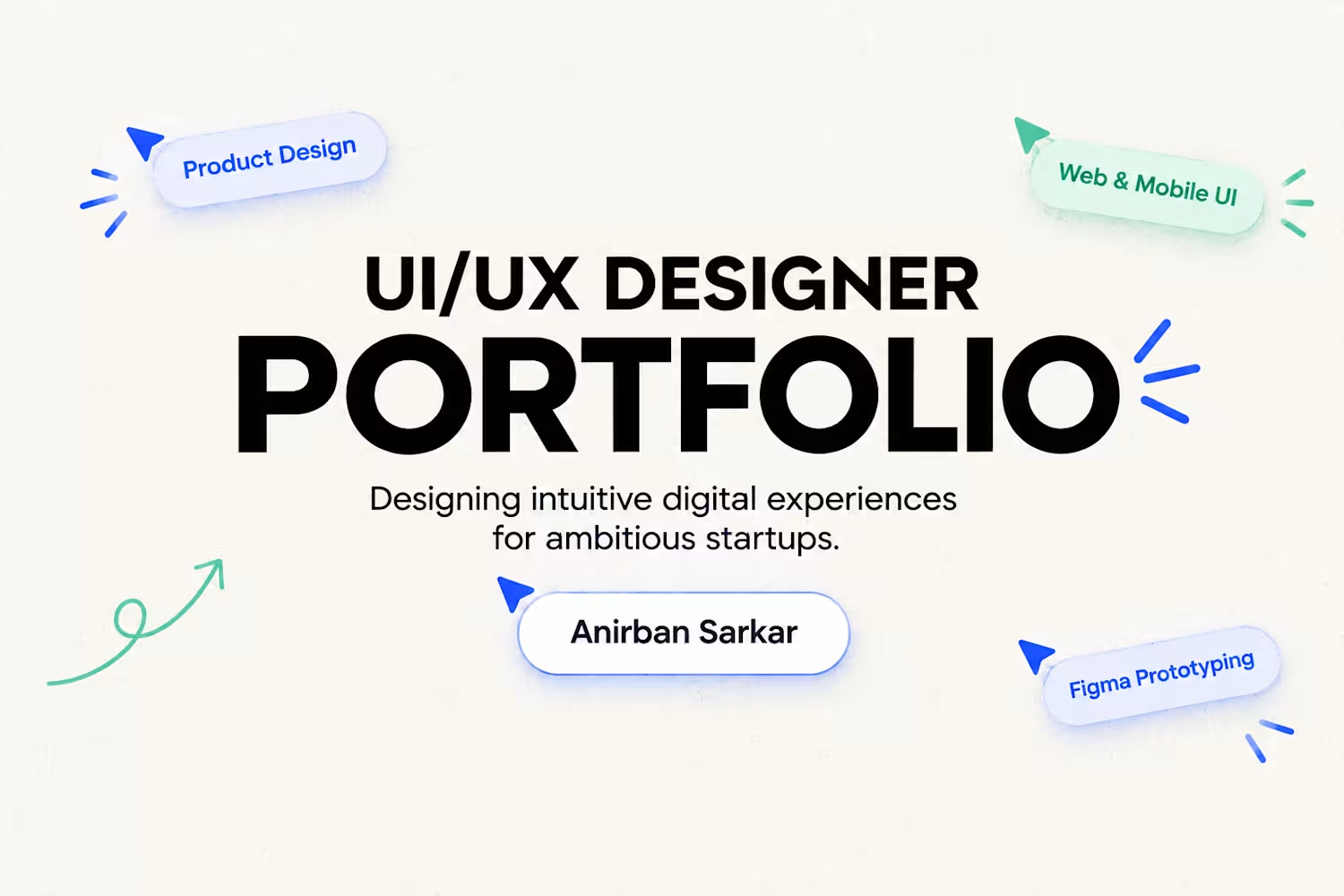
UI/UX & web designer turning ideas into intuitive products.


AuraSaaS: Revenue Analytics Dashboard
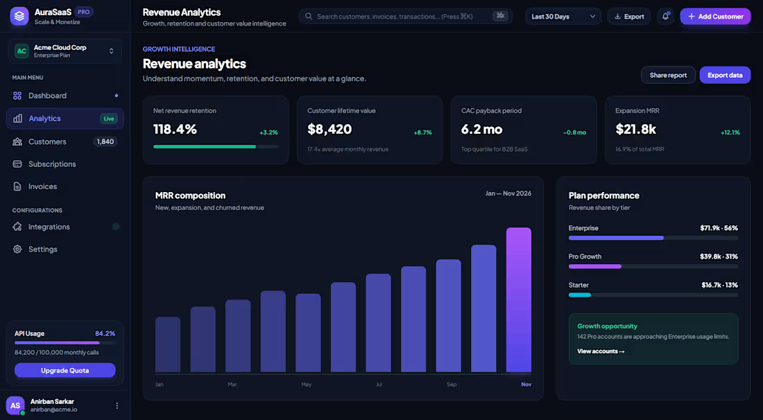
A dark-mode analytics screen for a subscription SaaS product. It shows a team’s revenue health at a glance and points them toward the next growth opportunity.
Layout and navigation: A fixed left sidebar holds the workspace switcher (Acme Cloud Corp, Enterprise Plan) and the main navigation: Dashboard, Analytics, Customers, Subscriptions and Invoices. Integrations and Settings sit under a separate Configurations group. At the bottom are an API usage meter (84.2% of the monthly quota) with an “Upgrade Quota” call to action, and the user profile. The top bar has global search with a ⌘K shortcut, a date-range filter, Export, notifications and a primary “Add Customer” button.
Key metrics: Four KPI cards lead the page: Net Revenue Retention (118.4%), Customer Lifetime Value ($8,420), CAC Payback Period (6.2 months) and Expansion MRR ($21.8k). Each has a trend indicator in green and a short line of context, such as “Top quartile for B2B SaaS”, so the numbers read as insight rather than raw data.
Data visualization: The MRR composition chart shows steady month-over-month growth from January to November. The latest month is highlighted with a bright violet gradient so the eye lands on the current period. Beside it, a Plan Performance panel breaks revenue down by tier (Enterprise 56%, Pro Growth 31%, Starter 13%) using color-coded progress bars.
Actionable insight: A “Growth opportunity” card calls out that 142 Pro accounts are approaching Enterprise usage limits, with a “View accounts” link. This turns the dashboard from a reporting tool into one that prompts action.
Visual design: A deep navy base with indigo and violet accents, green for positive signals, rounded cards with subtle borders, and clear typographic hierarchy. The result is a modern, focused interface that keeps dense data readable.
1
0
6
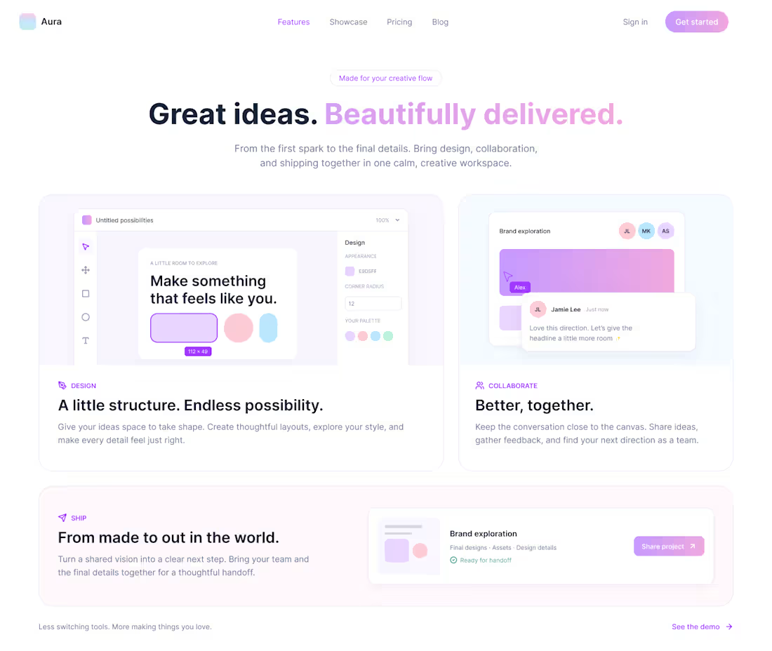
Aura is a conceptual website and onboarding experience for a creative collaboration platform, designed for teams who care about aesthetics. This UI/UX project covers the full journey from first impression to account creation: Home, Showcase, Pricing, Blog, Sign in and Get started. It uses a calm, pastel visual language and clear, low-pressure messaging to make a collaborative design tool feel welcoming and easy to understand.
0
13
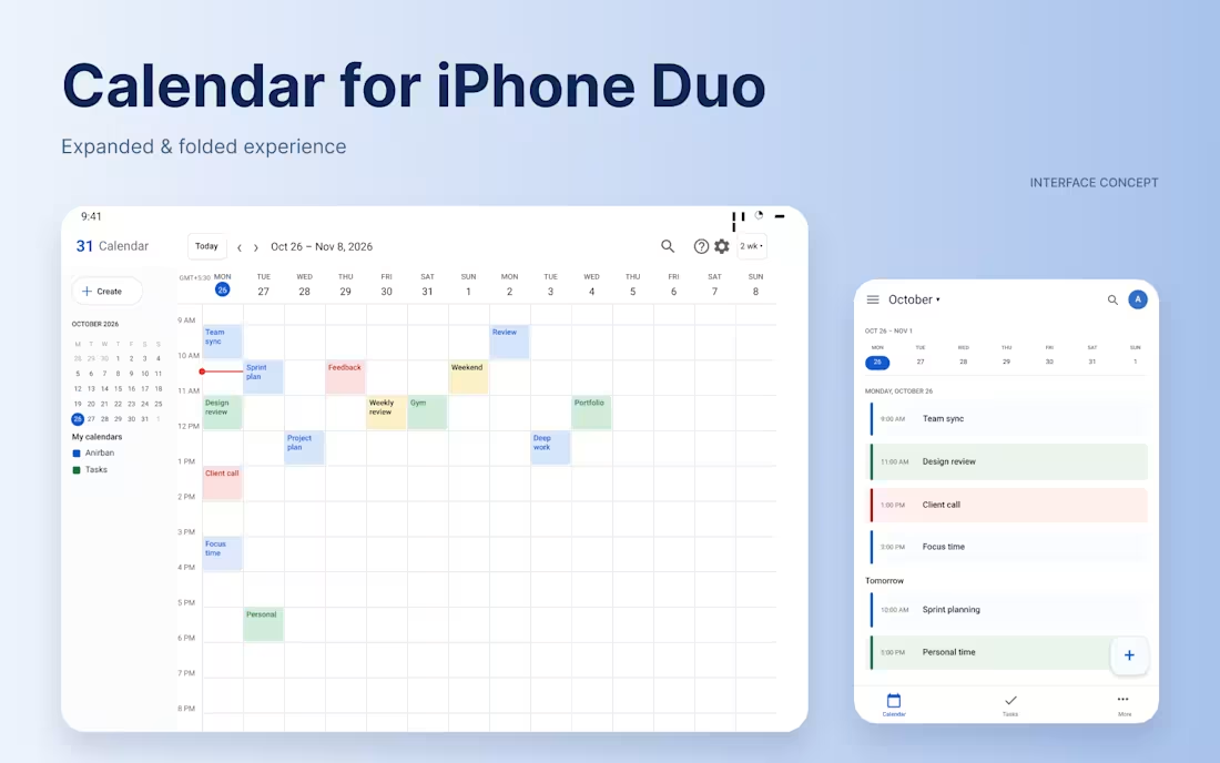
An exploration of integrating Google Calendar into the DUO dual-screen device experience. This concept brings calendar views, weekly schedules, event details, and event creation into a cohesive interface designed for both expanded and folded screen states.
The design focuses on clear information hierarchy, intuitive navigation, and a consistent experience across different device configurations, while maintaining the familiar Google Calendar visual language.
0
26
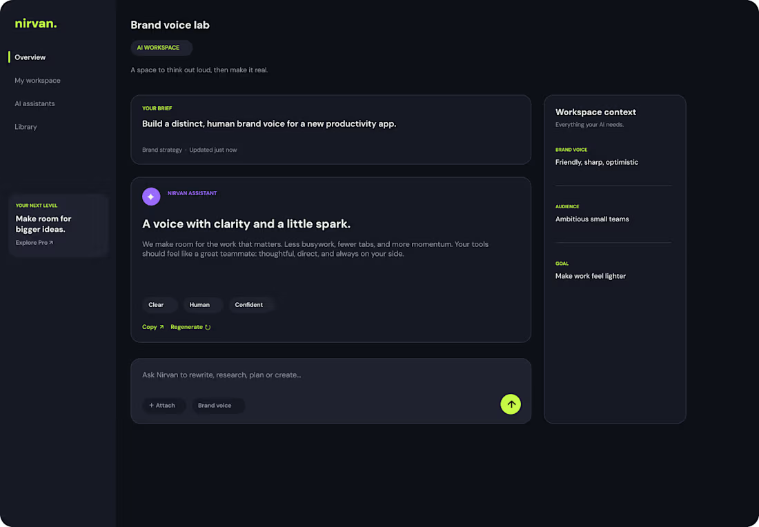
NIRVAN — AI Productivity Platform
A sleek, modern AI-powered productivity platform UI kit designed to streamline workflows, manage daily tasks, and seamlessly integrate smart AI teammates into your daily routine. Crafted with a sophisticated dark-mode aesthetic, clean auto-layouts, and fully structured components, NIRVAN is built for designers, creators, and teams looking to prototype next-generation SaaS applications effortlessly.
Highlights:
Fully articulated desktop overview dashboards & activity streams
Smart AI teammate and automation widgets
Clean auto-layout structure & organized layer hierarchy
Feel free to duplicate, explore, and use it as a foundation for your next productivity or AI interface project!
1
46