
Andjela Jovanovic
Art Director // conceptual brand campaigns and editorial.
New to Contra
Andjela is ready for their next project!
Comeback campaign for Slurp Laboratories - Clearing the Air
After a long pause, Clearing the Air marked the return of Slurp Laboratories with a complete product relaunch and a refreshed visual identity.
The campaign was built around the idea of transparency, renewal, and moving forward - reintroducing the brand through new packaging, a refined creative direction, and a clear narrative that acknowledged the hiatus while looking ahead.
I led the project from concept to launch as Creative Director and Producer, developing the campaign strategy, overseeing production, and directing the photoshoot. From the visual language and storytelling to the final launch assets, every touchpoint was designed to make the relaunch feel intentional, cohesive, and true to the brand.
1
1
32
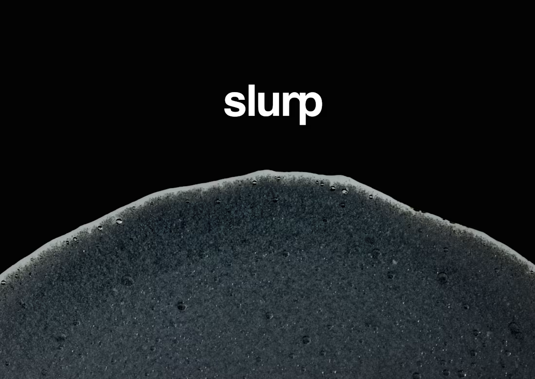
Slurp Laboratories - Brand Identity and Guidelines
2
1
40
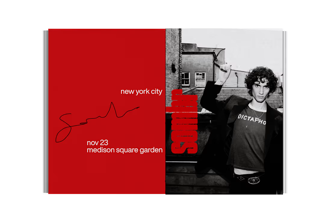
Editorial Zine Merch
0
43
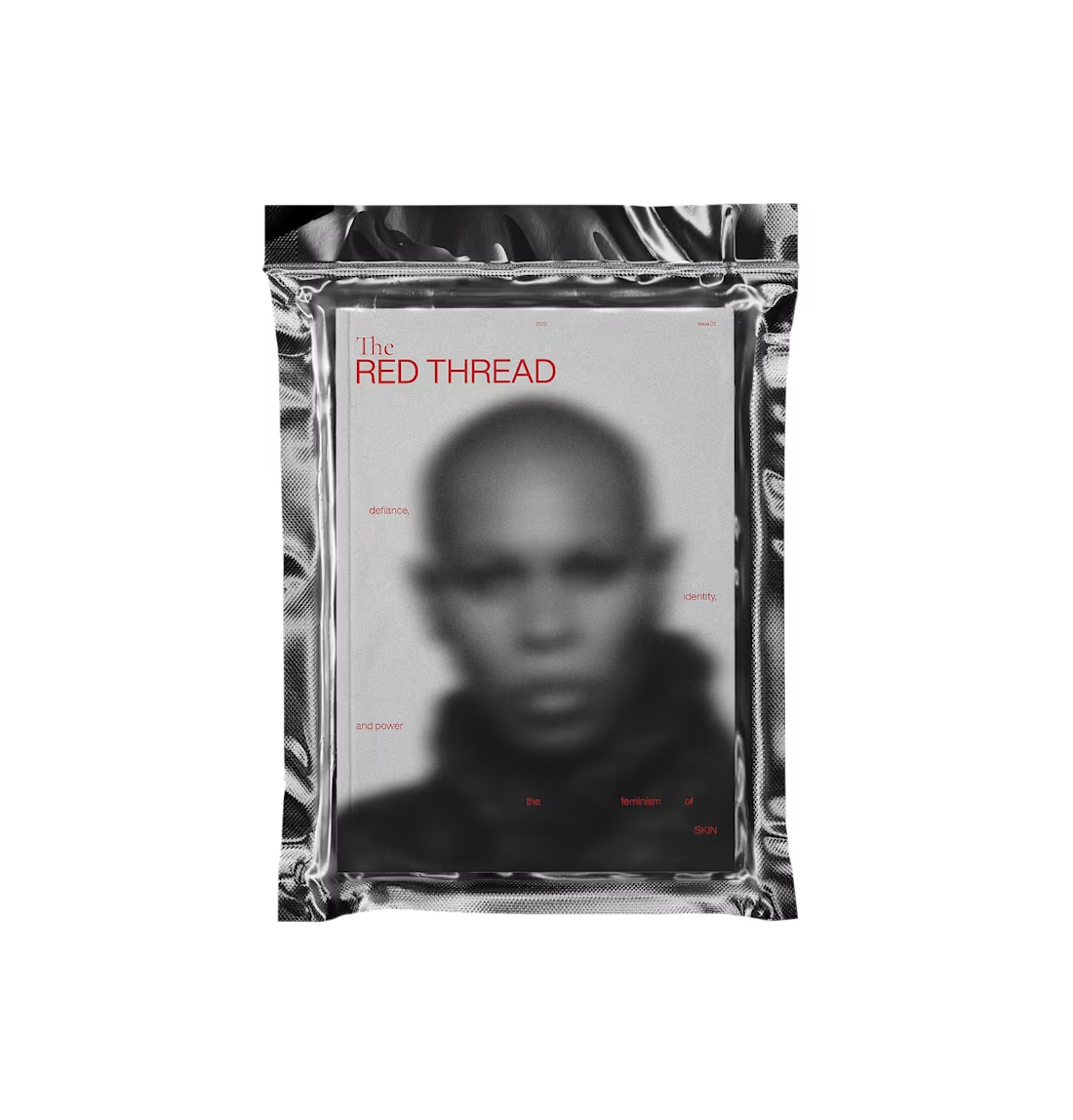
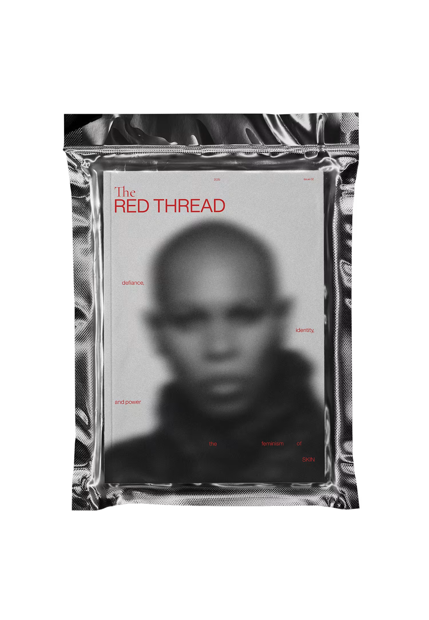
The Red Thread is an avant-garde feminist magazine that explores themes of resistance, identity, power, and emotion through a raw and atmospheric editorial approach. it’s a space where design meets activism, where storytelling is as much about aesthetics as it is about meaning. each issue dissects different aspects of feminism — rage, rebellion, resilience, identity, power, autonomy, etc. — through a mix of visual and textual narratives.
the magazine takes its name from the symbolic “red thread” found across cultures: a connector of fate, a sign of resistance, a bloodline of history. here, it represents the unbroken line of feminist struggle, the emotional and political ties between women, and the inescapable connection between personal and collective liberation.
1
74
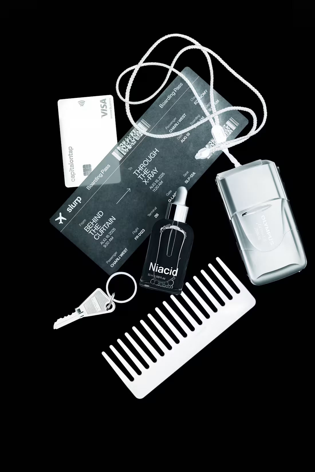
“Through the X-Ray” is a brand campaign built around the idea of radical transparency. After a period of silence, Slurp chose to return not with noise, but with clarity, laying everything out, holding it up to the light, and asking: what do you actually see?
2
2
110