
pro
Ana Sofia Rodriguez
Translating ideas into clear, intentional visual systems.
New to Contra
Ana Sofia is ready for their next project!
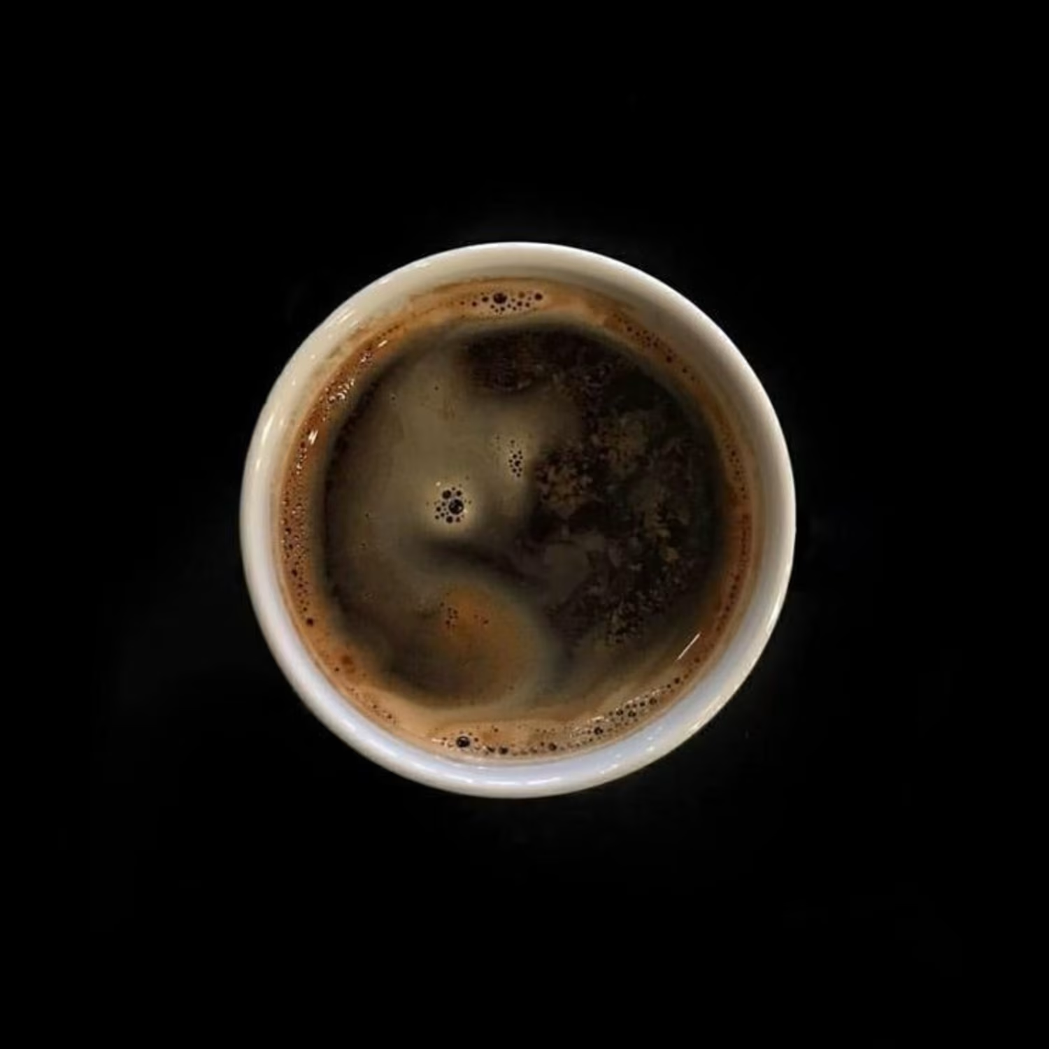
María Castañó Ceramica
Brand Identity System — Case Study
Services: Brand strategy · Visual identity · Brand book
Year: 2026
Category: Branding
The brief
María Castañó makes ceramic objects by hand — pieces that carry weight, texture, and the memory of the process that created them. Her work had found an audience, but her visual presence didn't reflect the intention behind the objects. There was a gap between the depth of her practice and how she was showing up: no consistent identity, no language to describe what made her work different from other ceramics studios.
She needed a brand that could hold that depth without flattening it.
The challenge
The ceramics market is crowded with a particular aesthetic — neutral tones, rustic textures, artisanal warmth. The risk was building a brand that looked like everything else in the category: beautiful, but generic.
María's work is not generic. Each piece is born from a personal decision. She doesn't replicate styles or follow trends — her process is a commitment, and the objects carry that responsibility. The brand needed to communicate exactly that: not craft as aesthetic, but craft as ethics.
The second challenge was tone. María doesn't sell urgency or impact. Her language is slow, material, honest. The brand had to speak that way too — no excess, no decoration that doesn't earn its place.
The approach
I started with the brand DNA: identifying the pillars that would protect the project's core objective regardless of where it showed up. Three emerged clearly:
Autoría consciente — Every piece is authored, not manufactured. The maker's presence is not incidental, it's the point.
Materialidad — The material is not a neutral medium. Clay has weight, memory, limits, and possibilities. The brand needed to respect that specificity.
Intimidad compartida — The relationship between maker and user is private and ongoing. These aren't decorative objects; they integrate into daily life with discretion and purpose.
From those pillars, the positioning took shape: Dar lugar a lo que merece permanecer — making space for what deserves to last.
The identity
The visual system was built around restraint. A color palette anchored in warm earth neutrals with a CMYK base (45 / 37 / 43 / 4) that reads as neither cold nor saturated — materials, not moods. Typography that favors weight and negative space over decorative detail.
The tone of voice follows the same logic: calm, attentive, unhurried. Language that doesn't chase immediate impact or excess words. It prefers clarity, a measured pace, and leaves room for the person to find their own reading.
Taglines developed for use across social, web, and product contexts:
Belleza que se habita
Lo sencillo permanece
Donde la materia guarda memoria
Formas que construyen hogar
Tiempo, forma y sentido — donde el objeto encuentra calma
Each one works independently. None of them shout.
The deliverable
A complete brand book covering identity DNA, brand pillars, positioning statement, tone and style guidelines, color system, and storytelling framework — built to function as a living document María can hand to collaborators, photographers, or stockists without losing control of how her brand is represented.
The result
A brand that finally matches the objects it represents. María now has the language and the visual system to communicate not just what she makes, but why it matters — and who it's for.
Interested in a brand identity system for your practice?
8
11
197
SEGUNDO PISO PODCAST
A visual identity and editorial system for Segundo Piso, a podcast by two friends navigating life in their twenties. The project focused on shaping a cohesive visual language that could move easily across digital and physical touchpoints.
The system balances playfulness and clarity through bold typography, a warm color palette, and subtle graphic gestures that reflect the tone of the conversations—honest, light, and slightly self-aware.
14
26
927
CERRAJERIA
We crated a small rebrand and editorial system for Cerrajería Bistro. The project focused on refining the existing visual identity and developing a cohesive set of printed materials, including menus and stationery.
The updated system balances tradition and contemporary elegance through restrained typography, a deep color palette, and subtle graphic elements inspired by the restaurant’s name and atmosphere.
2
1
98
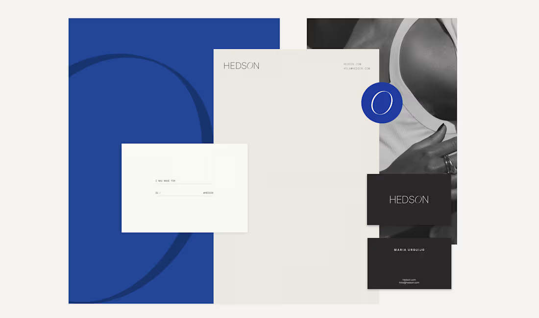
HEDSON
A visual identity designed for Hedson, a dress rental concept rooted in contemporary fashion and shared use. Clean typography, restrained composition, and bold color contrasts create a modern and confident brand presence.
An identity that supports the garments without competing with them.
2
2
122
SENCIA PACKEGING
Created a packaging system inspired by nature’s textures, stillness, and balance. Soft materials, muted tones, and restrained typography create a calm visual presence aligned with the brand’s botanical and sensorial identity. Designed to feel intimate, tactile, and enduring.
1
65
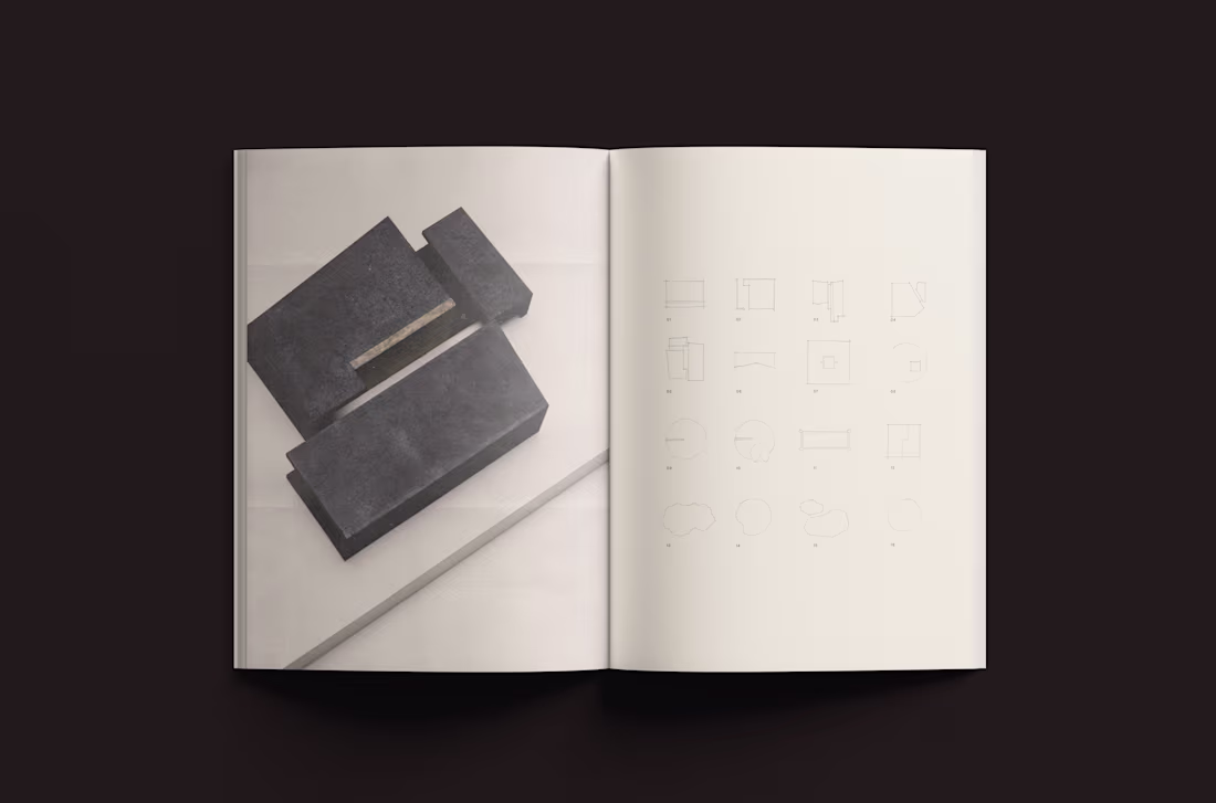
SCUPTURE CATALOGUE AV
A publication designed to accompany a series of sculptural objects. Through minimal typography, generous margins, and slow visual pacing, the catalogue frames each piece with clarity and restraint.
The editorial system approaches documentation as interpretation, translating material presence into printed form.
1
95