
pro
Amsal K
High Converting Ads Designer | Visual Designer
Ready for work
Amsal is ready for their next project!
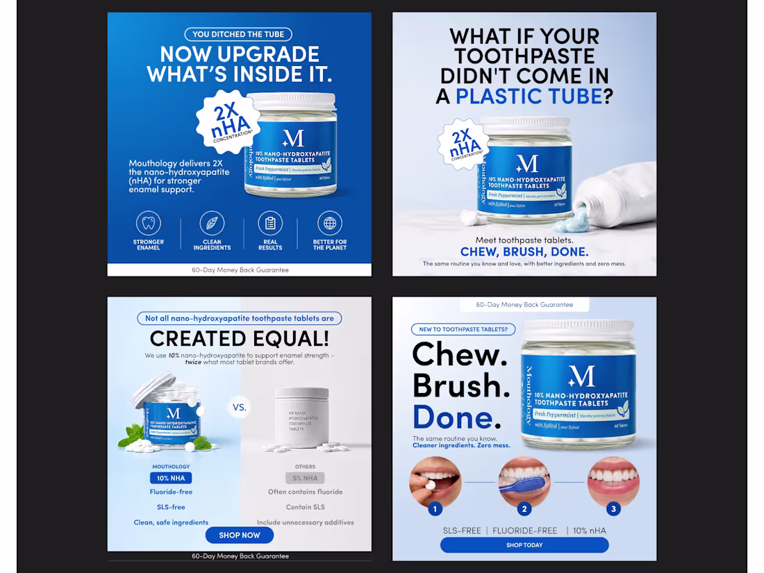
Changing a customer's daily routine is hard. Strategic ad design makes it profitable. 🦷
When a brand asks a consumer to completely ditch a lifelong habit—like squeezing a plastic toothpaste tube—a "pretty" ad simply won't cut it. If the creative doesn't immediately educate the buyer and eliminate their skepticism, they will keep scrolling, and your ROAS will tank.
For our client Mouthology, the team at CocoPixel (https://www.linkedin.com/company/cocopixel/) didn't just design standard product graphics. We engineered a high-conversion visual funnel built specifically to introduce a new product format (toothpaste tablets) to cold traffic.
Here is the exact creative strategy our agency applied to these ads to drive clicks and conversions:
🧠 1. Frictionless Onboarding (The 1-2-3 Method)
People hesitate to buy what they don't understand. "Toothpaste tablets" sounds complicated to a first-time buyer.
Our Strategy: We designed the "Chew. Brush. Done." framework, paired with direct, 3-step visual cues (the tablet in mouth, the wet brush, the bright smile).
The Insight: Visually demonstrating the simplicity of the routine removes the friction of the unknown. We used design to educate in under 2 seconds.
⚖️ 2. The "VS" Authority Play
To convince a customer to upgrade, you have to prove superior value instantly.
Our Strategy: We built a stark, side-by-side comparison layout placing Mouthology’s 10% nHA formulation directly against the generic 5% nHA standard.
The Insight: We didn't just write "We're better." We visually quantified why the product is superior (Fluoride-free, SLS-free), destroying the price and value objections immediately.
🛡️ 3. Absolute Risk Reversal
When asking consumers to take a leap of faith on a completely new personal care format, trust is everything.
Our Strategy: We anchored the bottom of the creatives with a high-contrast "60-Day Money Back Guarantee" bar and utilized clean, medical-grade iconography (Stronger Enamel, Clean Ingredients).
The Insight: By visually de-risking the purchase before the user even clicks through to the landing page, we significantly lower the Cost Per Acquisition (CPA).
At CocoPixel, we know that effective e-commerce design isn't just about aesthetics. It's about removing every ounce of friction between "Seeing" and "Buying."
P.S. Is your ad creative the bottleneck holding your e-commerce brand back from scaling? DM me "ROAS" and let’s talk strategy. ⚡
#CocoPixel (https://www.linkedin.com/search/results/all/?keywords=%23cocopixel&origin=HASH_TAG_FROM_FEED) #AdStrategy (https://www.linkedin.com/search/results/all/?keywords=%23adstrategy&origin=HASH_TAG_FROM_FEED) #EcommerceGrowth (https://www.linkedin.com/search/results/all/?keywords=%23ecommercegrowth&origin=HASH_TAG_FROM_FEED) #ConversionRateOptimization (https://www.linkedin.com/search/results/all/?keywords=%23conversionrateoptimization&origin=HASH_TAG_FROM_FEED) #DirectToConsumer (https://www.linkedin.com/search/results/all/?keywords=%23directtoconsumer&origin=HASH_TAG_FROM_FEED) #GraphicDesignAgency (https://www.linkedin.com/search/results/all/?keywords=%23graphicdesignagency&origin=HASH_TAG_FROM_FEED)
0
24
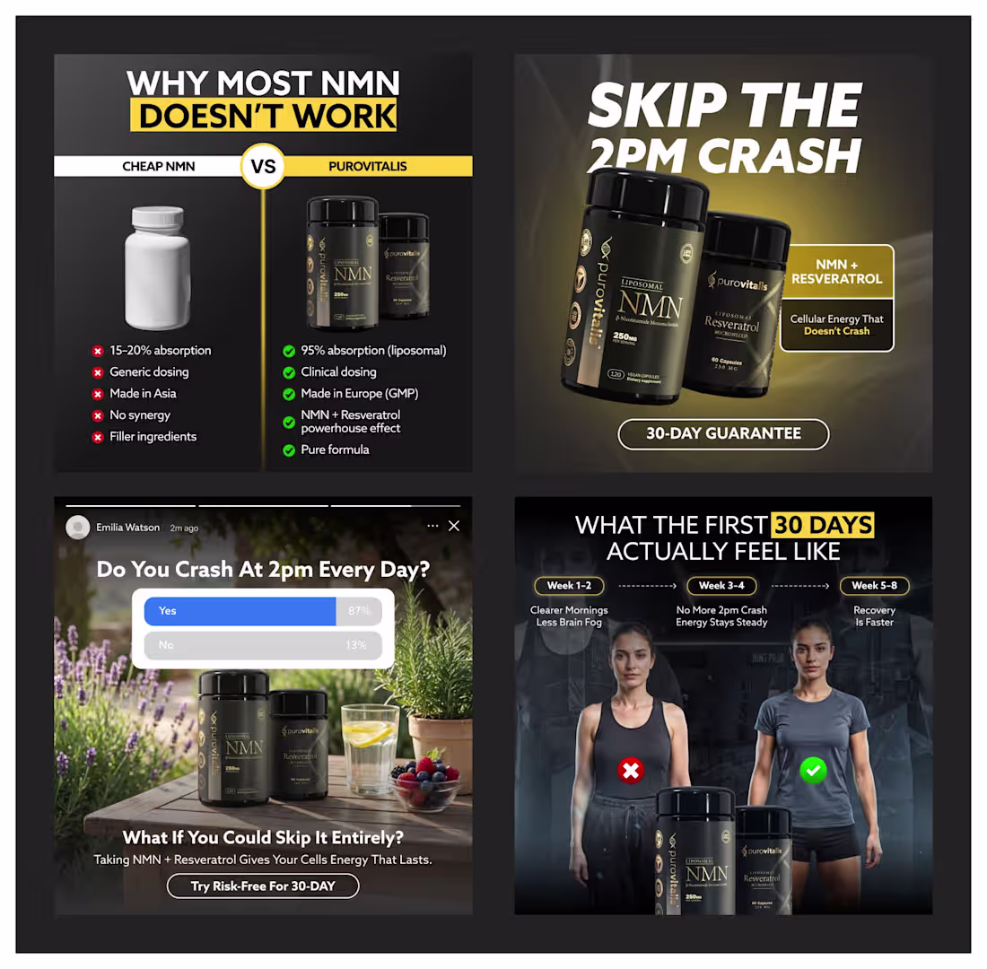
Stopping the scroll is easy. Holding the attention is where the ROAS happens.
We recently wrapped up these creatives for Purovitalis, and the strategy was simple: Design for the Brain, Not Just the Eyes.
Here’s the breakdown of the CocoPixel (https://www.linkedin.com/company/cocopixel/) approach:
✔️ Logical Validation:
Using data-driven comparison tables to justify premium pricing.
✔️ Psychological Relatability:
Using "poll" mockups to tap into the user’s daily struggle (the 2 PM crash).
✔️ Visual Trust:
High-fidelity 3D renders paired with clean, authoritative typography.
✔️ Risk Mitigation:
Bold, clear "30-Day Guarantee" seals to lower the barrier to entry.
Creative is the new targeting. If your ads aren't speaking to the customer's specific journey, you're leaving money on the table.
Design isn't about making things look "pretty." It's about removing every bit of friction between "Seeing" and "Buying."
Check out the full CocoPixel portfolio here: www.behance.net/cocopixel
(http://www.behance.net/cocopixel)P.S. Ready to scale your brand with creatives that actually convert? DM me "ROAS" and let’s look at your current strategy.
1
56
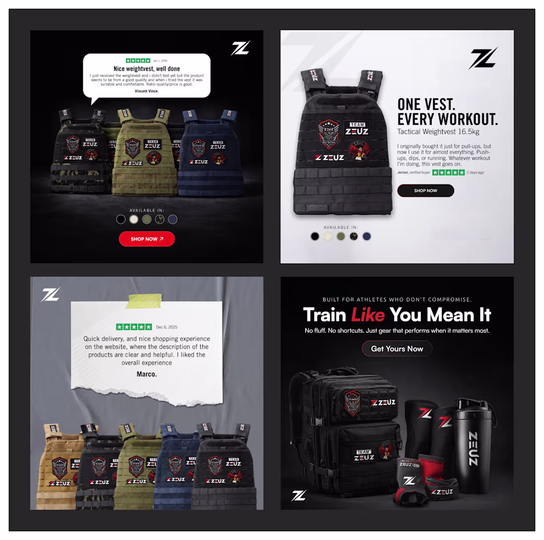
🔥 Stop designing e-com ads that just "look cool." Design them to convert.
For this recent campaign at CocoPixel (https://www.linkedin.com/company/cocopixel/), we didn't just want to make this tactical gear look tough. We engineered these creatives to actively lower CPAs by targeting the buyer's psychology.
Here is the exact breakdown of how we built these for ZEUZ:
⚡ Weaponized Social Proof:
We didn't bury the 5-star reviews in the ad copy. We made them the visual anchor—using textured paper and speech bubbles to build immediate, pre-click trust.
⚡ Zero Cognitive Friction:
Notice the color swatches directly above the CTA? We answered the "Does it come in black?" question before they even had to ask, qualifying the traffic before they hit the landing page.
⚡ Built for the Algorithm:
We didn't just guess on aesthetics. We delivered distinct light/clean and dark/gritty variations to give the ad account high visual contrast and battle ad fatigue head-on.
⚡ Identity-Driven Typography:
"Train Like You Mean It." We paired heavy-duty product shots with zero-fluff, aggressive typography that speaks directly to the no-excuses athlete persona.
Design is just the vehicle. Profitable performance is the destination. 📈
What’s the biggest friction point you see in most e-com ads right now? 👇
2
76
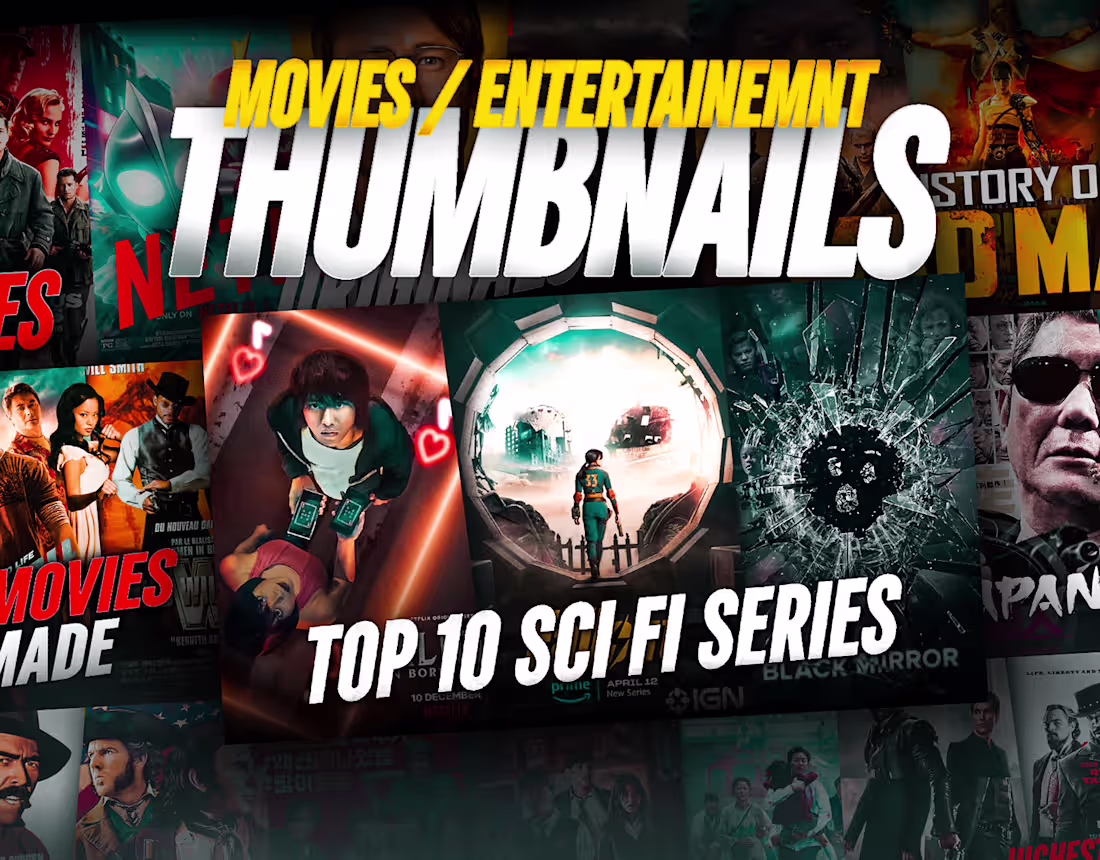
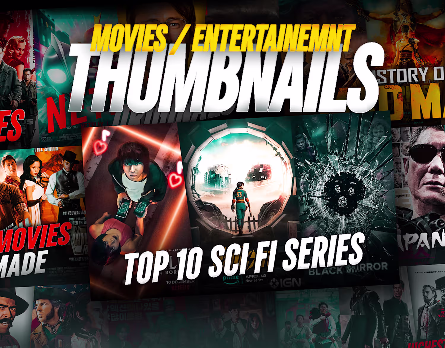
Movies & Entertainment Thumbnails
0
11
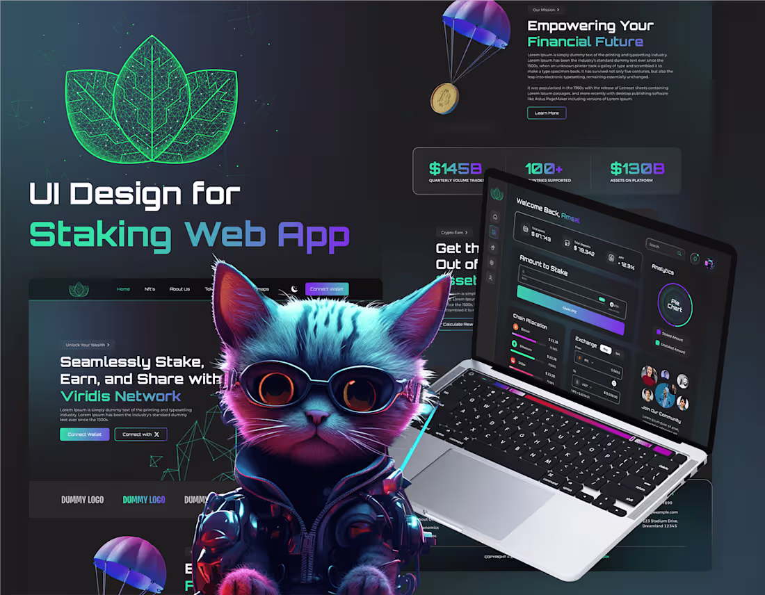
UI Design for a Staking App
0
8
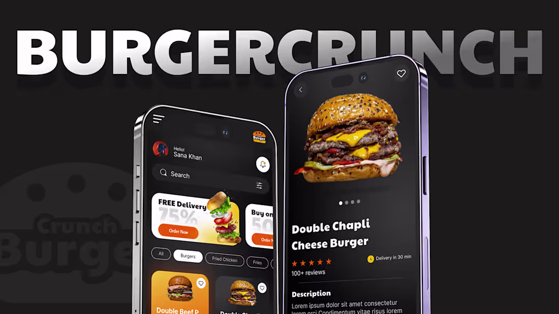
Restaurant App | Mobile App UX/UI Design | BurgerCrucnh
0
4
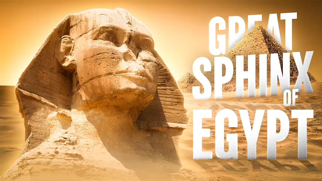
Creative Thumbnails Design Vol - 03
0
5
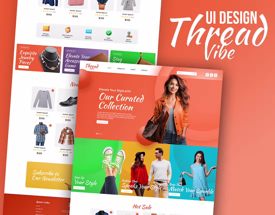
APPAREL WEBSITE UI DESIGN
0
16
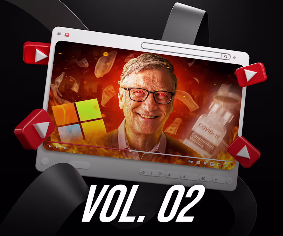
YouTube Thumbnails - Volume 02
0
12
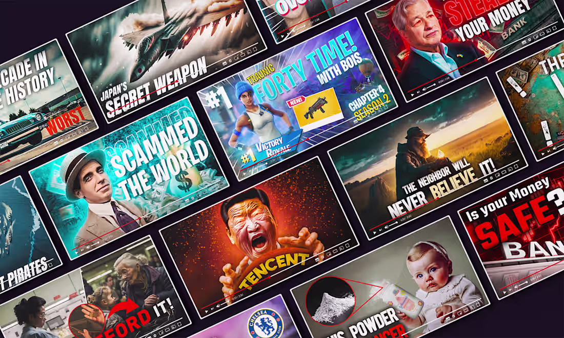
YouTube Thumbnails
0
16
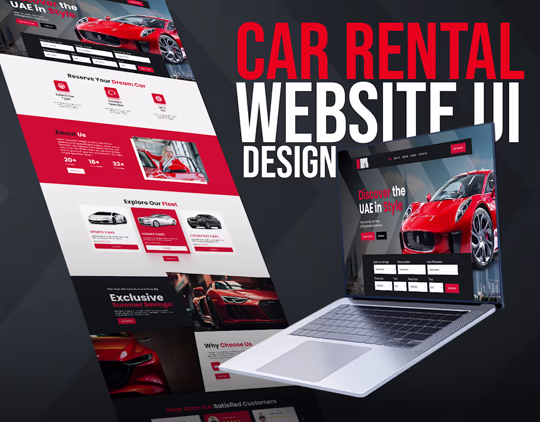
Car Rental Website UI Design
0
8
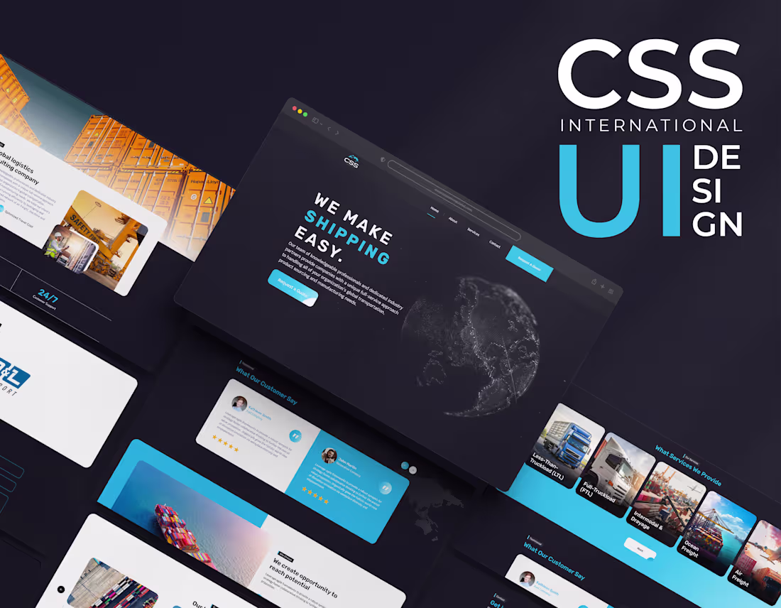
Shipping Website Web UI Design on Behance
0
10
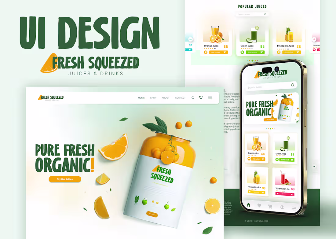
UI Design for Fresh Squeezed on Behance
0
8
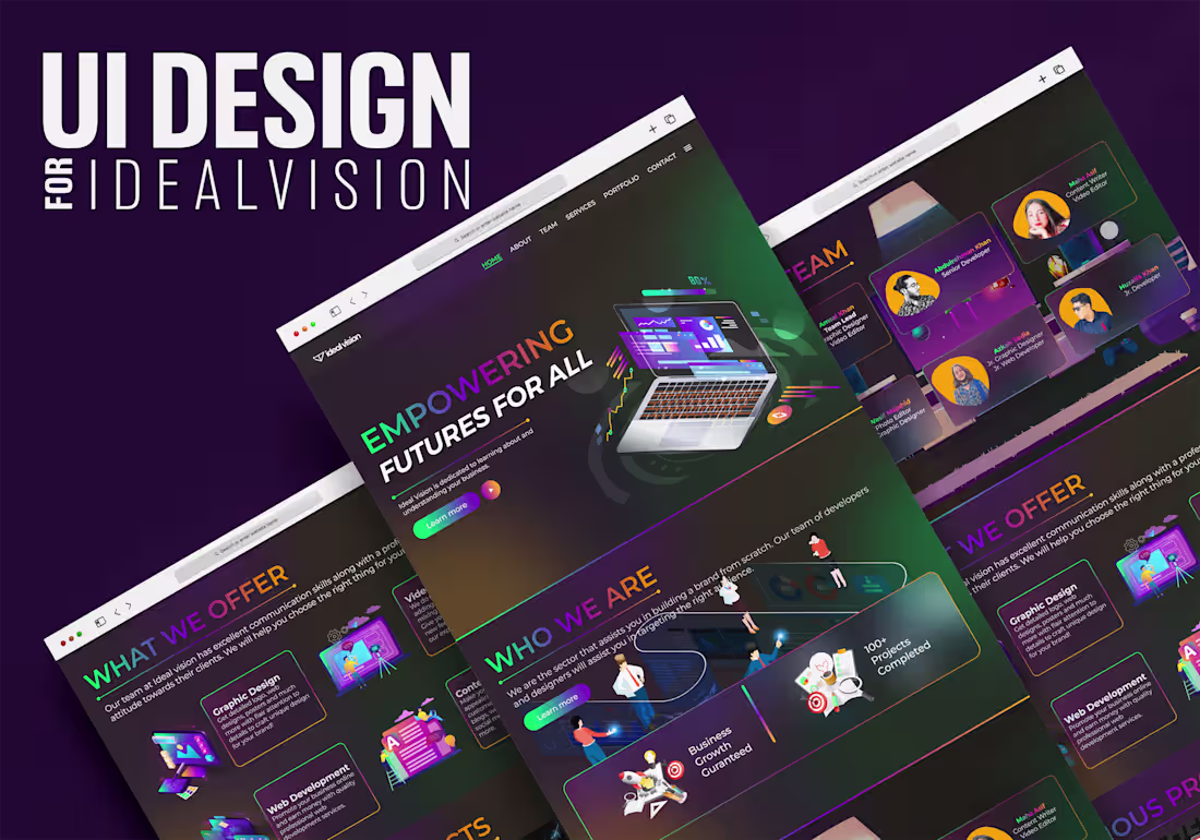
UI Design for IdealVision on Behance
0
10
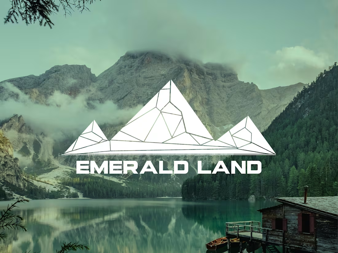
Logo Design for Emerald Land
0
1
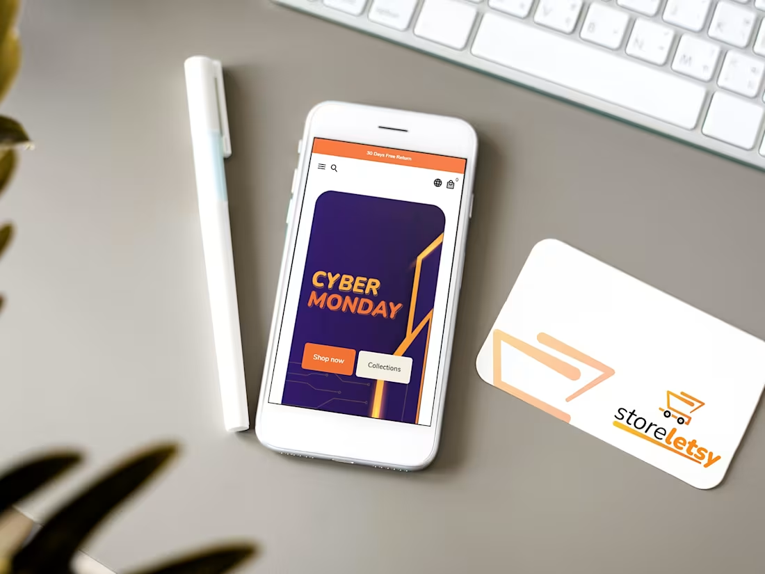
Brand Identity Design for Storeletsy
0
2
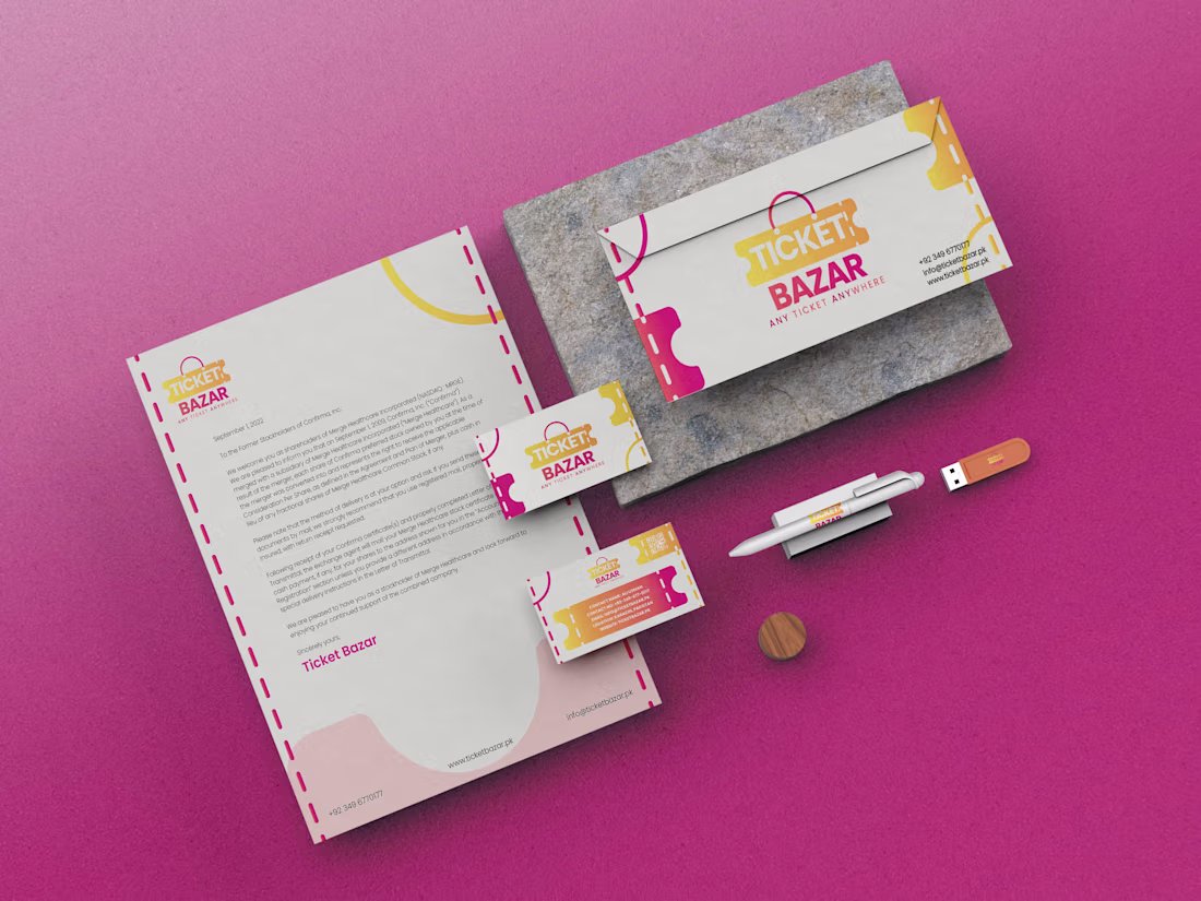
Brand Identity Design for Ticket Bazar
0
8
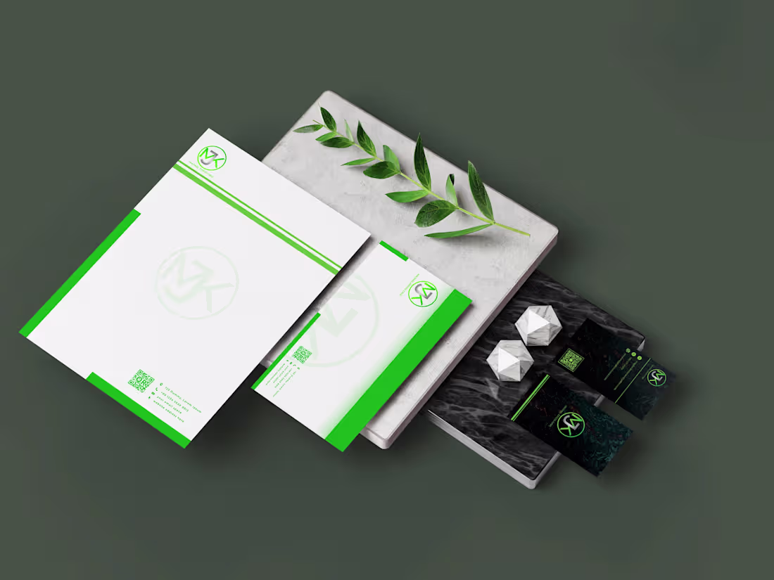
Brand Identity Design for MJK
0
6
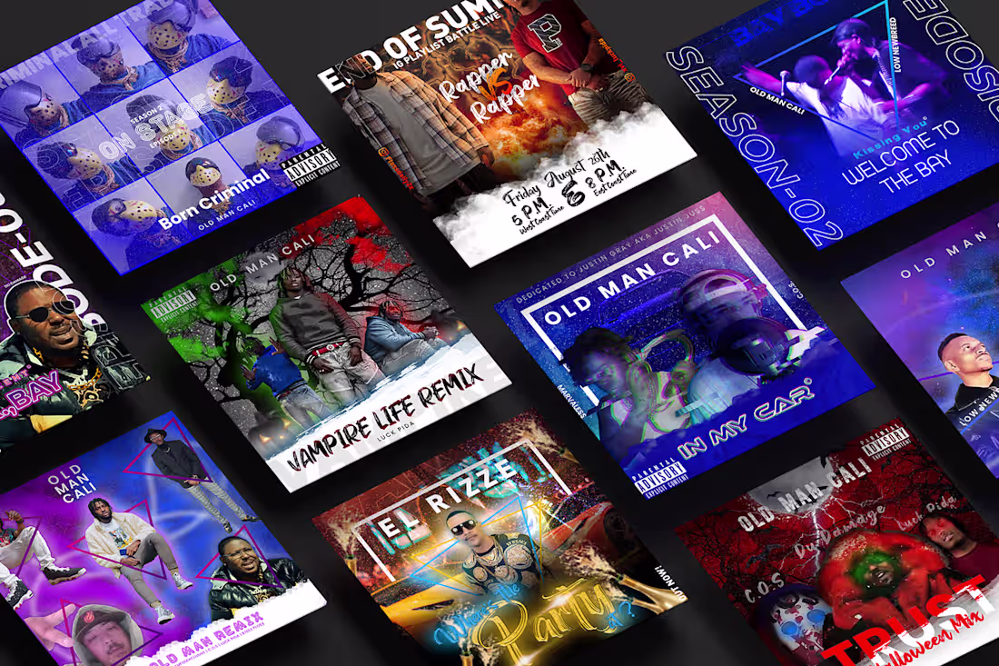
Music Album Cover Art Designs
0
12
Tooki - Logo Design
0
6