amr sheha
Logo & Social Media Design Expert 🌟
Profile in progress
amr is building their profile!
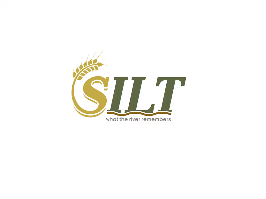
SILT — Restaurant Brand Identity
The challenge: build a brand for Egyptian
fine-casual dining that feels premium and
rooted — without falling into folklore
or Western imitation.
The approach: find the real idea behind
the concept, then let design follow.
The name "Silt" references the fertile
sediment left by the Nile — the foundation
of Egyptian agriculture and civilization.
That became the brand's entire logic:
depth over decoration.
Deliverables included:
→ Brand strategy & naming rationale
→ Custom wordmark with hand-illustrated
wheat motif (not stock, not AI-generated)
→ Earth-toned palette system derived
from the Egyptian landscape
→ Tagline: what the river remembers
→ Full mockup suite: exterior signage,
menu, napkins, packaging, uniforms
This project demonstrates how brand
identity works when it starts from
a real idea — not a mood board.
Available for brand identity projects.
Response within 24 hours.
0
5
MEZAN — Weighed Carefully.
A visual exploration of balance, craftsmanship, and heritage through a premium fermented beverage brand inspired by the flavors of the Eastern Mediterranean.
From logo design to packaging and art direction, every detail was carefully measured to reflect the essence of the name: MEZAN.
#BrandIdentity #PackagingDesign #LogoDesign #Branding #ArtDirection #Behance #GraphicDesign #ProductBranding #CreativeDirection #MEZAN
0
3
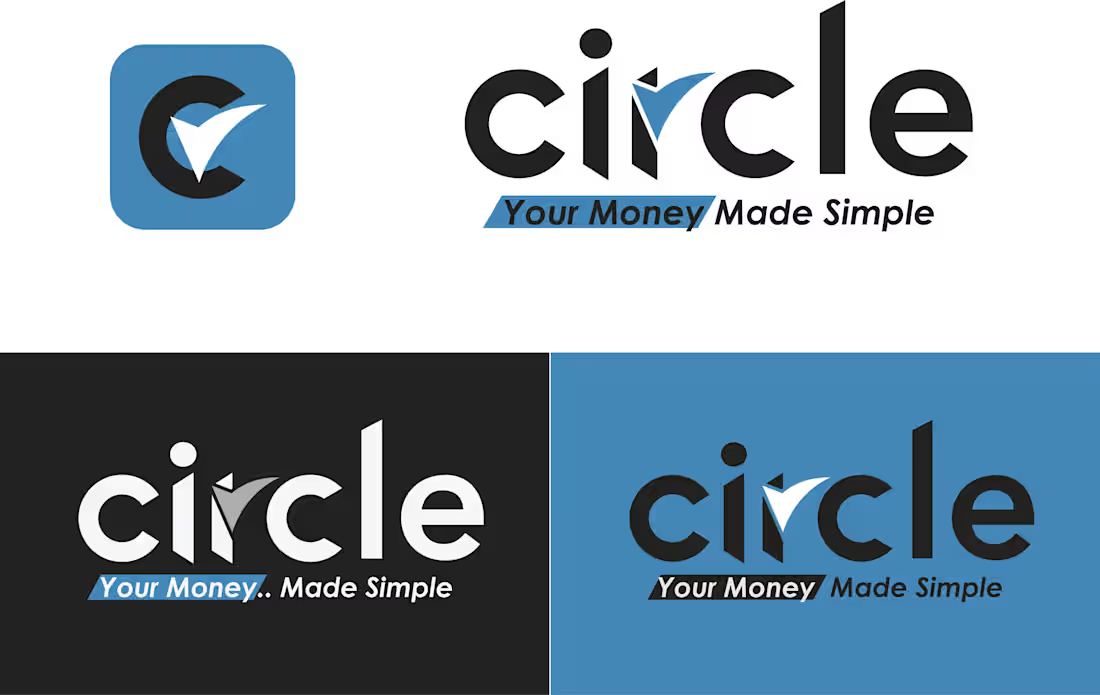
Circle is a fintech brand identity concept created to explore the balance between trust, simplicity, and modern financial technology.
The goal was to move away from the cold, overly corporate feel often associated with financial services and create a visual identity that feels approachable, reliable, and easy to use.
The logo combines clean typography with a subtle approval-inspired visual cue, reinforcing the idea of seamless transactions and financial confidence. The system was designed to scale across mobile apps, payment cards, web platforms, and digital products while maintaining strong recognition and clarity.
A modern identity built around one simple promise:
Your Money. Made Simple. 🤔
0
13
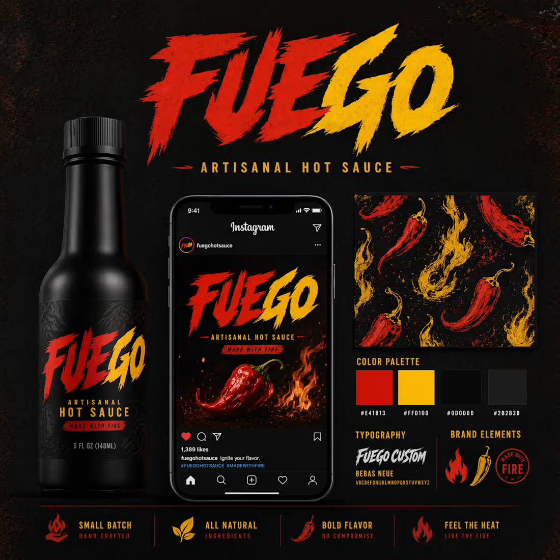
🔥 FUEGO — Hot Sauce Brand Identity
Built to ignite attention and celebrate bold flavor.
FUEGO is an artisanal hot sauce brand identity designed for food lovers who crave intensity, adventure, and unforgettable taste experiences. The visual system combines saturated fiery reds, vibrant yellows, and custom expressive typography to create a powerful shelf presence and instant brand recognition.
Every design element was crafted to reflect the heat, energy, and passion behind the product—from the dynamic label architecture to the high-contrast social media assets. The result is a cohesive brand experience that feels bold, modern, and impossible to ignore.
Key Design Elements:
• Custom typography with energetic movement
• High-impact color palette inspired by fire and spice
• Strong shelf visibility and digital performance
• Scalable visual system across packaging and social content
• Distinctive brand personality targeting adventurous food enthusiasts
The goal was simple: create a hot sauce brand that looks as bold as it tastes.
#BrandIdentity #PackagingDesign #FoodBranding #HotSauce #GraphicDesign #LogoDesign #BrandStrategy #VisualIdentity #Packaging #CreativeDirection #Typography #Behance
0
6
Benne & Batter is a modern Quick Service Restaurant brand built around authentic South Indian favorites — Idli, Dosa, Filter Coffee, and signature Dosa-with-Gravy Combos. The brief called for an identity that feels warm and inviting without leaning on cliché food imagery, and modern enough for a fast-casual market without losing its cultural roots.
The design direction centers on a minimalist combination mark — a distinctive icon that subtly references the world of dosa and benne (butter/ghee) through abstract form rather than literal illustration, paired with a clean, confident logotype. The palette draws from warm reds, oranges, and yellows to evoke appetite and energy, with earthy undertones grounding the brand in authenticity.
Every decision was made with versatility in mind — the mark holds its own on a paper cup, a shopfront fascia, a staff cap, and a social media avatar without losing clarity or character.
This is the kind of brief I enjoy most: a brand with genuine cultural depth that deserves a mark as intentional as the food it serves.
0
25
The current label has the right ingredients — the hand icon, the warm cream palette, the understated copy — but the typography lacks cohesion and the layout feels unresolved. "AYA'STOUCH" as a single run reads as a production choice, not a brand decision. The label panels compete rather than breathe together.
My approach: settle the wordmark first. "aya's touch" in lowercase — a refined italic or upright light-weight serif, with "touch" carrying slightly more weight than "aya's" to land the brand promise. The hand icon stays but gets simplified to a single-weight line drawing, cleaner at small scale. Warm blush and cream remain the palette anchors, with a dusty rose for the icon circle.
The label redesign centers the hierarchy: brand name dominant, product name ("cleansing milk") as a quiet descriptor, volume in the lightest weight. Left and right panels breathe with generous margins. The result feels considered rather than assembled.
Delivered: primary logo in AI/SVG/PDF/PNG, favicon crop, and a print-ready label file sized to the existing bottle dimensions.
0
25
The direction you've landed on is strong — the tension between the italic serif warmth of pulp and the cold-tracked precision of AÇAÍ CO is exactly right for a brand sitting between clean-eating and convenience. The gold-on-aubergine combination reads premium without effort.
Two things worth flagging before production lock: first, the sub-mark currently reads "ACAI CO" in the reference mockups — the brief correctly identifies that AÇAÍ CO with authentic diacritics is non-negotiable, and I'll ensure ç and í are correctly specified in every file and supplier-ready format. Second, the italic serif needs a single committed font decision — I'd recommend Cormorant Italic (available via Google Fonts, zero licensing cost, excellent diacritic support) as the wordmark, paired with Neue Haas Grotesk or Inter Light for the sub-mark and tagline.
My deliverable covers everything in scope: locked lockup files in all formats, five applied mockups including the full shopfront facade at correct dimensions, color system with HEX/RGB/CMYK/Pantone, and a clean 8-page brand guide ready to hand directly to your packaging supplier and signwriter.
Timeline: 7 days from brief confirmation. Two rounds of revisions included.
0
25
The existing TechSource Systems mark has strong bones — the gear-plus-S concept is strategically sound and worth preserving. The opportunity is in the execution: tighter geometry, a more sophisticated color relationship between the blue and silver, and typography that matches the precision the icon implies.
My approach: refine the gear silhouette to sharper, more consistent teeth and stroke weights. Evolve the interior S-curve from a wrench shape into a cleaner fluid arc — more tech, less mechanical. Shift the blue from flat cyan toward a deeper electric blue with a subtle gradient that adds depth without losing crispness. Update "TechSource" to a geometric sans-serif with precise letter spacing, and set "Systems" in a lighter weight with more breathing room.
The result stays instantly recognizable to existing clients while looking built for the next decade.
Turnaround: 3 days from brief confirmation.
0
24
an AI generated reel for office furniture company named as HEICO in Egypt
the elements and items are taken from real product images , enhanced , recreated via nanobanana , and invoked to the scenes to make this accurate and shape motion consented reel video
i hope you like it
thank you
Amr sheha
2
1
103
Collection of my logo designs
0
3