
Aminul I.
Product Designer | SaaS • AI • Mobile Apps • UIUX


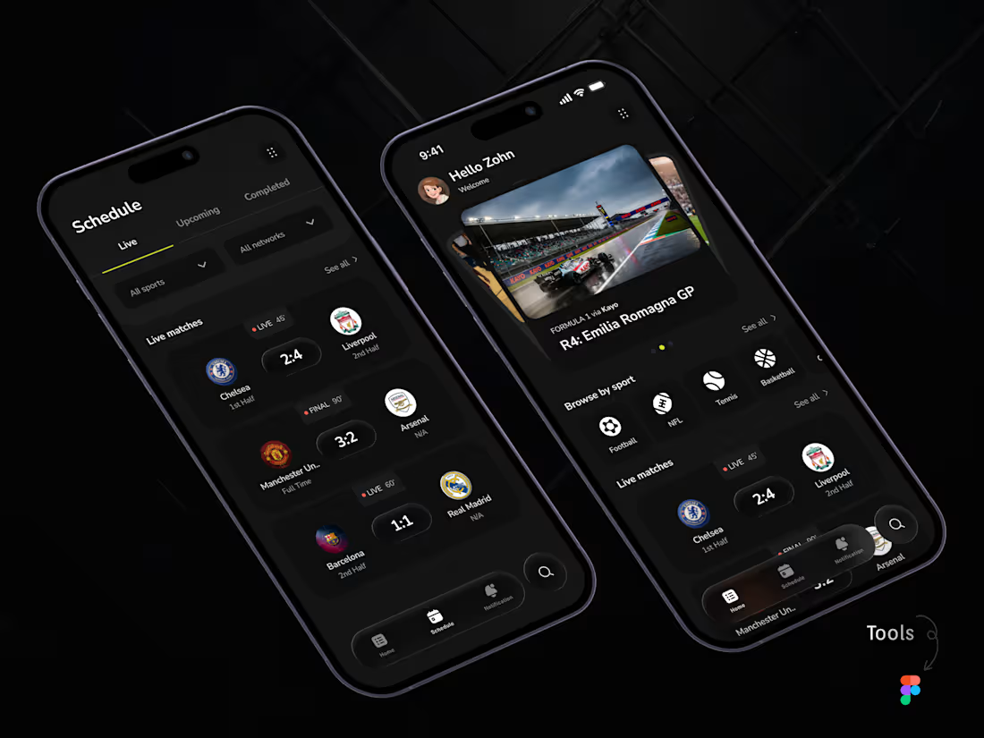
Sports app UI concept focused on live scores, schedules, and quick match updates.
Designed for fast scanning, simple navigation, and a clean dark-mode experience.
Product Design · Mobile App · Sports UI · Figma
0
51
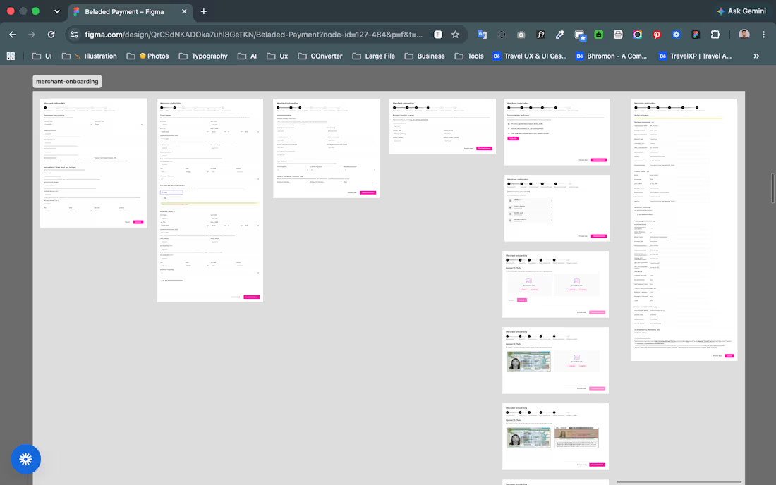
Merchant onboarding for a payment product
Designed a multi-step merchant onboarding flow for Beladed Payments, covering business information, ownership details, banking, identity verification, document uploads, and final review.
The main challenge was handling a large amount of financial and compliance information without making the experience feel overwhelming.
I focused on:
1. Breaking a complex process into clear, manageable steps
2. Creating consistent form patterns for faster completion
3. Making verification and document requirements easier to understand
4. Designing clear progress, review, and error states
#Product Design #Fintech #SaaS #UX/UI #Figma
3
134
A pricing section shouldn’t overwhelm the landing page.
For this landing page, I designed the pricing section to guide visitors toward the plans that are most relevant to them.
Instead of showing every package at once, users can first choose:
Brand or Creator → One-Time Setup or Monthly Retainer
The pricing cards then adapt to that selection, keeping the section focused while still supporting multiple packages and pricing models.
The goal was simple: reduce the noise, make the options easier to scan, and help visitors understand the value without overloading the page.
Good landing page design isn’t just about making sections look polished.
It’s about making important decisions feel simple and natural.
#ProductDesign #UIDesign #UXDesign #LandingPageDesign #WebDesign #PricingUX #Figma
3
4
250
I came across a UI I designed more than 2 years ago, and it made me think about how much AI has changed the design process.
This was an eSIM product where we needed to show different plans for different countries.
I wanted each country to feel unique, so I used:
→ Country flag colors
→ A recognizable landmark
→ Travel-related visual context
Today, this kind of work is much easier with AI. You can generate variations, explore visual directions, find references, and iterate much faster.
But when I designed this 2+ years ago, almost everything was manual.
I had to research each country → Find the flag → Search for popular landmarks → Figure out which landmark would actually mean something to a traveler → Download and prepare the assets → Then test how everything worked together inside the UI.
It took days.
Looking back, I don't think AI is making design “easy.”
It is making the execution faster, and that's an important difference.
The designer still needs to decide:
What should we show?
Why should we show it?
Which option is actually relevant to the user?
AI can help us get to the answer faster.
But the quality of the answer still depends on the thinking behind it.
1
7
276