
ali dempster
Tech Consultant & UX Designer for Small Businesses
New to Contra
ali is ready for their next project!

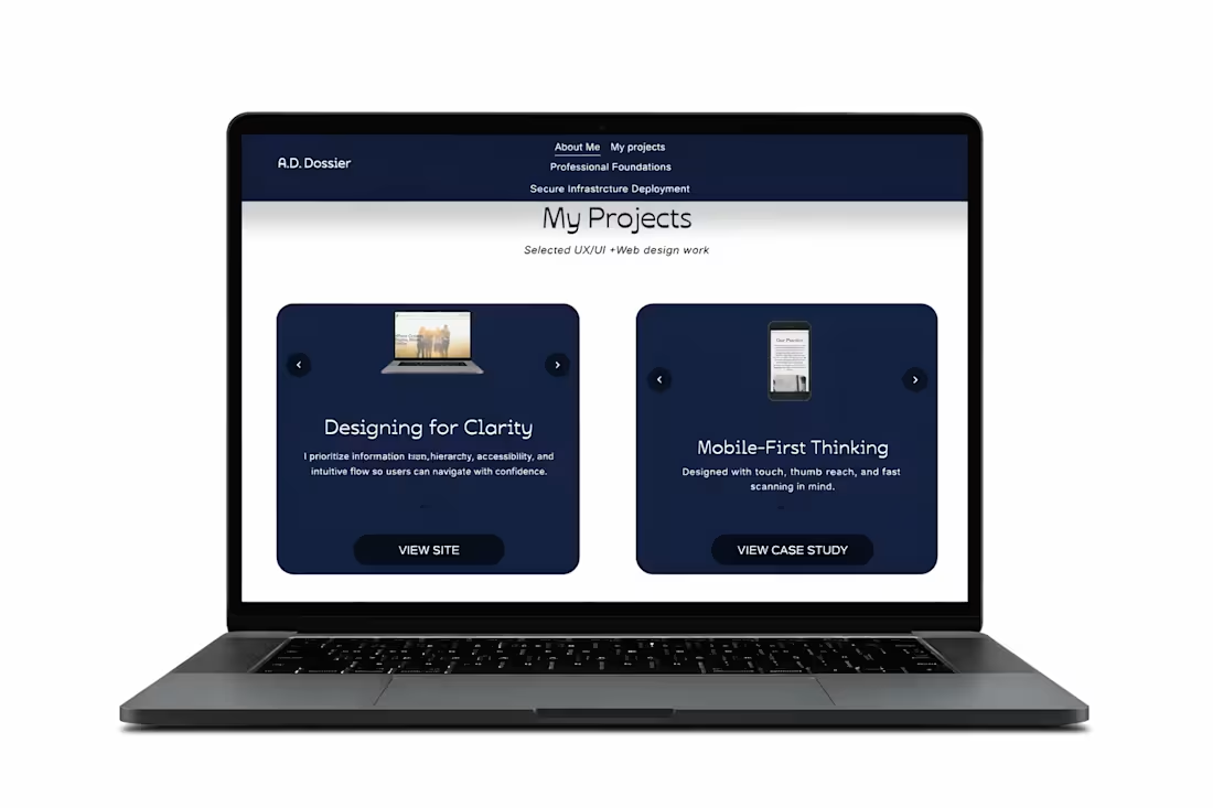
Custom Portfolio Carousel (HTML/CSS)
This is my personal portfolio webpage where I implemented my own HTML and CSS to build a custom image carousel that showcases my work. The carousel was designed to be clean, responsive, and easy to navigate, allowing users to quickly scroll through projects without leaving the page.
Key focuses:
• Custom HTML/CSS implementation
• Responsive layout and spacing
• Clear navigation controls
• Smooth, user-friendly browsing experience
0
48
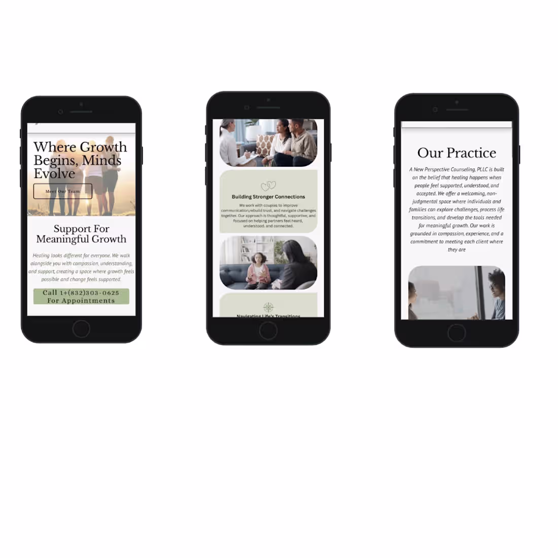
Mobile-Optimized Experience
Designed with a mobile-first approach to ensure clarity, readability, and ease of use on smaller screens. Content was structured to maintain clear hierarchy, reduce cognitive load, and support quick, frictionless action through touch-friendly calls-to-action.
0
50
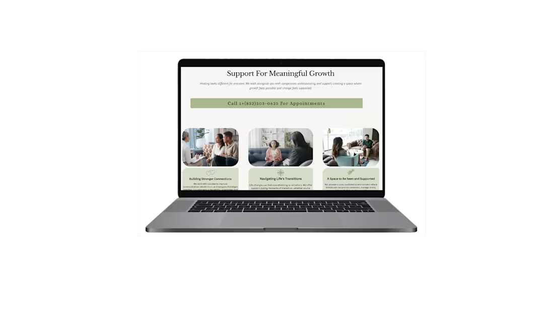
Services Section – Clear, Guided Decision-Making
This section was designed to clearly communicate the practice’s core services while guiding users through an organized, easy-to-scan layout. The goal was to reduce uncertainty and help visitors quickly identify the support that aligns with their needs.
Each service is visually grouped with supportive imagery and concise descriptions to balance emotional reassurance with informational clarity. The structure minimizes cognitive overload while reinforcing trust and professionalism.
Key considerations:
• Clear service categorization
• Strong visual hierarchy
• Scannable layout for faster decision-making
• Emotionally supportive imagery
• Prominent call-to-action placement
The result is a structured service overview that builds confidence and encourages the next step toward booking.
0
48
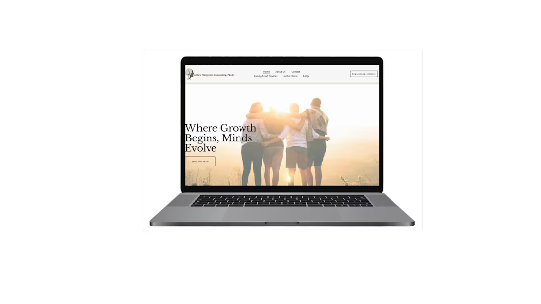
Homepage – Emotionally Intentional & Trust-Building Design
This homepage was designed to feel welcoming, calm, and emotionally safe — essential qualities for a therapy practice. Warm tones, soft imagery, and balanced spacing were intentionally used to create a sense of reassurance and approachability.
The hero section immediately communicates support and growth, helping visitors feel understood within the first few seconds. Typography and layout were structured to reduce overwhelm and guide users naturally toward learning more or reaching out.
Key considerations:
• Warm, trust-building color palette
• Clear, emotionally resonant messaging
• Clean visual hierarchy
• Mobile-responsive design
• Low-friction navigation
The result is a homepage that supports users emotionally while guiding them clearly toward the next step.
1
69
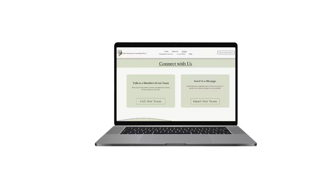
Contact Page – Conversion-Focused & User-Centered
This contact page was designed with clarity and ease of action in mind. The goal was to reduce friction and make it simple for users to reach out in the way that feels most comfortable to them.
The layout prioritizes two clear options: calling directly or sending a message. By presenting both paths prominently, users can quickly choose their preferred method without navigating away or searching for contact information.
Key considerations:
• Clear call-to-action hierarchy
• Minimal cognitive load
• Mobile-responsive structure
• Warm, trust-building visual design
• Accessibility and readability focus
The result is a streamlined contact experience that supports higher engagement and smoother client conversion.
2
54