Alexia Garrido
Multimedia graphic designer
Ready for work
Alexia is ready for their next project!
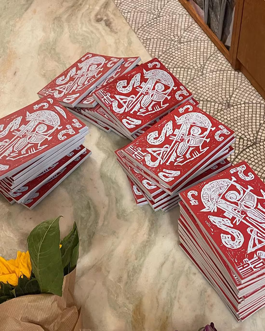
Looking back at DEFA Zine 2, which I designed for Studio DEFA. The zine captures the studio’s playful, boundary-pushing ethos through print. The zine brings together poetry, comics, cultural criticism, and art from a global roster of contributors. https://www.studiodefa.com/
24
163
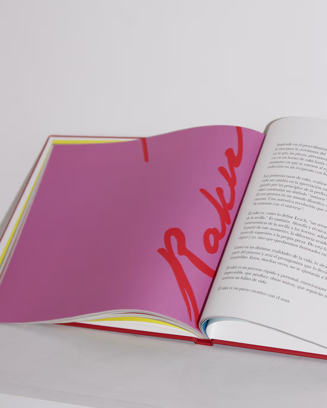
Book design for Mariemi Otaola, printed with Nova Era in Bilbao. Mariemi is a multidisciplinary Basque artist whose practice spans sculpture, ceramics, printmaking, photography, and music, rooted in a dialogue between visual and auditory expression. The book brings together the full scope of her work, with design decisions, including her distinctive use of color, reflecting the energy, rhythm, and identity that define her practice.
4
30
188
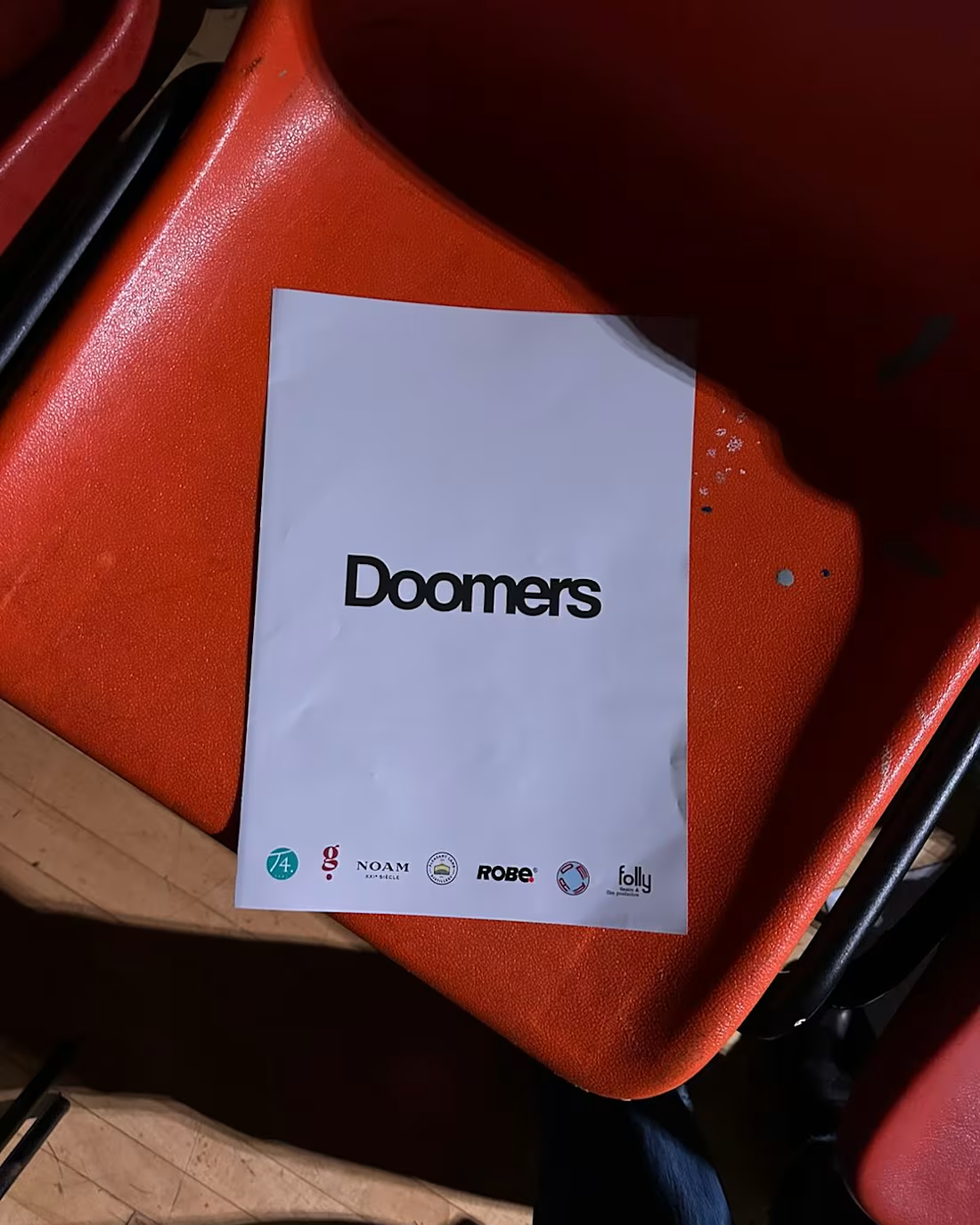
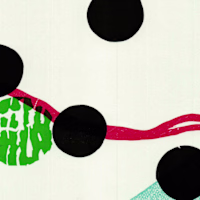
Visual identity design for Doomers, a London-based AI boardroom drama asking a timely question: In humanity’s last act, who plays God? Doomers is a razor-sharp reflection of our accelerating world where tech, ethics, and ego collide. It explores the thrill of creation, the fear of losing control, and the uneasy realization that the future might already be slipping from our grasp. For this identity, AI-generated hands were explored. For humans the hand is one of the hardest parts of the body to draw, it seems like AI is struggling as well.
1
20
159
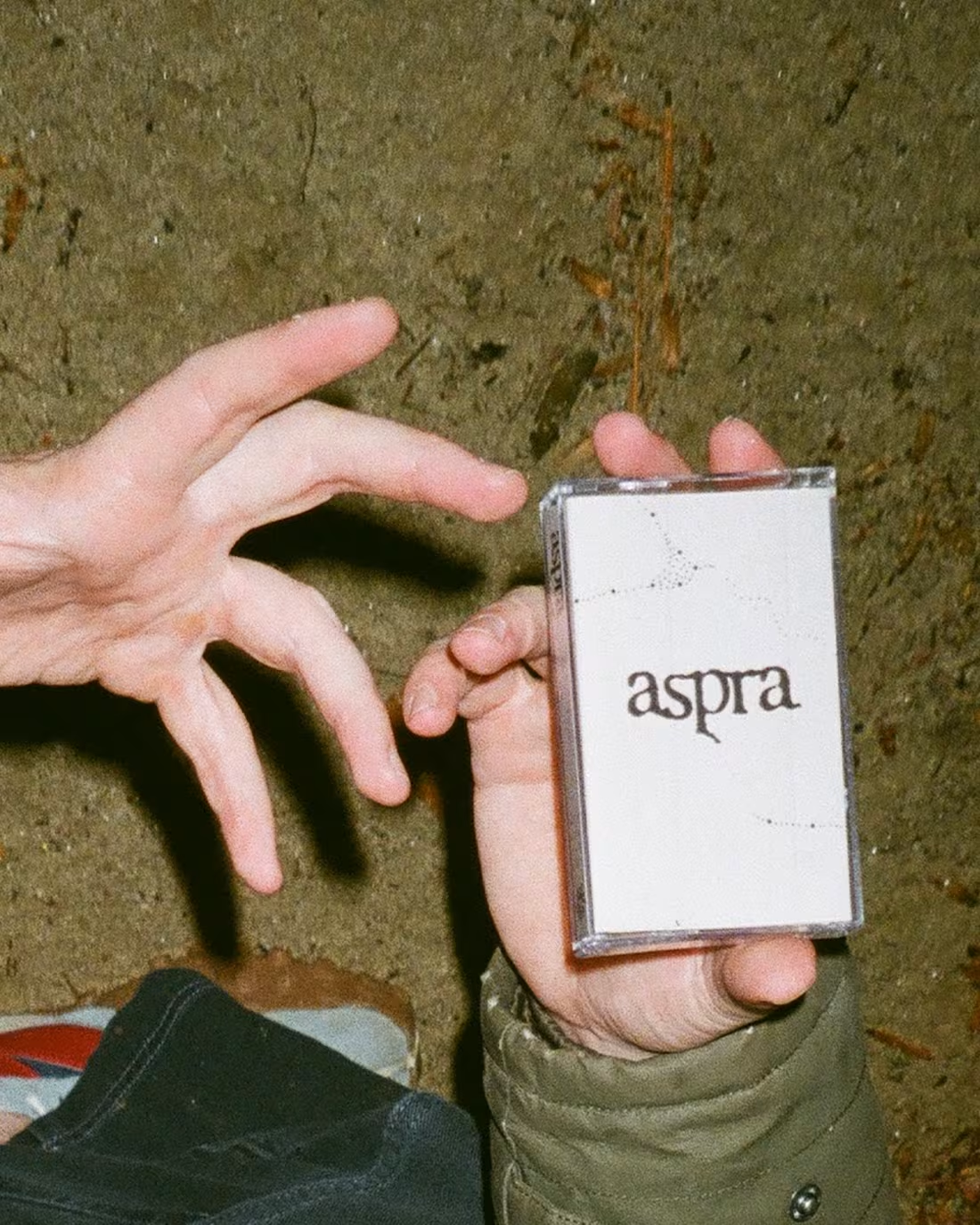
Sound as artifact, music as message. Designed with Mestiza Estudio for the ASPRA cassette series by Atlanta-based label Mithra Records, Aspra imagines a speculative, interspecies future through ambient drone and experimental sound. Bringing together 14 underground artists, the cassette functions as a ritual object — physically buried atop Monte Aspra in Italy’s Sibillini mountains — becoming a time capsule and an auditory letter from humanity to a multi-species world.
2
20
163
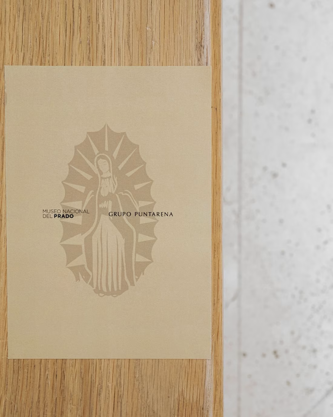
Menu design for Museo Nacional del Prado in collaboration with Grupo Puntarena, developed alongside Nonnetta Studio in Madrid. The project translates cultural heritage into a refined, contemporary dining experience through clarity, typography, and thoughtful material choices.:
16
147
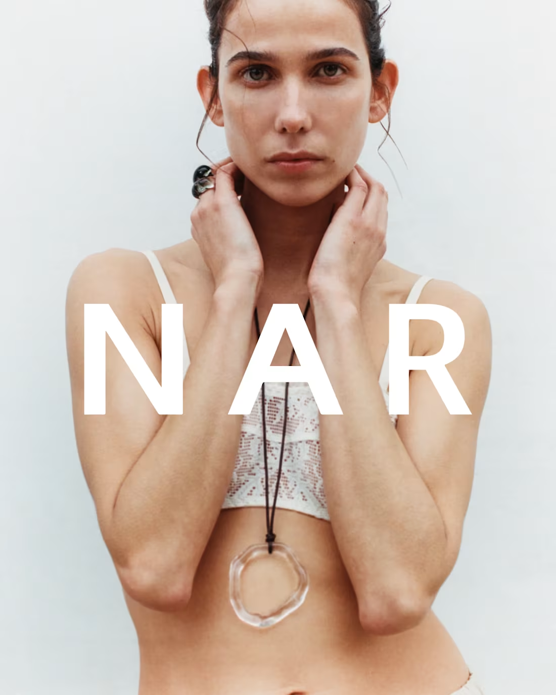
Shaping the visual identity and website creative direction for NAR was about creating space for the work to speak. Co-founded in Barcelona by Carlota Marin and Chloe Peyrouzet, NAR is rooted in personal values, sustainability, and a deep respect for glass craftsmanship. The minimalist identity was designed to act as a quiet frame, one that elevates each piece as wearable art while reinforcing the brand’s commitment to thoughtful production and timeless design. By stripping back the visual language, the focus remains on material, form, and intention.
https://nar-official.com/
4
29
186
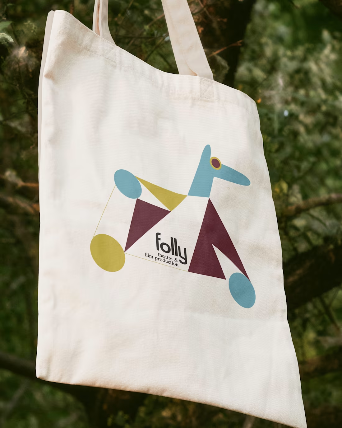
Building the visual identity for Folly Productions was an exercise in embracing play with intention. Developed alongside Daniel García Muñoz, with animation direction by Gabrielle Poullion, the London-based studio’s identity reflects Folly’s belief in clarity, structure, and not taking things too seriously. Founded by two women who’ve been creating since childhood, the brand system is built on variation and joy: a wordmark with a smiling final letter, the expressive Sneaky Times typeface, and a custom font — Folly Satoshi — that subtly randomises the letters f o l l y each time they appear. Anchoring it all is the rocking horse: a symbol of imagination, movement, and creative mischief, carrying the spirit of folly forward across film and theatre.
https://www.follyproductions.com/
3
32
227
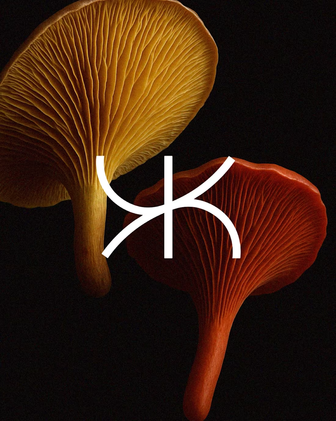
Rebranding Kinjani in collaboration with Cosmati Studio meant translating purpose into a system that could grow, adapt, and endure. Based in South Africa, Kinjani empowers science-driven founders to scale impactful climate solutions, and the new identity reflects that mission at every level. Grounded yet modern, the wordmark draws from local visual language, while the icon expands into a repeating pattern that represents connection, regeneration, and growth. Together, they form a flexible, scalable identity system, a visual expression of Kinjani’s regenerative impact across Africa.
https://www.kinjani.com/
12
46
236