
Alamgir Brands
Brand Identity Designer 🔅 Design Creator
New to Contra
Alamgir is ready for their next project!
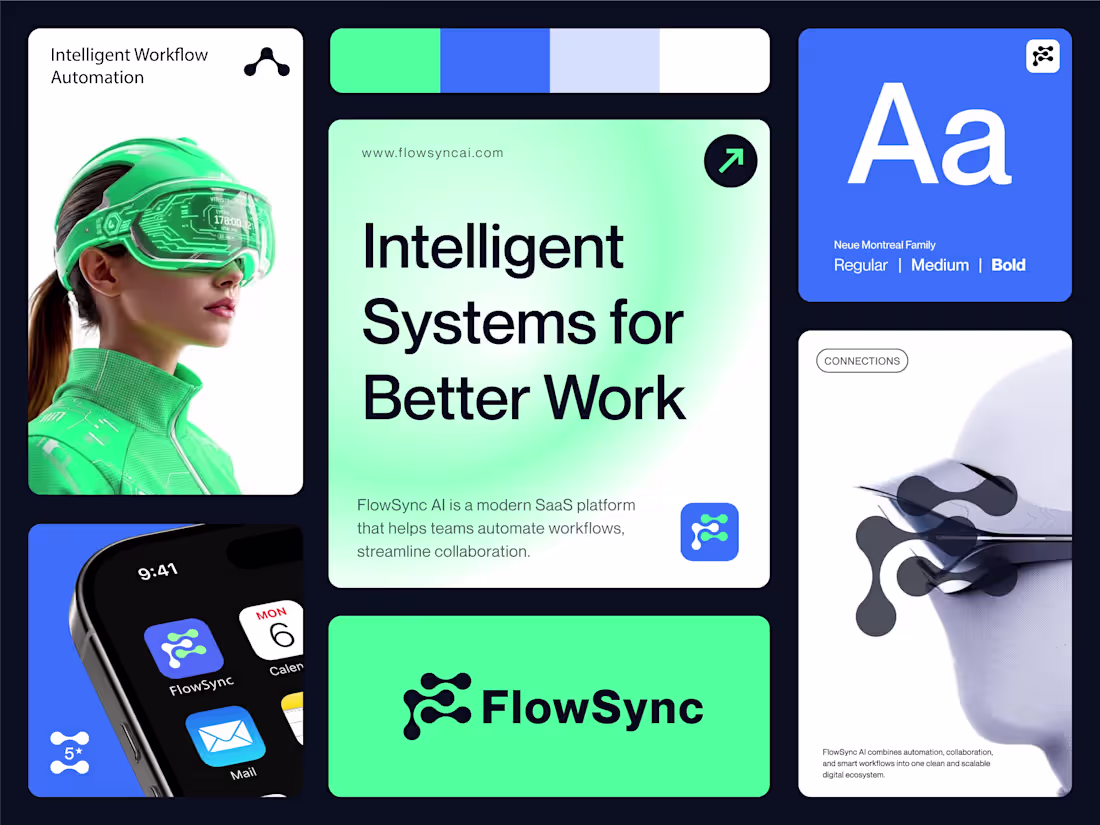
Building a SaaS brand identity is more than designing a logo — it’s about creating a system that communicates speed, intelligence, and trust across every touchpoint.
Dribbble : https://dribbble.com/shots/27359414-FlowSync-AI-SaaS-Brand-Identity-Bento-Grid-Presentation
FlowSync AI was designed as a modern workflow automation platform focused on simplifying collaboration and streamlining operations through intelligent systems.
The visual direction combines:
• A fluid, connected symbol representing synced workflows
• Bold typography for clarity and confidence
• A vibrant green-blue palette to balance innovation with usability
• Clean UI-inspired layouts for a scalable digital-first identity
The goal was to create a brand that feels futuristic, adaptive, and product-ready from day one. ⚡
From logo construction to app visuals and brand applications, every element was crafted to support a seamless SaaS experience.
What do you think about this direction for an AI automation brand?
#BrandIdentity #LogoDesign #SaaS #SaaSBranding #AIStartup #TechBranding #VisualIdentity #BrandDesigner #IdentityDesign #StartupBranding #CreativeDirection #LogoInspiration #WorkflowAutomation #ArtificialIntelligence #UIBranding #DigitalBranding #ModernBranding #GraphicDesign #DesignProcess #MinimalDesign
2
2
43
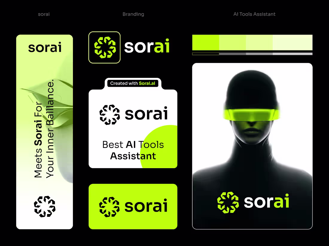
Designed a bold and futuristic brand identity for Sorai — an AI tools assistant focused on simplifying creativity and productivity through intelligent technology.
The logo is built around an abstract “S” symbol, crafted to represent:
• Continuous AI evolution
• Smart connectivity & automation
• Human + machine collaboration
• A scalable modern tech ecosystem
For the visual direction, I combined:
→ Minimal geometric forms
→ High-contrast black & neon green palette
→ Clean typography
→ Futuristic UI-inspired branding elements
The goal was to create a visual identity that feels intelligent, memorable, and instantly recognizable in the growing AI space.
Branding is not only about aesthetics anymore — it’s about creating a system that communicates innovation at first glance.
What do you think about this direction for an AI brand? 👀
#LogoDesign #BrandIdentity #AI #ArtificialIntelligence #TechBranding #MinimalLogo #ModernBranding #VisualIdentity #GraphicDesign #CreativeDesign #BrandDesigner #LogoInspiration #IdentityDesign #FuturisticDesign #UIDesign #AItools
0
26
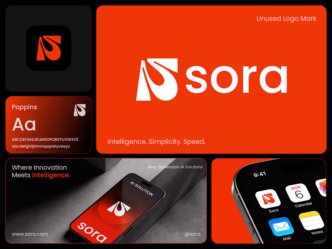
AI Brand Identity Concept — Sora
AI companies are building the future, but many still struggle with brand identities that truly reflect innovation.
This concept branding for Sora explores how a modern AI company can communicate intelligence, simplicity, and speed through a clean visual identity.
The logo symbol is built from a stylized “S” combined with a fluid droplet form, representing flowing intelligence, adaptability, and continuous learning — qualities that define modern AI systems.
The bold orange palette brings energy, innovation, and strong digital visibility, while the minimal typography keeps the brand clear, scalable, and product-ready.
The identity was designed to work seamlessly across:
• AI platforms
• Mobile apps
• Digital products
• SaaS dashboards
• Tech marketing materials
In a competitive AI landscape, a distinctive and scalable brand identity can make a powerful first impression.
If you're building an AI, SaaS, or tech startup and need a brand that reflects your innovation — let’s connect.
💬 What do you think about this concept?
3
71
Logofolio 2025-26
0
42
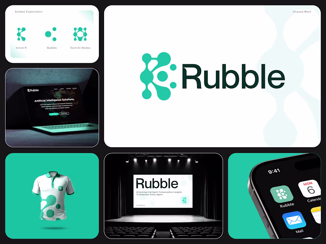
Rubble - Ai Logo & Branding
2
200
Voltguard - Cybersecurity Brand Identity Design
1
0
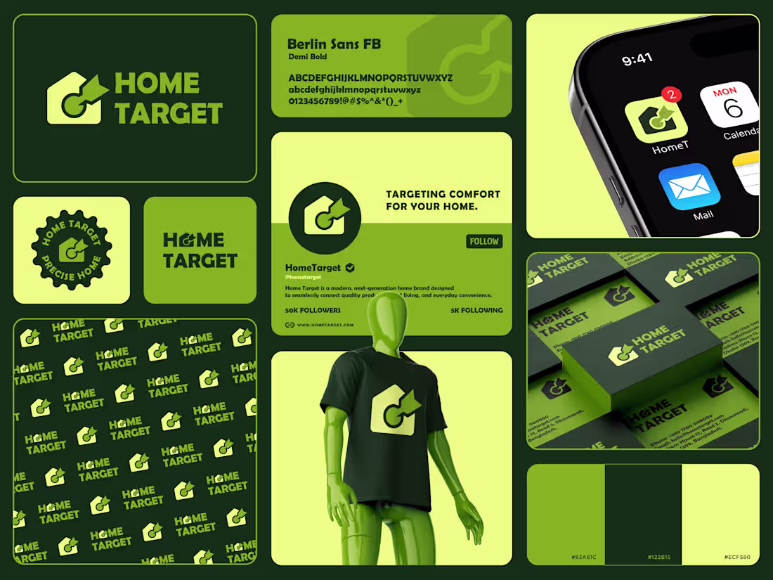
A strong brand is more than just a logo — it's a clear message.
Introducing HomeTarget — a modern brand identity designed to represent precision, comfort, and smart home living.
The logo combines a house and a target symbol to communicate accuracy and reliability in home solutions. Paired with a bold green color system, the identity feels fresh, trustworthy, and scalable across all platforms.
From social media to packaging, every element is designed to create a consistent and impactful brand experience.
What do you think about this concept?
1
66
Nexitrans — Brand Identity for a Logistics & Transport Company
2
1
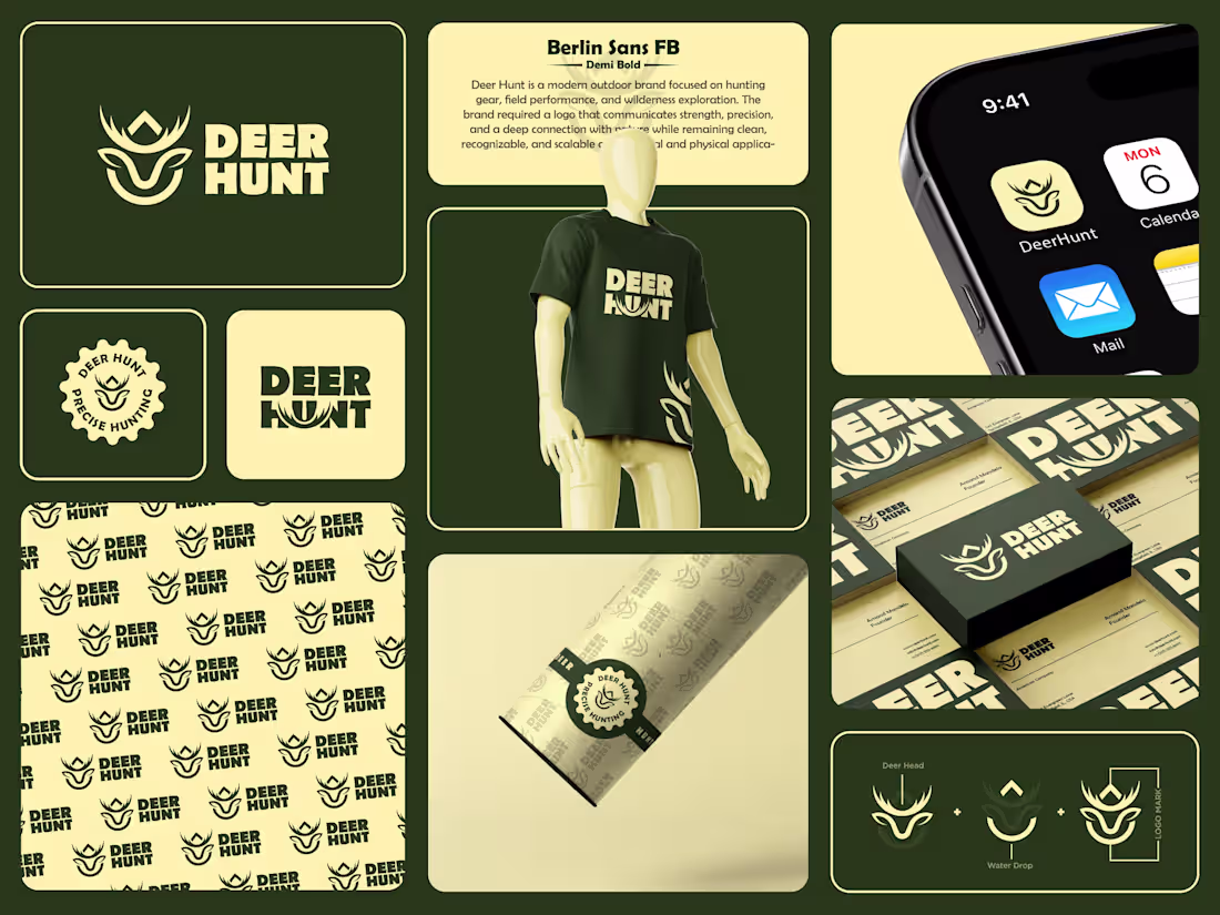
Adventure & Wildlife Branding Design
1
100
Amelogix Logo & Visual Identity Design
2
1