
pro
Akram Adjab
Web Developer creating fast, polished animated interfaces
- $1k+
- Earned
- 1x
- Hired
- 9
- Followers
Menus don't have to just appear.
Built a GSAP-powered mega menu with layered color slides that wipe in sequence before the content drops. Smooth open/close toggle, every layer timed to feel deliberate.
That split-second choreography? That's what makes an interface feel alive.
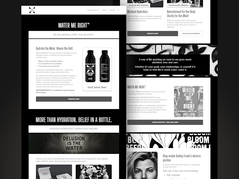
Homepage refinement for a Shopify project.
The goal was to simplify the layout, strengthen the visual flow, and make the story feel more intentional.
Before vs After.
Which version communicates the brand better?
1 voted
100%
0 voted
0%

1 vote
Closed
Experimenting with scroll-driven storytelling.
In this animation, the image starts fully immersive, occupying the entire viewport. As you scroll, it smoothly scales down and transitions into a grid of image cards with a subtle parallax effect.
Small interaction, but it creates a more cinematic browsing experience.
Scroll-Based Motion Experiment
Quick motion experiment I’ve been playing with.
As you scroll, a small Lottie character “walks” across the page while pushing a video that scales down with the scroll. Inspired by Ribbit and built as a playful way to connect motion directly to user...