So this is an interactive 3D mechanical assembly I built in Omma.
The focus here was on keeping the structure clean and making it easy to explore different components.
You can inspect parts of a model and understand how everything fits together. It’s more about clarity and...
Made this interactive fruit slicing experience in Omma
I focused on making every slice feel smooth and Satisfying. Just slice and enjoy the feel of it.
Check it out
https://omma.build/p/fruit-slicing-physics-game-vw15b9
AI design tools are getting scary good.
I pasted monad website link into MagicpathAI and it recreated the entire design instantly.
Then I asked it to create a prediction market landing page for Monad. and it generated a new page from the same style.
It can generate designs...
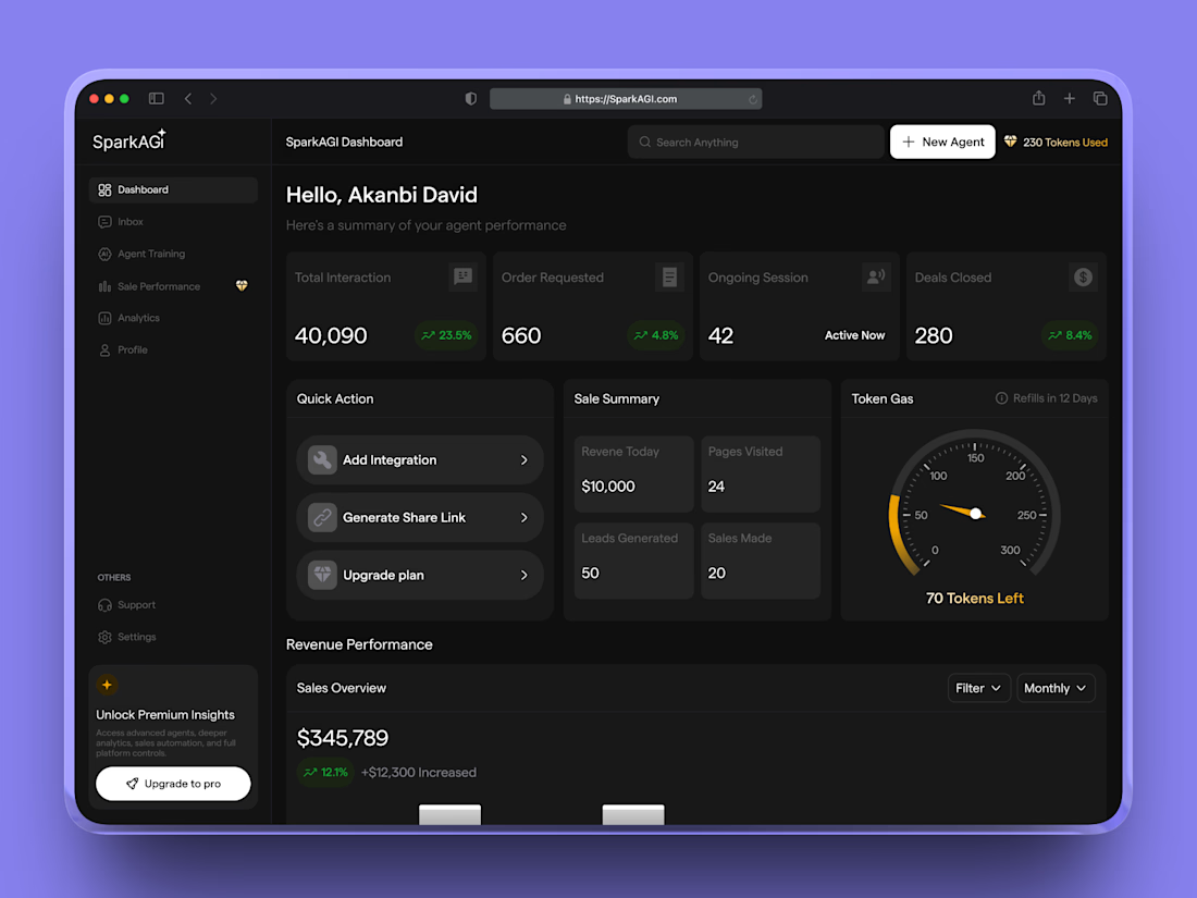
AI Sales Agent – Analytics Dashboard UI
The command center of the AI sales platform.
This dashboard gives founders instant visibility into interactions, deals closed, revenue, and active sessions plus token usage tracking to monitor AI consumption.
The focus: clarity, hierarchy, and actionable insights at a glance.

