

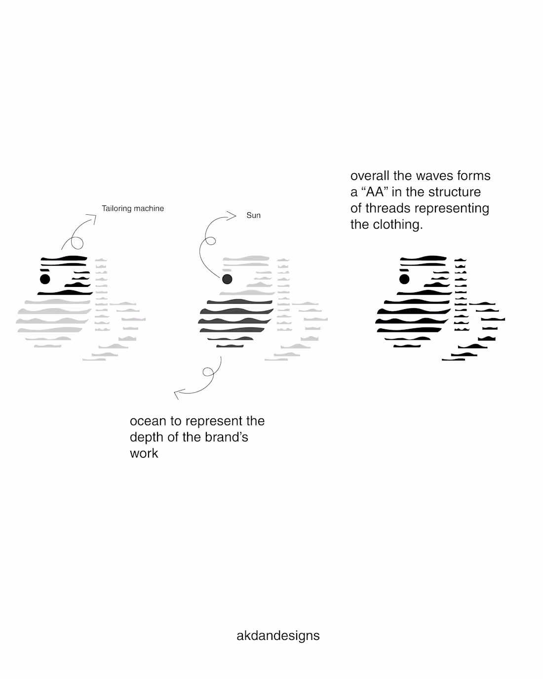
Designed a Brand Identity for Aazhai
Aazhai is a Tamil-based textile brand built on the philosophy of deep craftsmanship and dedication to the art of textile making.
To visually express this idea of depth, the logo concept draws inspiration from the vastness of the ocean. The flowing curves represent ocean waves meeting the seashore, symbolizing depth, movement, and continuity in craft.
These elements are thoughtfully integrated with symbols of tailoring — including the silhouette of a sewing machine — representing the brand’s foundation in textile craftsmanship. A rising sun element is also incorporated to symbolize brilliance, growth, and the shine of the brand’s future.
The result is a logo that blends nature, craft, and cultural identity, reflecting Aazhai’s commitment to traditional artistry .
2
19
A minimalist logo mark crafted with a traditional touch — clean, timeless, and rooted in heritage.
Built for a media brand that honours its cultural roots while staying modern and sharp.
0
12
WESAFE — a safe space for every girl and woman, from kids to adults.
Crafted a logo that reflects protection, confidence, and community.
A brand standing strong for empowerment at every stage of life.
0
11
SGR Fashions — bold, clean, and made to stand out.
Crafted this logo mark to match the brand’s energy: modern, confident, and style-driven.
A visual that hits instantly and speaks fashion without saying a word.
0
10

Just wrapped a brand identity design project for my college, celebrating 15 years of growth, creativity, and community.
I wanted the visuals to capture more than just a milestone—it’s about evolution. The new identity blends legacy and modern energy, reflecting how far we’ve come and where we’re headed next.
From refining the logo system to building a celebratory color palette, this one was close to heart.
Check out the full project on my profile 👀
0
17