
ahmed ali
I specialize in creating impactful, versatile logos
Ready for work
ahmed is ready for their next project!
Looking for a graphic designer who actually understands branding — not just “making things look nice”?
I help brands create visuals that feel premium, memorable, and built to convert. From logos to social media design, I focus on clean aesthetics, strong storytelling, and designs that make businesses stand out.
✨ What I can help with:
• Logo & Brand Identity
• Social Media Creatives
• UI/UX Design
• Adobe Illustrator & Photoshop Projects
• Marketing & Promotional Graphics
Whether you're a startup, creator, or growing business — I’m ready to bring fresh ideas to your brand.
Let’s build something people remember. 🚀
#GraphicDesigner #BrandIdentity #LogoDesign #SocialMediaDesign #UIUX #AdobeIllustrator #Photoshop #ContraCreator #FreelanceDesigner
0
0
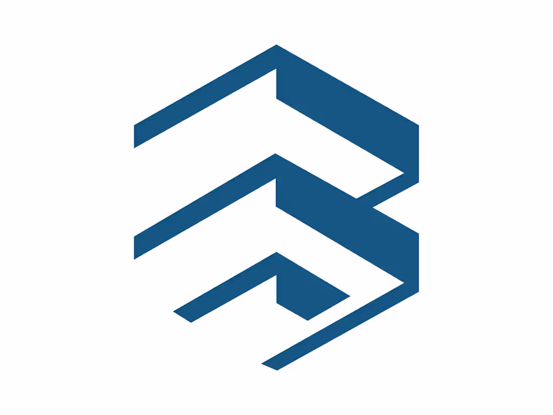
The logo you shared is a modern, geometric design that visually suggests the letter “B” through abstraction. Here’s how it works:
Shape & Structure: It’s composed of three blue parallelograms stacked vertically. Each one is angled diagonally, creating a sense of motion and dynamism.
Letterform Suggestion: The negative space between the shapes forms curves and breaks that resemble the outline of the letter B, though in a stylized, minimalist way.
Style & Tone: Clean lines and symmetry give it a professional, contemporary feel. The angular design conveys strength, precision, and innovation.
Branding Potential: Because it’s abstract yet recognizable, it could serve as a versatile corporate identity mark—working well across digital platforms, print, and even physical applications like signage or embroidery.
0
26
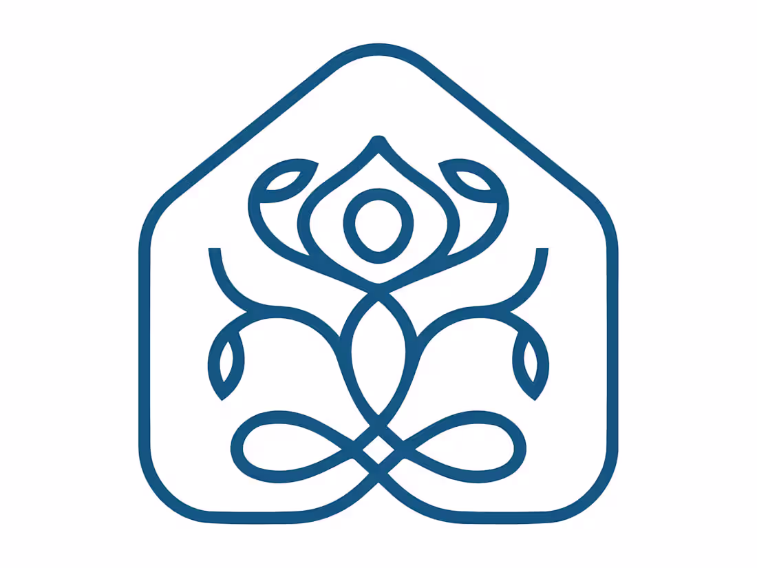
This logo design is inspired by nature and harmony. The symbol combines organic curves and leaf-like elements to create a balanced and elegant composition. The central shape represents growth and unity, while the flowing lines form a symmetrical structure that feels calm, modern, and refined.
The blue color conveys trust, stability, and professionalism, making the logo suitable for wellness brands, eco-friendly businesses, beauty products, or modern lifestyle companies. The overall design focuses on simplicity, balance, and a natural aesthetic that makes the brand memorable and visually appealing.
0
33
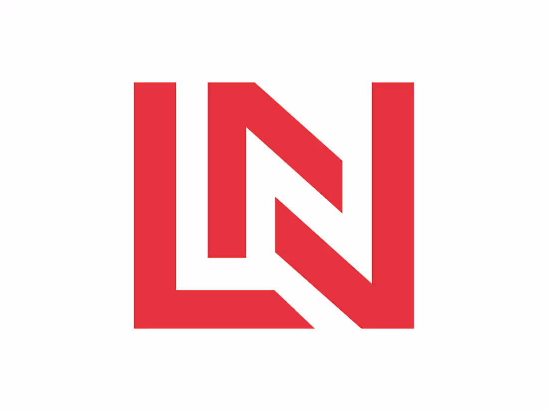
This logo concept features a bold and modern monogram built from the letters “L” and “N”. The design uses strong geometric shapes and clean angles to create a powerful and memorable visual identity. The overlapping structure of the letters forms a dynamic and balanced composition, giving the logo a contemporary and professional look.
The vibrant red color adds energy and confidence, making the mark highly visible and impactful. This style of monogram is ideal for brands, startups, or personal identities that want a strong, simple, and recognizable logo.
0
40
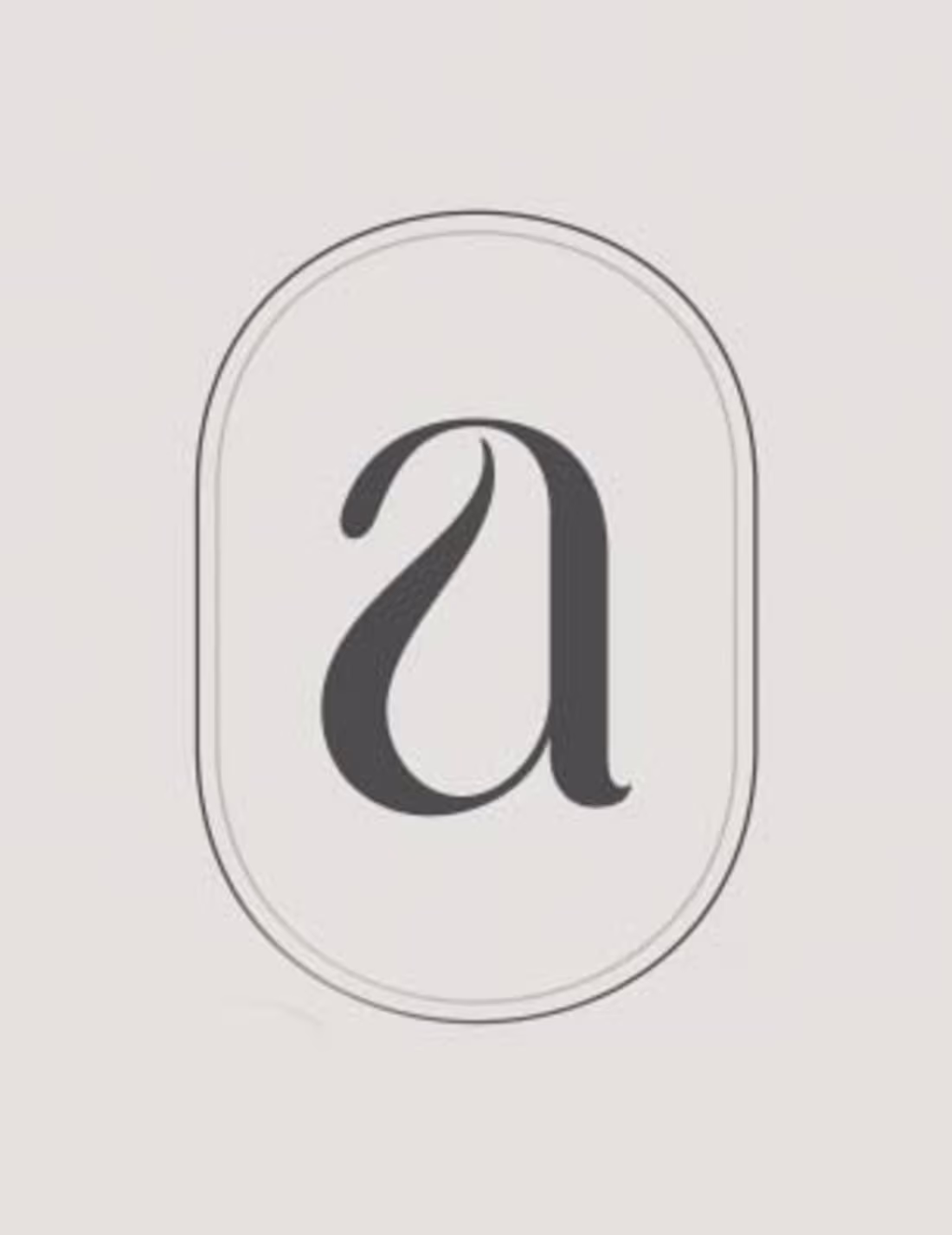
This design explores a clean and elegant typographic style using a lowercase “a” as the central element. The letterform is placed inside a soft rounded frame to create a balanced and modern visual identity. The minimal color palette and refined curves give the logo a timeless and sophisticated feel, making it suitable for brands that want a simple yet distinctive mark.
0
50