Ahmad khan
Creative Web Designer & Framer Expert.Crafting modern UI/UX
New to Contra
Ahmad is building their profile!

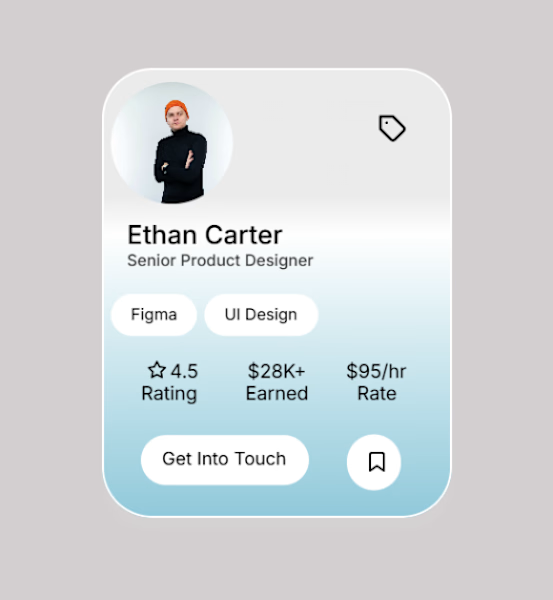
🚀 Updated Version of My Profile Card UI
I went back and refined my previous design by fixing spacing, improving typography, balancing the layout, and removing visual inconsistencies to make the overall experience cleaner and more polished.
I'd really appreciate your feedback!
What...

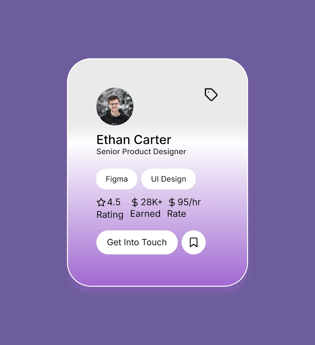
🚀 Just finished designing this clean profile card concept from scratch. I focused on a soft glassmorphism-inspired interface, balanced spacing, and a simple visual hierarchy to keep the design modern and user-friendly.
I'd really appreciate your honest feedback. What works well,...
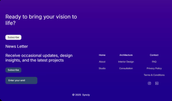
🚀 Just Built a New Footer Component
I've been working on a modern footer component for Framer, designed with simplicity and usability in mind.
✨ Features
• Clean & minimal layout
• Newsletter subscription section
• Organized navigation links
• Social media integration
•...

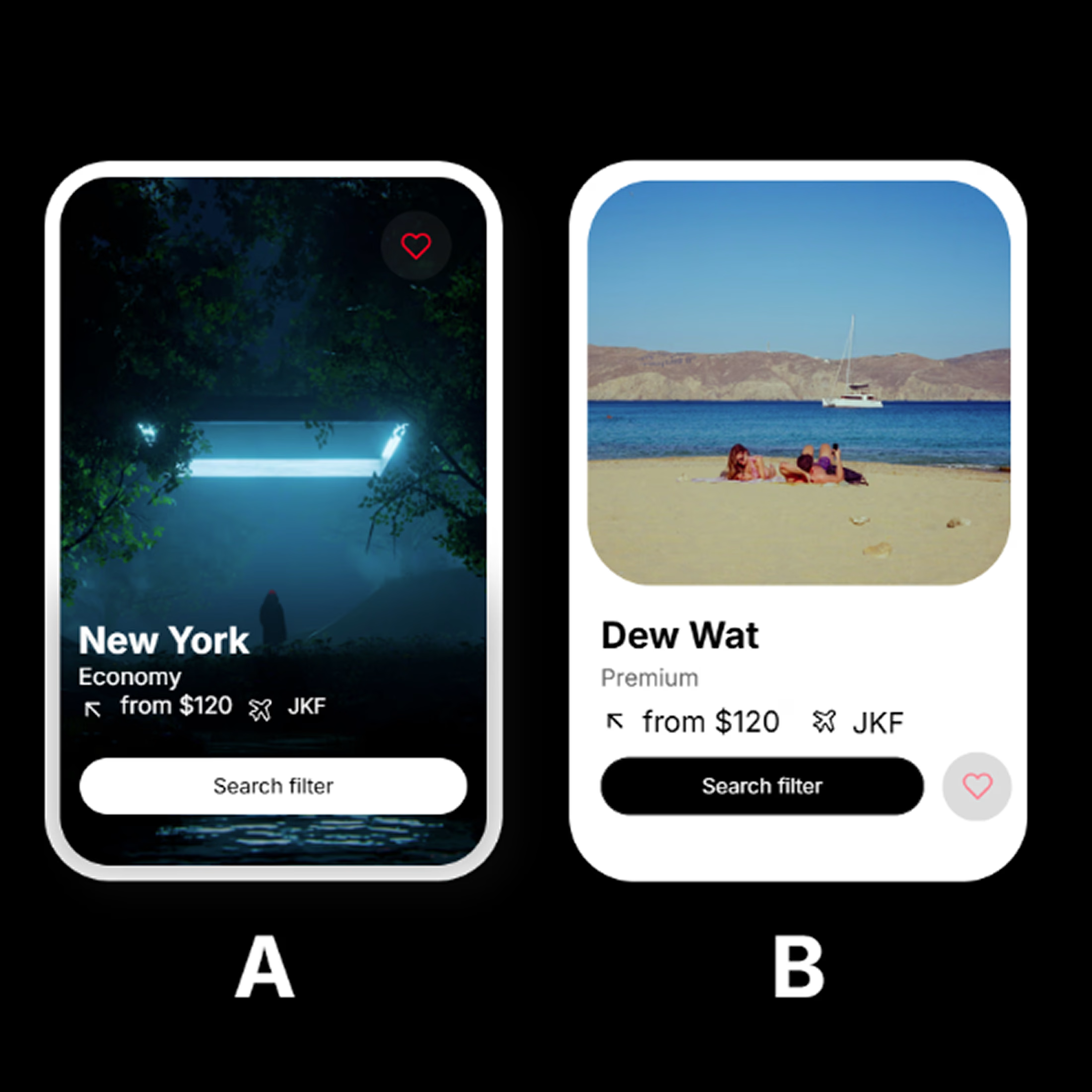
Which one would you choose? 👀
I'm exploring two different travel card concepts and I'd love your honest feedback.
🅰️ Card A
Full-image immersive design
Bold, cinematic feel
Great for premium destinations
🅱️ Card B
Clean, minimal layout
Better readability
Modern and user-friendly
If you...
🚀 Need Your Honest Design Feedback!
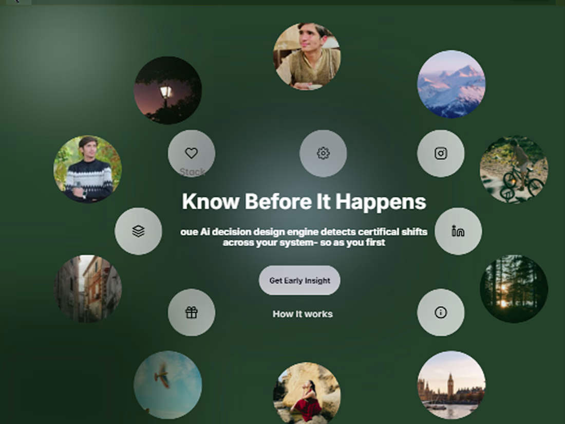
I designed this Hero Section from scratch and experimented with a circular layout to create a more interactive first impression.
I'm trying to balance visual appeal, hierarchy, and usability, but I'd love to hear your perspective.
What do you...