
Idowu Adebayo
Helping startups and growing businesses elevate their brand.
- 23
- Followers


The downside of being a presentation designer?
I can’t unsee bad hierarchy.
Someone sends me a screenshot:
“I like this.”
My brain:
The spacing is wrong.
Someone opens a presentation:
“Here’s our agenda…”
My brain:
Why are there 17 things on this slide?
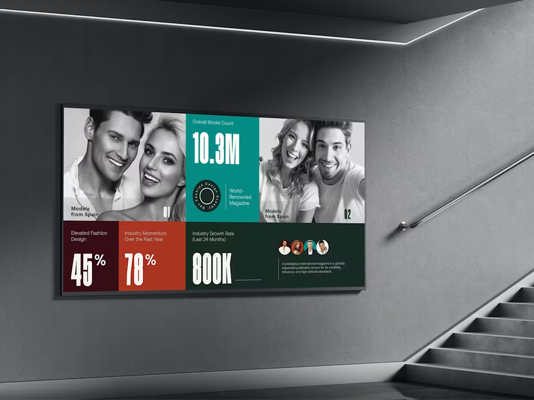
I walk past a billboard:
That headline needs 40% less text.
I see a beautiful restaurant menu:
Okay… whoever designed this understands rhythm.
At this point, I’m not sure if I’m enjoying everyday life…
or turning everything into a slide.
Maybe that’s what happens when design stops being your job
and becomes the way you observe the world.
#DesignerLife #PresentationDesign #DesignThinking #CreativeLife #VisualDesign
1
80
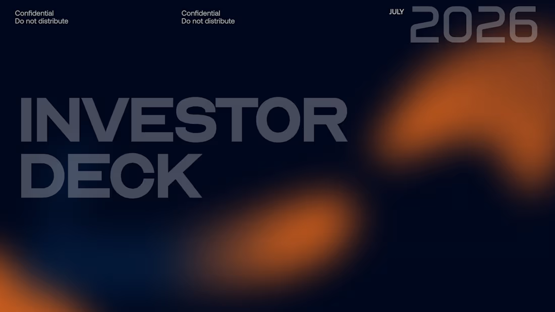
A great deck shouldn’t feel like a document.
It should feel like a room getting quieter.
One slide creates curiosity.
The next creates tension.
Then comes the insight.
Suddenly, the audience isn’t reading anymore.
They’re leaning in.
That’s the difference between arranging information and designing an experience.
I build pitch decks around rhythm, hierarchy, contrast, narrative, and visual restraint — so complex ideas can move with the confidence of a great brand.
No unnecessary decoration.
No walls of information.
No “make it look impressive” design.
Just a carefully engineered visual story that knows exactly when to speak…
…and when to leave space for the idea to speak for itself.
Your deck has a story.
Make people feel it.
2
176
The best design decisions are often felt before they're noticed.
A certain amount of space makes something feel premium.
A certain typeface makes it feel credible.
A certain composition makes it feel effortless.
A certain level of restraint makes it feel confident.
That's the part of design I find most interesting.
Not simply making something beautiful
but shaping how an idea is experienced.
Good design gets attention.
Great design builds perception.
1
151
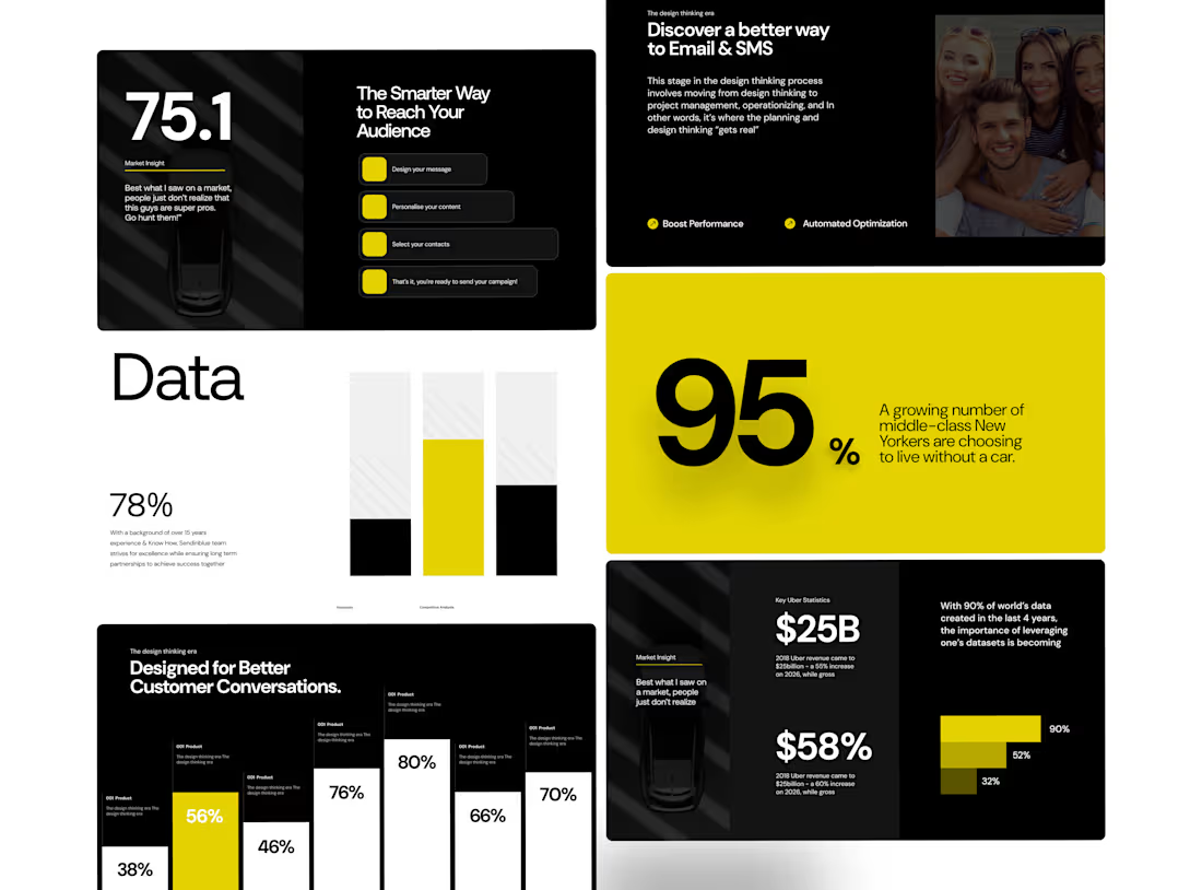
Designed around the idea that data doesn't have to feel dry.
I wanted this presentation to feel more like an editorial publication than a conventional business deck.
Large statistics create the impact.
Typography creates the rhythm.
Data visualizations create the structure.
And the yellow accent gives the system its energy. One of my favourite parts of the presentation design is finding the balance between information and emotion.
This project gave me room to experiment with oversized numbers, structured data, and a restrained colour system.
Nothing unnecessary.
Just enough visual language to guide the story.
3
3
267