Adejoju Aishah opeyemi
UI/UX Designer | Designing user-friendly products
New to Contra
Adejoju is building their profile!
Most users decide whether to stay on a website within seconds.
That’s why the hero section matters the most.
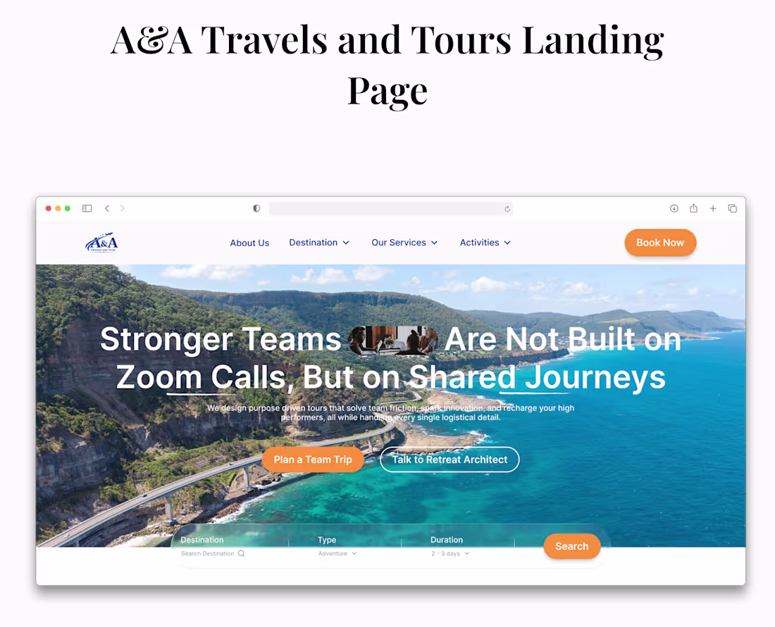
For the A&A Travels and Tours landing page, the goal was simple: help visitors understand, trust, and act immediately.
The headline speaks directly to modern teams:
“Stronger Teams Are Not Built on Zoom Calls, But on Shared Journeys.”
It instantly connects with founders, managers, and remote teams looking for meaningful experiences beyond screens.
The hero provides two clear paths:
• Plan a Team Trip for users ready to book
• Talk to a Retreat Architect for those who need guidance
The integrated destination search also allows visitors to start exploring trips immediately, reducing friction and increasing engagement.
A strong hero section doesn’t just look good.
It builds trust, guides decisions, and drives conversions.
1
12

When I first looked at this BEFORE website, it looked like a website, but it didn’t guide users toward action.
The layout was dense, unclear, and key sections competed for attention instead of leading visitors through a journey.
So I redesigned the experience with one goal:
Turn the website into a conversion driven journey, not just a page full of information.
Here’s what changed:
• A stronger visual hierarchy that guides users naturally
• A clearer hero message focused on value, not just description
• Structured sections that tell a story as users scroll
• Strategic CTAs placed where decision moments happen
The result?
The new experience makes it easier for visitors to:
• Understand the value quickly
• Explore destinations effortlessly
• Build trust through structured content
• Take action without hesitation.
2
25