
Olasunkanmi Adejayan
Providing solutions through design to products
Ready for work
Olasunkanmi is ready for their next project!
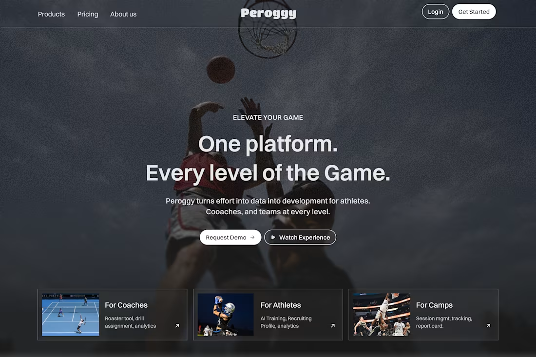
Designed to convert. Built to scale.
This landing page concept for Peroggy showcases how a sports technology platform can communicate value within seconds.
By combining bold visuals, strategic messaging, and a conversion-first layout, the experience helps athletes, coaches, and sports organizations quickly understand the platform and take action.
Clear positioning
Conversion-focused hero section
Modern SaaS UI patterns
Strong content hierarchy
Mobile-friendly structure
Ready for Framer development
I help startups and SaaS companies transform complex products into websites that attract users, build trust, and drive growth.
Available for SaaS websites, product design, and Framer development projects.
0
104
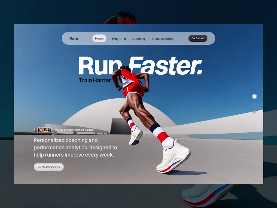
Numa is a performance-focused coaching platform built for runners who want measurable results. Combining personalized coaching, performance analytics, and structured training programs, the platform helps athletes improve pace, build consistency, and achieve their goals with confidence.
Whether preparing for a first race, chasing a personal best, or training for long-distance events, runners receive data-driven guidance tailored to their performance and progress.
0
123
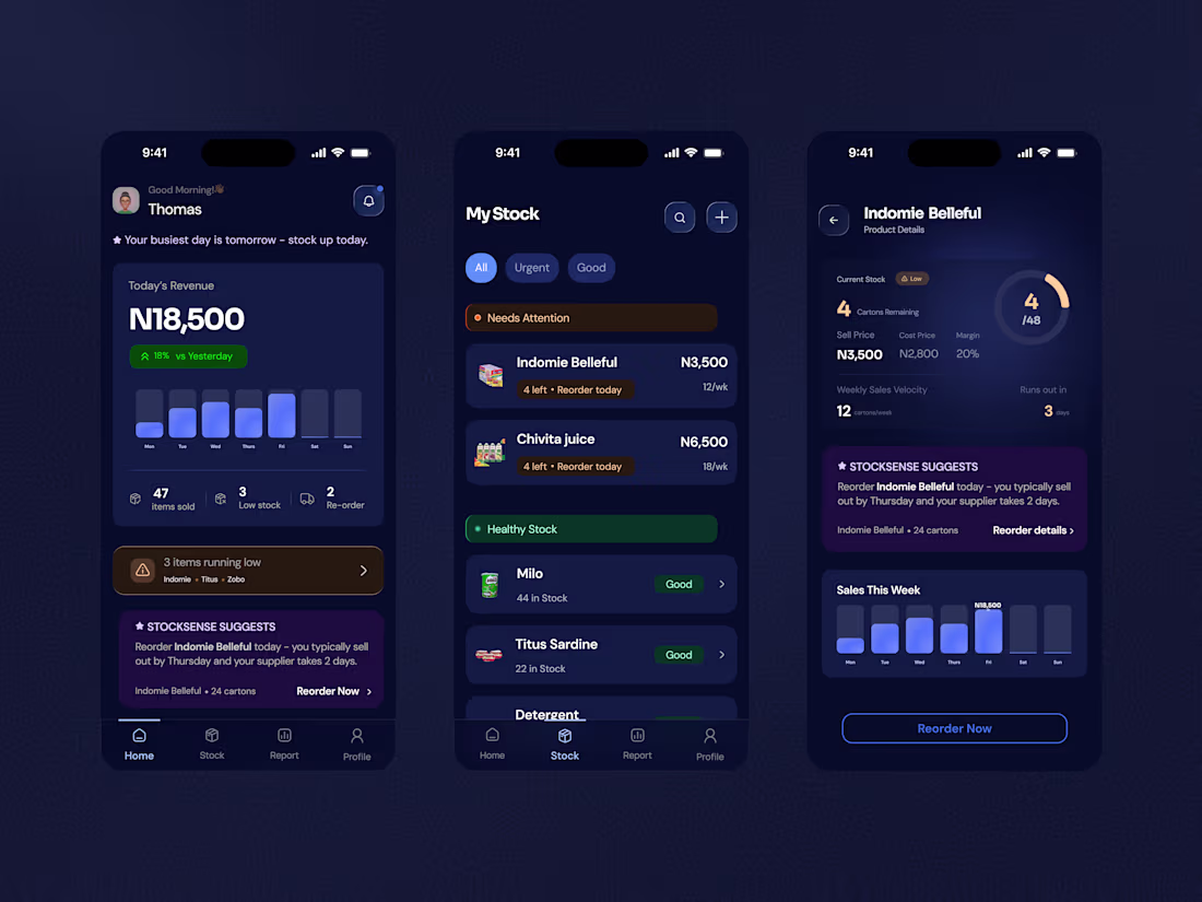
Stock Sense Mobile App
0
5
Topiq mobile app
0
4
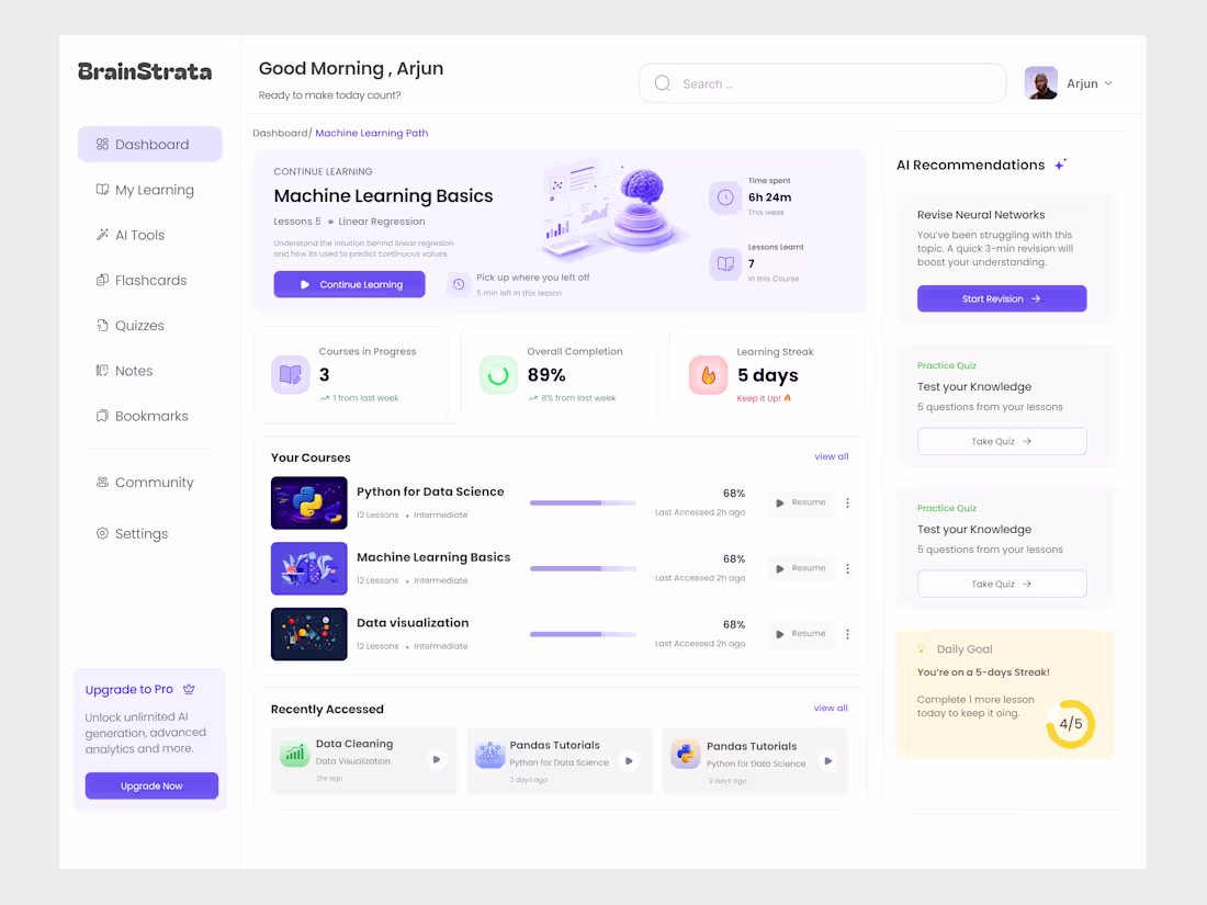
Redesign of an E-learning dashboard
1
11
#InteractionDesign #Fintech #UXDesign #UIDesign #jitter
0
96
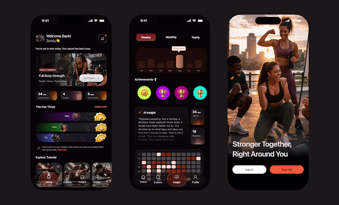
Built a dark-mode fitness app that doesn't just look good it keeps people coming back.
This is a social fitness platform designed around accountability, streaks, and squad motivation. Every screen was crafted to reduce drop-off and drive daily engagement:
🏠 Home — personalized greeting, today's workout front and center, squad leaderboard, and streak stats that make skipping feel costly.
📊 Insight — weekly/monthly/yearly activity heatmaps, AI-powered motivational coaching copy, and achievement badges that reward consistency.
🚀 Onboarding — full-bleed hero image with a single, clear CTA. Converts visitors into users in one tap.
The result? An interface that feels premium, moves fast, and makes working out feel like a social event not a chore.
Looking to build a fitness, wellness, or community-driven app that users actually open every day? Let's talk.
0
164
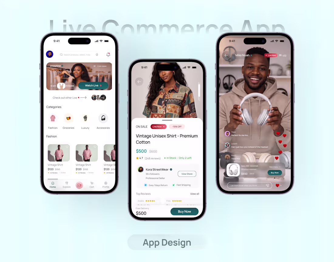
Redesigning Commerce for How People Actually Shop Today
Most ecommerce platforms still feel static, overwhelming, and disconnected from how users make decisions in real life.
People don’t just want to scroll endlessly anymore they want to see products in action, trust what they’re buying, and make quick decisions without friction.
So I explored a redesign of a multi-category marketplace by introducing a live commerce layer and rethinking the discovery experience from the ground up.
The focus was simple:
• Make discovery feel effortless, not overwhelming
• Use live interaction to build trust instantly
• Reduce friction between “seeing” and “buying”
• Design for real behavior browsing, saving, comparing
The result is a system where users can:
– Discover products through a clean, structured feed
– Join live sessions and see items in real-time
– Make confident decisions with clear product context
– Complete purchases quickly without unnecessary steps
This wasn’t just about visual polish it was about improving how users move from curiosity → trust → action.
2
2
225
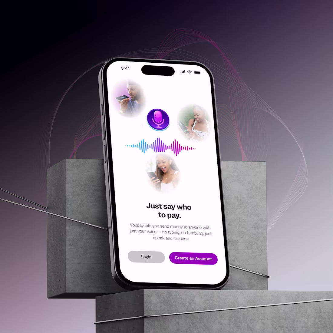
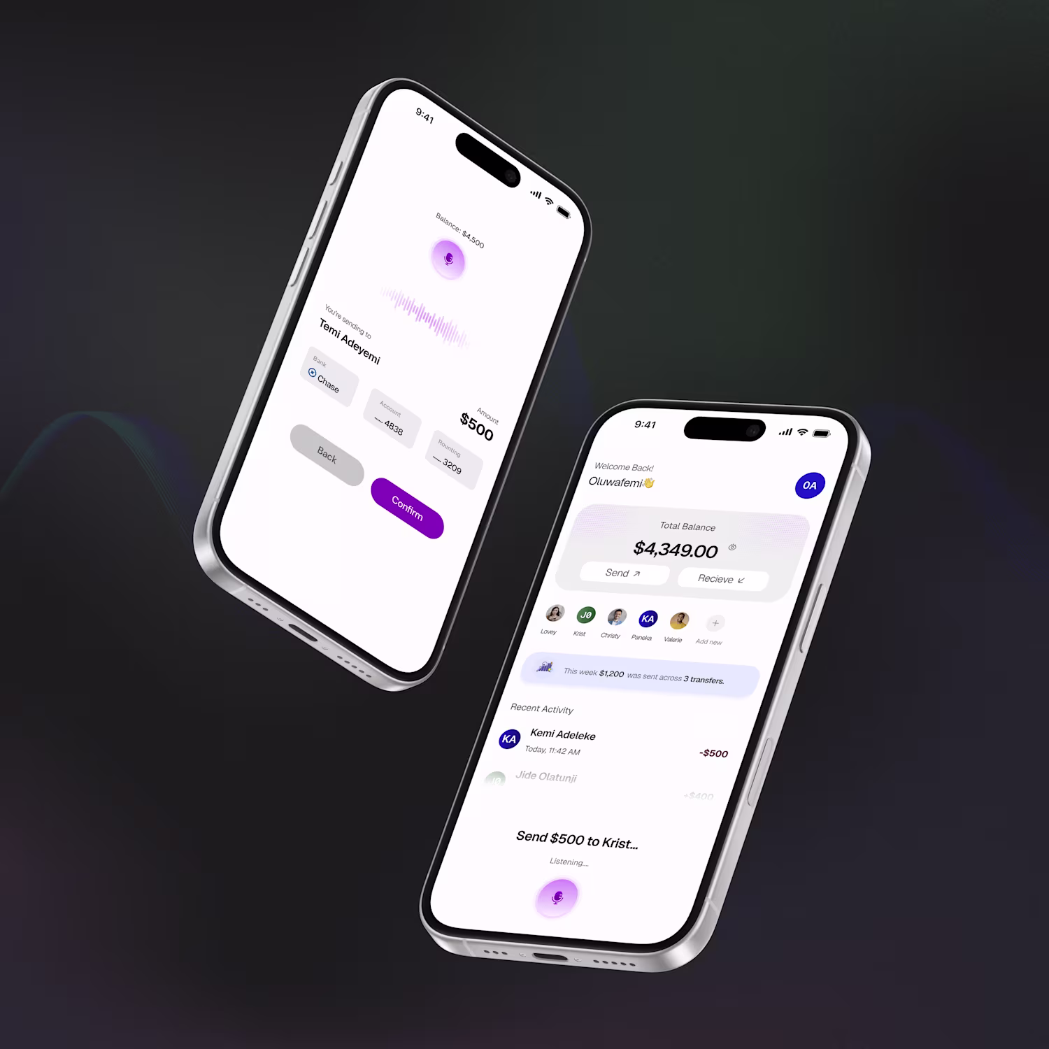
Voxpay - Voice-First Money Transfers
Most payment apps make you work. Open the app, find a contact, type an amount, and confirm. Voxpay flips that entirely; you speak, money moves.
The brief was to design a fintech app for students and young adults where voice is the primary interaction, not a feature buried in settings. The challenge was making voice feel trustworthy enough to send real money with and keeping manual input as a first-class fallback, not an afterthought.
Key design decisions:
The mic lives in the navigation bar, persistent across every screen, so users can trigger a transfer from anywhere in the app, not just the home screen. The voice parsing screen shows bank name and masked account number before confirmation, because a name alone isn't enough when money is on the line. The onboarding illustration animates a live transfer between two users so the product's value is understood before a single word is read.
The visual language is deep navy, electric cyan, and warm gold global, premium, and distinct from the overcrowded purple-gradient fintech aesthetic.
1
159
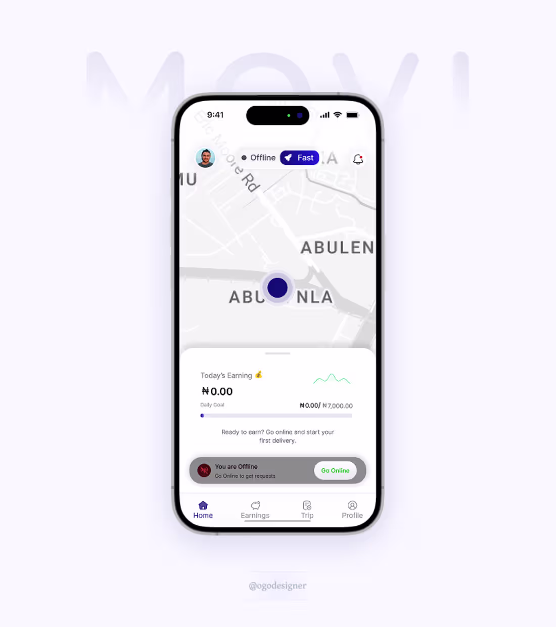
Before riders go online, they should already understand how today will pay.
Daily earnings. Clear goals. One tap to start.
Motivation isn’t something you add later.
It has to be visible upfront or supply quietly leaks.
1
144
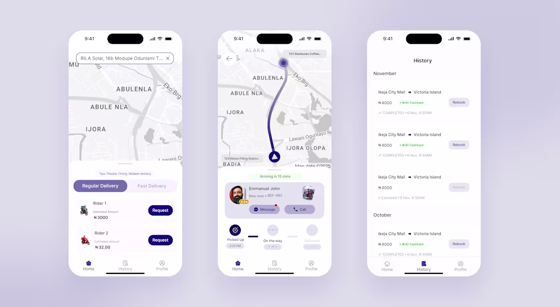
#WIP for a delivery app
Client: Make it minimal and very Intuitive as possible
ME:
1
136
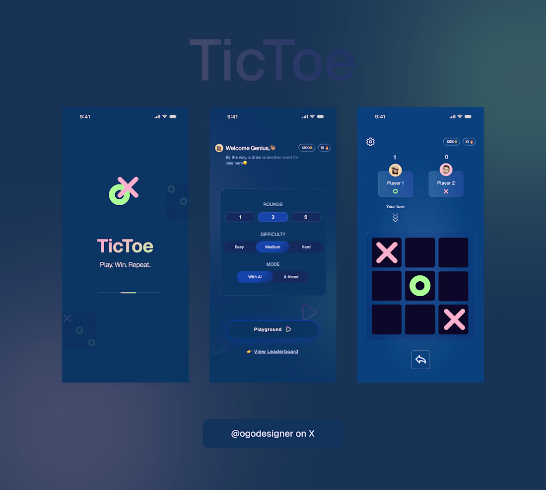
New project drop!🚀
Just wrapped up this sleek, minimal, and ultra-playable TicToe mobile UI. Clean gradients, sharp contrasts, and a smooth flow from onboarding → setup → gameplay.
🎮 Highlights • Modern, neon-inspired X/O icons • Intuitive difficulty + rounds selector • Player avatars + live scoring • A crisp, spacious board layout
Built with a focus on clarity, personality, and fun. Always iterating, always leveling up. ✨
If you’d like something similar for your product, let’s collaborate.
1
2
153