Adegbire Israel
Becoming better at what I do everyday ♥️
Ready for work
Adegbire is ready for their next project!
I've never really understood how people decide on a new hairstyle.
Most of the time, we save photos from Instagram, Pinterest, or a celebrity we admire and hope it looks good on us too.
But what if it doesn't suit our face shape?
That thought led me down a rabbit hole and eventually became a design concept I'm currently exploring: StyleScan.
The idea is simple.
You scan your face, get a breakdown of your facial features, and receive hairstyle recommendations that actually suit you. You can even try them on virtually, save your favorites, and share them with friends before making a decision.
One thing I kept asking myself while designing was:
"How can I help people feel more confident before they sit in a barber's or salon chair?"
Instead of making users guess, StyleScan is designed to guide them toward styles that fit their unique features.
Would you trust an app to help choose your next hairstyle? 👇
#UIUX #ProductDesign #MobileAppDesign #UXDesign #Figma #DesignThinking #AppDesign #StartupIdea
10
7
162
🧼 Design Concept: Spotless
A mobile app designed to connect homeowners with trusted cleaning professionals.
For this project, I focused on:
✨ Simple onboarding flow
✨ Clear user role selection
✨ Trust-building user experience
✨ Clean and modern visual design
✨ Mobile-first interface
The challenge was creating an experience that feels reliable, approachable, and effortless from the very first screen.
Designed in Figma.
Available for:
• UI/UX Design
• Mobile App Design
• Website Design
• Design Systems
What do you think of the direction so far? 👇
#UIUX #ProductDesign #Figma #MobileAppDesign #UXDesign #UIDesign #FreelanceDesigner #ContraCreator #DesignPortfolio #BuildInPublic
2
30
Working on a client portfolio
1
63
There’s something powerful about simplicity.
No loud graphics.
No excessive details.
Just clean silhouettes, timeless essentials, and a digital experience designed to feel as intentional as the clothing itself.
Currently designing "VOID" a minimalist fashion brand focused on restraint, structure, and modern everyday wear.
More sections coming up 👌😮💨🙂
What stands out to you first the typography, layout, or overall atmosphere?
2
3
92
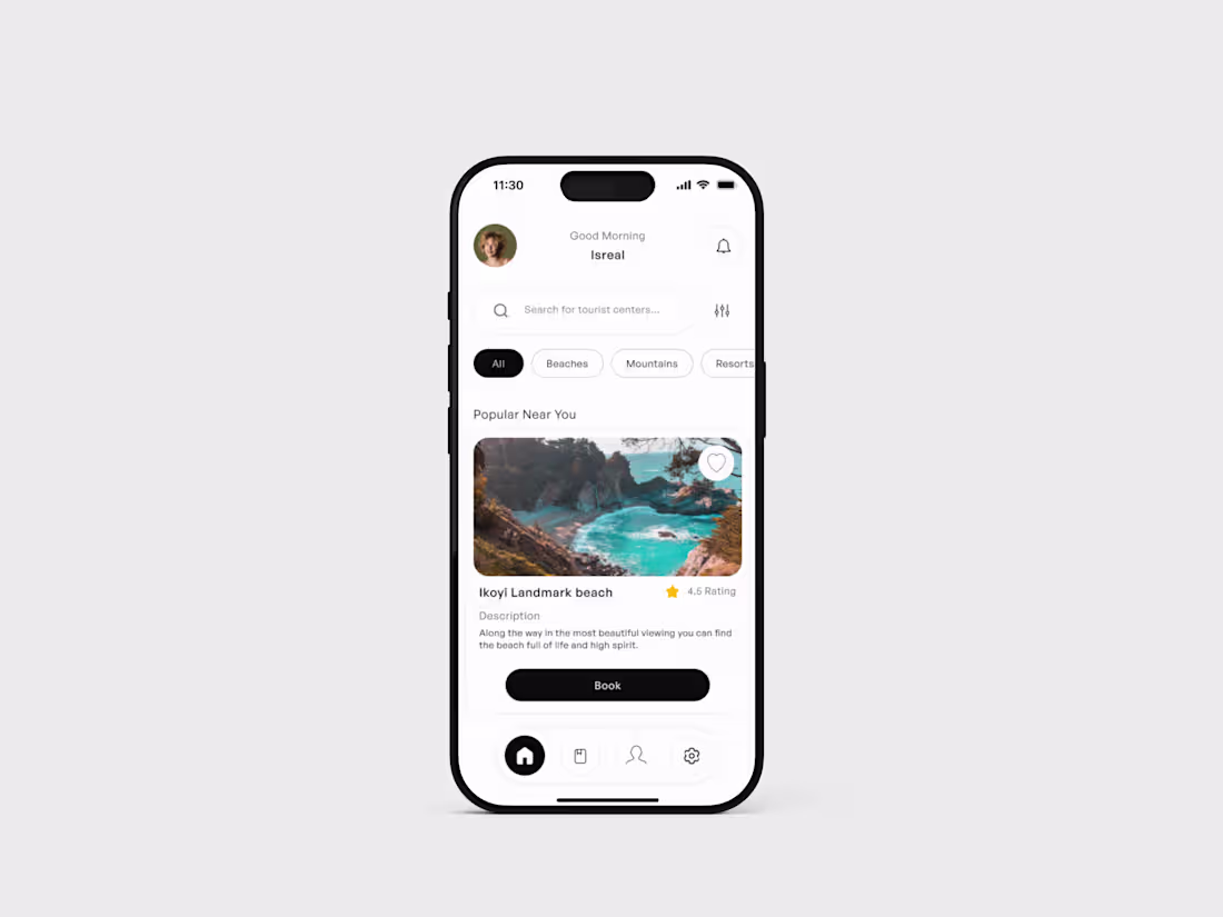
TRAVEL APP DESIGN
1
39
Hope you’re having a great start to the week
wishing you a productive and smooth one ahead.
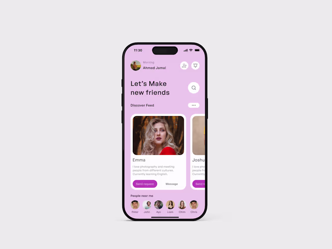
I’ve been working on a simple mobile concept focused on helping people connect globally. The idea was to keep things clean and easy from discovering people, to viewing profiles, to starting conversations without friction.
I explored a soft gradient + glassy UI style to give it a modern feel while keeping the experience intuitive and not overwhelming.
3
66
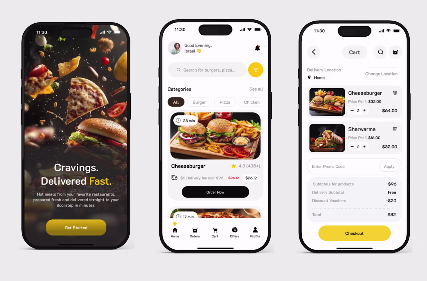
Your fintech app is failing
If users has to guess what to do on your app they have lost 80% attention to that app, but an app that guides users through the process keeps them.
Look at it like this, there are some apps that you can close your eyes and use the app if not completely but partially.
what step did they take:
1. They make things clear:
Clarity makes things look less stressful and better to use.
2. They make users take one step at a time, not rushing them through 5 processes at once.
That's why I have decided to Redesign the UBA Group (https://www.linkedin.com/company/uba/) App.
I focused more on clarity because when there is clarity there is trust.
hashtag#uiuxdesign (https://www.linkedin.com/search/results/all/?keywords=%23uiuxdesign&origin=HASH_TAG_FROM_FEED) hashtag#fintech (https://www.linkedin.com/search/results/all/?keywords=%23fintech&origin=HASH_TAG_FROM_FEED) hashtag#UBA (https://www.linkedin.com/search/results/all/?keywords=%23uba&origin=HASH_TAG_FROM_FEED)
0
38
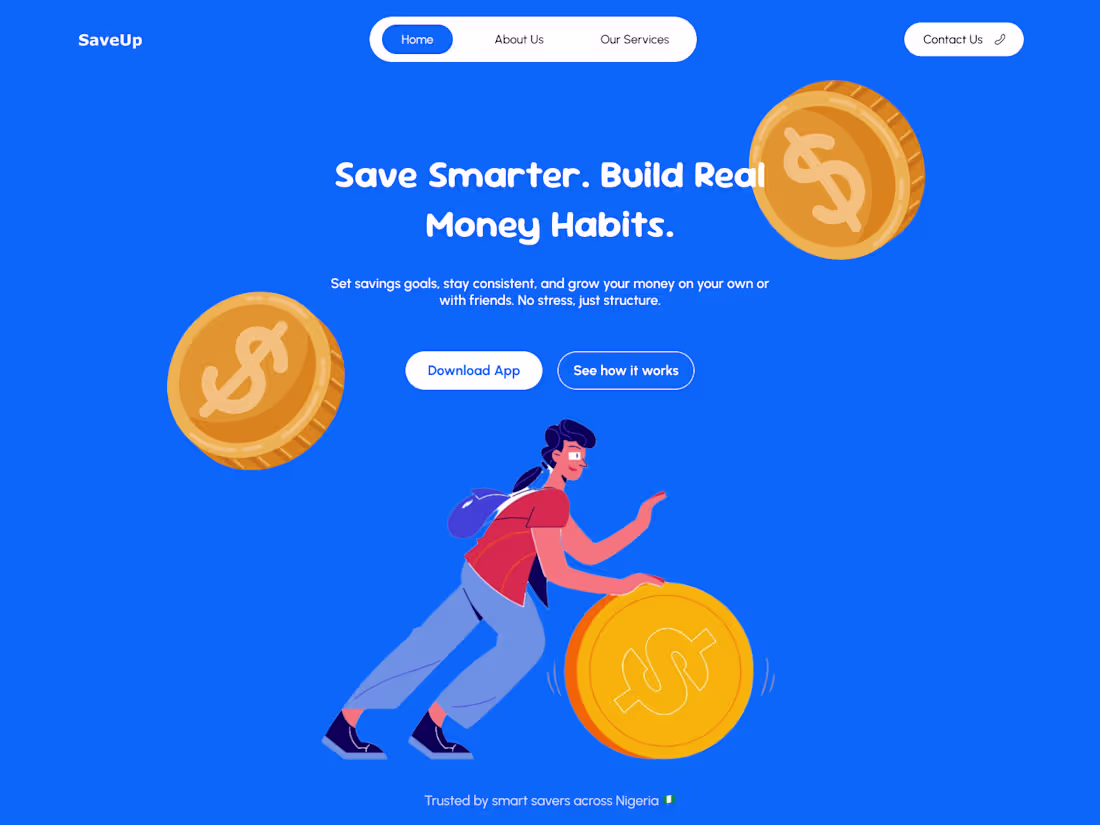
Most people don’t struggle with saving money because they don’t want to they struggle with consistency.
That idea shaped this fintech landing page concept: a system designed to help users actually follow through on their financial goals instead of abandoning them halfway.
I explored a structured savings experience built around clarity and behavior, not just aesthetics:
• Goal-based savings for clear financial planning (dream car, rent, business, etc.)
• Flexible contributions with both automatic and manual saving options
• Group savings for accountability and shared commitment
• A clean dashboard that makes progress visible and motivating
The focus was on combining usability, trust, and simplicity into a product that supports real financial habits, not just another finance interface.
Designed with a modern UI approach using glassmorphism, subtle motion, and a clean fintech aesthetic to improve clarity and engagement.
SaveUp landing page
(https://www.figma.com/proto/hxS1kNPii7pnvNaOBnWIRK/Untitled?node-id=1-2&viewport=258%2C122%2C0.15&t=DvZ6g7KUDe5oTXNL-1&scaling=min-zoom&content-scaling=fixed&page-id=0%3A1)#SaaSProduct
(https://www.linkedin.com/search/results/all/?keywords=%23saasproduct&origin=HASH_TAG_FROM_FEED)#Fintech
(https://www.linkedin.com/search/results/all/?keywords=%23fintech&origin=HASH_TAG_FROM_FEED)#StartupDesign
(https://www.linkedin.com/search/results/all/?keywords=%23startupdesign&origin=HASH_TAG_FROM_FEED)#DigitalProductDesign
(https://www.linkedin.com/search/results/all/?keywords=%23digitalproductdesign&origin=HASH_TAG_FROM_FEED)#UXStrategy
(https://www.linkedin.com/search/results/all/?keywords=%23uxstrategy&origin=HASH_TAG_FROM_FEED)#ConversionDesign
(https://www.linkedin.com/search/results/all/?keywords=%23conversiondesign&origin=HASH_TAG_FROM_FEED)#LandingPageDesign (https://www.linkedin.com/search/results/all/?keywords=%23landingpagedesign&origin=HASH_TAG_FROM_FEED)
0
42
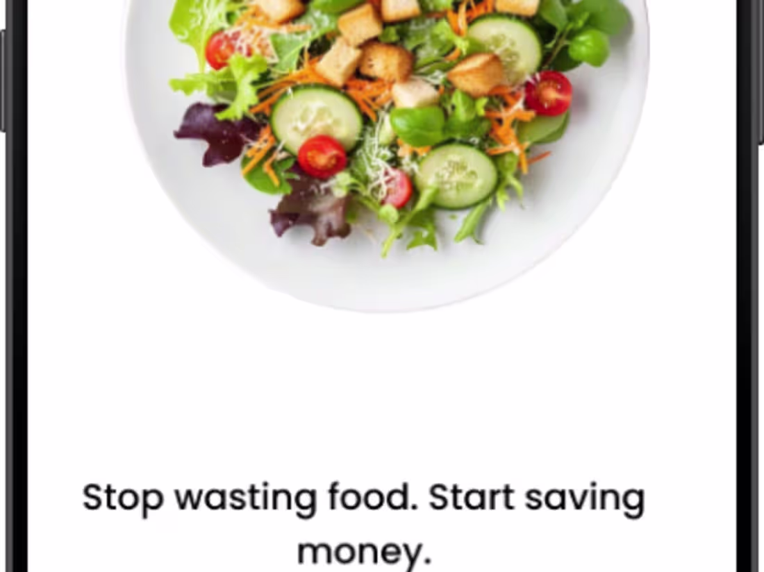
People don't waste food because they don't care,
They waste food because of forgetfullness, poor visibility or decision fatigue.
You buy Tomatoes, peppers, and vegetables for the week,
they go into the fridge drawer.
3-4 days later:
You forget they exist.
You Order food or cook something else.
A week later you find them rotten.
So I'm designing a smater way to reduce food wastage,
Before Spoil is an app where users can keep track of what they have in their fridge without opening the fridge, get reminders before things gets expired, and instantly find meals they can cook with what they already have.
This is not only an app to track food items, but also an app to shapen better habits, through simple, time sensitive decisions.
Still in progress, but here’s a look at the direction so far. I’d appreciate any feedback as I refine the experience.
#UXDesign #ProductDesign #UIDesign #MobileAppDesign #CaseStudy #DesignInProgress
3
4
97
I Designed a Landing page for an airline company
I focused on clarity and clear decision making for users who use the website
what do you think about it ?
9
4
132
I got paid $4500 for a landing page
Your landing page should speak better to your users.
I designed a landing page for a Gadget selling website.
what do you think ?
3
62
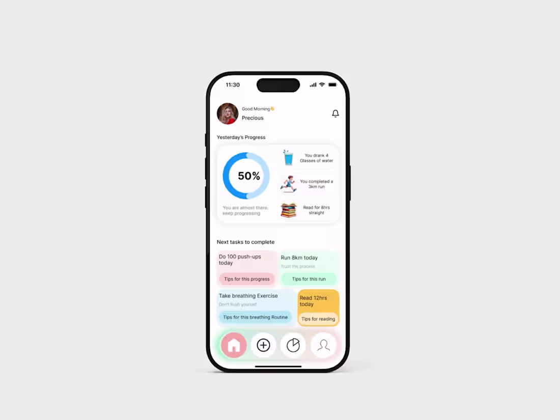
I'm working on a habit tracking app
0
40
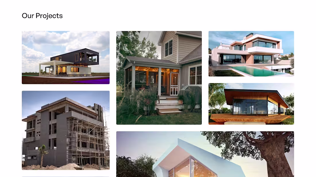
Just wrapped up a real estate landing page concept focused on clarity trust and conversion.
The goal was simple make it easy for users to browse properties speak with advisors schedule inspections and complete transactions with confidence.
This design prioritizes clean navigation mobile first UX and clear call to actions because real estate decisions should feel seamless not stressful.
I would love your feedback
What do you think matters most on a real estate landing page visual appeal or ease of use
#UIUXDesign #RealEstateDesign #LandingPageDesign #ProductDesign #UXUI #WebDesign
0
41
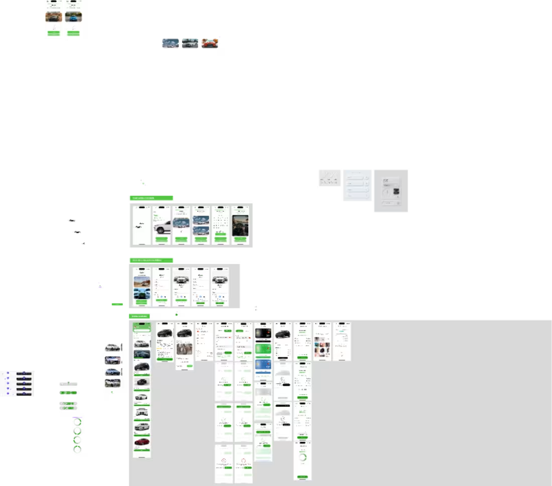
Autori is a modern car rental platform designed for speed, simplicity, and trust. Browse available cars near you, select flexible rental dates, and complete your booking in just a few taps. With secure payments, transparent pricing, and reliable support, Autori makes every ride stress-free.
1
51
Figma
0
1
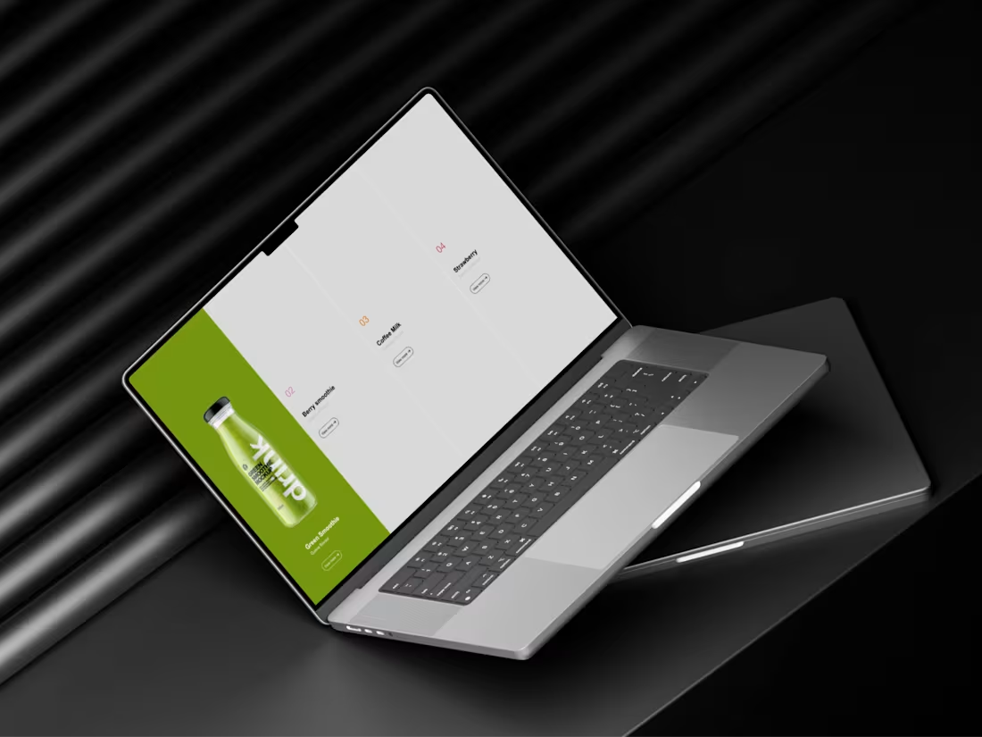
A sleek juice design
0
51
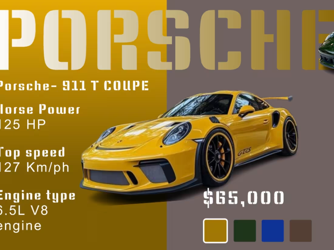
I worked on a porsche car selection page.
check more of my work: https://www.behance.net/adegbireisrael
0
49
I'm working on a parking app to help drivers find a better parking spot effortlessly in no time.
1
1
61
I worked on this fashion website hero section
check more of my work : https://www.behance.net/adegbireisrael
3
1
61