
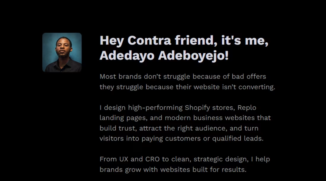
Adedayo Adeboyejo
Helping Brands Grow With Better Web Design, UX & CRO
- 5.00
- Rating
- 28
- Followers
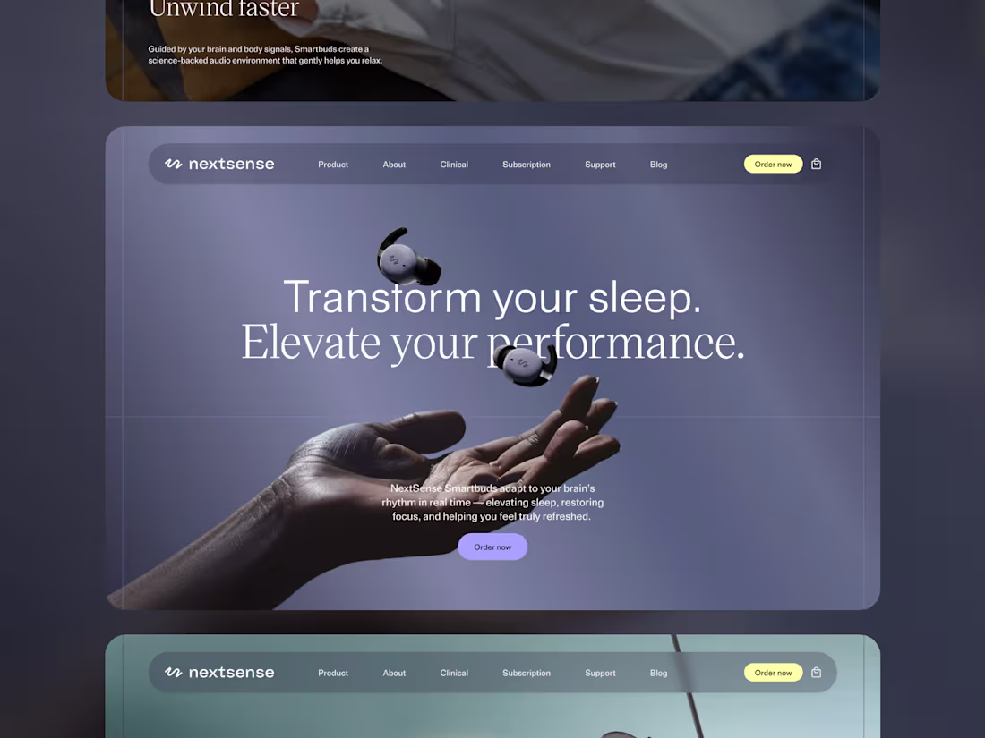
Sleep Technology eCommerce Experience Design
3
7
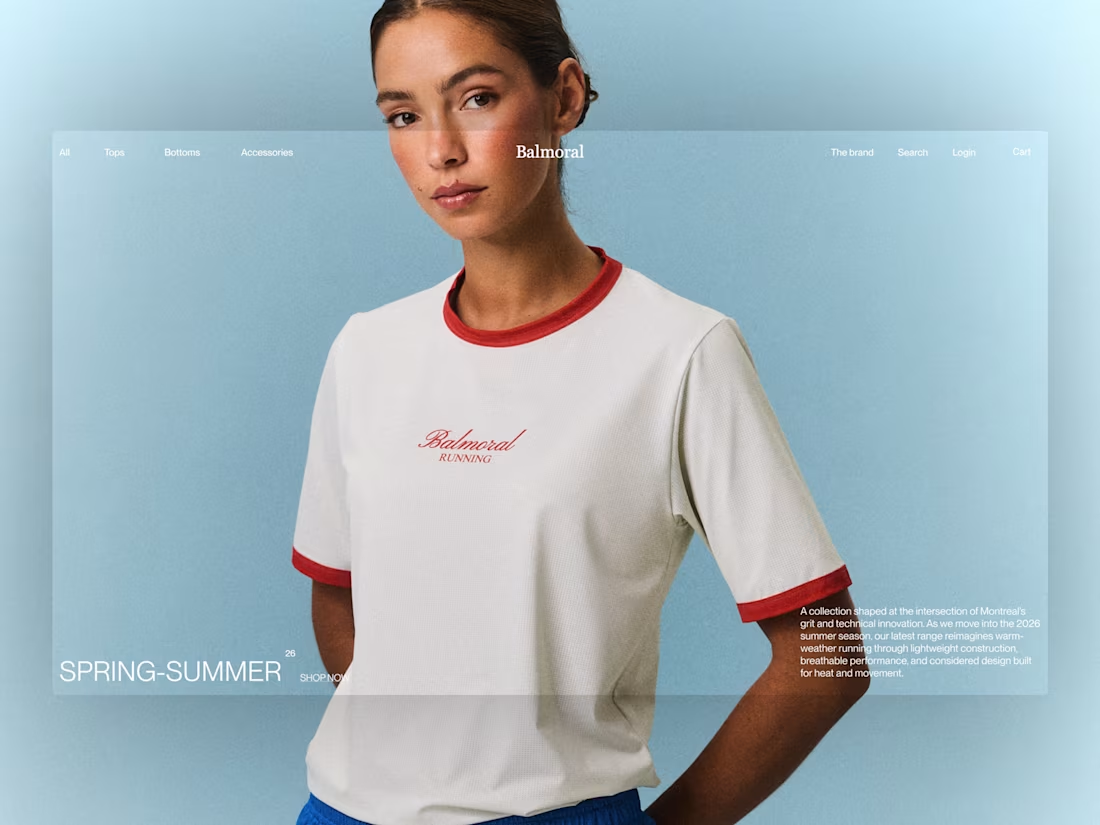
Timeless eCommerce Design for Balmoral
3
4
Luxury Jewelry Digital Storytelling Experience
2
2
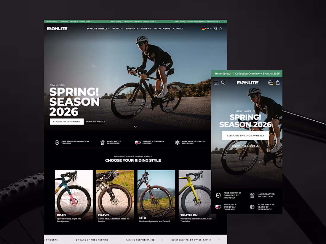
Designing a High-Performance eCommerce Experience for EVANLITE
2
3
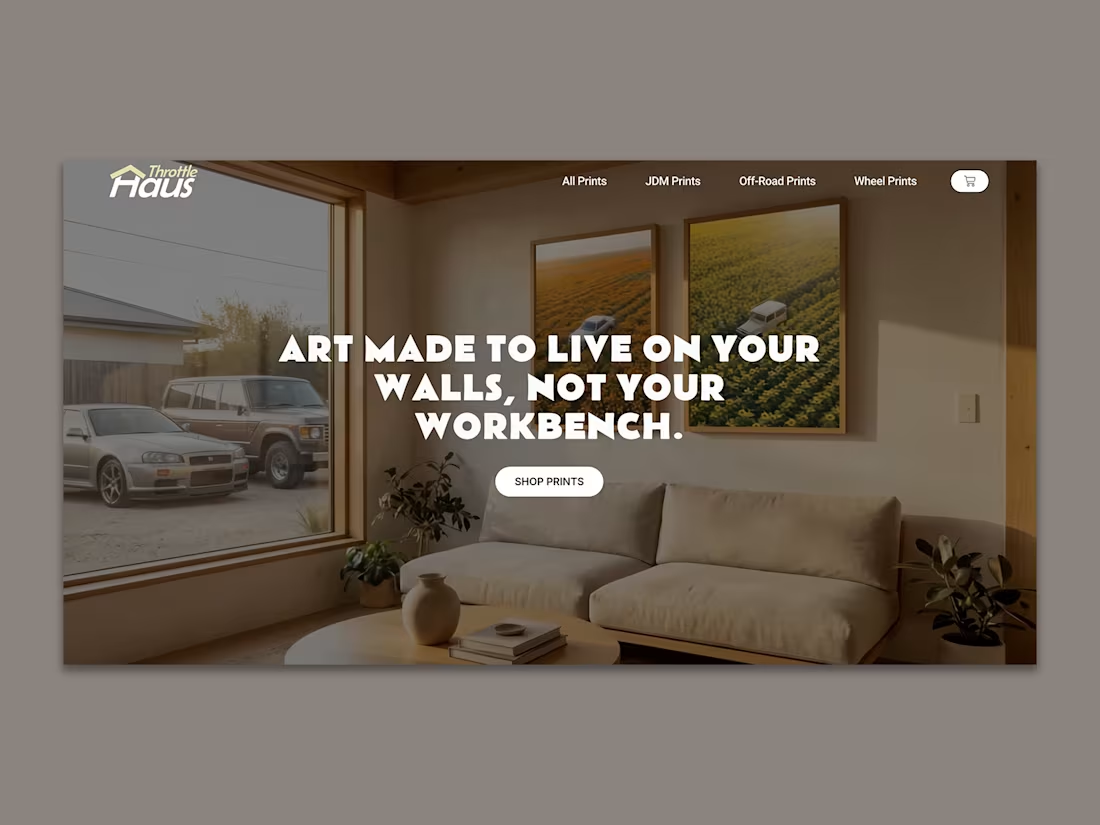
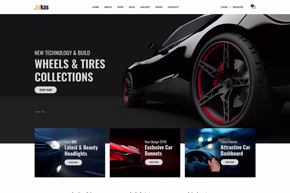
Designing an Automotive Art eCommerce Experience
2
2
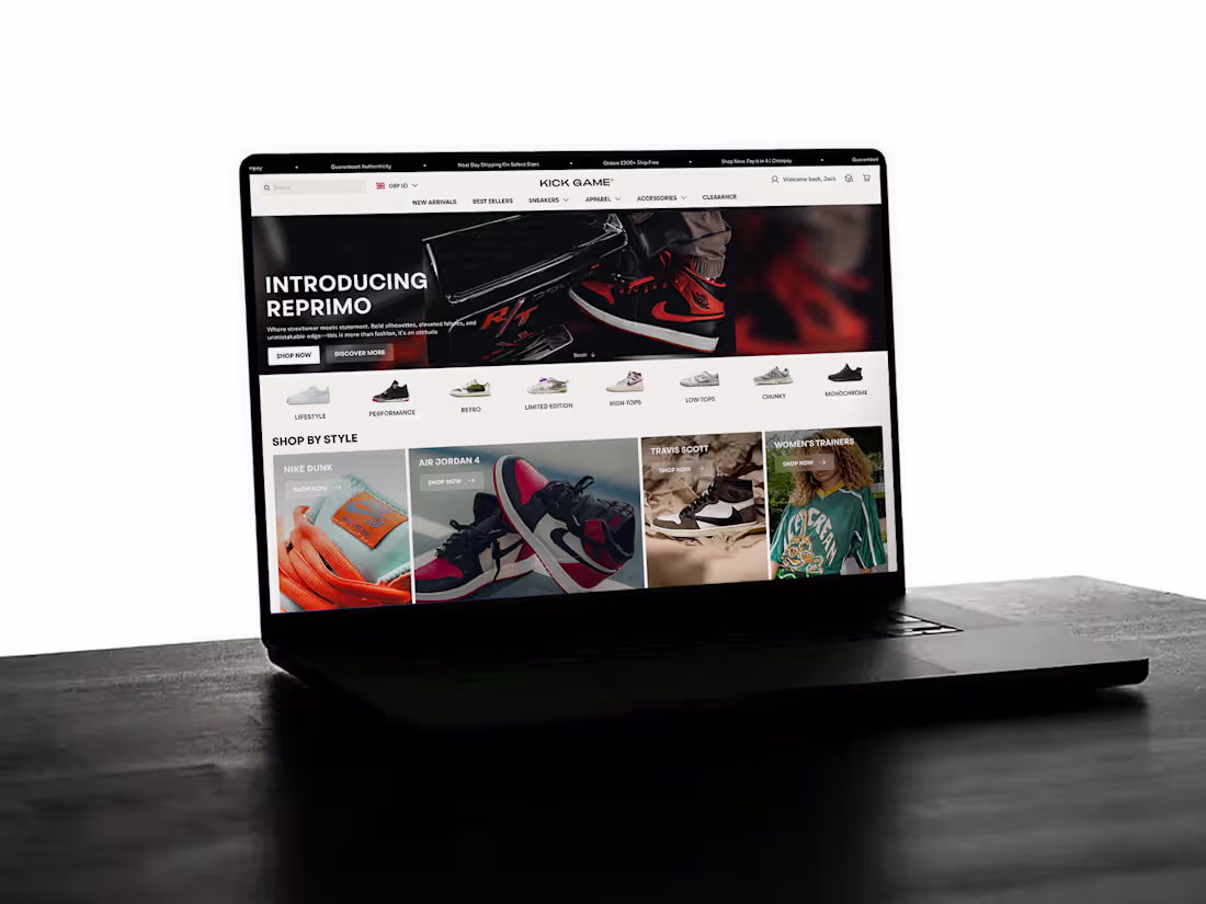
Premium Streetwear & Sneaker eCommerce Experience Design
2
5
Working on the ReneFris haircare brand was all about creating a storefront that feels clean, soft, and trustworthy while still maintaining a modern premium look.
I started by designing the experience around the products themselves letting the packaging, textures, and visuals lead the design direction. The goal was to make the store feel calming and high-quality from the very first scroll.
The homepage was structured with a strong focus on visual flow: a minimal hero section, featured collections, ingredient-focused highlights, and customer-centered storytelling. I used soft neutral tones, elegant typography, and balanced spacing to create a beauty-brand aesthetic that feels refined without looking overly complicated.
After refining the design direction, I implemented the experience in Shopify, making sure the layouts translated smoothly across both desktop and mobile. Product pages were designed to feel informative yet clean clear product imagery, simplified sections, trust-building details, and strong add-to-cart placement.
A lot of attention also went into the mobile experience since most beauty shoppers browse directly from their phones. Every section was adjusted to maintain that same polished feel on smaller screens.
The final result was a Shopify store that feels modern, intentional, and aligned with the kind of experience customers expect from a premium haircare brand.
What’s the first thing that makes people trust a haircare brand online the design, the product presentation, or the customer reviews?
2
4
139
Virginniejewelry came to me with a simple problem, their store didn’t match the quality of their handcrafted pieces. It felt basic, slow, and didn’t create desire. The goal was clear: make every visitor feel like they’re shopping a premium brand, especially on mobile.
I started with a quick wireframe to map out what a customer should see, feel, and do within seconds. Then I set up the Shopify backend properly, clean product names, structured collections, and descriptions that combined emotion with details.
Using GemPages, I rebuilt the homepage with a minimal, editorial feel. A strong hero image, clean “shop by collection” layout, and a featured product section designed to pull attention and drive clicks.
The real transformation was the product page. I designed it to guide the buyer — clear images, short persuasive copy, trust badges, and a sticky add-to-cart bar that follows the user as they scroll.
Everything was optimised for mobile faster load times, better layouts, and easy-to-tap buttons.
Finally, I added simple Klaviyo flows to recover lost sales.
The result? A clean, luxury-feel store that not only looks good but converts.
8
8
265
For this activewear thrive brand project, I handled both the UI design in Figma and the full Shopify implementation turning the concept into a functional ecommerce experience.
The goal was to create a store that feels modern, performance-driven, and premium without looking overly crowded. I started in Figma by designing the overall user experience, focusing on clean layouts, strong visual hierarchy, and bold imagery that reflects movement and energy.
The homepage was structured to guide visitors naturally through featured collections, best sellers, and product highlights while maintaining a sleek and minimal aesthetic. I used balanced spacing, modern typography, and subtle accent colors to give the brand a strong athletic identity.
After finalizing the design direction, I brought the concept into Shopify and customized the storefront to closely match the Figma design. Product pages were built with a focus on conversion clear product imagery, concise copy, simplified variant selection, and strong call-to-action placement.
I also refined the mobile experience to ensure the layouts stayed clean and easy to navigate across all devices.
The final result was a polished Shopify store that combines strong visual design with a smooth shopping experience tailored for a modern activewear brand.
What do you think makes an activewear store feel truly premium the branding, the product visuals, or the overall shopping experience?
2
3
143
For this project, the goal wasn’t just to build a Shopify store, it was to design an experience that felt premium from the very first scroll.
The brand had good products, but the presentation lacked intention. So I approached it from a design-first perspective, using Replo to create fully custom layouts that didn’t feel like a typical Shopify store.
I focused heavily on visual hierarchy and spacing letting each section breathe. Large editorial-style images, soft neutral backgrounds, and refined typography created that luxury feel. Instead of clutter, every element had a purpose.
The homepage was designed to guide attention naturally from a bold, minimal hero into curated collections, then into storytelling. No hard selling, just quiet confidence.
On the product pages, I used Replo’s flexibility to break away from the default structure. Clean image galleries, short intentional copy, and subtle interactions made the experience feel smooth and considered. Every detail — from button styling to hover effects — was designed to elevate perception.
Mobile design was treated separately, not as an afterthought. Spacing, font sizes, and layouts were adjusted to maintain that same premium feel on smaller screens.
The result was a store that feels less like a template and more like a designed brand experience.
1
4
194
Designed a sleek car parts & accessories store on Shopify from scratch. Dark, bold, and built to sell.
From the hero banner down to the product cards every section was crafted to keep shoppers browsing and buying.
What's inside the store:
• Featured collections: wheels, Headlights, Bonnets & Dashboards
• Best Seller section with ratings and sale badges
• Trust badges free delivery, Quality guarantee & Online support
• Clean dark theme with bold typography that screams premium
The result? A store that looks expensive, loads fast, and converts.
Want a Shopify store that actually looks this good? Let's build yours.
Drop a comments if you want like this!
2
6
135
Conversion-Focused Portfolio Website Design
2
3
A simple portfolio bio section designed using Kit, focused on creating a clean and modern visual experience that highlights culture, storytelling, and connection through thoughtful design. The layout blends elegant typography, structured content blocks, and minimal aesthetics to create an engaging and visually balanced introduction section inspired by the vision of my creative brand
1
46

A modern culinary brand experience designed to celebrate the connection between cultures, cuisines, and community through food.
Built with an elegant editorial-inspired aesthetic, the project blends rich storytelling, immersive visuals, and refined typography to showcase Chef Johnson Mcall’s vision of bringing people together through unforgettable global dining experiences.
1
47
For this bag brand, the focus wasn’t just on building a Shopify store, it was about creating a clean, elevated design that reflects quality and style at first glance.
The products were strong, but the store felt crowded and generic. Using Replo, I approached it with a design-first mindset, stripping everything back and rebuilding with intention.
I used bold, high-quality lifestyle images to lead the design, allowing the bags to speak for themselves. Spacing was key, fewer elements, more breathing room. Neutral tones, soft contrasts, and refined typography helped create a modern, premium feel.
The homepage was structured to guide the eye naturally, a minimal hero, followed by curated collections and subtle storytelling. Instead of overwhelming the visitor, the design builds interest step by step.
On the product pages, I moved away from the standard layout. Clean image galleries, short confident copy, and well-placed trust elements made the experience feel smooth and considered. Small details like hover effects and button styling added to the overall feel without being distracting.
Mobile was carefully refined to keep that same clean look and easy navigation.
The final result is a store that feels intentional, stylish, and aligned with the brand not just functional, but designed to convert.
3
177