
pro
Abox Agency
We make brands to stand out digitally differently.
Ready for work
Abox is ready for their next project!
3D Product Visualization & Rendering
2
2
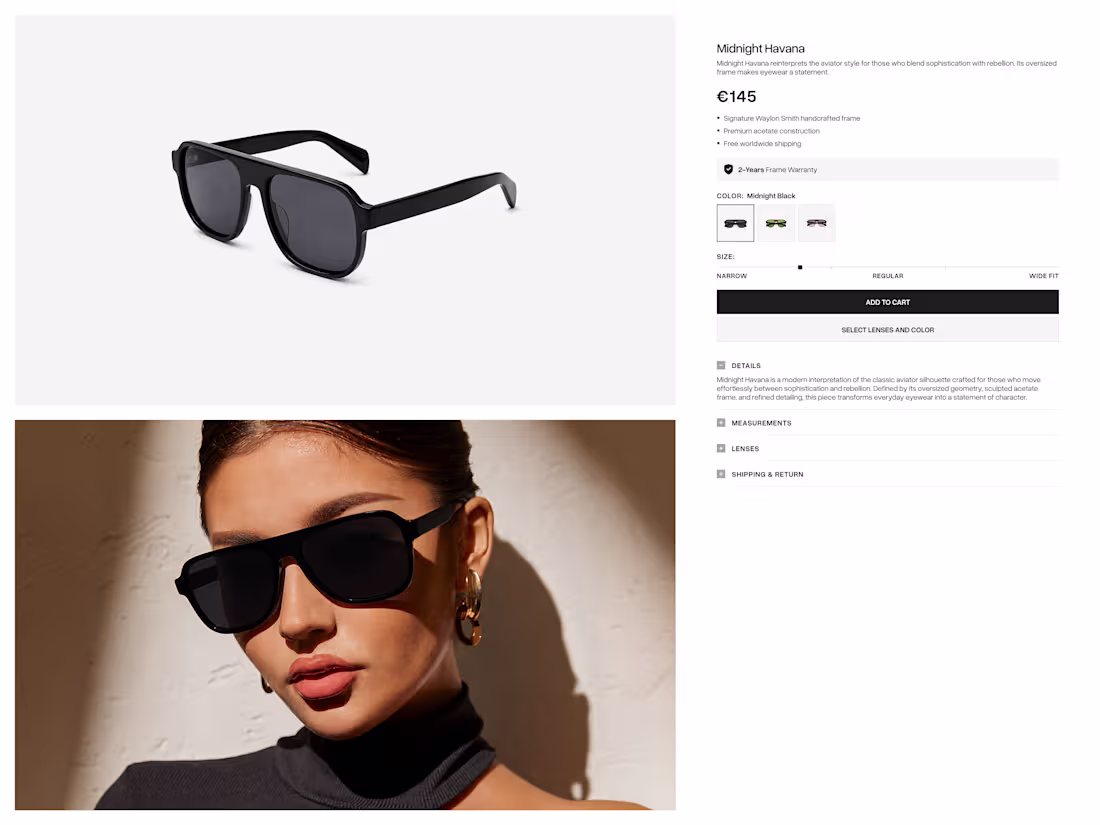
Waylon Smith — Premium Eyewear eCommerce
1
1
Kidolin: Baby Care Brand & Packaging Design
1
1
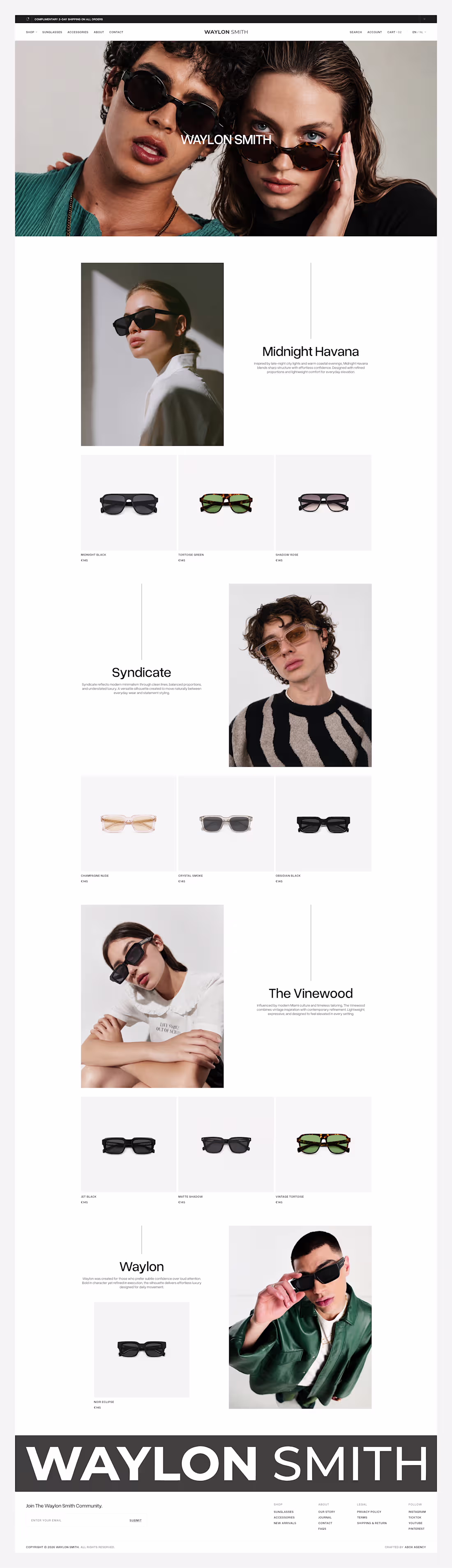
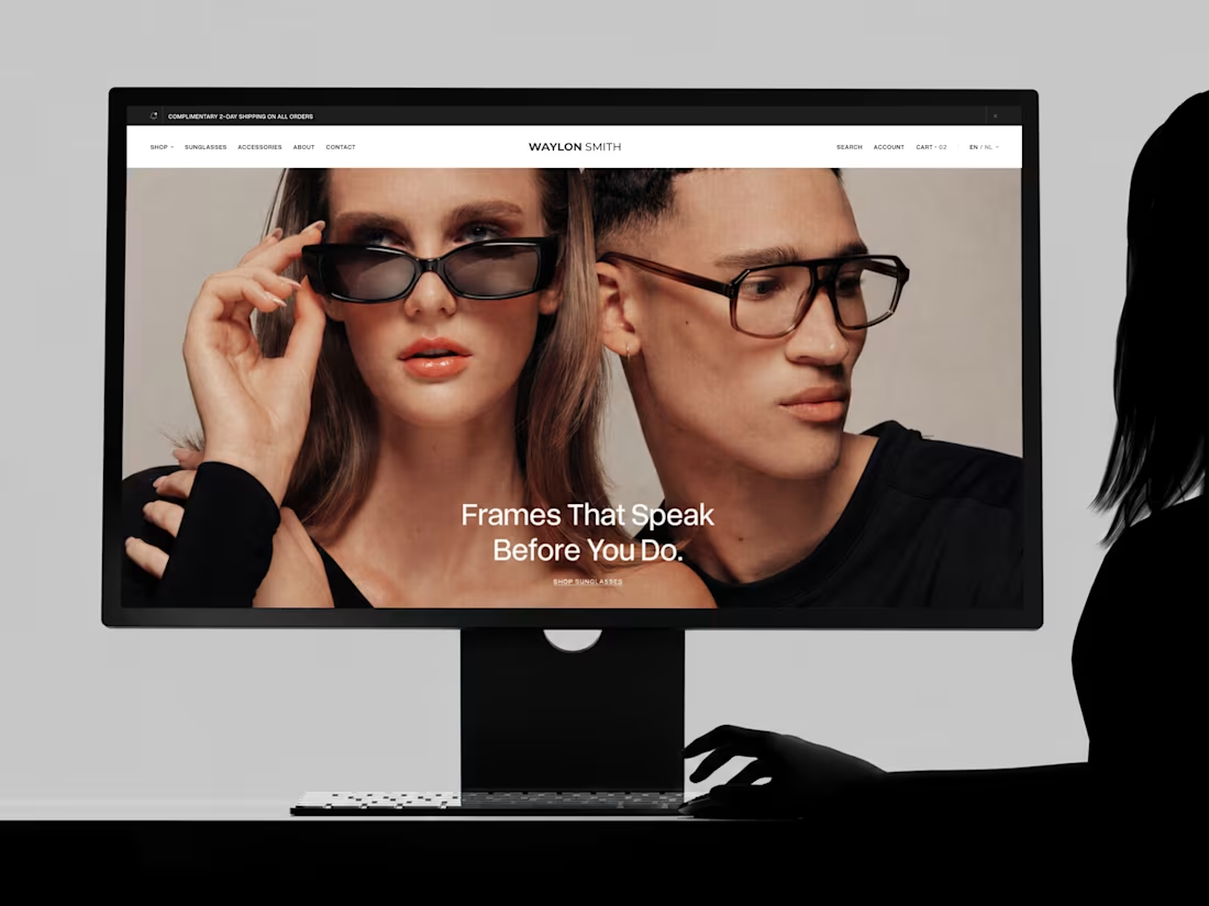
For Waylon Smith, we designed an editorial-inspired collection experience that showcases each frame through immersive imagery, clean layouts, and thoughtful typography. Every section was crafted to highlight the unique identity of each collection while creating a seamless browsing experience that feels both premium and intuitive
Explore more: https://dribbble.com/shots/27573385-Waylon-smith-collection-UI
1
3
63
A Product Detail Page designed to turn product exploration into a premium shopping experience.
We focused on creating a clean visual hierarchy, immersive product presentation, effortless customization, and intuitive interactions that keep the attention exactly where it belongs on the product.
Explore more: https://dribbble.com/shots/27565877-Waylon-Smith-Product-Detail-Page
2
3
74
Bringing the Braakhuis Fysiotherapie identity to life through motion. This logo animation captures movement, care, and recovery with smooth transitions, transforming a static mark into a dynamic brand experience that feels modern, memorable, and aligned with the brand's purpose.
View more inside: https://dribbble.com/shots/27568830-Braakhuis-Logo-Animation
1
2
65
This motion explores the lens experience through clean transitions, refined compositions, and premium product presentation. Designed to highlight the craftsmanship behind every frame while maintaining a seamless and engaging visual flow.
Explore more: https://dribbble.com/shots/27562435-Waylon-Smith-Lens-Experience-UIUX
2
83
We designed and developed a fully custom website that features custom UI/UX design, AI-generated imagery, custom frontend and backend development, responsive layouts, smooth animations, interactive experiences, and performance optimization all working together to create a premium web experience.
Explore more inside: https://dribbble.com/shots/27552438-Waylon-Smith-Custom-Website-Design-in-motion
4
89
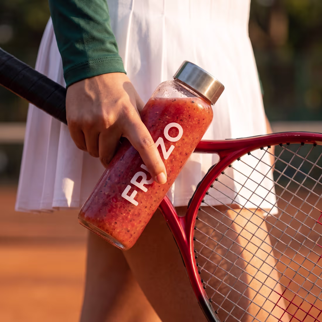
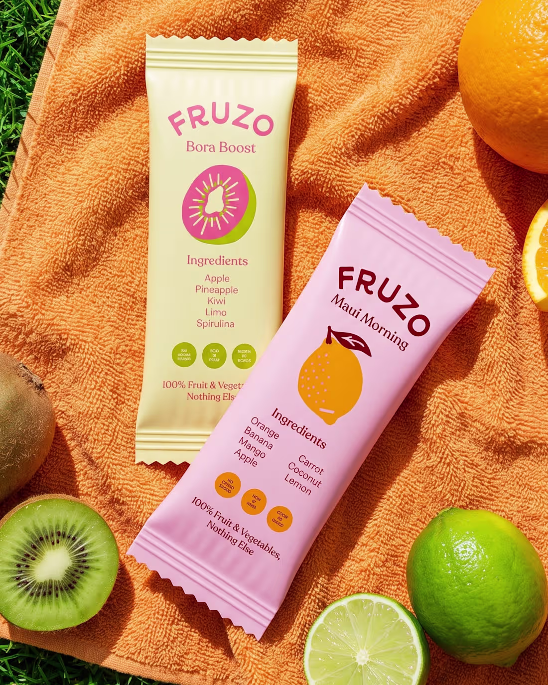
We designed these 3D lifestyle visualizations for Fruzo to showcase the product in real-life moments.
Each scene was carefully crafted with realistic lighting, materials, composition, and natural environments to create visuals that feel authentic while highlighting the product.
Explore more here: https://dribbble.com/shots/27541571-Fruzo-Smoothie-3D-Product-Visualization
4
2
136
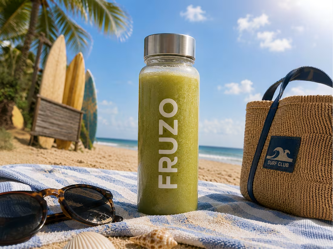
We designed this 3D lifestyle visualization for Fruzo to showcase the product in a fresh, summer-inspired environment.
From realistic materials and lighting to detailed textures and composition, every element was crafted to create a premium visual experience that highlights the product naturally.
Explore more: https://dribbble.com/shots/27539785-Fruzo-3D-Lifestyle-Product-Render
2
3
128
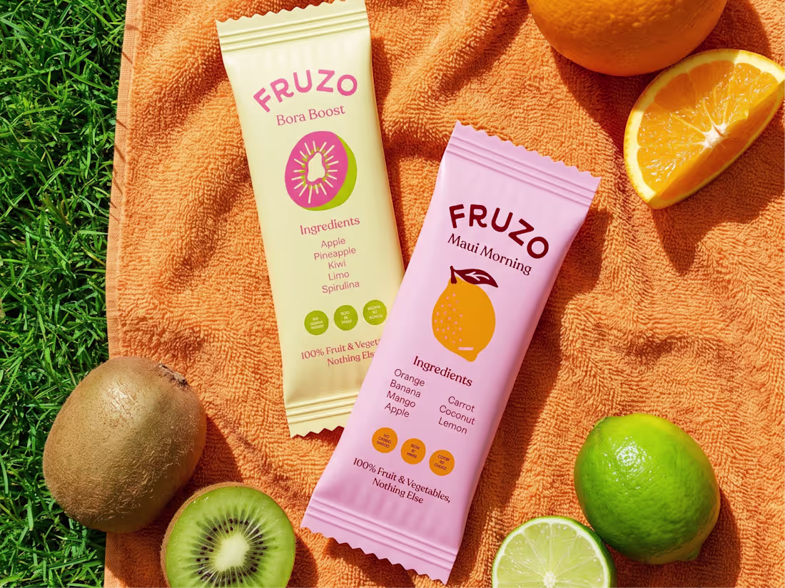
We designed this 3D product visualization for Fruzo to showcase the brand in a fresh, vibrant, and premium way. From realistic materials and lighting to carefully composed scenes, every detail was crafted to bring the product to life and create visuals that stand out across digital platforms.
Explore more inside: https://dribbble.com/shots/27532009-Fruzo-3D-Product-Visualization
3
104
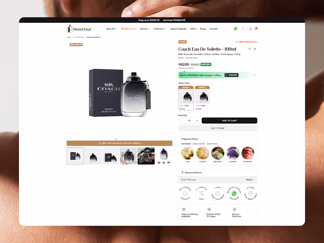
This product page combines immersive visuals, detailed fragrance notes, trust signals, and a seamless purchase flow to make every buying decision feel effortless.
Explore more: https://dribbble.com/shots/27524874-Fragstalk-Product-Page-UI
2
3
120
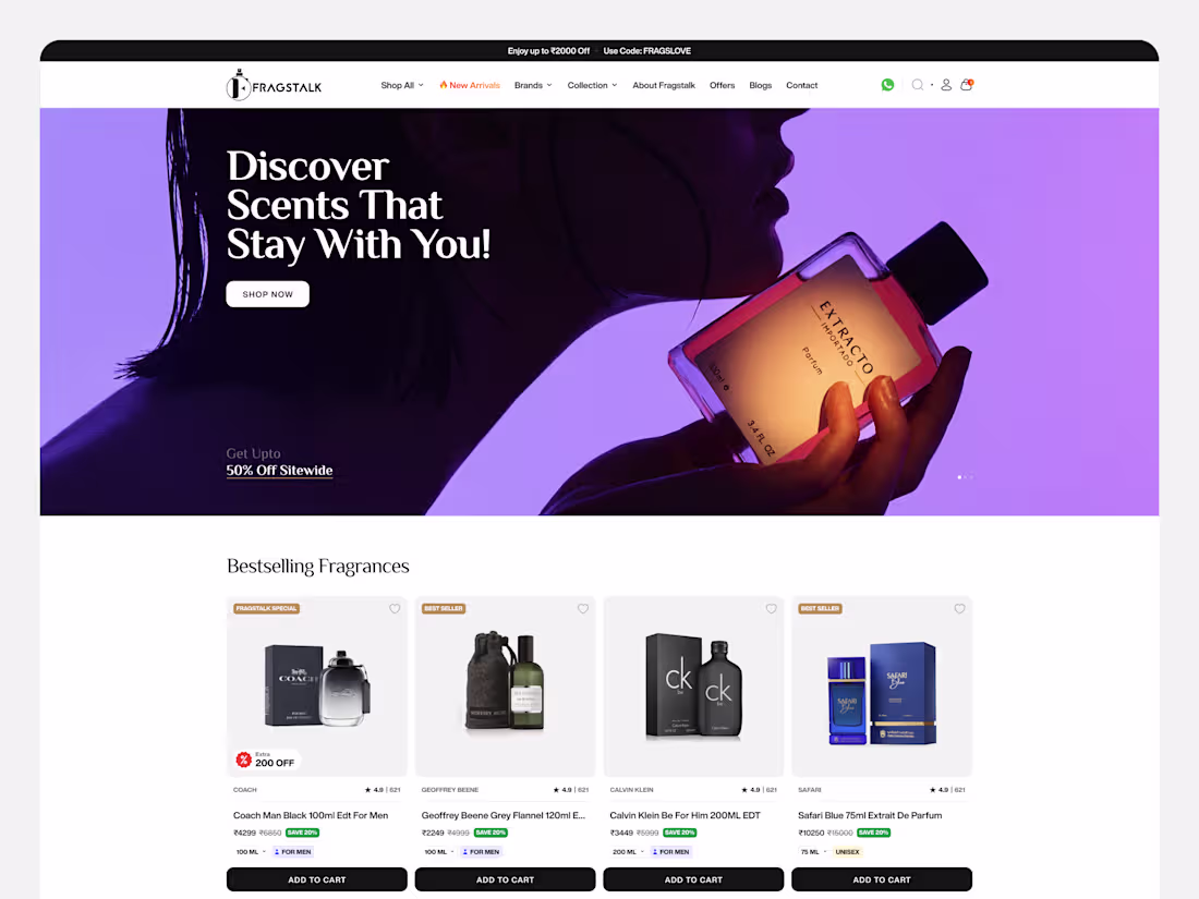
We redesigned Fragstalk's digital experience to make discovering premium fragrances feel as refined as the scents themselves. From immersive visuals to a seamless shopping journey, every detail was crafted to elevate the brand and create a conversion-focused experience.
Explore more:
2
85
Designed a premium brochure for Tapra Stay, bringing together elegant layouts, refined typography, and destination-inspired visuals. Every page was crafted to reflect the warmth of mountain hospitality while creating a memorable brand experience across every touchpoint.
Explore more here: https://dribbble.com/shots/27515189-Tapra-stay-Deck-Animation
2
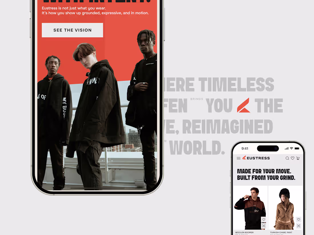
98
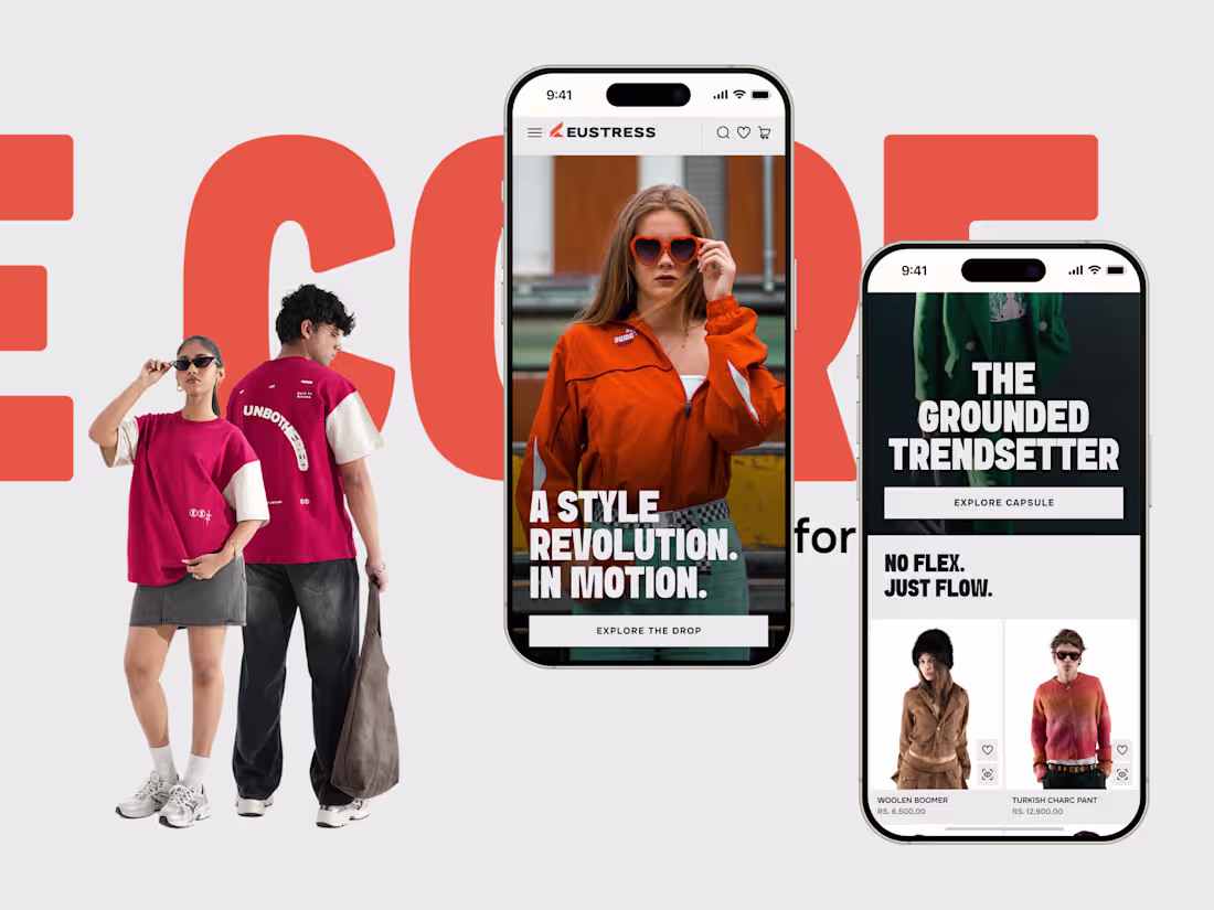
Designed a motion-first fashion eCommerce experience for Eustress, where bold typography, immersive imagery, and fluid interactions come together to create a premium digital shopping journey. Every transition is crafted to guide users naturally through product discovery while bringing the brand's identity to life across desktop and mobile.
Explore more here: https://dribbble.com/shots/27511621-Eustress-Website-Design-in-motion
1
78
Designed a responsive mobile experience for Eustress, where bold editorial layouts, immersive imagery, and conversion-focused product discovery come together. Every interaction was crafted to deliver a seamless fashion shopping journey while preserving the brand's bold visual identity across every screen.
Explore more (https://dribbble.com/shots/27505458-Eustress-Typography-Mobile-Shopping-Exploration)
2
80
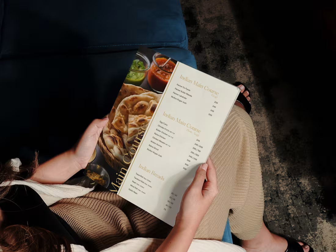
We designed this menu for Tapra Stay to complement its premium hospitality experience. Through refined typography, clean layouts, and rich imagery, the design aims to create a dining experience that feels elegant, welcoming, and aligned with the brand's mountain-inspired identity.
Explore more:https://dribbble.com/shots/27475130-Tapra-Stay-Menu-Design-Hospitality-Branding
1
77
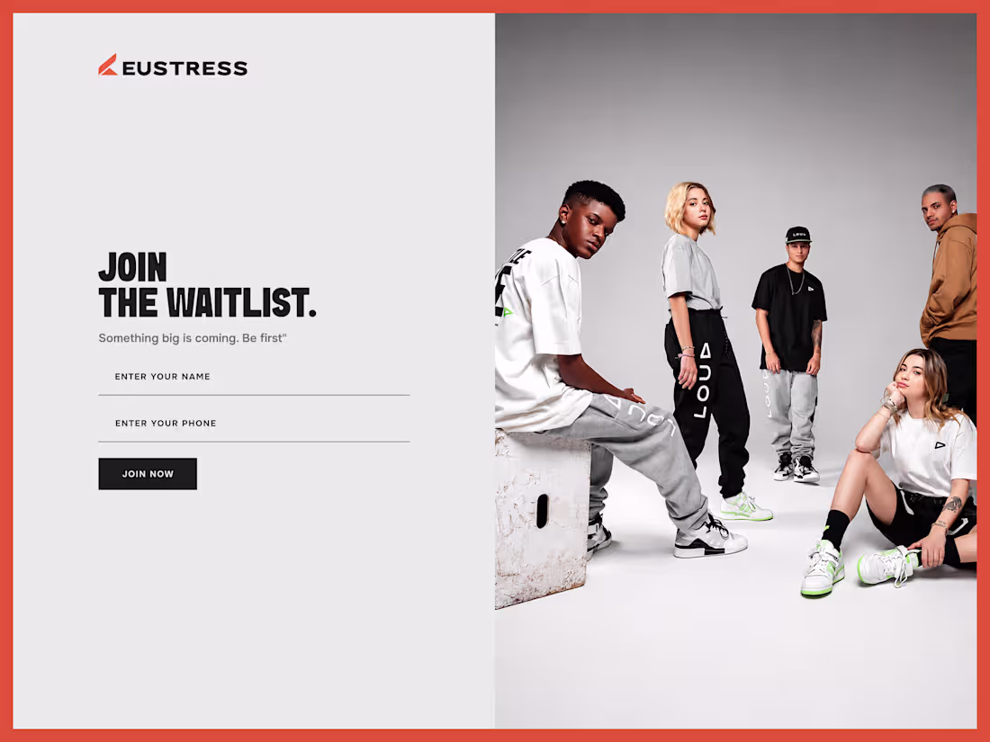
Designed a pre-launch waitlist page for Eustress to build excitement before the official website launch. The experience combines bold typography, clean layouts, and fashion-led visuals to encourage early sign-ups while introducing the brand's identity through a premium, conversion-focused landing page.
Explore more here (https://dribbble.com/shots/27501788-Eustress-Project-Waitlist-Landing-Page).
1
79
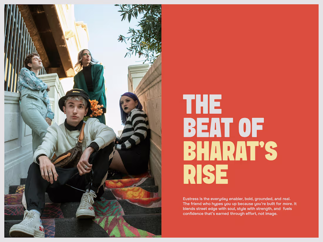
A closer look at the art direction and UI layout for Eustress. For this specific section, the goal was to seamlessly bridge raw, authentic lifestyle photography with a bold, messaging-driven design.
2
91
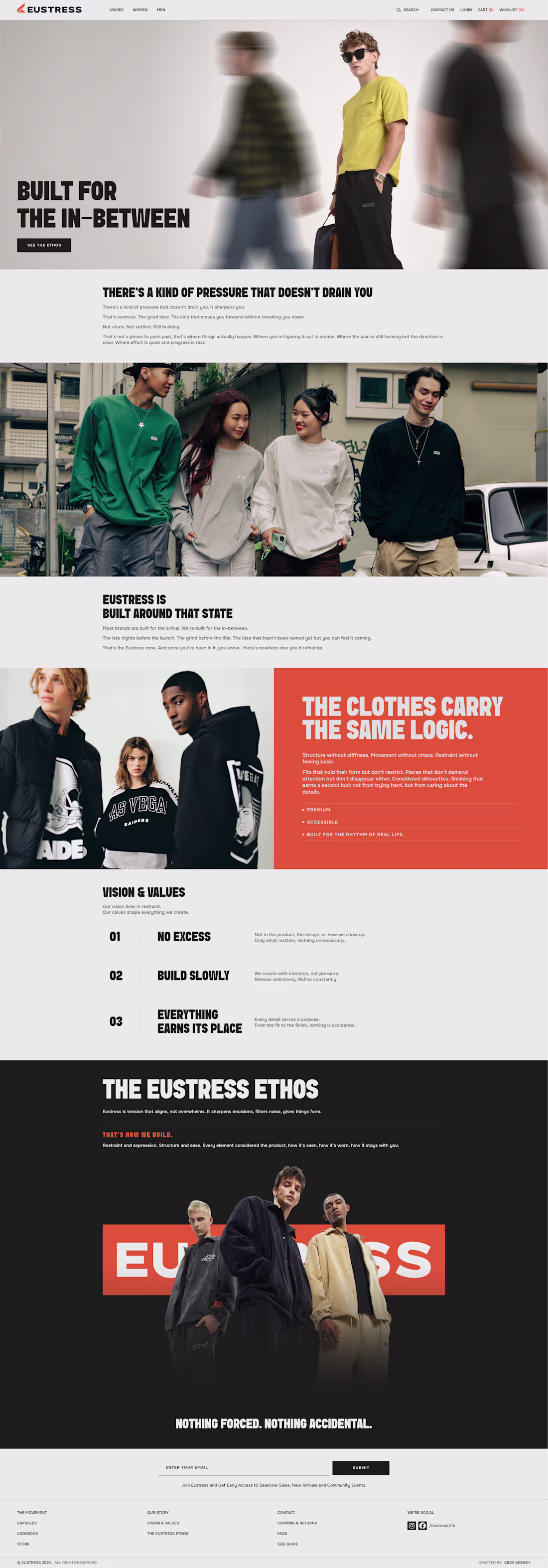
We designed an editorial-inspired About Us experience for Eustress, translating the brand's philosophy into a visually immersive narrative. Through expressive typography, cinematic imagery, and thoughtful content hierarchy, the page communicates the values, ethos, and identity that define the Eustress movement.
Explore more: https://dribbble.com/shots/27488200-Eustress-Project-About-Us-Page
3
114
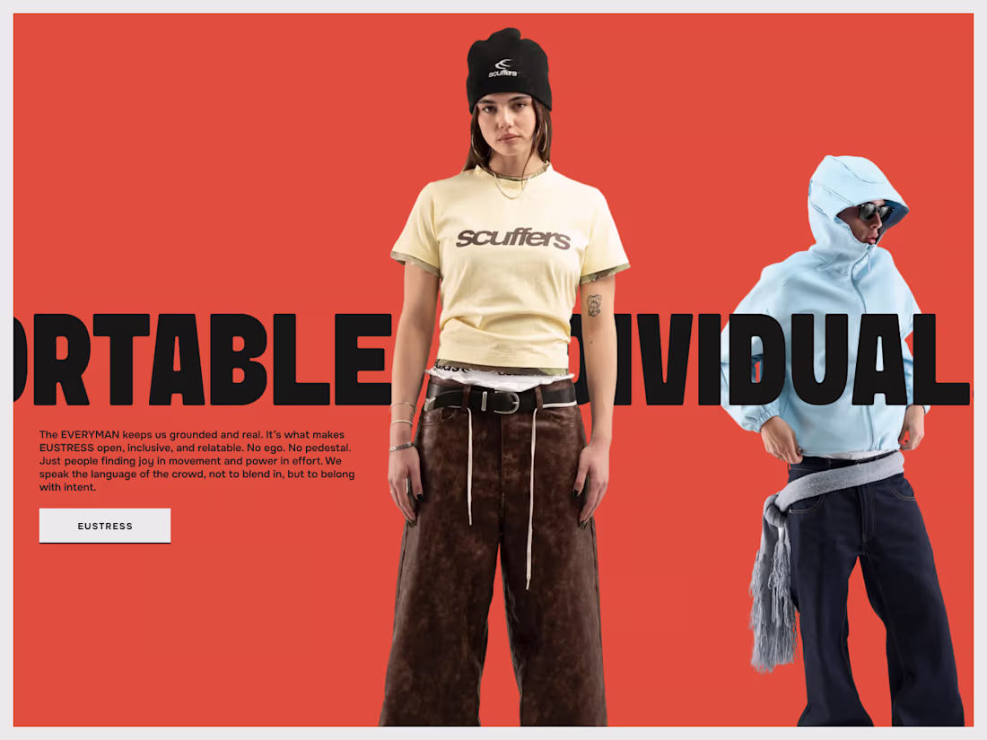
We explored an editorial-inspired section for Eustress that celebrates individuality and everyday expression. Combining oversized typography, bold color contrasts, and contemporary styling, the experience transforms brand values into an immersive visual statement that feels confident, grounded, and unmistakably modern.
Explore more here: https://dribbble.com/shots/27485597-Eustress-Editorial-Section-mobile-view-UI
2
96
We designed a bold and immersive mobile experience for Eustress, a contemporary Indian fashion and lifestyle brand blending streetwear, athleisure, and everyday essentials. Built with expressive typography, editorial visuals, and a clean hierarchy, the interface delivers a seamless shopping experience optimized for users on the move.
Explore more here (https://dribbble.com/shots/27482405-Eustress-Mobile-First-Landing-Page).
2
100
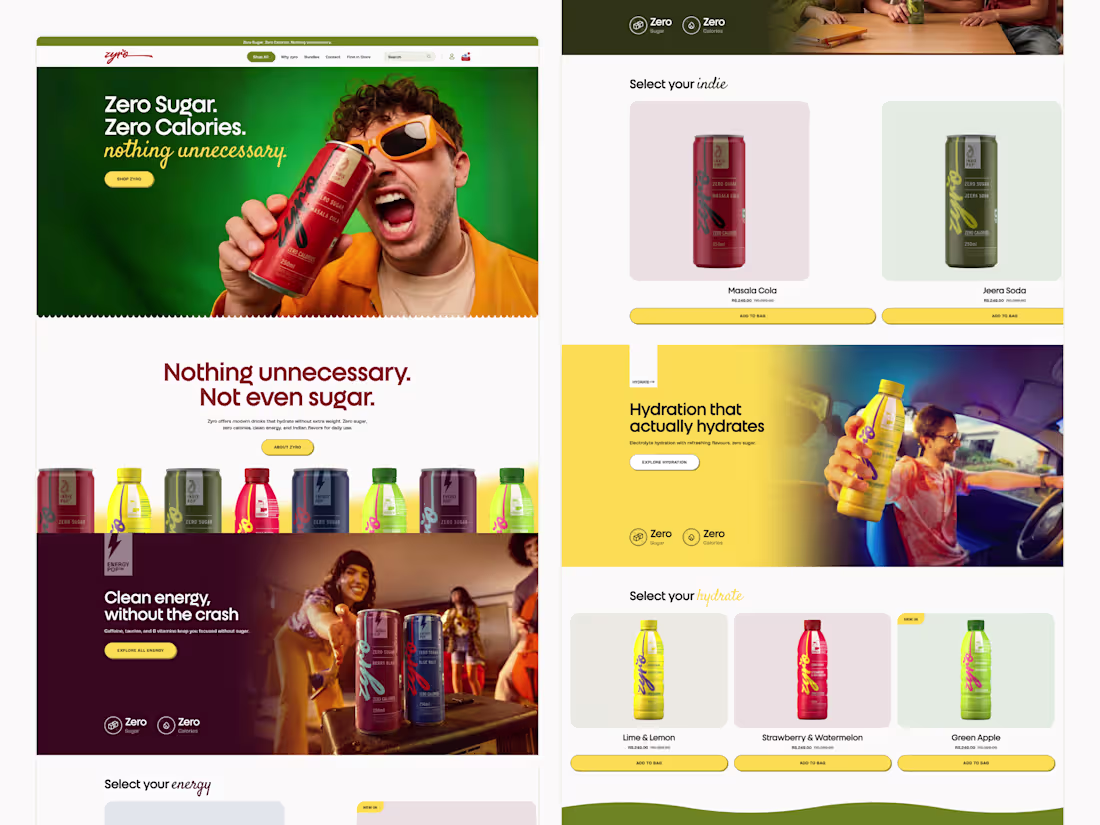
Designed and developed a fresh digital experience for Zyro India. From immersive product sections to streamlined navigation, every detail was crafted to create an engaging and conversion-focused shopping journey.
Explore more here (https://dribbble.com/shots/27463185-Product-Focused-UI-for-Energy-Pop).
2
85
We redesigned Adhira & Appa’s website to bring the warmth and craftsmanship of modern coffee culture into a digital experience.
Explore more inside (https://dribbble.com/shots/27465026-Adhira-Appa-Modern-Coffee-Brand-Website-Design).
1
74
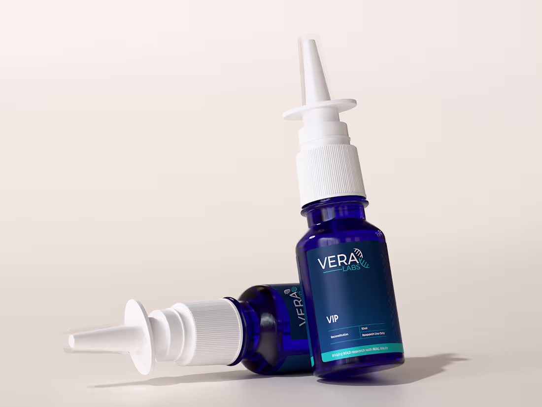
Premium 3D product visualization and packaging design for VERA Labs VIP Nasal Spray, combining realistic rendering with a clean, science-driven brand identity.
View more inside (https://dribbble.com/shots/27471251-VERA-Labs-3D-Product-Visualization-Label-Design-System).
5
139
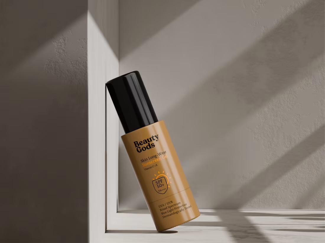
This is a 3D-crafted sunscreen gel packaging concept, designed to highlight a clean premium aesthetic through realistic lighting, soft shadows, and product-focused composition. The goal was to create a skincare visualization that feels modern, trustworthy, and shelf-ready while maintaining a luxury cosmetic appeal.
Explore more: https://dribbble.com/shots/27448816-Cosmetic-Packaging-Product-Render
4
6
280
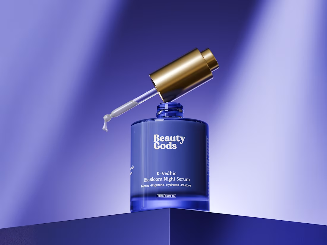
Beauty Gods K-Vedhic BioBloom Night Serum brought to life through photorealistic 3D visualization.
This project combines premium packaging design, realistic glass materials, detailed label work, and product-focused lighting to create a luxury skincare presentation from every angle.
Explore more: https://dribbble.com/shots/27448628-Luxury-3D-Night-Serum-Packaging-Design
4
4
187
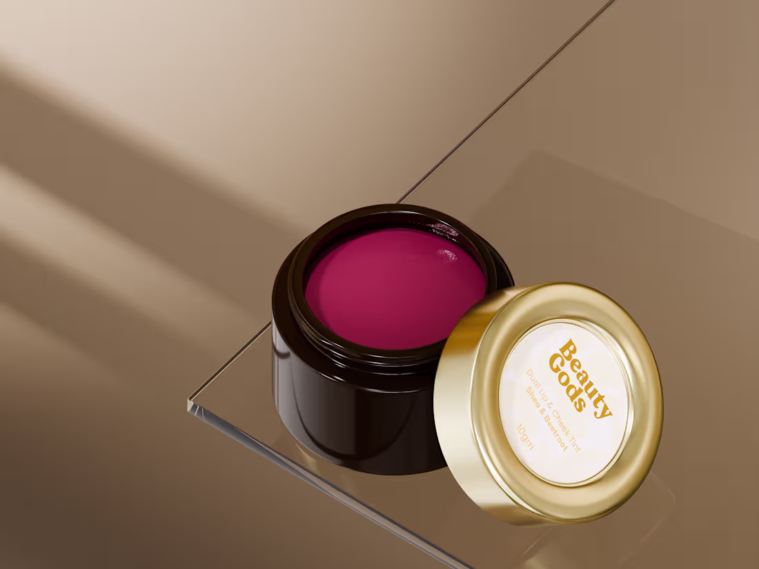
This project explores premium cosmetic packaging, realistic material rendering, and detailed product presentation, showcasing the rich tint texture and luxurious gold-accented design from multiple angles.
https://dribbble.com/shots/27445933-Beauty-Gods-Cosmetic-Packaging-Design
4
4
164
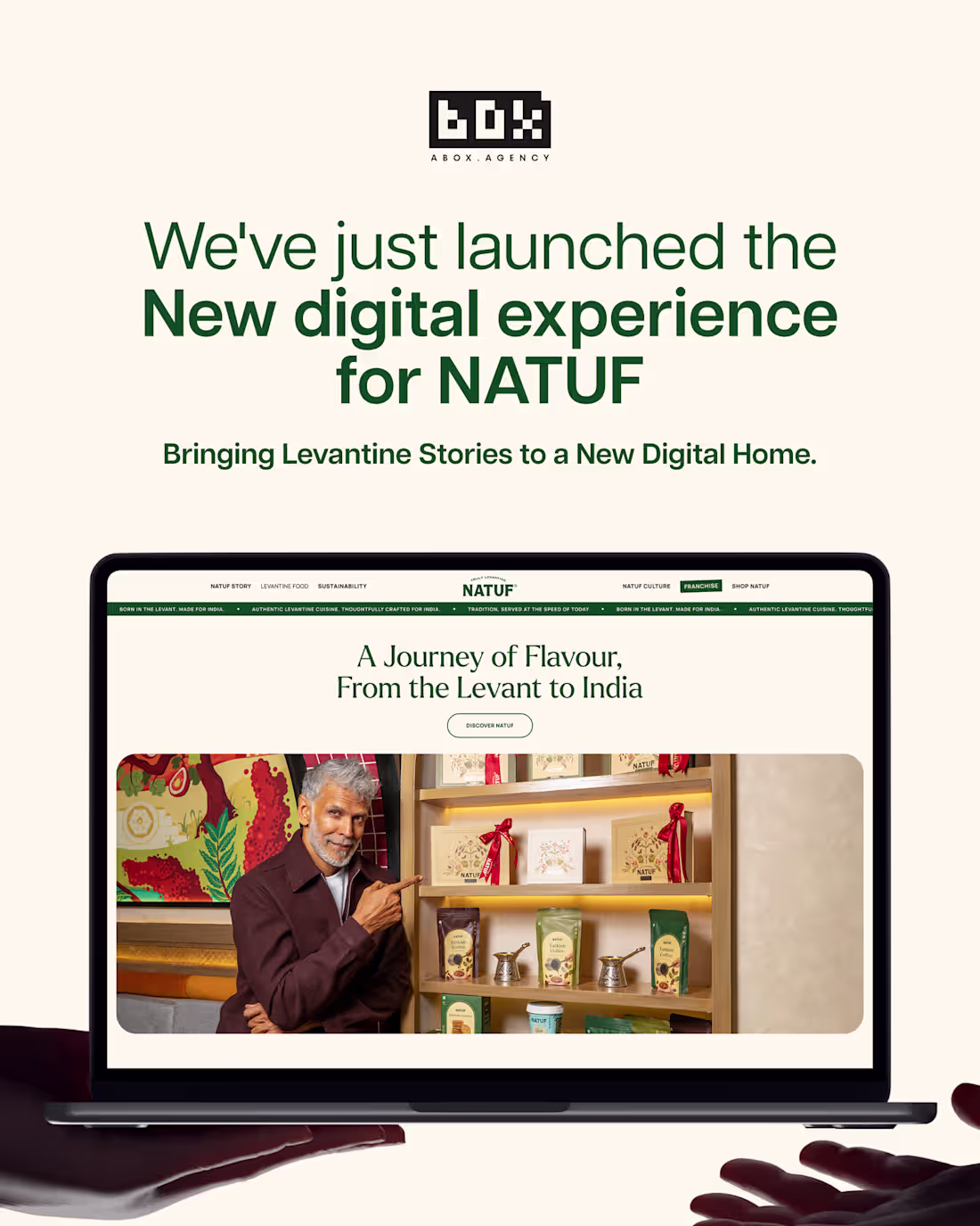
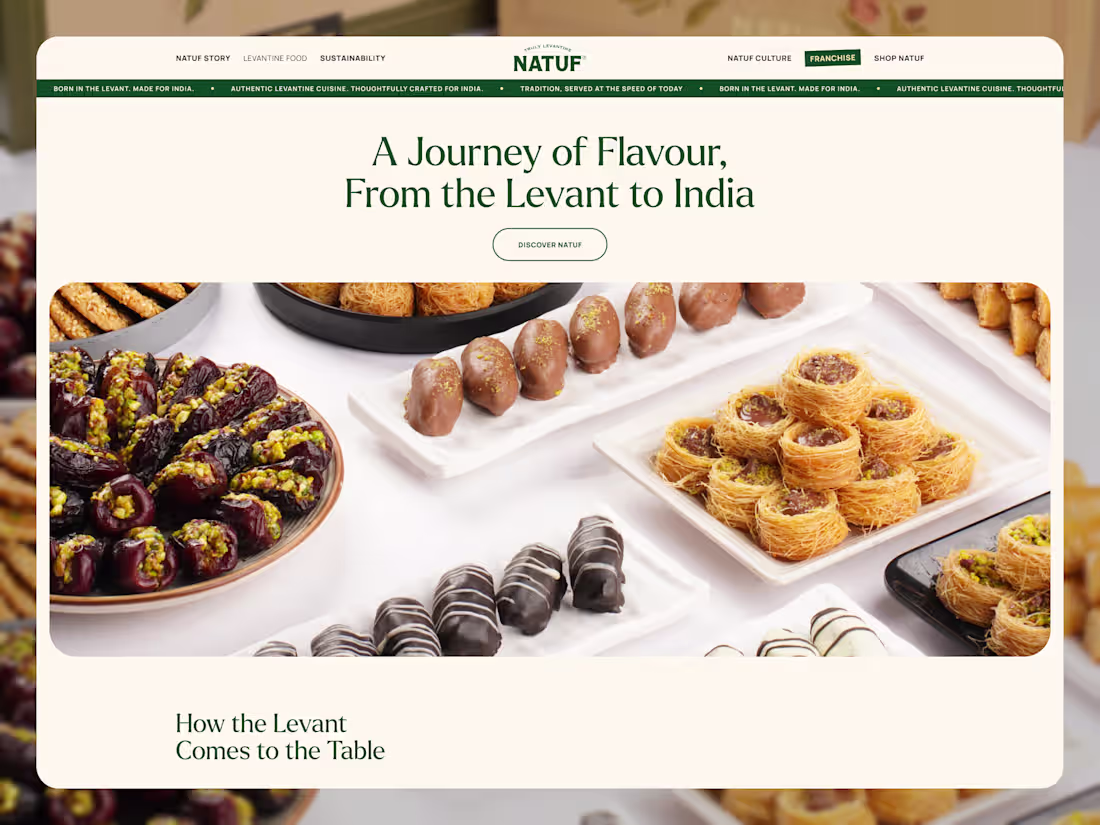
We crafted this website experience to bring NATUF's culture, hospitality, and Levantine heritage to life through motion and storytelling.
Using smooth transitions, immersive visuals, and thoughtful interactions, the goal was to create a digital journey that feels warm, authentic, and memorable across every touchpoint.
Explore more:https://dribbble.com/shots/27443027-NATUF-Website-Experience-in-Motion
2
2
119
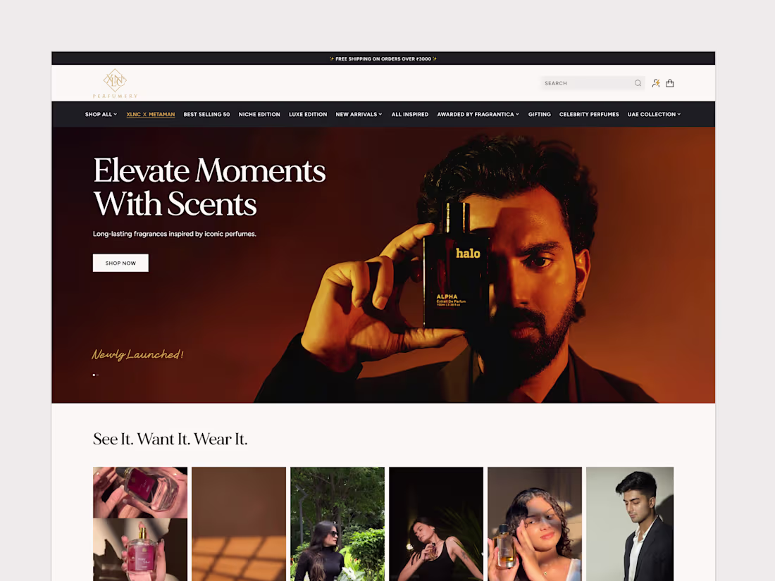
We partnered with XLNC Perfumery to design and develop a premium eCommerce website that reflects the sophistication of its fragrance collection while delivering a seamless shopping experience.
The project focused on creating a luxury-first digital presence through elegant typography, immersive product imagery, intuitive navigation, and conversion-driven user flows.
Explore more: https://dribbble.com/shots/27436731-XLNC-Perfumery-Luxury-Fragrance-eCommerce-Experience
6
8
302
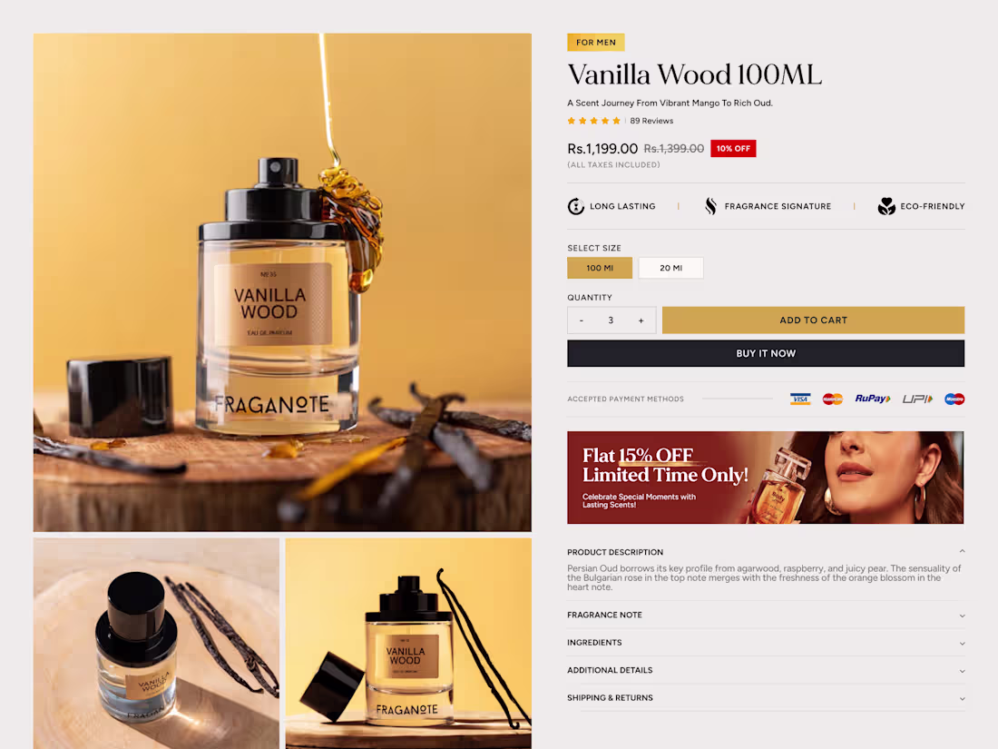
Designed a premium PDP experience that transforms fragrance discovery into a seamless shopping journey.
The page combines immersive product photography, clear product information, trust-building reviews, fragrance notes, and conversion-focused purchase flows to help customers make confident buying decisions.
Explore more: https://dribbble.com/shots/27438597-XLNC-Perfumery-Product-Detail-Page-Experience
2
4
136
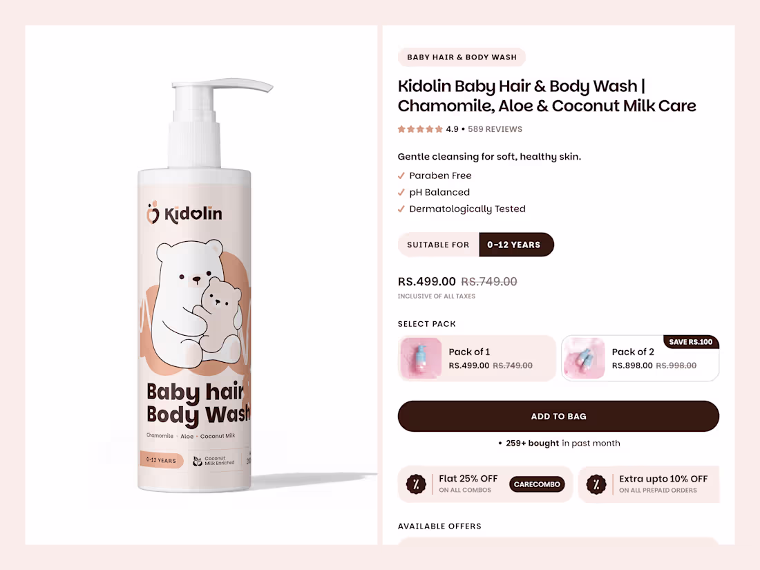
A thoughtfully crafted Product Detail Page designed to make every purchasing decision easier and more confident.
For Kidolin, we designed a comprehensive PDP experience that combines product storytelling, ingredient transparency, trust-building content, care guidance, and seamless purchase flows. Every element was carefully structured to help parents understand the product, explore its benefits, and shop with confidence.
A balance of education, trust, and conversion wrapped in a clean and premium user experience.
Explore more here (https://dribbble.com/shots/27431774-Product-Page-UIUX-Baby-care).
2
2
137
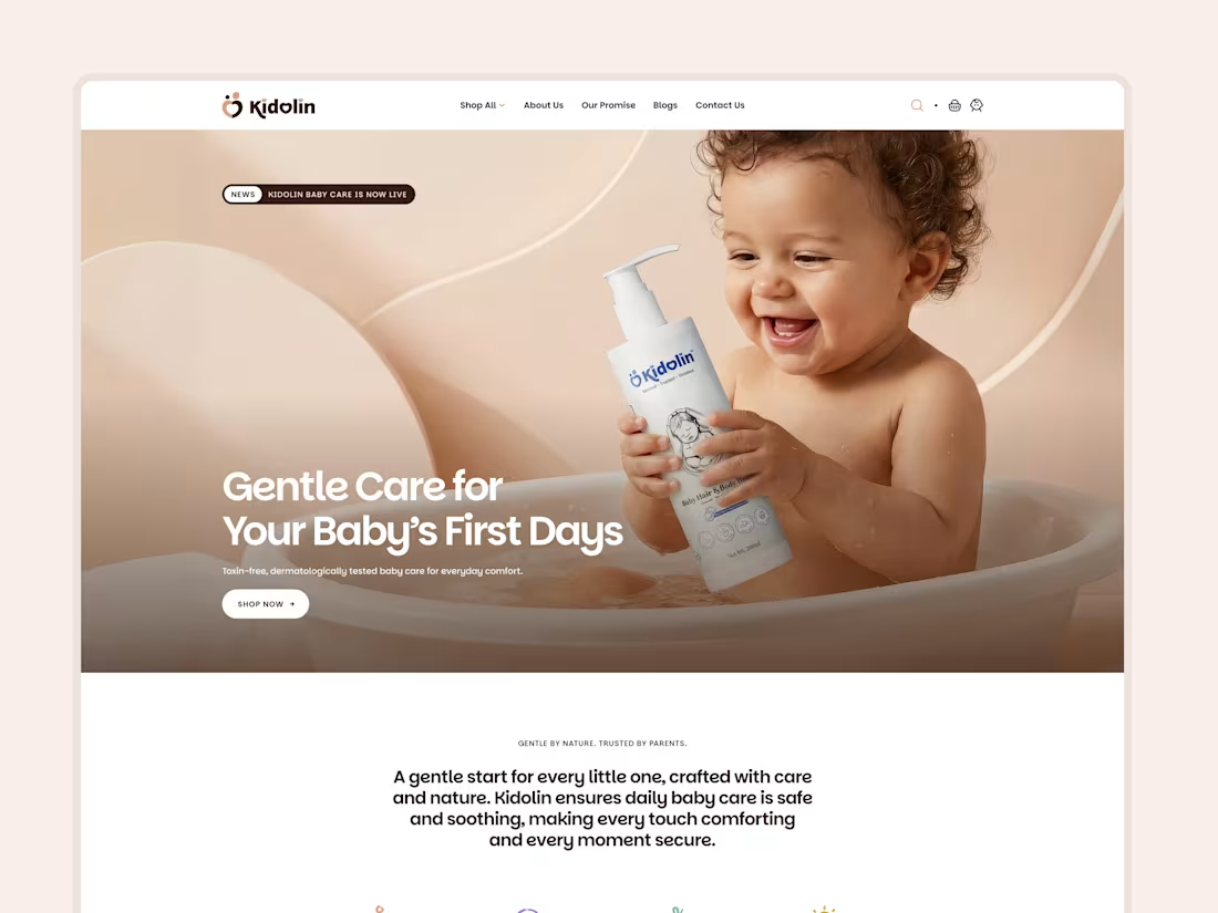
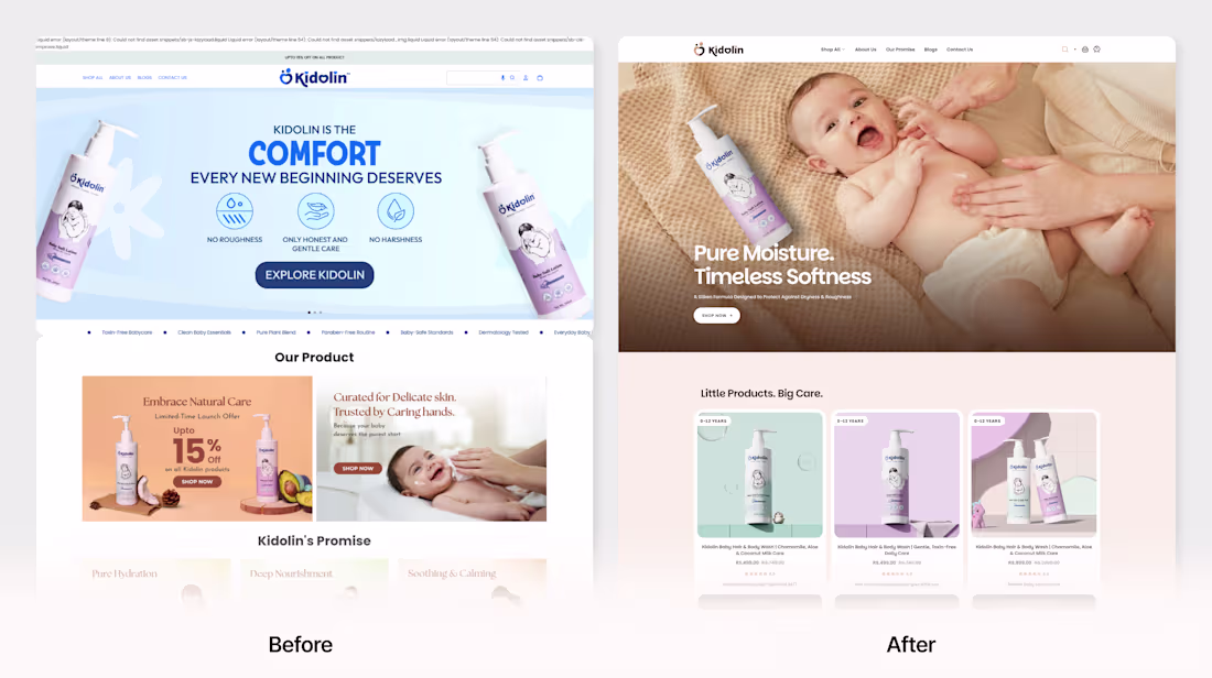
Kidolin is a baby care brand built around trust, comfort, and gentle everyday essentials for growing little ones.
For this project, we crafted a modern eCommerce landing page that translates these values into a warm and engaging digital experience. Through soft visuals, thoughtful layouts, intuitive navigation, and product-focused storytelling, the design creates a seamless journey that feels both premium and parent-friendly.
Designed to build trust, encourage exploration, and create meaningful connections with modern families.
Explore more here (https://dribbble.com/shots/27427682-Kidolin-Premium-Baby-Care-Website-Redesign-anf-footer-design).
2
3
137
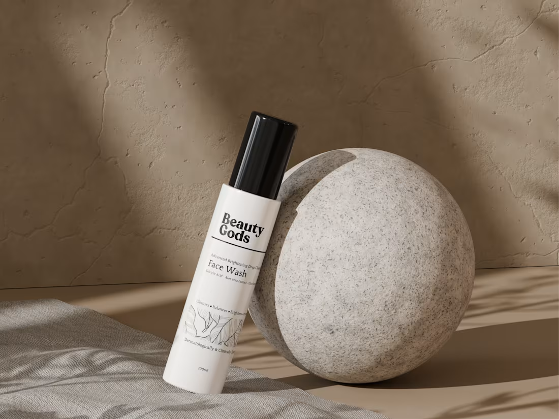
Created a premium 3D product visualization for Beauty Gods Face Wash.
The goal was to showcase the product through realistic materials, soft natural lighting, and a clean composition that reflects the brand's minimalist skincare identity.
From modeling to final rendering, every detail was crafted to deliver a refined and photorealistic product presentation.
Explore more here (https://dribbble.com/shots/27424971-Beauty-Gods-Face-Wash-3D-Product-Visualization).
2
3
145
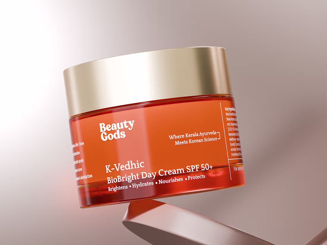
Designed and rendered a photorealistic 3D visualization for Beauty Gods.
This project showcases the K-Vedhic BioBright Day Cream along with its retail packaging, focusing on premium materials, accurate product details, and high-end presentation.
3D Modeling • Product Visualization • CGI Rendering
2
4
197
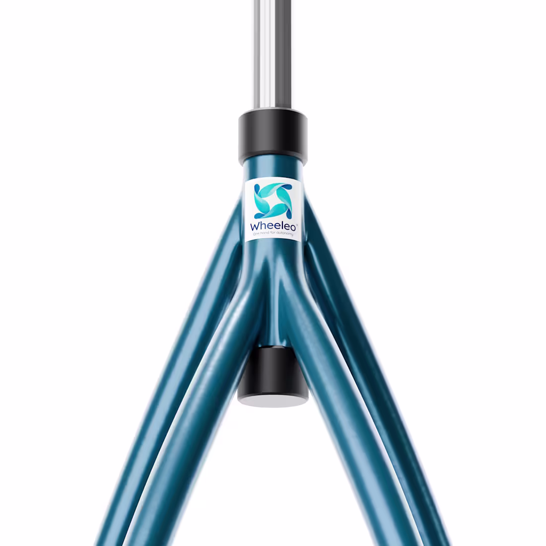
Created a premium 3D product visualization for Wheeleo®, focusing on realistic materials, engineering precision, and clean product presentation.
The project combines detailed component renders and hero product shots to showcase the design, functionality, and craftsmanship behind the product through high-quality CGI.
Explore more here (https://dribbble.com/shots/27421441-3D-Product-Visualization-for-Wheeleo-Mobility-Aid).
4
4
200
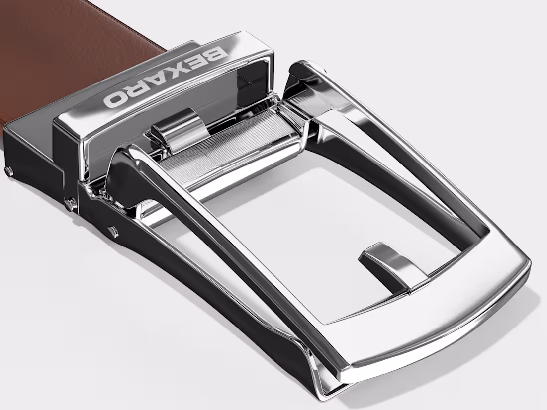
Crafted a premium 3D belt design with realistic textures, detailed modeling, and high-quality rendering. Focused on clean visuals and refined product presentation to bring everyday accessories to life.
Explore more: https://dribbble.com/shots/27412783-3D-Belt-Design-Exploration
3
154
Just went live 🚀
The new digital experience for NATUF crafted to bring Levantine culture, hospitality, and storytelling into a seamless online journey.
Thoughtful interactions, immersive visuals, and a responsive experience designed to feel as warm as the brand itself.
2
2
120
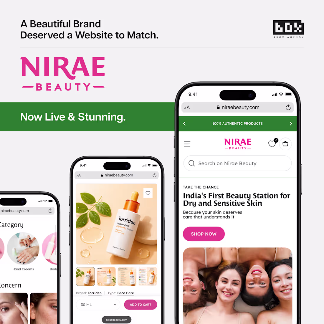
esigned and launched a refined digital experience for Niraé Beauty ✨
A modern beauty brand needed a website that felt just as elegant and intentional as its identity. Focused on creating a seamless user experience with clean visuals, responsive layouts, and a premium aesthetic across every touchpoint.
Built to elevate the brand and create a smoother customer journey.
View more here (https://www.linkedin.com/feed/update/urn:li:activity:7462764458499743747).
2
100
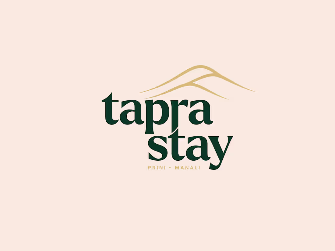
Exploring the Tapra Stay logo system through multiple variations designed for versatility, consistency, and a stronger hospitality brand experience across different applications.
2
4
155
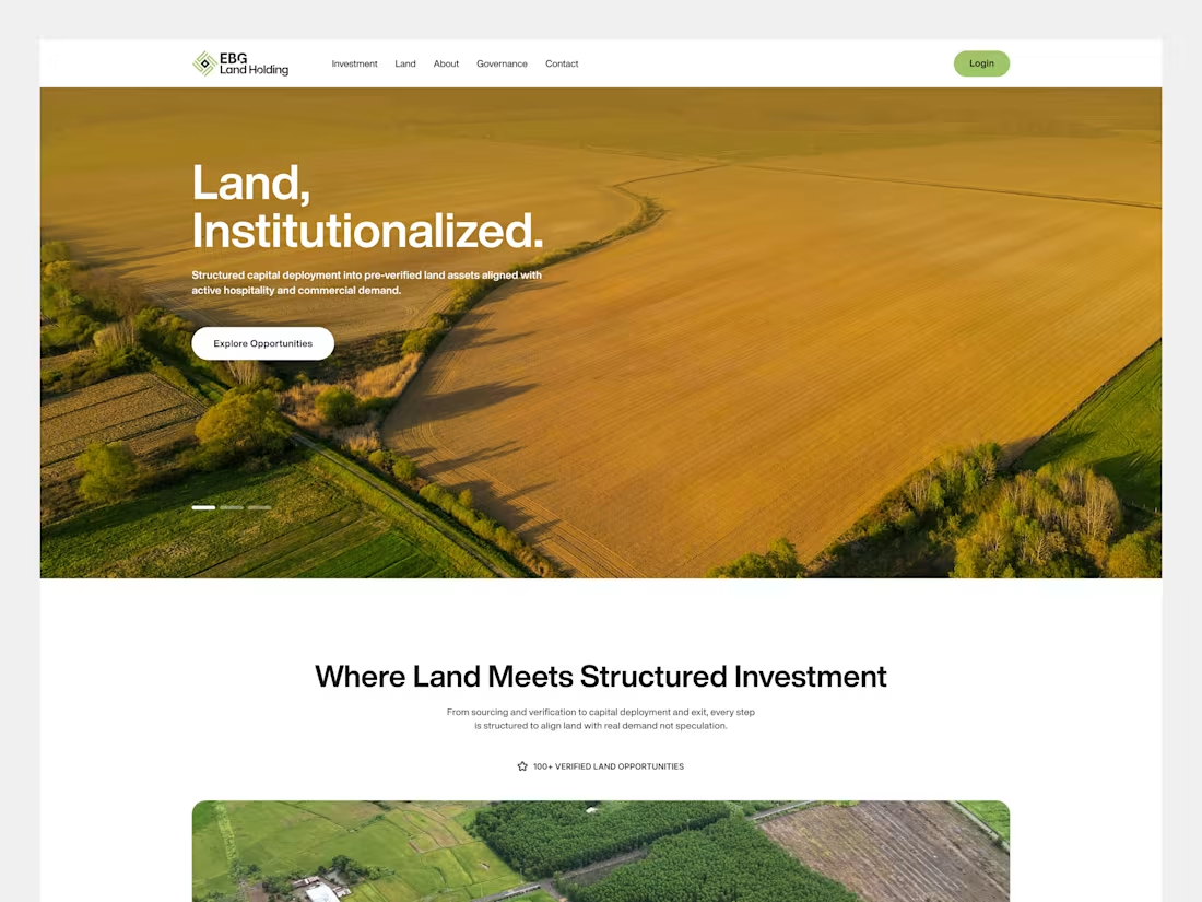
Redesigned the digital experience for Land Holding — a platform connecting verified landowners, investors, and structured investment opportunities through a transparent ecosystem.
The project focused on simplifying a complex land investment journey by creating a clean, trust-driven interface that balances usability with institutional credibility. From opportunity discovery and governance frameworks to investment models and conversion flows, every interaction was designed to improve clarity and user confidence.
Key focus areas:
• Website redesign
• UX strategy & information architecture
• Investment-focused UI system
• Trust & governance experience
• Conversion-focused user journey
• Responsive web design
The visual direction combines minimal layouts, bold typography, and nature-inspired tones to create a modern experience built around transparency and long-term value.
Explore more: https://dribbble.com/shots/27402190-Land-Holding-Real-Estate-Investment-Platform-Website-Design
2
90
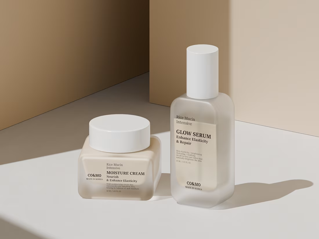
Designed and rendered a premium skincare CGI concept focused on soft lighting, realistic materials, and minimal composition.
A clean 3D exploration crafted to give the product a calm and luxury visual identity.
Explore more: https://dribbble.com/shots/27393989-Minimal-Skincare-Product-Visualization-for-Co-mo
2
2
114
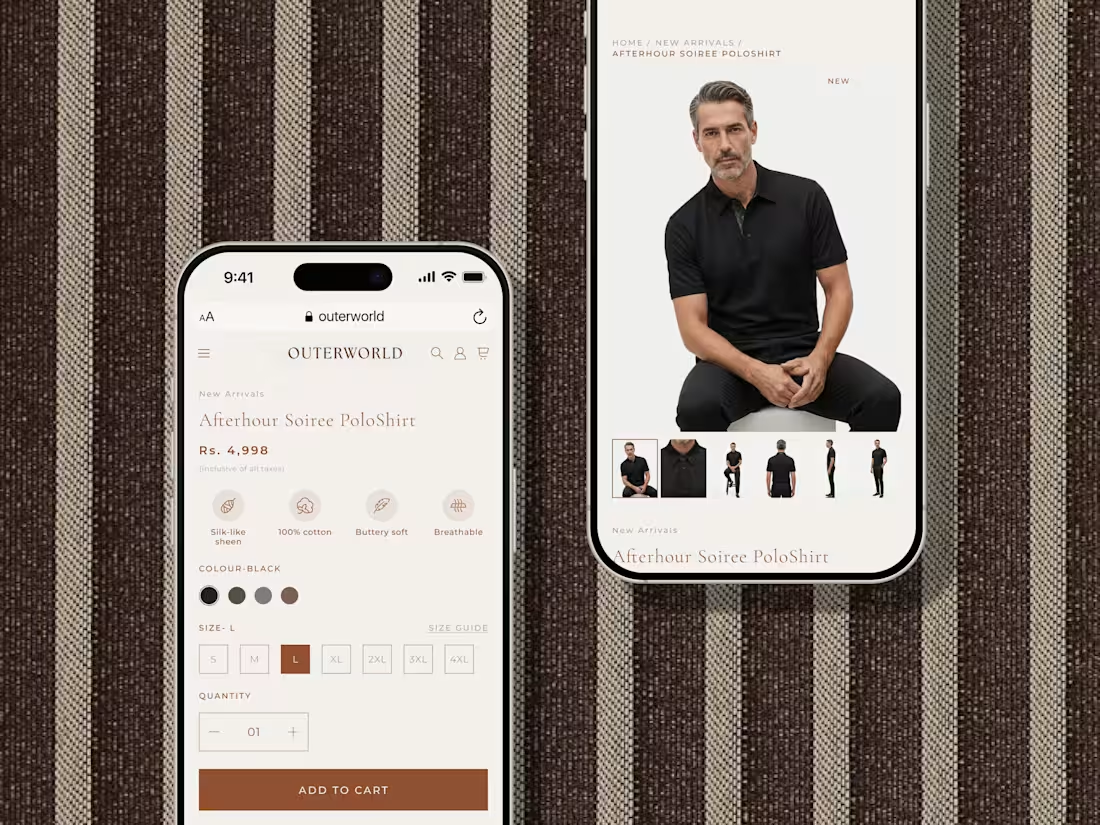
Designed this responsive mobile experience for Outerworld to make luxury shopping feel seamless, refined, and effortlessly intuitive.
Minimal UI, premium product storytelling, and elegant interactions crafted for modern commerce.
Explore more: https://dribbble.com/shots/27388987-Outer-world-Mobile-UI-Design
1
71
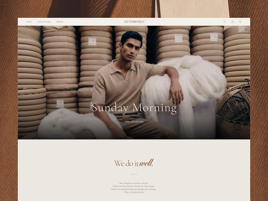
Designed this luxury menswear landing page for Outerworld a brand focused on timeless elegance, refined craftsmanship, and premium digital storytelling.
The experience combines editorial-inspired layouts, immersive fashion visuals, and minimal typography to create a calm and sophisticated browsing journey. Every section was carefully crafted to balance visual richness with clarity, allowing users to naturally explore the brand, collections, and craftsmanship behind the products.
Built with a mobile-first mindset and a premium e-commerce experience at its core.
Explore more: https://dribbble.com/shots/27387053-Luxury-menswear-Landing-Page-Design
2
76
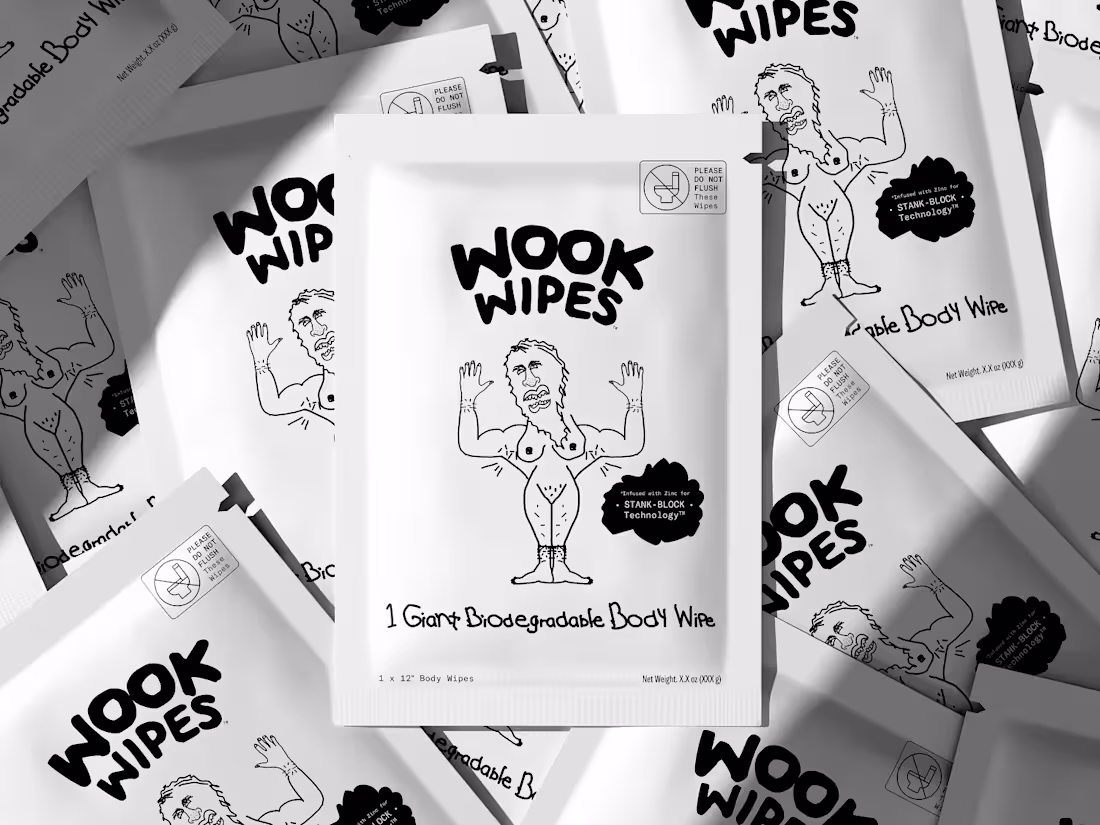
A bold packaging project built around the idea that personal care products don’t always have to look polished and predictable.
For WOOK WIPES, the goal was to create visuals that felt raw, unconventional, and impossible to ignore while still maintaining a clean premium presentation through 3D visualization.
Using monochrome tones, playful typography, and expressive compositions, we transformed the packaging into a striking visual experience with real shelf presence.
One of those projects where the attitude of the brand became the strongest design element itself.
Curious what’s a packaging design that instantly grabbed your attention the first time you saw it?
Explore more:
https://dribbble.com/shots/27385408-WOOK-WIPES-3D-Packaging-Visualization
2
92
Crafted a modern brand identity for NoirStep a socks brand focused on comfort, simplicity, and contemporary style.
The visual direction was built using bold typography, minimal structure, and a monochrome aesthetic with subtle red accents to create a premium and memorable brand presence.
Designed to work seamlessly across packaging, storefronts, apparel, and digital touchpoints while keeping the identity clean, scalable, and timeless.
Explore more here (https://dribbble.com/shots/27362363-Physio-care-Landing-Page-Design)
3
3
128
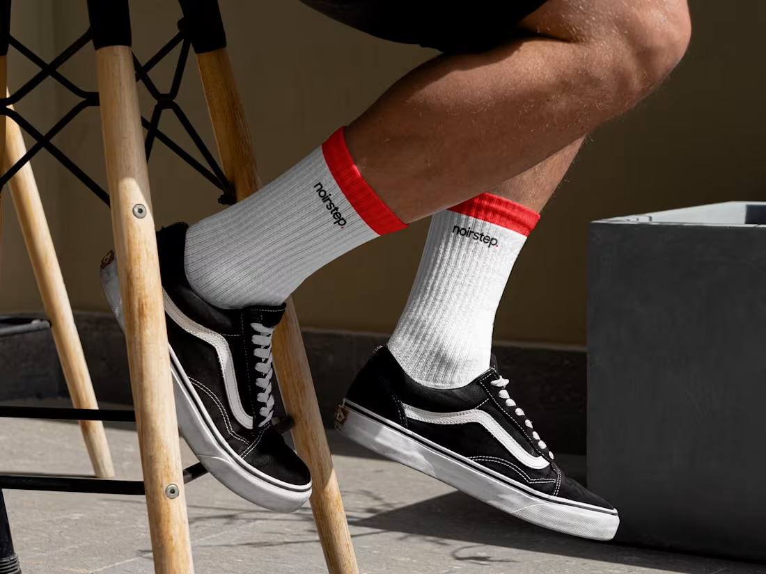
Built the complete brand identity for noirstep. a modern sock brand. From wordmark to product, every touchpoint designed around one idea: everyday comfort with real personality.
Explore more (https://dribbble.com/shots/27358396-niorstep-socks-logo)
2
3
115
If a food brand talks about culture, warmth, and authenticity but the website feels generic, where’s the connection?
That’s where thoughtful UI/UX becomes essential. For NATUF, we designed a storytelling-driven digital experience that brings Levantine culture into a modern and immersive web presence through editorial layouts, refined typography, and rich food visuals.
Every section was crafted to maintain the same warm and culturally rooted brand experience across the entire website.
The result: a cohesive digital identity that feels authentic, premium, and memorable across every touchpoint.
2
2
108
Here's a glimpse of early concepts from the Natuf project. A Levantine food brand making its way into the Indian market and needing to feel genuinely premium from the very first impression.
Some directions leaned into heritage. Some leaned into modern minimalism. All of them were exploratory.
A lot of this won't make the final cut and that's exactly the point.
Explore more (https://dribbble.com/shots/27345970-Natuf-Website-uiux)
1
94

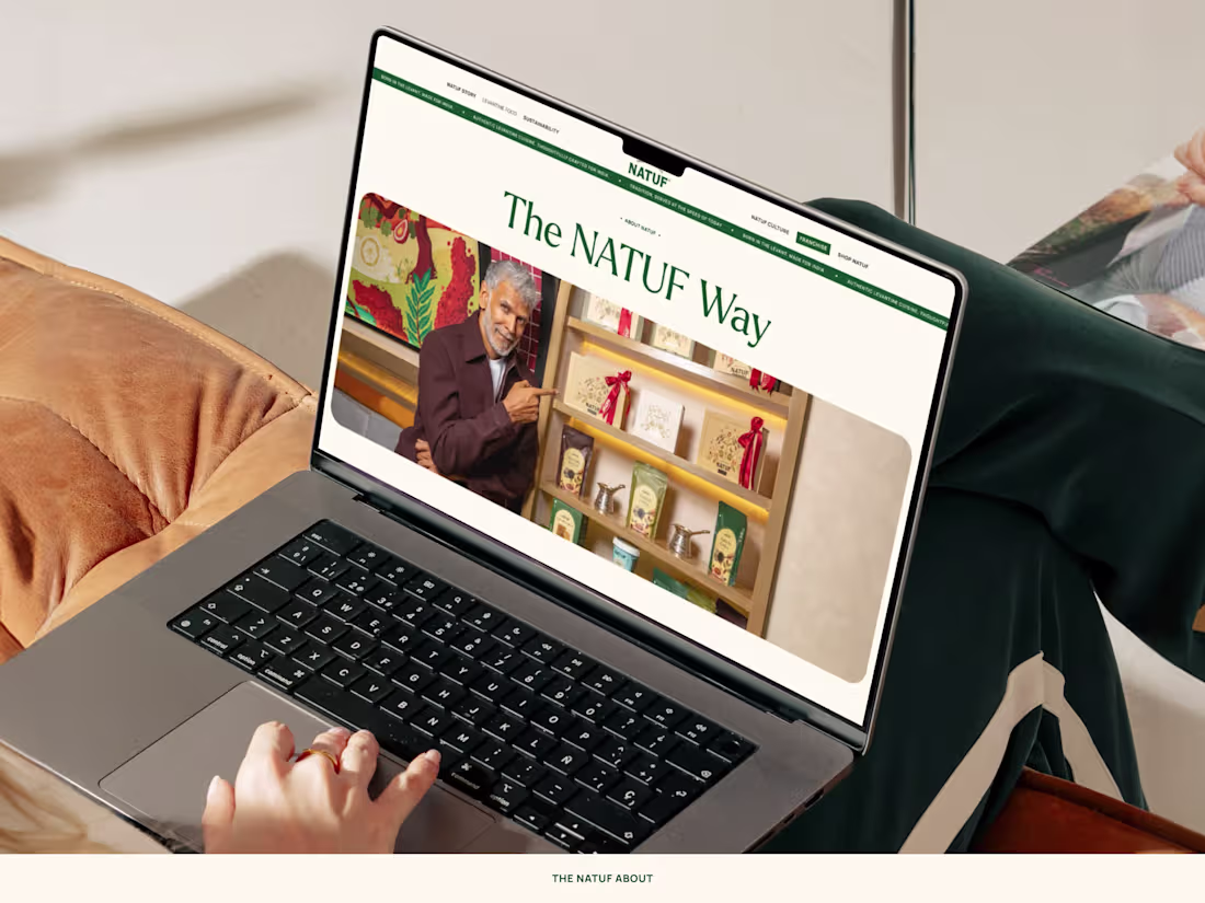
Just launched a recent website design project that I successfully completed for NATUF.
NATUF is a Levantine food brand crafted around authentic flavors, cultural richness, and thoughtfully curated culinary experiences. The website was designed to bring the warmth of Levantine cuisine into a modern digital space blending premium visuals, refined typography, and an elegant user experience that reflects the brand’s heritage and contemporary identity.
Clean layouts, immersive food photography, and a minimal editorial approach were used to create a sophisticated browsing experience that feels both inviting and elevated. Built with a strong focus on storytelling and visual balance, the design captures the essence of tradition while presenting the brand in a fresh, modern way.
The overall visual language combines earthy tones, spacious compositions, and subtle luxury-inspired aesthetics to create a timeless and memorable online presence for the brand.
You can see full project presentation here (https://dribbble.com/shots/27345970-Natuf-Website-uiux).
Feel free to like, comment and follow, kindly appreciated.
1
89
HavenIQ is built to make mental wellness accessible anytime, anywhere.
This branding focuses on simplicity and calmness, using clean visuals and a grounded color palette to reflect a peaceful digital experience.
Explore more: https://dribbble.com/shots/27337159-HavenIQ-Telemeditation-Branding-UI-Concept
1
89
Designed a modern brand identity for LetsPay a digital payment platform. Focused on simplicity, trust, and scalability through a bold geometric logo and clean typography.
2
2
119
Logo design for Bynix, a modern crypto platform.
Focused on a minimal wordmark with sharp geometry to reflect speed, structure, and digital precision.
1
83
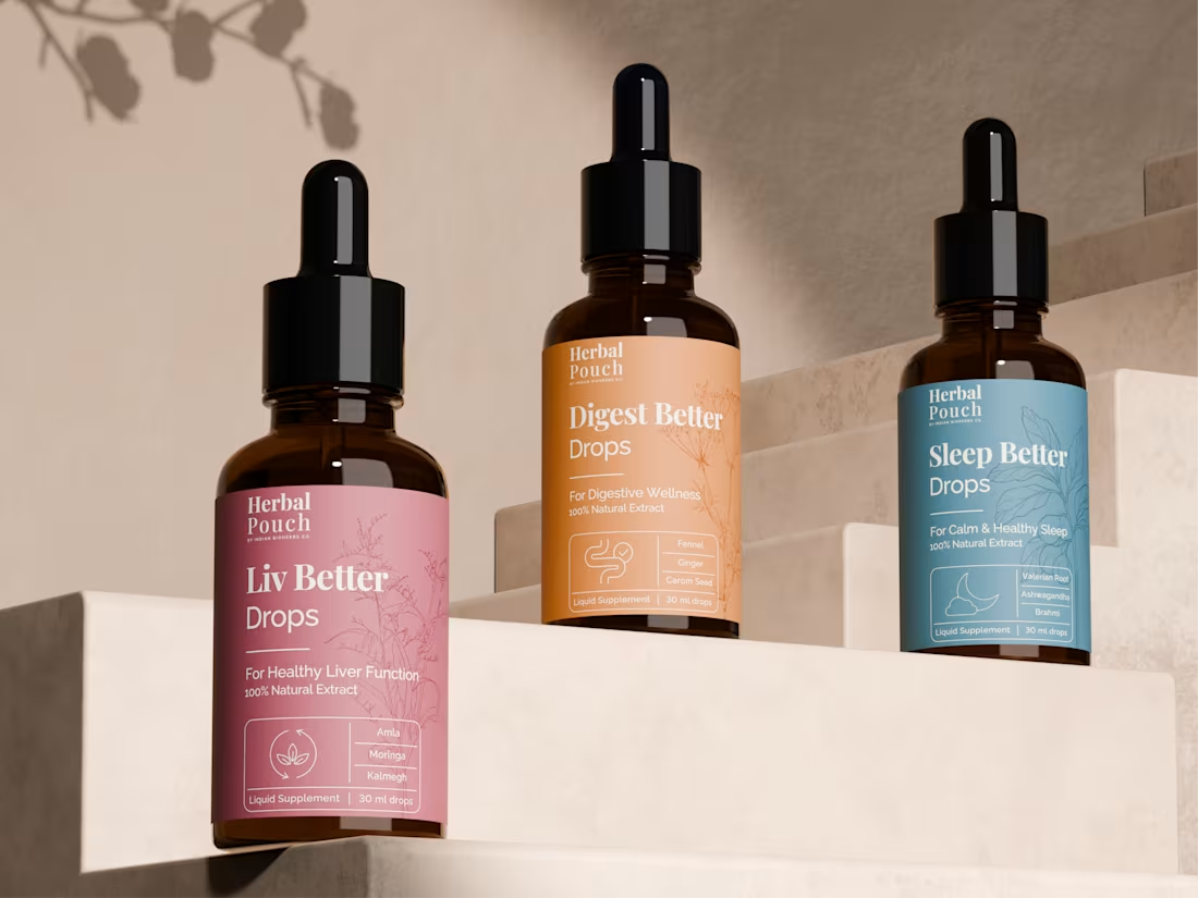
Designed a 3D product showcase for Herbal Pouch, bringing the full product line to life with depth, realism, and a clean premium aesthetic.
1
136
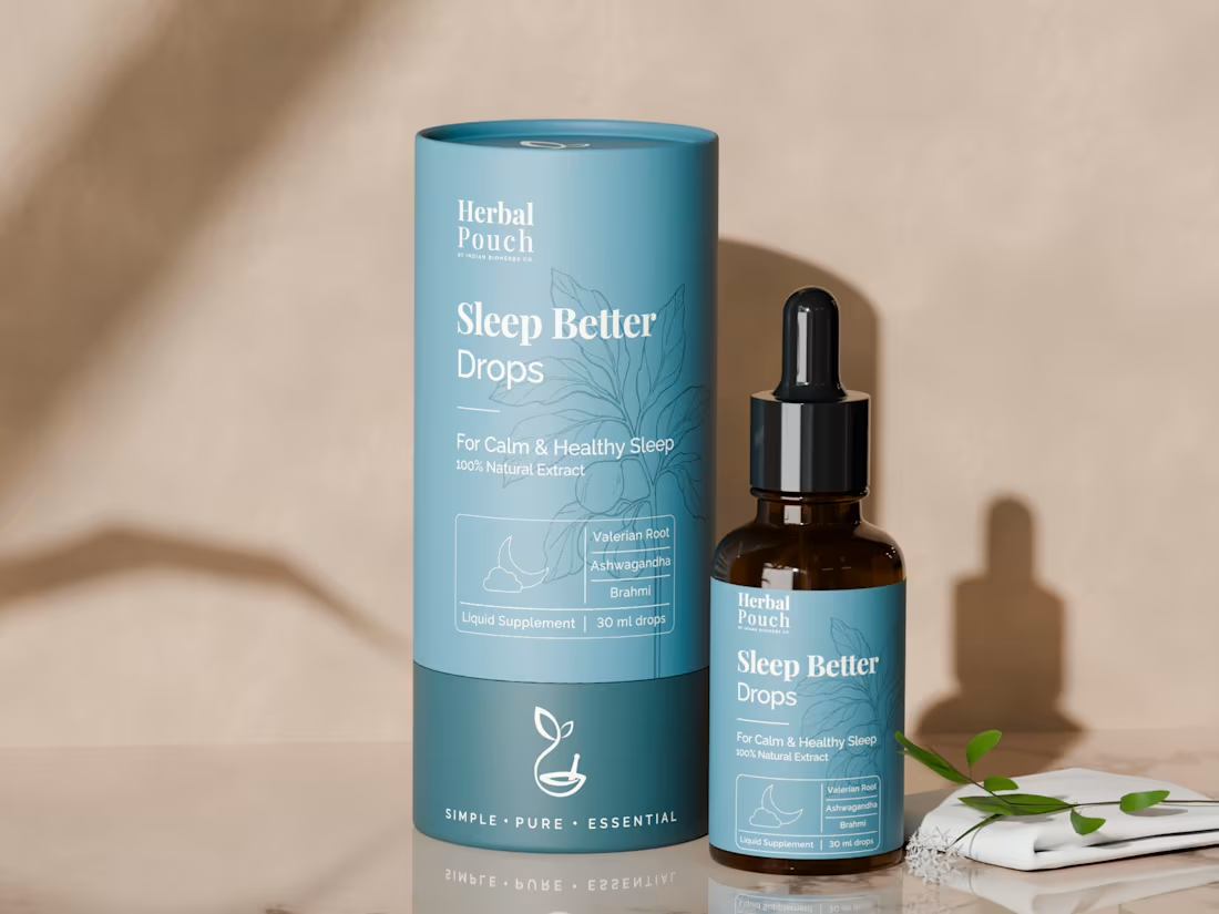
Designed photorealistic 3D packaging visuals for Herbal Pouch to showcase the product with an elevated and premium brand feel.
1
131
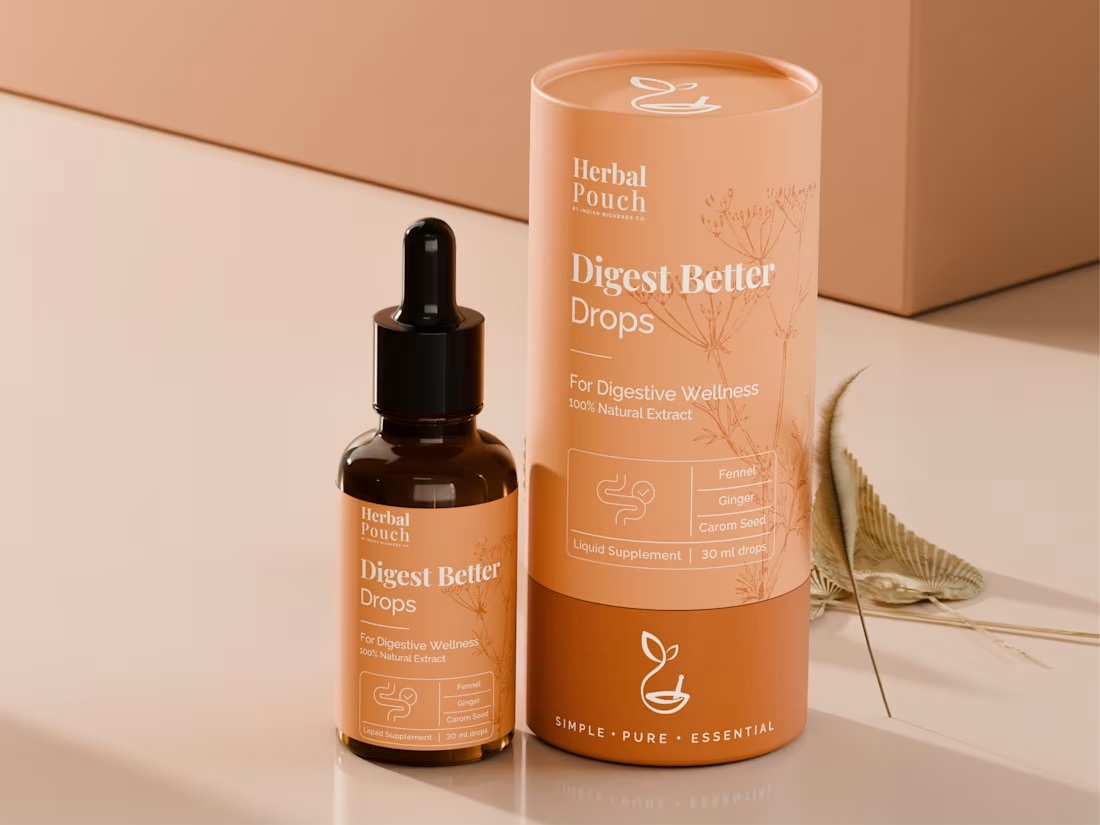
Designed premium 3D product visuals that bring Herbal Pouch’s packaging identity to life through detail, lighting, and realism.
1
132
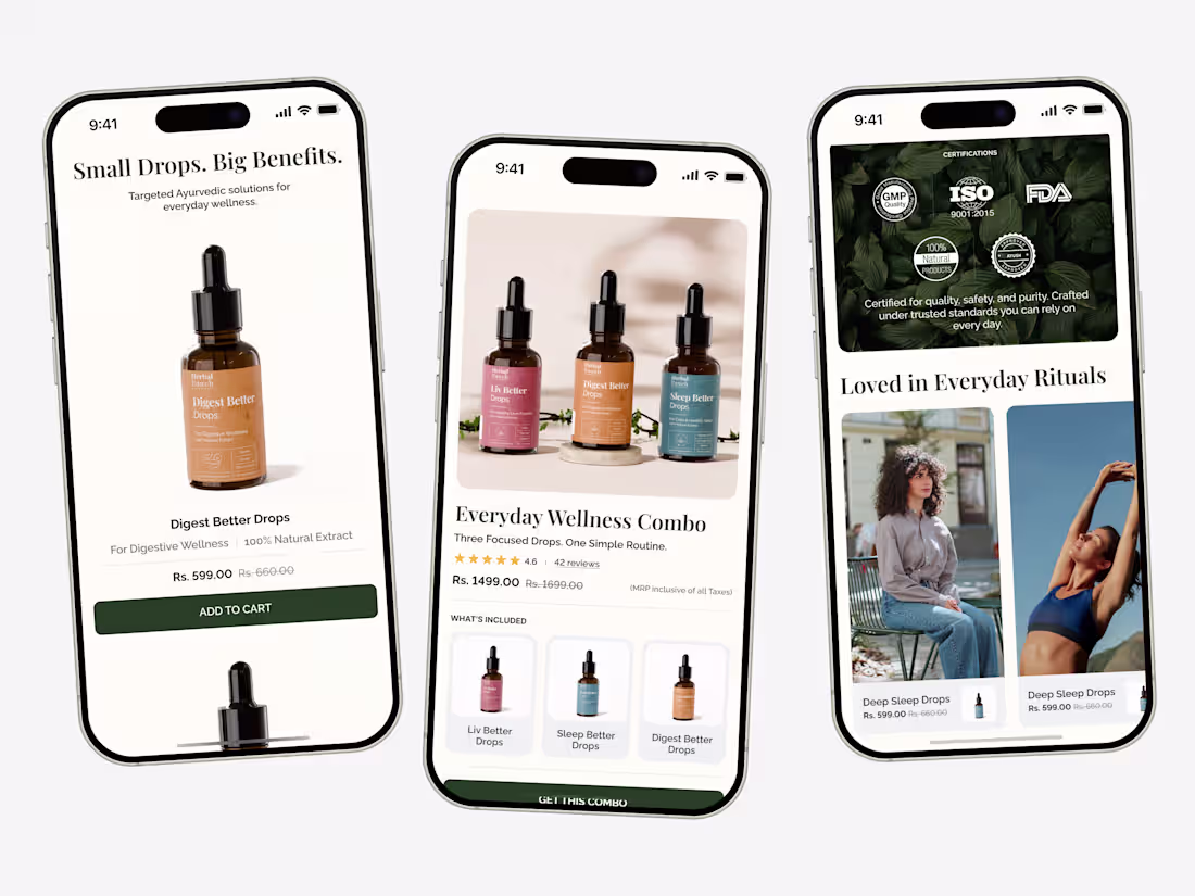
Designed a mobile-first UI for Herbal Pouch with thoughtful product discovery and smooth ecommerce usability.
4
3
155
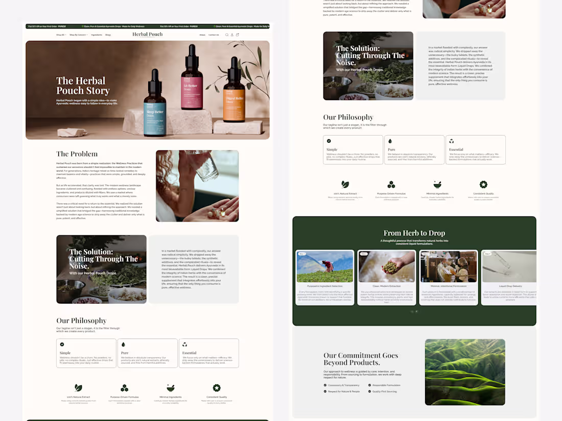
Crafted a brand story and process experience for Herbal Pouch, designed to communicate philosophy, sourcing, and product journey with clarity.
1
104
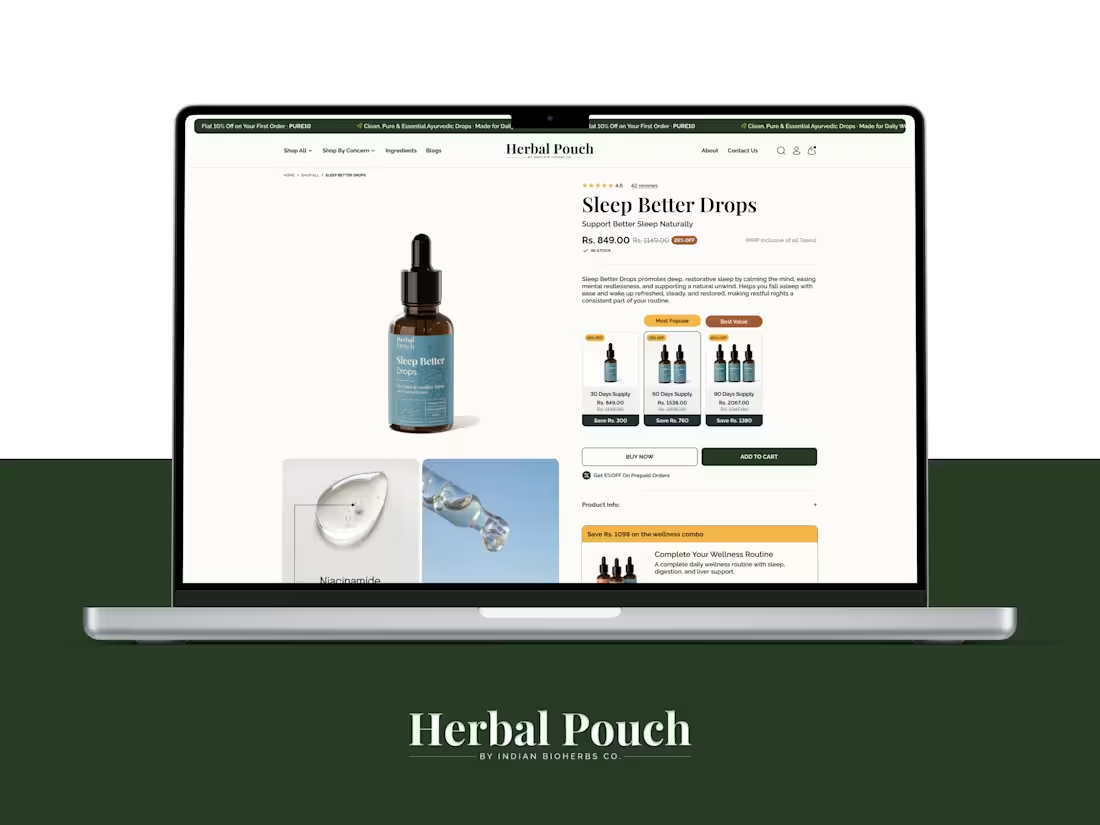
Product page UI crafted for Herbal Pouch, balancing premium visuals with ecommerce usability.
1
108
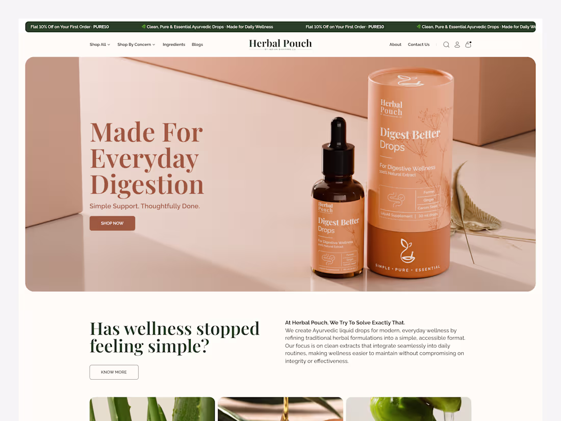
Designed a refined website UI for Herbal Pouch focused on usability, visual clarity, and brand-led storytelling.
1
96
A better look at the mobile view crafted for clarity, usability, and smooth navigation.
1
91
A refined About Us page experience built around storytelling and brand connection.
1
78
A closer look at a high-converting product detail page
2
111
A better look at the landing page experience designed for clarity, flow, and conversion.
2
128
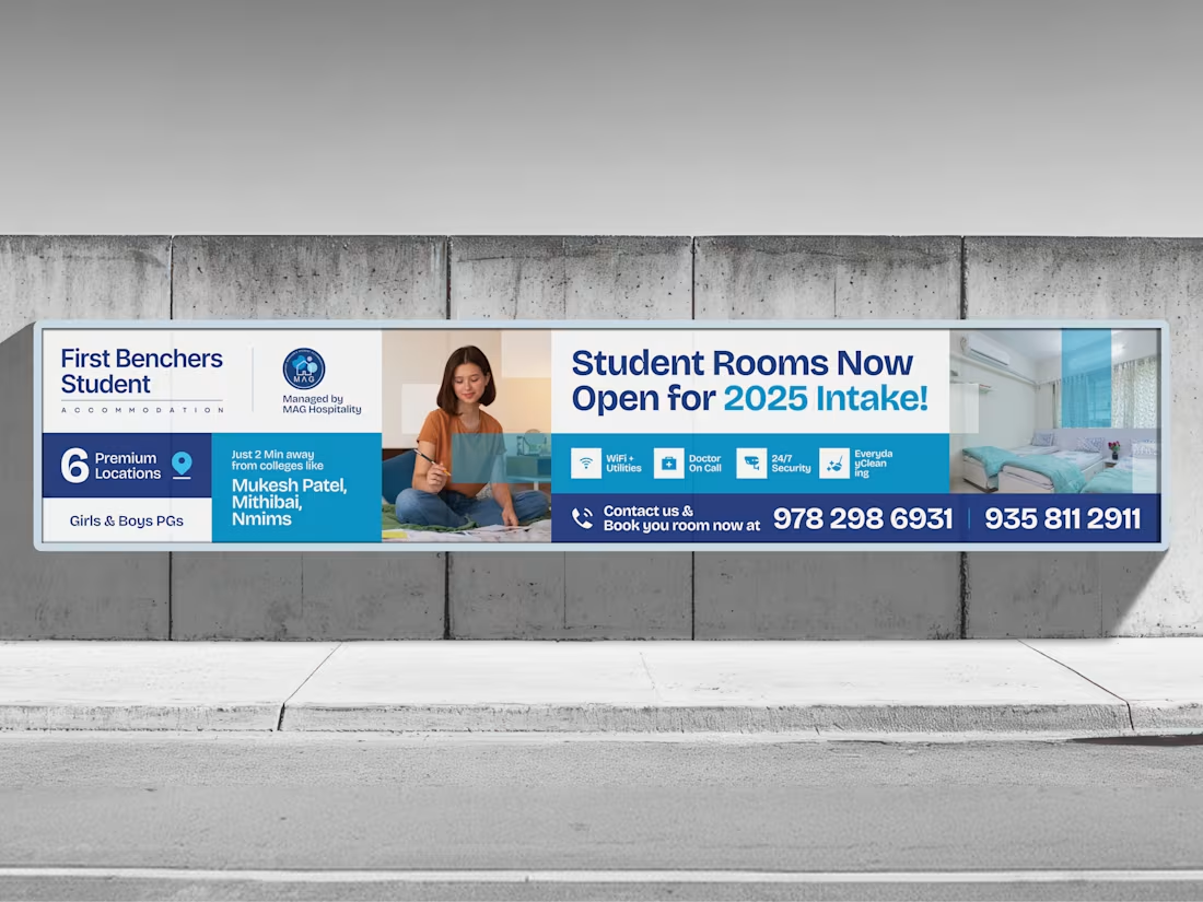
We crafted this billboard to communicate fast, clear, and bold in real-world environments.
Designed for attention. Built for impact.
1
106
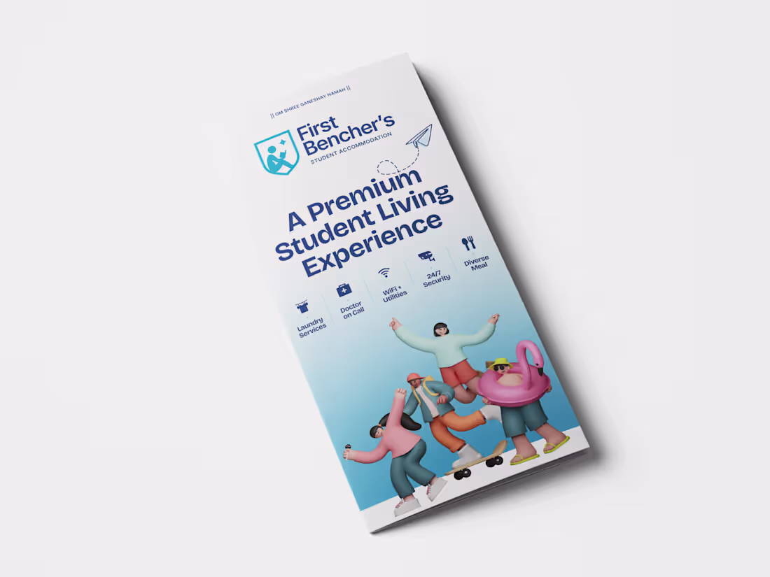
We crafted this threefold leaflet to showcase a premium student living experience with clean layouts, clear structure, and engaging visuals.
View more on dribbble: https://dribbble.com/shots/27276405-Threefold-leaflet-Design
1
1
136
This is a responsive UI, and for that we crafted a seamless experience that adapts effortlessly across mobile and desktop.
How important is consistency across devices for you?
2
3
127
This is a booking experience, and for that we crafted a clear and frictionless journey from discovery to selection.
View more inside: https://dribbble.com/shots/27269890-Room-Listing-UI-Booking-Experience-Design
2
113
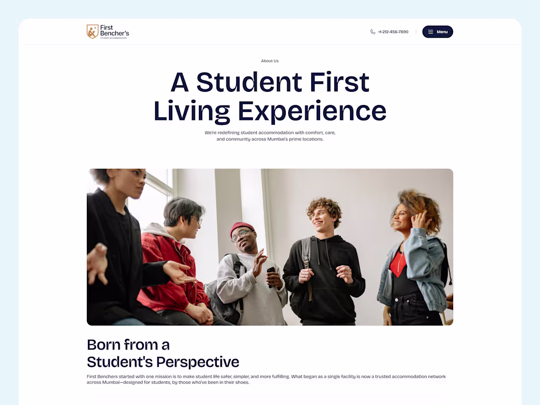
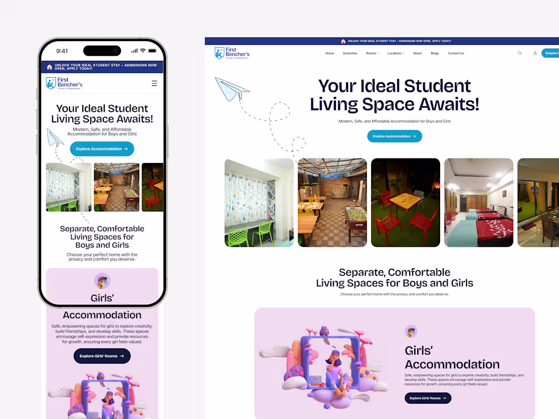
This is a responsive student accommodation platform, and for that we crafted a clean, content-driven experience that blends lifestyle, engagement, and usability across devices.
Explore more: https://dribbble.com/shots/27268687-About-Us-Page-Design-Student-Accommodation-Website-UI
2
122
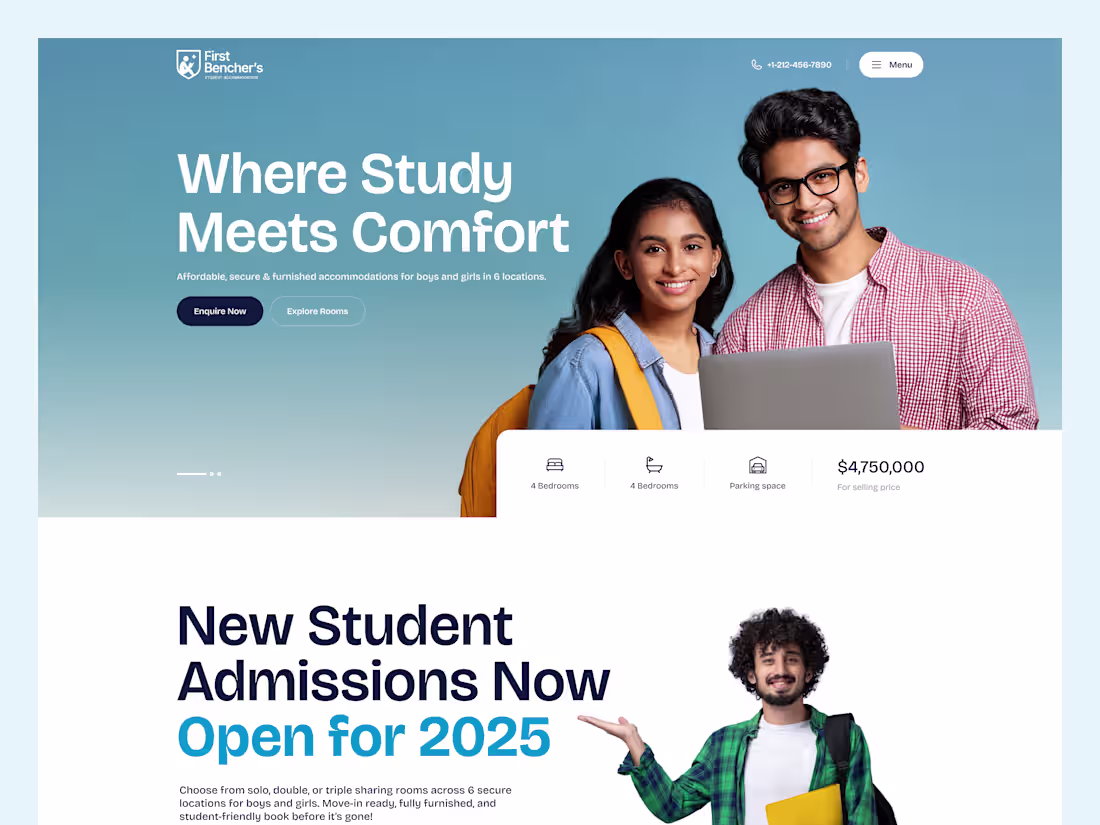
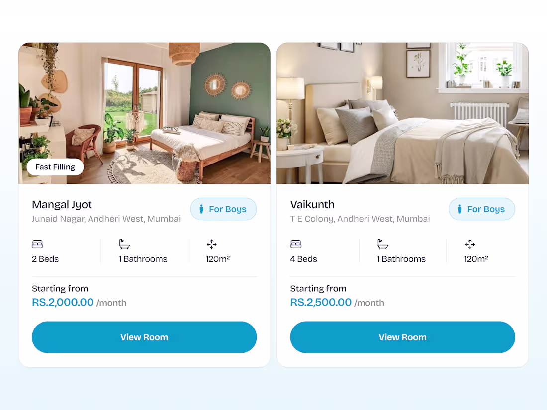
This is a student housing platform, and for that we crafted a visually engaging and user-friendly landing page that highlights comfort, accessibility, and ease of booking.
View more inside: https://dribbble.com/shots/27261259-Student-Housing-Platform-UI-UX-Design
8
4
241
What if one page could tell an entire FMCG story?
Built this to explore structure, storytelling, and impact without overwhelming the user.
Explore more: https://dribbble.com/shots/27250503-EBG-FoodWorks-Purpose-Driven-FMCG-Brands-United
3
115
A clean, conversion-focused product page design for Acer Electric built to improve user experience, product clarity, and engagement ⚡
Explore more: https://dribbble.com/shots/27246384-Acer-Electric-Product-Page-Concept
2
109
3D box exploration we created for Fruzo.
Focused on structure, motion, and how the product reveals itself not just how it looks.
What do you think about this approach?
3
135
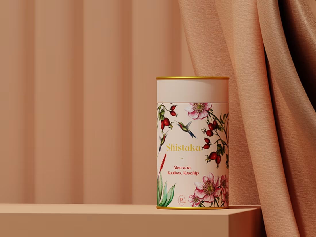
Exploring packaging through 3D. Loved playing with compositions and bringing these to life.
Explore more: https://dribbble.com/shots/27243917-Shistaka-Tea-Series-3D-Product-Visualization
2
125
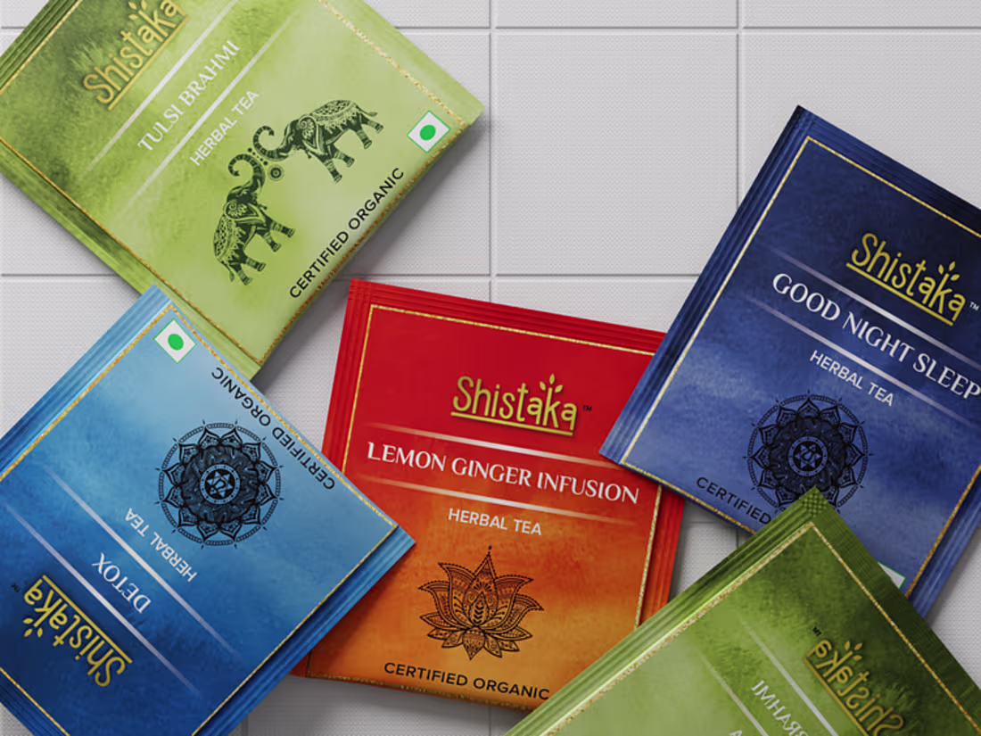
Packaging that feels as good as it looks.
Explore here (https://dribbble.com/shots/27224505-Shistaka-Herbal-Tea-Packaging).
2
119
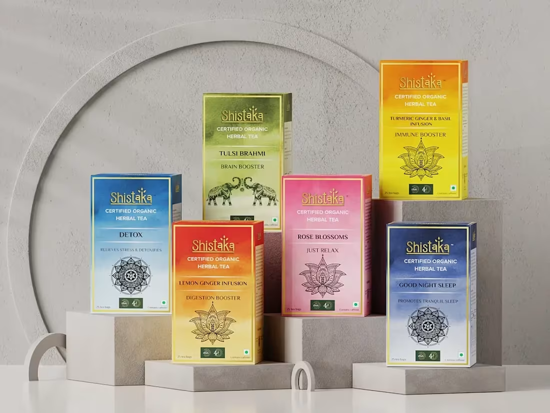
A 3D product visualization project for Shistaka, exploring how thoughtful composition, soft lighting, and realistic materials can transform packaging into a strong visual experience.
View more here: https://dribbble.com/shots/27216827-Shistaka-3D-Herbal-Tea-Packaging-Series
2
109
Turning product details into visual stories.
2
102
Every brand has a story.
This one flows with every sip.
Explore more inside: https://dribbble.com/shots/27210561-Shistaka-About-Us-in-Motion
4
130
What if your first scroll could feel premium?
Shistaka Hero Motion Concept 🍃
2
3
117
Do users really care about footers?
I think they do if it’s designed right.
2
90
Built this mobile experience around simplicity and flow.
The best mobile UI is the one users don’t even notice it just works.
view more inside: https://dribbble.com/shots/27195144-Pet-Care-Mobile-App-UI-Design
2
6
128
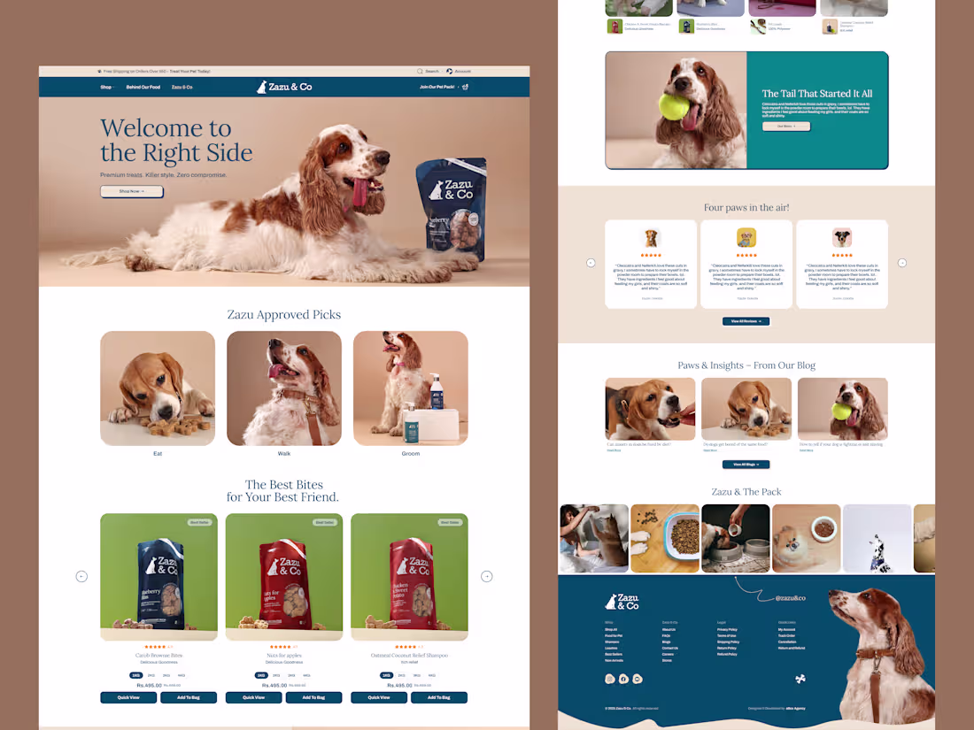
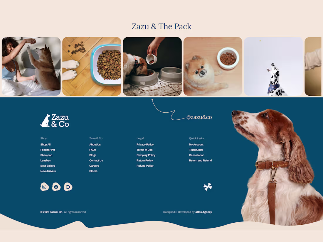
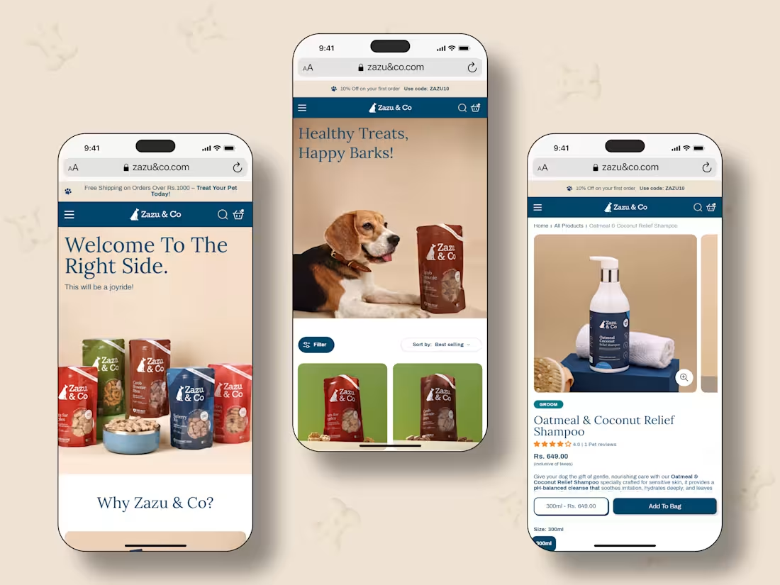
Worked on this UI/UX for Zazu & Co.
The goal was clarity and smooth flow
Must chckout: https://dribbble.com/shots/27191687-Zazu-Co-Pet-Care-Website-UI-UX-Design
3
83
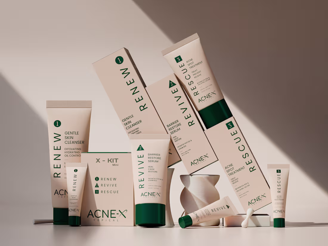
Designed these 3D renders for Acne-X
Kept everything minimal so the product stands out.
How does it look? Open to honest feedback.👀
2
4
111
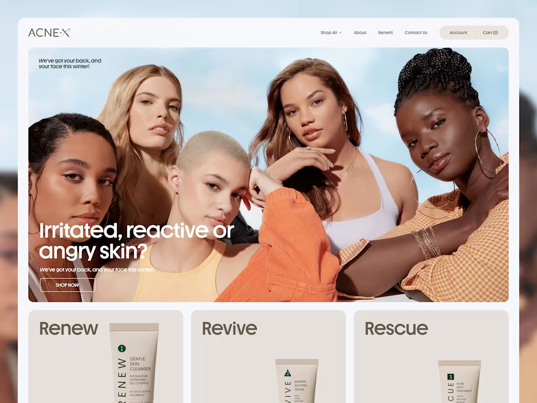
Lately, we’ve been rethinking how we design websites. 🤔
For Acne-X, the focus was simple create an experience that feels clear, trustworthy, and easy to act on.
But here’s the question…
Do users actually explore the full website, or just scan and decide?
As an agency, we design for clarity
but behavior is always unpredictable.
Curious to know:
What makes you stay on a website… and what makes you leave?
2
70
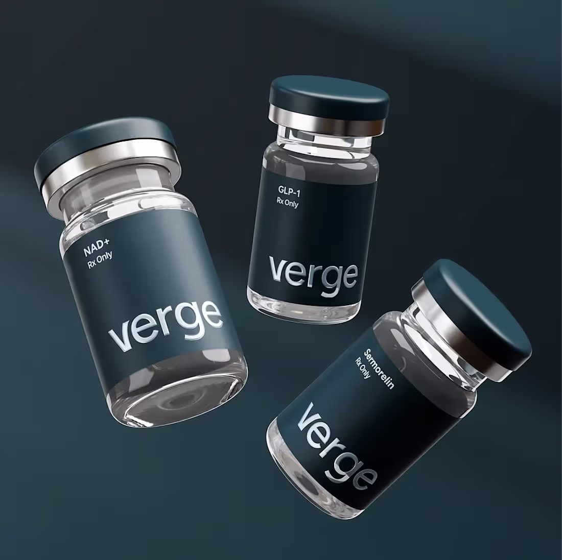
3D product visualization crafted for VERGE.
Multiple formulations.
One refined identity.
Explore more here: https://dribbble.com/shots/27144320-VERGE-Pharmaceutical-3D-Product-Visualization
2
78
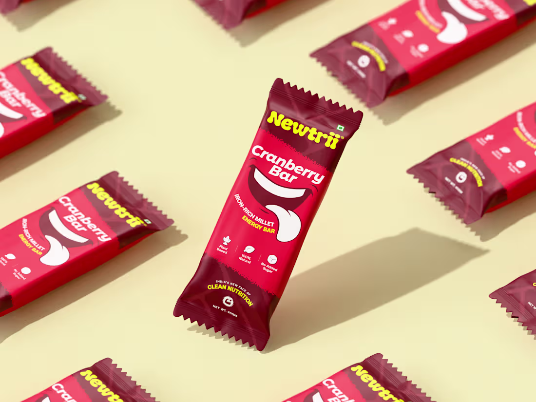
Newtrii Product Visualization
Clean design. Vibrant energy.
Made to stand out on every shelf.
Explore more: https://dribbble.com/shots/27153794-Newtrii-Energy-Bar-3D-Packaging-Presentation
3
94
Crafted this animated identity for Newtrii to visually express growth and energy.
Explore more here: https://dribbble.com/shots/27144068-Newtrii-Brand-Identity-Guidelines
2
81
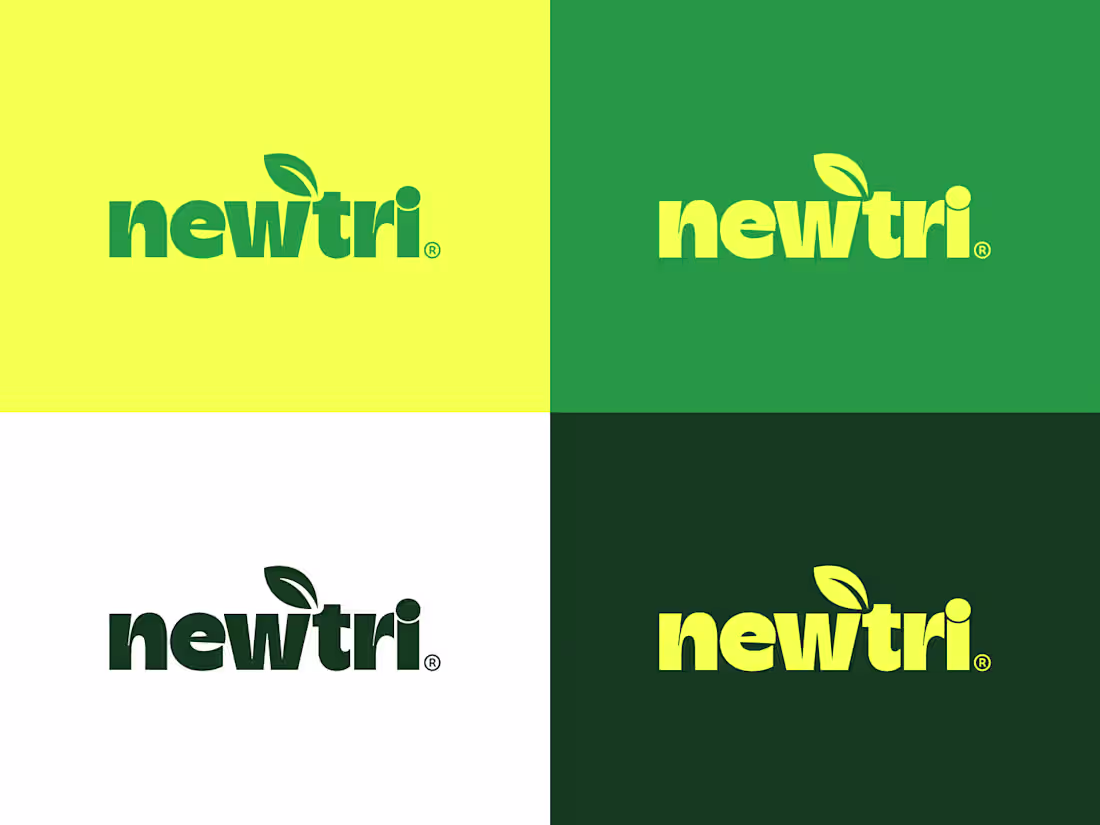
Newtrii Brand Identity 🌿
Designed to feel fresh, friendly, and optimistic
a visual system inspired by nature, wellness, and modern nutrition.
Explore more here: https://dribbble.com/shots/27144068-Newtrii-Brand-Identity-Guidelines
2
87
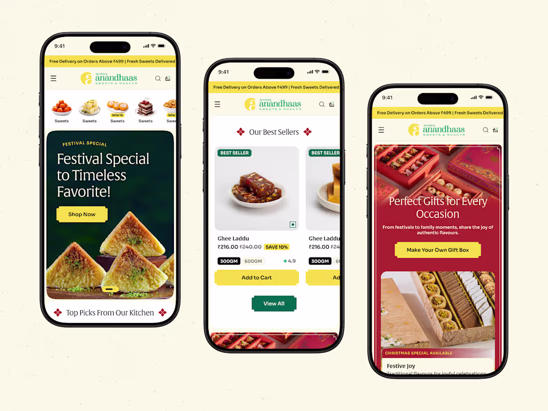
Mobile-first ecommerce experience crafted for clarity and conversion.
Seamless, responsive, and built to perform.
Explore more: https://dribbble.com/shots/27125470-Shree-Anandhaas-Mobile-UI-Design
2
3
137
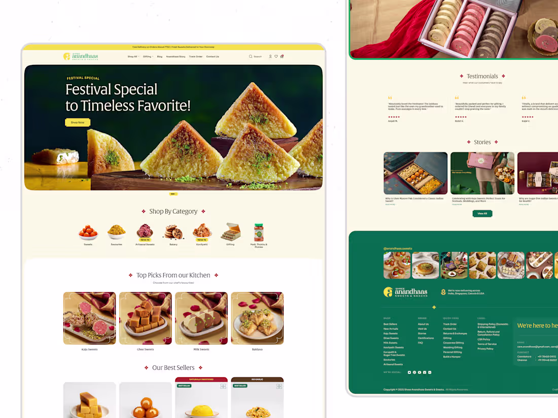
A premium ecommerce experience designed to bring traditional products into a modern digital journey.
Clean UI, strong hierarchy, and built to convert.
Explore more: https://dribbble.com/shots/27121481-Shree-Anandhaas-Ecommerce-Website-Design
2
2
97
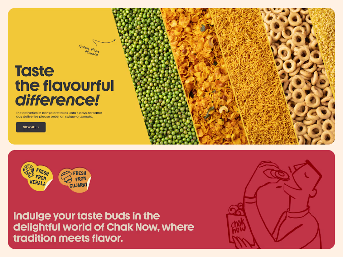
Worked on the landing page design for Chak Now, a modern Indian snack brand by Anand.
The focus was to create a flavor-first experience using bold food textures, strong color sections, and clean typography to make the product instantly appealing.
Also explored sections around distribution, regional presence, and brand legacy to build both appetite and trust across the page.
3
3
101
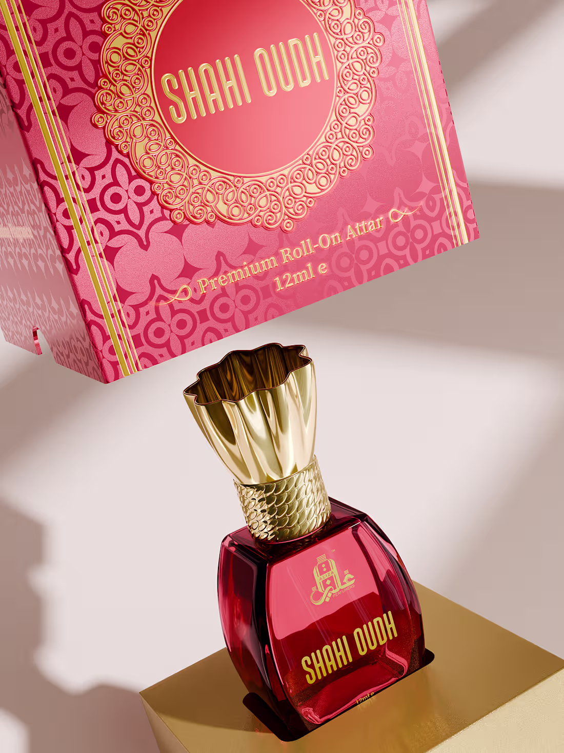
Crafted this luxury attar bottle and packaging in 3D for Shahi Oudh.
Explored glass material, gold reflections, and lighting to achieve a rich, premium look
Explore more: https://dribbble.com/shots/27127491-Aliza-Perfumers-Luxury-Attar-Packaging-3D-Visualization
5
186
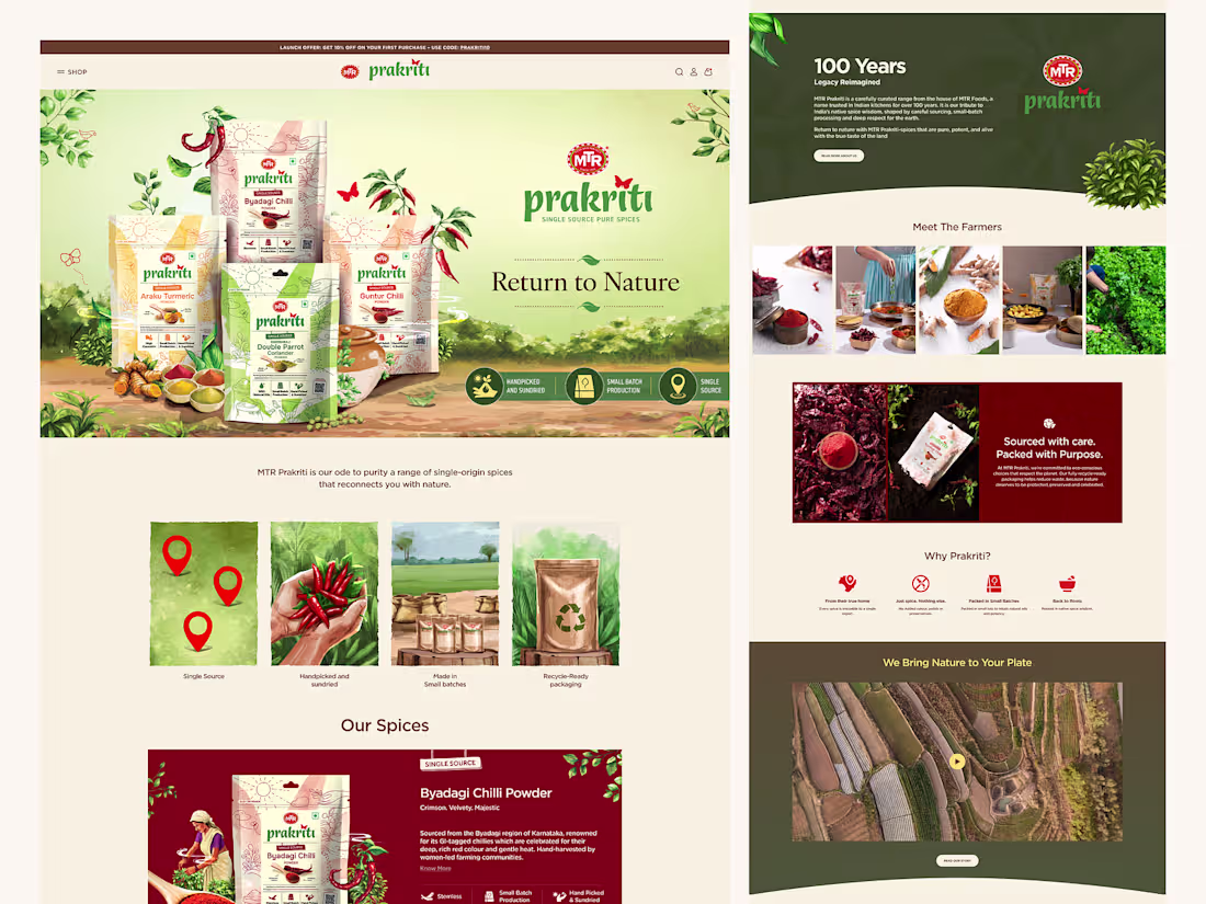
MTR Prakruti Website Design
1
3
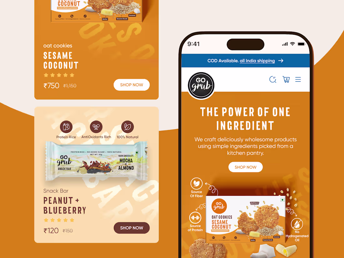
Mobile UI design for Go Grub’s eCommerce experience.
Explore more: https://dribbble.com/shots/27103304-Go-Grub-Mobile-UI-design
2
2
171
Product page UI designed to highlight Go Grub’s ingredients, benefits, and product details.
Explore more here: https://dribbble.com/shots/27102825-Product-Page-UI-for-Go-Grub
1
160
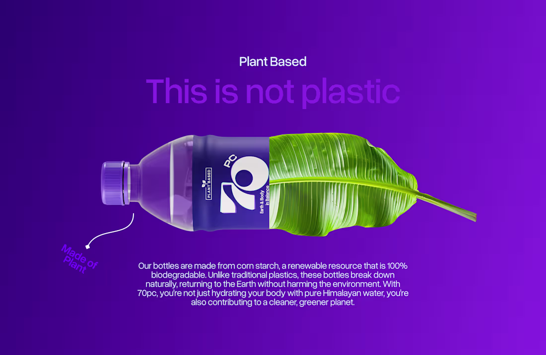
A sustainable branding and packaging concept for 70pc, a plant-based water bottle made from corn starch.
The project includes brand identity, color palette, 3D product design, and minimal packaging created to promote a biodegradable alternative to plastic and support a cleaner, eco-friendly future.
2
187
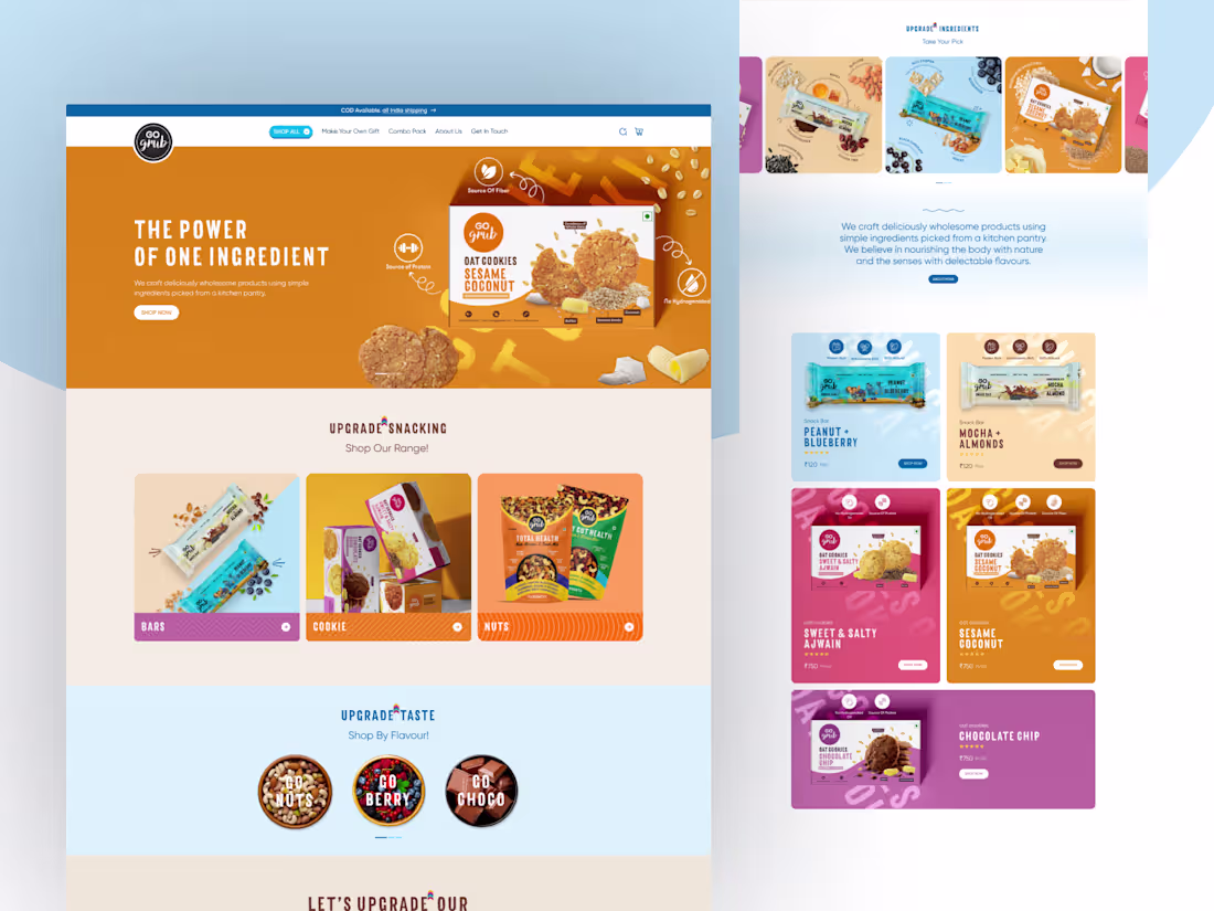
Website UI design for Go Grub.
A clean desktop layout built to showcase products, highlight ingredients, and create a smooth eCommerce browsing experience.
1
157
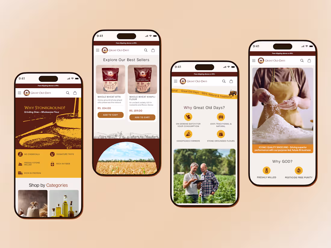
A mobile first ecommerce experience for Great Old Days.
Explore more → https://dribbble.com/shots/27096443-Mobile-experience-UI-for-Great-Old-Days
0
120
Designed a clean and easy-to-use product page for Go Grub.
We focused on clear product details, strong benefits, and a smooth buying experience across desktop and mobile.
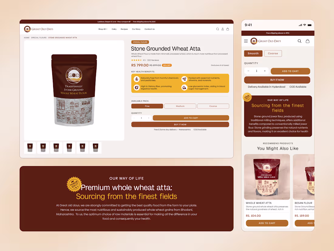
Tap here to explore more → https://dribbble.com/shots/27090549-Great-Old-Days-Ecommerce-Product-Page-Experience
2
148
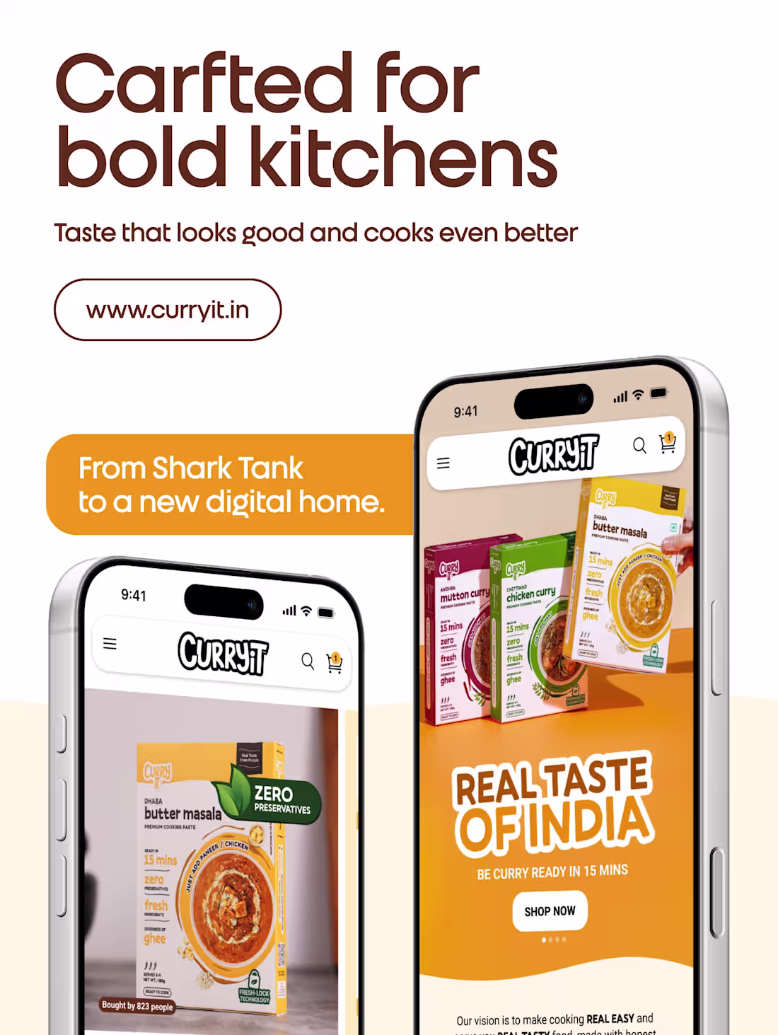
From Shark Tank spotlight to seamless UX.
CurryIt website - now live 🚀
Go and check the website here 👉 https://www.curryit.in/
2
164
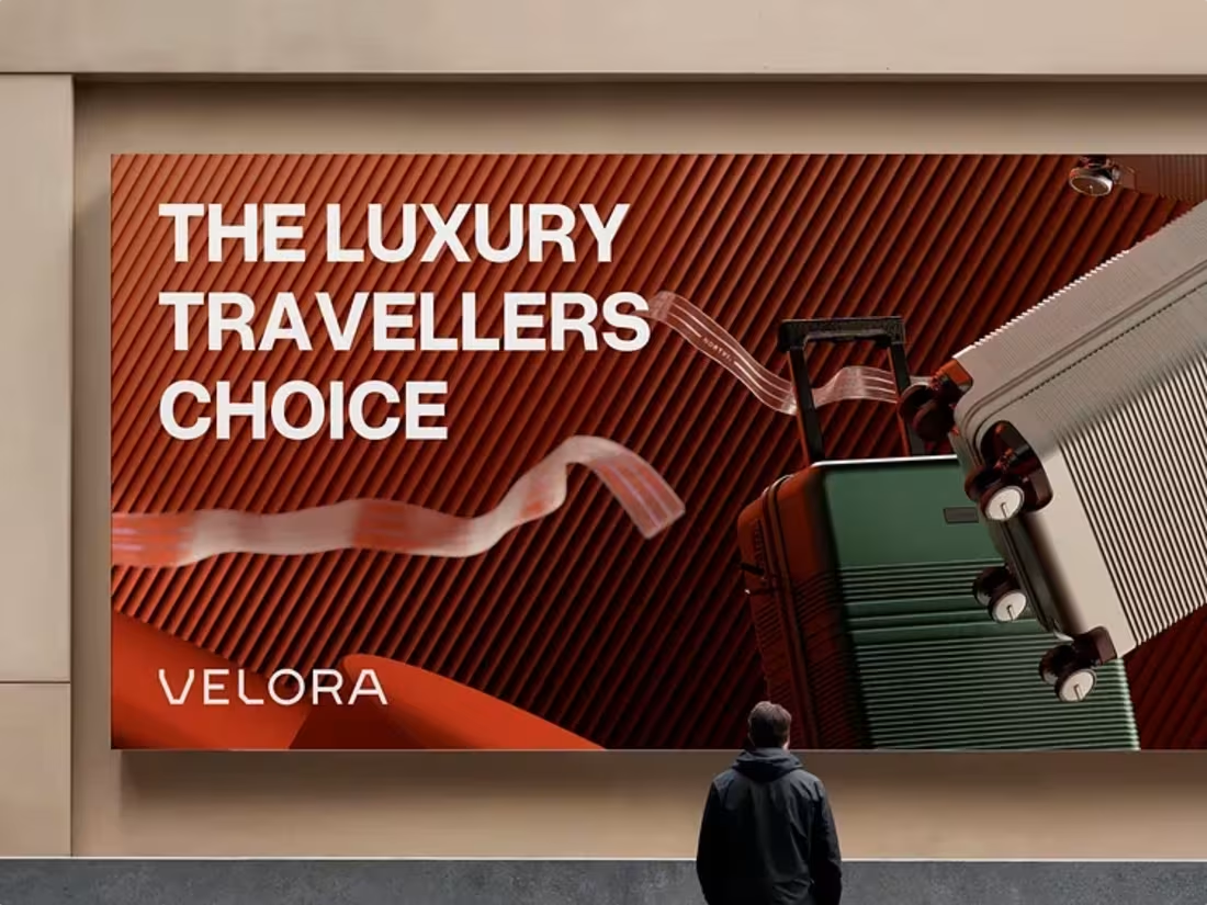
If there’s one thing a luggage brand must carry well, it’s identity.
We designed the logo and visual identity for Velora, a premium travel gear brand built for modern explorers. The goal was to create a mark that feels durable, sophisticated, and forward-moving without relying on obvious travel clichés.
🛠️ What We Crafted:
Logo Design: A bold, minimalist mark adaptable across app icons, web, and product embossing.
Brand System: Signature chain motif symbolizing strength and connectivity.
Visual Identity: A refined color palette balancing adventure with elegance.
2
170
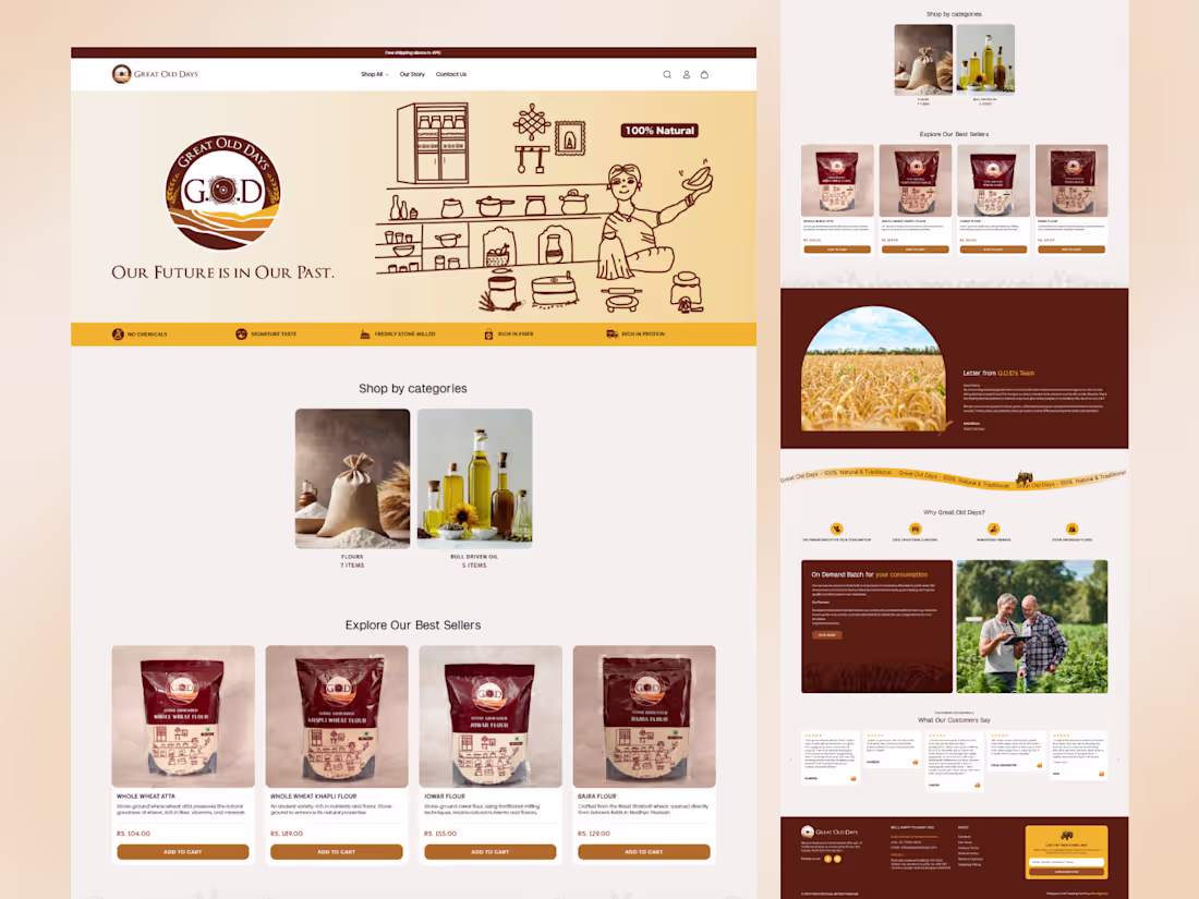
Great Old Days ecommerce website designed to blend tradition with modern usability.
Clean layouts, warm visuals, and a seamless shopping flow create a simple and trustworthy digital experience.
Tap here to explore more → https://dribbble.com/shots/27086254-Great-Old-Days-Desktop-UI
2
181
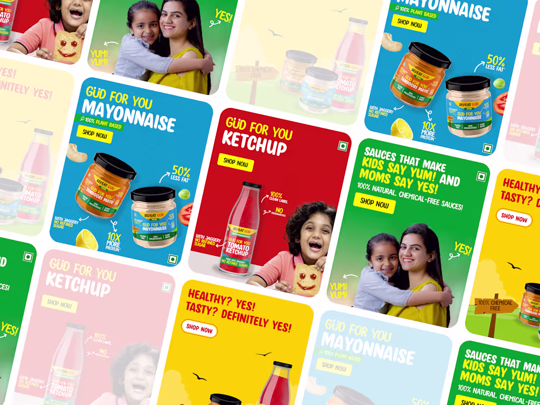
Bright visuals. Clear claims. Scroll-stopping banners.
Thoughts?
2
175
More than packaging.
A visual ecosystem. 👇
Thoughts?
2
185
Uppercase (https://uppercase.co.in/) project highlights 👇
1
239
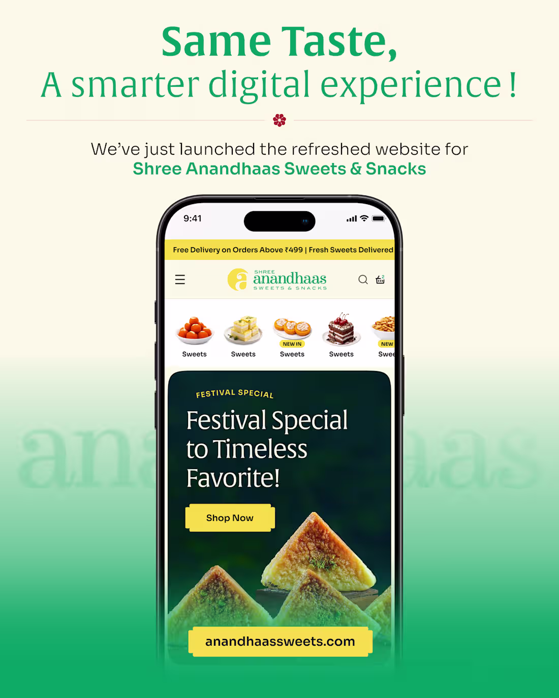
From sweets to seamless UX.
Anandhaas Sweets website - now live 🚀
2
2
269
Pitch deck crafted for clarity, confidence, and conversion.
Explore more: https://dribbble.com/shots/27029630-Oval-Pitch-Deck-Design
1
233
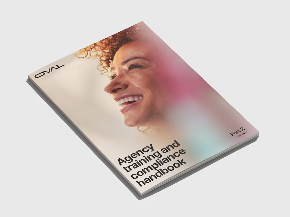
A handbook that makes healthcare training feel effortless.
View more inside: https://dribbble.com/shots/27018635-Oval-Handbook
1
241
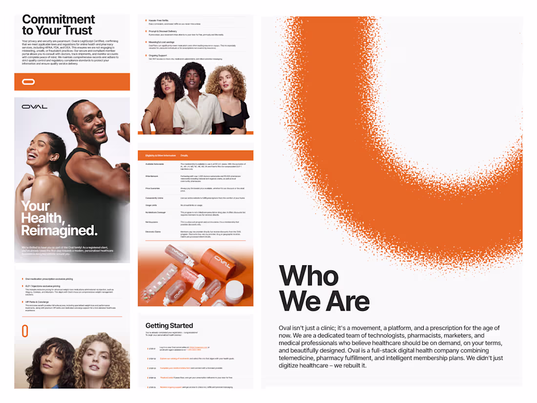
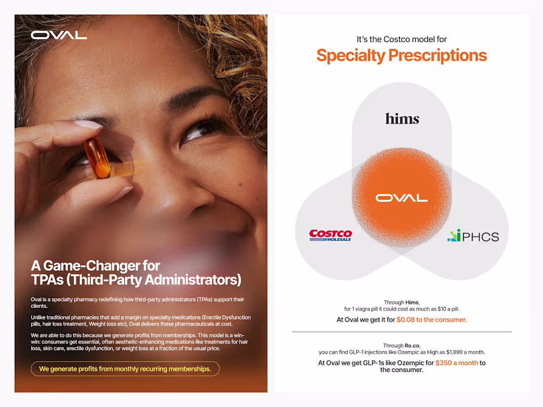
Modern healthcare, made human. A clean, bold brochure design for Oval built for clarity, trust, and impact.
Explore more: https://dribbble.com/shots/27016121-Oval-Brochure-Design
2
223
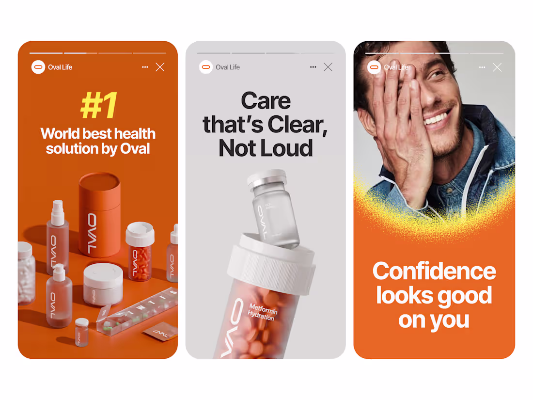
Social media creatives for Oval, combining lifestyle imagery with refined 3D product design.
Want it even shorter or more bold?
2
223
Minimal 3D motion design for Oval—clear, modern, and clinically confident.
Eplore more: https://dribbble.com/shots/26991256-Oval-3D-Packaging-Product-Design-System
2
222
Where clinical precision meets motion.
3D product & packaging for Oval.
view more inside: https://dribbble.com/shots/26991256-Oval-3D-Packaging-Product-Design-System
2
219
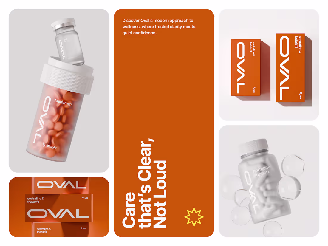
This is the 3D product system we crafted for Oval, designed to feel clear, modern, and easy to trust. The shot showcases three core medicine products.
Explore more: https://dribbble.com/shots/26991256-Oval-3D-Packaging-Product-Design-System
2
206
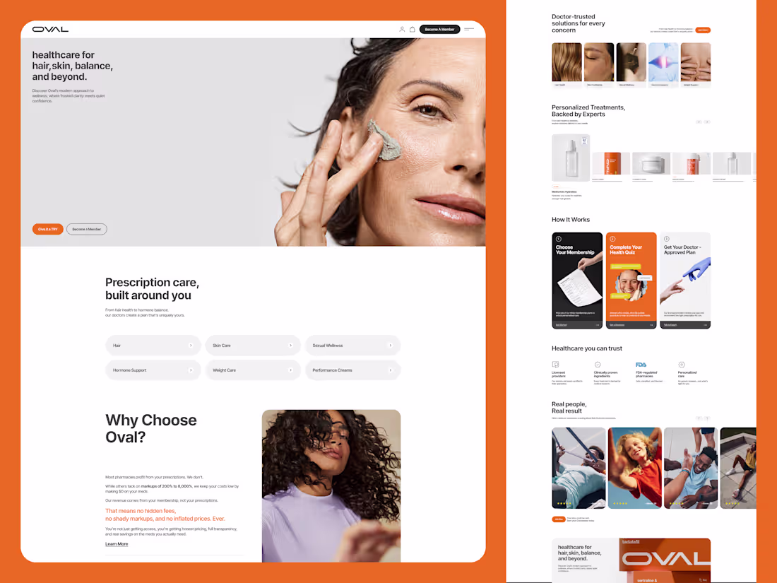
Oval’s healthcare website designed for clarity, trust, and everyday usability.
Clean layouts, calm visuals, and a thoughtful flow come together to create a clear, science-led digital experience.
Tap here to explore more → https://dribbble.com/shots/26989487-Oval-Healthcare-Website-Design
3
5
246
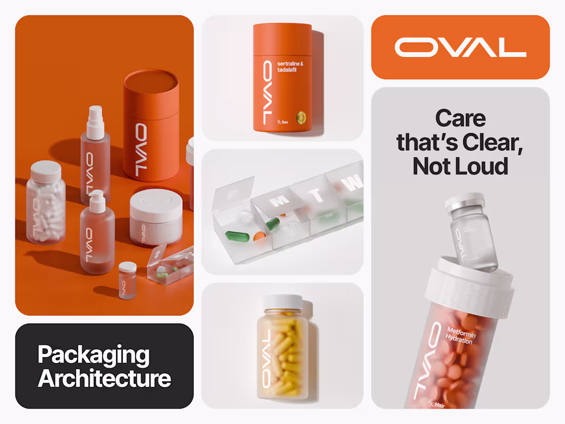
Oval’s 3D product and packaging system crafted for clarity, consistency, and clinical confidence.
Tap here to explore more → https://dribbble.com/shots/26974412-Oval-3D-Product-Packaging-System
1
190
Design that feels as premium as the product.
see more : https://dribbble.com/shots/26648734-Krit-Jewelry-Website-Concept
2
216
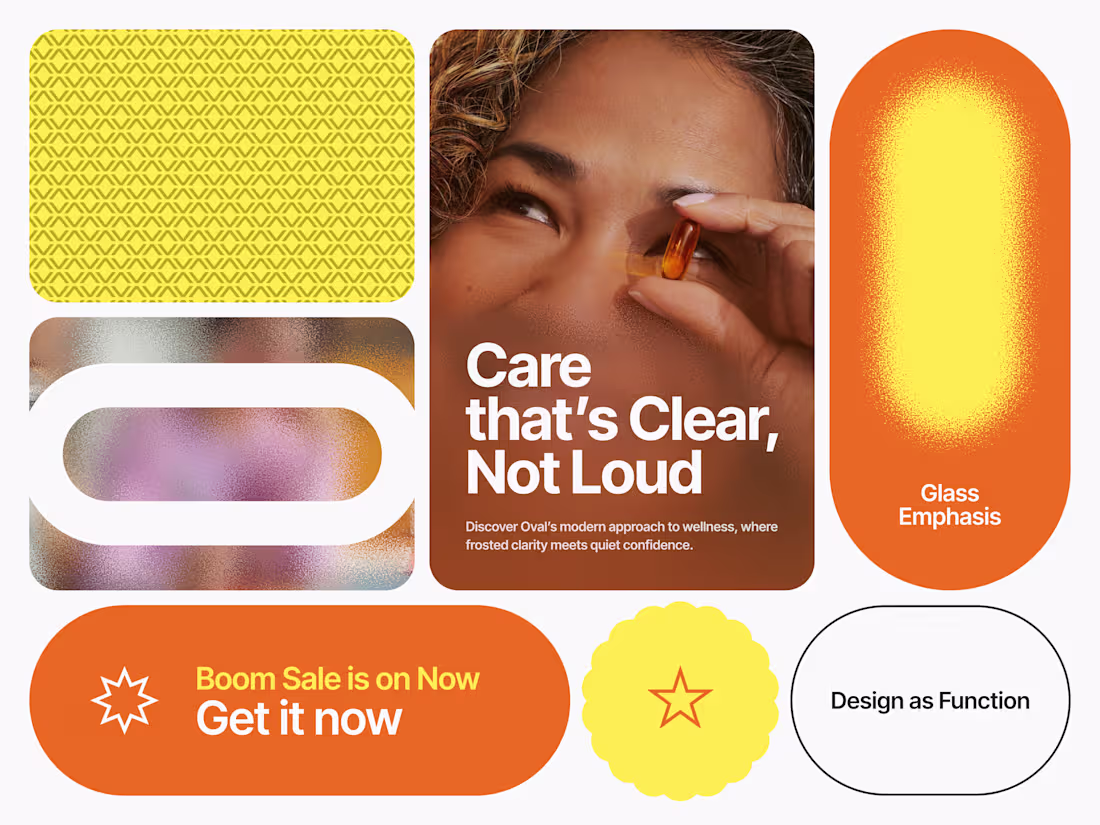
Oval’s color, pattern, and icon system designed for clarity and functional elegance.
Tap here to explore more → https://dribbble.com/shots/26969093-Oval-Color-Pattern-and-Icon-Design
2
205
Where simplicity meets clinical confidence.
OVAL - A modern symbol of healthcare innovation.
explore mere : https://dribbble.com/shots/26964351-OVAL-Personal-Care-Brand-Identity-and-Logo-Design
1
227
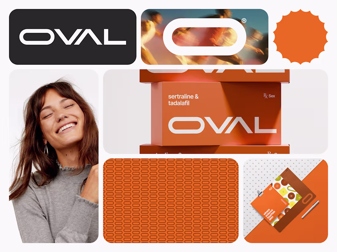
A complete healthcare identity crafted for precision, trust, and everyday usability.
Tap here (https://dribbble.com/shots/26964351-OVAL-Personal-Care-Brand-Identity-and-Logo-Design) to explore more...
2
3
259
TokyoFix gets a new visual foundation.
Strong type, a memorable panda mascot, and a brand system designed to last.
3
214
A tactile 3D exploration of a skin barrier cream.
Focused on material, light, and visual depth.
3
221
Where packaging meets motion and light.
Light, ice, and motion transform a simple can into a bold visual story of freshness and energy.
How does this look? 👀
2
183
A tiny experiment in beauty and balance.
1
210
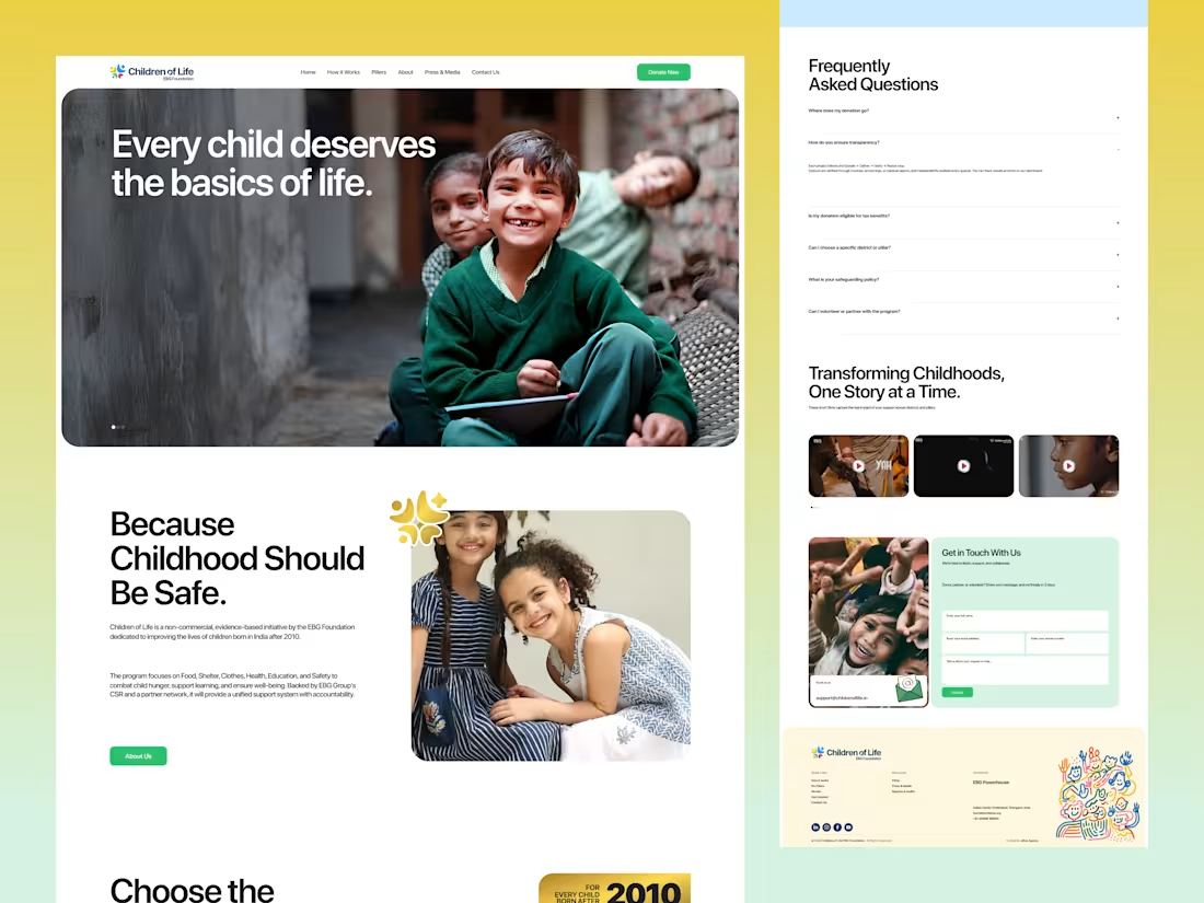
This started with a simple question we couldn’t ignore how could a child-welfare website feel more human and less institutional?
We approached this as an exploration, focusing on warmth, clarity, and flow rather than rigid sections. The goal was to design an experience that feels calm, trustworthy, and driven by care.
Would genuinely love to hear thoughts or feedback from other designers.
2
204
3D product animation exploring glass, gloss, and gradients of light.
Bold accents highlight the form and materiality.
Share your thoughts!
~ must checkout here (https://packagingoftheworld.com/2026/01/molecule53-skincare-3d-product-visualization-series.html)
2
3
270
How does the 3D motion feel?
Pick your mood. 👇
1
218
New drop! Slimease app icon & logo
clean, modern, wellness-focused.
🔗 Check it out here
(https://dribbble.com/shots/26909654-Slimease-Nutraceuticals-Wellness-Brand-Logo-Design)🛒 Available for sale - full rights + source files.
Reach out if interested.
1
241
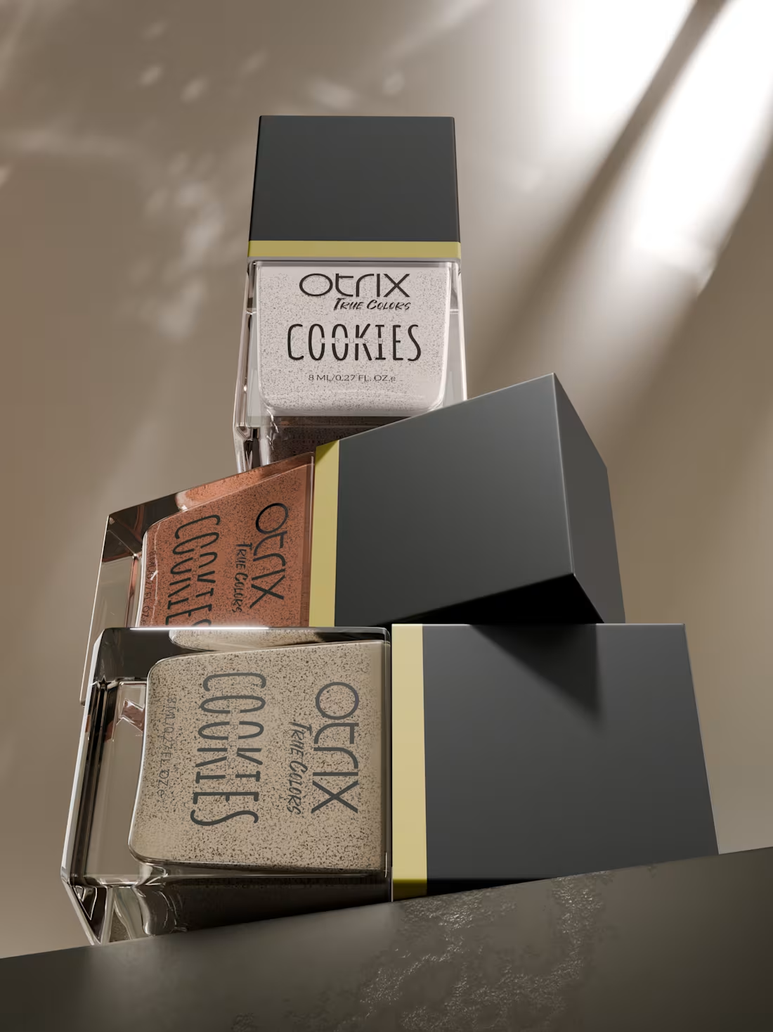
3D product modeling and render for Otrix nail paint collection. 💅✨
2
3
256
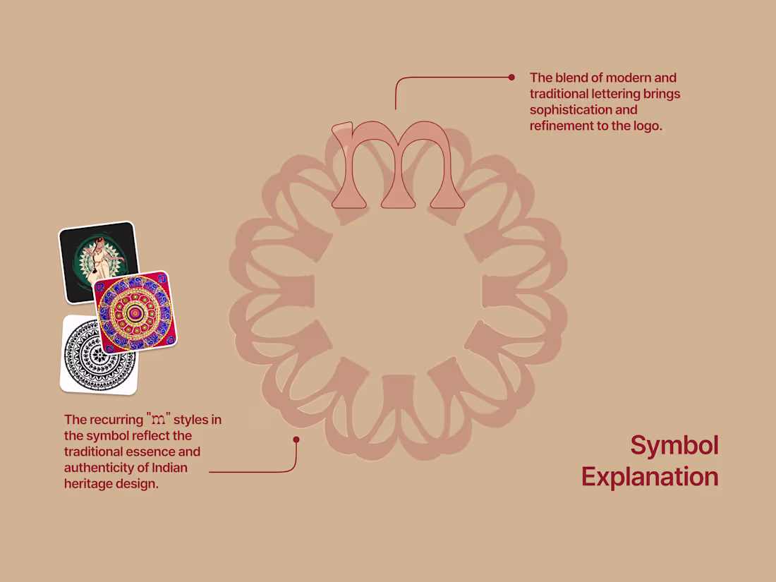
Handcrafted logo for Marandaa, inspired by Indian heritage.✨
View more Here (https://dribbble.com/shots/26936041-Marandaa-Brand-Identity-Design)...
3
253
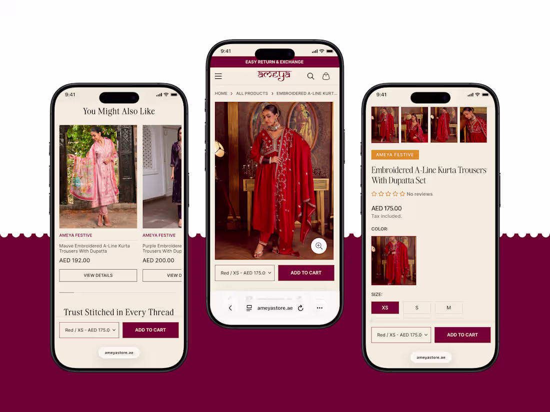
Ameya responsive web design one brand, all devices, same premium feel. ✨
👉 Open to feedback and new projects.
2
217
MTR Prakruti - Mobile Product Page UI
👉 See more inside (https://dribbble.com/shots/26924560-MTR-Prakruti-Mobile-UI-Design)
2
1
209

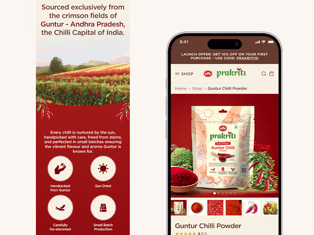
Spice it up 🌶️
Desktop Website UI — MTR Prakruti
A warm, earthy interface crafted to connect people with pure, single-origin Indian spices.
🌾 Storytelling layout with farmer-focused origin
🥘 Product-first sections for quick discovery
🎨 Nature-inspired visuals and organic illustrations
🛒 Clean, intuitive ecommerce flow
Go ahead, add some spice ✨
1
189
Smoother than the drink itself: 3D + motion magic for POUR'D. ✨
Love it, hate it, tweak it? Tell me in the comments 👇
3
214
Packaging, in motion. ✨
How does it feel?
4
5
278
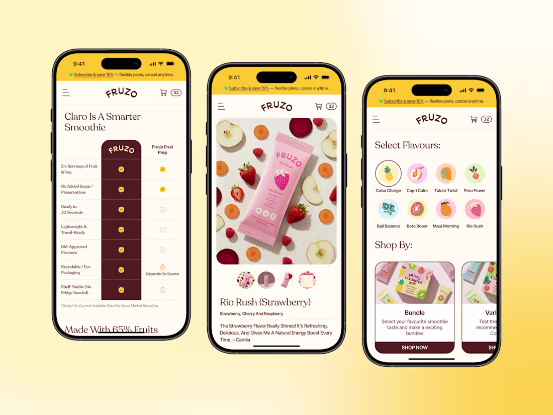
Fruzo – Healthy Smoothie App UI 🍓
Hello, Everyone 👋
We designed and developed Fruzo’s mobile app experience with custom flavor selection, allowing users to choose multiple products of the same flavor, avoid unwanted ones, and personalize their box easily.
We also designed a flexible subscription flow to make healthy choices effortless.
Would love your feedback 🙌
Contact & Collaboration
Email: hi@abox.agency
(mailto:hi@abox.agency)Available on Dribbble, Behance & Linkedin
2
273
Too Yumm is a conceptual website redesign focused on creating a bold, energetic, and snackable digital experience for a modern snack brand.
This project explores how a snack brand’s website can feel as fun and effortless as the product itself using vibrant colors, modular sections, and product-first layouts to improve browsing and discovery.
Created as part of the #YouWareChallenge to build, refine, and ship a real-world digital product concept.
5
12
850
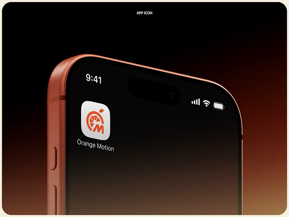
Thrilled to share our latest work: the app icon and logo design for Orange Motions.
The focus was on creating a bold, modern icon that represents motion, reliability, and speed, while staying instantly recognizable at small sizes across mobile devices.
Check it out (https://dribbble.com/shots/26876863-Orange-Motions-Logo-Design)
2
3
296
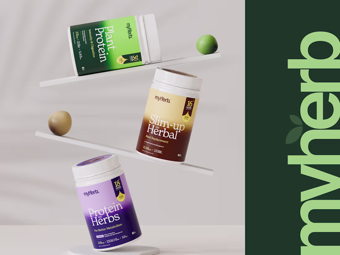
Redesign of MyHerb’s nutrition range, focusing on clarity, balance, and modern wellness aesthetics.
4
5
293
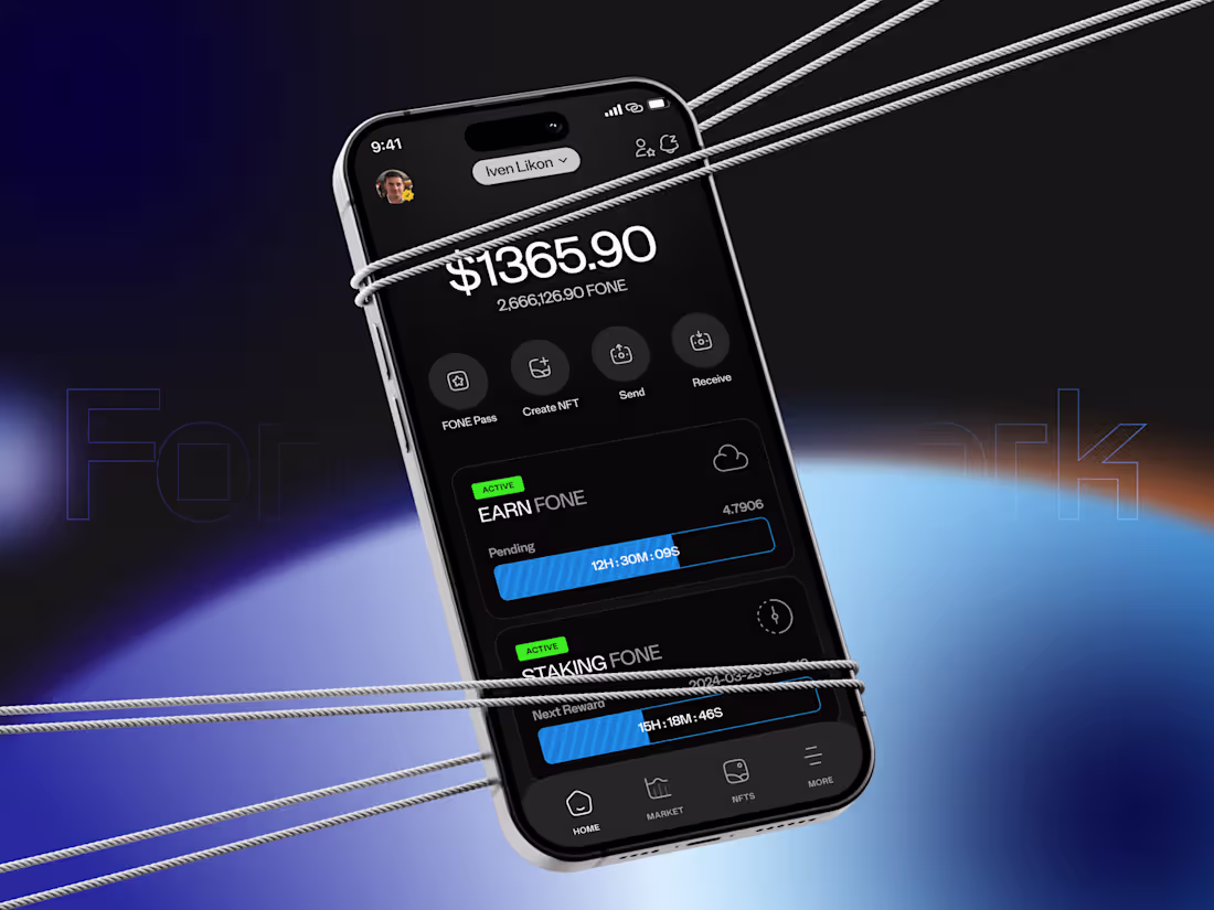
FONE, in motion.
Designed to move with the future of Web3.
2
249
Rate this mockup
1
235
Showcasing the refreshed MyHerb identity across packaging and product visuals. A modern, fresh direction designed to bring more clarity, color, and consistency to the brand.
How does the new look feel to you?
1
281
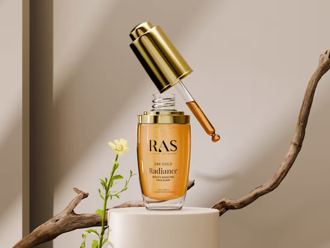
RAS Luxury Skincare’s hero serum reimagined through high-end 3D artistry.
SERVICES
• Art Direction
• 3D Modeling
• Product Rendering
• Lighting & Shading
• Post-Processing
THE OUTCOME
A visually rich 3D series showcasing the serum’s luxurious texture and premium detailing capturing the essence of a modern, indulgent skincare brand.
2
316
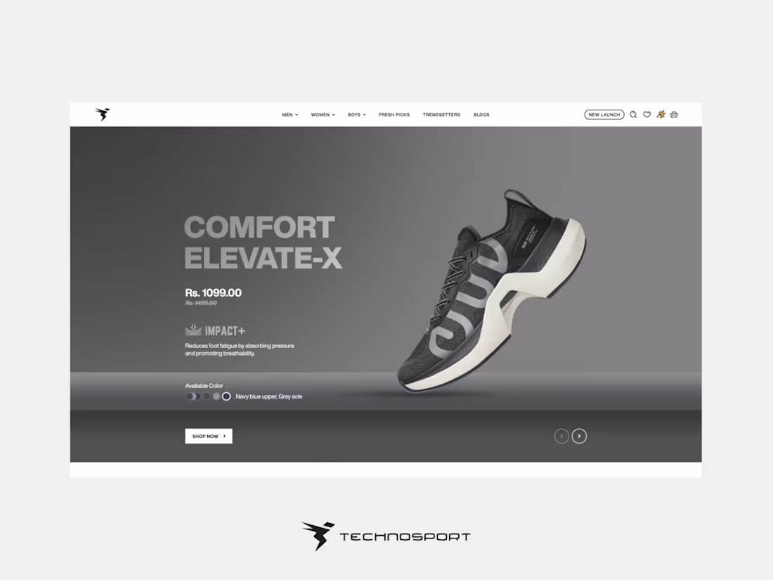
Technosport’s latest drop deserves a standout product page so we designed one.
How does it look?
2
7
377
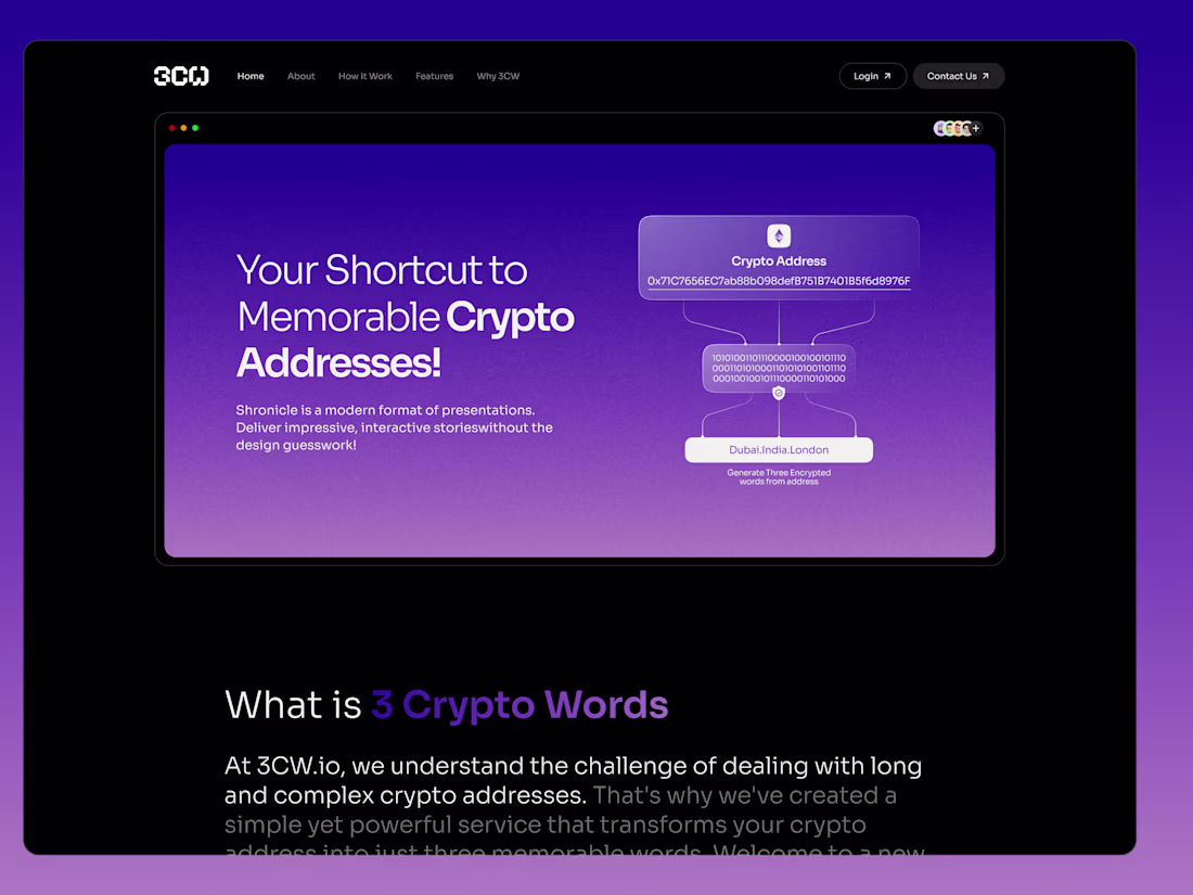
Designing 3CW || A Simpler Way to Share Crypto
1
4
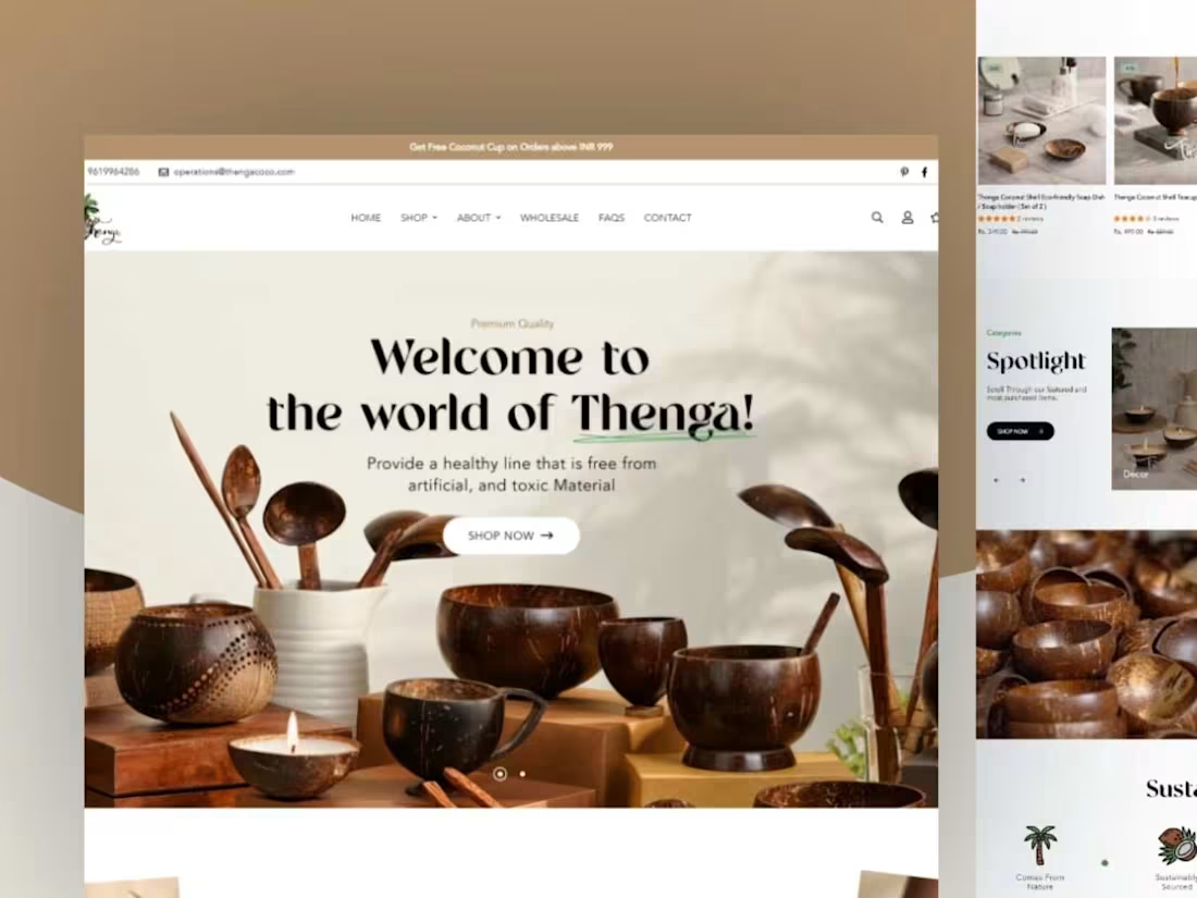
Thenga Coco
Eco-Friendly Treasures - Shopify
1
2
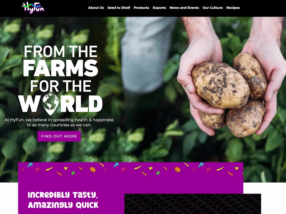
HyFun Foods
Veg. Frozen Treat -Wordpress
1
10
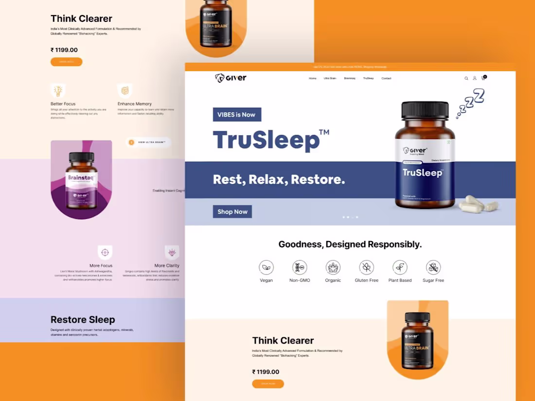
Giver Nutrition
Nourishing Minds - Shopify
0
4
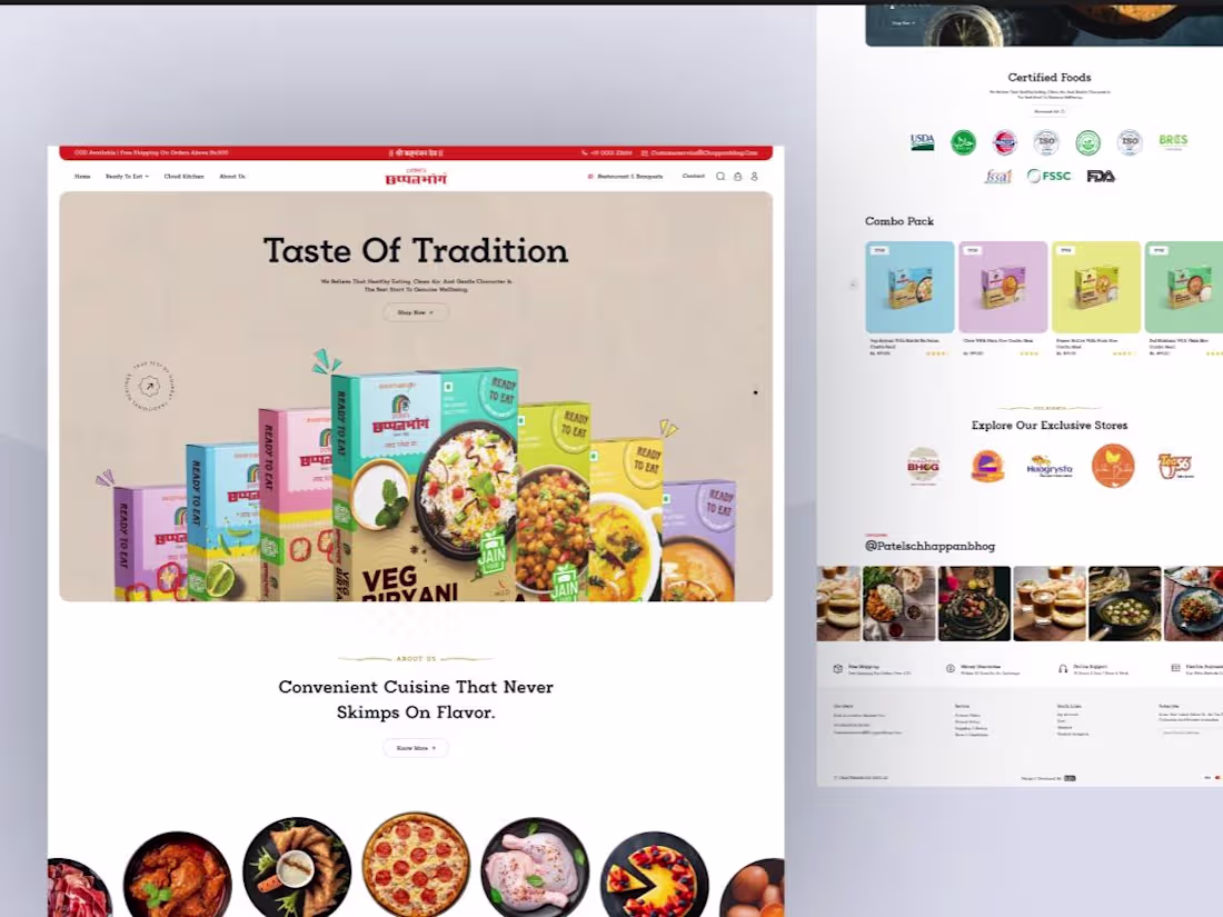
Patel's Chhappanbhog - Shopify Store
1
3
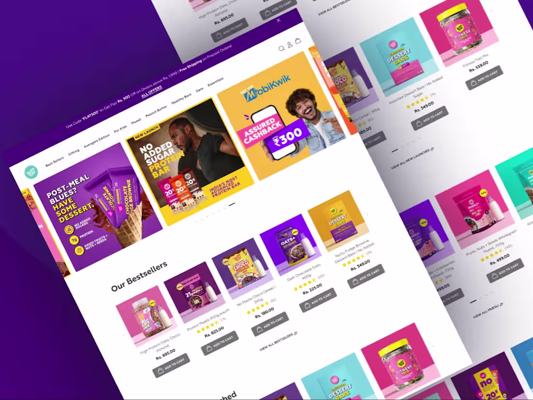
Yogabar
The Perfect Blend of Nutrition and Delight - Shopify
0
4
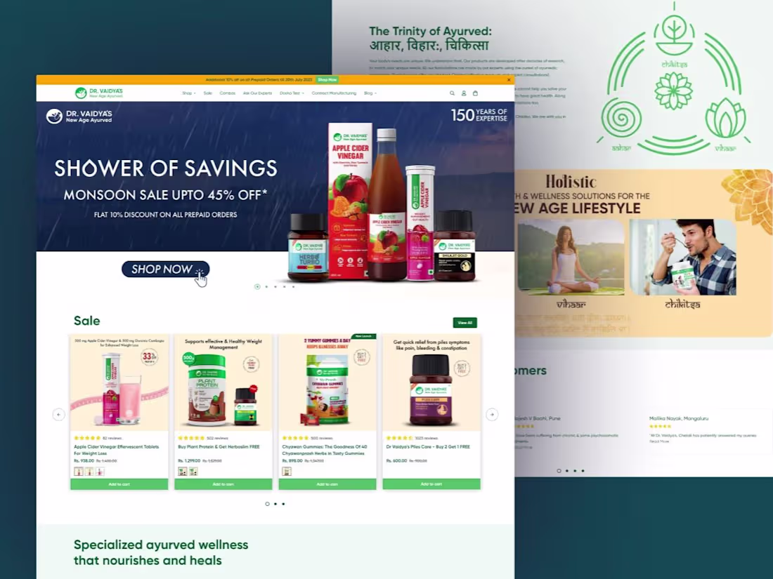
Dr. Vaidya
Nurturing Wellness - Shopify Plus
0
4
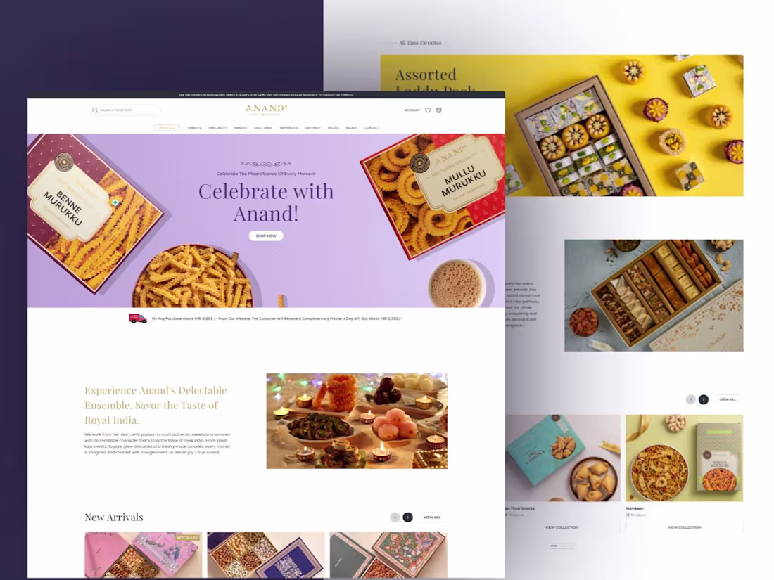
Anand Sweets
Elevating Online Delights to New Heights
0
3
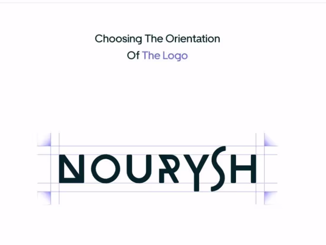
Nourysh
Strategy for Wellness. Stand Out on Shelves.
0
5
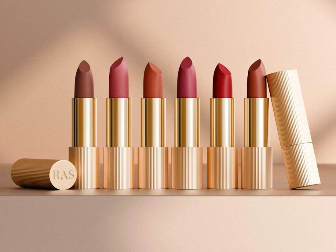
Ras Lipstick - 3D Design
1
3
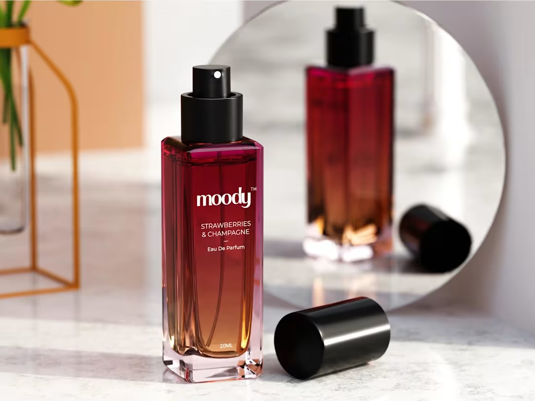
Moody
3D Renders Elevate
Skincare Appeal
0
8
RAS Luxury - Elevated in 3D
1
4