
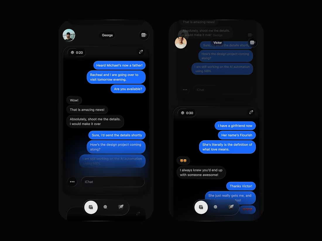
What if we could choose our chat layouts?
I would personally pick “Scroll”.
I designed this putting accessibility and speed to use.
Did you know that in a conventional layout, it takes about 4 taps to move from one chat to another sending a text?
These steps are in order of:
1. Tap on the chat/person you want to reply
2. Tap on the message bar/frame to prompt keyboard
3. swipe left to go to chat list or use the back button.
4. repeat step 1.
What if this can be reduced to 2/3 taps to get a message sent? Scroll Layout seems like a very useful way to go about this.
Allowing you have a preview of chats and makes getting messages across easier, by swiping vertically across the screen to move from one chat to another, and allowing you text messages directly when a chat frame comes on.
0
56
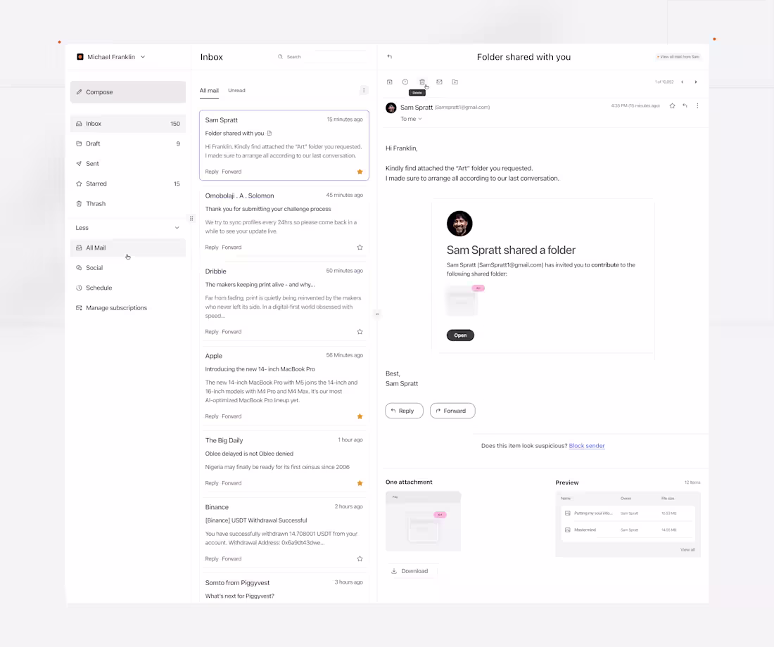
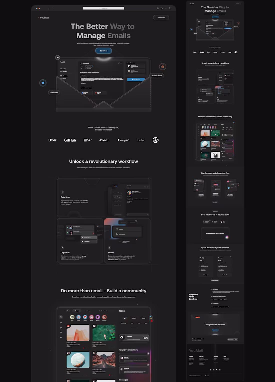
How to design an AI Email Web Application Dashboard.
1/2
- When I set out to design this concept, few things came to mind. Questions like, (1) how much organization can mailing web applications be? (2) In terms of users accessibility, how can tiny details enhance users retention and save time, even if it's for a couple of seconds.
So I designed a dashboard that I think has a good use case for this.
- A visually appealing dashboard with a clear hierarchy in functionalities.
- A preview section for files to be unveiled, giving users some sort of information. about the file they just received. In this case, indicating the file type and the size.
2
2
89
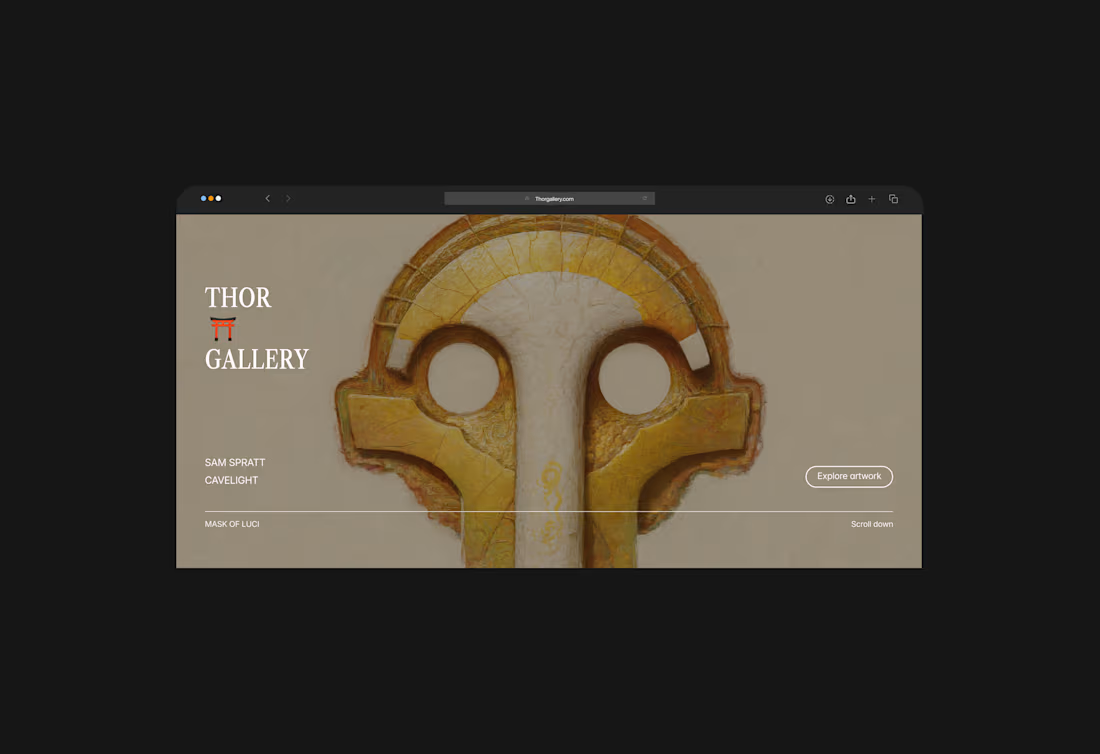
Thor Gallery Landing Page
1
6
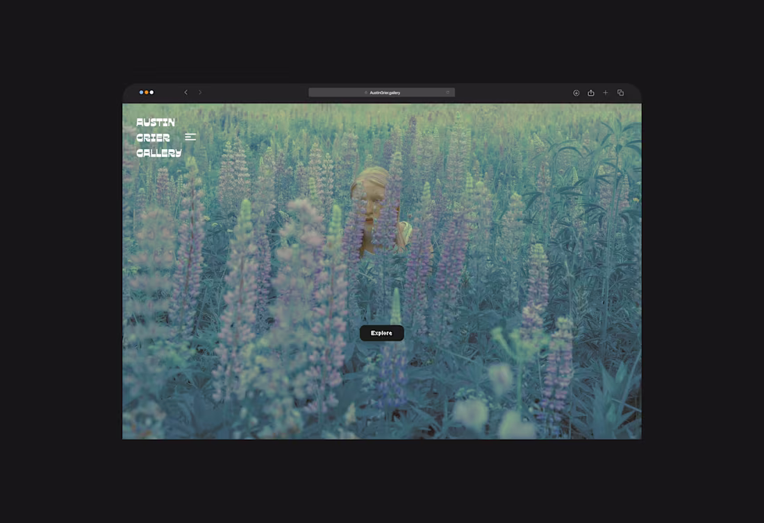
Austin Grier Gallery Digital Art Website
1
3
'YouMail'
1
4