
Abisola Shofoluwe
Product Designer| UI/UX Designer| Design Engineer
New to Contra
Abisola is building their profile!
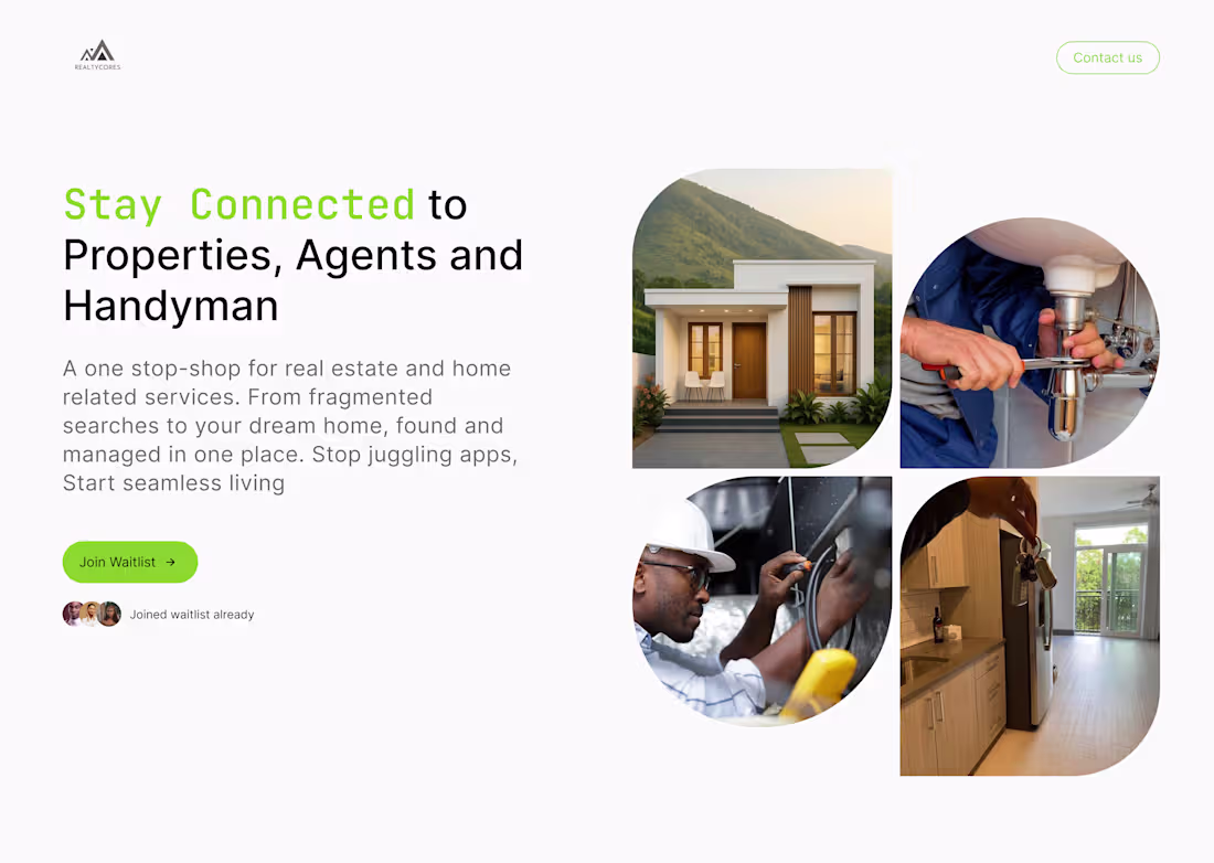
RealtyCore - Real Estate & Home Services Web App
UI Design · Web Design
RealtyCore is a pre-launch real estate platform designed to be a one-stop shop for everything home finding properties to rent or buy, connecting with verified agents, and booking trusted handyman services, all in one place.
The landing page was designed to do two things: communicate the value clearly and convert visitors to the waitlist.
The visual language is clean and grounded: fresh greens, off-white backgrounds, and rounded UI elements that feel approachable and modern without being flashy.
The result is a launch page that builds anticipation, earns trust, and turns curious visitors into waitlist signups before a single line of code is shipped.
0
3
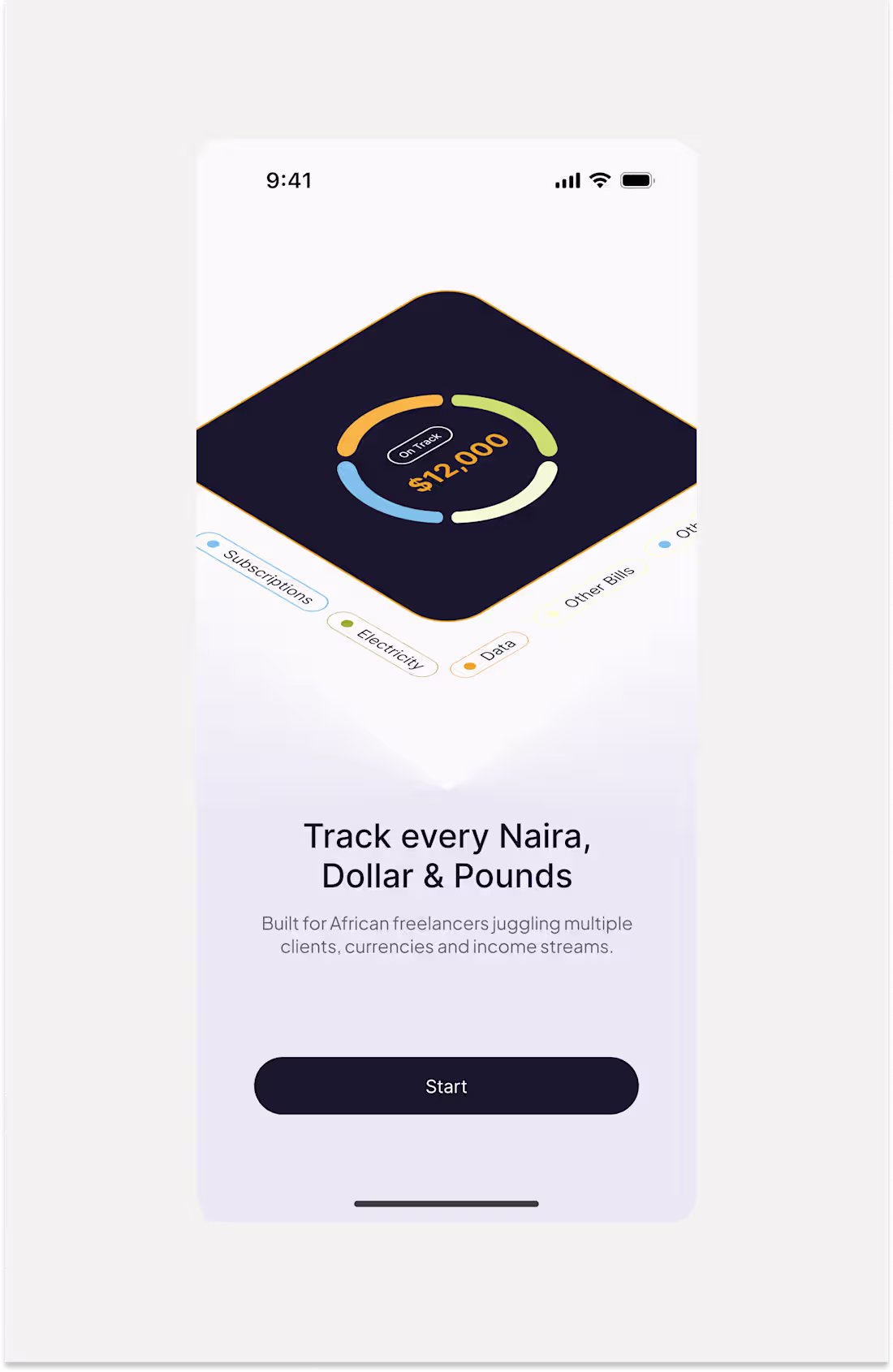
KashFlow - Freelancer Finance App
UI Design · Onboarding Design
KashFlow is a finance tracking app built specifically for African freelancers managing multiple clients, currencies, and income streams.
The design challenge was clear: how do you onboard a user into a complex financial tool without overwhelming them before they even get started?
The answer was a four-screen onboarding flow that sells the value of the app one idea at a time. Each screen dedicated to a single, relatable pain point every African freelancer knows intimately.
The visual language is warm but serious soft lavender backgrounds, bold dark type, gold and amber illustration tones that feel premium without being cold. Each screen uses a consistent layout so users build familiarity as they swipe through.
The result is an onboarding flow that doesn’t just explain features, it makes the user feel seen before they even sign up.
0
20
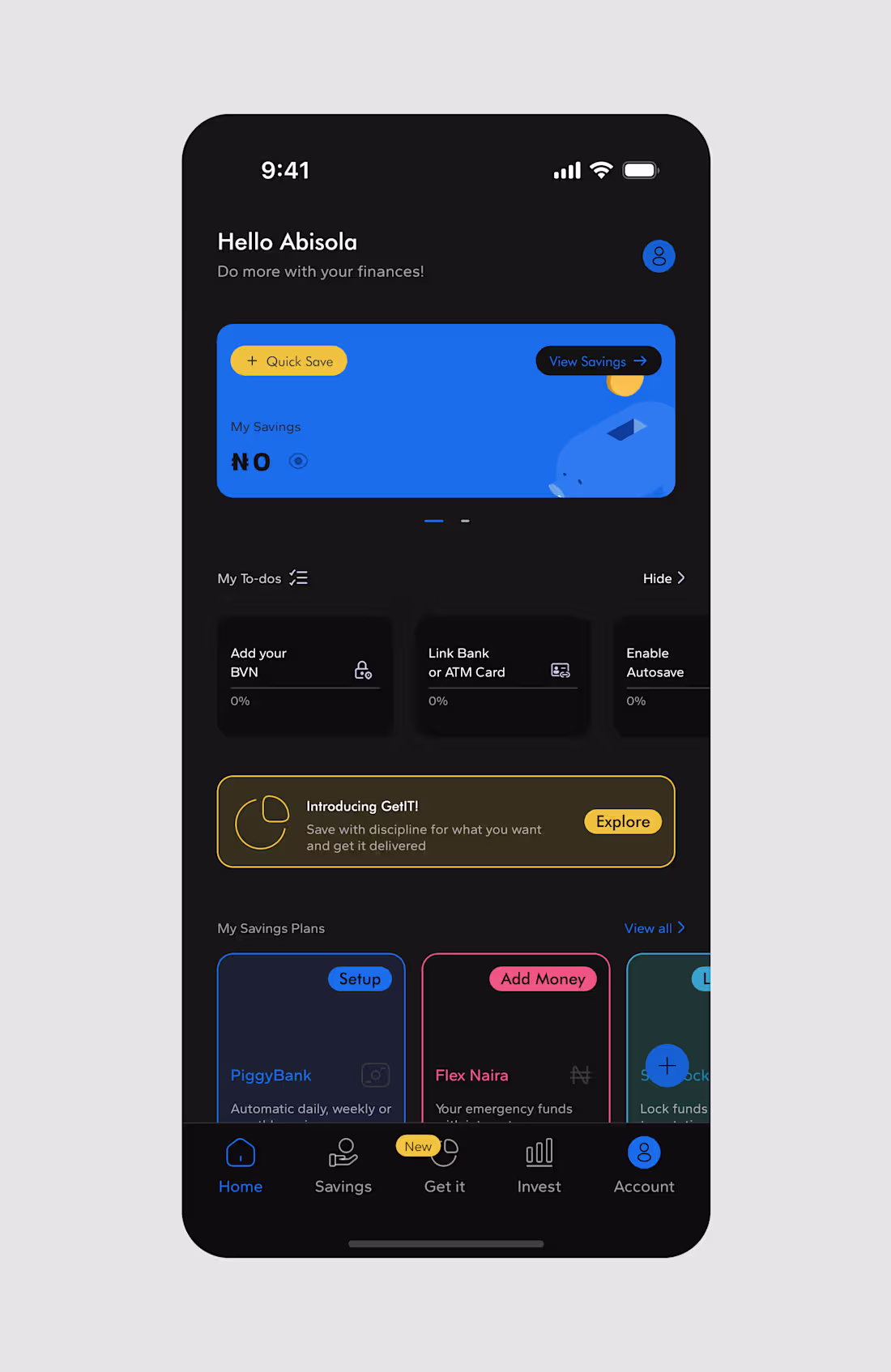
PiggyVest - Homepage Redesign
UI Design · Product Redesign
A conceptual redesign of PiggyVest’s home screen, one of Nigeria’s most used savings and investment platforms. The focus was on improving visual hierarchy, personalising the dashboard experience, and introducing a dark mode variant without losing the familiarity users already have with the product.
PiggyVest’s original home screen works, but it can feel cluttered for new users who haven’t set up their account yet. This redesign brings structure to that early experience surfacing the savings balance prominently, guiding users through onboarding tasks (BVN, bank linking, Autosave) in a clear to-do format, and introducing new features like GetIT with contextual, non-intrusive banners.
Key design decisions:
Personalised greeting (“Hello Abisola”) sets a warm, human tone from the first screen making the app feel like a financial companion, not just a tool.
Savings card hero uses PiggyVest’s signature blue boldly, keeping the balance front and centre with quick actions (Quick Save, View Savings) always accessible.
To-do progress cards break down account setup into bite-sized steps, reducing the overwhelm new users often feel with finance apps.
Dark mode was designed with the same intentionality as the light version deep blacks, preserved color accents, and no loss of readability showing that the design system scales.
The result is a dashboard that feels more personal, more guided, and more premium while staying true to what PiggyVest users already trust.
0
15
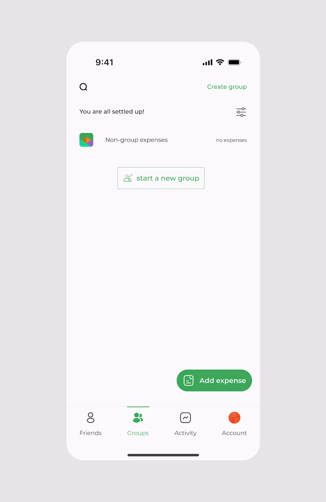
Splitwise Redesign - Expense Splitting App
UI Design · Product Redesign
A conceptual redesign of Splitwise, reimagining how groups of people create, manage, and settle shared expenses with a sharper focus on clarity, visual delight, and reducing cognitive load.
The original Splitwise gets the job done, but the experience can feel dense. This redesign strips it back to what matters: getting into your group fast, logging an expense quickly, and knowing exactly where you stand financially without having to think too hard.
Key design decisions across the three screens:
Groups home screen keeps the state simple and actionable. An empty state doesn’t feel like a dead end “You are all settled up!” is reassuring, and “Start a new group” is the only next step a user needs.
Create a group flow introduces category-based group types (Trip, Home, Couple, Others) with icon selectors, making setup feel intuitive and personal. The “Add trip dates” toggle with contextual helper text reduces confusion for first-time users.
Group detail screen uses a bold orange hero header to give each trip its own identity making the app feel alive, not just functional. Quick access tabs (Settle up, Charts, Balances) keep key actions one tap away.
The colour system deep green for actions, warm orange for context, clean white for content creates a visual language that feels trustworthy and modern.
The result is a redesign that respects what Splitwise users already know, while making every interaction feel faster and more considered.
0
11
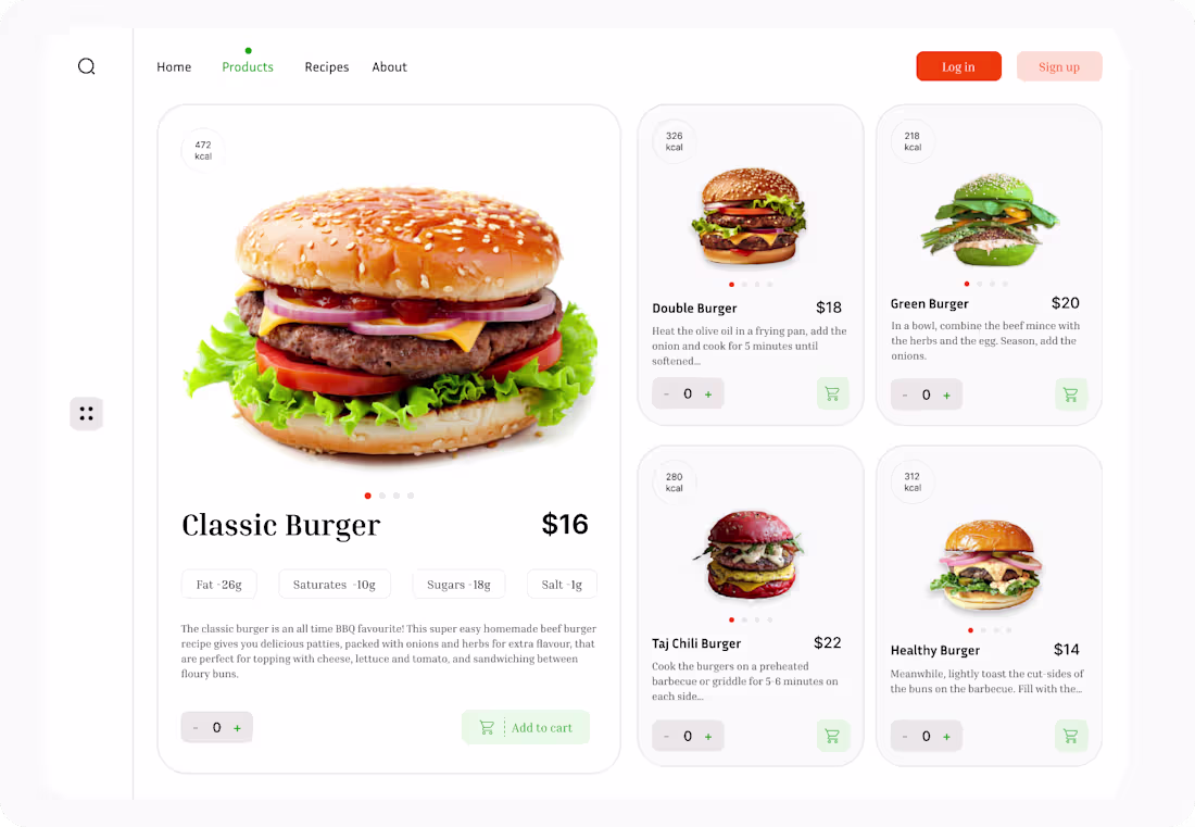
Burger Co. - Food Ordering Website
A clean, appetite-driven web experience designed to make browsing and ordering food feel effortless. The layout balances visual impact with usability a large hero product display on the left draws the eye immediately, while the grid of options on the right keeps the full menu accessible without scrolling fatigue.
Nutritional information (kcal) is surfaced upfront on every card, catering to health aware diners who want to make informed choices without digging through menus. The quantity selector and add to cart interaction are kept minimal and consistent, reducing friction at the most important moment decision to buy.
The colour system is intentional: warm reds to stimulate appetite, soft greens for freshness cues, and a clean white background that lets the food photography do the heavy lifting.
The result is a product page that feels premium, trustworthy, and easy to shop turning browsing into ordering in as few taps as possible.
0
12
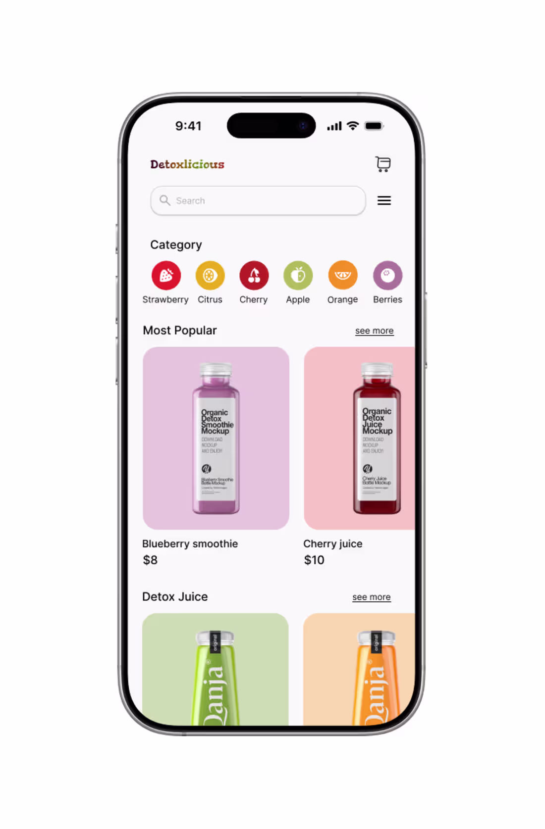
Detoxlicious is a wellness app designed to make detox drinking a simple, enjoyable, and consistent habit. The goal was to create an experience that feels as clean and refreshing as the product itself guiding users from discovery to daily routine without friction.
0
10