
Abeeha saeed
Excel Dashboard Developer & Data Analyst | Transforming Raw
New to Contra
Abeeha is building their profile!
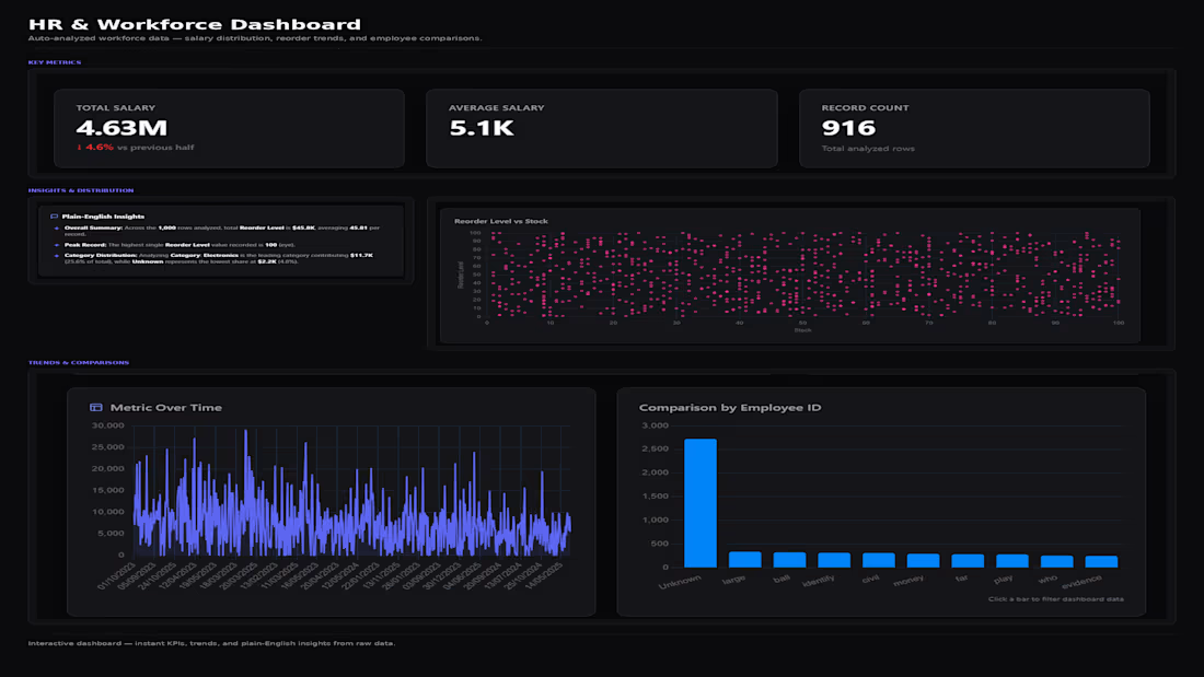
This dashboard takes raw workforce and inventory data and automatically surfaces the metrics that matter no manual pivot tables or chart configuration needed.
What it includes:
KPI summary cards (Total Salary, Average Salary, Record Count) with period-over-period change indicators
A plain-English insights panel that surfaces the standout patterns in the data peak values, leading categories, and distribution shifts instead of leaving the reader to interpret raw numbers
A Reorder Level vs. Stock scatter plot to visualize the relationship between two variables at a glance
Time-series and categorical comparison charts (metric trends over time, comparison by employee ID) that respond to clicks for on-the-fly filtering
2
81
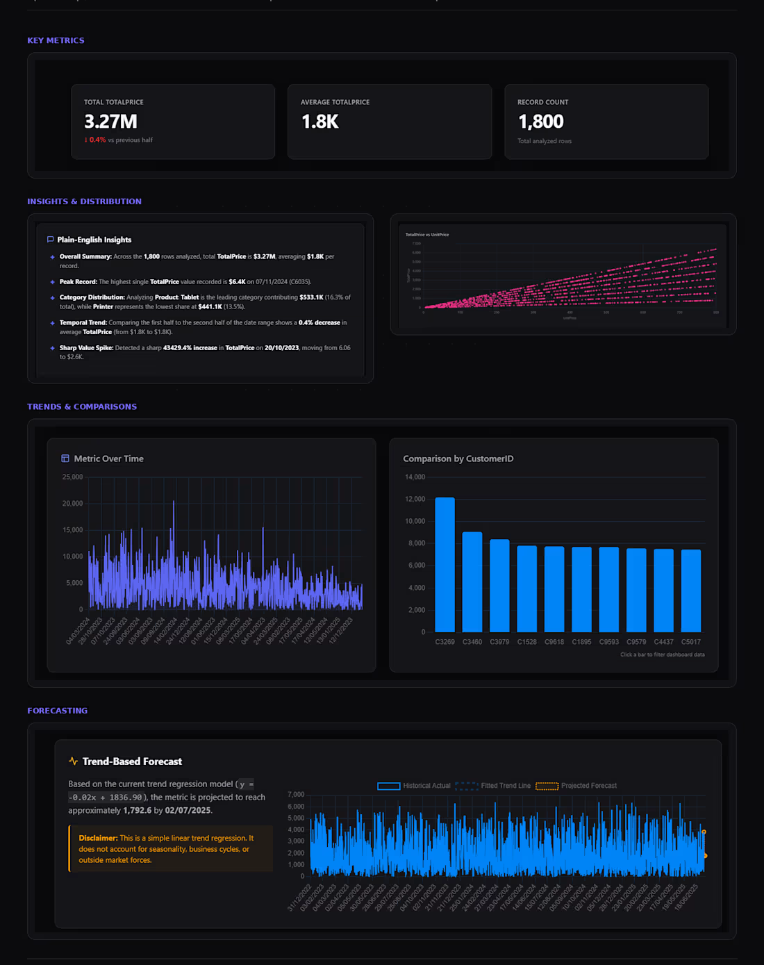
This is a budget tracking dashboard built entirely in Excel, designed to replace the typical cluttered "totals + pie charts" layout most budget templates default to.
Instead of static tables, the dashboard uses KPI cards (Total Planned, Total Actual, Variance, % of Budget Used) with sparkline trends, a Planned → Actual → Balance waterfall chart to show variance at a glance, and slicers that let the user filter by category or time period, with everything on the sheet updating live.
What it includes:
KPI summary cards with month-over-month sparklines
A waterfall-style variance chart replacing traditional bar/pie combinations
Category and period slicers connected to PivotTables for real interactivity, not just static charts
Conditional formatting on the variance table (over/under budget flagged automatically)
A plain-English insights panel summarizing what the numbers mean
A simple linear forecast projecting year-end spend based on current burn rate
Design approach: clean, minimal styling inspired by modern product dashboards (Linear, Notion) muted color palette, no gridlines, consistent typography built to look like a tool someone would actually want to open, not a default Excel export.
1
1
40