
Abdul Basith Mohamed Aslam
Turning complex ideas into clear visual communication
New to Contra
Abdul Basith is ready for their next project!

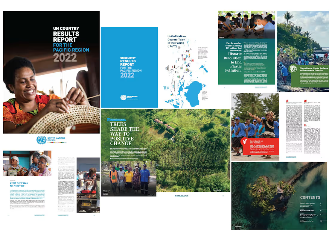
This project involved the editorial and data-visualisation design of the UN Pacific 2022 Annual Results Report, bringing together outputs from multiple UN agencies across the Pacific region.
I structured complex regional data into clear visual hierarchies, combining charts, maps, infographics, photography, and editorial layouts to ensure the report is easy to navigate and understand. The design balances data clarity with human stories, enabling stakeholders to quickly grasp impact, priorities, and regional outcomes while maintaining consistency with UN branding standards.
0
19
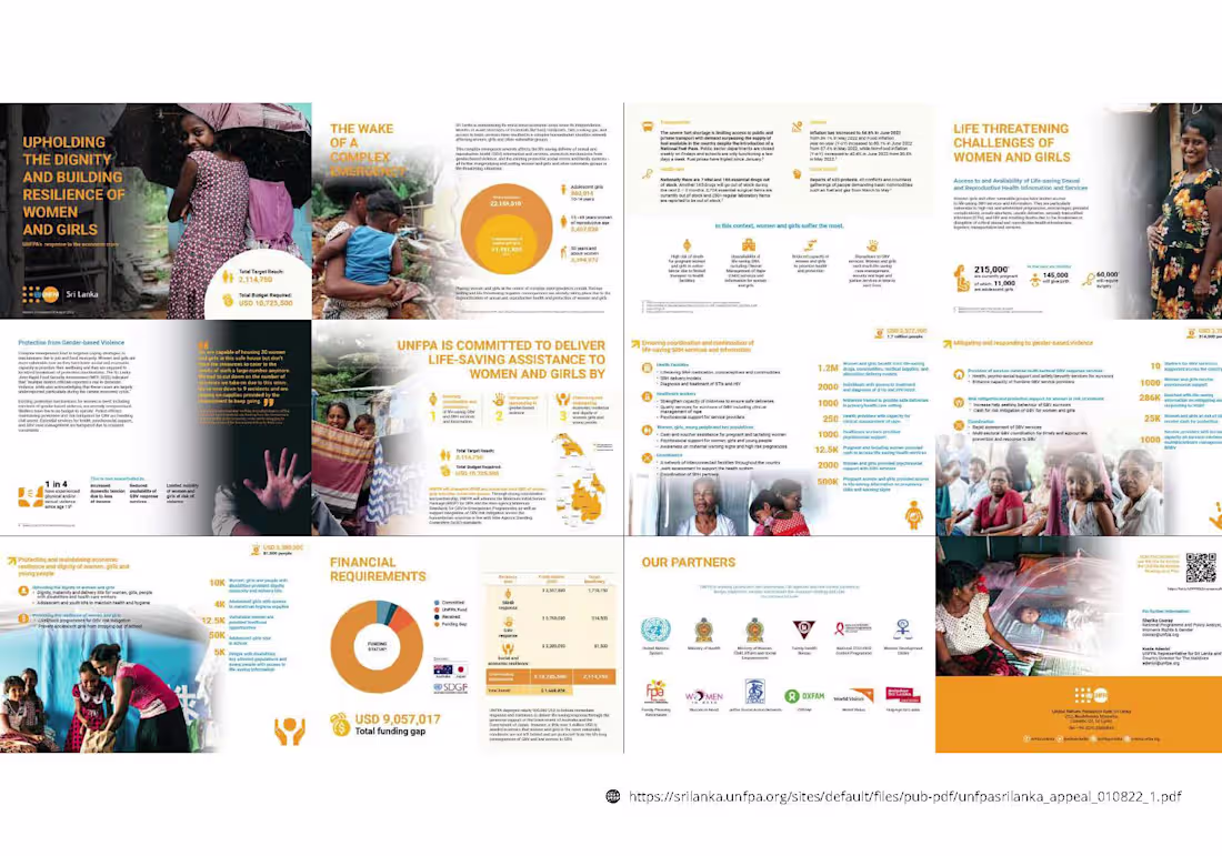
This project focused on translating complex humanitarian and economic data into clear, presentation-ready visual narratives for advocacy, donor briefings, and stakeholder engagement.
I designed data visualisations, charts, iconography, and modular layouts that allow key insights—impact figures, funding gaps, and response priorities—to be quickly understood in presentations and high-level briefings. The layouts were structured for clarity at a glance, enabling content to be reused across decks, reports, and briefing materials while maintaining visual consistency.
The outcome is a presentation-first visual system that supports evidence-based storytelling, making complex data accessible without oversimplifying sensitive issues.
2
38
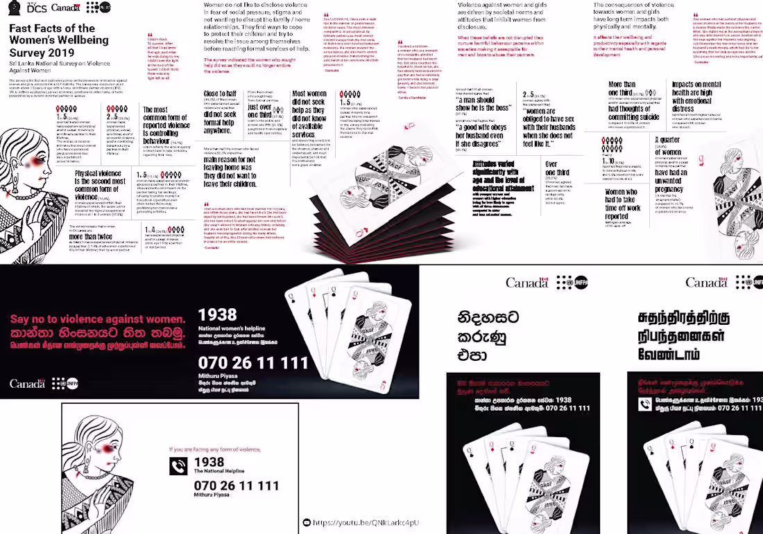
This project involved the concept, visual direction, and design of a public awareness campaign based on Sri Lanka’s Women’s Wellbeing Survey (WWS), addressing violence against women and girls.
The creative idea—“Don’t play the hand you’re dealt”—uses playing cards as a central metaphor to challenge social norms, silence, and victim-blaming. I translated complex research data into accessible, emotionally resonant visual communication, typography, and bold layouts to balance sensitivity with impact.
The work was executed across print and outreach materials, including posters, informational spreads, and campaign adaptations in multiple languages. Special care was taken to ensure cultural relevance and consistency across formats, while maintaining a strong, visual identity that supports advocacy and public engagement.
0
19
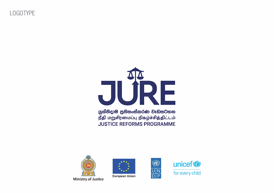
This work focused on the design of the JURE (Justice Reforms Programme) logotype. The goal was to create a clear, authoritative mark that reflects justice, balance, and institutional credibility within an international development context.
I designed the primary logotype along with approved colour, black, and white versions, ensuring clarity, scalability, and consistency across print and digital use. The final logotype was developed to work seamlessly alongside government and UN partner identities and across multilingual applications
0
26
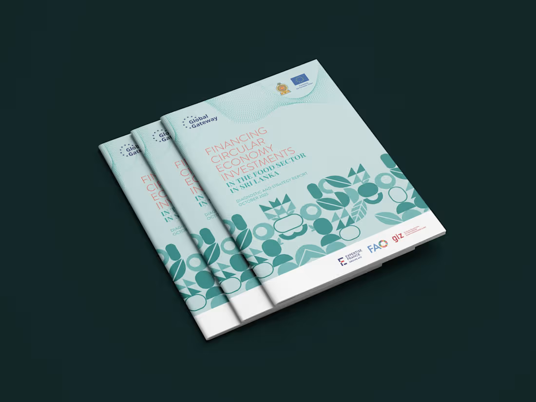
Designed the complete layout, visual identity, and publication for the diagnostic and strategy report.
The visual system draws inspiration from organic forms and circular motifs, reflecting regeneration, growth, and balance — core values of the circular economy. The design ensures clarity, accessibility, and aesthetic consistency across print and digital formats, aligned with the EU’s and partner agencies’ branding standards.
full report: https://lnkd.in/gXwShUBt
Client: Expertise France
0
35