pro
Biam Whye Low
Graphic Design • Branding • Packaging • Digital Design
New to Contra
Biam Whye is ready for their next project!

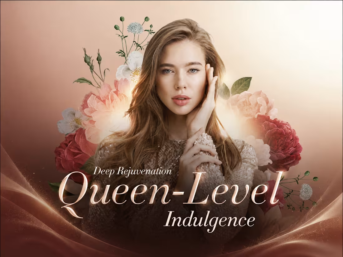
HerbalLine Women’s Day — Treatment Menu Design
Feminine & Luxurious Soft blush tones, floral elements, and elegant portrait photography create a sophisticated feminine aesthetic that complements the Women’s Day campaign.
Premium Visual Direction The combination of warm gradients, deep burgundy accents, and refined serif typography enhances the sense of indulgence and positions the treatment as a premium spa experience.
Strong Visual Hierarchy The campaign headline, treatment name, promotional price, and key benefits are clearly structured, allowing customers to quickly understand the offer and treatment highlights.
Floral Art Direction Layered botanical illustrations frame the model and create visual depth, reinforcing themes of beauty, rejuvenation, and self-care without overpowering the promotional message.
Clear Benefit Communication Key treatment benefits — Deep Hydration, Improved Elasticity, and Smoother Fine Lines — are presented in a concise and accessible format to support quick decision-making.
Overall Concept A promotional treatment menu that combines feminine elegance, premium beauty aesthetics, and clear commercial communication, designed to make the Women’s Day offer feel both exclusive and inviting.
Credit: HWG
1
8
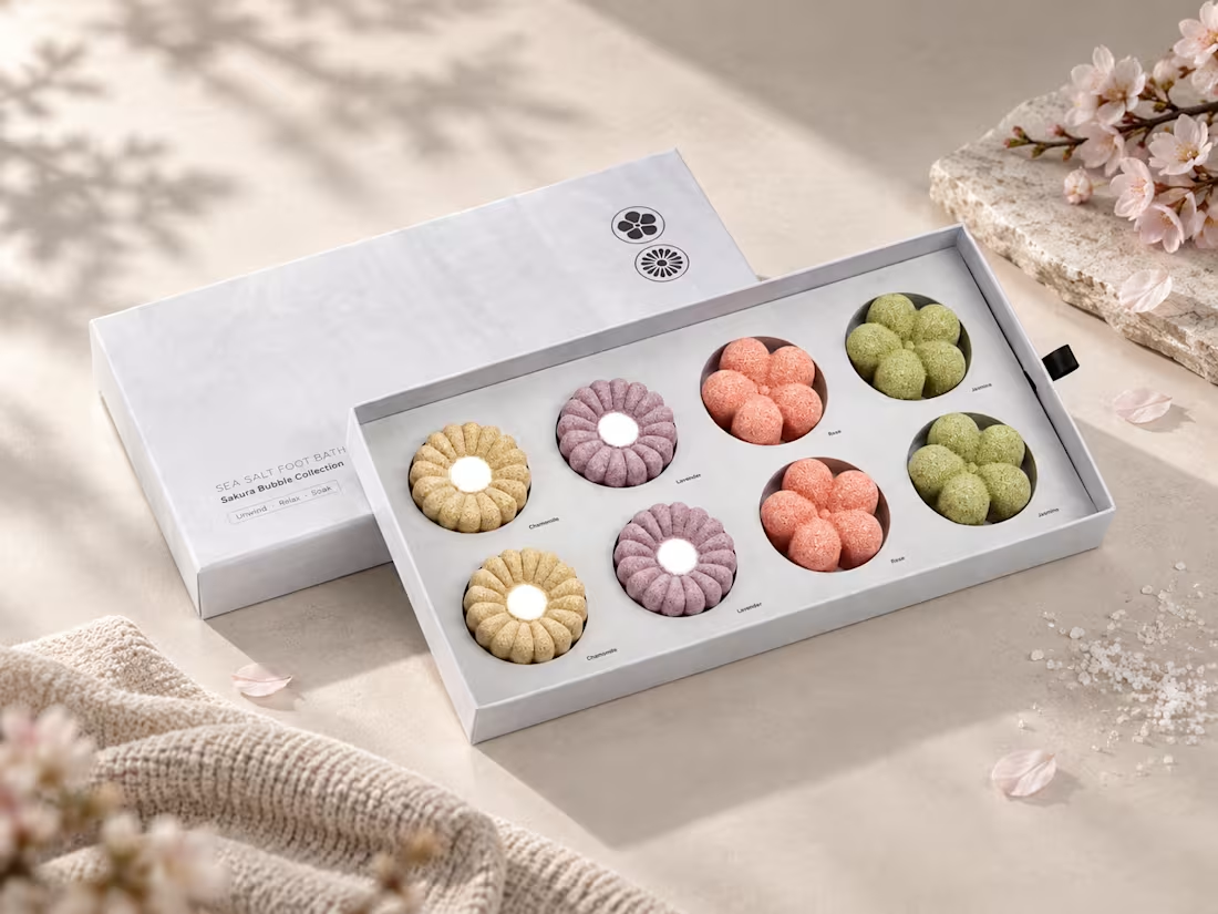
Sea Salt Foot Bath — Sakura Bubble Collection Packaging Design
Minimal & Refined
A clean white packaging system creates a modern, calming aesthetic that reflects the relaxing nature of a foot bath ritual.
Japanese-Inspired Aesthetic
The floral forms and Sakura-inspired concept introduce a subtle Japanese influence, giving the collection a delicate and sophisticated character.
Soft Colour Coding
Pastel tones differentiate each fragrance — Chamomile, Lavender, Rose, and Jasmine — while maintaining a cohesive visual identity across the collection.
Product Presentation
The structured gift-box layout presents each bath piece neatly and clearly, creating a premium unboxing experience while allowing the colours and sculptural floral shapes to become the main visual focus.
Clean Typography
Minimal typography and generous spacing reinforce the sense of simplicity, relaxation, and understated elegance.
Overall Concept
A packaging design that combines minimalism, soft botanical colours, and a spa-inspired aesthetic, transforming an everyday foot bath product into a refined self-care experience.
Credit: HWG
2
1
21
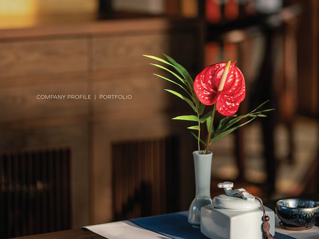
Dai Jin Dining — Company Profile & Portfolio Design
Oriental Elegance
Inspired by traditional Chinese aesthetics, the design combines classical cultural elements with a contemporary editorial approach to create an elegant and refined visual identity.
Rich & Sophisticated Palette
Deep burgundy, dark brown, and black tones establish a luxurious atmosphere, complemented by subtle gold and warm earthy accents.
Cultural Storytelling
Traditional Chinese calligraphy, paintings, architectural details, ceramics, and botanical elements are incorporated throughout the layout to communicate the brand’s cultural heritage and dining philosophy.
Editorial Photography
Atmospheric interior and culinary photography is given generous visual space, creating an immersive presentation that highlights both the dining environment and artistic food presentation.
Modern Meets Tradition
Clean typography, structured layouts, and generous negative space balance the richness of traditional Chinese visual elements, giving the portfolio a more contemporary and sophisticated character.
Overall Concept
A refined company portfolio that combines Chinese heritage, culinary artistry, and modern luxury, presenting Dai Jin Dining as an elegant and culturally distinctive dining experience.
Credit: HWG
1
35
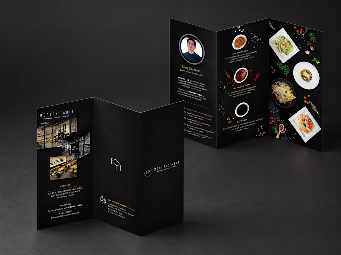
MODERN TABLE Korean Fusion Cuisine — Brochure Design
Modern & Sophisticated
A dark, minimalist visual direction reflects the restaurant’s contemporary Korean fusion concept, creating a refined and sophisticated brand image.
Food-Focused Visuals
Top-view food photography is integrated with key Korean ingredients — soybean paste, hot pepper paste, and soy sauce — to communicate the restaurant’s culinary concept visually.
Clear Content Hierarchy
Chef introduction, signature ingredients, restaurant information, and franchise details are carefully structured to keep the content informative while maintaining visual balance.
Black & Gold Palette
A predominantly black palette combined with warm gold accents creates a premium dining atmosphere while allowing the food photography to stand out.
Zig-Zag Fold Layout
The fold structure creates a continuous visual journey across each panel, allowing different sections of information to flow naturally as the brochure is unfolded.
Overall Concept
A contemporary restaurant brochure that combines Korean culinary culture, modern aesthetics, and editorial-style composition to present the brand in a distinctive and premium way.
1
41