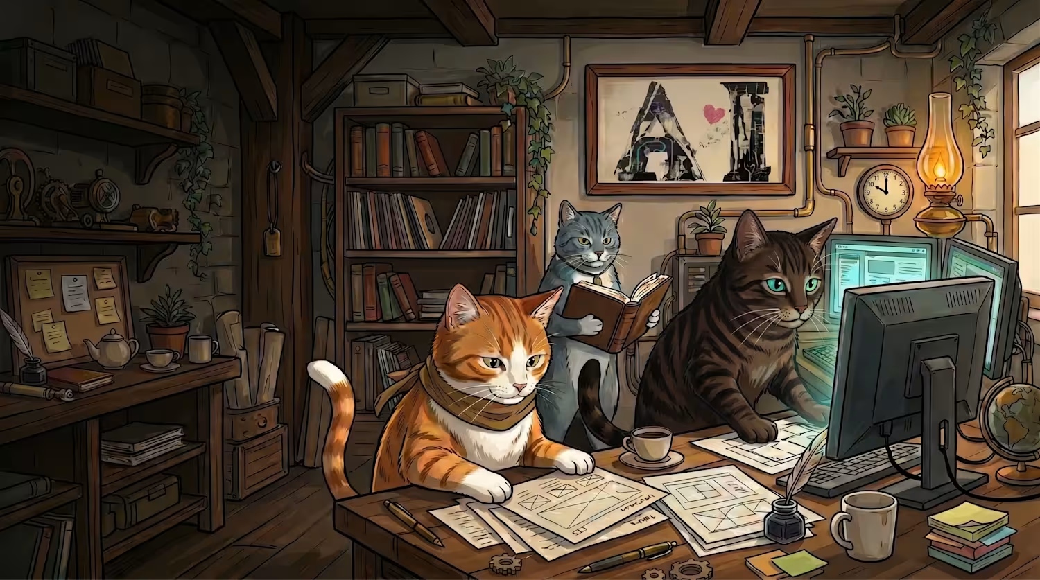
スタジオ猫の手
猫の手、貸します。 Need a hand? Borrow a paw from an AI web studio.
New to Contra
スタジオ猫の手 is building their profile!
PROJECT TITLE
Neko Samurai: Toto's Slop Inspection Room
PROTOTYPE LINK
https://spontaneous-biscotti-c7d4e5.netlify.app/
SHORT DESCRIPTION
Neko Samurai: Toto's Slop Inspection Room is a warm, JRPG-inspired web prototype about content fatigue in the age of AI.
Rather than building a harsh AI slop detector, I wanted to reframe AI-era content fatigue as something playful. The user submits a URL, and Toto, a friendly cat samurai, turns the inspection into a warm little ritual with humor, motion, and theatrical drama.
The experience has four main states: URL input, inspection, Neko Matagi, and Neko ni Koban.
Neko Matagi is used as the “slop” verdict: if a page feels too generic or too dependent on AI, Toto cuts it with a vermilion ink slash, paper-splitting motion, and drifting confetti. Neko ni Koban is remixed into the positive verdict: if a page feels crafted with human care, the prototype celebrates it with falling koban coins and a warm badge of approval.
The result is not a real AI classifier. It is a playful, motion-rich interface that asks a more human question: does this page feel like someone put their heart into it?
The prototype also includes an EN/JP language toggle and short phrase notes so a global audience can understand the Japanese idioms behind the experience.
HOW I USED GOOGLE STITCH
I used Google Stitch as the core interface design workspace for turning a story-driven concept into a structured, responsive prototype.
I began with a clear creative direction: a warm Japanese JRPG atelier, a gentle cat samurai, paper textures, lantern light, and a small ritual around judging AI-era content. Stitch helped turn that mood into an actual multi-screen interface instead of leaving it as a loose idea.
Stitch generated the core four-screen flow: Input, Inspecting, Neko Matagi, and Neko ni Koban. Seeing those states together made it much easier to judge the rhythm of the product, refine the visual language, and keep the experience consistent from screen to screen.
I also used Stitch to explore visual variations before choosing the final direction. That exploration was important because the project needed to feel playful and handmade, not like a generic AI dashboard.
The in-place editing workflow was especially useful. I could refine copy, layout, tone, and interface details directly from the generated screens while keeping the overall UI intact. I adjusted elements such as the title area, progress feedback, inspection checklist, and small JRPG-style labels without rebuilding the whole interface from scratch.
After refining the screens in Stitch, I exported the structure and extended it into a working prototype. I added the URL-to-verdict flow, timed inspection states, the Neko Matagi slash sequence, paper confetti, the Neko ni Koban celebration, hover states, responsive tuning, and the EN/JP phrase notes.
Stitch provided the core screen flow, interface architecture, and visual direction. The final motion and interaction polish were built on top of that Stitch-generated foundation.
FEEDBACK ON USING STITCH
Stitch was most valuable as a bridge between imagination and implementation. I knew the world, character, and emotional tone I wanted, but I did not yet know how that should become a screen structure. Once Stitch rendered the first multi-screen layout, the concept became something I could judge, refine, and build on.
The name Stitch felt very accurate in practice. The tool connected two states that are usually difficult to bridge: a story and mood in my head on one side, and a concrete interface that could be exported and developed on the other. It really felt like Stitch was stitching together imagination and implementation.
The in-place editing workflow was one of the strongest parts of the experience. Ideas often appeared only after I saw the generated screens. Being able to refine the parts that needed attention while keeping the interface intact helped me stay in the creative flow.
I also appreciated how quickly Stitch made it possible to compare different visual directions. Seeing several versions helped me choose a warmer, more character-driven interface instead of a colder AI-tool style.
For future improvements, I would love stronger support for organizing and comparing generated variations. A lightweight way to pin favorite versions, compare them side by side, and leave quick notes would make the exploration stage even stronger.
For final polish, I would also love more direct manipulation on the canvas. Small layout changes such as moving a badge, resizing a panel, adjusting spacing, or dragging an element slightly away from a character often still feel like they need prompt-based edits.
A hybrid workflow where AI generates the interface, the creator can directly drag and drop or fine-tune elements on the canvas, and the result still exports cleanly would make Stitch even more powerful for professional UI prototyping.
2
0
87