
Francis Odili
I design simple, user-focused digital products. UI/UX
Profile in progress
Francis is building their profile!

A travel discovery card designed and animated in Framer
0
19
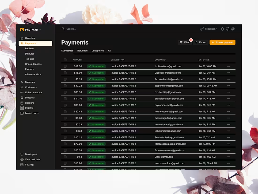
PayTrack Payments Dashboard, comprehensive view of the core transaction engine, showcasing a streamlined list of successful payments and seamlessly integrated financial management tools.
In financial software, clarity is non-negotiable.
1
30
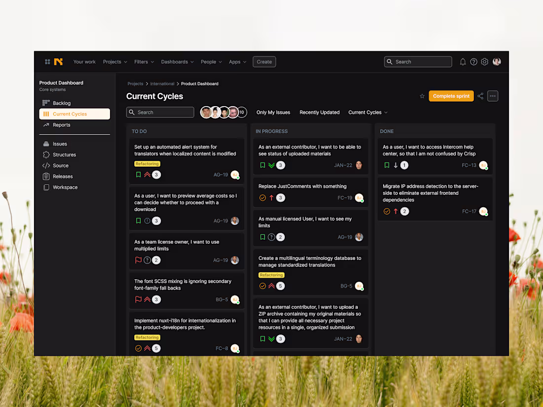
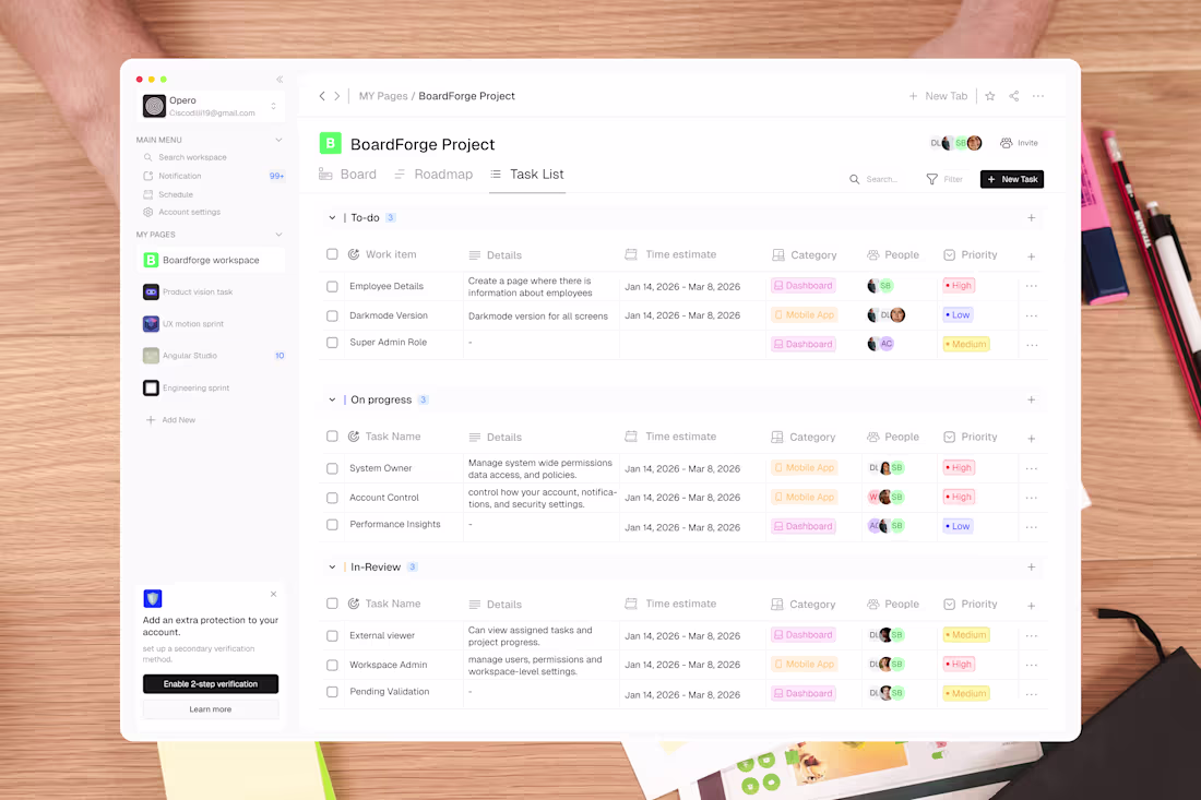
Dark UI, high signal. The interface fades into the background so decisions can move forward without friction.
Built for teams that move fast. Status, ownership, and progress always visible, never buried.
Note - saw the white design online and decided on a dark mode.
2
55
A minimalist, action oriented CRM dashboard for travel agents, designed to streamline booking management through high-contrast scannability and clear information architecture. The interface prioritizes urgent tasks and financial tracking to ensure rapid decision making and a clutter free workflow.
1
59
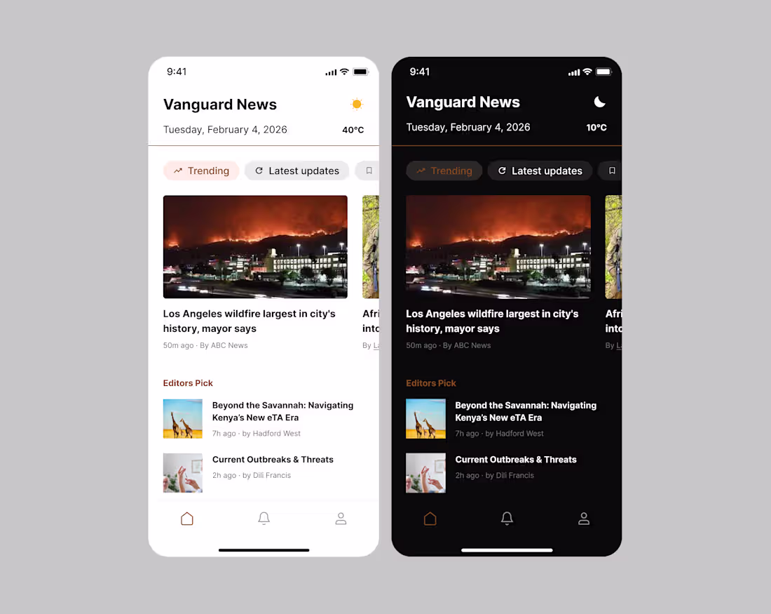
The design explores a personalized news feed that priortizes clarity, scannability and quick access to relevant stories.
The layout uses cars and visual hierarchy to help users consume information efficintly while maintaining calm editorial feel.
1
50
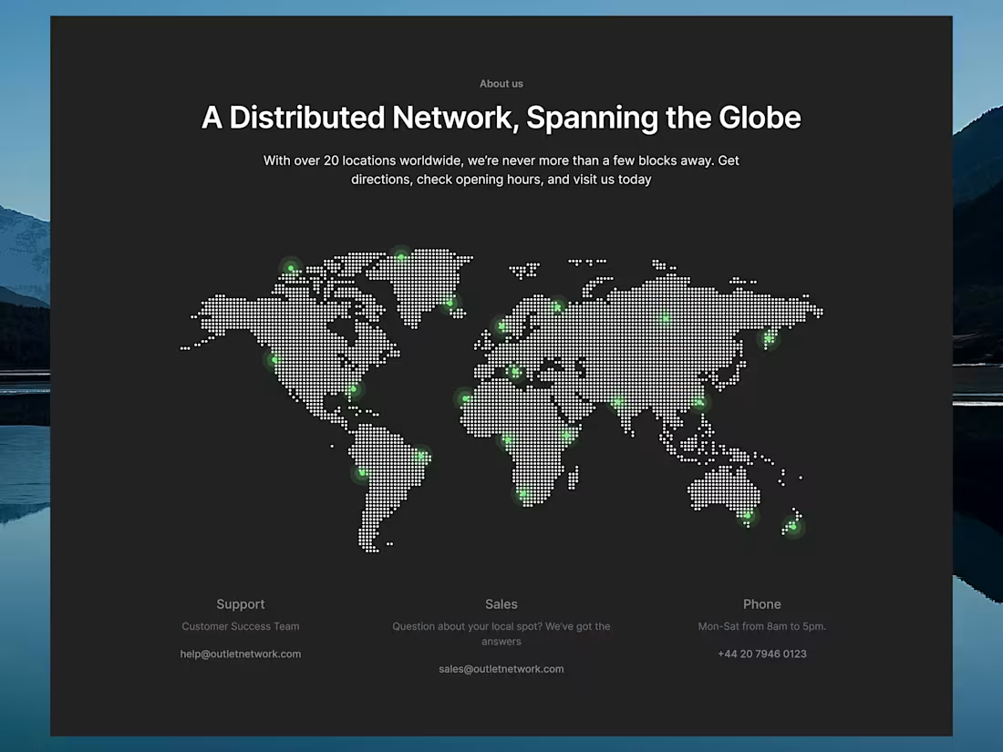
I designed this "About Us" section to bridge the gap between a massive, globally distributed network and the individual user. The goal was to take a complex brand story and translate it into a narrative that feels personal, transparent, and community-focused.
1
69
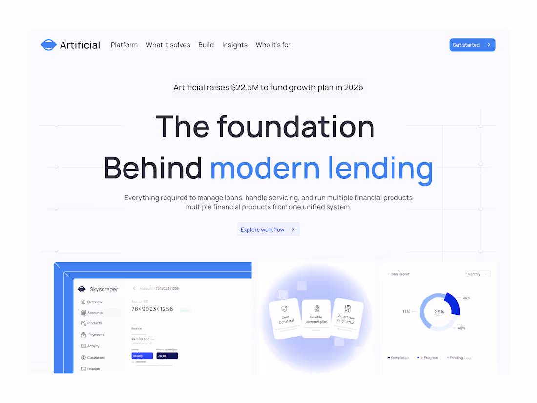
A clean and modern hero section design for a loan service website. The layout features a professional color palette, a bold headline highlighting interest rates, and a prominent 'Check Eligibility' lead generation form. The design includes high-quality imagery and trust badges to establish credibility, all optimized for a responsive desktop view.
1
45
I’ve just added a new blog post design to my portfolio! I specialize in creating high converting blog layouts that align with your brand's voice. Need a fresh look for your publication? Book my 'Blog Design' service directly on my profile
1
62
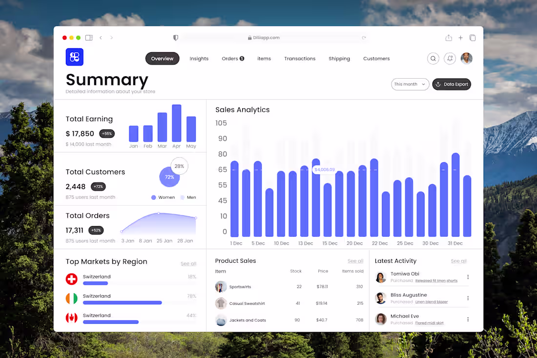
This dashboard was designed to give product teams and founders an instant snapshot of business performance highlighting what matters most at a glance without overwhelming the user.
Built to surface key business metrics instantly: total sales, customers, earnings, and activity.
1
50
A quick walkthrough of Vaulta, our mobile banking app prototype, showcasing a calm, intuitive interface that makes income, expenses, and transactions easy to understand and act on.
1
43
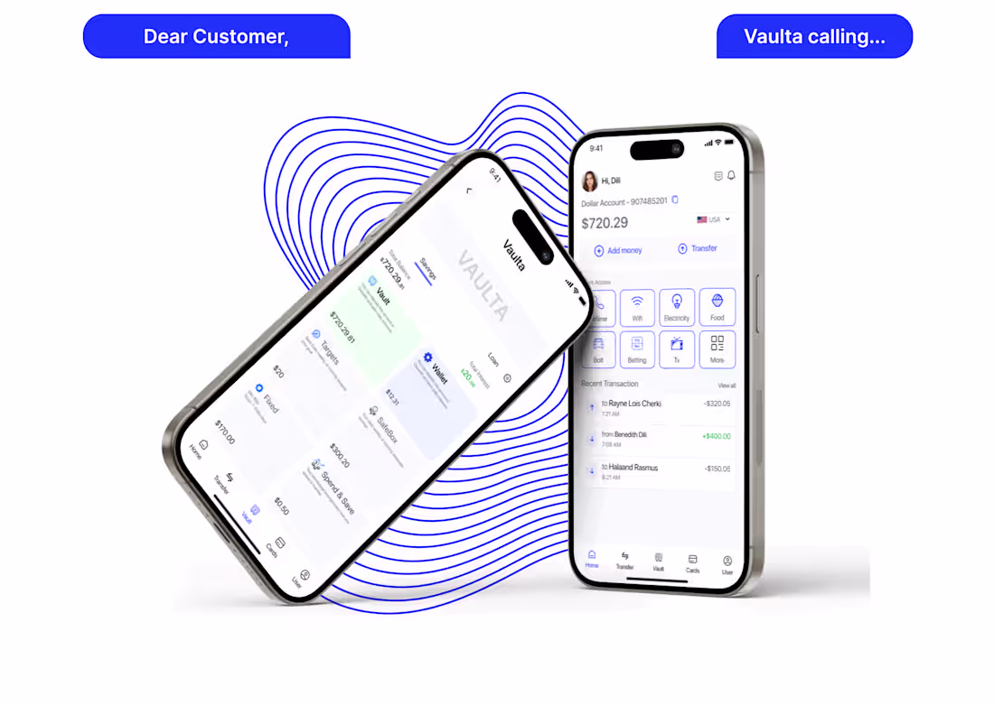
Vaulta Banking App — Case study
Vaulta is a mobile banking app designed for clarity and calm. Unlike traditional apps, it separates income and expenses, makes transactions easy to scan, and keeps key actions accessible. The goal: a modern, trustworthy experience that simplifies everyday banking without visual overload.
1
36
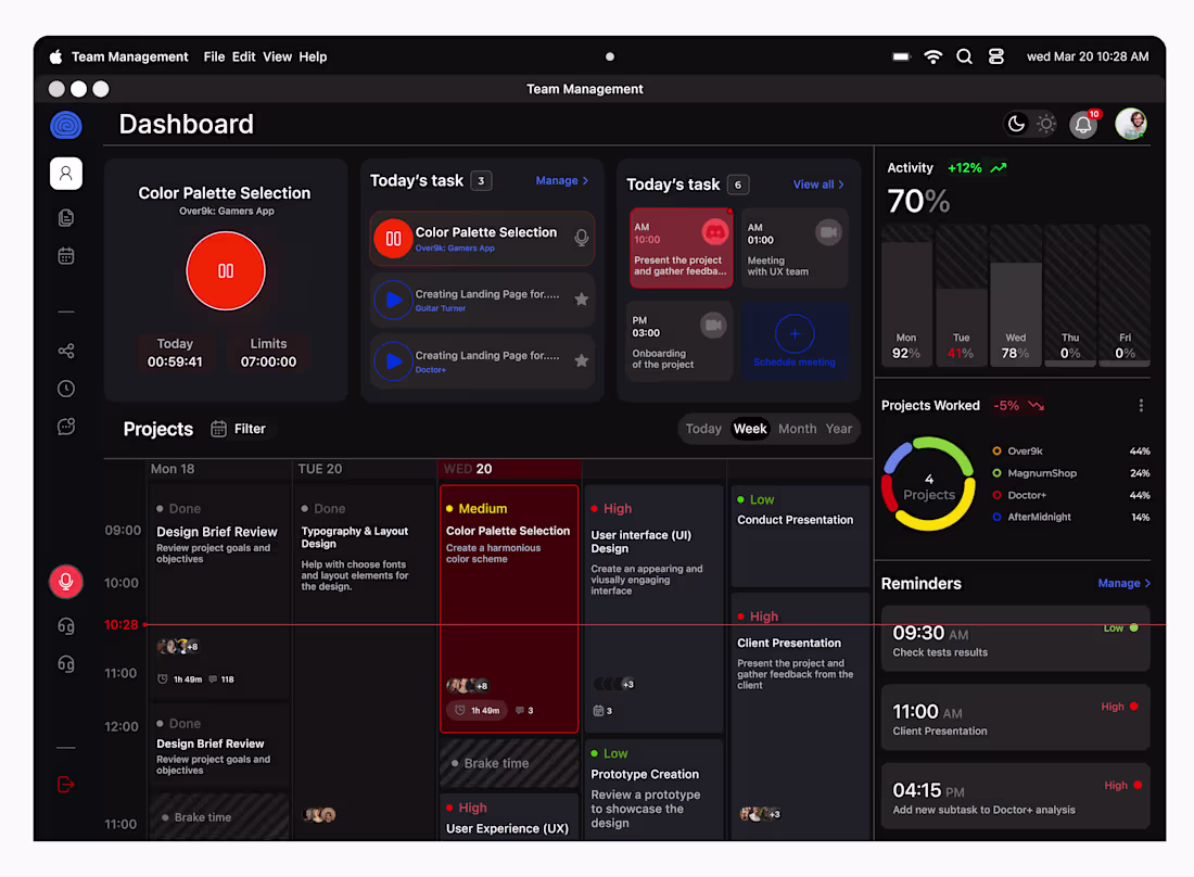
This dashboard exists to answer three questions quickly:
What's being worked on, what needs review,and what needs attention next. It's designed to give teams and founders instant clarity, so decisions can be made faster without digging through noise. Every design choice was made to reduce friction and improve understanding
1
46
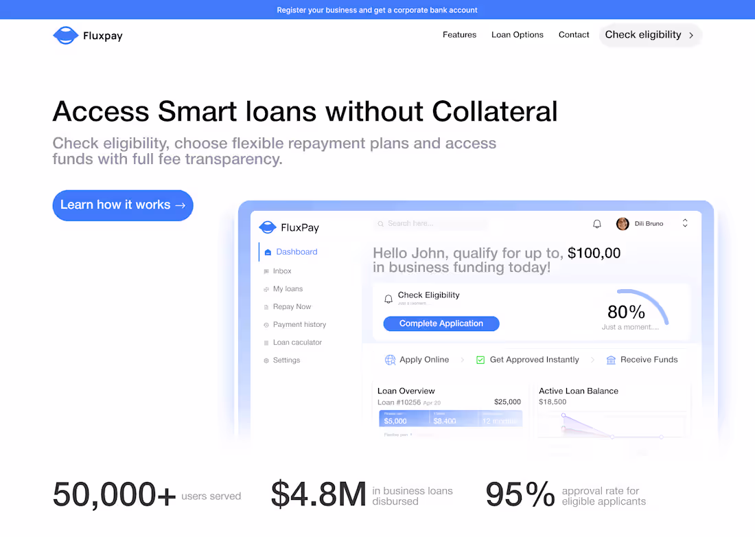
Designed the FluxPay hero section to communicate trust at first glance clear value proposition, simple messaging, and a strong call-to-action that guides users instantly.
1
27
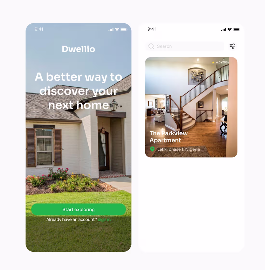
A mobile home discovery app designed to make finding your next stay simple and stress free. Focused on clean visuals, user friendly search, and a welcoming experience from the first screen.
1
73
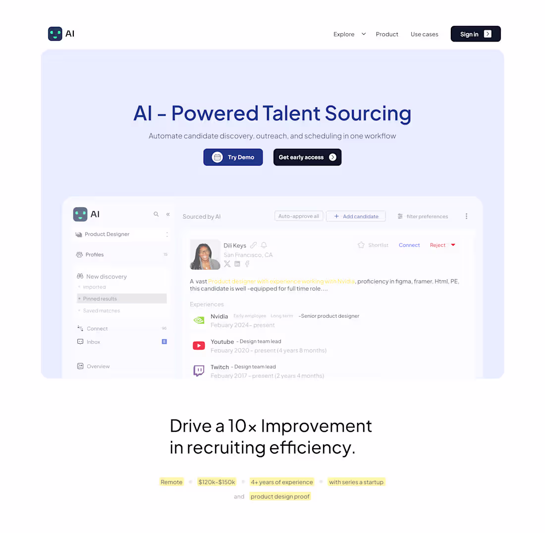
Hero section design for an AI-powered talent sourcing platform that automates candidate discovery, outreach & scheduling in one workflow.
Try demo now
1
40
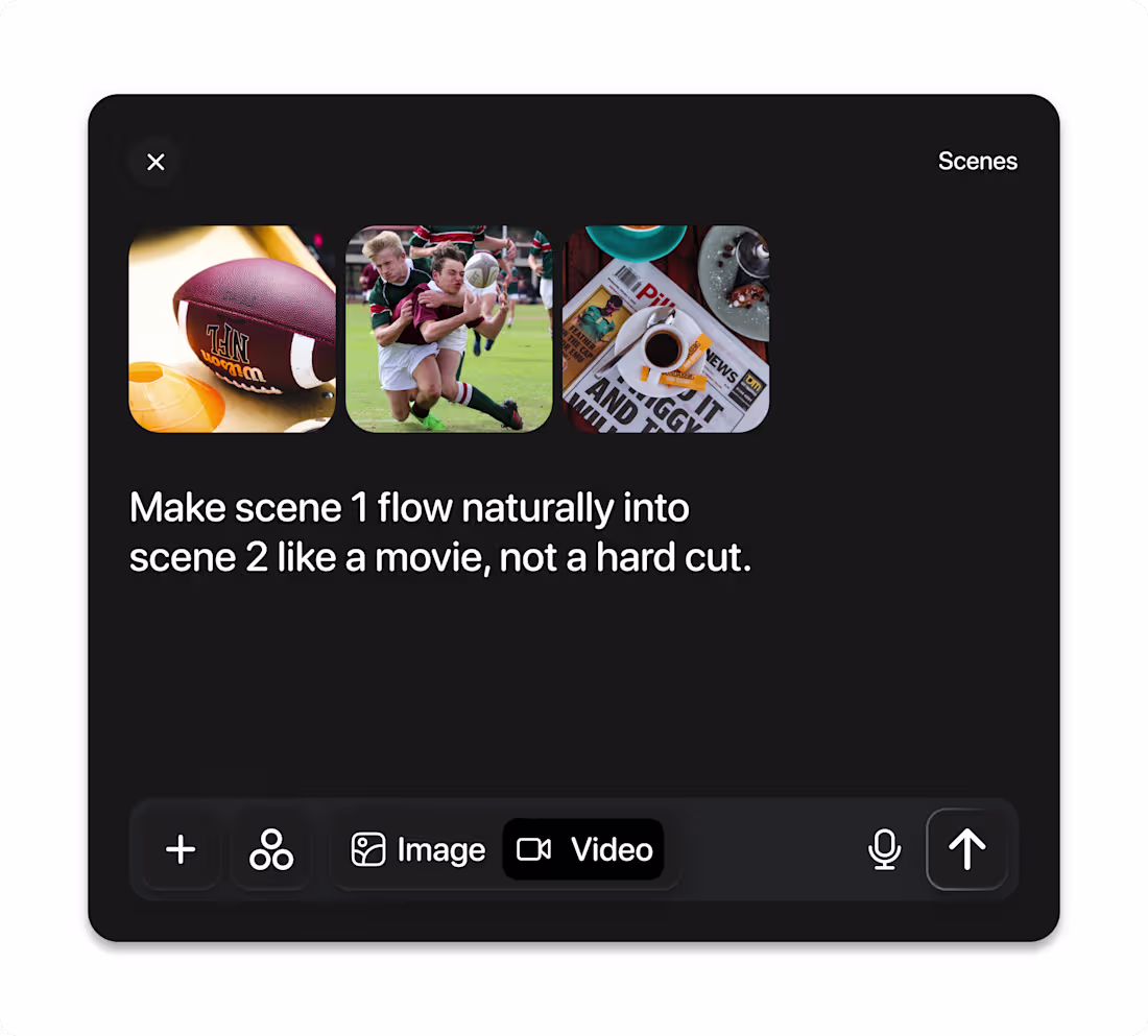
From idea to movie ready transitions in seconds. AI powered editing made effortless.
1
50
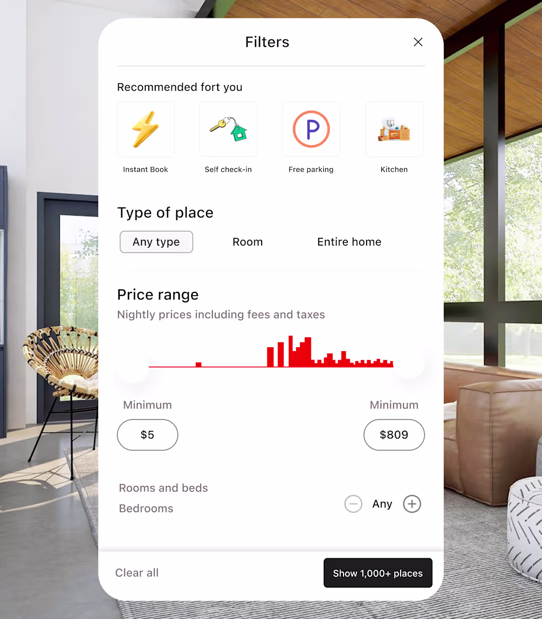
A filter section to make searching easier
Designed to reduce friction and speed up decision.🚀
2
2
41
The idea behind this dashboard I designed is to create a space where design and functionality meet. I focused on clarity, easy navigation, and real problem-solving to help users make better decisions with less effort.
1
2
43
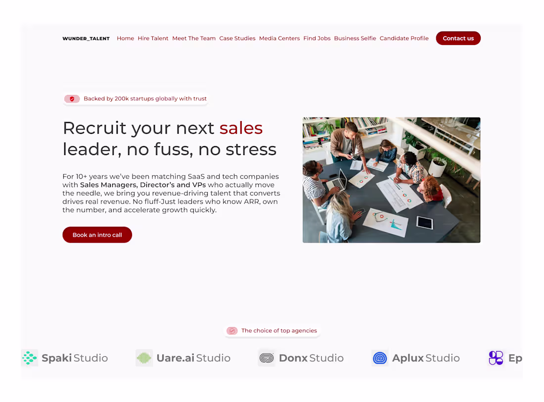
A sleek and conversion-focused SaaS hero section for a recruiting service built to connect companies with the right people faster.
1
2
41
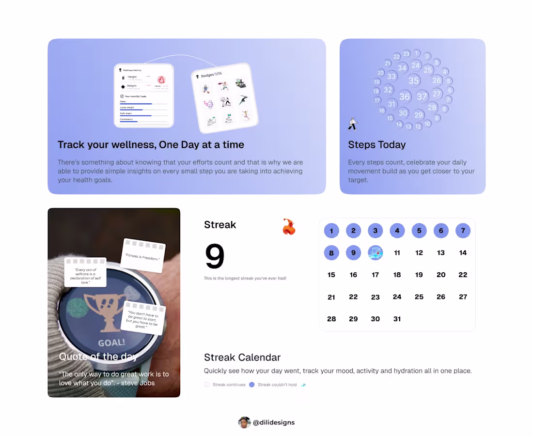
I Designed a Bento Card that turns daily habits into clear steps track progress, build awareness, and maintain momentum with streaks and a streak calendar.
2
2
35
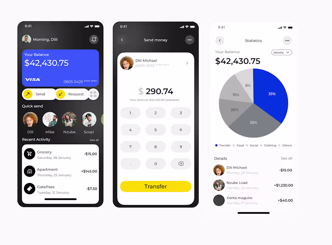
A streamlined FinTech interface crafted in Figmabuilt to make money management feel effortless.
Inspiration from uxthrive since I started there 30 days UI challenge
1
2
31
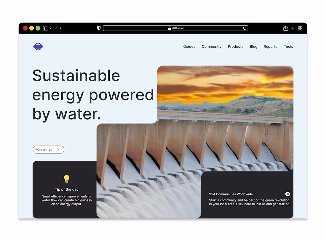
Hero Section DesignA new hydrodam hero section and this one feels different.
1
25