
Kumar Shrestha
UI/UX Designer & Developer
New to Contra
Kumar is ready for their next project!
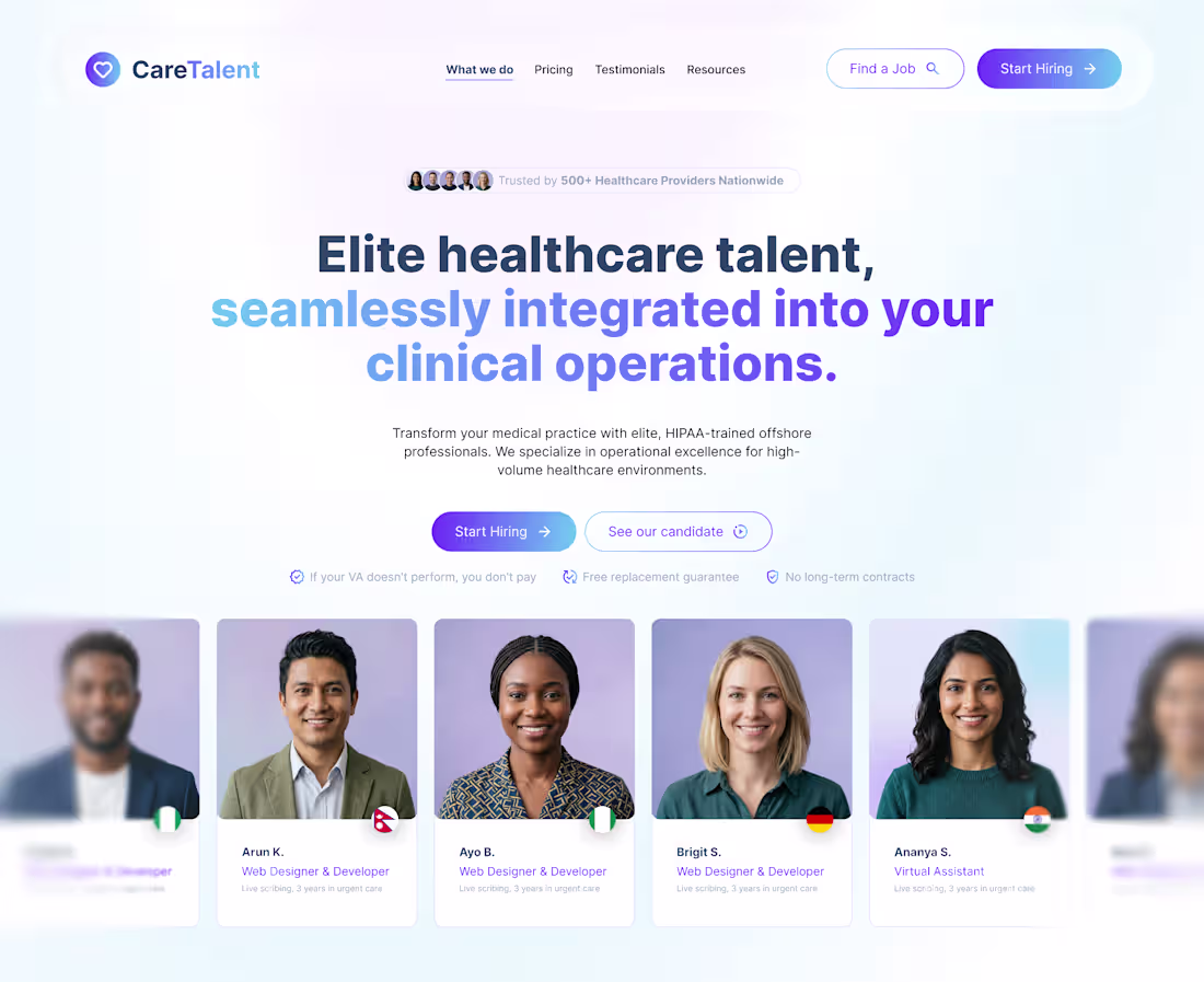
This project showcases a conceptual landing page design for a specialized staffing platform, developed to explore the intersection of medical services and remote talent management.
The design focuses on building immediate trust through a clean, modern aesthetic and strategic information hierarchy, demonstrating how to effectively articulate the seamless integration of high-quality, HIPAA-trained talent into clinical operations. By incorporating trust indicators and a human-centric approach that features a diverse talent pool, this concept illustrates effective conversion-focused design, highlighting an ability to blend B2B SaaS functionality with professional service branding.
0
57
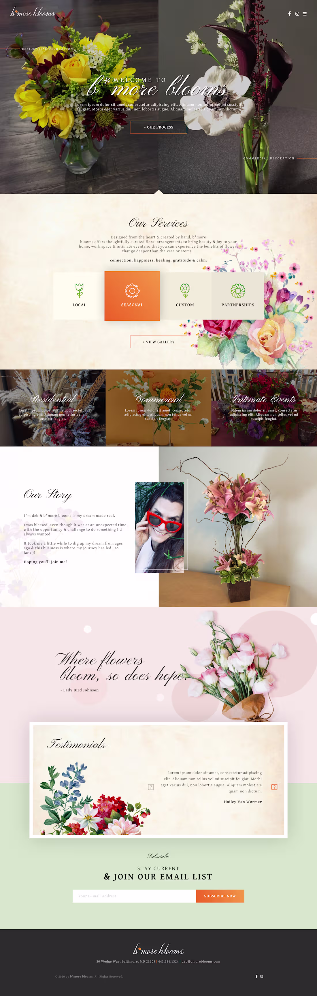
This website design for "b'more blooms" embraces a warm, elegant, and botanical aesthetic perfectly suited for a floral boutique. The layout effectively combines high-quality imagery with a sophisticated, textured background, creating an immersive experience that feels both personal and professional. Key elements of the design include a clearly organized service section, a dedicated narrative space for the brand story, and a featured testimonial area, all of which work together to build customer trust and convey the artistry behind the floral arrangements.
The site successfully balances visual beauty with functional features, such as a prominent email signup to help the business maintain long-term relationships with its community.
0
74

This logo for BitcoinRoyals.com is a branding project that combines financial authority with a premium, distinguished identity. The design features a bold Bitcoin symbol housed within a shield, topped with a crown, which creates an immediate visual metaphor for security, prestige, and leadership in the cryptocurrency space.
The clean orange-and-black color palette provides strong contrast and modern appeal, ensuring the brand mark remains professional and highly recognizable across digital platforms.
0
61
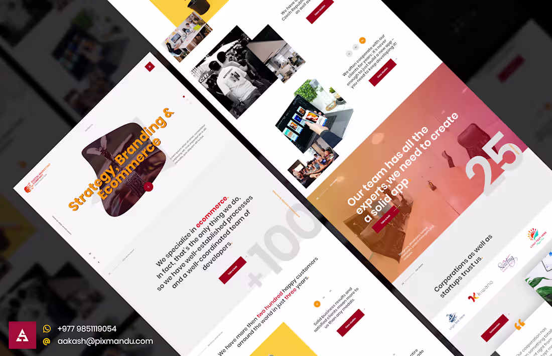
This project for Digitank involved designing a clean, modern website for a global digital agency specializing in ecommerce and branding. I focused on creating an intuitive user experience, featuring a minimalist overlay navigation system and a well-structured "About Us" section that highlights the agency’s international reach and business impact. By effectively organizing complex corporate data and multi-regional contact information into a cohesive interface, I delivered a professional platform that serves as both a brand showcase and a functional business tool.
0
74

Project: Brand Identity Design – UK-NEPAL.com
This logo was designed for "UK-NEPAL.com," a digital platform with the tagline "Your business... Our community..." that aims to connect two distinct regions.
Design Concept:
The logo features a creative, stylized integration of the UK and Nepali flags, symbolizing the bridge between these two cultures and the community-focused nature of the business.
Visual Strategy:
By utilizing the signature colors and shapes of both national flags, the design immediately communicates the platform's cross-cultural purpose, while the bold, clean typography ensures the brand name is professional, memorable, and clear.
0
76
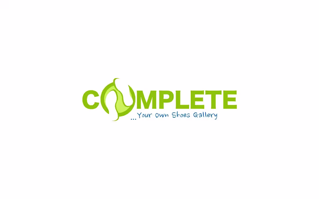
Project: Brand Identity Design – Complete
This logo was designed for "Complete," a footwear retail business. The design focuses on clarity and brand recognition while incorporating a visual nod to the product offering.
Design Concept:
The logo uses a clever typographic integration where the "O" is replaced by a stylized shoe-shaped element, creating an immediate connection between the brand name and the retail specialty.
Visual Strategy:
The vibrant green color palette conveys a sense of freshness and energy, while the bold, clean lettering ensures the brand remains professional and highly legible across different storefront and marketing applications.
0
71

Project: Brand Identity Design – Gossip Queen
This logo was designed for "Gossip Queen," a fashion retail boutique. The goal was to create a recognizable and approachable brand mark that resonated with a style-conscious audience.
Design Concept:
The logo features a playful, sophisticated typeface paired with an iconic crown element, directly reflecting the brand's name and its focus on trendy, premium retail.
Visual Strategy:
The clean, white-on-pink aesthetic provides high contrast and a vibrant, modern feel that aligns perfectly with the brand's social media and in-store marketing presence.
0
68
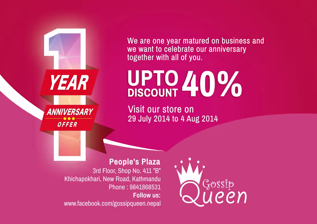
To mark the one-year milestone for Gossip Queen, I designed this promotional campaign to drive in-store traffic through a limited-time anniversary discount. The layout utilizes bold typography and clear, actionable messaging to highlight the "Upto 40%" offer, effectively balancing festive celebration with strong sales incentives to encourage customer visits.
0
78
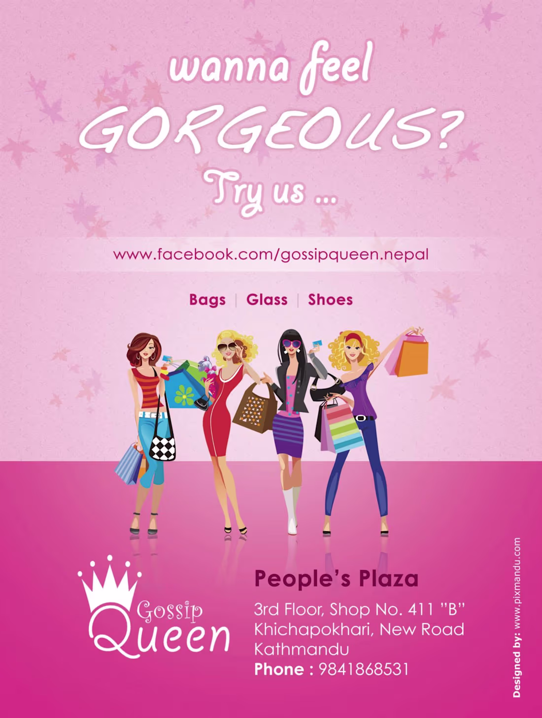
This promotional graphic was designed to boost brand visibility for Gossip Queen, a fashion retailer in Kathmandu. Using a bright, feminine color palette and illustrative style, the design focuses on building a relatable, trendy persona for the brand while clearly showcasing the product categories offered, including bags, glasses, and shoes.
0
76
Cleaning out my computer archives recently led me to this gem from 2008–2009: a fully immersive, animated website I built for Raaga Restaurant during my early career days. Revisiting this project reminded me of how much I enjoyed the technical and creative challenge of pushing the limits of Adobe Flash to craft unique, motion-heavy brand experiences.
While the web has evolved significantly from the Flash era to the modern frameworks I use today, the core principles of storytelling and user-centered design I mastered back then remain the bedrock of my work. It’s been a great trip down memory lane to see where my journey began.
0
87
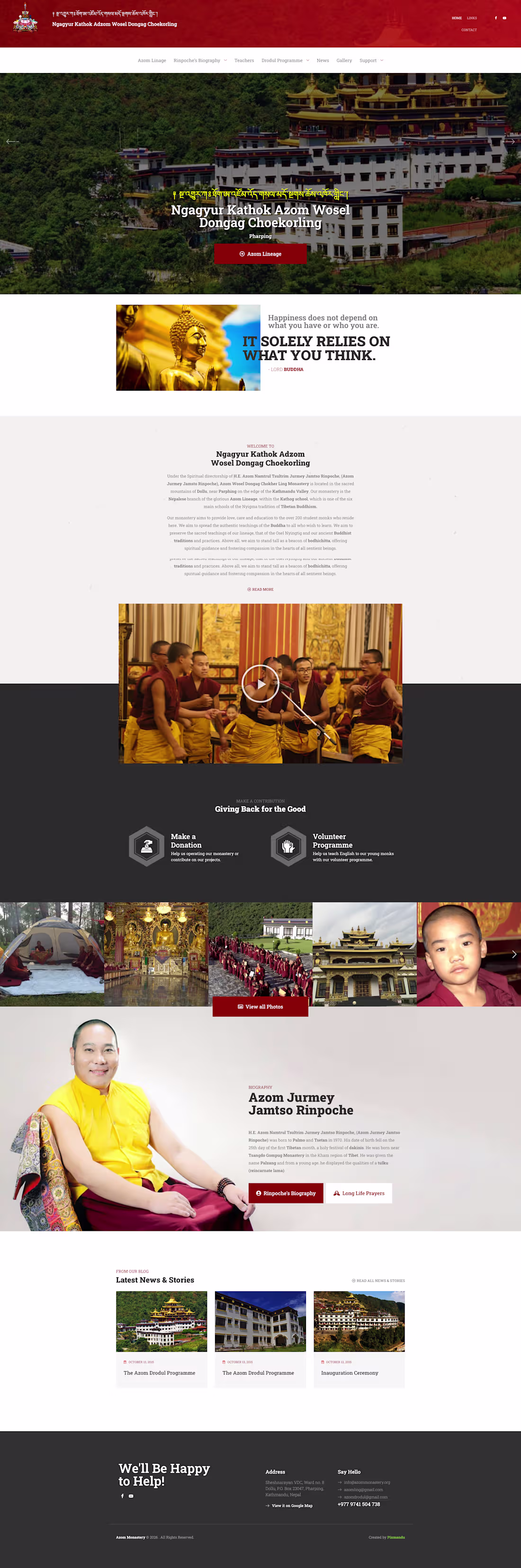
Designed the complete UI/UX in Figma and developed the Azom Monastery website using WordPress with Elementor. The project focused on creating a clean, responsive, and spiritually aligned design that reflects the monastery’s values, while ensuring easy navigation, smooth content management, and an accessible experience for visitors across all devices.
0
122
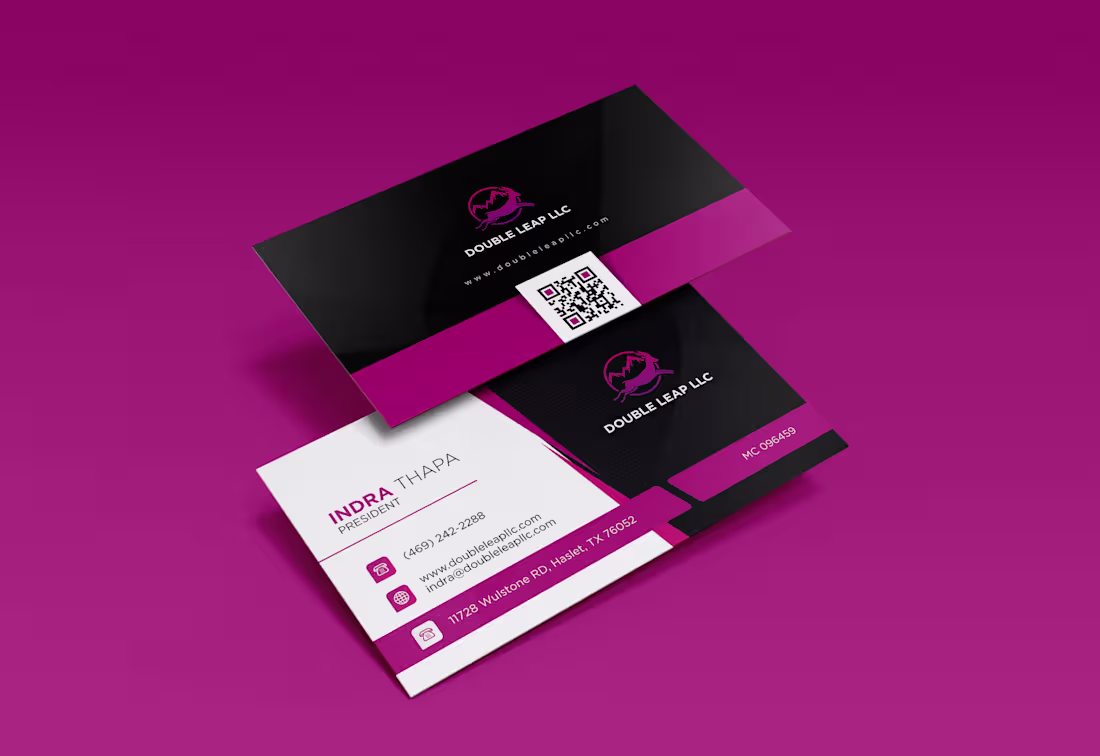
Custom Business Card design for Double Leap LLC
0
116
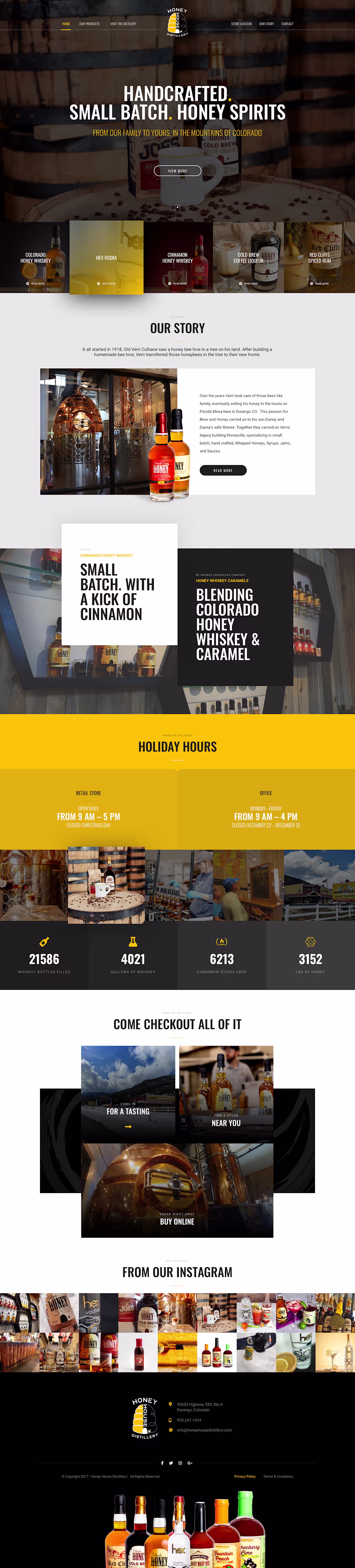
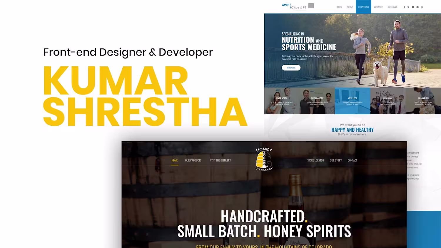
Designed the complete website UI in Figma and developed the website on WordPress using Elementor for Honey House Distillery. The project focused on creating a modern, responsive, and visually engaging experience that reflects the brand’s premium identity while ensuring easy content management and smooth user navigation.
0
116
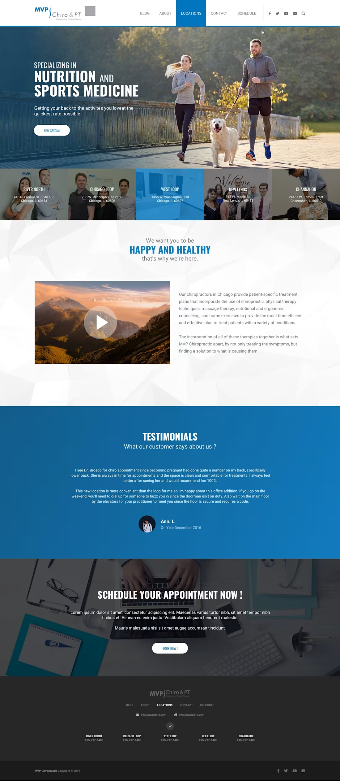
Built custom designed Wordpress website using Elementor Pro.
0
118