
pro
Shivam ツ - Brand Designer | Framer Expert |kittl Expert| Kajabi Expert | Anything Expert
Graphic Design | Branding | Wix |Framer | Anything Expert
- $1k+
- Earned
- 4x
- Hired
- 5.00
- Rating
- 165
- Followers

The Envato Challenge kicks off on July 8th 🚀
It's time to create, showcase your skills, and compete with creatives from around the world. ✨
Can't wait to see what everyone builds! 🔥
Join now 👇
https://on.contra.com/cNtwmQ
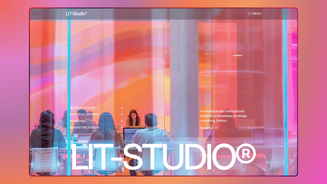
Pushing pixels and breaking patterns—just dropped a fresh hero section. 🚀✨
The Renoise Challenge starts in 3 days ✨🚀
💰 $10.5K in prizes up for grabs.
Get a head start on your build, explore new ideas, and create something amazing 👀🔥
Join now 👇
https://on.contra.com/9WnzKQ
The Recraft Challenge is here 🎨🚀
💸 $10,000 in prizes up for grabs.
Time to push your creativity, experiment with AI-powered design, and build something extraordinary 👀🔥
Can't wait to see what everyone creates.
Join now 👇
https://on.contra.com/MBTtk8
The Rive Interactive Character Challenge starts in just 10 hours 🚀✨
💸 $10,000 in prizes are up for grabs.
Bring your characters to life with interactive animations, creative storytelling, and experiences that feel truly alive 👀🔥
Can't wait to see what everyone creates.
Join now 👇
https://on.contra.com/PTwcwm
on.contra.com
#characterchallenge on Contra
Rive Character Challenge