Kushal Singh
SEO writer , Web developer & Logo Design. Fast delivery.
New to Contra
Kushal is building their profile!
Responsive Web Design — Device Showcase
Personal Project
A cinematic device mockup demonstrating premium responsive web design across all screen sizes — laptop, tablet, and mobile. No specific client — created to showcase the quality and fluidity of my web design work.
✦ Fully responsive across all devices
✦ Smooth UI transitions & interactions
✦ Modern, clean aesthetic
0
15
What if your website wasn't built from a template — but born from scratch?
This little 8-second film captures something I genuinely love about my work . It starts with a robot made of plastic blocks — familiar, functional, but limited by its pieces. Then the code kicks in , and something transforms.
That's how I think about every project. Not assembling pre-made parts, but writing every line HTML , CSS , Javascript by hand — so the final product moves, feel, and perform in ways templates simply can't.
No theme. No page builders. Just clean, purposeful code crafted around your idea .
1
43
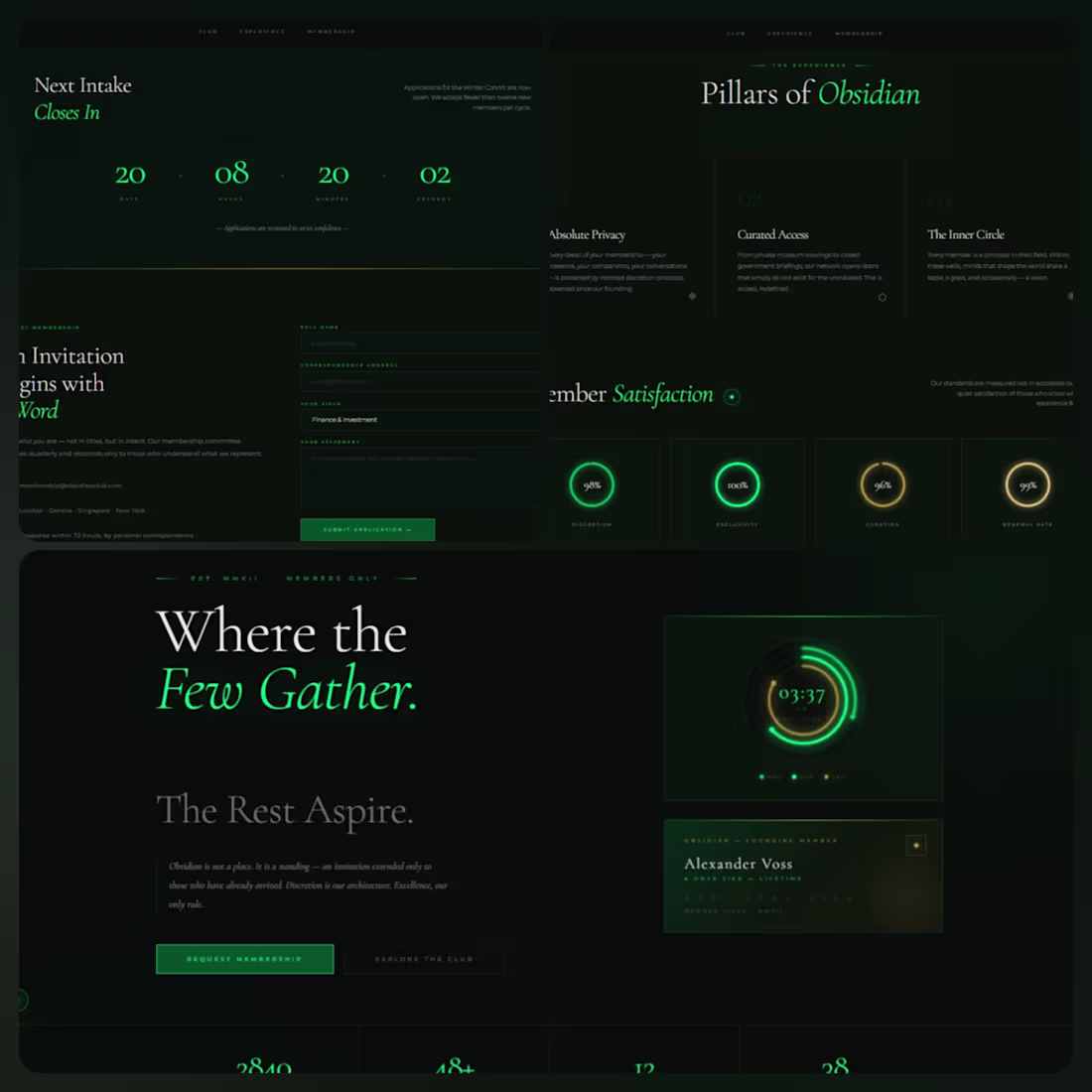
OBSIDIAN — Elite Private Members Club
Personal Project — Concept Design
A self-initiated website concept built to showcase high-end UI/UX design capabilities. No client brief — purely a creative exploration of luxury digital aesthetics.
✦ Custom animated arc clock with glowing rings
✦ Magnetic triple-layer cursor experience
✦ Animated progress rings & countdown timer
✦ Liquid wave transitions & ambient glow effects
✦ Cormorant Garamond serif typography for luxury feel
✦ Fully responsive with scroll reveal animations
Built entirely with vanilla HTML, CSS & JavaScript — no frameworks.
0
38
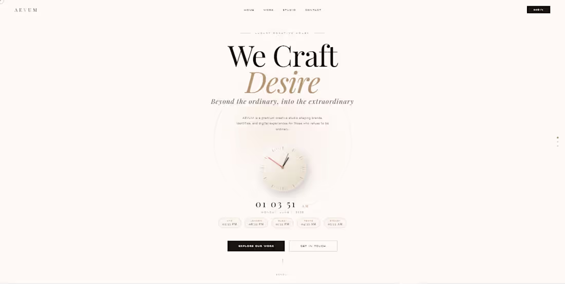
Luxury Brand Website — Personal Project
A self-initiated personal project where I
designed and developed a full premium luxury
brand website called AEVUM Creative Studio.
Built entirely from scratch using pure HTML,
CSS & vanilla JavaScript — no frameworks.
Highlights:
Live analog & digital clock with world timezones
Particle network background
CSS 3D rotating cube
Custom magnetic cursor
Scroll reveal animations
Animated counters
3-page full website layout
Glassmorphism & neumorphism effects
Fully responsive design
0
113
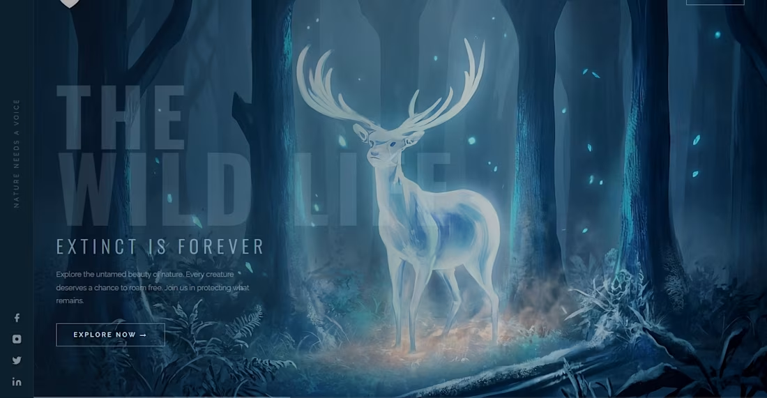
Project Title:
The Wildlife — Extinct Is Forever
Description:
Designed a cinematic wildlife awareness website with a dark, immersive blue theme. Features a stunning glowing deer hero image, atmospheric animations, and a bold typographic layout. Built entirely in pure HTML and CSS with no templates used.
0
145
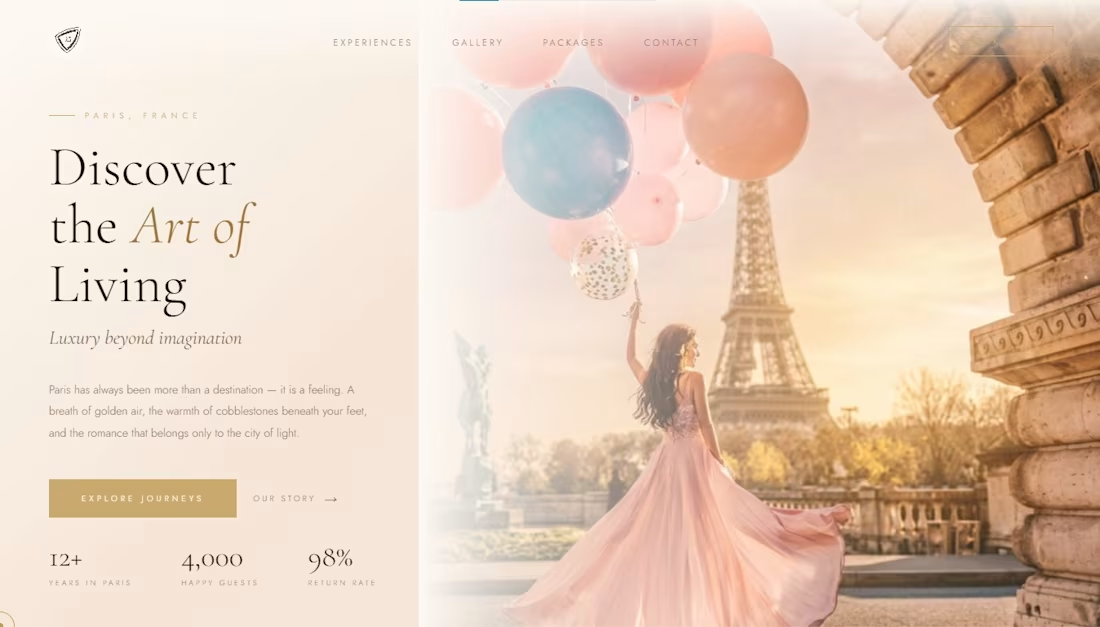
Project Title:
Éclat — Paris Luxury Travel Website
Description:
Designed a high-end luxury travel website for a Paris-based experience brand. The design features an elegant cream and gold color palette, cinematic hero layout, smooth animations, and a fully responsive multi-section page including experiences, gallery, packages and contact. Built entirely in pure HTML, CSS and JavaScript — no templates used.
0
179