
Healing Hawk Studios
Crafting High-Conversion UI/UX for Wellness & AI Platforms
New to Contra
Healing Hawk is ready for their next project!

Resonate (Flow-State OS) — Digital Sanctuary & Somatic Interface Design
💡 The Vision
Resonate was engineered as a direct response to the hyper-stimulated, friction-heavy layout structures that dominate modern SaaS and digital medicine platforms. The goal was to build a low-stimulation onboarding pipeline and cohesive system dashboard that anchors user focus, reduces cognitive fatigue, and establishes absolute clinical and aesthetic trust from the first interaction.
🛠️ Execution & Spatial System
Typography Hierarchy: Utilizes sharp, high-contrast, widely spaced geometric sans-serifs paired with restrained editorial layout margins to establish distinct information architecture without visual clutter.
Somatic UI Architecture: Implements intentional container intervals, soft gradient backgrounds, and micro-animations designed to guide the member's eye smoothly through onboarding timelines and daily wellness tracking.
Technical Integration: Built utilizing highly modular Figma component libraries, fully mapped out for seamless, developer-ready translation into responsive code environments.
🔗 Project Assets
Live Concept Staging: https://somatic-align-play.base44.app
Design System Studio: https://www.linkedin.com/in/healing-hawk-studios-468551422/
0
5
🏷️ The Project Metadata
Project Title: DeVine Wines — Luxury Brand Identity & Digital Experience
Role: Lead Brand Designer & Creative Director
Tools Used: Figma, FigJam, Envato AI Hub, CapCut
Project Description
Project Overview
DeVine Wines is a premium luxury rebrand built on the intersection of human creative direction and generative AI tools. The project demonstrates how to break past predictable automation to build a deeply rooted, cohesive, Michelin-star brand identity across digital, physical, and hospitality ecosystems.
The Creative Journey
The Human Pivot: The initial automated generations yielded highly predictable industry clichés (a standard wine glass and grapes). Recognizing the need for depth, human curation stepped in to pivot the concept toward authentic sommelier history: the traditional silver Tastevin cup.
Refinement & Customization: Transforming flat, geometric AI sketches into high-end brand assets by injecting reflective liquid-platinum textures and high-contrast studio lighting profiles.
The Physical Ecosystem: Scaling the visual assets into bespoke physical retail goods, featuring laser-engraved wooden collector boxes, structured charcoal-and-leather totes, high-shine apparel, and beautifully frosted, etched glassware.
The Digital Flagship: Translating the premium physical aesthetic into an immersive, editorial dark-mode e-commerce web presence styled with sophisticated typography.
6
5
241
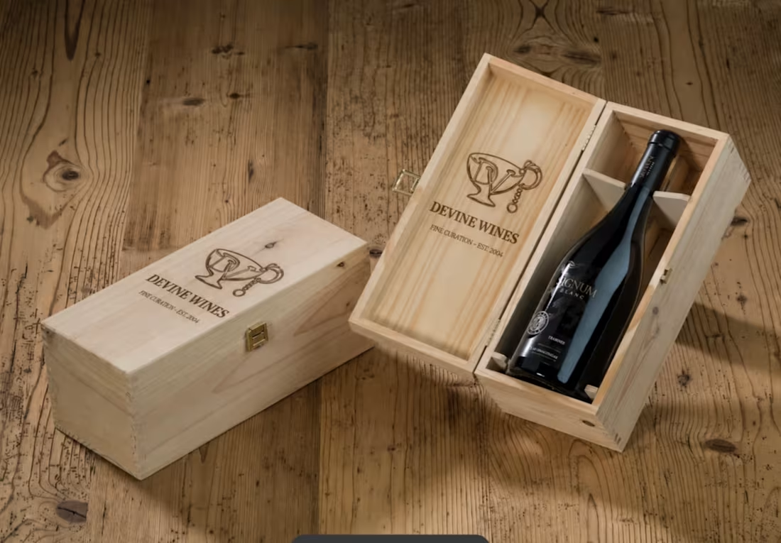
DeVine Wines — Luxury Brand Identity & Digital Experience
Description: "A premium sommelier-inspired rebrand featuring bespoke physical packaging, high-end hospitality collateral, and a cohesive dark-mode digital storefront."
0
30
The Nova Journey — Luxury Concierge Fertility Onboarding
"How do you design a digital entry point for clinical coaching that feels deeply reassuring, elite, and completely supportive?"
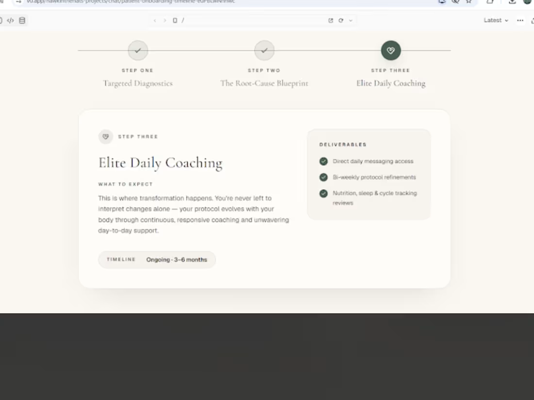
Designed for Courtney's high-end fertility clinic, The Nova Journey is a bespoke three-step interactive onboarding timeline. Built through a lens of quiet luxury, it translates a complex patient clinical path into a calm, highly readable editorial experience across all devices.
🎨 The Design Architecture: Dual-Theme Serenity
To accommodate patient preferences and state of mind, the layout supports both a calming, warm-cream light aesthetic and a deeply private, low-stimulation dark mode.
By eliminating the chaotic, sterile grids of typical healthcare portals, this design uses:
High-End Editorial Serif Typography (utilizing premium classic serif styling) to command clinical authority, trust, and timeless warmth.
A Harmonious Color Palette of earthy sage greens and grounding charcoal accents, keeping cognitive stimulation to an absolute minimum.
A Visual Chronology (Step 1, 2, and 3) that anchors the user and removes the anxiety of "what comes next."
🛠️ Core UI & UX Features Built
1. Elegant Sequential Timeline (Step-by-Step)
The Problem: Traditional clinical onboarding feels cold, mechanical, and overwhelming for patients navigating sensitive fertility paths.
The Solution: A beautifully spaced horizontal timeline ($◯ \text{---} ◯ \text{---} ◯$) that serves as a visual guide. As patients progress or tap through, the active step is highlighted with soft organic sage green tones.
2. Detailed Deliverable Modules
The Content: Explicitly outlines Targeted Diagnostics, The Root-Cause Blueprint, and Elite Daily Coaching.
The Layout: Clean card components with modern, rounded corners. Features structured lists for high-contrast "What to Expect" content blocks paired with explicit, reassuring bulleted deliverables.
3. Seamless Responsive Behavior
The Execution: Perfectly adapts from a spacious, multi-column desktop layout into a vertical, single-column mobile-first flow that retains all of its luxurious editorial proportions and spatial breathing room.
💻 The Tech Stack
Framework: React / Next.js
Styling: Tailwind CSS (configured for custom tracking, spacing, and fluid typography)
Prototyping Environment: v0 by Vercel
0
27
LP Grid — Immersive Private Markets Lattice (Interactive Concept)
"How do you visualize the complex, high-friction web of global private equity without overwhelming the user?"
This interactive web prototype is a cinematic, dark-mode experience designed for LP Grid (a private markets intelligence platform). Built through the lens of Somatic UX, it translates dense institutional datasets—such as investor discovery, relationship mapping, and advanced capital filtering—into a calm, low-stimulation, and highly engaging interactive system.
🎥 The Hero: Live Interaction Walkthrough
🎨 The Design Philosophy: "Enterprise Calm"
Standard fintech and private equity dashboards are notoriously cluttered with chaotic data tables, aggressive red/green tickers, and overwhelming information hierarchies.
For LP Grid, I architected a Digital Sanctuary for allocators. By utilizing a deep, immersive space-navy backdrop (#050b14), ultra-thin gridlines, and strict spatial layout rules, the interface feels deeply secure, premium, and authoritative. Crucial data points are highlighted not with loud warnings, but with a highly intentional, luminous dual-color ecosystem:
Neural Blue (#00d2ff) for GP network paths, interactive system inputs, and synchronizations.
Cyber Emerald (#00ff87) for active LP nodes, successful data flows, and primary call-to-actions.
🛠️ Key Interface Features Built
1. The Interactive Relationship Lattice (Section 01)
The Problem: Traditional relationship lists fail to capture the multi-dimensional connections between investors.
The Solution: A live-rendered visual network mapping out Limited Partners (LPs) and General Partners (GPs). Users can visually map out connected funds (e.g., Sequoia Capital, Endowment Forge, Sovereign Wealth Alpha) with glowing connection vectors that pulse dynamically on selection.
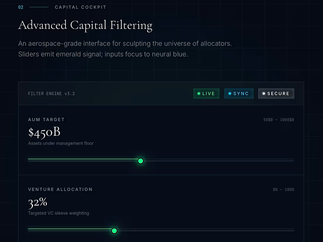
2. Aerospace-Grade Capital Filtering Cockpit (Section 02)
The Problem: Complex financial database queries feel tedious and technical.
The Solution: An elegant control panel mimicking a luxury cockpit. I built custom tactile slider states for filtering huge financial ranges—such as AUM Targets (up to $1,000B), targeted VC sleeve weightings, and liquidity horizons—giving the user physical, visual feedback as they narrow their search.
3. High-Contrast "Initialization Gate" (Section 03)
The Goal: Drive conversions securely.
The Solution: A high-conversion sign-up gate featuring clean, high-contrast typography and a prominent glowing primary CTA button, anchored by clear security, SOC 2 compliance, and encryption metrics.
💻 The Tech Stack
To achieve this extreme level of aesthetic precision, responsiveness, and performance:
Framework: React / Next.js
Styling: Tailwind CSS (for the high-end spatial utility system)
Prototyping Environment: Base44
Typography: Playfair Display (Luxury Editorial Serif) paired with Inter (Clean, Geometric Sans-Serif for interface metrics).
0
29
Designed a premium, dark-mode digital sanctuary for SPRe® Somatic Education. Features a tactile, interactive skeletal tension map, responsive practitioner grid, and an ambient breathing pacer designed to lower nervous system load. Built for clinical precision and high-end wellness branding. UX, motion, and code fully integrated. ✨🧘♂️ #UIUX #SomaticDesign
1
58
👁️ The Vision
To architect a cutting-edge web infrastructure for Healing Hawk Studios that embodies true sovereign technology. The objective was to design an absolute privacy sanctuary—completely free of tracking, commercial databases, or external telemetry—while retaining high-performance, dark-mode animations and desktop-grade interactions.
⚙️ Core Architecture & Innovation
100% Data-Sovereign Infrastructure: Engineered an environment that runs entirely in-memory on the user's local device, eliminating standard cloud vulnerabilities.
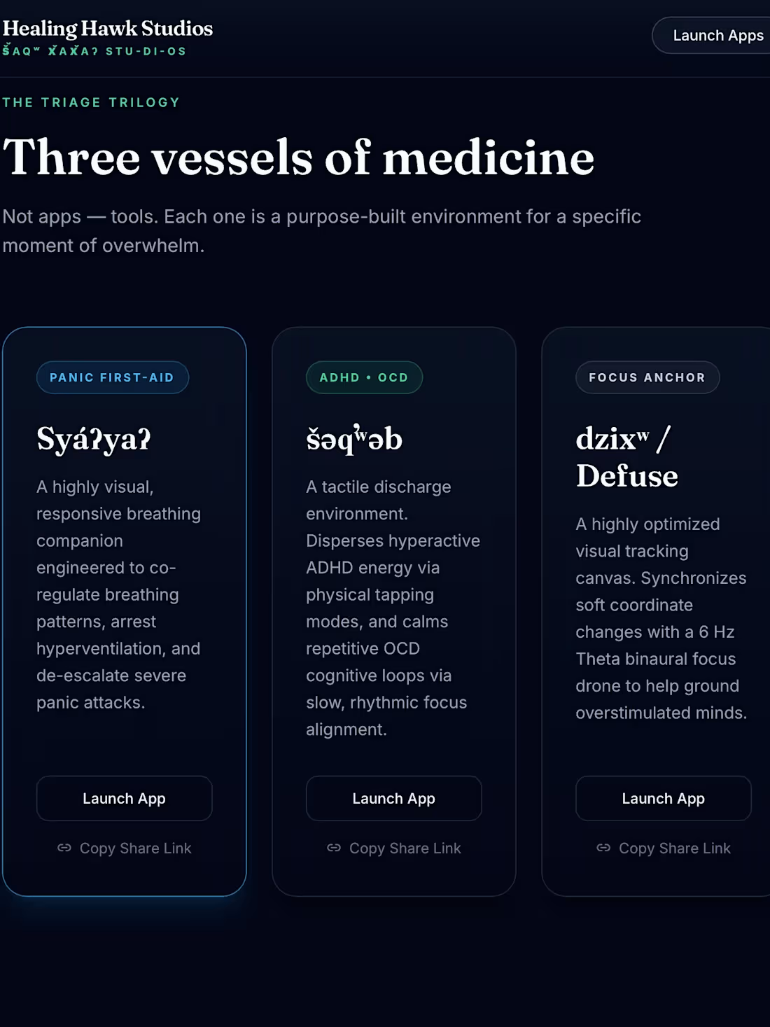
Tactile Responsive Vessel Layouts: Designed a modular, low-stimulation grid specifically structured to de-escalate cognitive overload (Syáʔya?, šəqʷəb, and dzixʷ engines).
Fluid Dark Aesthetics: Styled a luxurious, dark-mode canvas utilizing custom neon vector illumination and smooth transitions optimized to limit visual strain.
🏆 The Results
A beautifully responsive, IT-approved digital medicine hub that operates seamlessly without collection of personal identifiers or forced user sign-ins. This project stands as proof-of-concept that premium UI/UX design and rigid, privacy-first engineering can comfortably exist in the exact same space.
0
43
Healing Hawk's avatar
Healing Hawk Studios
• 1d
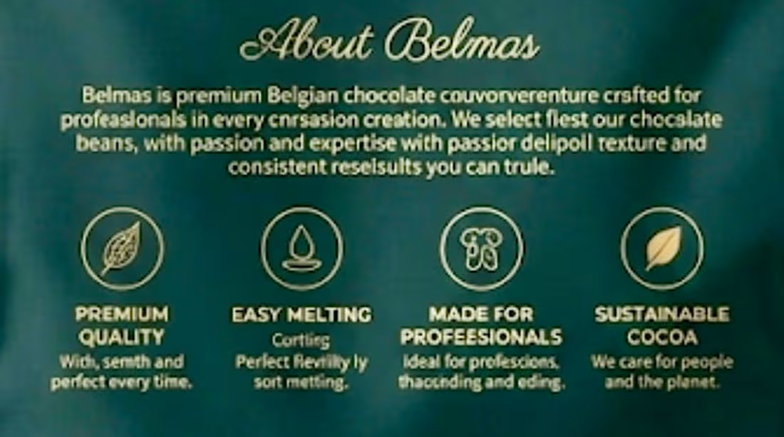
At Healing Hawk Studios, we specialize in translating brand potential into premium physical presences. Led by Founder and Lead Visionary Joe Ancheta, our studio partnered with Belmas to design a high-end, editorial packaging system for their imported Belgian chocolate lines, specifically tailored for B2B pastry chefs and luxury GCC retailers.
🎨 Dynamic Design Decisions:
• Luxury Palette: Selected a deep, sophisticated dark-teal texture paired with high-contrast gold foil accents to immediately establish premium shelf-presence.
• Structural Hierarchy: Engineered spacious, clean typography to make dense professional ingredient lists and product weights easily legible on active kitchen floors and retail shelves.
• Strategic Branding: Balanced a modern, clinical grid system with classical editorial elegance to capture executive buyer trust and project a multi-million-dollar established identity.
By bypassing platform boundaries, Healing Hawk Studios collaborated directly with the client to customize layouts, adjust dimensions, and deliver production-ready vector dielines with zero friction.Healing Hawk's avatar
Healing Hawk Studios
0
43
The Challenge
Modern freelancers manage an exhausting stack of tools, communication channels, and design frames across multiple active contracts. Context switching—jumping between client Slack channels, Figma documents, active codebases, and contract terms—drains executive focus and creates overwhelming browser tab clutter.
The Solution
Freelancer Flow Hub is an intentional, elite digital workspace designed to eliminate visual noise and protect creative momentum. Using a high-contrast clinical dark mode (College Navy and Action Green), it establishes a structured environment that groups projects by active contracts and allows instant switching across design and development workspaces.
0
76

For the Swoop brand identity, I designed a multi-faceted mascot-driven system that bridges digital culture and lifestyle physical products. The project focuses on creating a high-impact visual mark that remains recognizable across various scales and applications.
Design Strategy:
Mascot Evolution: Developed a bold, illustrative hawk character with a focus on 'focused intensity,' ensuring the design works effectively as both a detailed digital avatar and a simplified vector icon.
Brand Versatility: Executed a comprehensive brand system, applying the logo across disparate mediums—from high-fidelity digital app interfaces (Somatic Grounding) to tactile physical merchandise (diffusers, linen journals, and tech accessories).
Cohesive Ecosystem: Maintained a strict 'deep blue' and 'tech-focused' aesthetic palette, creating a unified brand language that ties digital wellness tools to physical lifestyle products.
0
59
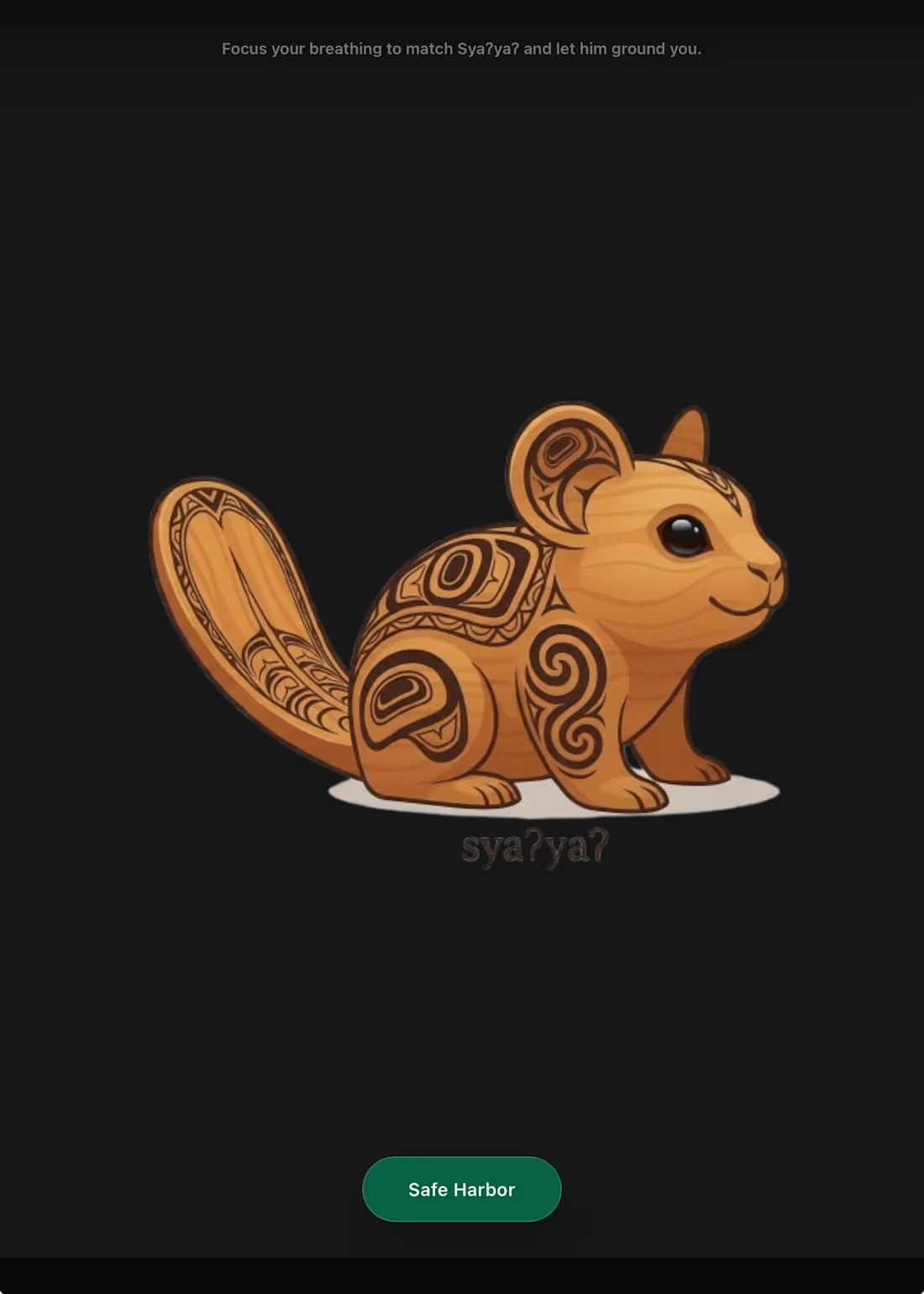
SÝAYƏ Mobile Interface: An elegant, low-cognitive-load conscious breathing guide featuring an interactive geometric expanding wave to assist users through acute hyperventilation or anxiety spikes.
0
51
An interactive, mobile-first arcade game featuring 4 unique game modes, advanced collision detection, real-time score math, and dynamic visual transitions. Built with smooth client-side animation loops to ensure zero latency at 60fps. Proves high-level state control, physics modeling, and complex mathematical event handling in modern web environments.
0
40