
Zurain Khan
Data Analyst | Web Developer | Graphic Designer | Where Data
New to Contra
Zurain is building their profile!

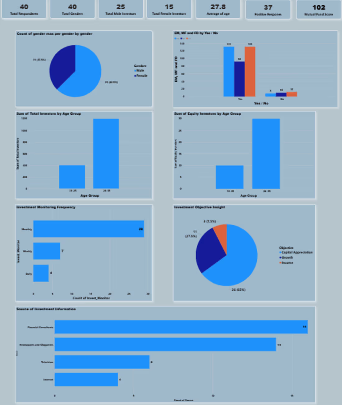
This dashboard presents an Investment Behavior Analysis Survey conducted on 40 respondents, providing insights into investor demographics, preferences, and investment habits.
Key Findings
📊 Respondent Overview
Total Respondents: 40
Total Genders Recorded: 40
Total Male Investors: 25
Average Age: 27.8 years
Positive Responses: 37
Total Mutual Fund Investments: 102
👥 Gender Distribution
The survey consists of approximately 62.5% males (25) and 37.5% females (15).
Male participation is significantly higher than female participation in investment activities.
📈 Investment Participation
Most respondents indicated that they actively invest.
Both males and females show strong investment interest, with a higher number of male investors.
🎯 Investment Objectives
Capital Appreciation (65%) is the primary investment goal.
Growth (27.5%) is the second most common objective.
Only a small percentage (7.5%) invest mainly for income generation.
📅 Investment Monitoring Frequency
Monthly monitoring (29 respondents) is the most preferred approach.
Weekly monitoring is less common (7 respondents).
Only a few investors track investments daily (4 respondents).
📚 Sources of Investment Information
Investors primarily rely on:
Financial Consultants (16 respondents) – most trusted source.
Newspapers & Magazines (14 respondents).
Television (8 respondents).
Internet (6 respondents).
👨👩👧 Age Group Analysis
The 26–35 age group contributes the largest share of investors.
Younger investors (18–25) participate less compared to the 26–35 segment.
Equity investment activity is also highest among the 26–35 age group.
Business Insights
✅ Young professionals aged 26–35 are the most active investment segment.
✅ Investors are primarily focused on wealth creation and capital growth rather than regular income.
✅ Most investors prefer periodic (monthly) monitoring, indicating a long-term investment mindset.
✅ Financial advisors and traditional media remain influential sources of investment information despite the availability of digital channels.
Conclusion
The analysis suggests that the surveyed investors are predominantly young adults who favor capital appreciation-oriented investments and actively monitor their portfolios on a monthly basis. The strong reliance on financial consultants highlights the importance of expert guidance in investment decisions, while the dominance of the 26–35 age group indicates a growing investment culture among young professionals. This information can help financial institutions better target their products, marketing strategies, and advisory services.
0
9
Main page for client
0
13

Social media post for client
0
20
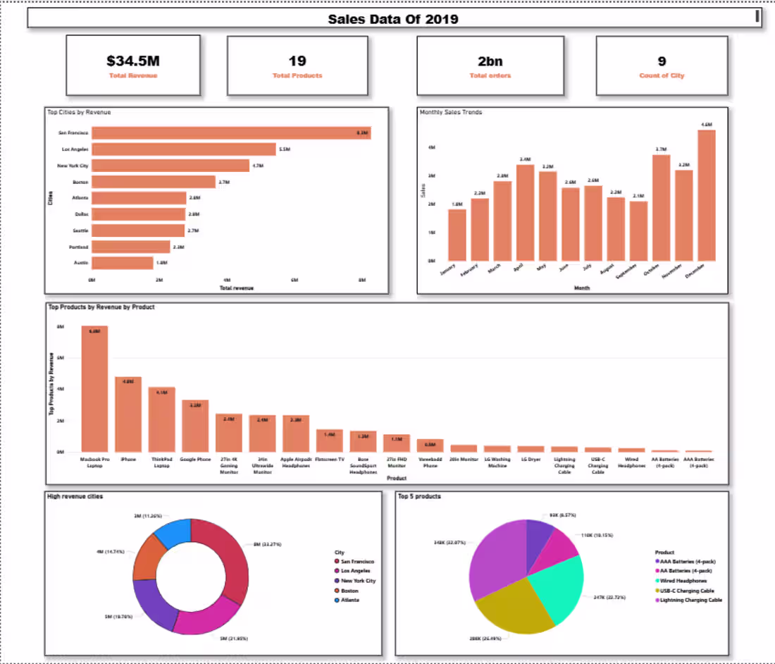
This dashboard is a Sales Data Analysis Dashboard for 2019, likely created in Power BI to provide business insights through interactive visualizations. It demonstrates skills in data cleaning, data modeling, KPI tracking, and data visualization.
Project Overview
The dashboard analyzes sales performance across different cities, products, and months, helping businesses understand revenue trends and identify top-performing products and locations.
Key Insights Displayed
Total Revenue: $34.5 Million
Total Products: 19
Total Orders: 2 Billion
Cities Covered: 9
Visualizations Included
📍 Top Cities by Revenue
A horizontal bar chart compares revenue generated by each city. San Francisco leads with the highest revenue, followed by Los Angeles and New York City.
📈 Monthly Sales Trends
A monthly sales analysis highlights fluctuations throughout the year, showing peak sales periods and seasonal patterns. December records the highest sales performance.
💻 Top Products by Revenue
A product-wise revenue chart identifies the best-selling products, with the MacBook Pro Laptop generating the highest revenue.
🏙️ High Revenue Cities
A donut chart visualizes the contribution of major cities to total revenue, making it easy to compare market performance.
🛍️ Top 5 Products
A pie chart showcases the revenue share of the five highest-performing products.
Skills Demonstrated
Power BI Dashboard Development
Data Visualization & Storytelling
Business Intelligence Reporting
KPI Design and Tracking
Sales Performance Analysis
Data Cleaning and Transformation
DAX Measures and Calculations
Interactive Dashboard Design
0
20