pro
Zap Zo
Brand Designer & Visual Storyteller
New to Contra
Zap is ready for their next project!
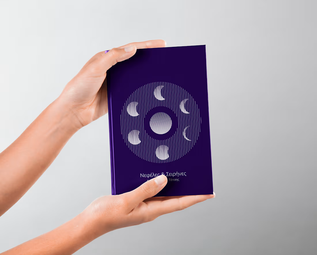
Book Covers for Nefeles & Seirines
Overview
A collection of book cover designs created for Nefeles & Seirines, focusing on visually capturing the essence of each story through thoughtful composition, typography, and imagery.
The Challenge
The goal was to create unique covers that reflect the mood, genre, and themes of each book while maintaining a professional and eye-catching appearance.
Design Concept
Each cover was designed with a strong visual narrative, combining carefully selected colors, typography, and illustrations to create engaging and memorable designs.
Typography
The typography was chosen to complement the tone of each story while ensuring clarity, balance, and readability.
2
43
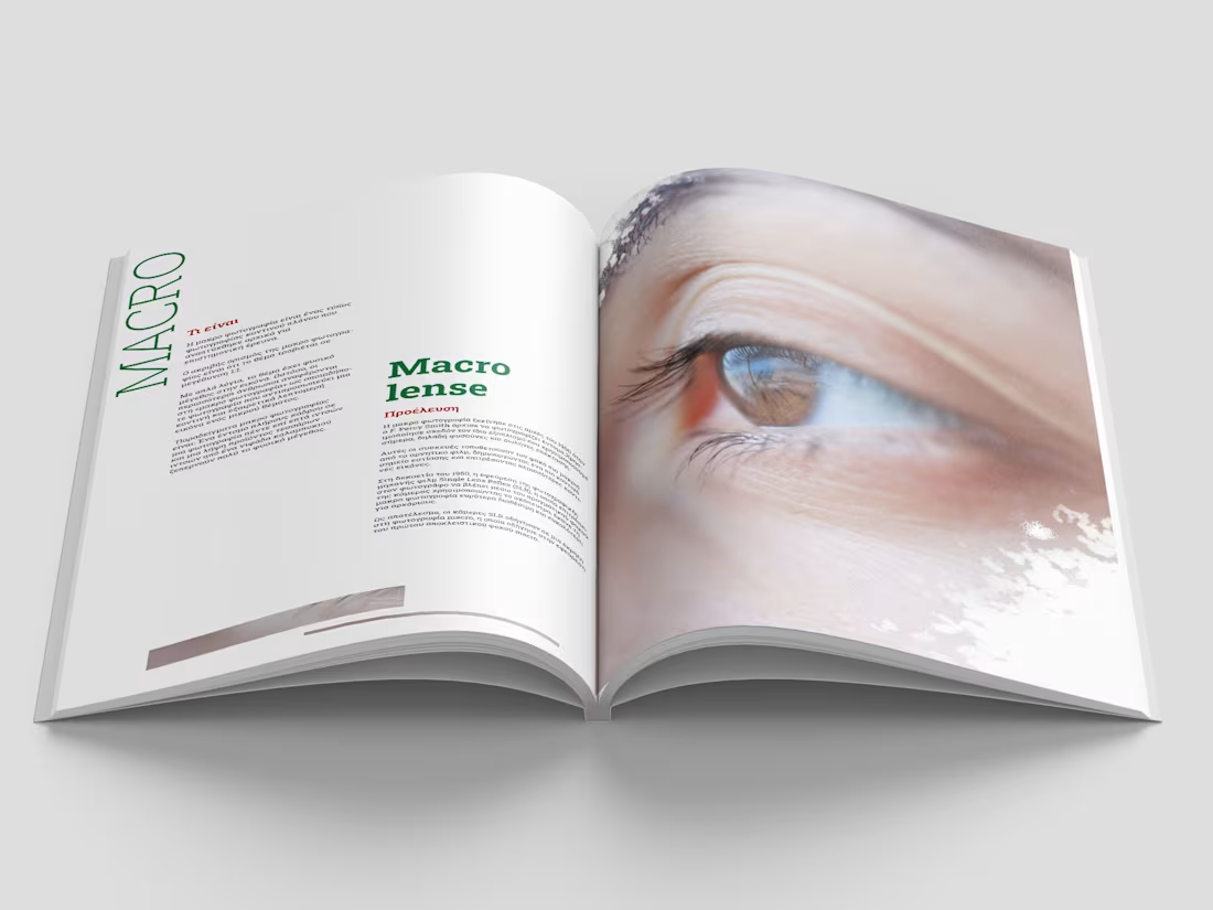
NOW - Photography Magazine
Overview
A magazine design project focused on creating a modern and visually engaging publication centered around photography. The project explores editorial design, image composition, and typography to create a balanced and immersive reading experience.
The Challenge
The challenge was to design a magazine layout that allows photography to take the spotlight while maintaining strong visual structure, readability, and a consistent editorial identity.
Design Concept
The design combines clean layouts, expressive typography, and carefully curated imagery to create a contemporary magazine aesthetic. Each page is designed to enhance the storytelling aspect of photography while maintaining a cohesive visual flow.
Typography & Layout
A thoughtful combination of typography, spacing, and grid systems was used to create hierarchy and guide the reader through the content. The layout balances text and visuals to create a sophisticated editorial experience.
0
38
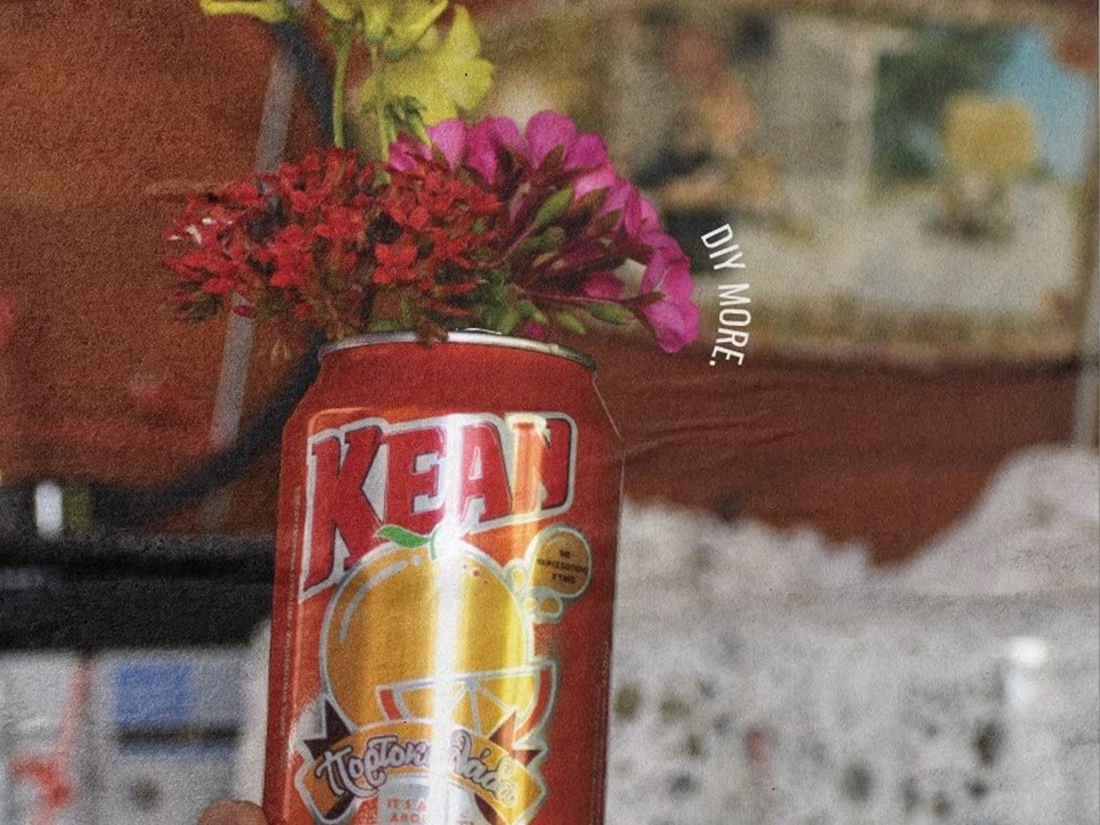
KEAN - Posters
Overview
A poster design project created for KEAN, exploring visual communication through bold compositions, typography, and creative layouts. The project focuses on creating engaging designs that capture attention while effectively presenting the brand and its message.
The Challenge
The challenge was to develop a series of posters that combine creativity with clear communication. Each design needed to maintain a strong visual identity while adapting to different concepts and applications.
Design Concept
The posters were developed through experimentation with typography, color, imagery, and composition. The designs aim to create a dynamic visual experience while reflecting KEAN’s energetic and recognizable identity.
Typography & Layout
Strong typographic choices and structured layouts were used to create hierarchy, improve readability, and guide the viewer’s attention throughout each poster.
0
44
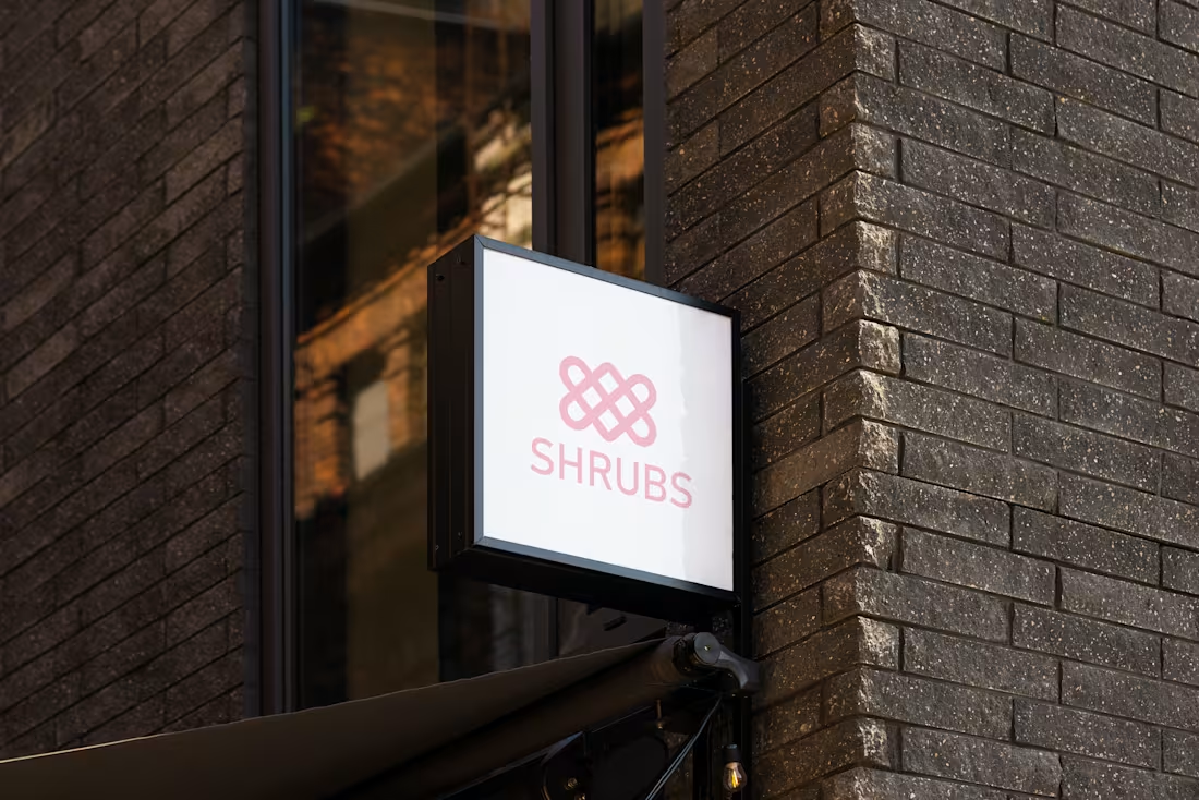
SHRUBS - Branding & Packaging
Overview
SHRUBS is a conceptual branding and packaging project created for a premium botanical brand. The objective was to develop a clean, modern identity that reflects the freshness and authenticity of natural ingredients while creating a memorable shelf presence.
The Challenge
The challenge was to design a visual identity that balances minimalism with an organic aesthetic. The packaging needed to communicate quality, sustainability, and a handcrafted feel while remaining versatile across multiple product variations.
Brand Concept
The identity is inspired by the natural forms and textures found in herbs and plants. Soft earthy tones, elegant typography, and subtle botanical elements create a calm, premium appearance that appeals to environmentally conscious consumers.
Logo Design
The logo combines modern simplicity with organic characteristics to establish a timeless and recognizable identity. It is designed to remain effective across packaging, print, and digital applications.
Color Palette
A muted palette of greens, beige, and natural neutrals reinforces the connection to nature while maintaining a sophisticated visual language.
Typography
A combination of clean sans-serif and refined serif typefaces creates a balance between contemporary design and premium craftsmanship.
Packaging Design
The packaging system focuses on clarity, consistency, and functionality. Each product variation is distinguished through subtle color changes and botanical graphics while maintaining a cohesive brand identity throughout the collection.
0
55