Studio YNNH
Making brands look less… branded
New to Contra
Studio is building their profile!
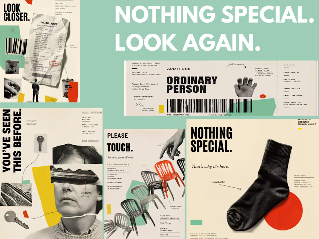
An exhibition for things nobody asked to see.
The Museum of Ordinary Things (M.O.O.T.) is an experimental campaign built around a simple idea: what happens when we give completely ordinary objects the attention usually reserved for something important?
Receipts, lost keys, plastic chairs and lonely socks become museum-worthy artefacts through experimental design, analogue collage, bold typography, photography and a little dry humour.
It’s about playing with the familiar, finding personality in the overlooked, and proving that even the most ordinary things can become interesting when you look again.
0
25
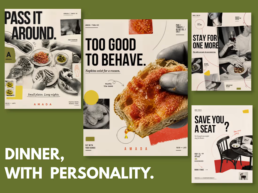
Small plates. Big personality.
AMADA started with a simple thought: restaurant content doesn’t have to look like restaurant content.
For this experimental tapas campaign, I wanted to move away from perfectly styled plates, polished food photography and predictable social templates. Instead, I mixed analogue collage, editorial photography, playful typography, hand-drawn details and imperfect print textures (with plenty of breathing room to keep it feeling light rather than chaotic.)
The result is a little messy, a little cheeky and very human. Hands reach across tables, food gets eaten, napkins get crumpled and glasses leave marks. Because a good restaurant isn’t really about the perfect table setting -it’s about wanting to stay for one more.
Each piece also has a job to do: introduce the brand, make the food irresistible, sell the atmosphere and, eventually, get someone to book a table. The visuals may be experimental, but the content still has a purpose.
This kind of direction works especially well for restaurants, cafés, bars and hospitality brands that have a personality worth showing, and would rather be remembered than blend into another perfectly curated feed.
Good food gets people through the door. A good brand makes them curious enough to open it.
2
65
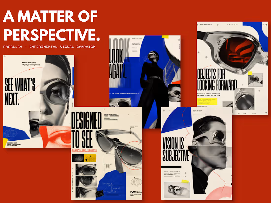
Same world. Different lens. 👁
PARALLAX is an experimental eyewear campaign built around one idea: the way we see things is never completely fixed.
I mixed retro-futuristic visuals with analogue editorial collage; fragmented photography, bold type, print textures and a little controlled weirdness to create something that feels caught somewhere between the past and the future.
This one was mostly about experimenting, breaking a few design rules and seeing where it went. Because sometimes the interesting stuff happens when everything isn’t perfectly polished.
A little strange. A little futuristic. Very much on purpose.
2
2
114
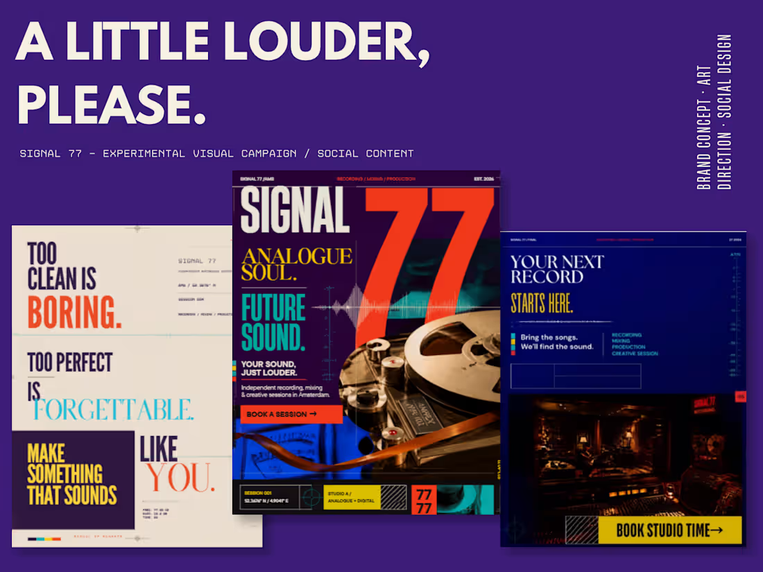
Who said good design had to be quiet?
SIGNAL 77 is an experimental visual campaign built around bold colour, oversized typography and a little retro-futuristic chaos. Inspired by analogue music culture and editorial design, I wanted this project to feel loud, tactile and slightly unexpected; the kind of content you notice before you even realise you’ve stopped scrolling.
I’m a big believer that brands shouldn’t be afraid of colour, boldness or having a little personality. Not every brand needs to whisper in beige. ;)
That doesn’t mean every brand needs to shout either. I love adapting my design approach to the personality in front of me; from refined, minimal and luxurious identities to colourful, expressive brands like SIGNAL 77.
Different brand, different voice. That’s the fun part.
2
2
195