
Wisdom Olatunde
UI/UX Design & No-Code Solutions Specialist
Ready for work
Wisdom is ready for their next project!
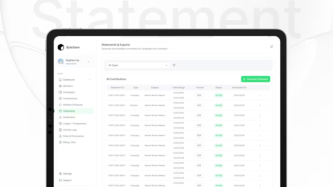
So I designed this Statements & Exports screen with one goal: generate reports fast.
Filter by type (campaign/member)
Clear table: ID, subject, date range, format, status, generated on
One primary action: Generate Statement
Quick access: export PDF + overflow actions
Design rule: reporting should be a 2-click task, not a workflow.
0
9
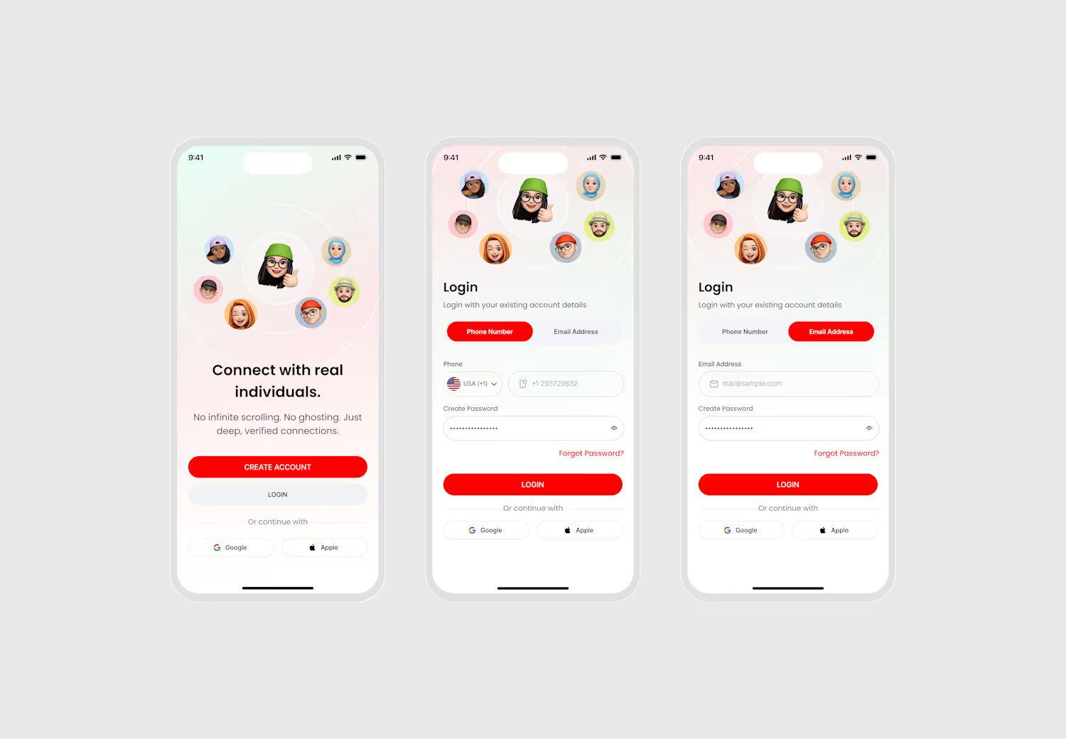
So I designed this welcome screen with one goal: make the value obvious in 5 seconds.
Clear headline: “Connect with real individuals.”
Trust promise: no infinite scrolling, no ghosting, verified connections
Two actions only: Create account (primary) + Login (secondary)
Optional sign-in: Google / Apple (kept quiet)
Design rule: if users don’t understand it fast, they won’t start.
0
10
Dating profiles should be skim friendly.
So I designed this profile screen with one goal: help users decide fast.
Big photo + compatibility badge (instant signal)
Name, age, location, job (quick context)
Short About (no long reading)
Interest tags as conversation starters
Gallery for vibe check
Clear actions: Like or Pass
Design rule: if it takes effort to understand, users won’t engage.
1
18
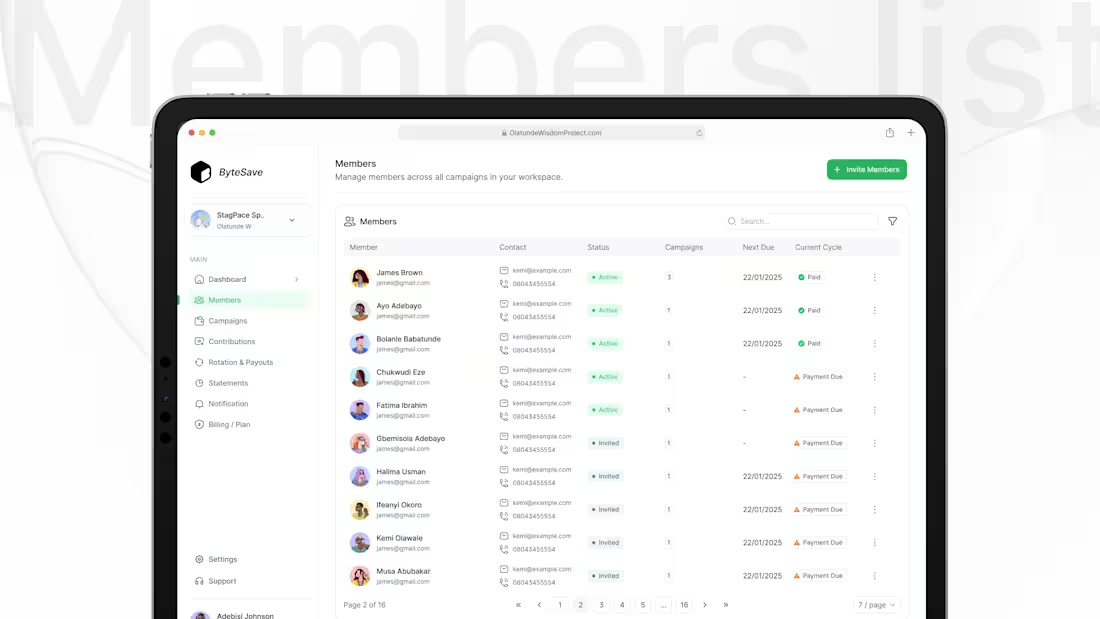
So I designed this Members list with one goal, manage people fast.
At-a-glance status: Active / Invited / Payment Due
Actionable columns: Contact, Campaigns, Next Due, Current Cycle
Speed tools: Search + filters
Clean actions: overflow menu keeps the table calm
Design rule: admin screens should feel like a task list, not data.
2
3
46
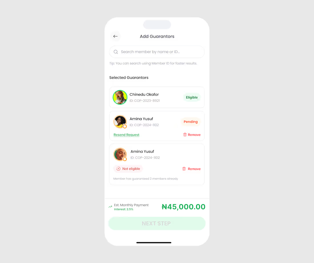
While working on a Loan Application project I designed this “Add Guarantors” screen with one goal:
Make eligibility obvious and next steps effortless.
1) Search is built for speed
Users can search by name or Member ID and there’s a tip right under it.
Less friction, faster selection.
2) Selected guarantors are shown immediately
No “where did my selection go?” moment.
Everything is visible in one list.
3) Status is clear at a glance
Each guarantor gets a label that answers the only question that matters:
Eligible ✅
Pending 🟠
Not eligible ❌
4) Explain the “why” (not just the error)
“Not eligible” comes with a reason:
Member has guaranteed 2 members already.
This reduces back-and-forth and supports trust.
5) Built-in recovery actions
If pending, users can Resend request.
If wrong choice, they can Remove instantly.
No dead ends.
0
25
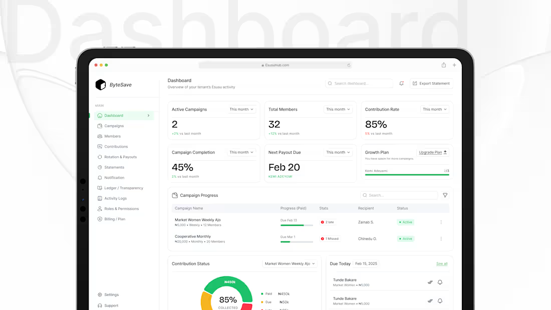
Most dashboards show data.
But admins don’t want “only data”…
They want clarity and control.
So I designed this admin dashboard with one goal:
Let a coordinator know what’s happening in 5 seconds and what to do next.
1) Start with the health metrics (top cards)
At a glance, you can see:
Active campaigns
Total members
Contribution rate
Campaign completion
Next payout due
No digging. No guessing.
2) Make “Next payout” impossible to miss
Because in rotation savings, payout timing is everything.
It’s the most anxiety-triggering part of the systemso it gets priority.
3) Progress table = operations view
The “Campaign Progress” table answers the admin’s daily questions:
Which campaign is active?
Who is late / missed?
Who is the recipient?
What’s the status?
2
3
70
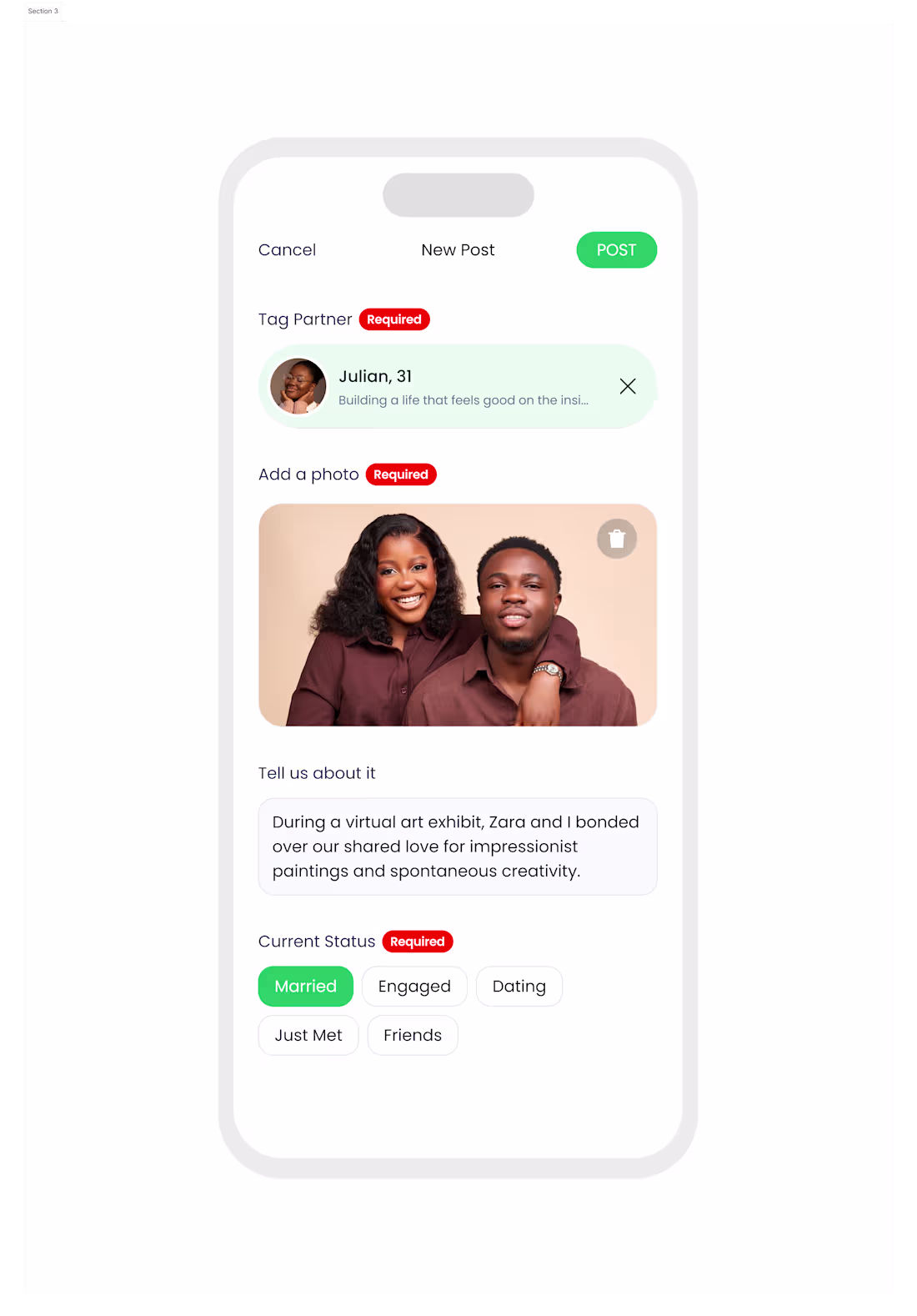
Most “post” screens feel like a form.
And when it feels like a form… users won’t post.
So I designed this Relationship Update / New Post flow with one goal:
Make sharing a relationship milestone feel simple, safe, and intentional.
1) Clear structure: what you need, in the right order
Tag partner
Add a photo
Write a short caption
Select current status
No guessing. No hunting.
2) “Required” labels reduce confusion
Instead of letting users hit Post and get errors, the UI tells them upfront what’s needed.
3) Tag partner first = trust + context
Relationship posts are sensitive.
Tagging ensures it’s about the right person and reduces fake/ambiguous updates.
4) One photo slot, large and obvious
The image isn’t an attachment it’s the centerpiece.
And delete is right there for quick correction.
0
46
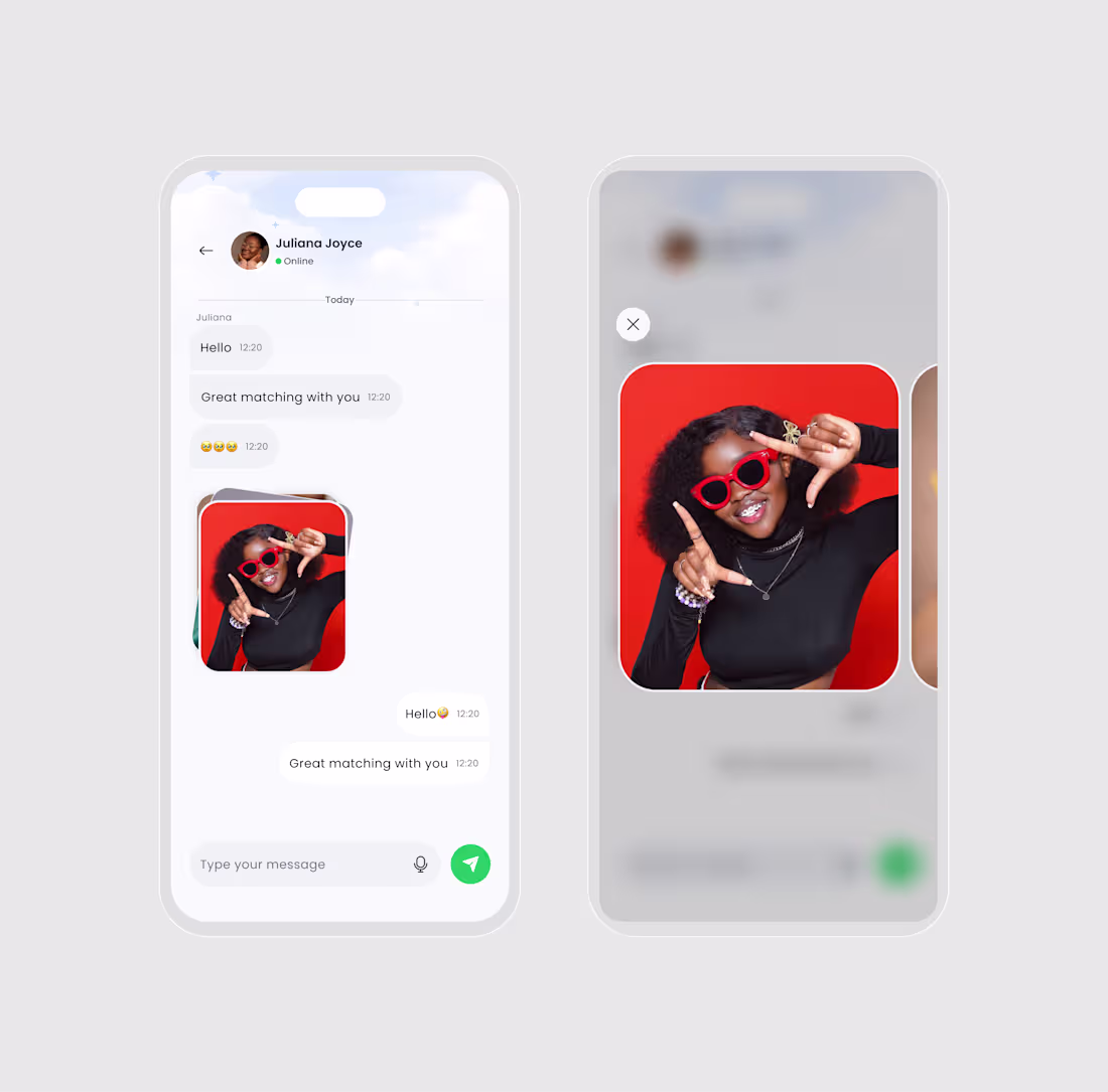
While working on this project, I designed this Messaging experience with one goal:
Make conversations feel safe, simple, and natural. 👇
1) Keep the chat layout familiar
No fancy patterns.
Just clean bubbles, clear spacing, and timestamps that don’t distract.
2) Presence is subtle (Online status)
“Online” is visible, but not screaming for attention.
It helps users understand response timing without pressure.
3) Media is part of the conversation
Instead of sending photos as tiny thumbnails, the image preview feels intentional rounded, clean, and easy to recognize.
4) Full-screen preview without leaving the chat
Tap image → focus mode preview.
The background blurs, the photo becomes the hero, and users can close instantly.
5) One clear input action
A simple message field + mic icon + send button.
1
52
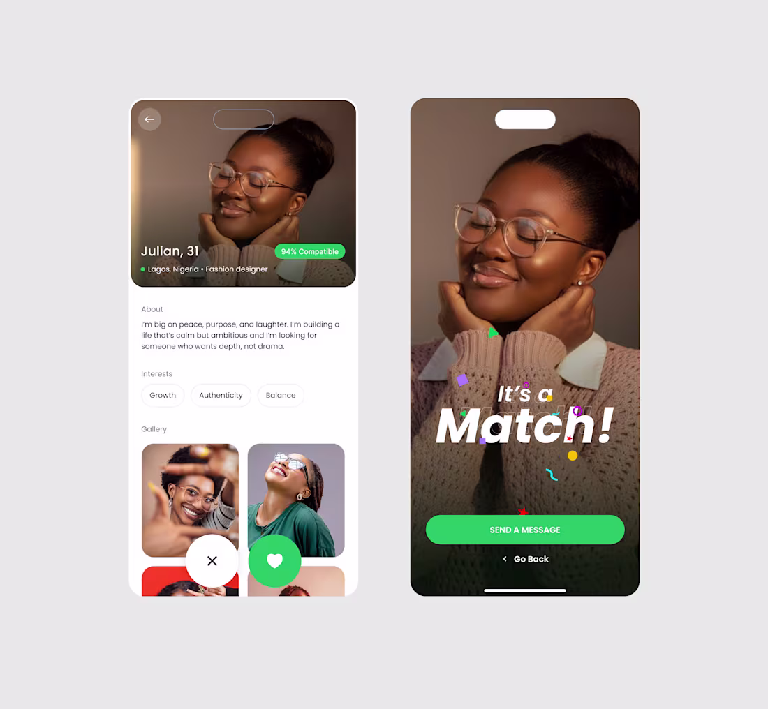
Most dating apps celebrate the swipe.
But the real moment is what happens after the match.
So I designed this Profile → Match experience with one goal:
Turn “Matched” into “Start a conversation.”
1) Lead with the human, not the UI
A large, warm photo sets the tone.
No clutter. No distractions. Just the person.
2) Compatibility is visible, but not loud
The 94% compatible badge is there for confidence,
without hijacking the profile.
3) Quick context in one line
Name, age, city, and job appear instantly.
“Julian, 31 • Lagos • Fashion designer”
That’s enough to decide if you want to read more.
4) About section is short on purpose
People don’t read essays on mobile.
So the bio is designed to be skimmable and emotion-led.
0
50
Mobile App Homepage
0
43
Upload Image Mobile App Design
0
44
Mobile App Homepage
0
41
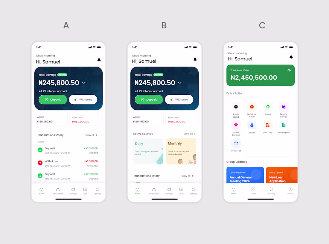
Mobile App Homepage
0
44
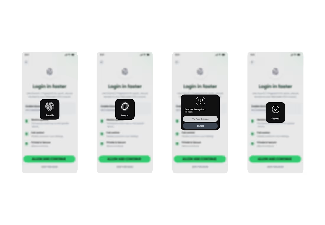
BIOMETRICS FLOW FOR MOBILE APP
1
60
Get Started Screen for a mobile app
1
58
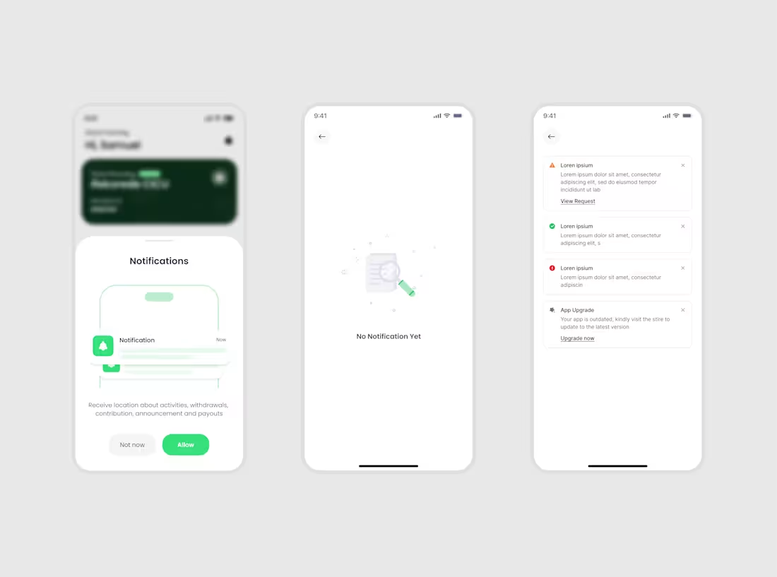
Notification Screens
1
60
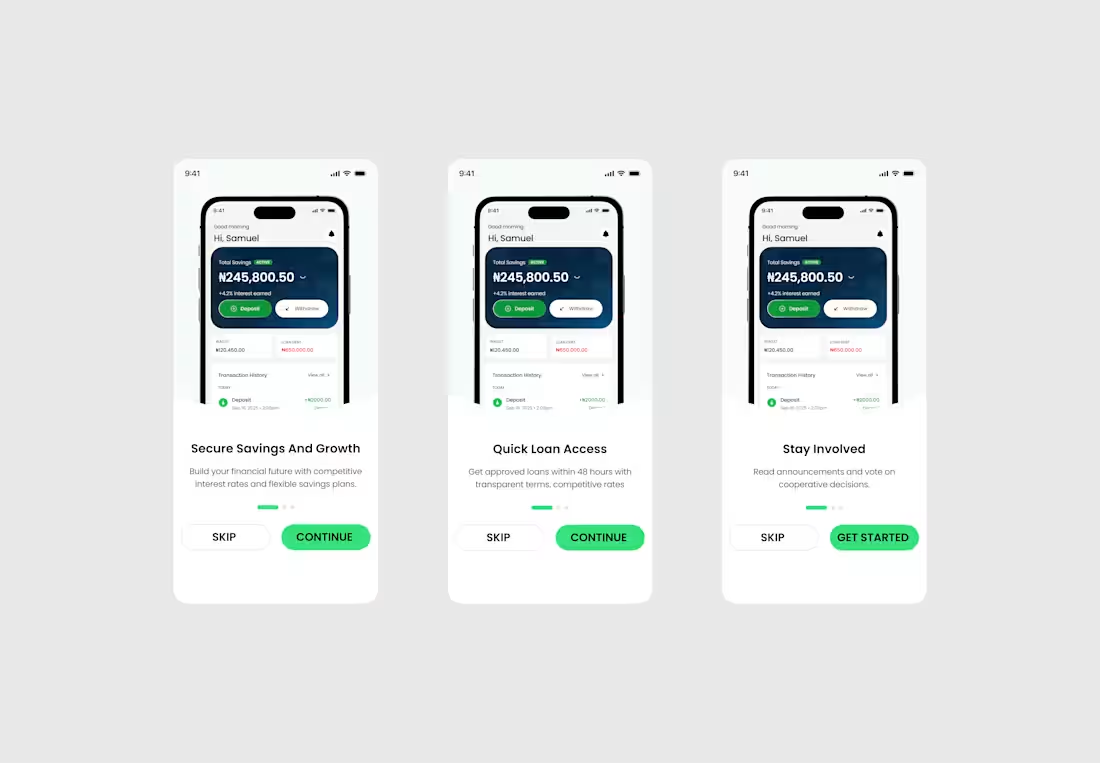
Onboarding screen for Coporative account
1
61
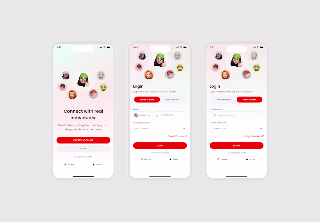
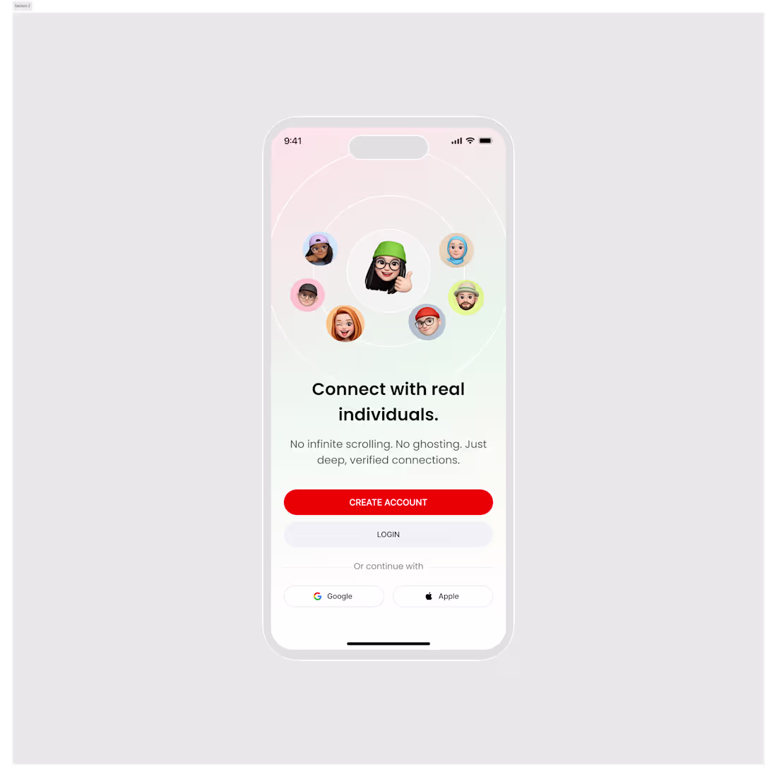
Authentication screen for a dating app
1
55
No code development
0
0