
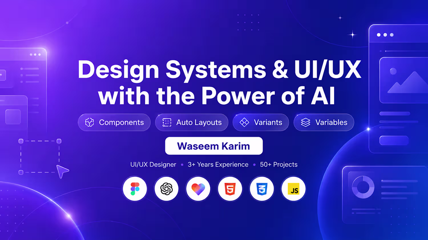
BriefPilot is an AI-powered tool that helps freelancers and designers turn messy client messages into clear project briefs, UX flows, MVP scope, screen recommendations, timelines, wireframe ideas, client-ready proposals, and portfolio case studies.
The idea comes from a real freelance challenge: clients often communicate project requirements through unstructured WhatsApp messages, emails, or short notes. BriefPilot transforms those unclear ideas into a practical design sprint that is easy to understand, review, and present.
My goal was to create a clean, simple, and useful SaaS experience that users and judges can understand within seconds.
🔗 Figma Make Prototype: [https://www.figma.com/make/WseWdSFzix1djCpKGbUK7H/Generate-full-design-prototype?fullscreen=1&t=m3oJurvOc7gCdlZN-1&code-node-id=0-9 ]
I would love to hear your feedback!
Hashtags
#FigmaMake #Figma #BriefPilot #UIDesign #UXDesign #ProductDesign #SaaSDesign #AIUX #AIDesign #DesignHackathon #InteractivePrototype #FreelanceTools #DesignTools #NoCode
2
2
147
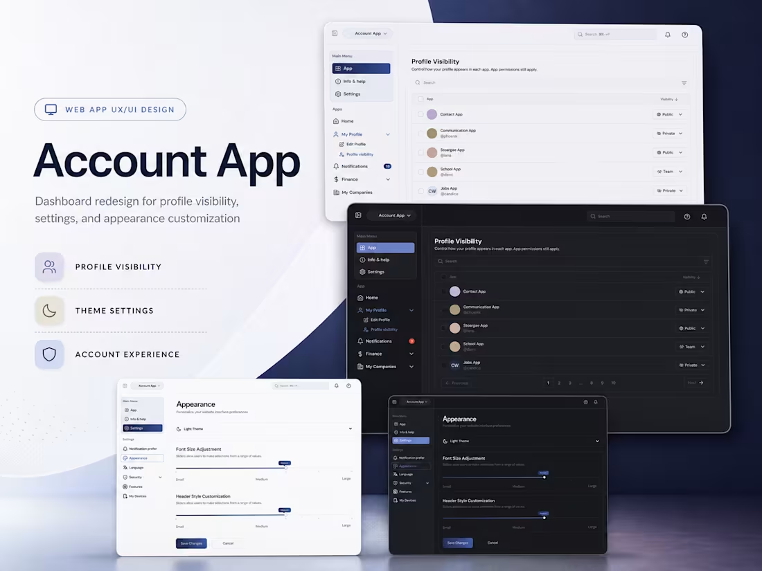
Onplo is a large platform with multiple connected apps, including the Account App. The project is still in progress, and I have been involved in designing and redesigning several dashboard screens across the platform. My work includes improving the overall user experience, creating cleaner layouts, fixing existing usability issues, and making the interface more consistent across different modules.
I also worked on wireframes to explore better user flows before moving into high-fidelity dashboard designs. Since the platform includes 6 to 7 apps, my focus has been on building a scalable design direction that feels simple, modern, and easy to use while supporting the complex structure of the product.
2
41
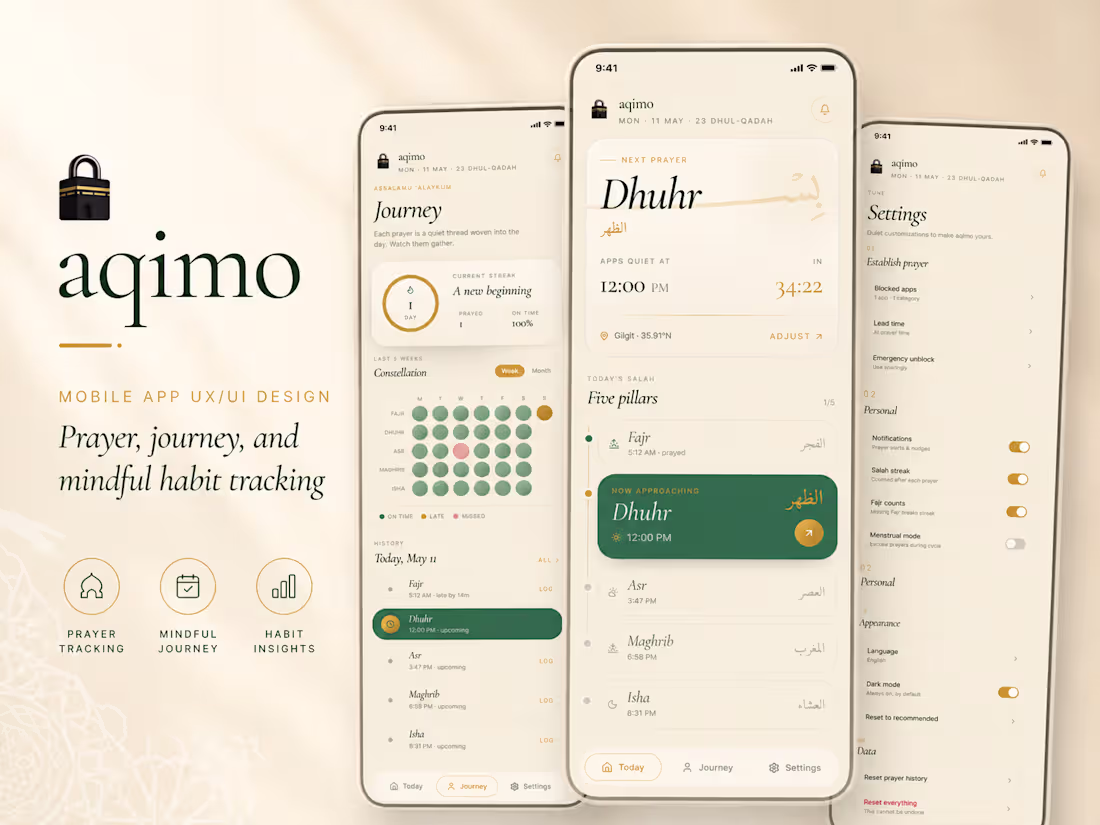
Aqimo Mobile App Redesign
This project was originally created as a test task for an Upwork client. Although the client did not move forward, I redesigned the concept as a polished mobile app UI to showcase my design approach, visual direction, and user experience thinking.
Aqimo is a prayer and mindful habit tracking app focused on helping users stay consistent with their daily salah routine. My goal was to create a calm, premium, and emotionally connected mobile experience using soft colors, elegant typography, clear spacing, and a peaceful Islamic visual style. I redesigned the main screens including Today, Journey, and Settings to make the app feel more intuitive, modern, and easy to use.
The design focuses on clean hierarchy, smooth navigation, meaningful prayer tracking, habit insights, and a warm visual identity that feels personal and spiritual.
2
58
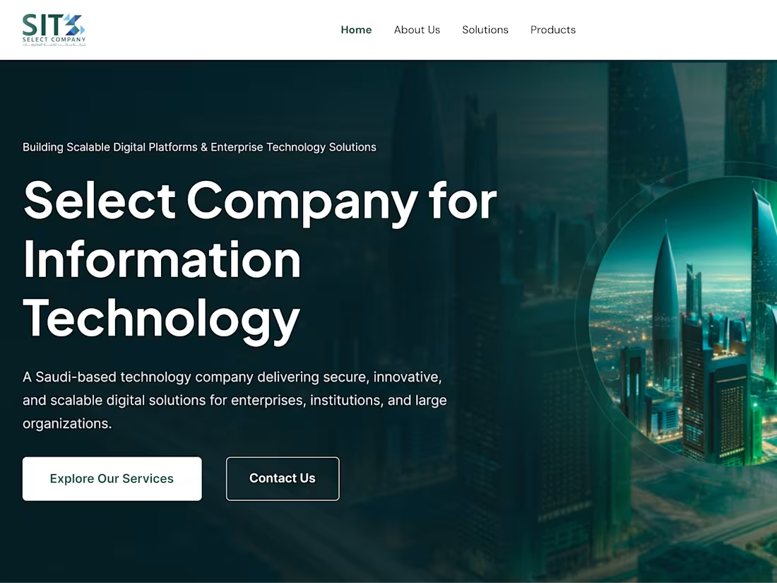
Designed a 6-page corporate landing experience for a Saudi IT company, focused on clarity, credibility, and conversion. The UI blends modern enterprise aesthetics with a regionally aligned visual tone, using structured layouts, strong hierarchy, and strategic CTAs. From hero to services and contact, each section guides users smoothly while reinforcing trust, scalability, and digital innovation. Crafted entirely in Figma with a consistent design system and responsive approach.
Link: Link: https://www.select.net.sa/
2
71
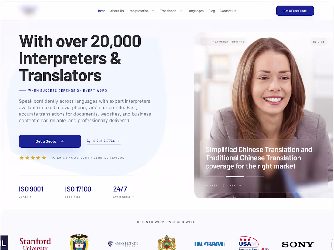
I designed the Capital Linguists homepage with a clean, professional, and trustworthy visual style for a language services company.
My focus was to create strong visual hierarchy, clear service communication, and easy navigation for users.
I structured the homepage to highlight translation, interpreting, conference services, equipment, testimonials, and contact actions.
The design uses a modern blue-and-white theme, rounded cards, clean spacing, and conversion-focused CTA sections.
Overall, the goal was to make the website feel reliable, accessible, and easy for clients to understand and take action.
1
45